As most of you know, I sold off a ton of stuff when I moved last month. One thing I said at the time was, “A nice thing about getting rid of old stuff is that you’re making room for new stuff.” I’ve put that concept into action over the past few days, so I want to go off-uni today and talk about the latest addition to Uni Watch HQ.
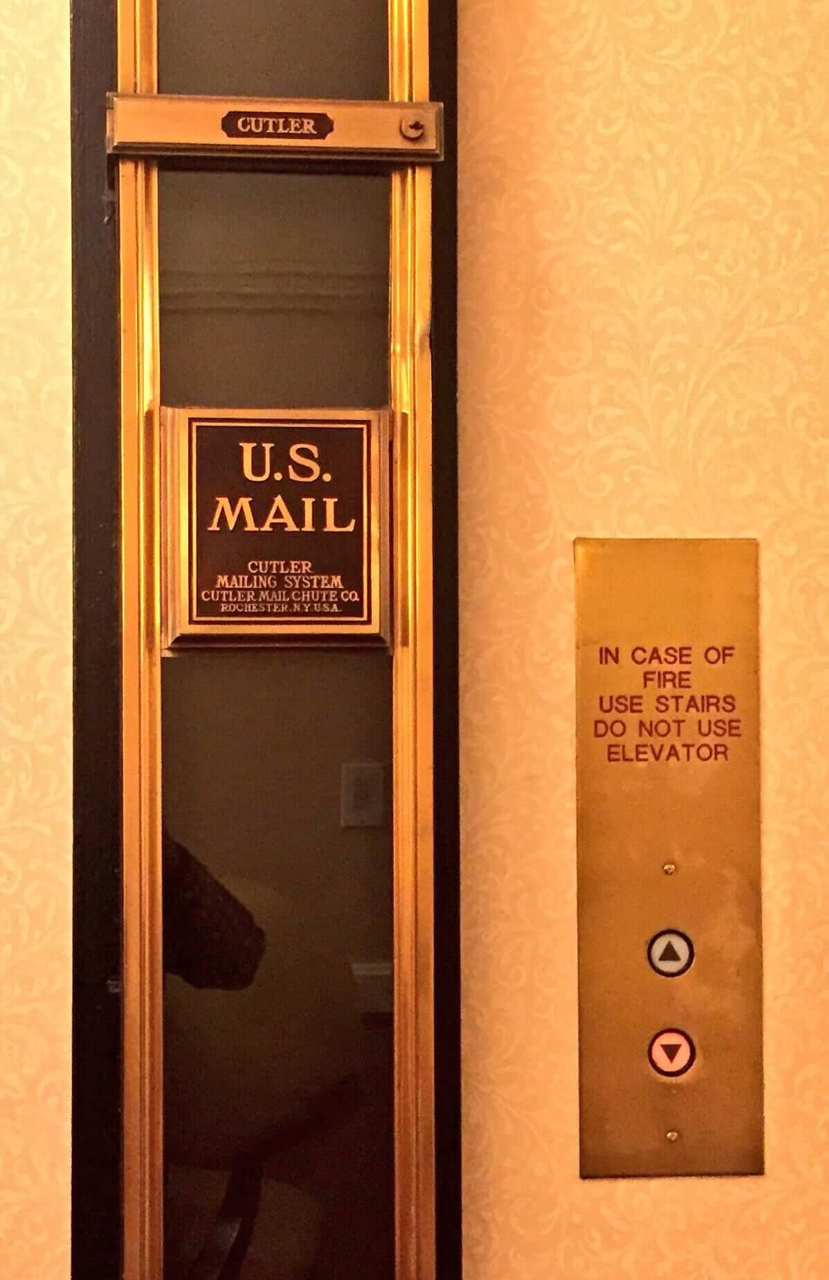
So: A few nights ago the Tugboat Captain and I were at a furniture maker’s studio to take a look at something he’d listed on Craigslist. He had all sorts of industrial junk strewn around his studio, a few pieces of which I immediately recognized: They were salvaged mail chutes — or as they’re more formally known, the Cutler Mailing System, produced for many decades by the Cutler Mail Chute Co. of Rochester (named for its founder, one James Goold Cutler, who patented the chute concept in 1883).
I’ve always loved mail chutes. They seem simultaneously modern and retro, industrial and elegant. The key thing about them, of course, is that they’re transparent, so you can see your envelope disappearing down the chute after you drop it, or see other envelopes flying by from higher floors. (As a kid, I used to stare at mail chutes for minutes at a time, hoping to see just that, until my father would say, “Okay, that’s long enough, let’s go.”) Imagine if the chutes were opaque metal, like mailboxes — they’d have much less allure.
I love mail chutes so much that I even wrote about them in the first issue of my zine, Beer Frame: The Journal of Inconspicuous Consumption, which came out almost exactly 25 years ago. So when I saw the old chutes lying on the floor of the furniture maker’s studio, I immediately said, “Whoa, you have Cutler mail chutes — that’s so cool!”
The furniture guy, whose name is Joe, explained that the chutes were salvaged from a nearby demolition site. He had a lot of them, and he seemed to like how enthusiastic I was about them, so he encouraged us to take a few of them at no charge — an extremely generous gesture considering what vintage Cutlers go for on eBay.
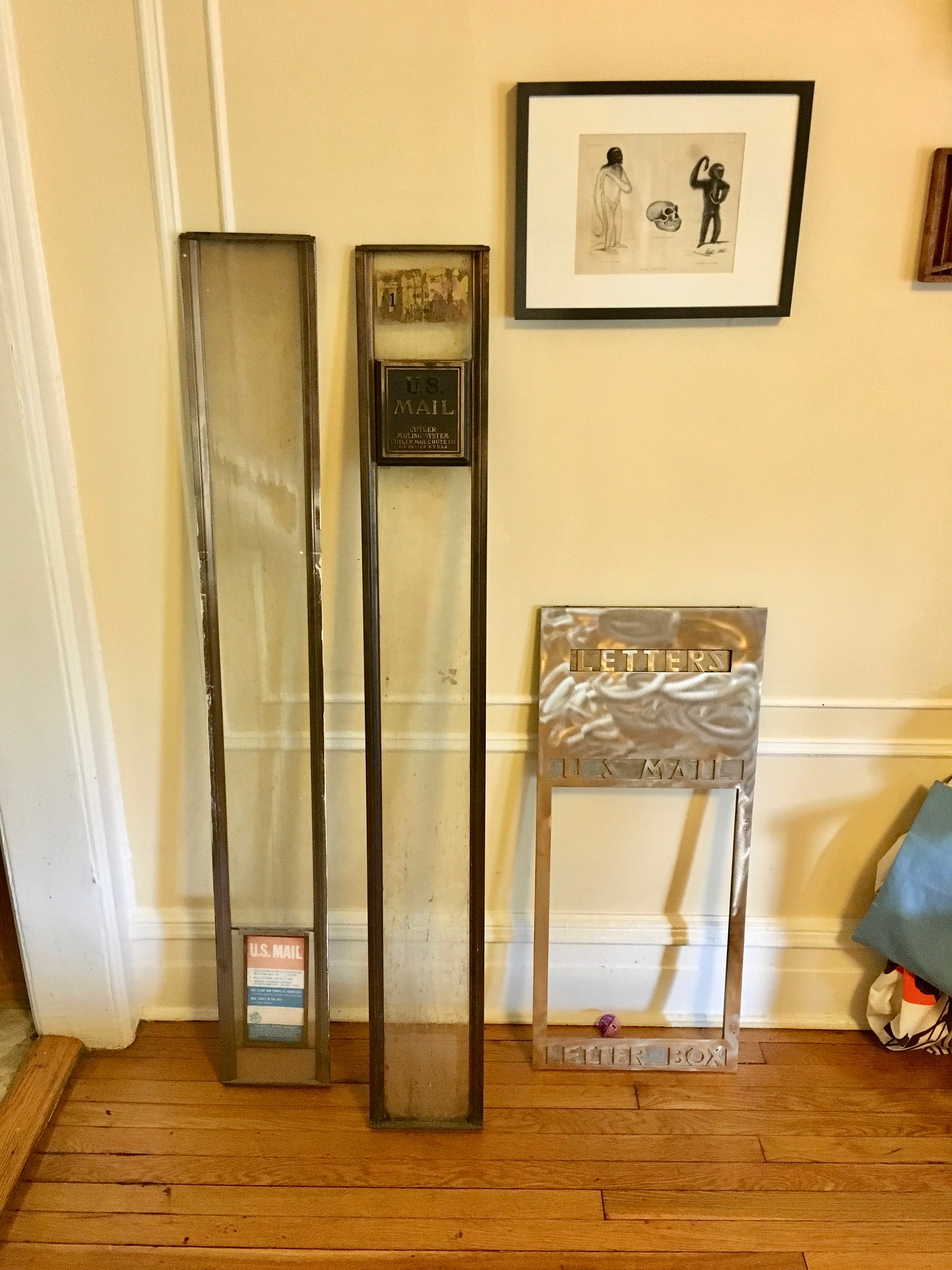
So we bundled up a few chute sections plus a gorgeous brass panel taken from the front of the box that would have gone at the bottom of the chute in the building’s lobby. It all made for an interesting ride home on the subway, where a few people were curious and, in one case, chatty about our cargo.
Here’s what we had when we got home (for all of these photos, you can click to enlarge):
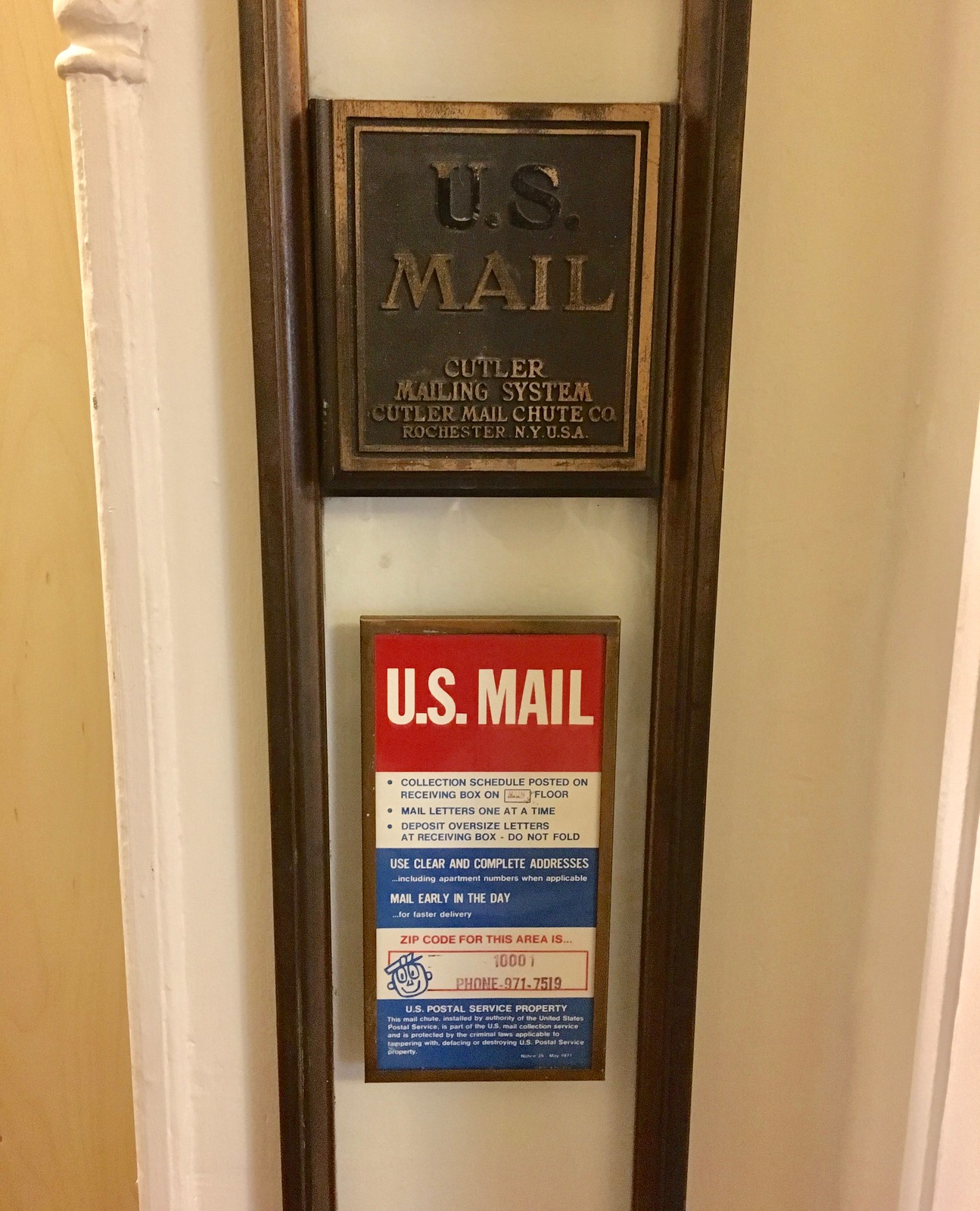
It’s hard to tell from that photo, but all of the pieces were filthy. The next day I took everything out on the porch and cleaned it. The best part came when I was cleaning the compartment that holds the little U.S. Mail placard that appears on most mail chutes. The placard, which dated back to the early 1970s, was pretty faded — but then I opened the compartment and found a spare placard, pristine and unfaded, hiding behind the first one:

How cool is that? Buried treasure! As you can see, the placard features Mr. ZIP, the cartoon mailman character that was introduced in the 1960s to encourage people to use zip codes.
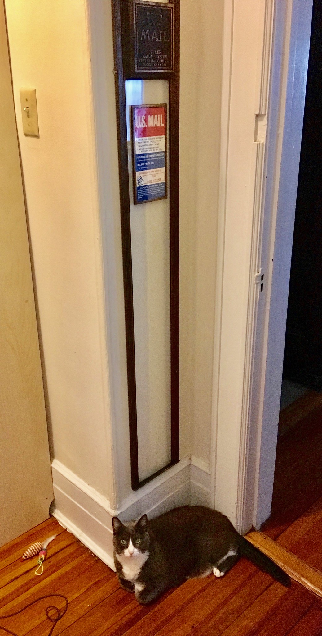
We have a one-floor apartment, so there’s no way to install the chute to run through multiple floors (plus our landlords wouldn’t be too happy about the structural modifications that would come with that). Instead, we just mounted one chute section on the wall. We chose a spot with a narrow stretch of wall that seemed right:
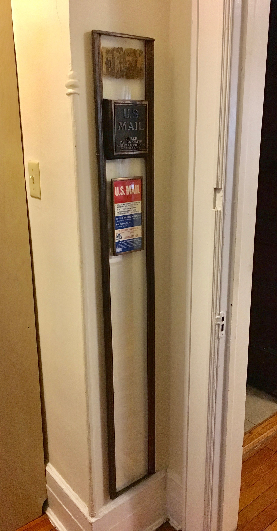
It’s fun to put a letter in the slot, but it doesn’t go anywhere except to the floor:
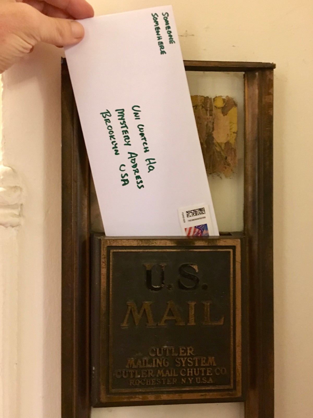

Hmmmm, might have to put a box of some sort down there. But first we’ll need approval from our new postmaster:
We have another section of chute to play around with, but for now we have no plans to mount it (one is enough). A bigger question is what we should do with the brass plate, which is spectacularly beautiful:
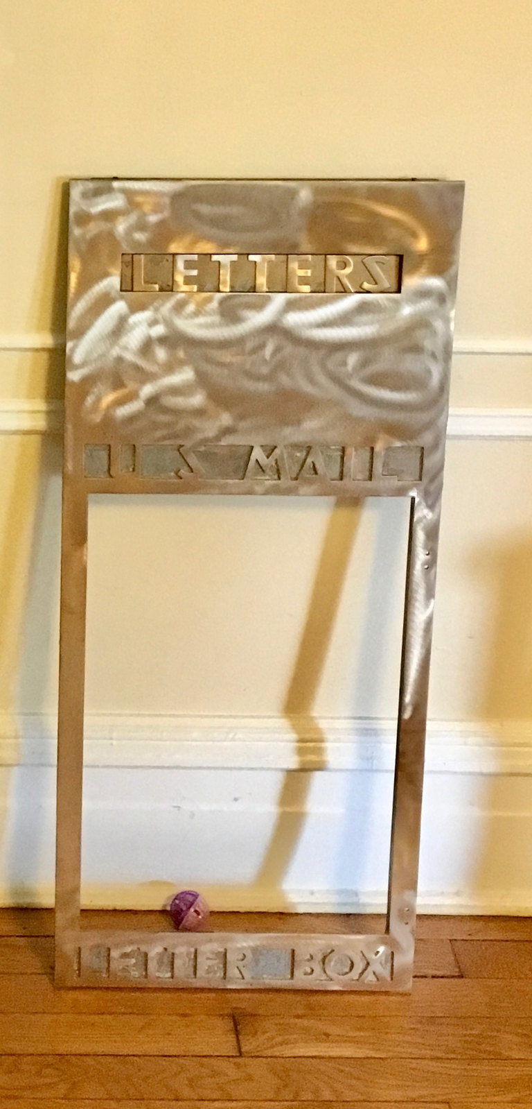
The plate would have gone on the front of the box at the bottom of the chute in the building lobby. The problem is that we don’t have the box itself, so the “belly” of the plate — the spot where the box would have been — is empty. We might have to get our own box (not a solid brass one, presumably) and rig something up, or my clever friend Beck suggests that the plate would make a great picture frame. For now, the “Letters” flap on the mail slot is easy to remove, so we’re using it as a paperweight for our daily mail:
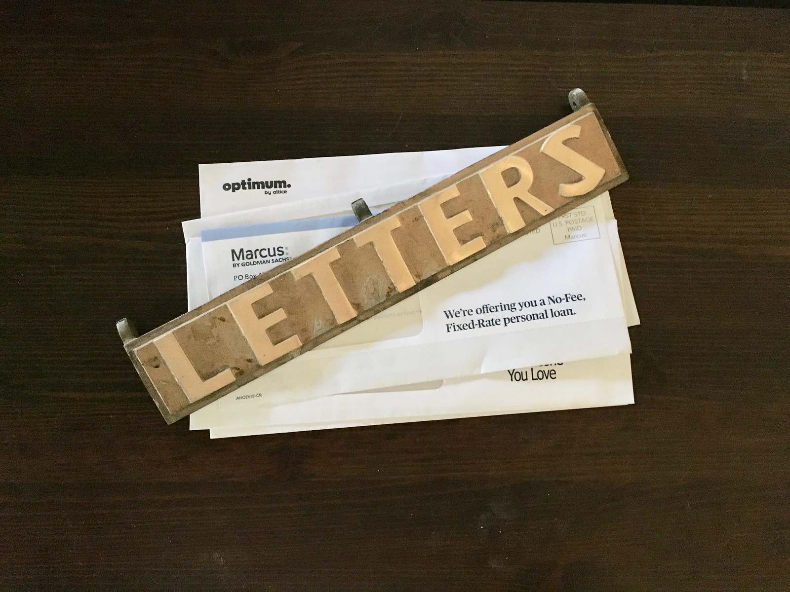
Such gorgeous typography! And to think we got all of this for free from Joe — what a score! (We also spent real money for something he made, but I’ll tell you about that another time.)
Now I just need my own pneumatic tube system. But hey, one thing at a time.
Mean Green(e) Scene: I assume most of you are familiar with the famous 1979 Coke commercial featuring Steelers defensive lineman Mean Joe Greene (embedded above). If not, take a minute to watch it before reading the rest of this section.
Greene’s alma mater, North Texas, is unveiling a statue of him this Saturday, and the team will wear 1967 throwbacks for the occasion:
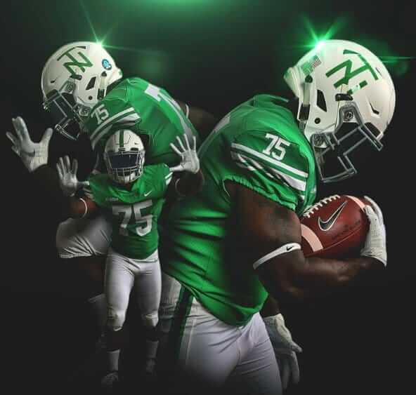
In addition, Greene’s No. 75 will be unretired for the game and will be worn by defensive lineman LaDarius Hamilton. The school announced this via a clever video — check this out:
He’s the 🐐 and the only Mean Green Football player to wear the No. 75 in the last 50 years. Until this week. For one day only, the iconic Joe Greene jersey is coming out of retirement. #GMG #UniSwag pic.twitter.com/jeaqesZ5n2
— Eagles (@MeanGreenFB) September 26, 2018
Not bad, right? Nicely done, North Texas.
The Ticker
By Paul

Baseball News: Mets 3B David Wright, finally back on the active roster for the first time since 2016 (but not slated to get into a game until Saturday), wore a standard blue undershirt prior to Tuesday night’s Mets/Braves game but changed to his signature orange base layer once the game started. … New uniforms for Marshall (from Brice Wallace). … Pete Clark notes that Orioles 3B Renato Núñez has two diacritical marks — an accent and a tilde — on his NOB. He had both marks when previously playing for the Rangers but only had the tilde — not the accent — when playing for the A’s. … The Brewers’ postseason caps and T-shirts feature the ball-in-glove logo — along with the obligatory embarrassing sloganeering (from John Okray). … I don’t think I’ve ever seen a ball be this far foul and then turn fair before. Amazing! … A new baseball magazine will soon be debuting. Although it’s not uni-centric per se, it will be called Road Grays (from Neil MacLeod).

Pro Football News: The new AAF team in San Diego, which will be called the Fleet, will reportedly have Naval-inspired uniforms (thanks, Phil). … With the Rams slated to wear throwbacks tonight, there’s a movement afoot to get defensive coordinator Wade Phillips to dress like his cowboy hat-wearing dad, Bum Phillips, for the occasion (from Jeff Ash). … The Titans will wear white over navy this Sunday (from Sam McKinley). … The Broncos will wear their mono-navy alts (thanks, Phil). … And while the Packers wear their throwbacks, the visiting Bills will wear white over blue (from @bonesj0nes). … According to this article (NYT link) about workplace abuses suffered by NFL cheerleaders, at least three teams — the Jets, the Saints, and Washington — have gone with more modest cheerleading uniforms that show less skin this season.
College Football News: Regarding yesterday’s post about the red dot on BYU’s helmets in a 1989 game: 1990 Heisman Trophy winner Ty Detmer, who played for BYU, has confirmed that the red dot was indeed a “Say no to drugs” symbol (thanks, Phil). … Here’s a brief history — but without photos — of Oregon uniforms (thanks, Phil). … Here are this week’s uni combos for Penn, Colorado, UNC, Oklahoma, Virginia Tech, and Arkansas (from Rose Culper, Andrew Cosentino, James Gilbert, and Phil). … Here’s some video of Miami coach Mark Richt discussing the mono-black uniforms that the team will be wearing tonight (thanks, Phil).

Hockey News: An NHL team will be making a uni-related announcement this afternoon, and I can pretty well guarantee that it’ll be a crowd-pleaser. Sorry, can’t say more just yet, but stay tuned. … Here’s an interview with the Stars fan who let Alexander Radulov wear his retail jersey during a recent preseason game. … As most of you know by now, the Red Wings routinely use straight block lettering for their NOBs during the preseason and then switch back to their standard vertically arched NOBs when the regular season starts. This usually results in a bunch of people emailing or tweeting at me during the preseason to say, “Hey, they changed their lettering this season,” and then I have to explain that it’s an annual preseason thing. This year, however, not a single person has mentioned the lettering, which I guess means either people have finally learned or they’re simply not watching preseason hockey. … The great Frozen Faceoff site has provided a handy rundown of this season’s NHL center ice and red line changes.

NBA News: New Era has just released a bunch of NBA caps. … The Wizards’ practice jerseys now have ad patches (from Robert Anderson). … Lakers fans are upset about LeBron James’s plan to wear sneakers with Cavs colors in this year’s season opener.

College Hoops News: Here are Houston’s first Jordan-branded uniforms (from Ignacio Salazar). … Here’s a weird one: At the beginning of the 1996-97 season, Oklahoma State’s home uniforms had “Cowboys” on the chest and had swashes, or “tails,” extending from the “C” and the “s.” But according to this 2/6/97 newspaper item, the swashes were removed from the chest insignia because they “were a violation of an NCAA rule. “No further explanation is given, and I can’t imagine what rule could apply here. Anyone..? (From OSU alum Craig Ward.) … Ohio State has made lots of arena renovations. One of the photos in that piece shows an old Jerry Lucas jersey with a crotch extension, which is something more commonly found in old football jerseys (from Jason Hillyer). … Speaking of Ohio State, they have a new jersey template this season (@OSUBballinsider). … New practice gear for Providence (from Anthony Gonsalves). … New uniforms for Hawaii (from Aaron Wigg).

Soccer News: Here’s a great graphic that originally ran in the Italian magazine Guerin Sportivo, showing the uniforms of all the NASL teams in 1981 (from Matt DeWeese).

Grab Bag: Here’s the uniform scripting for the European Ryder Cup team (thanks, Phil). … New uniforms for the Japanese women’s volleyball team Toyota Auto Body Queenseis (from Jeremy Brahm). … Dunkin’ Donuts intentionally vague names. … In a related item, Weight Watchers is changing its name to WW. … ESPN has run a piece on the Jumpman logo and has also published a quiz on athletes’ personal logos. … Pretty cool jersey design for the Netherlands’ U20 women’s ultimate team (rare non-rugby contribution from Eric Bangeman). … New uniforms in the works for British Airways.
I enjoyed reading about mail chutes – I had never heard of it before.
I saw one when my wife and stayed at the Greenbrier in West Virginia. Pretty awesome concept, and good on PL for getting one for the new digs. I love the gold one – Art Deco always looks good!
Unsure how to feel about the whole dunkin thing as a New Englander lol It doesn’t really make sense to leave off the donuts because the the whole point was the donuts are for dunking in coffee, right?
Anyhow, an interesting tidbit is that in Madrid, the shop is called Dunkin Coffee, have no idea why, maybe coffee resonates with Europeans more than donuts do.
It’s worrying when a company renames or rebrands itself and gets away from what it used to be about, but in this case, it’s understandable:
link
I’m wondering what this will mean for Dunkin Donuts Park in Hartford and/or the Dunkin Donuts Center in Providence. Dunkin Park and the Dunkin Center seems likely.
Slam Dunkin Center?
I still call it the Providence Civic Center
We have that shirt!
It’s dumb, but like my daughter said, “Nobody calls it Dunkin‘ Donuts. We say we want to go to Dunkin’.” And she’s right I guess.
They should have changed to DD, that’s what we here in Connecticut call it. Like KFC…
As for LeBron’s sneakers…I’m a Lakers fan and I want to be 1-0, I don’t care if he wears flip-flops.
You can’t go to DD if you’re in WW though…
I don’t think I have heard anyone call it just Dunkin, and never heard it referred to as just Dunkin until they started using that slogan in their commercials. Certainly could just be the people I encounter.
Though it was Dunkin Donuts because you dunked their doughnuts into their coffee. What are you Dunkin if not Donuts? I get they now realize their core is coffee, and want to market themselves as a larger food service option. I am just curious who doesn’t know they have loads of breakfast food, regardless of their name? I haven’t bought a doughnut there in at least a decade, but I have gone in there for a bagel or breakfast sandwich many times.
The chain isn’t a big player in the Midwest. I’ve never been in one and that’s news to me that they have food other than donuts. I’m not a coffee person (or breakfast much, either) but I guess I need to crawl out from under my rock. Or their advertising here should let me know what they have…
I’m not sure what part of the Midwest you’re from, but having lived here in the Chicago area my whole life (40 years), I have always seen quite a few Dunkin’ Donuts locations, I have gone to Dunkin’ Donuts many times, I see their commercials on TV, I know that that they have muffins, bagels, and breakfast sandwiches in addition to donuts, and I see people on the street carrying and drinking Dunkin’ Donuts beverages like iced coffees all the time.
Well, in areas like Nebraska, Kansas, and Missouri, I know that Dunkin only re-entered those markets in the past 7 years or so (around the time I moved out of that region and came back to the Boston area), so I’m not surprised that a lot of folks remain unfamiliar with it.
I will say that locals (myself included) only refer to it as Dunkin, so I get the change, but it still doesn’t make sense given something needs to be dunked! lol
I had to look it up, but there is one in the city of Green Bay, and not in an area I routinely travel.
I remember only a few buildings in my youth with mail chutes, and would watch intently to see something whiz by. The time spent watching v. falling item ratio was quite high!!
I have/had a similar infatuation with pneumatic tube systems.
PS: Stop bragging about your porch! ;^)
Hey Paul, if you ever wanted to come up here and visit Rochester, the department of rare books at the U of Rochester keeps a selection of papers from the Cutler Mail Chute company. I believe the collection has old photos, memos, etc.
While you’re up here you could visit the Genesee brewery, take in an Amerks game and have a garbage plate!
I love Rochester! Last time I was there was in 2015:
link
Thanks for letting me know about the Cutler archives. I’ll add that to my list for my next visit!
Nick Tahoe’s right? A former co-worker brought a Garbage Plate back for me once….DEEEEELICIOUS
Does Joe Greene’s nickname have anything to do with his playing for “Mean Green”? It it a play off of that?
I guess my question is, which nickname came first, and are they related?
Would he be “mean” if he played at Boise State?
Yes, that’s exactly how he got the nickname.
He’d be “Bronco Joe”, but only if he wound up in Denver.
For what it’s worth, UTN’s official nickname when Greene got to school was just the Eagles, and the Mean Green were the nickname for the defensive line Greene was on his sophomore year, and the name started showing up on t-shirts and stuff by his senior year. He retained the nickname in Pgh because Steeler fans incorrectly assumed it was his nickname from college, and since UTN liked the national attention that came with it, they officially changed their name after. So viewed a certain way, the team actually got their name from Joe, not the other way around.
Its UNT…not UTN
Don’t let the new postmaster get her boxes confused!
Your closing line to the lede is perfect. I was thinking the same thing as was reading.
I remember staying in a NYC hotel in the late 80s and the mail chute had a letter stuck for our entire trip.
For more Mr. ZIP, here’s a spectacular 14 minute musical video made by the Postal Service in the 60s to encourage people to use ZIP codes: link
It’s worth watching the whole way through.
The mail chute is an awesome find, by the way.
Wish I still had my Mr. Zip lunch box from when I was a kid. My uncle Matt owned it and passed down to me. Then I lost track of it. :(
Amazing. That video is a true gem. Love the upside down New Jersey placard that made the final cut in the “Springfield, USA” song
First, Mr. Zip rocks.
Second, that video is amazing. Never saw it before. Thanks so much for sharing the link here, Bernie!
I could only take 30 seconds of that song. For anyone like me who just wants a quick music-less ZIP code video, try this one: link
The Whalen building locally to me has those mail chutes. Some pics of the building and mail chute I took a few years back.
link
I stayed in a hotel in DC last week that had a Cutler Mail chute in the hallway near my room (it’s a converted former residential building) and the whole thing was painted over with the thickest coat of drab gray paint that I’ve ever seen. Sad!
Great story about the mail chutes. Growing up and living mostly in the burbs I have never encountered this. One of the neat innovations for city life that sadly did not stick around (though the continued decrease in paper mail surely contributes).
Reminds me a bit of pneumatic trash system on Roosevelt Island.
The 1981 NASL uniform graphics exclude the Calgary Boomers (the relocated Memphis Rogues). Meanwhile the Jacksonville club (the relocated New England Tea Men) are not shown with the nickname and logo they brought with them from their former home.
Good eye, Max. I was just about to note the same observations!
The Jacksonville (previously New England) Tea Men had a beautiful logo:link
As for the Boomers, I’m not sure why they were omitted: link
FWIW, Calgary folded after the ’81 season. This graphic may have been made after the season. As for Jacksonville, according to one account, the team nearly folded after the ’81 season. Just a guess, but considering the name was more closely related to the team’s Boston roots and was a reference to the Lipton Tea owners, the status of the team and the name was likely very much in limbo at the time. Maybe they were thinking of selling, or maybe they were thinking of moving.
“By the end of 1981, Lipton’s patience with the NASL was nearly exhausted. The league had blown its national television contract with ABC and was now shedding franchises at an alarming rate. Lipton lost a reported $7M on the club between 1978 and 1981, including $1.7M during the first ten months in Jacksonville. In September 1981, the Tea Men were on the verge of folding before Lipton posted the required $150,000 bond with the league to stay in for the indoor season.”
More significant than the ball-in-glove logo on the Brewers postseason* merch is the navy and yellow** color scheme. I continue to believe that the Brewers are likely to swap the dreary metallic gold for the bright yellow athletic gold in their alts and the postseason* merch. It’s a better look, and as much as fans love the Brewers in royal, I frequently get teased for supporting the Cubs when I wear royal Brewers shirts and caps when people can’t see the Brewers logo on the front. There’s just not room for a second mainly royal team in the NL Central.
Speaking of teams and colors, the Syracuse Chiefs, who are switching affiliation from Washington to the Mets for 2019, have put much of their red-white-and-blue merch on clearance on their online store. Will the Chiefs be going blue-and-orange for the new affiliation?
* Last night’s celebration and merch dump was embarrassing. Yeah, the Brewers clinched a playoff spot, but they’re still in the hunt for the Central division pennant, so celebrating merely not being eliminated seems premature. “But what if we don’t celebrate now and then lose the division pennant on the last day, when do we get to celebrate and sell a bunch of merch?” After you win the wild-card play-in and make it to the real playoffs.
** “Yellow” to distinguish between the two colors the team calls “gold,” the other being really just tan most of the time.
Well, since Milwaukee has one World Series title in 1957, and one NBA title in 1971 – and not a whole of lot of coming close since (One NBA finals and one WS appearance), the celebration is OK by me. Give us cheeseheads a break.
I’m wondering where they got the Miller Lite after they ran out of champagne. Not from any concession stand at Busch Stadium, I bet…
There’s just not room for a second mainly royal team in the NL Central.
So go back to the AL where you belong! ;)
Seriously, though, do it. Put Houston back where they belong, then move KC to the AL West. Fixed.
Don’t ever recall the NASL Portland Timbers wearing gold jerseys. link
Here’s a fun uni-adjacent fact about Bum Phillips’ wardrobe: When he was coaching the Houston Oilers, he never wore his cowboy hat on the sidelines of games played at the Astrodome. He said his mama always told him not to wear a hat indoors.
Since the Rams game is outside tonight, Wade should feel free to wear a cowboy hat.
Bum Phillips wore a cowboy cap plenty of times in the Astrodome for games. Tons of google images.
New York Times, January 9, 1981:
”Mama always told me,” Bum once explained, ”never to wear a hat indoors.” ”But isn’t the Astrodome too big,” he was asked, ”to be considered indoors?” ”When it can’t rain on you,” Bum Phillips twanged, ”then you’re indoors.”
FYI–Naval-inspired means inspired by the Navy. The oranges and bellybuttons are spelled Navel.
D’oh! Fixed.
I’m sure that your postmaster will approve of any box you suggest.
My in-laws have a story about their wedding. The story goes something like this: There are two towns in NY with the same name. Half of the guests went to the right town, the other half went to the wrong town.
1) ZIP codes (postal codes) are handy. But. . .
2) Why can’t a state find original names for each municipality?
It’s a problem left to the towns. New Jersey has SIX Washington Townships and FOUR Franklin Townships (down from six as well). Hell, suburban Philadelphia (PA side) has 2 Springfields, about 30 minutes apart by car (2 separate counties, so it’s Springfield-MontCo and Springfield-DelCo).
Back around 1999, I was looking at a road atlas and discovered that there are at least four different towns in Alabama called Shady Grove.
Nothing to contribute on the Okla State Cowboys question, but….Booze Less Giants???? And the “I” in Giants is a basketball player shooting a layup with his arm extended over his head??? That’s fantastic and deserves its own ticker mention, if not a full story!
Never heard of a mail chute before. I assume they are clear so that you can see where mail was stuck. Yes?
Maybe. But the mail could just as easily be stuck between floors, where nobody could see.
That zip placard with 10001 narrows down the demolition site a bit. Any plans to try to narrow it down further?
My job sites for the past many years all have had pneumatic tube systems. Unlike mail chutes, those contraptions require prodigious maintenance.
North Texas should make those throwbacks a full-time uni. If they did, they’d join the very short list of teams who look good in white helmets (‘zona, Texas, Auburn, Air Force, Virginia, The Ohio U)
That North Texas Throwback is gorgeous
There is a typo in the Ticker – Soccer News: the name of the Italian soccer magazine is Guerin Sportivo
Fixed.
Did you really waste a stamp for that picture? Or did you just put it on without removing the back?
The latter. Left it on its backing and taped it to the envelope, then removed it afterward.
Soccer news:
The USL announced a rebranding for 2019)
USL Championship (2018 – USL)
USL League One (Division III league)
USL League Two (2018 – PDL)
The Fleet logo reminds me of the Virginia Destroyers, a (semi?)-pro team based in VA Beach. Guess there’s only so much you can do with a naval/ship theme. :)
link
The Banff Springs Hotel has the greatest Cutler mail chute system I’ve ever seen. This is in the lobby
link
I think most of the Fairmont hotels in Canada still have them.
The stadium where the Mean Joe Greene commercial was filmed just just demolished =/
link
It was a beauty:
link
Our county building (erected during the 1930s) has one of these that’s more brass than glass up front that they still use. If you’re in the lobby it’s usually quiet enough (most public use offices like clerk or register of deeds are on floors 2-8) you can hear when a letter is coming down as it bounced around the chute.
Two things I used to do when I would go with my data to his office on the odd weekend he had some work to do:
1. Stand in the hall and watch the mail chute
2. Play with the old Multi=Line telephone (the one with the plastic buttons that lit up) and try not to get yelled at for playing with the phone.
Is this you with your data?
link
Thanks for the spell check…can’t go back and fix it.
DAD, not Data.
So Paul, now that the AAF has announced their team names and logos, are you planning a breakdown of them or are you waiting for uniforms to be revealed?
Can’t say it’s high on my list of priorities.
Does anyone remember the UFL? Right, exactly.
Go Tuskers!!!
Well, maybe if you want to farm out an article…
San Diego Fleet, huh? Every failed pro football league has had those dreaded singular team names. At some point you’d think they’d learn.
link
An amusing mail slot video.
If the Hurricanes’ Whalers throwbacks are on TSN’s Instagram, it’s public and I’d bet that’s the monumental news Paul couldn’t divulge because he’s a man of his word. I say: good, the NHL needs more green, and I’m also surprised they didn’t use the Pucky the Whale shoulder patches, which is seemingly a restrained choice because EVERYBODY has shoulder logos these days.
The San Diego Fleet AAF logo looks a LOT like the UFL’s Virginia Destroyers logo.
Destroyers: link
Fleet: link
That brass plate would make a pretty sweet picture/poster frame. Something retro would look great in there.
If Krispy Kreme changes to “Krispy” I’m moving to Canada!
It never ceases to amaze me how much a lede like today tantalizes me old taste buds as much as uni’s. In some cases… more.
Thank you Jesus, Allah, and Buddha for Uni Watch.
My guess on the Oklahoma State basketball jerseys is some sort of advertising/trademark issue with the Coca-Cola logo
Don’t known if anyone else suggested it, but the mail chute would be great for putting ticket stubs from sporting events, movies, concerts, ect. If you sealed the bottom of course.
I also am enamored with mail chutes. Heck, the hotel I’m presently staying at – Hotel Phillips in Kansas City – has a working mail chute.
I religiously write postcards to my friends and kids, and one time I saw my cars snag an edge in the chute and stick there – and they remained there even when I visited the hotel a few months later. I wonder how many other letters in time have been stuck in those chutes waiting to be dislodged.