If you read Uni Watch during Paul’s August sabbatical (and I know you did), I was fortunate to feature my friend Mark Anderson’s concepts for a proposed Oakland A’s ballpark (if you didn’t read that — please take a few minutes to do so). Shortly after running that piece, Garrett Zubler sent an e-mail which read, in part,
I saw that you had an article about a design for a new ballpark for the Oakland Athletics. I was intrigued because I’ve been following the Athletics’ pursuit of a new stadium semi-frequently for the past two and half years or so. In order to receive my degree of Bachelor of Architecture, I needed to complete a thesis design project. My project was the design of a baseball stadium for the Oakland Athletics. Coincidentally, I had chosen the Howard Terminal site, which is the same site that Mark Anderson had used in the article on your site.
My design for the stadium sought to create a contemporary feel while also drawing inspiration from the successful elements of the retro-classic and retro-modern ballparks. In addition, my project being a year-long effort, also looked at the site design around the ballpark. In the end, I was able to find the number one selling point for building the stadium at Howard Terminal: the view. After setting the stadium into Google Earth, I was able to show that the stadium would provide a picturesque view of downtown Oakland AND the hills beyond the city.
I was intrigued and one thing led to another, which culminated in what follows. Garrett sent along some of his very detailed sketches for his proposed stadium, along with descriptions, and I also interviewed him about this project. The interview is first, and the stadium proposals follow. Please enjoy!
Uni Watch: OK, standard question first — are you a Uni Watch follower (and if so, for how long?) and what first brought you to the blog?
Garrett Zubler: Yes, I’ve been following for a few years now. I originally found the site from the season preview for college football uniforms.
UW: How old are you and where do you live?
GZ: I’m 25 and living in Philadelphia, PA.
UW: You sound a lot like me: in addition to unis, you love stadium design. Have you been into both since childhood?
GZ: I’ve always been fascinated by football helmets and I would actually draw football uniforms as a kid. As far as stadiums go, I always enjoyed going to different ones, but found a passion for them as I became interested in architecture in high school.
UW: Your thesis for your Bachelor of Architecture was the project we’re about to see. How did you come up with this?
GZ: One of the main goals of a thesis project is to come up with a design solution to a real world problem. Being an avid baseball fan, I knew that the Athletics and Rays were in dire need of a new stadium. Having previously researched major league baseball stadiums in Philadelphia, I was aware of the Athletics’ history in Philadelphia and I chose to design a stadium for them.
UW: Where did you go to school for this and do you plan to create other stadia proposals in the future (either for fun or for your vocation)?
GZ: I graduated from Drexel University and was fortunate to have Don Jones, who worked on the design of Citizens Bank Park, as my adviser. While I would love the opportunity to design stadiums, unfortunately there are not a ton of firms that get to consistently focus on designing them. At the moment I’m studying to get my license as an architect and working for JacobsWyper Architects.
UW: Obviously it is coincidental both Mark Anderson and you chose the Howard Terminal site for the proposed new ballpark. Having never been to Oakland (or San Francisco for that matter), is this a “logical” location or what made you choose it?
GZ: When I first started the project I researched sites that the Athletics’ had been considering for the stadium. Hindsight being 20/20 I really wish I had sent a survey out to Oaklanders (I hope this is the correct term) and Athletics fans to get their opinions on the location and what they would like in a new stadium. While it cannot be overlooked that the site is currently being used by a shipping company, I think the site has too many positives for the city to allow that to stand in the way. Obviously my number one selling point was the potential view toward downtown, but further research indicated the development would help diversify the Jack London neighborhood, increase waterfront development, cleanup the existing industrial site, and could strengthen the relationship between the team and the city.
UW: Was the goal of the location access to mass transportation or is it convenient for those living in the vicinity or the picturesque view it would present, or a combination of things? Was any factor the deciding one or did each one add up to the whole?
GZ: Having been able to take public transit to Phillies games for $3.60 round trip (a couple years ago) made me question why anyone would drive to the ballpark if public transportation was convenient. If public transportation is safe, easily accessible, and cheap you don’t need a giant sea of parking around the ballpark. Upgrading the infrastructure for a new train station just outside the ballpark would be beneficial to the city, neighborhood, and stadium. It would be foolish to undertake a project of this scale without doing so. I’m going to make a number of references to the picturesque view this location offers, but honestly, its only worth it if the other necessities are taken care of as well.
UW: What would be the seating capacity for the stadium? How much room for cars (either in the parking garage/area or in nearby lots) is there and would it be just as easy to get to via mass transportation? In other words, is this something that would be driveable, but just as easy to get to in other ways?
GZ: The capacity is 42,854 seats including 84 suites. On-site garages and lots would park about 5,000 cars with additional 1,500 spaces plus street parking within a half mile of the park. However, the location is very easy to get to by other means and one of my main focuses was to maximize the ease of access to the site in ways other than by car. A new local and regional train station could be built less than 500′ away from the stadium. Being located on the bay also allows for fans to arrive by water. The San Francisco Bay ferry has an existing stop at Jack London Square and I also showed docks being constructed for fans to arrive by private boats, canoes, or even kayaks. As the stadium is less than one mile from downtown, many fans could walk to the game after work (in doing so they would walk past neighborhood bars and restaurants for dinner). I also looked at census data and I was able to find that approximately 15,000 people live within 1 mile of the stadium and this number would increase as new residential buildings are constructed around the site.
UW: Did you decide on the location first and then work from there, or did you design the ballpark and tailor it to fit into the location?
GZ: Location was the first thing to be determined – I love the fact that baseball outfields don’t have fixed dimensions and originally fields were constrained to their sites. Being a large open lot, my stadium wasn’t really constrained to any city blocks, but the site planning around the park was. I carried some of the city blocks through to the site but let them disintegrate and mesh into the ballpark in various ways; specifically having M.L.K. Jr. Way and Market St defining the east and west edges of the ballpark property. The public park to the east of ballpark was also one of the driving factors as I wanted a way to create more public green space and gradually extend Jack London Square until it led into the ballpark. This is one way that the ballpark can do more to enhance the existing neighborhood.
UW: What made you choose the exterior materials?
GZ: Great question! The base material of limestone comes in various scales, is tactile, casts varying shadows throughout the day, and can be locally sourced. The metal panel also casts shadows through a deep rib panel but provides a linear patterned surface to contrast the stone. Finally, the copper accents are a tribute to the copper-trimmed mansard roof of Shibe Park. The added benefit of using copper is that it adds color and will patina into a green for the Athletics over 5-30 years.
UW: I note both Mark’s plans and yours detail extensively activities OTHER than simply watching the game (amenities to draw in fans and give them something to do when they’re at the park). I guess this is a major concern nowadays for architects. Would everything be all WiFi and other “necessary” amenities?
GZ: This is really something that all professional teams should be concerned about as tv and streaming quality increases and attendance decreases. Die-hard fans will always go to the games, but teams should get creative in how to bring families and casual fans to the game. Not to mention, the longer fans are at the game, the more likely they are to spend additional money on things like food and beverage. I wanted to spread the activities out, starting with a wiffle ball field and beer garden outside the park this provides fans a reason to get to the game early. Inside the stadium, I put the beer garden, entertainment, and gaming area on the upper deck as it’s less crowded than the main concourse and a number of these fans may have purchased lower price tickets to hang out at the park rather than be highly focused on the game. This space also gives fans a place to spend time after the game ends until they are ready to leave.
UW: This is really fantastic. Is there anything else you’d like us to know about the stadium proposal?
GZ: A few other things to note: I was heavily influenced by City Baseball Magic by Philip Bess and would recommend it to everyone with an interest in baseball stadiums. The outfield dimensions are noticeably deep due to strong winds from the WSW direction from April through October. This could also be beneficial for how the Athletics build their roster – by acquiring fast, line-drive hitters that can rack up doubles and triples. Also, the ballpark would be a lot more beneficial to the neighborhood if it can be used throughout the year rather than just for games, which is why I fully developed the site around the stadium. For this I’ve included a public park, ground floor retail and dining around the perimeter of the ballpark that is open year-round, and adjacent housing and office space.
UW: Do you have a website, blog and/or social media presence? How can folks follow you if they wanted to?
GZ: I don’t have a social media presence for people to follow as I wouldn’t really have the free time to keep up on it. If anyone had comments on the design or wanted to reach out, they could use my email address of gmz26@drexel.edu.
UW: Awesome! OK, let’s take a look at your project (click on any images to enlarge)!
Urban Stitches: A Major League Baseball Stadium Design for the Oakland Athletics
Thesis Project for Bachelor of Architecture Degree at Drexel University

Downtown Proximity: One of the benefits of building the new ballpark at Jack London Square is its proximity to downtown. A stadium here would be less than one mile from downtown Oakland compared to nearly five and a half miles of the current location of the Coliseum.

Public Transportation: One of the major concerns with building the stadium at Howard Terminal is the question of how to maximize public transportation to get fans to the game. Currently, the nearest BART Stations are over 1 mile away; however, there is an Amtrak line that runs adjacent to the site already. There is no reason to think that this line cannot be overhauled and tied into the existing BART lines to increase access to the site via train.

South Approach: Additional transportation outside of cars could be considered by constructing docks for the San Francisco Bay Ferry, private boats, and even kayaks.

Site Amenities: Looking at the current amenities in the area one can see that the Jack London Square neighborhood has ample restaurants and bars but has very few green spaces and entertainment options. The addition of the ballpark will add a new entertainment destination, public parks, increased retail, and residential and hotel buildings.

Site Plan: One of the under considered aspects of a ballpark is the design of the site around the building. If the Athletics are to acquire Howard Terminal we can assume that the current users of the terminal will be relocated leaving the A’s free to fully develop the entire site.

Center Field Approach: In addition to the ballpark there will be a new public park to the east that leads to the center field entrance of the stadium. This park is an extension of Jack London Square and will also have a waterfront portion that wraps around and is partly covered by the stadium. To the north is a retail, entertainment, and residential district that is adjacent to the new train station.

Center Field Approach Night: At night, fans are drawn through the public park by the bright lights emanating from the stadium.

Tailgate Area – Third Base Side: To the west side of the ballpark are office buildings, parking garages, and another public park. During the day the garages and green space can be used for the office employees while at night they are used for fans to park and as a tailgating space.

Façade Materials: The exterior of the building is made of heavy textured stone, corrugated metal panels, and copper accents. The stone and metal panels provide texture and shadow to the building that changes appearance throughout the day. The copper pays tribute to the Athletics origins at Shibe Park, and it will also patina to a green over time. Part of the façade features large bridge-like spans of glass. There are also openings where fans inside the ballpark can interact with people outside.

Main Concourse Plan: The main concourse completely encircles the field, allowing fans to freely roam in any direction around the field without missing a minute of action. There are also large sections of the concourse pulled away from the field for fans to get food and experience different views out of the stadium. The field dimensions are fairly deep due to the wind primarily blowing out right center field.

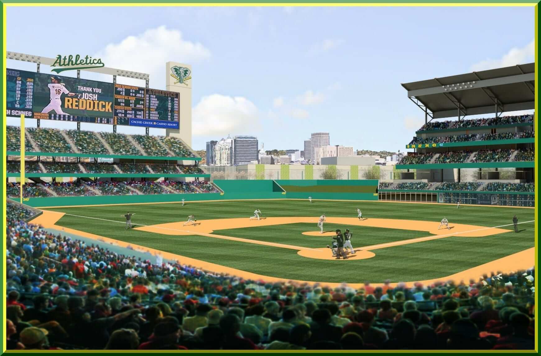
Main Concourse, Home Plate: The view from behind home plate opens up in center field to allow sights of the downtown area and the hills beyond. Unlike the Coliseum where the field was shared with a football team, the foul territory here is substantially smaller. The scoreboard in left field is made entirely of LED’s.

First Base Seats, Night: This night rendering shows how close the seats are to the field and the band of lights above the upper deck. With the use of LED’s, the number of light fixtures can be substantially reduced.

Upper Concourse, Home Plate: Views from the upper concourse allow for a more expansive view of the downtown area and the hills beyond.

Upper Concourse Plan: Each seating level in the stadium has different features and elements for its users. The upper concourse has places where fans can look down and interact with people on lower levels. On the south side of this concourse there is a large entertainment area with different sections. This space has a flexible, open entertainment area, small quiet dining areas, a large beer garden, and a gaming section. All of these spaces look out over the San Francisco Bay.

Quiet Dining Space: Here fans can get away from the busy areas and relax on Adirondack chairs overlooking the Bay.

Beer Garden Area: There are large tables as well as cluster seating for smaller groups. The shipping containers, referencing the history of the site, are fit-out and painted Athletics’ colors.

Gaming Area: This area is adjacent to the beer garden. This is a way for the team to get fans to arrive earlier and stay later.

Section Perspective: This view captures the different elements for the fans on various levels. Not mentioned earlier is the two story space overlooking the bay for the club and suite levels. On the ground level outside the park is a boardwalk along the water. People walking out here can be partially protected from weather by the cantilever above and they can interact with fans on the main concourse level.

Right Field Seating Section: Fans on the main concourse level have access to a large concession area. Fans in the upper decks have the advantage of being covered by the roof above. Additionally, the seats in the last row of the upper deck are still able to see to the edge of the outfield wall below.

Right Field Upper Deck Seating: Fans in the “cheap seats” still get a great view of the game. They are only unable to see a play that is right up against the wall.

Site Model: To help visualize the space in 3-D, I built a site model at a scale of 1”= 80’. This helps to put the size of adjacent buildings into perspective. In this model, gray buildings are new and brown buildings are existing. Much development would be constructed around the stadium to help the community thrive.

Section Model: This model was built at a scale of 1” = 10’ to help visualize the structure of the cantilevered portion of the building and the roof. The seating rows also help convey the scale of the building.
Wow! Fantastic stuff Garrett. This is another proposal the Oakland A’s need to see before they finalize anything for a new home at some point down the road. OK readers…what say you?

Calgary Flames Release New Third Sweater

If past is prologue, then Adidas seems intent on making NHL teams’ new third sweaters either full throwback, or certainly retro-inspired. The new Calgary Flames third sweater, revealed yesterday, follows this trend (one of the few new uni trends in sports with which I’m 100% on board).
I’ll attempt to dispense with most of the corporate speak, but according to the Flames/Adidas
Calgary set out to create the new while honoring the past by bringing back a heritage jersey that celebrates the 30th anniversary of the team’s 1989 Stanley Cup® victory. This true-to-form retro look features a primary red base with the flaming “C” logo and gold and white accents, along with stripe detailing on the sleeves and hem.
Inspired by a version of the 1989 uniform from the team’s glory days, the fan-favorite jersey was reimagined and reengineered for the innovation and technical design of the adidas adizero Authentic jersey silhouette and will carry a significant piece of team history into the upcoming season.
Unfortunately — as is completely the trend as well these days — the team/Adidas did not provide photos of the full uniform — in fact, they only included one full jersey shot, with a couple up close versions showing some details. Fortunately, since this is basically a throwback to 1989, we know what the rest of the uni should (and likely will) look like.
Here’s the new jersey (click on any photo to enlarge):


Here’s how those original 1989 jerseys looked:

And of course — if that design looks familiar to you in a more recent era, it should. The jersey was worn first as a throwback (beginning in 2009) and then as the team’s third jersey back in 2016. So, as I’ve said before with other new third jersey unveilings: what’s old is new again.
Here’s how that third jersey (and full uni) looked in the prior Reebok template (so it will look slightly different with the new Adidas update):

Nice right?
So far, I’ve pretty much loved every “new” third jersey teams have unveiled so far!
Your thoughts?

Kreindler’s Korner
I had the distinct pleasure of featuring the wonderful artwork of artist Graig Kriendler on two occasions over the summer and fall of 2017, and more recently, in August of 2018.
For those who don’t wish to click the links, Graig paints baseball heroes (and regular guys) from the past, and is an immense talent.
Occasionally, I will be featuring his work on Uni Watch.
Here’s today’s offering (click to enlarge):

Title: “Sandy’s No-No”
Subject: Sandy Koufax, 1964
Medium: Oil on linen
Size: 24″ x 33″This was a tough painting to pull off. With the background element of the lit scoreboard, I knew that most of the contrast had to come from those lit numbers, which because of that difference in value, was where the viewer’s eyes were going to go first. In this case, that was fine, though I couldn’t have them dwell TOO long there, as I still wanted Sandy to be the focal point. The best thing I could do to facilitate that was to make sure my edge control was just right. Each number had to stay on the softer side, with very few – if any – hard edges. And most of the nuance would go to Koufax and that mound he was on.
I had a good guide, as the photo the painting was based on (by the master, Walter Iooss) had some of that work done for me. Even though I changed elements of the scoreboard itself (making the scene from a later inning and including final scores from out-of-town games), it retained a lot of the original characteristics found as a result of his lens. But when these images enter the realm of color via paint, it can – and should – change some of those dynamics. I was able to separate Sandy from the background even more with the surface texture I could develop with the medium (while keeping the scoreboard flat and smooth by comparison), in addition to making him more three-dimensional with the manipulation of his edges. It also didn’t hurt that he was the most recognizable human element of the piece, as we are often drawn to that detail above others if one is presented in an image.
However, there was also a bit of an issue with the player in the background. This is one of those situations where if I had to do something over or make a change, I would have done so. I placed center fielder Willie Davis in the picture, which in itself was the right way to be, but I believe he’s probably a bit too big. Reason being, I made him that size as it would have been a bit more true to how we would see him with the naked eye, rather than how compressed he becomes because of the camera. Though as a result, and because we don’t see Dick Tracewski in frame, most viewers might assume that I mistakingly depicted a left-handed second baseman. I often have to explain that when I post the painting on social media, but even then, shouldn’t have made the decision that required me to do so.
A tough painting to pull off, indeed.
Thanks, Graig! You can (and should!) follow Graig on Twitter.
The Ticker
By Anthony Emerson

Baseball News: The Cardinals wore hockey-themed BP jerseys to celebrate the impending start of the NHL season (thanks, Brinke). … The Rockies’ Twitter account made a delicious typo (from @YAMANSDOOD).

NFL News: Apparently the Browns’s color rash unis featured the old Browns wordmark (from Chris J. Spisak). … The Falcons released their black jersey schedule yesterday (thanks, Phil). … The Panthers are going all white (thanks again, Phil). … The Packers have recreated one of Vince Lombardi’s famous jackets, complete with minimalist chain-stitching (from @MilesCliatt).
College/High School Football News: Here’s an awesome — but brief — video of the grounds crew at Neyland Stadium putting down their famous orange-and-white checkerboard end zones (many thanks to Moe Khan). … The Sooners will wear a Thunderbird helmet decal during the game against Army to honor the Oklahoma National Guard (from @PaytonGlen). … Utah State is going all white today (from @akaggie). … Houston will go white-red-red today (from Ignacio Salazar). … Rice is going blue-white-white today (from Bronson Black). … Kentucky are wearing blue lids today (from Drew O’Neal). … The following are all from Phil: Orange-white-blue for the Gators. … Blue-red-white for Ole Miss. … West Virginia will go blue-gold-blue against K-State (thanks, Phil). … TAMU is going with white jerseys today, and that’s all you can get out of this teaser video. … ‘Cuse is going blue-orange-blue with a special camo helmet logo. … “Superintendent of Willoughby-Eastlake Schools in Ohio rocking a split jersey for the annual game between North HS and South HS, both High Schools in the same district” says @JThrock45.

Hockey News: Coyotes goalie Antti Rantaa’s new pads may be the greatest in the history of organized hockey (from Tyson Tomao). … No design yet, but the Stanley Cup Champion Washington Capitals — still feels weird to type that — will have a third jersey (thanks, Phil). … Bruins coach Bruce Cassidy wore a fleece pullover with the Bruins 1975-1994 logo during a press conference. Perhaps a hint as to the Bruins’s as-yet unreleased third jersey (from @WeberKing).

NBA News: So we have jersey schedules in football. And now, the Jazz bring jersey schedules to basketball (thanks, Phil). … One of the last teams that hasn’t gotten the Mr. Yuk treatment is now exploring ad patches (thanks again, Phil). … Also posted in the soccer section: The Junior Basketball League (aka the Ball family’s personal basketball league) has Team USA uniforms for their international tour, and they look very similar to US Soccer’s crest (from Nate Olivarez-Giles).

Soccer News: AEK Athens wore the logo of UEFA’s anti-racism campaign heat-pressed over their typical advertisement, a betting company. The match was against Ajax in Amsterdam, and the Netherlands does not allow betting advertisements on unis (from Josh Hinton). … Uruguayan club Peñarol inexplicably released a 127th-anniversary kit (thanks, Jamie). … Cross-posted from the basketball section: The Junior Basketball League (aka the Ball Family’s personal basketball league) has Team USA uniforms for their international tour, and they look very similar to US Soccer’s crest (from Nate Olivarez-Giles). … The soccer world has seen a bunch of crazy and bad shirt advertisers, but this is the first time I’m seeing a primary ad for something as benign as mops. That’s the 1995-96 AS Cittadella kit (from Lucan Denfield).

Grab Bag: St. Louis’s Laumeier Sculpture Park is hosting an absolutely amazing neon sign exhibit (from @matthewkd1982). … The National Lacrosse League’s Vancouver Stealth are rebranding as the Vancouver Warriors (from Zeke Perez Jr.).
Holy cow the Superintendent of Willoughby-Eastlake Schools in Ohio is JACKED
Bet he takes “supplements.”
And also seems to be related to Bruce Willis.
Technically, the logo on Cassidy’s pullover is from 1955-1967, because of the black circle and black spokes. That color arrangement was only worn on the Bruins’ gold jerseys of that era. The version worn on black jerseys (also dating back to 1955) had a gold circle, while the version worn on white jerseys (dating back to 1949) had a black B, gold spokes, and black circle.
I love the gold B! The Bruins made a mistake when they switched to the black B on the black sweater.
Here is a bit more on the lacrosse team rebranding as the Vancouver Warriors,including the corporate speak explaining the basis of the name and logo:
link
This looks good but not what I was expecting. As team is now owned by Canucks Sports & Entertainment, was thinking the uniforms were going to be blue and green like the NHL team. Heard some team name rumours like Vancouver Kodiaks, but I am happy with the name and the look.
The big deal about this for me if the changing of arenas. I live in Vancouver and like going to lacrosse games. I often make the trek to WLA summer games in New Westminster (sometimes Burnaby), but have passed up NLL games due to the further distance. When the Stealth were playing at Langley Events Centre, the games were about 40 kms (24 miles) from my home in Vancouver, with public transit a bit more difficult. Excited to go to Warriors games now that they have moved to Rogers Arena will not be an onerous travel.
Loved the stadium design. Unfortunately, Amtrak runs on a different gauge track than BART. BART runs on a broad gauge that makes it so difficult to expand and impossible to tie into other systems. They’d need to build a shuttle or an extension from Lake Merrit Station.
“The Rockies’ Twitter account made a delicious typo”
They are so are using the Coyotes logo. Typo or troll job?
Also got several of their own players’ names wrong. It’s either a troll job or it was wine and weed night at the Rockies’ offices
Looks like modern cookie cutter. There’s no unique features in the design.
Only problem with the stadium design is there are too many seats. A`s games typically have about 5-7 thousand people there.
Add some more foul ground when taking out seats. My favorite part about the Coliseum is the old-school expanse of foul territory. I know, almost everyone wants homers and being on top of the action but I want to see fielding…including the catcher. More foul ground helps with pace of play, too!
Anyway, I really like this project. Good work!
Mizzou today…dang, that’s a lot of yellow.
What a fantastic, awesome stadium proposal by Garrett! Great share. As a nearby resident (and part-time A’s fan), there are a few things that I would modify or be concerned with. First off, in the long run, I don’t believe the A’s can sustain any kind of attendance numbers to consistently fill and warrant a 42,000-plus seat stadium. I think making it closer to 32K-35K would make it more heavily attended due to scarcity. Second, and perhaps the biggest challenge for Oakland at the Howard Terminal location is a homeless problem. Currently there is a fast-growing (i.e. out of control) and large encampment in that neighborhood. Oakland would need to shift A LOT of police resources (which they don’t have) to maintain a safe and enjoyable neighborhood for fans attending events at the new ballpark. That law enforcement need will be heavily opposed by human rights activists and anti-gentrification advocates who are prominent and prolific in the S.F. Bay Area. This latter part of a challenge was not encountered at AT&T Park since it was built in a largely dilapidated, unoccupied area of S.F. at the time. Lastly, there no way in h-ll that BART would significantly modify their system to integrate with the site. They’ve got too many other, over-budget projects burning and I think they would be satisfied with other stations being “close enough”.
Thanks for the A’s Stadium take. I’m not a fan of the large capacity. The Diamondbacks are looking to move to a new smaller, more intimate, ballpark. Also the large seating areas in right and left field block the view. I’d eliminate the upper decks in the outfield, and just have the lower sections there. This would accomplish both reducing the capacity and also greatly improve the view, which is the selling point of this location.
If the Ohio/Cincinnati game does not in as one of the “5” tomorrow, then all credibility is shot.
What impact did California Seismic Building Codes have on the design of this project?
Wonderful painting of Sandy Koufax, my all-tine favorite player. Thank you.
That third is what the Flames should wear as their primary, and what they always should have worn. No BFBS, no dragons. Just this.
Here is a list of the considerably huge amount of aspects for the week. Some of them will have charts in the daily. Obviously, there are too many to put up. But I have put the time of the aspect there, if you want to create your own charts…
Multiple