The egg timer at the New Era offices — the one that rings every few weeks to remind them it’s time to feed the retail beast by cranking out another line of “lifestyle” caps that nobody really needs — apparently went off recently, because yesterday they launched a new series of NFL team caps called “Elements.”
The idea behind “Elements” is that each team’s cap design is based on “the most identifiable element” of the team’s logo. A few of the designs look pretty cool, others look ridiculous, at least one just uses the team’s entire logo instead of just an “element” of it, and another doesn’t even have anything to do with the team’s logo.
In other words, your usual pointless retail slop. None of which would matter to us here at Uni Watch, except for the one thing: In a situation like this, what do they do with the Browns, whose logo is just their helmet? Here’s the answer:
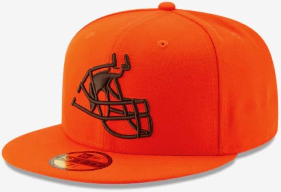
And there you have it. According to New Era (and, presumably, according to the Browns themselves, since teams have to approve these designs), the Browns’ most prominent logo element is a facemask! Too funny. Is this the first time a facemask has ever been featured as the primary logo on a baseball cap? I’m guessing yes.
Perhaps a better question is whether this will be the last time a facemask will be featured on a cap. Once you open that door, there are plenty of possibilities. After all, lots of NFL players have had distinctive grills that became their visual signatures, plus you could have a whole line of designs just for Archie Manning (collect ’em all!). Do a limited-edition, premium-priced design featuring Y.A. Tittle’s kithen sink rig and you’ll be sitting on a pot of gold in no time flat. Hell, you could even include a few MLB players in the mix!
My usual position with any Browns-related merch is “Put Brownie the Elf on it!” But in this case, I’m glad they went with the facemask. Much more absurd and thought-provoking. Thanks, New Era!
(My thanks to Jim Tischler, who brought the Elements caps to my attention.)
Speaking of caps: I’m happy to report that all fitted sizes of the Uni Watch classic cap, available exclusively from Ebbets Field Flannels, are now back in stock. Grab your preferred size before they sell out again!
Meanwhile, two weeks ago I asked for feedback on our flex-fit alternate cap, and a bunch of you said, “Actually, I’ve been meaning to buy that one, but I keep forgetting or putting it off.” If that’s you, go ahead and order one already.
Hey, wouldn’t it be great if we did a Uni Watch “Elements” cap? It could feature just the wing. Or just the stirrup. Or just the undersock. Or just the stripes.
Or not.
For all photos in this section, click to enlarge
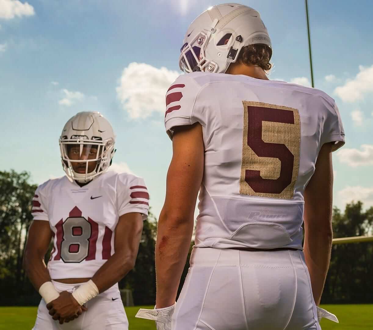
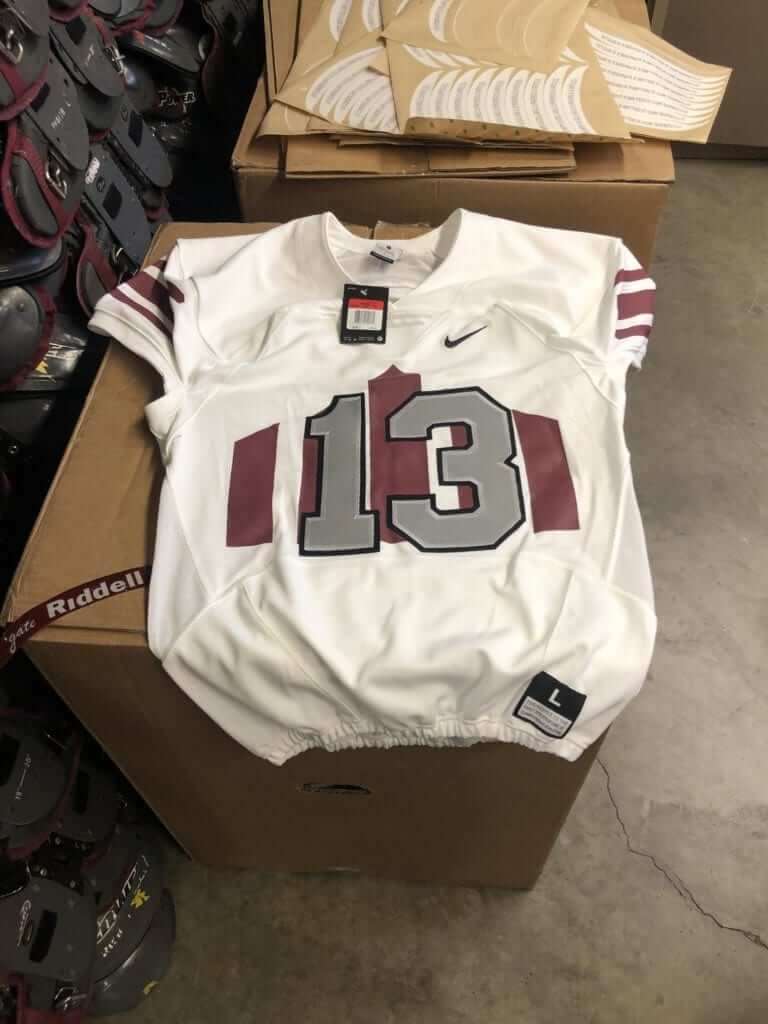
Now that’s a throwback: Colgate, an FCS school, has something special planned for this Saturday’s game against Lafayette. The university is celebrating its bicentennial, and the football team is marking the occasion by wearing 1932 throwbacks. That was the season Colgate famously went, as the saying goes, “undefeated, untied, unscored upon, and uninvited” (to the Rose Bowl).
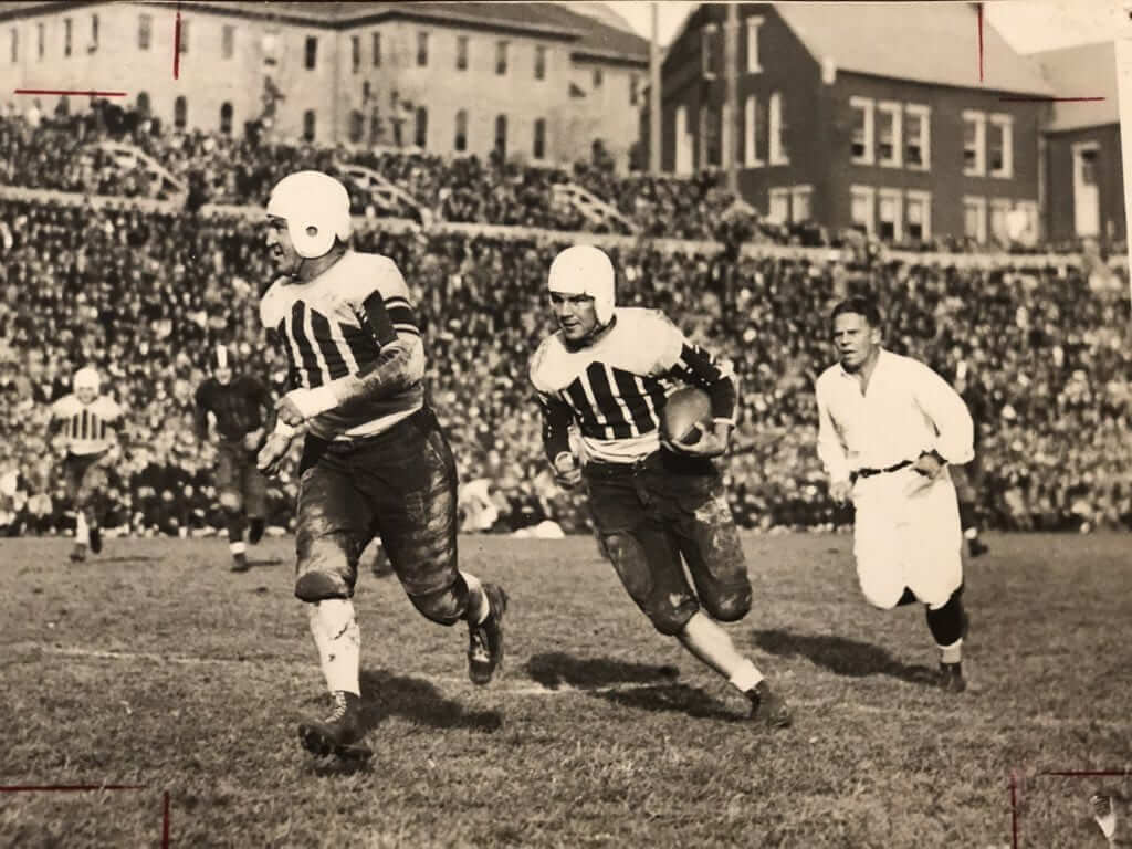
Here’s a game shot of the original 1932 unis:
Obviously, they can’t go without front uni numbers 2018, so they had to come up with a solution that looked old-school while still meeting NCAA requirements. I’d say they did a pretty good job of that:
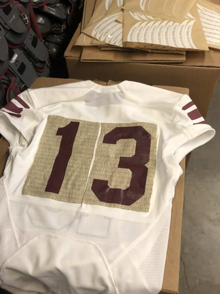
For the back numbers, they actually applied panels of a burlap-like material to the jersey and then applied the numbers to those panels:
For the helmet, they’re going with a hydro-dipped faux-leather texture pattern, with decals to simulate the old leather stitching:
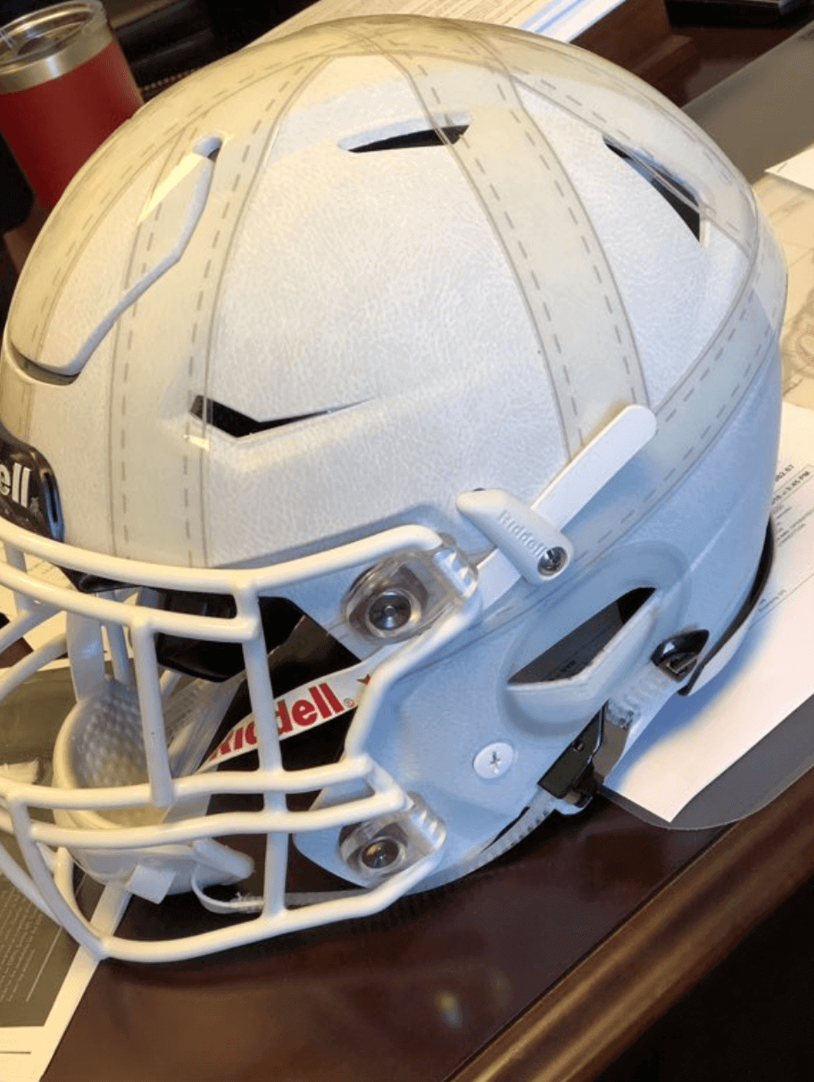
This was all the brainchild of Colgate assistant equipment director Broc Hazlet. You can read more about the design process in this excellent article from the Colgate website.
One other notable item here: Colgate will be wearing white at home for this game.
Click to enlarge
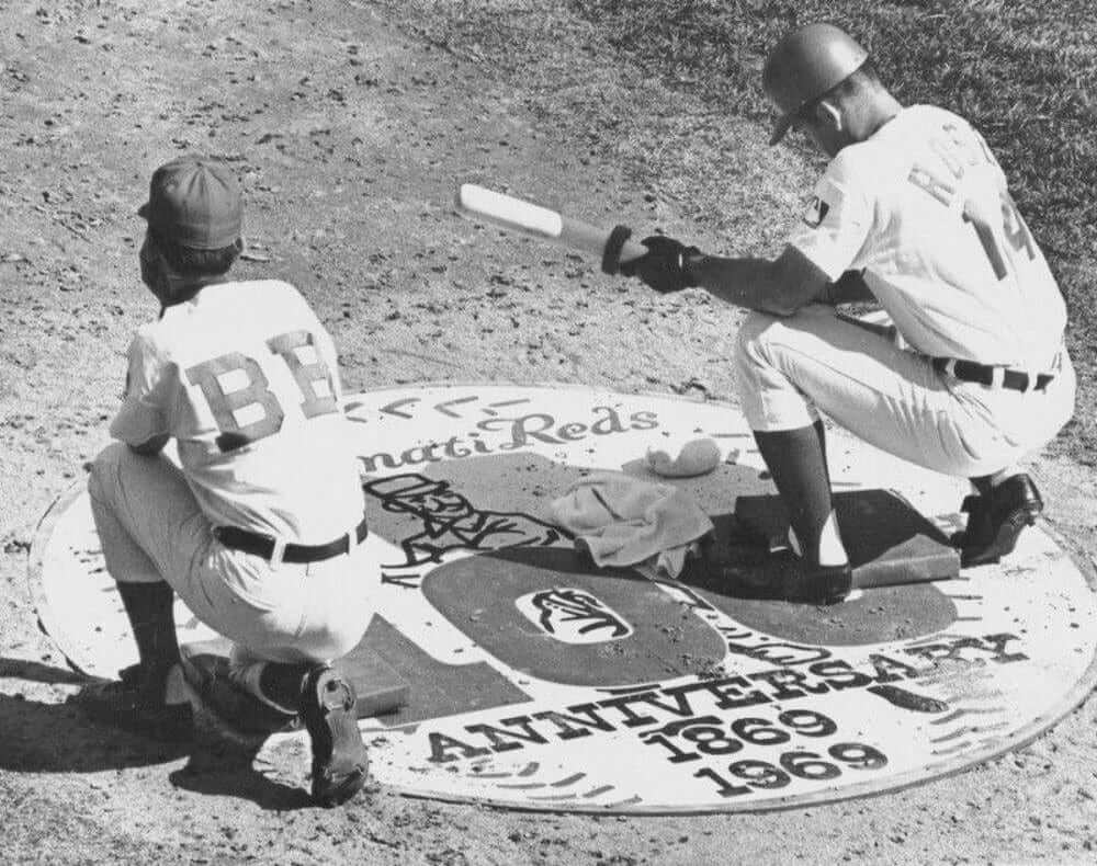
Too good for the Ticker: There’s sooooo much going on in this 1969 shot sent my way last night by longtime reader Marc Viquez. Dig:
• The Reds did not wear a patch for their 100th anniversary in ’69 (although they did wear the MLB centennial patch). But it turns out that they had a logo for the team centennial, which they used for their on-deck circle.
• I’m pretty sure that’s the earliest example I’ve ever seen of a logo or graphic being used for the on-deck circle. I think of that as a 1970s and ’80s phenomenon. (Update: Longtime reader/contributor BSmile reports that the Yankees, of all teams, had a team-logo on-deck circle in the mid-1960s.)
• I’m old enough to remember when it was fairly common — or at least not uncommon — to see players kneeling or squatting on deck, as Pete Rose is doing in this photo. At some point, that fell out of vogue. When you think about it, it’s pretty ridiculous. Why wouldn’t you be standing as you get ready to hit? (Update: Note that Rose and the batboy both have little cushions — maybe colored bases? — to kneel on. Never seen that before! Big thanks to reader/commenter Mangler for pointing that out.)
• Never really noticed before that the late-’60s Reds had a Tigers-like profusion of belt loops on their pants.
• At first glance, it looks like the bat boy’s pants have few belt loops than Rose. But upon closer inspection, it appears that he simply missed at least two of his loops.
• Batting gloves were fairly rare in 1969, but Rose is wearing at least one of them. Some very quick photo research indicates that he sometimes wore one in ’69, but not always.
• Nowadays, bat boys are required to wear helmets. Back in the day, they wore caps. (And the “BB” jersey is very nice, of course.)
That’s a lot of mileage from one photo, right? Big thanks to Marc for sending it my way.
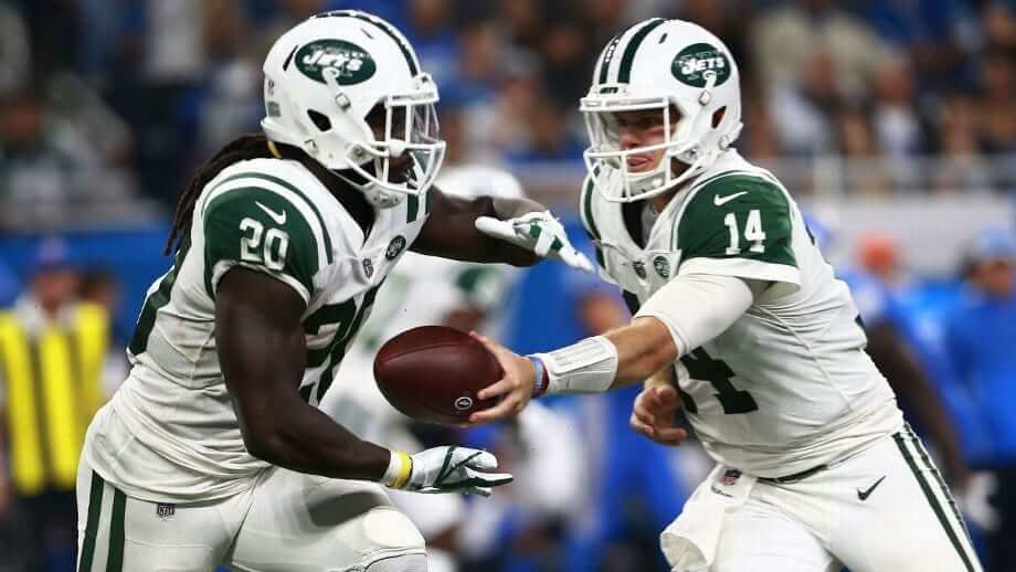
Contest reminder: Just a few days left to get your entries in for my Jets-redesign contest. As usual, the best entries will be featured in one of my upcoming ESPN columns. Full details here.
Click to enlarge
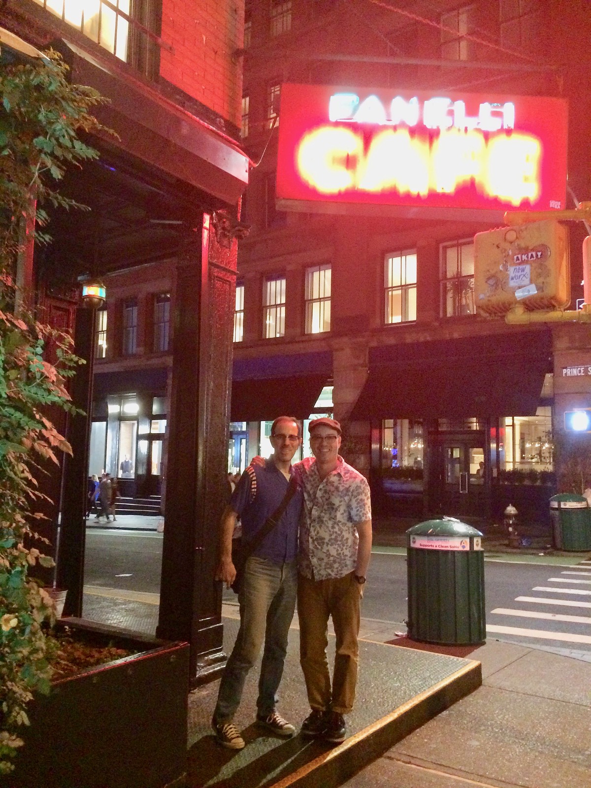
Celebrity sighting: Who was that alongside me in Soho last night? None other than the pseudonymous DIY genius Wafflebored, who’s in town to celebrate his birthday. The Tugboat Captain and I met up with him and his lovely partner, Carmen, and it was a genuine thrill to meet the man behind so many great jerseys. I’ve featured him many times here on the site, but do yourself a favor and follow his blog, which documents his many amazing jersey projects.
New Uni Watch HQ pays porch dividends: Until now, I’d never lived anywhere that had a front porch. And I have to say, there’s something really nice about sitting on said porch, safe and dry, while enjoying wifi and Diet Coke (not necessarily in that order) during a thunderstorm.
The Ticker
By Alex Hider

Baseball News: The Orioles wore their braille-lettered uniforms last night against the Blue Jays. Paul first wrote about them earlier this month (thanks to all who shared). … Mets 3B Todd Frazier went high-cuffed last night, and his socks appeared to be a lighter shade of blue than the Mets’ usual royal (from Justo Gutierrez). … Fashion designer Ralph Lauren is throwing out the first pitch on Thursday, but don’t expect him to dress up. He says he isn’t going to “worry” about what he wears (from Tom Turner). … This family borrowed the Seattle Mariners logo for its family reunion (from Michael Miller). … The Staten Island Yankees raised $8,000 on behalf of their GM, who is battling breast cancer, thanks in part to auctioning off their pink cancer awareness uniforms (from Phil). … The Phillie Phanatic wore green for Irish Heritage Night last night.

NFL News: Resurgent Bucs QB Ryan “Fitzmagic” Fitzpatrick is the talk of the league right now. But it’s Dolphins DB Minkah Fitzpatrick who’s filed a trademark for the “Fitzmagic” nickname. … Yahoo took some liberties with NFL helmets in this graphic (from Dylan Nowak and @RipVanWhiskey). … A restaurant in Wisconsin has a black, yellow and white mural on a wall, and the color scheme makes a Packers helmet look like a Grambling State helmet (from Christian M. Zummer). … David Whitley put together a Raiders concept uniform.
College/High School Football News: We missed this one, but Stanford and UC Davis went color-vs.-color on Saturday (from John Furstenthal). … Iowa State will wear a memorial decal Saturday to honor Celia Barquín Arozamena, the ISU golfer who was murdered on Monday (from @cylinen). … Matt Schudel was taking a look at Davidson’s old yearbooks and noticed that the Wildcats wore plaid or checkered numbers on their white jerseys from about 1956-1962. … A Connecticut high school football website now has its own uniform column (from David Kranz). … Cross-listed from the NFL section: A restaurant in Wisconsin has a black, yellow, and white mural on a wall, and the color scheme makes a Green Bay Packers helmet look like a Grambling State helmet (from Christian M. Zummer).

Hockey News: ’Canes RW Justin Williams was recently named team captain, and he’s offering to cover the cost for fans who wants to add a “C” to their jersey (from Ted Arnold). … Speaking of Williams, his “C” will be on the right side of his jersey instead of the standard left, at least on the team’s alternate jersey (from Keaton). … Staying with the ’Canes, they played a color-vs.-color game with the Lightning yesterday (from Bobby Fenton). … A Bruins blog speculates that the team will have a vintage third jersey this season (from Sara Schieve). … The Preds are painting team murals around Nashville, and they uploaded a time-lapse video of this mural of a front-facing sabertooth tiger. … The Atlanta Gladiators of the ECHL have new uniforms (from Phil). … Ohio University has new 1958-inspired green sweaters to go with the white jerseys they debuted last season (from Trevor Wilson Patton). … The Utah Grizzlies of the ECHL have their center ice logo ready to go (from Brian Prutch). … Jägermeister is now the “official shot” of the NHL, but hockey fans, that doesn’t mean you need to drink it. And really, why would you ever want to?

Basketball News: Looks like the Trail Blazers are getting ready to reveal a new uniform. The announcement will apparently come later today (from Jarrod Campbell). … The refs probably had a tough time calling fouls on the Celina High School (Ohio) basketball team during the 1943-44 season. Check out that number selection! (From Kyle Shaner). Same goes for 1947 Arlington High School (Illinois) team (from Andy Garms). … New uniforms for North Carolina. Not sure if the color is actually lighter, or it’s just the lighting in the photo. Here’s another shot (from @heelsupdates and Jason Collins). … Nebraska unveiled new pinstriped home uniforms yesterday (from Shamus McKnight).

Soccer News: New Champions League kits for Napoli (from Josh Hinton). … Also from Josh: The South American uniform manufacturer Dana has copied a bunch of notable kit designs from other outfitters, including Nike’s much-discussed 2018 World Cup kit for Nigeria.

Grab Bag: This what U.S. players will wear in the Ryder Cup next week (from Phil). … ColorWerx, the website that tracks the colors of pro and college sports teams, has changed its name and URL to TruColor.net.
G’mar Hatima Tova to all who are observing Yom Kippur today.
One thing about: “Put Brownie the Elf on it!” He’s not an elf. He’s a Brownie.
link
So the battle cry should be either “Put Brownie on It!” or “Put Brownie the Fairy on It!”
Anything but “WOOF! WOOF! WOOF!” The whole “dawg” thing needs to go.
No way! Gotta use Todd Radom’s Casey on there!
link
Note that the Browns logo is a QB’s facemask. Since Cleveland has been a revolving door at that position, a generic QB facemask is representative of their unis.
I think that instead of “Cleveland” on the jerseys, they should have Casey on the whites, and Brownie on the brown jerseys, like the Chiefs have the AFL logo, and the Jags have their logo, on the front left. Orange jersey, dealer’s choice.
Good to see you like the new place, that neighborhood looks nice!
Spotted on eBay: on link, his jersey number has been bumped down to fourth place on the back, below a minor league logo on the collar, a manufacturer’s logo below that, then his name below that, then finally his number.
These pesky insect-like collar logos are a scourge and have to be stopped. At least put them on the sleeves or somewhere where they won’t be so distracting.
If it wasn’t marked as authentic, you would have to question it. Looks like the name itself is straight across the back…. on a severely arched nameplate. Who does that?
Contreras only wore the jersey a handful of times, if that many, because he was rehabbing with the team before going back to Chicago. So they wouldn’t have put much effort into the NOB.
And I was too busy noticing the terrible positioning of everything that I never noticed the weird arching!
All NFL ballcaps are “lifestyle” caps that no one really needs.
So are Uni Watch hats and the naming wrongs shirts but of course they have to keep pushing the sales of those.
We’ve already been thru that. Here, read this: link
Understood Paul. We agree to disagree as you had stated in that article which I happened to read when you first published it. I stated my opinion in agreement and response to a comment directly around this subject. Are you still allowed to express your own opinion and we cannot express ours?
Please stop creating straw men. I never once said you couldn’t express your opinion. I simply provided a link to something that addressed your specious concerns. At this point you’re just trolling. Let’s please move on. Thanks.
I’m not saying fashion caps are categorically bad. One of my current favorite hats is a fashion cap with the current Brewers logo in royal and yellow. I’m just saying that all NFL-themed ballcaps are fashion caps. There are no NFL-themed ballcaps that fall outside of the category of fashion caps. Even the ones you see players wear on the sidelines are fashion caps that happen to be modeled by NFL players. The rules of the game quite strictly require players to wear helmets on the field of play. That’s their uniform. All NFL ballcaps are fashion or lifestyle merchandise.
The Hurricanes announced Justin Williams’s captaincy a week ago, with a short video of his C getting sewed on. Looks like the C will be on the more normal wearer’s upper left chest for the standard home and away jerseys.
link
Speaking of Archie Manning’s facemasks, were you ever able to track him down for an interview? I don’t recall seeing it but perhaps I just missed it.
No. But thanks for the reminder!
Wait, if the Reds didn’t wear the 1969 Centennial Patch, what is that on Rose’s left sleeve?
The MLB 100 patch every team wore. I think Paul meant to say, no special centennial patch just for the Reds themselves.
I liked the special one they wore with the 1869 Red Stockings team photo on it in 1994. Even at that tiny resolution, you could tell what team it was.
They didn’t wear a *team* centennial patch. But they wore the MLB centennial patch.
Ah, got it.
I’m guessing the Blazers will be replacing their Jack Ramsey-inspired plaid uniform set with the new ones (unless they’re adding a fifth set). Not the worst thing, as they were definitely better in theory than in execution.
I just realized it’s probably not a new jersey at all, and rather the addition of an ad patch. Eh.
With due respect to Mr. Whitley’s effort and skills, I can’t think of anything more anti-Raiders than a calligraphic/italic title-case wordmark.
link
How hard is it to center a number when you HAVE vertical stripes to line up to?
I would be ashamed of myself if I did that to a jersey I lettered. Embarrassing.
Fair point. I suspect they did it that way because centering it would have completely obscured two of the red stripes.
Everyone knows the the most distinctive “element” of the Raiders logo is the busted chinstrap!!
Busted?! I always thought the chinstrap just came undone in the normal course of play. Maybe it’s the FACEMASK that broke off and does not appear in the logo.
You know, I always saw it as unsnapped too.
But if you look at it, it is disconnected/broken right near the chin cup. Both *ends* appear to be snapped to the helmet.
link
I always thought that the chinstraps on old leather helmets, like the one’s depicted in the Raiders logo, were attached to the helmet at either side, then buckled together in the middle.
That Colgate helmet doesn’t look hydro dipped… it appears to be strips of decal, all of them the same, just criss-crossed over and around the helmet. They actually bridge the gap in the helmet. That’s gotta be a much cheaper solution I would think.
No no no — the *shell* is dipped with a pebbled faux-leather texture. Look closely and you can see it. But yes, the strips of stitching are decals.
Oh ok, cool, I see :)
The link to the Justin Tuck picture is clearly a Photoshop, and not actually a face mask he wore in game.
link
Thanks. New photo swapped in.
The Browns should adapt the brown facemask as their new logo; then it can evolve as new facemask designs come into being.
Pete Rose and the bat boy have knee(l)pads on the on-deck circle, but why not have small stools in the on-deck circle for players to sit on, just like boxers sit on stools between rounds?
Sidewalks in my neighborhood have things that resemble on-deck circles; as a little kid, my thing was to kneel on the circles and pretend I was waiting for my turn at bat. Considering that we used to use the streets to play baseball,…
I didn’t even notice the knee(l)pads! I’ll add that to the text.
The facemask used on the Browns hat is already 25 years out-of-date, as the graphic uses a stock Riddell model from the late 80s-early 90s–it wouldn’t even fit any current Riddell helmet. What’s more, that style was scarcely ever worn on an NFL helmet, as most teams swapped them out for masks manufactured by Schutt.
You wouldn’t want a stool in the on-deck circle. If you’re the batter and a foul ball comes, sitting down makes it harder to duck. More relevantly, it’s an obstacle to get out of the way of a catcher chasing a foul ball/wild pitch/wild throw.
MINKAH Fitzpatrick holds the patent, not Mikah.
Fixed.
Don’t know if this has been covered yet (with my luck, it probably has), but Chasen Hines of LSU got into the game last weekend.
His jersey number seems aptly chosen.
link
Paul, is it the lighting? Or are you wearing purple in that photo? Also, thanks for the thunderstorm video.
Definitely the lighting!
In 1969, and possibly earlier, the Mets were using on deck logos for visiting teams as well.
link
They likely got the idea from the Yankees.
Is Pete Rose wearing a batting glove, or a golf glove?
Early batting gloves WERE golf gloves. Batting gloves per se didn’t exist, so early wearers re-purposed golf gloves. Not sure when they started making batting gloves as such.
A couple of the “Elements” caps are okay. The yellow Steelers is pretty cool. The majority are either stupid or redundant.
The Vikings have a helmet as “Elements” logo. No facemask on theirs.
Throwing a wordmark on the back of them instead of the “complete” version of the logo would’ve been the much better way to go. The NFL shield is still the best option, but it seems that continues to be relegated for “on-field” apparel.
I’m surprised no one else has mentioned it yet, but in the photo from the Davidson yearbook, the UCLA-style shoulder stripes are inconsistent!
Actually that cap shows the Browns’ entire helmet. It just blends in with the rest of the cap so you can only see the mask. :-)
No ear hole! ;-)
OMG, that has driven me crazy that they always show the helmet on an ORANGE background!! So it is just a facemask floating in space. All the score bugs do it that way.
There was a rumor that Ralph Lauren was interested 20 or so years ago in buying the naming rights to a newly built baseball park. Had this gone through, the Giants would, once again, be playing at the Polo Grounds.
Scrolling through the site at first glance I thought the Jets ‘contest reminder’ said “constant reminder” – Funny how it’s fitting either way.
BTW, a “contest” would suggest there is a “prize” to be won, right?
The prize is being featured in the resulting article and being named as one of the best or most notable designs.
The Bills “Element” caps are laughable.
I completely expected the horn/eye combo and the red stripe, which would have been cool.
The actual hat is the entire logo except for the back legs. Sad effort from a Buffalo based company.
“Sad effort”
So perfectly Buffalo, no?
Wow I just scrolled through the elements page and I must say its disappointingly unimaginative. It feels like they had concept art for three different hat lines and mashed into one theme. I love the ones like the Panthers or Rams. That Jags one is nifty but just doesnt seem right on a hat(plus it looks like lsu) and then theres like 28 awful hats with some really terrible alternate colors.
Elements hats. Broncos, Steelers, Texans succeed.
Seems like most of the “Element” hats are a bit of a stretch. Almost like someone at NewEra had an idea for one team and then was forced to come up with 31 more. As a Browns fan I’m ok with the face mask look, but I would have liked to see them incorporate the stripes from the helmet.
link
I love the bucking Colt logo way more than the horseshoe, and IF I were a Colts fan and IF I were in the market for a cap, that logo would be my preference, but otherwise HOLY COW those Elements caps are terrible. The whole thing is so inconsistent: the “essential element” of the Falcons logo is the whole falcon, but they were able to break down the logos for all the other bird teams? The 49ers element is the SF without the circle, while the Skins is sort of the opposite? And how are the Green Bay and Dallas elements any different from a regular cap? I agree with RANDY WILLIAMS that it seems forced, but it also seems really lazy.
I was expecting the Colts logo to be represented by 7 dots.
Look at all the people at the Lightning/Canes game. Just move already.
Well, it IS just a preseason game.
“Dude… why did you buy half a cap?”
Reebok release the same “Elements” hats in 2005. Some of these “Elements” are identical to the hats Reebok released.
Regarding the Bruins’ alleged vintage 3rd… I’m not sure I trust a blog that thinks the Ducks are wearing a throwback this year.
I don’t trust it either. Heard no other mentions of leaks from more trusted sources and do not see much to back it up the claim.
Though I would love to see that black jersey come back as an alternate. It would mean that the Bruins would need to wear yellow socks with the jersey…and those yellow socks could then be worn with the primary jersey. Like it is supposed to be!
Love sitting on the porch when I’m home watching the thunderstorms and sometimes tornadoes pass by. Storms are relaxing for me.
Paul, I hope I don’t sound too dumb here, but I didn’t know you could live in a neighborhood that looked like that in NYC. If you don’t mind me asking where is that exactly? (LA born and raised)
It’s in Brooklyn, and I’ll leave it at that. And yes, it’s less urban-seeming than much of the rest of NYC, but there are a fair number of pockets like this scattered throughout the city.
Very cool, thanks for sharing/responding. Brooklyn is good enough, no need to be more specific.
I remember sitting on my uncle’s porch in Midwood when I was a kid. Coming from Park Slope, it felt like the country. Kensington, Ditmas Park and parts of Flatbush have similar housing. Enjoy the new home, wherever it is.
Huge Wafflebored fan. Always wondered what he looked like. As cool as I expected :) Picture’s a little blurry, but I thought it was Paul and Ashley Beedle. (My token music reference that will make sense to .79% of the UW readership.)
Could squatting in the on deck circle have been a “safety move” i.e. something perceived, perhaps subconsciously, as protecting the head by either lowering it and/or minimizing the natural inclination to look down occasionally when standing? If so, it could’ve “dropped out of fashion” as players began to come through that’d always worn helmets and so has less concern about being struck in the head on deck. If so, an example of a uniform change resulting in a behavioral change.
More likely, they didn’t want to block the view of paying customers in the first several rows of seats. At least, that’s what I always believed they were doing.
Hey Paul, the link on New Era’s site to the Falcons Elements hat is wrong, here is what the hat looks like. link
I own it and actually think the Logo looks really cool with the silver and white elements removed.
Red helmet, black facemask, black and white stripes down the center and that logo, would look fantastic.
I’m a big fan of the Cincinnati Bengals Elements hat. It looks like the tiger is coming out of the darkness. I think a variation of that would work well as a helmet logo.
I completely agree that that’s one of the better ones.