I’ve written a lot this year about the 1963 Kansas City A’s — the team that introduced the franchise’s now-familiar green/gold color scheme. (To see the posts I’m referring to, look here, here, here, here, and here.)
Now we have yet another entry about the ’63 A’s. It comes from longtime reader/contributor Ferdinand Cesarano, who was recently reading a book called The Kansas City Athletics: A Baseball History, 1954-1967, by John E. Peterson. “To be honest, it is not a well-written book,” says Ferdinand. It does, however, have a very uni-notable passage on page 179:
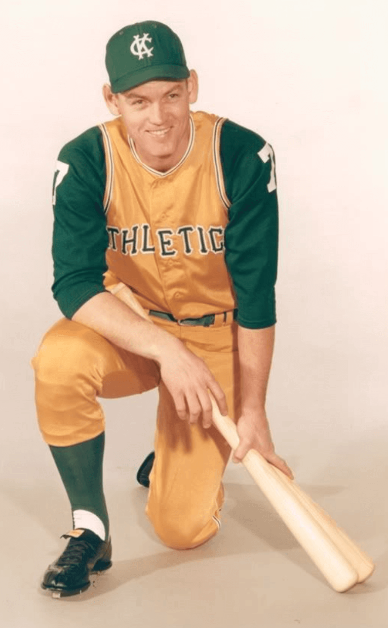
Norm Siebern … was Kansas City’s lone representative on the [1963] All-Star team but did not appear in the game because Yankees manager Ralph Houk [who was skippering the American League squad that year] felt the green and gold uniform would embarrass the American League.”
Wow! Pretty amazing to think that Houk would effectively bench an All-Star because of his team’s uniform. Imagine if the same kind of snub had been directed at, say, Bob Watson, who was the Astros’ lone All-Star in 1975, the year that the tequila sunrise uniforms debuted, or at Goose Gossage, who was the sole White Sox All-Star in 1976, when the leisure suit design debuted. (Actually, Gossage didn’t appear in the ’76 All-Star Game, but there’s no indication that it had anything to do with American League manager Darrell Johnson’s feelings about his uniform. Then again, we didn’t know Siebern’s absence from the ’63 game was uni-related until now, so hey, anything is possible.)
As for Siebern — that’s him pictured at the top of today’s entry — he was selected as an All-Star again in 1964, but he had moved on to the Orioles by then. He appeared in the ’64 All-Star Game as a pinch-hitter and flied out. The lone A’s All-Star that year was John Wyatt. Houk wasn’t managing the American League team that year (White Sox skipper Al Lopez had the honors), so Wyatt got into the game, allowing Charlie Finley’s signature color scheme to finally make its All-Star debut. Wyatt didn’t exactly cover himself in glory, though: He allowed two runs in an inning of work as the American League lost again, 7-4.
They’re back! 🙌🏻 #CBJ pic.twitter.com/Nk4kmdVyG2
— The CBJ Artillery (@TheCBJArtillery) September 17, 2018
Another day, another NHL alternate: The Blue Jackets are the latest NHL team to announce an alternate uni for 2018-19. As you can see above, it’s an Adidas-updated version of the alternate that they wore from 2010 through 2017. Looks like they’ve changed the cream elements to white, although maybe that’s just the lighting.
Additional info, including the dates when this jersey will be worn, is available here.
Click to enlarge
Collector’s Corner
By Brinke Guthrie
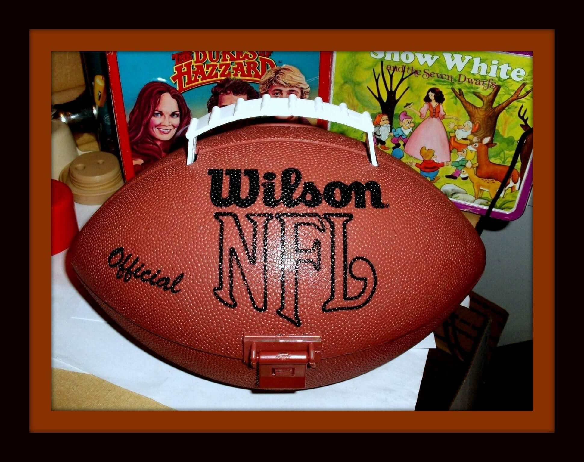
Are you ready for some footb — er, lunchtime? Have to say I’ve never seen one of these before: a Wilson NFL football-shaped lunchbox. It has a sticker on one side saying, “Play Football,” and the hinges open up to reveal a water bottle. Doesn’t look like there’s too much room for a banana, Triscuits, or Oreos, but there you go.
Now for the rest of this week’s picks:
• Kinney Shoes (The Great American Shoe Store, don’tcha know) offered this NBA snapback trucker cap back in the day. Maybe you got it for free when you bought some sneakers?
• Take a look at this 1970s Texas Rangers shot glass, complete with their original “Baseball Hat” logo. Speaking of that logo, did you know that the reason the R and the S are rendered at a larger size is because the owner at the time was Robert Short? It’s true!
• Have your Crayolas ready? You’ll need ’em for this 1970s Hank Aaron coloring book.
• Chiefs fans! Unleash the spirit with this 1980 vinyl placemat, sponsored by Brown’s Chicken. It Tastes Better! (Says so right there on the corner.)
• This 1970s Chicago White Sox Soapy Slider is still in the box, and features that great modern batter logo they went with.
• This 1970s Minnesota Vikings button urged fans to “Think Super Bowl.” (Should’ve read “Win Super Bowl,” no?)
• This authentic 1970s Phillies zip-up dugout jacket by Wilson looks to be in excellent shape.
• Here’s another Phillies item: this 1970s pinstriped coffee mug.
• Nice-looking vintage NFL logos on this early-1970s towel. I believe on the left you can pick out Ron Johnson (30) and Bob Tucker (38) of the New York Football Giants. Wanna say that’s Don Perkins from the Cowboys on the right, parallel to Johnson, but he retired in 1968.
• Check out how much time there is until kickoff with this 1970s Rams wind-up watch. Has a Swatch-y look to it.
• Bundle up for those upcoming cold fall and winter games at Soldier Field with this 1970s-1980s Bears scarf.
Seen an item on eBay that would be good for Collector’s Corner? Send any submissions here.
Contest reminder: Just a few days left to get your entries in for my Jets-redesign contest. As usual, the best entries will be featured in one of my upcoming ESPN columns. Full details here.
KRC update: The latest installment of Key Ring Chronicles is a really nice story about a key tag from a pizzeria. I like this one a lot. Check it out here.
The Ticker
By Alex Hider

Baseball News: It’s September, which means Cubs 2B Ben Zobrist is riding his bike around Chicago in his full uniform. He did the same thing in 2016 and 2017 (from Brinke). … Marlins superfan Marlins Man — the guy who shows up at almost every notable sporting event in an orange Marlins jersey — won a charity auction and will get to be a “player for a day.” He was given a black jersey at a press conference yesterday, but will the Marlins wear his beloved orange when he goes on the field tonight? They haven’t worn orange this season (from Billy King). … The newest member of the American Association of Independent Professional Baseball is the Milwaukee Milkmen. Here’s their uni set (thanks to all who shared). … This picture of Ernie Banks from 1957 (note the cap piping) shows him in white stirrups with blue stripes, but Dressed to the Nines says the ’57 Cubs usually wore blue stirrups with white stripes (from Phillip Santos). … Pretty cool project: A guy from Idaho has been making a mythical minor league baseball league that would be based in Idaho and giving the teams backstories (from Geoff Baker). … For anyone who keeps score during baseball games, this is the pencil for you (from Matthew Alego). … Twitter user @PhillyPartTwo found this framed Bugs Bunny baseball print for sale on eBay.

NFL News: The cleats Bucs WR DeSean Jackson wore on Sunday were reminiscent of old Vans sneakers (from Collin). … Shaquill and Shaquem Griffin, the brothers and defenders for the Seahawks, have been wearing standard NOBs this season, with no FIOB (from Kenneth Guckenberger). … Eagles K Jake Elliot is featured wearing a Bengals jersey in Yahoo’s fantasy football app. He played for Cincinnati during the 2017 preseason (from KT). … Seahawks P Michael Dickson was wearing super-short biker shorts and what appeared to be a codpiece for last night’s game against the Bears (from @BackAftaThis). … Surprising to see NFL Primetime using an outdated Jags helmet (from Trey Volk).
College Football News: Texas A&M will wear 1998 throwbacks, which include the faux-mesh numbers pioneered by Nebraska last season, on Oct. 6. Here’s a good look at the helmet (thanks to all who shared). … Georgia Tech will break out new blue jerseys on Saturday against Clemson, pairing them with gold helmets and white pants. They’re calling the jerseys a “nod” to the 1990 championship jerseys, but they’re just the current set with a blue shirt. … UAB will wear the names of sick children on their NOBs in partnership with Children’s Harbor on Oct. 20 (from Lauren Webster Veach). … Florida State will wear gold/garnet/gold on Saturday (from Phil). … This may have been ticked at some point, but former BYU QB Jim McMahon wore a blue facemask in the 1980s while the rest of his team wore white (from John Fitzgerald). … Donovan Mitchell of the Utah Jazz was at Utah’s game last week and blacked out the Under Armour logo on the jersey. He has an endorsement deal with Adidas (from @B_handy).

Hockey News: Panthers C Aleksander Barkov will wear the “C” for the Panthers this season (from Moe Khan). … The Caps are among the teams that will have ads in the corners this season (from @bryanwdc). … Tennis legend Roger Federer visited the Blackhawks and they gifted him a custom sweater (from Brinke). … Not uni-related, but the NHL has launched a new website that will track notable franchise and league records.

Basketball News: Cross-listed from the college football secteion: Jazz G Donovan Mitchell was at the University of Utah football game and blacked out the Under Armour logo on the jersey. He has an endorsement deal with Adidas (from @B_handy). … Sports Illustrated ranked their 10 favorite current college basketball uniforms (from Phil). … Also from Phil: New uniforms for Northern Kentucky.

Soccer News: West Ham manager Manuel Pellegrini got a jersey-shaped cake for his birthday (from Mark Coale).
That Norm Siebern story appears to be true, or at least apocryphal, turning up in at least two other books on the A’s.
Longtime A’s broadcaster Monte Moore said Houk “didn’t want Siebern to be embarrassed in front of a national audience wearing that softball uniform.” That, according to beat writer Susan Slusser’s book “100 Things A’s Fans Should Know & Do Before They Die.” It’s in a brief chapter titled “White Shoes,” which also discusses some other A’s uni details.
link
Little did Ralph Houk know that the following season would go on to feature the Best. A’s. Uniform. Ever. The ’63s were no slouch either for sure.
Kinda like the Fighting Pines pennant on that mythical Idaho baseball site!
The Peterson book says that Houk didn’t want Seibern’s A’s uniform to embarrass the American League; while the Monte Moore quote frames it as Houk not wanting the uniform to embarrass the former Yankee himself.
Either way, the invocation of the concept of “embarrassment” demonstrates just how jarring those A’s uniforms must have seemed alongside the other uniforms of the time.
Story and same exact quote appears in Tom Clark’s superfine book “Champagne and Baloney” 1976 on page 16. Houk didn’t want uni to embarrass AL.
The Jackets’ photos of the third jersey seem to be a bit off color-wise, as if to put greater emphasis on the blues. I want to see white, but I have a feeling it is actually off-white. I just don’t like off-white on a modern hockey jersey on the ice, because it just makes it look dirty.
More about Blue Jackets third.
-The video on their website does state it is cream rather than white.
-The number template on this jersey is different than the last cannon third. The number template will match the primary uniforms.
Not sure why Columbus doesn’t make that their primary jersey. Way better than their standard logo jersey, which ranks with Oklahoma City and the Clippers as one of the worst logos in sports.
Strongly disagree. Love their primaries.
Are you also a fan of their logo, or just the primary jersey? I think the primary jersey is nice, outside of the logo. I find their primary logo to be overly stylized. I like the idea of using the unique Ohio flag as part of the logo, but the execution here is off. Plenty of concepts with the flag on the interwebs that are far better.
I like the logo.
DeSean Jackson’s cleats are actually Under Armour, but they’ve been painted to look like Vans Old Skools. Kenny Stills has also been wearing custom Under Armour cleats painted with a Vans logo, though his are aqua.
For what it’s worth, someone posted on a fan site that they bought a new 3rd at the team shop yesterday and it is cream not white.
Question on the actual NY Jets new uniforms: Is it a complete overhaul to include new logos and word marks? Or just uniform?
To my knowledge, that distinction has not been publicly addressed.
Just curious. Complete overhaul always best when a team changes uni’s twice in a lifetime. Just my two cents…
When I skimmed over the Twitter entry that linked to today’s Uni Watch, I thought, “Too soon to mention Jeff Samardzija.” But, yeah, the A’s were basically a farm team for the Yankees back then, and Ralph Houk must have thought, with that uniform, anyone from the A’s was not eligible to play in the All Star Game.
The A’s also served as a trash bin for Yankee management. For instance, Billy Martin after the Copacabana incident.
Charlie O. had actually broken off from that “special arrangement” with the Yankees when he bought the A’s.
Edit: Shaquill (no e) and Shaquem (ue not uee) Griffin
Thanks. Got it.
No TV numbers on Georgia Tech’s new uniform? That is different.
Florida State will be wearing gold/Garnet/gold, not claret. The way this season is going they need any break they can get..
I’d be a fan of the Griffins doing the Youngblood treatment the Rams did with FNOB/LNOB.
The other guy in the picture with Federer, also showing a custom uni, is Nick Kyrgios, who is a top 30 player in his own right. He’s no Federer, but he’s probably worth mentioning in the item.
They are in town for the big Laver Cup event.
RE the new NHL records website: while I appreciate that a certain amount of effort must have been exerted putting it together, they have some egregious mistakes in there. Under the caption Useful Links, they have a link to the outdoor games over the last 15+ years. Definitely an American slant to it; it’s one thing to refer to the stadium in Ottawa as Landsdowne Park (it’s only been TD Place for the last four years, plus), but to refer to BMO Field in Toronto as Exhibition Stadium? The Ex was demolished nearly twenty years ago. Weak.
You may recall that either stadium used its actual name for the NHL outdoor games. This had to do with the title advertiser being Scotiabank for both games. Both stadiums are named after rival Canadian banks.
West Ham birthday cake has old crest on it.
The perfect pencil for scoring a baseball game is a clicky ballpoint pen. Never score in pencil. It encourages hesitation and editing. Score the game you see; if you see an error, score it an error and keep it marked E even if the official scorer rules it a hit. The official score will be in the morning paper; your score of the game you saw is what belongs in your scorebook.
You ever see Charlie Brown try to write a letter? That’s what my scorecard would look like.
link
Shouldn’t the Milkmen wear brown instead of black?
Has there been any word if the Maple Leafs and Islanders will have third jerseys?
Islanders yes, largely the white shoulder but mostly blue Stadium Series jersey with the NY stick logo not in a circle, but not completely the same.
Leafs, have heard nothing.
Those Georgia Tech navy jerseys aren’t a nod to jack squat. Different number font, different number color, lack of number double outline, different sleeve stripes. What would be wrong with saying, “these are our new navy jerseys, enjoy”?
I was about to say the same thing…they claim to have “drawn inspiration from the 1990 team” and then come up with jerseys that are totally different??
Are we just being trolled here?
Also notable in the Photo re: corner ads for Capitals: banners have been modified to reflect last season’s division and conference championships, but not Stanley Cup championship. Stanley Cup banner to be unveiled at season opener.
Also: Capital One Arena just underwent a “facelift” of sorts – not enough to call it a full renovation – and they replaced all the seats. They’re now black (they were purple – an odd choice for two teams that never wore that color). Personally, I would’ve thought they would go with navy blue.
Black hides empty seats the best.
BYU’s entire football team appeared to have mis-matched facemasks throughout the late 1970’s-early 1980’s; blue ones weren’t not exclusive to McMahon:
link
link
link