Click to enlarge
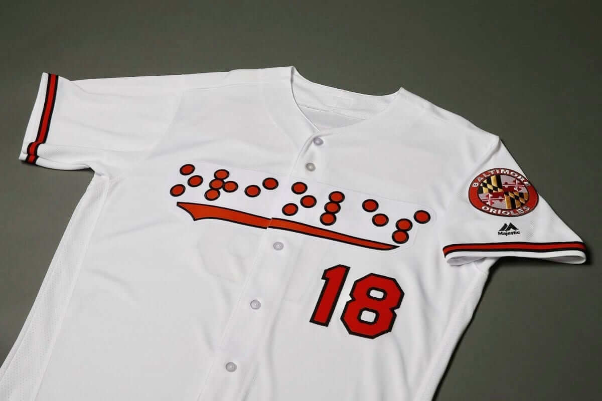
Earlier this year we had a minor league team doing a deaf-awareness promotion with American Sign Language jerseys. Now we have something similar on the major league level, as the Orioles announced yesterday that they’ll wear Braille-lettered jerseys on Sept. 18 for a promotion celebrating the National Federation of the Blind, which is headquartered in Baltimore.
In addition to the Braille insignia on the front of the jersey, the NOBs will also be rendered in Braille:
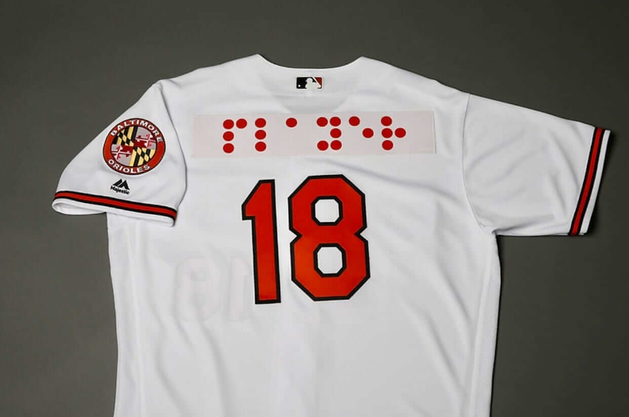
This is, to my knowledge, the first time an MLB team has done anything like this. I do wish they’d sewn the Braille dots individually, instead of putting them on a big patch across the chest, but it’s still a really nice gesture. And sure you can say, “Blind people won’t even be able to see it!” But as “awareness” jerseys go, this is a very effective one, and it’s tied to the local community besides. I like!
I’m not sure if anyone in the Orioles’ current front office is aware of this, but one of the classic stories about former O’s skipper Earl Weaver is that he was in one of his many heated arguments with an umpire, and the ump tried to prove his point by showing Weaver the rulebook, to which Weaver replied, “That’s no good — I can’t read Braille!” He got the boot after that.
All joking aside, Braille is a fascinating communication system. One of my very favorite possessions is a Braille copy of a certain lifestyle magazine, which is a beautiful and pleasing object (click to enlarge):
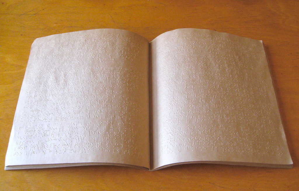
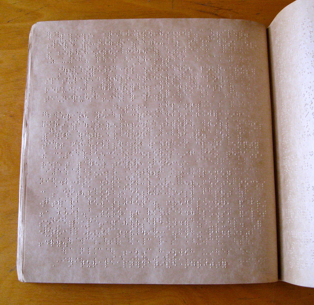
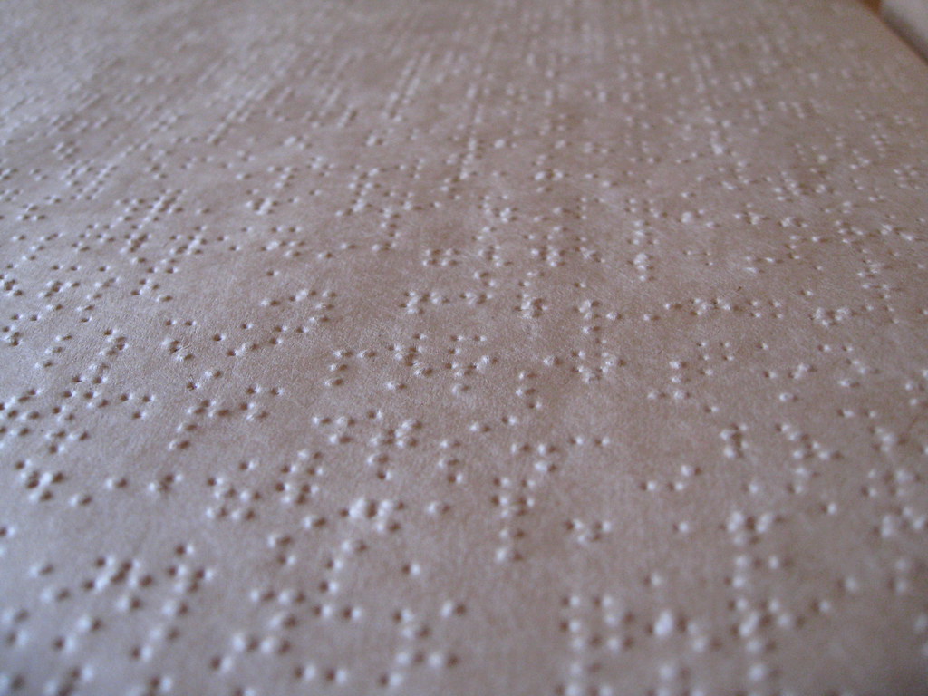
To find out which magazine this is, and to learn more about it, look here.
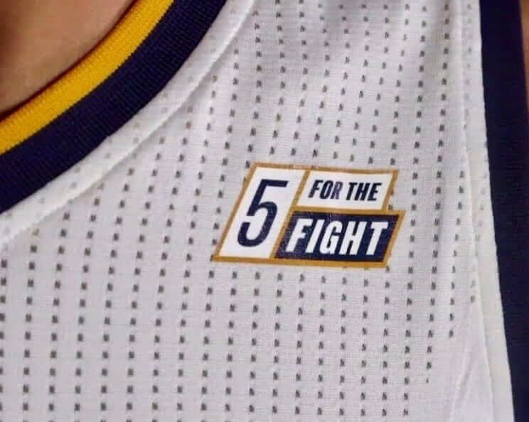
Jazz, Qualtrics stay the course with charity patch: When the Utah Jazz and Qualtrics announced a year and a half ago that they’d be foregoing a standard advertising patch and would instead be showcasing a patch to promote Qualtrics’s 5 for the Fight anti-cancer initiative, it stood out as a much more laudable approach than other NBA teams were taking. There was no Qualtrics logo on the patch — just the charity’s logo. Still, most observers, myself included, figured that would only last for one season and that the charity patch would be replaced by a Qualtrics patch for 2018-19.
I’m happy to report that I was wrong. Jazz beat reporter Andy Larsen tweeted yesterday that the Jazz will be sticking with the anti-cancer patch. Good for them! Too bad no other NBA team has taken a similar approach.
Larsen also reported that the Jazz will have new alternate uniforms in October, and that the team has a new court design:
Three pieces of Jazz news for you all:
1) This is indeed the court that the Jazz will use this season for most of the games, with no paint in the key pic.twitter.com/ofDkzN8n0q— Andy Larsen (@andyblarsen) September 5, 2018
ITEM! Jets-redesign contest: As you probably know, the Jets recently announced that they’ll have new uniforms for 2019, so we’re running a new design contest over on ESPN. The official ESPN announcement hasn’t yet been posted, but blog readers can get a jump on things now. Here are the ground rules:
• Your entry must include a primary logo, full home and road uniforms (helmet, jersey, pants, socks), and up to two alternate, Color Rush, or throwback uniforms. If you like, you can also include secondary logos and a field design, but those aren’t required.
• You can maintain some of the team’s current elements (the helmet logo, say, or the color scheme), draw upon the team’s visual history, or start from scratch and change everything. Up to you.
• Your designs can be created in any digital or analog medium (Illustrator, Photoshop, crayon, whatever) and can be submitted in any standard digital format (JPG, PDF, TIFF, etc.). You can also create a video presentation, upload it to YouTube, and submit the YouTube link as your entry.
• The files you submit should be named after yourself (PaulLukas.jpg, for example). If you’re submitting multiple files, please either number them (PaulLukas1.jpg, PaulLukas2.jpg, etc.) or use some other designation (PaulLukas-homeuni.jpg, PaulLukas-logo.jpg, etc.). Files that don’t follow this format will not be considered.
• In keeping with longstanding Uni Watch chromatic policy, entries with even a hint of purple will not be considered.
• Email your entry to Uni Watch HQ. If you have more than one concept, feel free to enter as many times as you like.
Deadline: Friday, Sept. 21, 7 p.m. ET.
The best entries will be showcased in an upcoming Uni Watch column. Good luck!
Ticker intern reminder: In case you missed it on Tuesday, I’m currently in the market for a new Ticker intern. The position would require being on Ticker duty on Thursdays and creating the Tickers that appear on Fridays.
Full details are available here.
The Ticker
By Paul

Baseball News: Mets 3B Todd Frazier fooled an umpire — or, if you prefer, cheated — with a new kind of hidden-ball trick the other night. … Brandon Phillips yesterday became the first player in Red Sox history to wear No. 0. … Forty years after an Ohio boy lost his baseball glove at a Little League game, his mother found the glove — with her son’s name still written on it — at a Florida thrift store (NYT link). She bought it for $1.49. … Here’s a good oral history of the Nationals’ racing presidents (from John Muir). … Former NFL player and coach Tony Dungy says he wore No. 21 when he played for the Pittsburgh Steelers as a tribute to Pirates great Roberto Clemente (from Jerry Wolper). … The Astros will be wearing NFL jerseys on their road trip to Boston today, and INF Alex Bregman will wear the jersey of 49ers WR Dante Pettis, the son of ’Stros coach Gary Pettis (from Ignacio Salazar). … The new minor league team in Madison, Ala., will be called the Rocket City Trash Pandas (from Will Nevin). … Brewers fans trolled visiting Cubs fans at Miller Park by unfurling a giant “L” flag after Milwaukee beat Chicago on Tuesday (from Mike Chamernik). … Here’s a corn maze that’s a tribute to Cleveland SS Francisco Lindor (from Jason Hillyer). … Looks like Bryce Harper was wearing stirrups under his pajama pants the other day (from Isaac Johnston).

NFL News: Here’s what the Titans and Bengals will be wearing for their season openers this Sunday (from @ckssense and Phil, respectively). … Back in 2012, the Texans tried to reinforce team solidarity by issuing varsity-style jackets (from Kary Klismet). … After briefly going back to his old helmet, Pats QB Tom Brady was once again wearing a SpeedFlex at yesterday’s practice. … Cross-listed from the baseball section: Former NFL player and coach Tony Dungy says he wore No. 21 back when he played for the Steelers as a tribute to Pittsburgh Pirates great Roberto Clemente (from Jerry Wolper). … Also cross-listed from the baseball section: MLB’s Houston Astros will be wearing NFL jerseys on their road trip to Boston today, and INF Alex Bregman will wear the jersey of 49ers WR Dante Pettis, the son of ’Stros coach Gary Pettis (from Ignacio Salazar).
College and High School Football News: Here are this weekend’s uni combos for Arizona State, FAU, Arkansas, and Syracuse (from Jake Elman, Brock Brames, and Phil). … Ohio State is trying to prevent Oklahoma from trademarking the block-O logo. … Twin brothers Jaret and James Patterson both play for SUNY-Buffalo — check out their NOBs (from Mike with an M). … Here’s a bracket-style competition to determine the best-looking high school football team in San Antonio.

Hockey News: Reprinted from yesterday’s comments: The Bruins’ and Blackhawks’ Winter Classic jerseys have leaked. … New uniforms for UAB (from @UABslant). … Here’s a weird one: Former NBA star Steve Nash playing hockey in a Phoenix Suns uni (from Mike Chamernik).

Basketball News: Cross-listed from the hockey section: Here’s former NBA star Steve Nash playing hockey in a Suns uni (from Mike Chamernik). … New uniforms for Butler (from Brandon Reef). … College of the Ozarks, an NAIA DII school, will no longer wear Nike uniforms in response to the company’s controversial new marketing campaign featuring Colin Kaepernick (from Lindle McAlister). … New uniforms for Texas. “Looks similar to what they wore in the mid-2000s,” says Brian Beckett.

Soccer News: David Beckham’s new MLS team in Miami has revealed its name and crest. … These next three are from Josh Hinton: New home kit for Peru, Nike has added a second star to France’s 2018 gear, and new sleeve badge for the UEFA Nations League.

Grab Bag: Interesting story about NASA’s first spacesuits. … USF has a new logo for everything other than athletics (from Griffin Smith).
The link to the Rocket City Trash Pandas doesn’t seem to have the Trash Panda story. Here’s a better link. link
Looking forward to seeing the logos they come up with for this team.
I live in the area. Will be posting them as they come along. Here’s the first early logo: link
Thanks. Fixed!
Rocket City Trash Pandas may go down as the worst name for a sports team in athletics history. Remarkably bad.
I think “Baby Cakes” is worse.
The Huntsville Stars used to have a raccoon as their mascot. Guess that area really does love the trash panda critters.
I’m not even a Texans fan, and I’d wear one of those varsity jackets from 2012. Pretty cool.
Is Butler still using navy and black on their uniforms? Never got that, it’s BFBS taken to the extreme (not counting someone doing anthracite and black, I guess…)
Bad move by the Jets. They are wearing their signature uniforms right now! What’s next, the Yankees ditch the pinstripes?
The J-E-T-S Jets/Jets/Jets haven’t worn their “signature” uniform since Namath was under center. That olive green is not the shade they should be in. But the rest of the uni (bad Nike striping/color mismatch and all, including the perfect white hat) is fine. Just go to kelly and we’re good.
Right Jay?
I’m fine with the hunter green if they can get it right, which so far they can’t even though the Packers can. I’d be fine with kelly green too, if they keep the inverted sleeves.
I’m probably dreading this change more than I should be.
Is it just me, or has every recent NFL team uniform update been horrible? I don’t recall anyone in recent memory making a clear improvement. Titans, Rams, Jags, Bucs, etc. I think we’d have to go back to the Bills return to their classic look.
Present design with kelly green instead would be great.
However, it is such a shame that there are 32 NFL teams and not 1 wearing a kelly green helmet. I would not be against the Jets going with a kelly green helmet – perhaps a present-day rendition of the just green and white uniforms worn in the 1980s
Concur wholeheartedly. Other than fixing the shade of green and ditching the mono-green combo, and maybe moving the Nike swoosh on the sleeves to below the TV number instead of above it, the Jets’ unis don’t need updating.
As I’ve written many times before, the Jets should take heed that right now every New York team is wearing essentially the same uniform it wore in 1965 (save the Nets and Islanders, who didn’t exist then; Isles match 1973 and Nets design is very subdued), and New York teams have historically done badly with “modern” redesigns or other radical changes which is why they always, often quickly, revert to the traditional.
I’m holding out hope that they’ll introduce only a new alternate uniform, not an entirely new set.
In the alternative, if the Jets are smart they’ll maintain the spirit of the current (and 1965-77) uniform but fix the green, tweak the shoulder/sleeve treatment for modern tailoring, and maybe change the logo from oval to football-shaped to match the old one. I wouldn’t vehemently object to adding silver to the color scheme, but NOT black, and if they go full clown-suit like the Titans or Bucs then I might have to start rooting for the Giants.
I’m usually a fan of keeping a traditional look for a team if they’ve stuck with it for a long time, but in the case of the Jets, I will make an exception.
Their uniform is ugly. The logo is boring. And this would be fine if they had a long history of success wearing them, but they haven’t. The Jets have sucked for all but one season half a century ago.
And hell, the name “Jets” sounds modern, sleek, and exciting. They don’t need to be stuck with a look that somebody in 1963 spent 30 minutes designing.
I imagine they’ll stick with green-and-white, but really this franchise needs to blow the whole thing up and start from scratch.
Wow. Couldn’t disagree more. The Jets current set may not be perfect, but along with the Raiders and Chiefs, it’s one of the great AFL-era uniforms that really don’t need changing.
I would be with you if the uniforms reminded one of a legacy of great football, but it seems like they have nothing to lose with an overhaul.
I don’t really get the need for a “long history of success wearing them”.
It looks good if it looks good. And I think it does.
I disagree with all of this, and reiterate that New York teams in particular, as distinct from other cities, have not only stuck with or reverted to traditional designs but have fared very poorly with “modern” redesigns. That the Jets are a New York team is an important factor to consider.
Based on the early tweets about this, it seems likely that they will go back to something based on the 1978-1998 uniforms. I miss that Jets helmet logo more than I should.
Uhg. I hated those ’78 to ’98 unis and the helmet logo in particular. Booooorrrriiiing. Lived in CT for much of that time and the two NY teams had “GIANTS” and “JETS” on their helmets. Hated the lack of style in both cases.
I’m with one of the posters above: I’m really worried they will totally screw this up with some overdone stupidity. Trying to be cautiously optimistic.
I doubt that very much, if only because they didn’t have a lot of success in those (particularly the black-trimmed variant used from 1990-97) and the overall design was even more subdued than what they have now (and what they had from 1963-77).
That said, I’d love to see the 1978-89 version as a throwback/alternate if the NFL abrogates the stupid one-shell rule.
I agree. The Jets uniforms are fine. Odds are they are going to be a massive downgrade. It’s really sad that one of the few teams with a proper number font is proof going to ruin their look.
I was thrilled when the Jets threw back to their current unis. The only thing wrong with them is Nike’s inability to get greens right. Like many other uni-geeks, I fear the upcoming change.
The Orioles have hit rock bottom with the Braille. No Helen Keller patch on the hat to go with the dumb jersey?
I don’t have a problem with it. It would have been nice if the front numbers had been in Braille also, though; people might mistakenly think that Braille doesn’t have numbers.
It would drive the scorekeeper nuts, though
If every player on both teams can wear 42 for a game, then braille numbers on one team for a game is fine. (Alternately and more correctly, precisely because unreadable-to-most braille numbers would be absurd, so too is the everyone-wears-42 thing absurd.)
And I’m glad to see that the Orioles are applying the braille with a plate rather than directly sewing it onto the jersey. Direct-sewn braille script would be too liable to mistakes that very few people involved in the process would detect. It’s a terrific promotion, so kudos to the O’s for this one, but I’d much rather they get it right with nameplates than get it wrong with direct-sewn lettering.
Leave it to the Orioles to do a minor league promotion. Whatever the merits of this, it’s an idea that is more appropriate for the minors.
I suspect Jackie Robinson day also drives the scorekeeper nuts. (To be clear, I support the Braille jersey promo and Jackie Robinson day.)
It would drive the scorekeeper nuts, though
That’s why they should only do the front numbers in Braille. People would be free to not look at them; plenty of teams don’t have numbers on their jersey fronts.
Bryce Harper has worn stirrups under his tight long pants all season.
Not sure if this has been covered; a little video/article at The Atlantic about logo design:
link
Mets 3B Todd Frazier
fooled an umpire — or, if you prefer,cheated — with a new kind of hidden-ball trick the other night.Good to see a 0 on a Red Sox jersey. Now let’s see a Yankee wearing it! Any other team that hasn’t issued a 0 yet?
Very interesting article on the Apollo suits (not NASA’s first…those would be the Mercury suits).
The Cubs have never issued 0, though pitching coach Lester Strode became the first to wear 00 when Cole Hamels was acquired a few weeks ago.
I wholeheartedly support the use of 0 and 00. Anything to stem the tide of 50s and 60s that are everywhere nowadays.
Plenty, according to link.
Here’s the list of teams that have never had a #0:
AL:
Baltimore Orioles
Detroit Tigers
New York Yankees
Oakland Athletics
Seattle Mariners
NL:
Arizona Diamondbacks
Atlanta Braves
Chicago Cubs
Cincinnati Reds
Miami Marlins
Washington Nationals (see Expos)
Defunct:
All except for Montreal Expos
I’m a little surprised to learn that Veeck never put a player in number 0 for either the Browns/Orioles franchise or the White Sox.
Apparently not for the Indians, either, as theirs came decades after his stint as their owner (Cleveland had a 00, Paul Dade, while Veeck was in his second stint with the Sox in the late 70s, but no others – including fictional players – until after his death).
That Utah Jazz court design looks like the workers who were painting the floor just up and quit before they were finished.
I’m not a huge fan of the name of the new Miami MLS club, but I love the colors, crest, and ancillary designs the team has revealed so far. If Minnesota United hadn’t already joined the league, I think I’d become a Miami fan on the basis of the crest alone.
Small Missouri college drops the Swoosh in response to Kaepernick:
link
Someone didn’t read the Ticker very carefully. ;)
I have a new favorite college basketball team – College of the Ozarks.
Wish it was closer. I’d send my kid there.
Wherever you stand on the issue of Kaepernick, the protests, the messaging etc that is going on right now, I think it is rather silly assume that Nike’s move here is any indication of their position on the issue. They are concerned with one thing only, making money. Surely they knew lots of people would be pissed at this, surely they knew lots of people would say they are “never” wearing Nike because of this. But they also did their research, knew it would give them a tons of press, whether good or bad, and much like our current president during his campaign, decided that any attention is good attention. Whether Nike actually agrees with Kaepernick is moot, and people who think that was their motive are fairly short sighted. Their only goal is to make money, they have no moral stance on anything. If they thought they would make more money by making Donald Trump their spokesman they would have done that. Companies like Nike, Apple, etc don’t have morals, they have earnings reports, that is all that matters to them. If those companies had morals they wouldn’t hire workers overseas who make next to nothing working in horrible conditions.
I agree.
Isn’t it ironic that Mr. Human Rights will make millions endorsing a product made by people earning slave wages in deplorable factory conditions?
Hypocritical? Not only is Kaepernick a complete and utter hypocrite for endorsing a product with such a wretched track record with human rights, but every one of the left-wingers who is influenced to buy Nikes by Kaepernick’s endorsement should take a long look in the mirror about their own supposed concern for the human condition.
You must be proud.
We really have Blaine Gabbert for all this…if he didn’t take Colin’s job, and if Colin did get trade request…and if the Denver Broncos did guarantee him a QB job…and if Nike didn’t use third-world labor…and if…wait?
Let’s please not delve into the corporate theater of this. The only thing that concerns us about this storyline from a Uni Watch perspective is that a school has chosen to stop wearing Nike uniforms. That’s legitimate uni-related news. The rest is just noise. Let’s please move on. Thanks.
Didn’t intend to set off a firestorm on this Paul. Just was trying to point out, as we all often do on here, that Nike just does what is best for their bottom line. Style, substance, etc always take a back seat to sales. And to react passionately one way or the other about this gives Nike too much credit as a “corporate citizen” and plays into their hand of seeking attention. It is a PR stunt, nothing more, no need to get fired up about it. If anything, Just Mock It!
Their bullshit pandering has been successful, then.
“…Weaver replied, “That’s no good — I can’t read Braille!” He got to the boot after that.”
I believe you meant to write: “He got the boot after that.”
Yup — thanks. Fixed!
The twitter post that I saw yesterday referencing the uniforms with braille was titled “Orioles debut umpire appreciation day uniforms!”
Maybe they can get it right and make the jets look like the jets. The old/ones they are wearing are awful
I may be in the minority, but I much prefer the 1978-97 streamlined Jets logo. And until they bring back kelly green, they’re dead to me.
With you on that. I’d like to see them incorporate the winged wordmark from that era into the existing oval/football logo. Also drop the contrasting “sleeve” colors, worked back when there were sleeves, with today’s jersey cuts it looks a bit gimmicky.
I guess I’m in the minority with you. I love that Jets mark with the speedbird on the J.
Paul – I notice your ad for Ticker Intern has a “Lorem Ipsum” in the background. Where did you find it? Is there a “repository” of such things somewhere? It’s begging for an article!!!
ed
Good point!
It’s just a stock “Now Hiring” image. I had nothing to do with the placeholder text.
Oh no! What will NIKE do without College of the Ozarks, who has a combined total of 2 non-white athletes in its program currently?
What a joke.
At least they’re following the spirit of the add by sacrificing pretty much anyone of any athletic skill going to their campus.
Will other schools follow College of the Ozarks and drop Nike, particularly in deep red States? Alabama? Oklahoma? Texas? Liberty U? Anyone?
It’s a pretty safe bet that large schools that have major contractual arrangements with Nike will not change anything, because the logistical and financial ramifications would both be huge.
It’s also worth remembering that these large schools have hundreds of black athletes, many of whom view Kaepernick, rightly or wrongly, as a hero.
Let’s please stick to what’s actually happening instead of dreaming up fantasy scenarios that are highly unlikely to emerge.
UT is in Austin. There is nothing red about Austin.
Now if A&M we’re a Nike school…….
Remember when sports was about sports?
Sports have always had a greater impact from beyond the playing area. This statement goes well beyond today…there are way too many examples to cite…so, in keeping with Paul’s wishes and on a “Uni” level, I will simply say that I am sure people said the same thing about Sonja Henie, those guys who wore black gloves in Mexico ’68, and Jim McMahon’s headband.
As a legally blind / low-vision guy, I heartily applaud Baltimore’s Braille awareness jersey! Seems far more worthy of note than the typically crass marketing ploy of GI Joke jerseys for example. On 18 September, I’ll be an Orioles fan.
My fear is that with the camouflage uniforms, the cancer awareness uniforms, the patriotic holiday uniforms, the Latin American heritage unis, and now these braille uniforms, pretty soon the Major Leagues are going to be as ridiculous as the minors.
I can’t go see my hometown minor league team wearing a normal uniform because every game seems to be some stupid cash grab crazy event jersey night. It takes away from my enjoyment of the game.
Sure, on Harry Potter jersey night you may draw a bunch of Harry Potter fans who wouldn’t have otherwise attended (and will probably never come again), and on Star Wars night you may draw the Star Wars crowd, but how about baseball being baseball and uniforms being uniform?
How long before the majors feature games between the one-night-only Baltimore Crab Cakes vs. the Boston Lobsters?
How low can they go, and when will it all end? Enough is enough already!
How low can they go, and when will it all end?
This question falsifies the entirety of the argument preceding it. The braille jersey, like the not-really-ASL jersey earlier this season, is not low, so doing it twice doesn’t take baseball lower. There’s no evidence the Orioles will be selling braille replica jerseys at retail, and the team has pledged to donate “all proceeds” of an after-the-game auction of the on-field jerseys to the National Federation of the Blind. Not some proceeds or profits, but “all proceeds.” As in, the team won’t keep a penny. Raising money but then handing all of it to a charity is the literal opposite of a “cash grab.”
This particular uni promotion is not a slippery slope, it’s a step up.
My apologies for my poor wording. I certainly did not mean to suggest that the Braille uniforms specifically were a new low.
Instead, I meant that the special-event jersey trend in the minors has made the minor league games almost unbearable to watch, especially to us true baseball fans. And with every new event the majors introduce to their growing cache of special event jerseys, the majors are getting more and more like the minors. Collectively, each new sure-to-be-followed-by-20-other-teams trend waters down a team’s brand identity
The “cash grab” term I used was in relation to the minor league jerseys, not specifically to the braille jerseys that the O’s have now introduced.
Over the winter I sat in a meeting in which the President of our local minor-league team discussed the ballclub’s finances, particularly what a boon our popular Team “Renamed-after-a-local-food” one-night jerseys and apparel was to the fiscal bottom line.
Last week at the final home game of the season, I walked in to the Team Shop at the ballpark and there were twelve…yes, TWELVE different jerseys for sale.
Harry Potter jerseys? Check.
Star Wars jerseys? Check.
Red-White-and-Blue Patriotic? Check.
Camouflage? Check.
City Logo edition? Check.
Food Name jersey? Check.
Light Blue Prostate cancer awareness night jersey? Check.
Breast Cancer awareness jersey? Check.
Vintage-Team-Name-in-a-Modern-Style jersey version? Check.
Black alternate? Check.
Red Alternate? Check.
Rainbow PRIDE jerseys? Check.
Where were the traditional home whites and road grays? Hidden on a rack in a cubicle in the corner of the store, where you could only find them if you looked really hard.
Cash grab? Yes.
Q: How is this “awareness” just not a creative way of getting around for “full-jersey ad” for the National Federatoon of the Blind?
It seems almost if Altice or Starbucks was going to promote some “awareness” but not stick their logo on a jersey, yet cover an entire jersey with “school for the deaf” or “ALS”…you’re okay with that.
Advertising and awareness can be blurry…
Does the Federations’s logo appear on the uniform? No, it does not.
Does the Braille insignia spell out “National Federation for the Blind”? No, it spells out “Orioles.”
Try again.
I’m a USF alum (C/O 2004) and while I love the bull on our new institutional logo, I’m not a fan of the “USF” in it. I would’ve rather seen the “USF” from our old institutional mark being taken out of that green rectangle and put next to the bull.
I forgot where you mentioned, but you often have a 7 and a 15 on the header, what do the numbers mean? Thanks in advance