Click to enlarge
So many minor league baseball theme uniforms end up being rote. Ditto for most of the “worthy cause” uniforms, which have become stale and predictable.
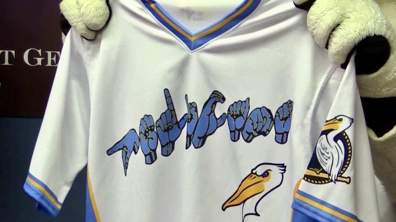
The Myrtle Beach Pelicans — the high-A affiliate of the Cubs — have nicely sidestepped both of those problems with the jersey design for their upcoming Deaf Awareness Night, which will take place on Aug. 19. As you can see above, the jersey features the team’s name spelled out in American Sign Language — a brilliantly simple concept that’s both attractive and powerful. Has Big kudos to all involved.
Other components of the promotion will include the following:
In an effort to create an inclusive experience for members of the deaf community, sign language interpreters will be infused into the Pelicans’ gameday experience. The night will include a silent inning. Additionally, Jason Hurdich, an RID-certified deaf interpreter, will perform the National Anthem, and for the first time in club history, the Seventh Inning Stretch will be performed by an ASL interpreter.
One slight fly in the ointment: If you look at the upper corners of that photo, you can see that the jersey is apparently being held up by a costumed mascot (presumably Splash, who’s been the Pelicans’ live mascot since 1999). Like many costumed characters, Splash has only four fingers on each hand, which means he can’t sign properly. Maybe not the best choice for promoting this jersey design.
There’s another uni-related wrinkle: The promotion will include a baseball clinic for deaf youth, which will be run by former MLB outfielder Curtis Pride, who has been deaf since birth. Pride played in the minors for the Nashua Pride in 1999 and again in 2003-04, making him one of the few athletes to wear his surname on the front and back of his jersey simultaneously — a nifty little distinction (although it obviously has nothing to do with the deafness promotion). He’s also the only major-level pro athlete I’m aware of to wear a hearing aid while playing. (Update: Several other examples of athletes with hearing aids can be found in today’s comments.)
I don’t know ASL myself, although it’s probably a skill I should learn. As it happens, back when I was getting to know the Tugboat Captain three summers ago, I went over to her house (which will soon be my house) to pick her up for what I believe was our second date. She invited me in to look around and seemed particularly pleased with herself when I saw this on one of her living room walls (click to enlarge):
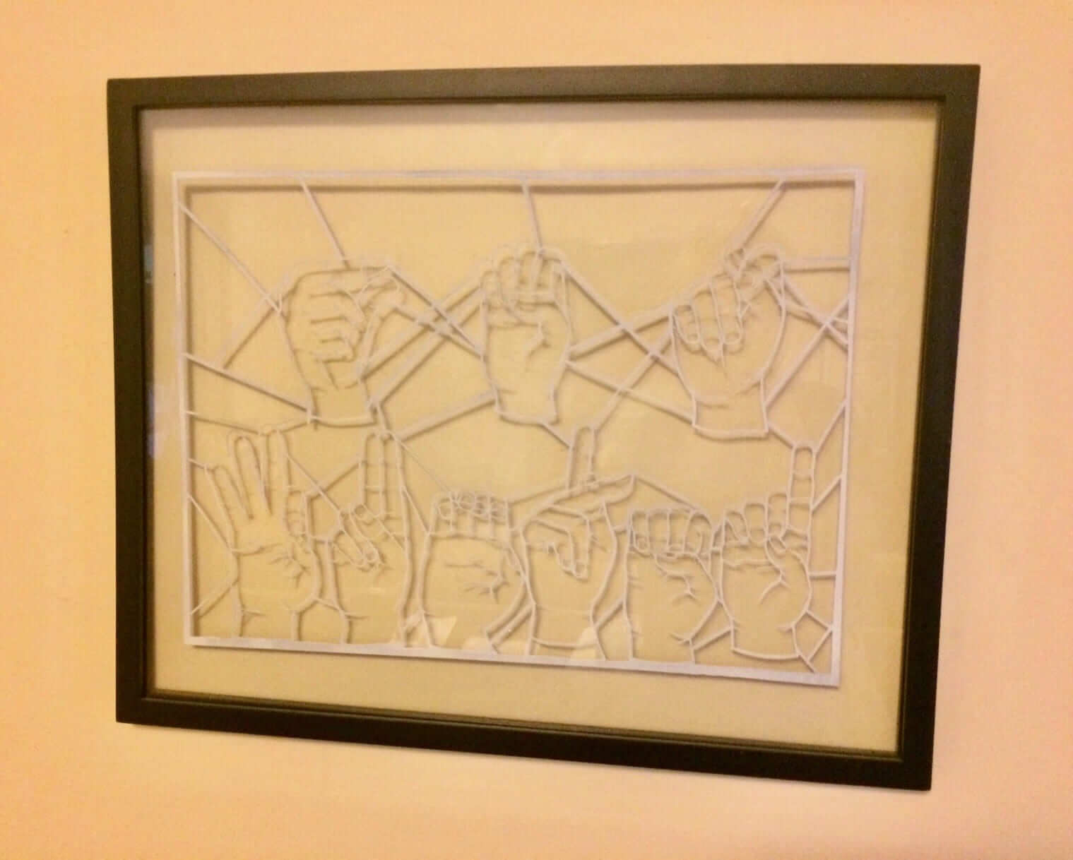
If you know ASL, you know what it says. If you don’t know, ASL, well, look it up!
Click to enlarge
Collector’s Corner
By Brinke Guthrie
Try saying this out loud in the classic Mission: Impossible voice: “His name is Broadway Joe. His trade is football. His hobbies are good times, girls, and winning Super Bowl championships.” The back cover includes more breathless hype: “The saga of a small town boy who made good in the big bad city.” And “After the Bowl was over, the hero of the hour was mobbed by his admiring fans, especially the girls.” It’s all right there in this inside and intimate profile!
Now let’s check the rest of this week’s picks:
• Around 1970-1971 was when Adidas and Puma took over NFL footwear from Riddell. Look at the Colts/Cowboys Super Bowl V photos and that’s pretty much all they’re wearing, like Cowboys DE George Andrie on this Adidas promo poster. No Nike football yet back then, kids.
• It’s “time” for another Patriots Super Bowl win with this 1970s Pats clock.
• I have long seen and admired these late-1960s NFL poster designs — even had several of them — but I never knew Fleer did a Big Signs release for them. Here’s a set of four, including the Chiefs, Browns, Pats and Bears.
• This 1970s Soapy Slider Soap baseball features the logo of the Texas Rangers.
• If you’re a diehard Montreal Expos fan, hang this 1970s bicycle plate on your seat.
• When you were freezing your backside off at Candlestick Park in the 1970s, they’d hear your chattering, frozen voice through this orange SF Giants m-m-m-m-megaphone.
• Couple more for the Giants: This is a 1970s Coca-Cola promo poster for the Say Hey Kid, and here we have a 1960s Giants inflatable batter.
• Check out this collection of late-1970s MLB cap lapel pins.
• If you’ve never worn one of those 1990s turtlenecks many NFL players wore, here’s an example. That little squiggle logo you saw on them was for a company called Maxit. The Chiefs always used to take their team photo head shots wearing these in white over their red jerseys. Anyway, here’s the 49ers version. I had one for the Bengals and it was very comfortable.
• This lot of Phillies stickers and decals declares that they’ll be “Great In ’78!” (They went 90-72, so it was true.)
Seen an item on eBay that would be good for Collector’s Corner? Send any submissions here.
XXL cap update: I’m sorry to report that the pre-orders for the XXL size of our upcoming “alternate” cap have continued to run on the slow side, so I’ve decided to pull the plug on that endeavor. We did not receive anything close to enough pre-orders to meet our supplier’s 144-cap minimum order, so unfortunately we won’t be producing this design in XXL, at least for now. We’ll issue refunds to everyone who pre-ordered, and I’ll see if there’s any other option we can pursue for you big-noggin types.
The other two sizes — S/M and L/XL — do will be in stock and available for purchase in the next week to 10 days, no pre-order required. Thanks for your patience!
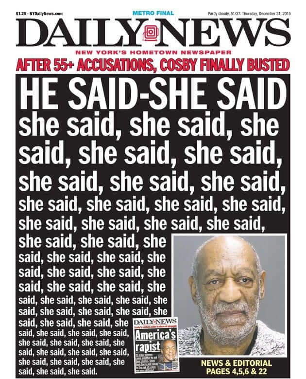
Tronc to NYDN: Drop Dead: I’ve periodically mentioned that these are very difficult days for those of us who work in journalism. The latest body blow came yesterday here in New York, as The Daily News — once the highest-circulation newspaper in the entire country — had its already-decimated newsroom staff cut by a whopping 50%.
If you can spare a New York Times click, they had the best coverage of the story. If you’d rather not spend one of those bullets, this NBC News piece isn’t bad.
These latest Daily News cuts are part of the larger trend of New York media outlets downsizing their local coverage. The people laid off included three-quarters of the sports staff and nearly the entire photo department (a particularly dispiriting move when you consider that the paper’s longtime logo includes a camera). The casualties included some people I know. Given the skeleton staff that remains, it’s hard to see how the paper can continue to function much longer.
I’ve said it before and I’ll keep saying it: If you value journalism, please-please-please stop thinking of it as something you get for free. The industry’s old business model, built on display ads, classified ads, and a modest cover price, has been destroyed by the internet, and so far nobody has successfully figured out how to consistently monetize clicks. So please consider subscribing to your local paper, or springing for a digital subscription to one of the larger paywalled papers (The New York Times, The Washington Post, The Wall Street Journal, etc.), or giving a gift subscription to a student (a good way to support journalism while simultaneously teaching the next generation about quality journalism), or making a donation to ProPublica.
We need your help. I hope you’ll consider giving it. Thanks for listening.
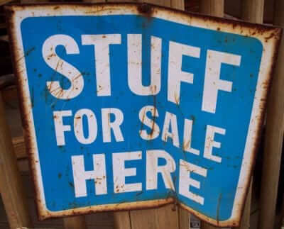
Cool stuff for sale: In case you missed it yesterday, I’m selling a bunch of stuff that didn’t sell during last Saturday’s moving sale. Even if you did see yesterday’s notice, I’ve added a few items that weren’t previously shown — you can see everything that’s currently available here.
Please click on the thumbnails to see larger versions and, more importantly, to read the descriptions of the items, which among other things indicate whether the item is something I’m willing to ship or if I’m only offering in-person pickup. (You can see even larger versions of each photo by clicking the download icon and choosing “View all sizes” from the resulting popup menu.)
If you’re interested in any of this stuff, please get in touch and make me an offer. I’ll continue to add more items to this photo set each day, so stay tuned. Thanks for listening.
Click to enlarge
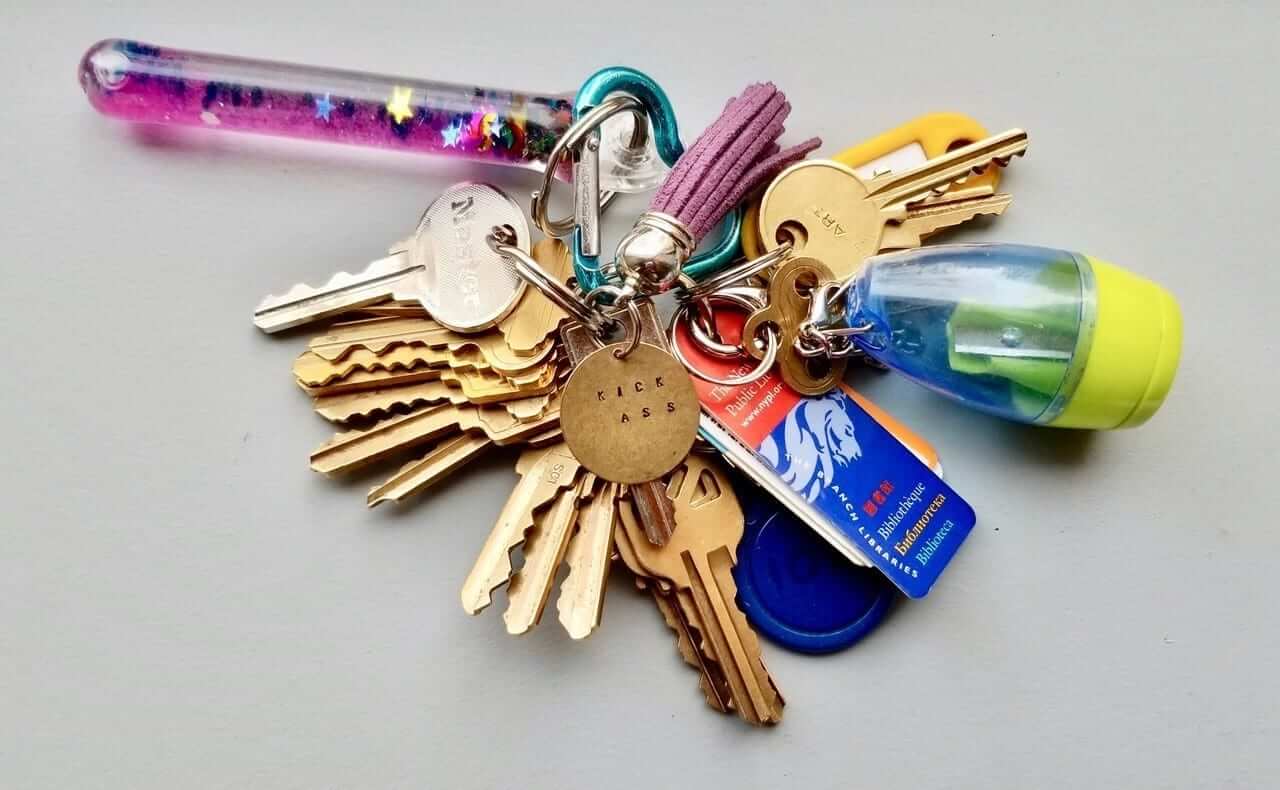
KRC update: The latest installment of Key Ring Chronicles is one of the best and most powerful we’ve ever run. It’s about a glitter wand, a tiny pencil sharpener, and a little metal tag that says, “Kick Ass.” Check it out here — you’ll be glad you did.
The Ticker
By Alex Hider

Baseball News: The San Diego Union-Tribune published an interesting opinion piece on the Padres in brown and the state of uniforms in San Diego (from Graham Block). … The D-Backs remade a scene from Bull Durham with current and former players. Everyone in the scene wears their era-appropriate uniform — except for Randy Johnson, who wore the Diamondbacks’ current set (from Josh Pearlman and @Hail21RIP). … The Rays trolled fans who wore replica Yankees jerseys with NOBs (from Matt Snyder). … Louisville Bats P Jimmy Herget has been sporting some nice stirrups lately (from Scott Setek). … Speaking of the Bats, they will retire Nos. 42 and 1 for Jackie Robinson and Pee Wee Reese on Saturday (from Josh Claywell). … The Williamsport Crosscutters, the short-A affiliate of the Phillies, wore law enforcement appreciation jerseys on Sunday (from Jim Taggart). … The Springfield Cardinals will wear Christmas in July uniforms this weekend (from Blake Cripps). … Keith Winney found these MLB (and football) mini-helmets while cleaning out his attic. … Here’s a treat: Color footage from a 20-inning Pilots/Bosox game at Seattle’s Sicks Stadium in 1969 (from Jerry Wolper).

NFL News: The Packers will have uniforms from throughout their history on display at the Packers’ Experience this weekend. Note that none of the uniforms, including the current-era ones, have makers’ marks. … Washington published a photo gallery of the team packing up equipment for training camp (from Tom Turner). … Repost: Keith Winney found these NFL (and baseball) mini-helmets along with a corresponding poster while cleaning out his attic. … This analysis piece breaks down the relationship between patriotism, football and the NFL’s controversial anthem policy (WaPo link) (from Phil). … Ravens DB Eric Weddle was wearing an unusual Ravens logo on his practice pants yesterday. Anyone seen that one before? (Good spot by Adam Foxman.) … Back in the day, the NFL champs would play an exhibition game against a team of college All-Stars. Here’s some video from the last such game, featuring the Steelers vs. the college All-Stars, in 1976. “I’ve never seen the All-Star uniforms before,” says Dan Tarrant. “I can’t tell if their pants were gray or were originally white (like the helmets) and just look gray due to the heavy rainstorm. The amazing thing is just how hard the rain is coming down. The teams then leave the field and the fans riot, tearing down the goalposts (at about the four-minute mark of the video). The rest of the game is cancelled. More info here.”
College Football News: New uniforms for South Alabama (from @TheOGBenchBoys). … You can always expect shenanigans to be afoot when an Alabama fan and an LSU fan get married. The groom thought he was cutting into an Alabama cake but was surprised to see the cake had purple and yellow layers (from Kary Klismet). … New uniforms for Wyoming.

Hockey News: The Blue Jackets are bringing back the cannon and cream alternates next season (from Moe Khan). … The Penguins and Flyers will face off in a Stadium Series game this season, and the logo is fit for a Keystone State battle. … This Islanders blog thinks it’s time for the team to revive the infamous “Fish Sticks” jerseys (from Phil). … Here’s a brief history on the Rangers’ uniforms (also from Phil). … Retired Tottenham Hotspur center-back Ledley King visited the Ducks and dressed up in full hockey gear (from our own Jamie Rathjen).

NBA News: LeBron James is the cover athlete for the 20th-anniversary edition of NBA 2K19. The cover was presumably shot before the offseason began, so he won’t appear in a Lakers or a Cavs jersey. James announced the cover on Instagram and included an in-game shot of him in a white Lakers jersey — though it appears to be a 2017-18 jersey, not the one he’ll wear this season (from Jonathon Neal).

Soccer News: Paris St. Germain is the latest non-basketball team to get the Jordan treatment (from Phil). … Klaus Gjasula, a defensive midfielder newly signed to second-tier German side SC Paderborn, wears a helmet during games (from Robert Marshall). … More updates from Josh Hinton: AS Roma now has ads on the front and back of their jerseys after years of going ad-less, Juventus’s new away kit has leaked, and Manchester United’s training uniform has been released. … New home and road uniforms for Lokomotiv Moscow (from Ed Zelaski). … New kits for for Man City. “While most love it, I’m not a huge fan — yet,” says Josh Hinton. “Need to see it on the pitch before I make a decision. That being said, I don’t think anything could top last season’s home and away kits.” … Also from Josh: New third kits for West Ham and for Tottenham Hotspur. “The whole purpose of a third kit is to prevent a kit clash,” says Josh. “But Tottenham has a navy away kit and a navy/green third kit, which means the third kit is completely useless.” … Reposted from the hockey section: Hotspur is currently in L.A., so retired player Ledley King, who works as a team ambassador, visited the NHL’s Anaheim Ducks and dressed up in full hockey gear (from our own Jamie Rathjen).

Grab Bag: Highly recommended read: “Veterans Speak Out Against the Militarization of Sports” (from @VKRatliff). …Case Western Reserve is using an endowment of $1.9 million from the family of former Nike designer M. Frank Rudy to outfit its athletic teams in Nike apparel. … Here’s a good look at all the uniforms in the National Rugby League (from @GoatJerseys). … The National Weather Service has weather safety logos for all four seasons and hurricane season (from James Gilbert). … The track and field uniforms for the upcoming Continental Cup have been unveiled (from Anthony Gonsalves). … Jason Collins found his grandmother’s bowling league champion patch from 1959-60. She’ll turn 104 in February, best to her! … Bubba Watson has added an ad for his Florida ice cream shop to his golf bag (from Michael Brighton). … Whoa, check out the super-colorful tennis court at last night’s World Team Tennis event in DC. … Nike plans to raise salaries (NYT link) for thousands of corporate employees after complaints about complaints about wage inequality and discrimination (from Tom Turner). … Longtime reader Jim Vilk, who lives in Ohio, had a steak shaped like Ohio.
The promotion will include a baseball clinic for deaf youth, which will be run by former MLB outfielder Curtis Pride, who has been deaf since birth and who I’m pretty sure is the only deaf player in MLB history.
William “Dummy” Hoy was an accomplished player in the majors in the late 19th and early 20th centuries.
From that entry: “Hoy became the third deaf player in the Major Leagues, after pitcher Ed Dundon and pitcher Tom Lynch.”
Thank you! I’ll update the text accordingly.
But deaf people can still read. Replacing text with ASL isn’t really necessary.
It’s Deaf *Awareness* Night. Raising awareness among the NON-deaf.
My great-uncle was deaf *and* illiterate, so no, not everyone.
Someone had a similar comment yesterday on the Interwebs.
link.
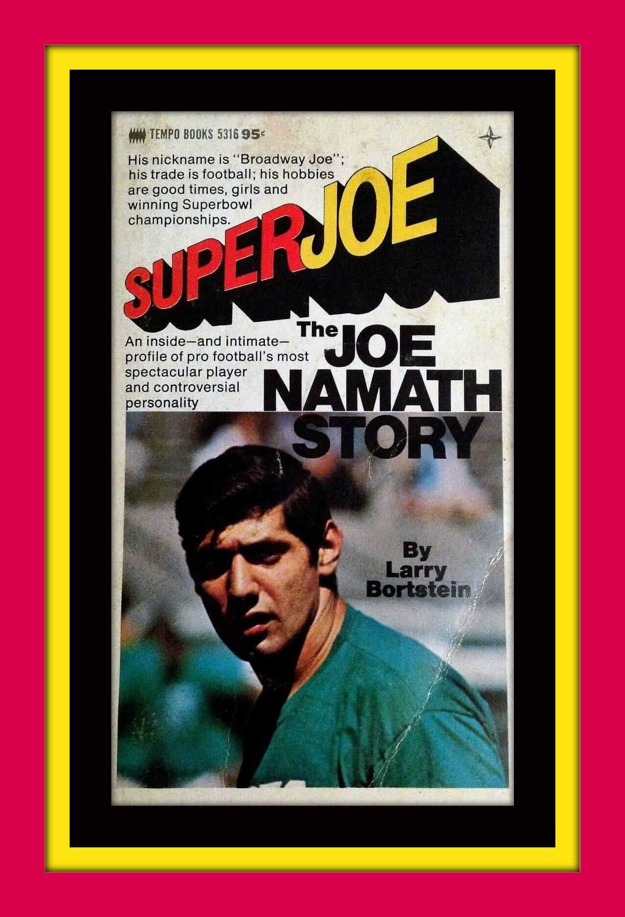
Wonder whatever happened to my copy of “Super Joe.” Must reading for a 12-year-old back then.
One would not to a Mission Impossible voice for narrating Super Joe. There is only one voice. The Voice of God and Frozen Tundra.
John Facenda.
oh yes, absolutely. Livin’…..Laughin’….LOVIN’….NAMATH STYLE.
See how easy it is to write taglines?
Love the sign language picture – another thing for those who Get It(TM).
Sorry about the NYDN goings on and the state of things. But from what I have heard, isn’t a lot of the impetus behind the layoffs was having to cobble together $15M to pay off the handsy exec? That’s what I don’t get. He gets caught being a pervert, and is “punished” with more money than most people will make in 3 lifetimes… and down the chain of events, innocent people lose their jobs. $15M pays a lot of salary. If I am misreading this particular situation, please enlighten me.
Reports are that Tronc is looking to make a lot more layoffs throughout their newspaper empire, so it’s not just the NYDN.
By the way, Paul, nice reference to the infamous Gerald Ford NYDN headline.
“Keith Winney found these … football mini-helmets while cleaning out his attic. ”
UGH!! My pettest of peaves–putting the “stripe” on non-striped helmets!!
8 year olds probably aren’t making sure their vending machine helmet they create matches the one on the field of an obscure team. The stripe shouldn’t be in the package to begin with.
In the OLD old days they came out of the gumball machine completely and (dare I recall) correctly stickerized. You didn’t to apply the stickers yourself.
the Ducks posted video clips of Ledley King on the ice. He looked much more comfortable than I was expecting – link
He also wore an Angels jersey to throw out the first pitch at the – link
Why the surprise about the colorful tennis courts for WTT? The multicolor floors have been around for years. They now can be lifted in and out like a basketball court the day of a hockey game in a multipurpose arena. When WTT plays its final at Arthur Ashe Stadium in New York, the court is multicolored, not blue.
I recall from “When Pride Still Mattered” that Larry Brown, the Washington running back, had some sort of hearing aid inserted in his helmet.
around the 14:15 mark Larry shows his hearing rig.
Other great stuff in here too– ‘Skins letterhead, kid unis, Larry’s nice penmanship.
link
Wow. I remember watching him play but had no idea about his hearing issues.
If memory serves, in the old NFL Films episode “The Professionals,” I remember John Facenda’s narration when he said it was Vince Lombardi who discovered Brown was deaf in one ear. The Brown segment of the episode used to be available on YouTube, but it looks like it’s been taken down. -C.
For deaf players, for the NHL there was Jim Kyte.
Also, nieces played in the World Deaf Ice Hockey Championships:
link
Jim Kyte and other deaf athletes with special equipment needs were mentioned in Uni Watch back in 2008.
link
Paul, you referenced your collection of sports-themed pinup illustrations that you were selling in your recap of your stoop sale yesterday. I assume they were all sold?
I don’t recall you ever posting photos of this collection. Did I miss it? Any chance you have photos that you could post?
They all sold, and I don’t have any photos of them — sorry.
And I always thought of the Tugboat Captain as such a nice gal.
I still have to commend her for learning sign language. Most of us only know the one-sign variant of the sentiment her picture expresses.
On the hockey news:
Not thrilled about the Columbus thirds coming back. I’m fine with the logo, and if they do update the number/NOB font, that would be great, but I still hate the lack of any red trim and the faux-vintage off-white.
While not as clever (or as 1970s) as the original logo, I never minded the fisherman logo. It was always the seasickness-inducing wave pattern on those unis – and especially the numbers and NOBs following that pattern – that I hated.
The Rangers timeline is not bad, but but I feel like it could have done better, expanding a few points just a little bit.
Okay, Ticker stuff:
“Reposted from the hockey section: Hotspur is currently in L.A.”
I know what you mean, but “Tottenham” or “Spurs [are]” are generally more preferable as second references.
Also, re: their third shirt, white and blue together covered every PL game last year and they should this year as well. Would guess it’s for the Champions League.
Bonus stuff about my Ledley King item:
-Whoever the goalie is is wearing a U.S. national team uniform that’s several years old. Neither of the Ducks’ goalies, John Gibson and Ryan Miller, have played internationally since the 2016 World Cup.
-King is one of the rare players that only played for one team and wore the same number (26) the entire time.
Tottenham Hotspur, though a pretty cool name, will never be quite as cool a name as Hotblack Desiato.
Supposedly Douglas Adams borrowed that name from some neighborhood shop, and then Hitch Hiker’s Guide became so famous that people started accusing the shop owner of stealing the name!
Given that Spurs away kit is EXACTLY the same as Barcalona’s training kit, I really hope they wind up using the third more than they did last year.
“whole purpose of a third kit is to prevent a kit clash”. The away kit prevents kit clashes. The only point of the third kit is to fill the cash register
Jamie, while the PL allowed it, all three of Tottneham’s kits clashed when they went to The Hawthorns (WBA):
link
Yeah, that’s true. Probably the reason it was allowed is WBA’s shirt was solid blue on the back.
As an Expos’ fan, I loved Curtis Pride. I saw him play with their AAA team in Ottawa, and watching him react to feeling the crowd’s applause through the vibration of the ground was amazing.
Another pro athlete who wore hearing aids was NHL tough guy defenceman Jim Kyte, who played about 15 years for Winnipeg, Pittsburgh, Calgary, Ottawa, and San Jose back in the 80s and 90s. I believe he actually wore hearing aids in both ears. Here’s a piece about him:
link
Regarding players wearing hearing aids on the field, Seattle had a FB, Derrick Coleman, that was the first legally deaf player in the NFL. Duracell even did a big commercial on him. If I remember the commercial correctly, he did indeed wear the hearing aids on field. Of course it’s hard to confirm with the helmet and all.
World Team Tennis court, 1977: link
Larry Brown of the Washington football team wasn’t deaf, but he had a device in his helmet because he was hearing-impaired in one ear. link
The Pelicans whole promotion is excellent, and the jersey is one of the all-time great promo jerseys. But it also raises an interesting dilemma: Sign language is not a set of print symbols. One doesn’t just make a sequence of static shapes with one’s fingers. It’s a four-dimensional kinetic language, essentially a dance. And if one wants to say “pelicans” in ASL, one does not make the signs for each letter of the word in order, one makes the sign for the word “pelican.” Which, like most of ASL, is a beautiful, elegant, and viscerally evocative sign. But because the sign for “pelican” involves several distinct hand motions in sequence, it cannot be depicted as a 2-D symbol like a letter of the alphabet.
Which is not a criticism of what the Pelicans are doing, though I suppose their not-really-ASL jersey risks reinforcing the popular misconception that ASL is about spelling words out like Morse code. It’s just that ASL is so different from written language that depicting it in 2-D symbols is a bit like how any flat map mecessarily distorts some of the spherical earth it depicts. It’s translation, not transliteration, and so requires a choice of what and how to distort in the process.
Anyway, thanks for featuring the Pelicans event! I hope the whole thing goes as well as planned, and I hope it catches on across sports.
Great commentary, Scott. I’d never thought about ASL being like a dance, but that will now stick with me. Thanks for the excellent critique!
Scott – that’s excellent info.
As the father to a boy with bilateral hearing aids, I’m truly amazed at the recognition from the pelicans and others.
Just this week link that specifically accommodates and welcomes deaf workers and customers in D.C.
Speaking on behalf of him and my ginger headed twins, nothing is better than the feeling of inclusion.
And that’s an amazing print(?) that the Tugboat Captain has. If you two ever decide to move, I’d be happy to take it off your hands in the next stoop sale.
And that’s an amazing print(?) that the Tugboat Captain has. If you two ever decide to move, I’d be happy to take it off your hands in the next stoop sale.
It’s a paper cutout! Really intricate. Not sure where she got it (I’m sure she’s told me, but I don’t recall). We’re definitely holding onto it.
Also, I said this yesterday but it bears repeating: Jay, it was such a pleasure to meet you and your family on Saturday. Hope our paths cross again soon!
Paul, – likewise! I’ll actually be sending you an email a bit later in the day/tonight. With the move and other life events, please don’t rush to read/respond. It won’t be anything time sensitive.
Scott, I’ve got a follow-up question to your excellent comment: is there a hierarchy of which signs people are expected to know, like there is for Chinese characters?
For example, in Japanese, the names of many animals are written phonetically with the kana syllabary rather than with “proper” Chinese characters because they’re just so obscure. The word for “pelican”, garanchou is properly 伽藍鳥 ‘garan-bird’ but these characters are super-obscure and people usually spell it out phonetically as ガランチョウ (when they even use the Japanese word at all; ‘pelican’ also came to Japan from English most people call this bird perikan).
But other closer-to-daily-life animals (熊 bear, 牛 cow, 亀 turtle, etc.) are written in single characters by adults and educated people, and phonetically by children, and if you resort to phonetic characters as an adult, people will look at you funny.
Would a deaf person be ridiculed for spelling out p-e-l-i-c-a-n that way if they didn’t know the “real” sign? Would someone who did know the real sign feel superior or arrogant? Are there signs which people are expected to be able to read, but not necessarily produce, like the upper-level Chinese characters are?
I’ve always been fascinated by sign language’s “ideograms” and how many people are expected to know: it has a good parallel with Chinese characters, and you never stop learning those.
Also, bold and somehwat ridiculous prediction: a century from now, we will have clothing that can change what is displayed on it, and it will be possible to have a moving picture of someone signing the word “pelican” on a jersey. (And the umpires won’t allow it, becuase it would distract the batter. And would open the door for moving advertisements on jerseys which would be a disaster beyind imagining.)
Great questions, Mark. I hope someone with ASL fluency will chime in! I’ve read that ASL has a “core” vocabulary of about 6,000 signs, and I know that individual ASL speakers tend to develop signs among themselves, such as for personal names. Like, when you first meet me, you might fingerspell S C O T T. But if I don’t already have a unique sign for my name, you would make one up rather than fingerspelling all the time. Which is slow and tiring. Maybe the sign for S while making half the sign for “pipe” with the other hand, since I’m skinny. Compared to an alphabet, ASL is huge, like the universe of ideograms. But compared to spoken language, which is really the like-to-like, ASL’s core vocabulary is quite small. However, the performative aspect of it gives ASL depth and flexibility beyond what most of us experience with spoken language. For example, I believe there’s one sign for the quality of physical largeness, whereas spoken English has dozens of such words (large, huge, gargantuan, vast, Bunyanesque, immense, etc). But ASL speakers can adjust their hand shapes and arm motions, the speed of their signs, as well as their facial expressions, to communicate nuances of meaning far beyond anything a speaker can do in pronouncing a word. Or anyway that’s my very limited experience based on some very tangential brushes with the deaf community.
I came here to make a similar comment.
Is it correct to say that this is ASL? I had always understood that ASL was distinct from “fingerspell” which is what this is called.
I learned fingerspell years ago when I was doing EMT training, basically as the rudimentary form of communication you could learn quickly. Communicating letter by letter. Completely distinct from ASL which (as you point out) is like a dance, and which has its own syntax and structure distinct from English syntax.
I’m not criticizing either – this is great, I just don’t think its ASL.
As always, epic Uni Watch commenter R. Scott Rogers does not fail to disappoint.
Nice to see color footage of the Pilots in action. A quick search turned up the link, and that game took 5 hours and 52 minutes. That’s a hell of a slog to get through, for a midseason day game, especially at a minor-league park intended as a temporary venue with nothing remotely like the modern amenities we have in today’s ballparks.
Thanks for providing the box score.
I also enjoyed the footage. Grounds keeping has come a long way over the past 49 years. The very end of the film, showing the scoreboard, reflects that the game ended at 7:55 p.m.
I’d like to comment on the Crosscutters’ law enforcement appreciation jerseys, and I’m directing this more toward the law enforcement community than to the ball club: appropriating the US flag — not to mention altering it graphically — for the purpose of promoting your own group or cause is just as “un-American” as these groups seem to think I am if I don’t pay them sufficient “honor”. First, the “honor me” culture is getting tiresome. Second, you don’t get to use the flag in such a manner to represent your own cause, ever. That’s just not cool, and feels worse coming from a group that’s so closely tied to civic service.
Yeah, I go into a mini-rage whenever I see that American flag/blue stripe decal and flag on places. However, it does help me see the type of characters who are out there who are tone deaf to some real issues (and perhaps use the decals to purposefully minimize the experiences people of color have had with police)
There are some recent happenings with MA state police and various levels of corruption with overtime and such that certainly make me less inclined to “honor” law enforcement. As with anything, there’s way too much hyperbole, not all police are saints, yet so many people go out of their way to treat them as such, just like the whole military appreciation stuff too.
The post about the Ray’s poking fun at Yankee fans brings up something a have always wondered. Why does MLB Shop sell replica jerseys with player names on them for teams that are NNOB?
Because fans want to express, “I’m a fan of [this player]” as explicitly as possible.
Interesting, I always assumed that the Yankees replicas had the NOB to show that they were replica jerseys. I had always noticed that the NOB on a replica jersey (at least the Phillies ones I frequently see) was rendered in a pretty plain font, not the official team font. That was always the sign that it was a replica. Since the Yankees dont have NOB, there was no fake font to use to begin with to show it was a replica, so they just put the NOB on there for the replicas.
“As it happens, back when I was getting to know the Tugboat Captain three summers ago, I went over to her house (which will soon be my house)”
Careful, Paul. That’s the kind of comment that will get you in trouble. I think you mean it “will soon be ‘our’ house”. ;)
“If I don’t survive, tell my wife, hello.”
USA Men’s National Volleyball team captain David Smith wears hearing aids link
Also the article could have mentioned how the French Men’s soccer team had their NOB in Braille in 2009 link
It seems crazy, but I cancelled my digital subscription to the local paper and subscribe only to the New York Times now (I live 874 miles from N.Y.C.). Until this year, I had digital subscriptions to three regional papers.
Does anybody have any comments on the newspaper industry’s stability once they jettison their newsprint paper versions (and their printing plants, presses, etc. – and unfortunately the corresponding workers) and only exist online?
Love the photo from Superbowl V. It’s so unique as both teams were forced to wear (per rules at the time) a uniform different from the one they’d prefer to wear. Cowboys in their blue tops, the Colts in white. We’ll never see that again and that’s too bad.
You never know. The AFC and NFC alternate each year as to who is the home team and who is the visiting team. The designated home team chooses the uniform combination they want to wear. According to the attached article, “the team wearing white jerseys has won 12 of the last 13 Super Bowls.” The article was written before the most recent Super Bowl and New England lost wearing white. So the updated list is the team wearing white jerseys have won 12 of the last 14 Super Bowls. The Colts, if superstitious, could choose to wear white if they are the home team. Or they could do so to force the Cowboys to wear blue which they don’t like so much and rarely wear.
link
Seriously folks, even if you don’t find the college all-star uniforms of 1976 to be that interesting, the video I submitted is worth watching simply for the unreal amount of water being dropped on the field during that storm. And the unintentional comedy from the announcers as they try to describe the situation as the fans crash the field, even though they can barely see them through the rain.
Seconded. We’re talking serious monsoon-level rain. Incredible!
I was deeply moved by today’s edition of the Keyring Chronicles. Don’t stop including great features like this. They make UniWatch unique!
While that wedding cake gag is great, is there anything tackier than incorporating sports teams into a wedding? Nothing says I love my new partner like showing how much you love a college football team.
yes, there is something tackier than that. complaining about the wedding parties cake.
Regarding LeBron and the very-soon-to-be outdated Lakers uniforms– don’t tell the paying customers at the flagship NBA Store on 5th Ave!
Stopped in yesterday around lunch… about 10-20 racks of replica and swingman 2017-18 Lakers LeBron jerseys, in all 3 colors, dominating the store and flying off the shelves.
Criminal!
The entire newspaper thing is a tough situation for me (brother is in media). I want to subscribe and support our local paper but it’s just so horrible. Is that because of layoffs (which they’ve had) or because people just want infotainment? On their website the lead can be something like “Top 5 hamburgers in Fort Collins”. Ugh. They are Gannett owned, so maybe that’s it. But I just can’t support that.
I hear ya. But if you can’t support that, then support journalism that you can believe in — NYT, WaPo, WSJ, ProPublica, whatever. It makes a difference!
So true. Been a Daily News reader since I was a kid. Yesterday was a sad day. I’ll continue to support what’s left of the paper but I also subscribe to the Wapo and the Athletic and will buy one for the NYT. Happy to do so.
HAAAAAAAAAAAAHAHAHAHAHAHA… oh PLEASE TELL ME WHERE I CAN FIND THAT fingerspelling frame!? (don’t worry, i’ll google but thought to ask in case there was a direct source.)
and secondly: Not to sound picky but it is a bit annoying within our community- It isn’t American Sign Language. It’s American Fingerspelled Alphabet. Now, if the jersey was to show 2 hands with arrow movements that signify “Big Chin/Beak” & “Bird” then it’s ASL.
source: i’m deaf.
Don’t know where she got it — I’ll ask.
And no, you’re not being picky. I’ve learned a lot about this topic from today’s commenters, yourself included. Thank you!
Update: A talented friend of hers made it.
That would be an all-time great baseball jersey! Maybe someone could make a moving ASL jersey script using lenticular plastic?
Just saw that the University of Hawai’i has “new” unis. First thought: those look like the old unis. Second thought: is that a Tardis?
1) the WTT court is uniform, that is how it is for all courts in WTT, in DC, NY, etc
2) Before I email what’s the range in price you’re trying to get for that NYC Parking Sign?
Great discourse today. I learned something and sincerely appreciate the insight and commentary on a variety of subjects.
I’m trying to think – what other athletes have worn their surname on the front and back of their jersey simultaneously? Maybe someone who played for Brown in college, although their basketball uniforms don’t appear to have NOB at the moment. I haven’t checked every sport, and they may have been NOB at some time in the past. Allan Houston never played for the Rockets, and in any case their uniforms said “Rockets” on the front for most of his career. Maybe someone named Richmond played for the Richmond Flying Squirrels/Braves at some point? I know there was a Scott Richmond who played for the Blue Jays, but he never pitched for Richmond when he was in the minors. And while the Squirrels’ road jerseys say “Richmond”, I’m not sure the Braves’ ever did when they were down there. Who else would there be?
What other cities/nicknames/college names even make plausible last names? There’s a player in the Mets organization named Vinny Siena, but he played his college ball at UConn, not Siena. There are some people named Columbus, did any of them ever play AAA ball for the Clippers? (I don’t believe the Blue Jackets have ever worn the city name on the front of their sweaters so that wouldn’t count.) Is there anyone you know of other than Pride?