[Editor’s Note: Paul is on his annual August break from site. Deputy editor Phil Hecken is in charge from now through the end of the month, although Paul is still on the clock over at ESPN and may be popping up here occasionally.]
By Phil Hecken, with Derek Smith
Follow @PhilHecken
Hey folks. I’d hoped today’s lede would be the announcement of a new Grand Rapids Griffins jersey design contest (with what follows as a sub-lede), but unfortunately, that announcement will likely have to wait until tomorrow. I do have some information (scroll down) on the 2018 Contest, but nothing is as yet set in stone. Hopefully I’ll have that information today.
In the meantime, today we have a guest entry from Derek Smith. As the PGA Championship begins this morning (in fact, by the time you read this, several of the threesomes will already be on the course) — and while it may be less well known (or prestigious) as the Masters or Open or US Open, it’s still golf’s Fourth Major. The PGA is actually moving the tournament to the month of May in 2019, and it’s being played on “the people’s course” on the Bethpage Black — which hosted the 2002 and 2009 US Opens, and which is both a mere stones throw from my condo (and a course on which I used to play a LOT in the early 1990s). But I digress.
Derek has a short little piece for us today where he takes a brief look at fashion in the world of golf. It’s come a long way from the Plus-Fours and knickers of yore. But that doesn’t mean the players don’t still dress up (a bit) for the occasion. Here’s Derek with more…
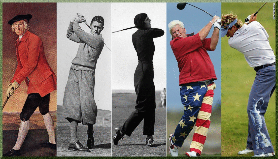
Golf Fashion
By Derek Smith
The Open Championship, the PGAs most recent major event, has historically displayed some of golf’s more interesting fashion choices due in part to the unpredictable weather. Phil Mickelson prompted some chatter this year with his long-sleeve dress shirt …

… a look he debuted during practice at The Master’s resulting in some teasing from his competitors.
Last year, Justin Thomas donned an undoubtedly sharp, yet questionably practical cardigan and tie combination. Alas, he missed this cut this year or else he would have worn a similar look on Sunday at Carnoustie.

While these sorts of looks are contentious (it doesn’t take much in the golf world), it is certainly refreshing to see some players occasionally revert to more conservative attire. For a game whose appeal is in its grace, class and tradition, its apparel has become anything but in recent years. Golf does not have a uniform per se, besides collared shirts and pants for ritzier country clubs and the PGA. Accordingly, it’s always been a game that allowed amateurs and pros to express some individuality and show their taste (or lack thereof) through their on-course dress. It is one place where navy polos and khakis can coexist with pink and green checkered pants.
Yet, in an attempt to “modernize,” golf apparel companies market their hi-tech fabrics, funky shirt designs and bright colors that are supposedly unique but instead leaving golfers at all levels looking like mannequins in Dick’s Sporting Goods. The beauty of Arnold Palmer and Jack Nicklaus’ aesthetic was, well … most importantly there were no corporate sponsors. But besides that, they were elegant—like serious, competitive men whose clothes looked just as sharp on the tee-box as they would in a bar or restaurant. The clothes themselves didn’t stand out. In fact, they were quite basic.
Black leather dress shoes, V-neck sweaters and cotton polos. But they looked infinitely classier than today’s “golf gear” that resembles those perfectly matching shorts/shirt combos found at GAP Kids.
Like too many other things in fashion and in sport, golf has fallen victim to a branding conquest by the big companies like Nike and Adidas to sell merchandise. No matter how outrageous they look now you can wear jogger pants …

… and henley shirts just like the pros if you spend $59.99 for each item!

Thanks Derek!

Orlando Magic Unveil 30th Anny Throwbacks

The throwback/anniversary craze continues.
Yesterday, the Orlando Magic, who celebrate their 30th anniversary this season, introduced a new uniform set that is a throwback to their 1994-1998 road unis. Except for the annoying advertiser patch and makers mark, they’re pretty spot on:

The team will wear these at various times throughout their 2018-19 season, according to a report from Josh Robbins of The Orlando Sentinel.
If these guys look familiar to you, you’re old you probably remember that squad made the 1995 NBA Finals. They had guys named Shaq and Penny, and despite losing those finals four games to none versus the Rockets, they did pretty well. So, the uni unveiled yesterday recalls better days from yesteryear.
At the moment, it’s unknown how many times the team will wear the throwback unis. That information will come at a later date.
And of course, no anniversary would be complete without a new logo to commemorate it, so the team also put out one of those as well:

The anniversary logo that includes the same blue basketball image and stars that were used in the franchise’s first logo in 1989.
COMING SOON: Grand Rapids Griffins Jersey Design Contest

As noted above, today I’d hoped to announce the THIRD annual Grand Rapids Griffins Jersey Design Contest (past announcements can be found here and here). I’d expect our rules from 2017 will again apply this year. What I don’t yet have is the theme.
You may recall both contests were incredibly well received (86 entires in 2016 and 119 entries in 2017) — you can check out all of last year’s submissions here, and the 2016 submissions here.
Past winners (in 2016 and 2017) had their winning jersey submissions made into game jerseys which were worn on ice, and the winner was a special guest of the Griffins on the night their jersey was worn. I’d expect the team will do the same this year as well.
Just to let you know — anticipating the team would want to again partner with Uni Watch for another design contest, I reached out to the team last month about doing another contest. I didn’t hear back from them until late Tuesday, when they apologized for the delay in responding as the person with whom I had previously worked on the past two contests had taken a new role in the organization. So I’ll be working with a new contact this year. Last night I got an email which stated,
Sorry for not updating you. We are currently in discussions to decide the contest theme and further details. I will let you know as soon as I am notified of more information so we can get the ball rolling.
Thank you for your patience!
I let the team know that the timeframe to do the contest is already short, but we can get it done if I can have it set up by tomorrow (which is my goal). Clearly the team is willing, so it’s just nailing down the deets. Make sure to check back here tomorrow if you’re interested in participating and I’d expect a tentative deadline of August 21st for submissions.
Stay tuned!

Kreindler’s Korner
I had the distinct pleasure of featuring the wonderful artwork of artist Graig Kriendler on two occasions over the summer and fall of 2017.
For those who don’t wish to click the links, Graig paints baseball heroes (and regular guys) from the past, and is an immense talent.
Occasionally, I will be featuring his work on Uni Watch.
Here’s today’s offering (click to enlarge):

Title: “Athletic Aider”
Subject: Rube Waddell, 1902
Medium: Oil on linen
Size: 26″ x 30″I’ve always had a bit of a fascination with Rube Waddell. Though often remembered as a bit of a clown – or if nothing else, a loose cannon – he was also one hell of a pitcher. With a blazing fastball and a devastating curve, he won more than twenty games every year between 1902 and 1905, and led the American League in strikeouts from 1902 to 1907. If the latter isn’t impressive enough, in 1904, he fanned 349 batters – 110 more than the runner-up, Jack Chesbro. He won pitching’s Triple Crown the next year, leading the league with 27 wins, 287 strikeouts and a 1.48 ERA.
The opportunity to paint him was one I latched onto quickly. Rube’s face was endless interesting, especially with his pronounced brow, cleft chin and crooked pointy nose. The particular image I was inspired by was extra special, as it dated from his first year with the Athletics, and even pictured him in action, warming up on the sidelines at Huntington Avenue Grounds in Boston. Such photographs are a rarity, especially when it comes to his stint with Philadelphia. So combining that with the fact that this particular image came directly from a clear glass plate negative, I couldn’t say ‘no.’
Immediately I was taken by the quality of light from the sun, especially as those shadows of his swooping arm played against his uniform, and the way the folds of the fabric undulated throughout his body. The aforementioned face was no slouch, as one can really feel the density of that chin as the light streams across it, and also the way that nose sticks out from under that big shadow created by the brim of the cap.
I also had a lot of fun playing with different kinds of textures that I found in the grass. It’s important to remember that back in that era, the fields weren’t manicured in the same way they are today. In addition to the grass not always being mowed, it wasn’t uncommon for there to be dips, valleys and even holes in the ground where these guys were running around chasing the ball. I loved the idea of keeping true to that sentiment, as it’s those little details that help make these paintings more historically accurate – even if something gets a tad embellished.
In the end, it’s just so interesting to be able to see Waddell as a player first, rather than the idiosyncrasies he is known for by most amateur baseball historians today. This painting allows us to see him for what he was: one of the biggest drawing card of his era.
Thanks, Graig! You can (and should!) follow Graig on Twitter.

And now a few words from Paul: Hi there. I’m in the middle of what is basically the Worst Week Ever (don’t ask), but I do have one bit of very good news, namely that the samples for our latest batch of StripeRite socks have arrived, and they look pretty awesome. Dig (click to enlarge):
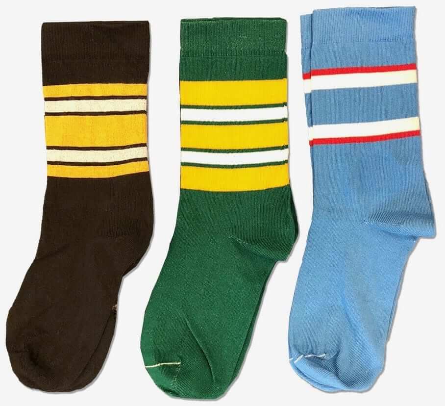
Not bad, right? These should be available for pre-order in a day or two. I’ll let you know.
Meanwhile, a few friendly reminders:
• The Uni Watch alternate flex-fit cap is available here. Readers have been sharing photos of theirs, and I don’t mind saying they look pretty damn sharp:
Been waiting for this fantastic hat from @UniWatch for a long time. pic.twitter.com/9JezhnfWkA
— Jacob Gibb (@_jgibbster) August 8, 2018
• While we’re at it, our classic cap is still available from Ebbets Field Flannels, although only in sizes 7, 7-1/8, 7-1/4, and adjustable at the moment. All sold-out sizes should be back in stock toward the end of this month.
• As I mentioned a few days ago, I’ll be having an open house to sell off a bunch of LPs and CDs this Saturday (plus you can make arrangements with me for a private shopping session prior to Saturday if you like). Some of the best stuff is already gone, but there’s still plenty of primo material. Full details here.
I’m on Ticker duty today (covering for Kris Gross, who’s on vacation this week), so I’ll be back with tomorrow’s Ticker. See you then.
The Ticker
By Anthony Emerson

Baseball News: The Great Lakes Loons (Class A affiliates of the Dodgers) are doing a one-off rebrand as the Great Lakes Camels (from Ryan Keberly and Alex Seder). … Glenn Chavez was at last night’s Rockies/Pirates game, and noticed a fan wearing a Todd Helton jersey, sans the “1.” … The Louisville Bats will have a Marvel Superhero Night to fight cancer (thanks, Phil). … The Pulaski Yankees are celebrating Agriculture Night by auctioning off an actual, living cow (thanks again, Phil). … Not uni related but too cool not to include: Fenway Park as a sandcastle! (from Justin Hicks). … Logan Conway of Tulsa was pitching in a Little League World Series qualifier while wearing PF Flyer sneakers. Amazing. … The Buffalo Bisons’ Buffalo Wings cap ships in a box of wings with a wet nap to boot! … @FittedsFlannels noticed that the Twins’ Coordinator of MLB Development was wearing a cap with the New Era logo on the right side, instead of the usual left. … Check out this blood stained uniform being worn by Jim Rice (from Paul Deaver). … “A friend found this book and these incredible uniforms are pictured,” says Mark Smith. He included this school yearbook photo for identification. … Whoops — bit of a score bug SNAFU last evening between the Brewers and Padres Dodgers and Astros last night (from Alex Bell).

NFL News: The Niners unveiled their memorial decal for Dwight Clark (from Tom Poulson). … The Packers are including their 100th Season logo on the field at Lambeau (from @JohnnyOeleven). … The Dolphins will wear throwbacks twice at home this season (thanks, Phil). … Here’s an excellent story on the Oilers/Titans one-season stint in Memphis (thanks again, Phil). … The Sporting News ranked all 32 NFL uniforms (from @AwesomeStout).
College/High School Football News: Madonna University out of Michigan is starting a football program in 2020. Here is the prototype helmet (from Ryan Keberly and Jerry Kulig). … Boise State is no longer the only blue field in town, now that the University of New England in Maine has added a football program (from James Gilbert). … Athlon Sports ranked the ACC’s football unis (thanks, Phil). … The University of Central Arkansas “teased” their new unis on Twitter, though you can basically make out all the important bits (thanks, Phil).

Hockey News: The Newfoundland Growlers, an ECHL expansion team, has released their unis. Can you tell they’re affiliated with Vegas Toronto? (from David Augustine). … The Canucks will be throwing it back throughout this season, their 50th (thanks, Phil). … A beer league team loves Phil Kessel, and honored him in their logo (from Jeff Perilman).


NBA & College Hoops News: Something called Fadeaway World has a list of five NBA jerseys that “need to be brought back” (thanks again to Phil). … Temple’s Alani Moore will be wearing No. 0 in honor of his former coach Butch Cherry (from @PhillyPartTwo).

Soccer News: Juventus has sold over half a million Cristiano Ronaldo jerseys in just 24 hours after they went on sale (from Owen Seaton). … Denis Hurley sends along this list of notable keepers who wore a number other than 1. … Telegraph reporter Thom Gibbs was kind enough to send along his ranking of the 2018-19 Premier League kits. … BBC Three has also ranked the new kits in the Premier League (from Ted Arnold). … Serie A has a new logo, just in time for their big new ESPN deal (from @jayappletree). … Insane — Real Madrid is selling Alex Hunter jerseys for 160 euros. For the uninitiated, Alex Hunter is a fictional soccer player from the FIFA video game series. … Real Betis has released their new away kits. … RB Leipzig has released a slick black-and-white third kit. … Parma has released a stunningly gorgeous hooped away kit design. … FC Schalke released their new home, away and third kits yesterday. … Barcelona’s new third kit was leaked, and it might go down among the worst ever worn by the storied club.

Grab Bag: Leinster Rugby released their new, Adidas-provided kits (from Charlie Kranz). … Georgia Tech has new volleyball unis (from Jake W. Patterson). … Lots of sports-related body art in this slideshow (from Kary Klismet). … BYU Women’s volleyball has new unis (thanks, Jim). … Two St. Lucia Stars — that’s franchise cricket — players, Darren Sammy and Andre Fletcher wore “Chocolateman” and “Spiceman” NickNOBs, respectively. … Here’s a look at Justin Thomas’s outfits for the PGA Championship (from Griffin Smith).
Tom Helton? is he afraid of the letter “D” post-DUI?
Are you sticking with the alphabetical order thing again on grouping the Griffins contest entrants? Every year everyone goes up against the same people and in my opinion, certain groups have shown to be stronger than others which leaves good designs out and weaker ones from other groups in. You seriously need to think of a different way to mix it up… or hey, NO GROUPS! You can swing it. You probably will say you can’t, but I’ve seen the fathers day entries, so I know that you CAN.
It doesn’t really matter how groups are composed; the better design will win out whether it faces its next-best competition in the group stage or in the finals. Or anyway that’s the logic behind most major sports tournaments, so either the World Cup and the NCAA tourney are crap, or the Griffins contest is basically OK.
That said, I would agree that a randomized group selection would increase the perception of fairness. Alphabetical-by-surname ordering feels arbitrary and unfair to pretty much anyone whose surname starts with a letter below D and who attended public school as a child.
That is usually true, but for instance, if you take the top 3 from one group, and they all had around 12% of the vote, and #4 had 10% of the vote, who is to say that when the rest of the group is weeded out, that #4 wouldn’t collect those votes. I don’t think that the general assumption holds that everyone who voted for less popular designs that didn’t get through the first round would automatically choose one of those that made it to the finals as their second favorite.
Perhaps run them all at once, and top X entries go into a run off final, or all entries over X% of the vote go into a run off.
(Ideally this is how our elections would work too instead of party primaries, this way everyone is campaigning to the moderate middle instead of polarized ends, and we get better candidates.)
I’m more than open to changing it up, but as of yet, no one has been able to come up with a better format. I never said I can’t, but if you have a suggestion(s), please feel free to share. Stronger entries often are received closer to the deadline, as they take a week or more to design, so grouping them in the order they are received doesn’t mean that will be “fairer” and a totally random order, which I’ve considered, is almost impossible to do by myself (remember, I have to host and track each entry) due to the sheer volume of submissions. But if you think you have a fairer way, by all means, please share.
I’m trying to recall if we’re limited to a specific # of votes in the preliminary rounds. If yes, then I can see the merit of Reynolds’ & Greg’s argument. Hypothetically, entries A & B both get exactly 200 votes, and C gets 190. But if voters can only pick their top 2 choices, I could see a scenario where maybe a lot more people would prefer C if given the choice between just those three, but because some “wasted” (apologies to Gary Johnson & Jill Stein) their votes on entries D-H, C wound up losing. Therefore I can see two solutions to this:
1) Ranked Choice Voting… I have no idea how easy this would be to implement, or if there’s services available on the interwebs to customize your own, but it certainly would allow really-good-but-not-group-winning-amazing designs a passage to the final round.
2) Allow people to vote for as many as possible (I think this already is the case, no?). By doing this, you eliminate the possible argument that ‘Johnny voted for D & E instead of C but certainly would never choose A or B’ because Johnny could then vote for C, D, & E, and if C still comes up short, then the consensus is that it’s never going to win against A or B, anyway, regardless of whether its competition in the subsequent round is inferior.
I’ve always liked that Orlando Magic uniform; we need more light-pinstripes-on-dark-background looks. The only other use of that particular color scheme I can think of is the US men’s soccer team a few years ago. The Chicago Cubs could pull it off.
Agreed! I loved that Hornets uni, during an era when I hated most NBA unis. The Hornets font was an abomination, but the underlying pattern was awesome. And light pins on dark is high on my list of uni styles that I wish someone in MLB would adopt. Cubs? Sure. But my first choice would be the Rockies, if they’d go gray (read: silver) pins on purple on the road.
“we need more light-pinstripes-on-dark-background looks”
Did Jimmer Vilk hack your login?
The Sporting News “NFL Uniform” rankings are WHACK! Obviously a Cowboy troll wrote that. Dallas at #1 and Washington at #32 with LEGENDARY uniforms Chicago, Indy, Green Bay way down the list. Seriously???
The list is laughable, dont get me wrong I love my NYG that high on the list but the author is a clown.
Yeah, the person that wrote that has horrible taste.
I’m not normally someone to criticize a list like that, but that might be the worst I’ve ever seen. Somehow the Browns’ jersey is better than the Colts & the Bears?
I get that lists are completely subjective & will never please everyone but I concur, that may be the worst NFL uniform ranking I’ve ever seen. Laughable.
Not sure which is worse, that list or those ACC uniform rankings.
Agreed, it kind of seems like the author decided Dallas would be #1 and Washington #32 and then pulled the other 30 teams’ order out of a hat.
Yep, one of the worst rankings Ive ever seen. A complete joke.
Yep, one of the worst rankings Ive ever seen. A complete joke.
Thought the same thing. So bad it was almost confusing.
I’m a Cowboy fan and I don’t think being number one on such a farce of a list means a thing. Any list that doesn’t have Tampa at the bottom is clearly invalid. Plus, Washington has a beautiful uniform, that could be in the top 10 discussion. Certainly not 32.
That 30th anniversary logo…I know the ball/stars logo is to commemorate the original logo and all, but couldn’t they extend the star pattern to define the 3 better? That image makes the 3 look flat!
The Newfoundland Growlers are a Toronto Maple Leaf affiliate, not Vegas.
No wonder I couldn’t find the Golden Knights’ logo embedded in the Growlers’ logo! The color scheme had me going, though.
It’s the silhouette of the Vegas Knights’ helmet “hidden” in the dog’s neck line
Something called Fadeaway World has a list of five NBA jerseys that “need to be brought back”
Yeah, aside from the Magic (who are bringing that one back), I’m going to say no to those. As far as I’m concerned, those were sartorial Dork Ages for those four teams.
Madonna University football…will the team’s inaugural year be known as the “Like a Virgin Year?”
“FC Schalke released their new home, away and third kits yesterday”
….no they didn’t? It’s just the third kit, despite what the headline says.
“Two St. Lucia Stars players”
That’s in the cricket Caribbean Premier League.
Newfoundland is affiliated w/Toronto.
(It’s been mentioned before in the comments)
link
Yea, I thought that was odd to mention – I am surprised that there isn’t a Maple Leafs logo on the shoulder like other ECHL Affiliates do.
So, this year PF Flyer released cleats that resemble the pair Benny “the Jet” Rodriguez wore in The Sandlot. They can be found here
link
I would bet that is what the Little League pitcher is wearing.
Phil….you do a much better job of ranking NFL uniforms than that hack in Sporting News…
Derek, I like your passion. Bright colors are nothing new. Jack Nicklaus wore his share of bold outfits (plaid pants, colorful striped shirts, etc) in the 70s.
I really like the dressier look of Justin Thomas and I don’t see why the tie and cardigan wouldn’t be practical. I don’t follow gold closely, but I would love one of the big players to go without a baseball hat.
I would also like to see more golfers go without hats…but that would require someone forgoing sponsorship revenue.
Wasn’t the blue 1994-98 Orlando Magic uniform an alternate uniform to the black primary road uniforms? Though I remember that they would wear exclusively the blue uniforms on the road in the playoffs, like in 1995.
I think you’re correct, but they wore that blue a LOT. Not sure if that’s the Icon or Statement alternate…
You would kind of think that if a team was going to celebrate their 30th anniversary with a throwback uniform, they’d choose a uniform style that they actually wore during their inaugural season, no?
Hahaha, the sad thing is I can’t tell if you are seriously unsure which alternate is it among their current options, or are joking about what alternate it WAS back in the 90s. I really wonder who at Nike thinks that marketing speak works, and/or if it does work, how our society has become so dumb as to fall for it or enjoy it.
Yes, and as I recall these, along with the black Bulls alternate, and purple Hornets alternate were darling of the 90s NBA alternate jersey crazy.
The Magic switched to blue on the road full-time in ’95, relegating black to alternate.
Now hold on a second…the Charlotte Hornets (along with the Miami Heat) started play a year earlier than the Orlando Magic (and Minnesota Timberwolves).
So it seems a bit strange that both teams would celebrate their 30th anniversary during the same season, no?
IIRC, all four teams were announced at the same time, but they started play in a staggered fashion. As you correctly noted, Charlotte and Miami began play a year before Minnesota and Orlando.
The Hornets are celebrating the 30th anniversary of the original franchise’s inaugural season. The Magic are celebrating their 30th season.
Sports franchising are historically inconsistent with this sort of thing, anniversary vs total seasons, so no surprise that teams that started a year apart would be celebrating the “same” milestone during the same season.
Charlotte’s a unique situation because of the relocation and reclamation that took place. Officially it’s celebrating 30 years of professional basketball in Charlotte (which, itself, is incorrect because the Cougars played games in Charlotte and the ABA merged into the NBA so shouldn’t those years count too?), the now defunct WNBA Sting are included in that calculation to cover the gap between the (old) Hornets and Bobcats.
I love the Orlando throwbacks, but that 9 is horrible. Not knowing it as a tribute to the 94-95 squad, it would be tough to differentiate it from a stylized 0. The 4 is pretty short so they couldn’t extend the post of the 9, but a smaller curl of the 9 would have probably worked better.
I tried looking up to see what it looked like back in the 90s, but reached a bit of a dead end. According to basketball-reference.com, Gerald Wilkins wore #9 in the 1996-97 season, but every image I’ve seen of him in the original-style uniforms have him in #21. (There are pics of him in #9 in the uniform introduced in 1998-99, but that’s a completely different style with a different font.)
The only other player to wear 9 in that uniform style (according to b-r) was Tim Kempton, but he only played three games for the Magic in November 1997, so pictures of his uniform are not exactly forthcoming. Nobody had a uniform number in 9 in it when they wore their throwbacks in 2003-04, either.
Good try, at least. I just figured they must not have had any players with that number back then, since it looks so odd.
From a distance that 9 really does look like a 0.
Maybe they could let the bottom part of the 9 hang below the baseline?
The PGA entry mentions “black leather dress shoes” as the epitome of style, yet everyone in the Nicklaus/Palmer photo have white shoes. White leather golf shoes were very much the standard by the early 70’s (as far back as I can remember) and they looked infinitely better than the current shoes modeled to resemble other athletic footware with colorful designs and logos.
It would be nice to see a similar story on the LPGA, or at least give some passing mention of it – if for no other reason than to address whether women are being held to a different standard when it comes to their apparel on the course.
Ticked edit: Todd Helton (currently “Tom” Helton)
The links to the Louisville Bats and Jim Rice stories do not work.
Forget the golfers; I really like those caddy uniforms with the block green numbers on them.
Beautiful artwork by Kriendler. Love the deadball era.
I honestly think the dumbest thing anyone wears is golf wear. The standard seems to be orthopedic shoes, dress slacks, a polo or tennis shirt (however you think of its origin) and a ball cap. Great young athletes dressing like retired old farts in the garden section at WalMart.
I think you’re right, but on the other hand, I’ve yet to see anyone come up with a better idea for what golf wear should look like.
I just realized that the image of the Magic throwback is a digital mock-up… and not a very good one, because of the way the pinstripes look on the shoulders.
Golf fashion has changed not only with the general fashion of the day, but also because the golf SWING has changed.
The golf swing of old was long, fluid, and used a lot of hip movement to generate power. This was necessary because of how shafts were constructed. Go watch a video of Bobby Jones swinging a golf club: link
Now compare this to today’s golf swing. Here’s Henrik Stenson: link
Golfers today generate power by STABILIZING their lower half and only turning their hips when it naturally turns with the shoulders. Power comes from coiling the shoulders and releasing all the that tension.
How this relates to clothing is that anything that restricts the coiling is just horrible for a golf swing. That’s why golf shirts are made of stretchy material. I’ve tried swinging clubs with a regular dress shirt on and it just does not work.
The Cristiano Ronaldo jersey thing is fascinating to me, because of how many people are a fan of the player more than of the team, the same thing with Messi. I mean, I guess it might exist to some extent with Lebron, but it’s definitely cranked up to 11 with soccer. I’m a Ronaldo fan due to sharing a country of origin, but I’m not going to be jumping ship with club team fandom
Newfoundland is affiliated with the Maple Leafs, not Vegas.
Paul would have ack’d his error and thank the people.
Phil never does (even though he has been proven wrong time and time again, even with documentation that he obviously doesn’t read in comments)
You know what? I do read the comments. And I police the site when I can. I also have a full time job (and it’s not Uni Watch) and it takes up enough of my day and night, especially when I am filling in for a month and I fix shit when I can. I didn’t do today’s ticker and I’m not the only one who can edit things.
Sorry if that’s not good enough for you.
It should be noted that even Paul doesn’t always fix the spotted errors right away. It all depends on whether or not there’s something that needs attention outside of the site. And in Phil’s case, like so many of us, it’s an actual job, and not all of us have the luxury to be able to loaf off and browse the site while on the clock.
Todd Helton. Not Tom
The link to the Jim Rice photo goes to someone’s Facebook page. Maybe it’s buried in their news feed somewhere.
But the full story, which is fairly well-known but worth repeating: a little girl sitting near the Red
Sox home dugout was hit in the head by a foul line drive. The players in the dugout heard the sound of the impact as well as her scream. Rice stuck his head out, realized that medical help from the stands would be a long time coming, ran over and carried the bloody girl into the dugout where she could get immediate medical attention from team staff.
In those largely pre-AIDS days, nobody would think twice about playing on in the bloodied jersey, and certainly not Rice who sort of shrugged the whole affair off as “just being human.” But it went a long way toward changing folks’ impression of Rice as standoffish, revealing him more as just reserved and perhaps a bit shy.
Sock samples looks great. I’ll make the purchase but I’m still holding out for the Jim Brown/Cleveland Brown socks and the Floyd Little/Denver Broncos socks.
Thanks Paul!
That 9 on the Magic jersey is the worst 9 I’ve ever seen. I bet you buy that jersey and you get a free bowl of soup.
Read that in Rodney Dangerfield’s voice for full effect.
It is a pretty bad 9. Is it the worst? Anaheim Mighty Ducks Wild Wing alternates had some bad looking 9s.
link
Doesn’t look as bad as Goldberg from the Mighty Ducks!
Worst treatment of the #9 I’ve ever seen?
Here you go:
link
I feel like Nike and Adidas kinda mail it in when it comes to unis for non-revenue teams in college sports, which is a shame because you can pull off some really cool looks in those sports as we see with teams around the world.
UA is really hit and miss but it does feel like they try with those sports sometimes.
The white hat, white shoes, white belt look on the PGA tour has got to go.
Did ANYONE see the Browns in a plain orange helmet without stripes coming?!?!?!?