
[Editor’s Note: Paul is on his annual August break from site. Deputy editor Phil Hecken is in charge from now through Aug. 25, although Paul is still on the clock over at ESPN and may be popping up here occasionally.]
By Phil Hecken
Follow @PhilHecken
Greetings weekday Uni Watch readers! Once again, I begin my annual month-long weekday run filling in for Paul by announcing an awesome new design contest, once again in partnership with the Grand Rapids Griffins (a professional hockey team in the American Hockey League, whose primary affiliate is the Detroit Red Wings). This will be our second year hosting this contest (you may recall that posting from last year, which resulted in 85 designs being submitted), narrowed down to 12 finalists by you, the readers. This year’s contest will follow last year’s quite closely.
I was again contacted by Marissa Malson, Director of Digital Marketing for the Grand Rapids Griffins:
I hope all is well! I wanted to reach out to see if you would again be interested in hosting the Griffins’ jersey design contest? We would be looking at hosting it during the month of August like last season.
Last year the winner received a personalized jersey and tickets to the game when the jerseys will be worn (In the end, there were actually TWO designs chosen, with Dan Kennedy receiving the awesome Griffin treatment — check out his design on the ice and his visit with the team here). That’s all in store for this year’s winner!

As I mentioned, this contest will be very similar in set-up to last summer’s — the difference being this year the Griffins are looking for an 80’s fauxback (see below for more details). Also, for those who are choosing to join the contest, please note the Griffins are planning to wear red pants and red helmets with the winning submission — so keep that in mind when designing your fauxback. OK…now the rules and stuff (please note the timeline for this year):
Timeline:
Submissions will be accepted from today through August 15th, 2017 (by 6:00 pm E.D.T.)
Reader voting will begin August 17, and continue on August 18, August 21 and August 22 (I’m expecting we will be breaking the submissions into four sets).
The top three vote getters from each set (for a total of 12) will be reviewed by the Griffins on August 23rd, and the winner will be announced on Uni Watch and Griffins social media on August 25th.
Design Guidelines:
• Create a brand new design for a Griffins alternate jersey (remember: you are ONLY designing a jersey, not a full uniform).
• DO NOT USE current or previous Grand Rapids Griffins logos or previous Griffins jersey design contest winning logo designs. Your work must be original.
• The jersey color must be red or black.
• This jersey will be part of an ’80s Fauxback Theme Night. If the Griffins existed in the 1980s, what would the jerseys have looked like?
• Use official team colors – CMYK Colors: Red 12/100/92/3, Gray 31/25/26/0, Gold 43/49/76/21, Black 75/68/67/90, White 0/0/0/0.
Rules:
• Readers will be allowed to vote once per day during the voting period.
• The top 12 designs as voted by readers will be the finalists.
• The Griffins staff and ownership will choose at least one winning design, which will be worn on January 12, 2018.
• The winning jersey design will become the property of the Grand Rapids Griffins.
• The Griffins reserve the right to make design modifications to the winning design as needed.
• The winner will receive a personalized version of their jersey and tickets to the game that the Griffins will be playing in the jerseys.
• LIMIT ONE DESIGN SUBMISSION per reader.
• Designs may be submitted as .jpg, .png or .pdf files.
• E-mail your entry to me (Phil Hecken) as an attachment to: Phil.Hecken@gmail.com; please label your submission “FirstnameLastname-GRGContest”
• It is strongly encouraged that you place your name or some sort of ID on your entry.
• One image (you may include multiple angles, such as front and back) per submission.

That’s it.
Big thanks to the Griffins and Marissa for again selecting Uni Watch readers to participate in their alternate jersey process. You should know what to do, so get crackin’ — but if you have any questions either post them in the comments below or e-mail me at the above address (phil[dot]hecken[at]gmail[dot]com). OK? OK!


.
Hornets Latest Second To Latest Team To Unveil…

Who the hell unveils a new uniform set on a Monday afternoon? The Hornets, that’s who. While I was off doing, you know, my 9-5 job, they became the latest NBA team to unveil their new home and road white and colored uniforms.
If you’re looking at the photo above and are thinking, “That looks a lot like their old uniforms,” you’re right!
Ok, enough joking around (if you don’t get why the above verbiage is what it is, you didn’t read Uni Watch over the weekend — for shame!). Anyway, let’s get down to the brass tacks here.
First, the hype video:
La nueva equipación de los @hornets pic.twitter.com/3xAp5auihP
— KIA en Zona 🀠(@kiaenzona) July 31, 2017
The first (and most obvious) change is the maker’s mark — which, unlike every other new uniform to be revealed for the 2017, features the “Jumpman” logo instead of the swoosh (if you happen to be living in a cave and not following Uni Watch, Nike has taken over from adidas as the official uni manufacturer of NBA unis). The jumpman logo appears on the jersey and the shorts.
Logo status.
The Jumpman has a permanent home on the @hornets jersey. pic.twitter.com/3Tckr4xDfW
— Jordan (@Jumpman23) July 31, 2017

There are a few other (subtle and not-so-subtle) changes as well. As has been the protocol with uni releases this year, only the home and road “Icon” and “Association” (also known as white and dark) uniforms were shown. Like other teams, the Hornets will be getting at least two additional uniforms, to be revealed at a later date. Both the white and teal uniforms look very similar to the uniforms worn last season (as noted by a certain scribe who is supposed to be on vacation!):
Better lighting for this Hornets uni comparison. Old version on left, new on right. pic.twitter.com/W19CMdy0IO
— Paul Lukas (@UniWatch) July 31, 2017
Better lighting for this Hornets uni comparison. Old version on left, new on right. pic.twitter.com/oR5zCujHoz
— Paul Lukas (@UniWatch) July 31, 2017
The most obvious change is the teal uniform now says “Hornets” on the chest of the jersey and “Charlotte” in the tone-on-tone lettering on the shorts, reversing the prior designs. Other smaller changes are below:

As noted in the above graphic, there are now thinner stripes on the jersey and shorts:

And the secondary logo now appears on the side of the shorts:


The collar is also changed slightly:
Quick glance on the updated #Hornets unis…No more line on the collar… Old vs. New pic.twitter.com/FjOUFFeThr
— Brad Solomon (@kingofbuzzcity) July 31, 2017
The “buzz” logo has been added to remains the waistband (it had been there previous), and which still keeps Nike’s streak of having a waistband mark on every team in tact.

One of the less obvious “changes” about this new uniform is the one that’s not even present: there’s NO AD PATCH (yet). The Hornets’ new uniform unveiling did not include any advertising patches on the opposite side of the jersey. Of course, the Hornets are still free to sell advertising space (the “Jumpman” is a maker’s mark, not an ad). So the Hornets are one of many teams who have not announced a jersey advertiser (it remains to be seen whether or not any teams remain ad-free once the season begins), but blissfully, Charlotte is not one with an advertiser (again, yet). There are so far ten NBA teams who have announced advertising patches on their uniforms this upcoming season.
You can read the official Hornets release here, complete with full corporate-speak.
So there you have it — at least the first two (of four or more) unis haven’t changed significantly. Previous alternates for Charlotte included a purple and black sleeved “Buzz City” design, but whether or not Nike (Jordan) will continue these is still to be determined. We can likely safely say the sleeved design is gone, but who knows whether they’ll (re)introduce a black alternate. Of course, most of us are probably hoping something like this will be a fourth uniform.
Paul is going to be interviewed and discussing the new Hornets uniforms on the Locked on Hornets podcast tomorrow. He’ll be recording the segment at noon, and we’ll keep you posted on when you can listen.
Oh and guess what…there’s a bunch of uni unveilings scheduled (possibly something like one a day for the next week or three).
Why the “strikeout” at the top of this section? That’s because the Philadelphia 76ers unveiled EARLY this morning — and like a true champ, Paul was there to write the sub-lede (that’s below). Also unveiling today (so far) will be the Denver Nuggets (at a more reasonable hour this morning — approx 10:30 Mountain Time) — so I’ll have coverage of those in tomorrow’s post. And now, here’s Paul’s review of the Sixers unveil:

.
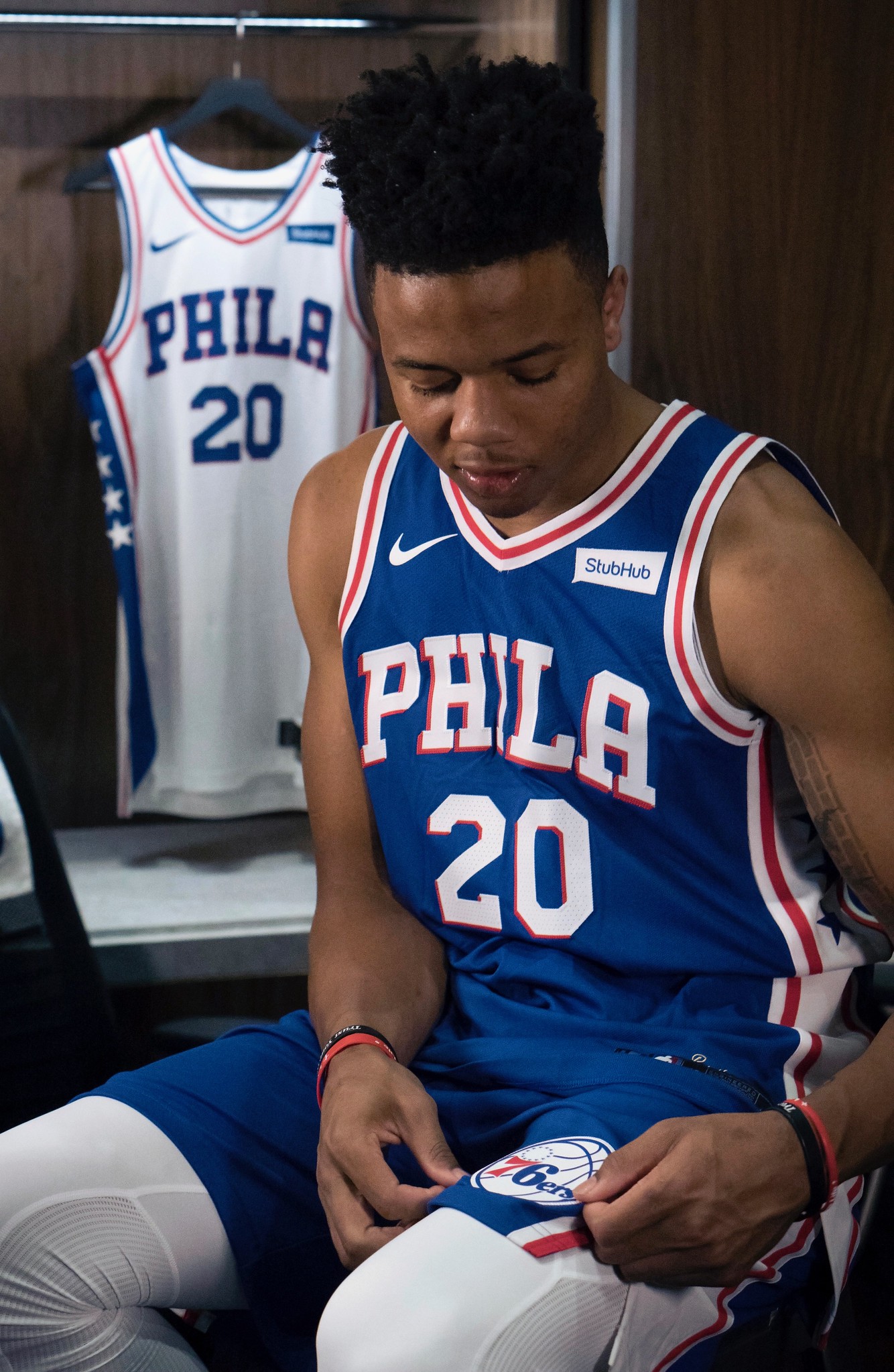
Photos courtesy of @Sixers; click to enlarge
76ers Are Latest NBA Team to Unveil
By Paul, who didn’t expect to be back on site so soon
Who the hell unveils a new uniform set at 6:30 in the morning? The 76ers, that’s who! While you were sleeping, they announced their new white and blue designs. I was provided with a sneak peek, and Phil was slammed with all the rest of today’s content (plus he had curling last night), so I volunteered to do this write-up, even though I’m technically on my August break from the site.
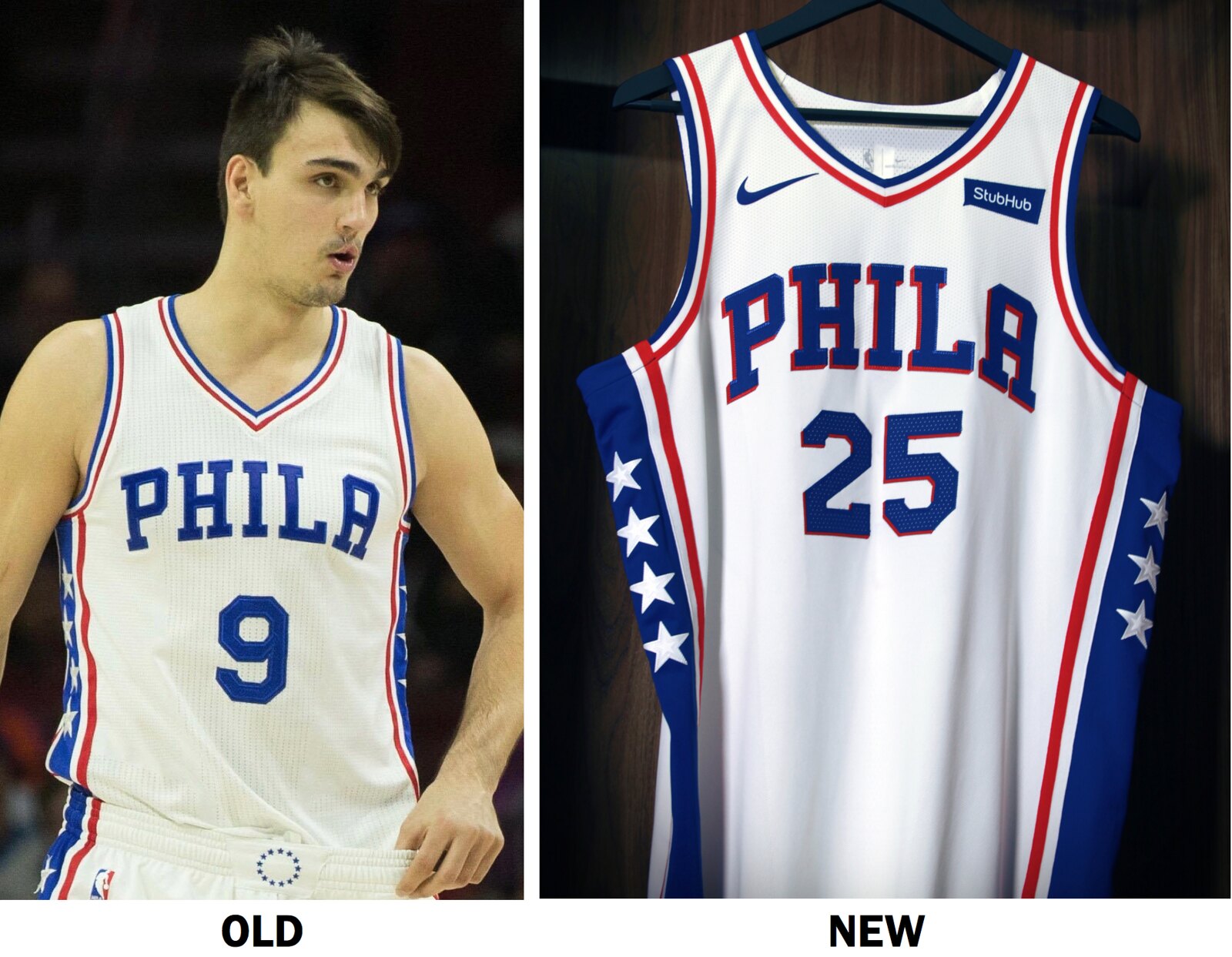
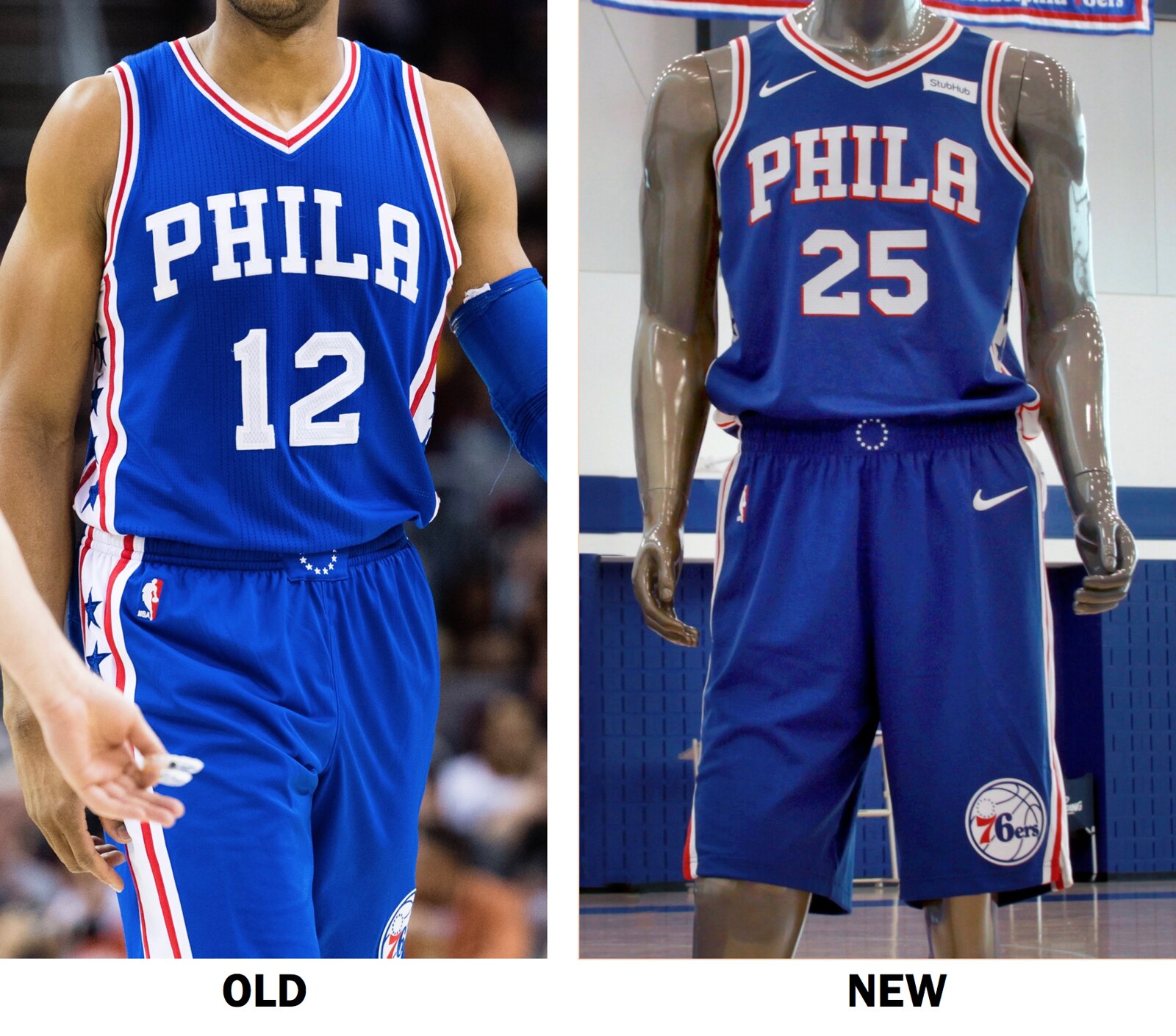
The primary change to the uniforms, as you can see above, is the addition of a drop shadow to the chest lettering. The intersection of the armhole piping and side panel has also been adjusted. Here’s a before/after comparison of the white uniform:
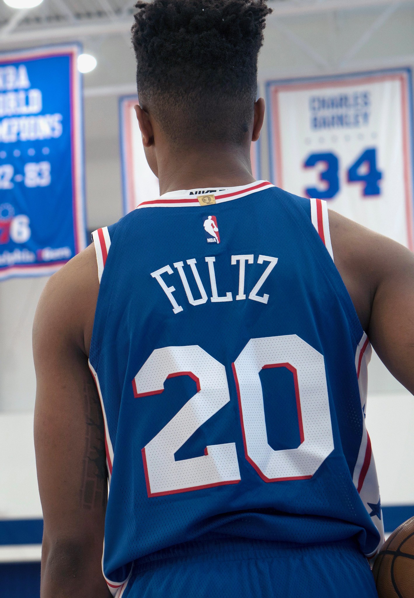
And here’s a similar comparison for the blue uniform, along with a rear view of the new design:
I like the addition of the drop shadow — has a nice retro feel and adds a bit of pizzazz to the design.
In addition, the Sixers are adding a “Brotherly Love” embroidery script just above the jock tag. Obviously, this won’t be visible during games, because the jerseys will be tucked in:
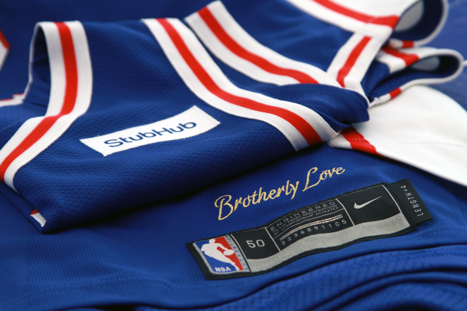
Okay, that’s it from me. Turning things back over to Phil now. Let’s hope I don’t end up doing this all month long!

.
Collector’s Corner
By Brinke Guthrie

Look at this NFL Stereo Helmet! Specifically, a Miami Dolphins “Football Helmet Headset With AM Radio.” For one, look at the series of photos on the eBay post. For one, this thing is gigantic. How heavy it must have been! And look at the dude’s smiling girlfriend. She’s laughing AT you, not WITH you, big guy. (And if you’re in the living room with a Miller Lite, wouldn’t you have the game on the tube? Who needs AM radio then?) The seller says it also comes with a cord to connect it to your Hi-Fi Stereo, too. Go, Fins! Now for the rest of the week:
• More Fins: nice artwork on this 1978 schedule poster c/o WIOD Radio 610 and the fine people at Century 21.
• Perfect attendance in school? Dodgers pitcher Fernando Valenzuela will send you this official certificate!
• Expos Fever: Catch It! (With this youth-sized Expos T-shirt.)
• Didja know Mickey Mantle had his own line of blue jeans? He did in fact, and here’s the patch that went on your backside.
• This 1977 Philco Football Radio/TV Guide caught my eye, since the artist put the jersey numbers right on the front of the helmet.
• This 1980s “Property Of The California Angels” shirt was a promo offering by your local Mobil dealer and the Coca-Cola Bottlers of Orange County. Also got a vintage Halos bobblehead.
• Interesting Hutch facemask on this 1970s Vikings helmet/hook/coat rack.
• Tune into the Pack with this vintage clock radio!
• If you’ve got a tiny Bears fan in your family, outfit him or her with this 1980s Bears jacket from Sears & Roebuck.
• Terrific looking 1960s Chiefs poster, and we’ll overlook the fact the artist put double-bar facemasks on the defensive linemen.
• Notice the back of this 1970s Browns T-shirt: “SIPEBOWL BOUND.” Didn’t quite make it, did they.

.
The Ticker
By Mike Chamernik

Baseball News: Long-time Cubs fan Steve Bartman, the scapegoat of the Cubs’ 2003 NLCS loss to the Marlins, will receive a championship ring. … Cardinals reliever Matt Bowman has a piece of hard plastic in his cap to protect against comebackers. … Mets call-up Amed Rosario will wear No. 1 when he makes his debut tonight against the Rockies (from James Beattie). … Orioles pitcher Donnie Hart will switch from No. 58 to 57 so that newly-acquired Jeremy Hellickson can wear his usual 58 (from Andrew Cosentino). … The Corpus Christi Hooks wore 1970s fauxbacks over the weekend. They paired them with matching blue pants one game and white pants the other (from Jesus Mora Saenz). … Centenary University will install a blue baseball field. Is this the first instance of a baseball team adopting colored artificial turf? It’s pretty common in football, of course (from Eric Strauss). … Nolan Ryan wore a mesh-backed truckers’ style cap during a game in Spring Training back in 1980. … According to Lee Lubarsky, Red Sox first base coach Ruben Amaro Jr. wears Nike shoes with what looks to be a backwards logo. Normally, the angled part of the Swoosh faces forward. By the way, my favorite derisive nickname of all time was when, as the anti-analytical GM of the Phillies, Amaro was known as Ruin Tomorrow Jr. Mini-QOTW: What’s your favorite unflattering nickname in sports? Leave your answer in the comments.

NFL News: The Panthers released their uniform schedule. They will wear white for the first five games, the second and third of which will be at home in the hot Carolina sun (from Phil). … Here’s a good look at the Rams’ new white facemasks (from Thom Abraham).
College & High School Football News: New unis for Indiana State (from Robert Hayes). … New uniforms for Ohio (from Ed Å»elaski”). … North Carolina’s new uniforms will be revealed at a fan event on Saturday (from James Gilbert). … Pink locker rooms, a narrow sideline, and raucous crowds make life tough for Big Ten opponents at Iowa’s Kinnick Stadium (from Kary Klismet). … NC State will wear a 125th-anniversary helmet decal this season. … A player on Cincinnati has a practice jersey that doesn’t match the rest of his teammates (from Jeff Griffin). … Fresno State will retire Derek Carr’s No. 4 on September 2 (from Phil). … San Jose State signed a deal with Adidas this spring, but the football team is still practicing in Nike jerseys (from Henri Bradley). … New unis and field turf design for the McKay Royal Scots, a high school in Salem, Ore. (from Ian Gerig).

Hockey News: The Islanders are eyeing a new arena at the site of Belmont Park in Queens. They have until September 18 to submit their proposal to the state’s development agency. … New pads design for Rangers goalie Henrik Lundqvist (from Patrick Thomas).

NBA News: Thunder forward Doug McDermott will switch to No. 3, from No. 25 (from Zachary Loesl). … Not exactly clear where this was, but Suns guard Devin Booker worked out on the court used in the 2009 All-Star Game, which was held in Phoenix that year (from Josh Pearlman). … Lots of old Kansas City Kings stuff from Kemper Arena is up for auction, including seats, basketball goals, the jumbotron, and the court itself (from Paul Deaver).

Grab Bag: A compromise has been struck: Paris will host the 2024 Olympic Games, and Los Angeles will host in 2028. … I think we’ve seen this before, but it can’t hurt to see it again: A look at 41 regional hot dog variations (from David Firestone). … New logo for Converse. … The annual National Sports Collectors Convention was in Chicago this year, and I stopped by on Saturday. The entire convention floor was filled with dealers who were selling trading cards, autographed balls, game-worn jerseys, old programs and magazines, and all sorts of other memorabilia. It was exactly as cool, and as exhaustive, as it sounds. I didn’t take any photos, but former ESPN columnist Bill Simmons attended in 2009, 2011, and 2014, and the show is pretty much still the same. Along with classic Phoenix Suns and Houston Oilers drinking glasses and some old yearbooks and programs, I bought a phantom 1982 Brewers World Champions pennant (Milwaukee actually lost the World Series to the Cardinals in seven games that year). I believe we’ve seen that in the Ticker before. Another mini-QOTW: Have any of you ever attended the National Sports Collectors Convention? If so, what did you think?

.
And that’s it for today. Thanks aplenty today, but especially to Paul for pinching in on that Sixers sub-lede, Mike for taking care of our ticker, Brinke for the Collector’s Corner, and of course Marissa for giving Uni Watch (and you designers) the privilege of hosting their design contest for a second year.
On that topic — I’ve heard from a couple folks about using a different poll system (which is *less* hackable than Pollcode, which I had used previously). If anyone has any suggestions OR if you’re really technically inclined and would like to assist with polling for the Griffins contest, please send me an e-mail. Since the Griffins will be selecting the winner (although you readers will be narrowing it down to 12 finalists), I’m not ‘as’ concerned about shenanigans, but I’d still like to have as fool-proof a system as possible!
Day One of Paul’s (almost but not quite) sabbatical is in the books — but I’m sure we haven’t heard nearly the last from him (and if he wants to, ya know, keep reviewing the new NBA reveals, I’m cool with that … I kid I kid. We all know Paul deserves his break from here). I do have lots of great stuff on tap for you guys this month, including some really special stuff.
Happy Birthday in heaven to Jerry Garcia, who would have been 75 today. RIP.
I’ll catch you guys in the morning, but until then…
Follow me on Twitter @PhilHecken.
Peace.
‘“I wish at least one of the Hornets’ unis had said ‘Charlotte’ instead of ‘Hornets’.”
— Winter

.
“annual month-long weekday” Bravo! Bravo!
Favorite unflattering nickname in sports:
Charles Barkley – Sir Cumference
Don Stanhouse – “Stan the Man Unusual”
My favorite unflattering sports nickname Claude “Pepe” Lemieux, ’cause it stank so much to play against him.
Looks like a lot of the NBA teams already had a logos on their waistband (you can see it quite clearly in the old version photos) even before Nike took over – may be less about adding anything new and just continuing a trend for a lot of the teams. Interesting that the league logos and makers marks are now rubberized/pressed on instead of embroidered like they used to be though.
Re color turf fields, Michigan (dark blue) as well as others (2012 London Olympics) use color field hockey turfs. [Field hockey still uses original style Astro Turf.]
UNC is builing a new field hockey stadium so I thought I’d see what a Carolina Blue turf might look like:
link
Artificial turf is the required surface for world-class field hockey events. It’s usually colored blue so that the yellow ball can be seen better on television.
I agree that the drop shadow on the Philadelphia Stubhubs jersey is a nice touch.
Makes the jersey reminiscent of the old Philadelphia Warriors.
Re: The National Sports Collectors Convention.
It’s gotten really stale. Same people, same stuff. You used to go to some regional shows in greater New York, and the selection would be better.
And who in their right mind schedules The National the same weekend as the Baseball Hall of Fame induction ceremony?
It’s gotten really stale. Same people, same stuff.
I can see that. Apparently show VIPs clear out the cool new stuff early on Thursday, the first day of the four-day show. In fact, I saw the same Pittsburgh Pipers ash tray that Bill Simmons snapped a photo of back in 2009. I’d imagine almost everything there has been kicking around for awhile.
Corpus Christi has had a number of fauxbacks in their history, including blue versions of the Rainbow Guts.
That being said, this Hooks uniform is semi-OK, but the cap logo is awesome. I think they should keep it.
Who the hell posts a comment at 9:16? I do, that’s who. While you guys were off doing whatever you do in the AM….
For unflattering nicknames, I heard this one once and I loved it. The former Bears quarterback, “The Drive Killer” Kyle Orton
The Pirates also had mesh spring training hats in the 1980s, but it’s difficult to tell how widespread this practice was. Spring training games weren’t on ESPN back then, few were covered with announcers like a regular game.
baseball colored turf question- Wichita State has turf and where the infield dirt would be they have black turf.
Did anyone else notice the ‘Hornets’ font across the chest is different on home/away (not calling it that other stupid name) jersey? The teal looks cleaner, without the serifs on the “H” and “S”.
Nevermind, someone on twitter just posted a more zoomed in photo and I can see they are in fact the same.
Faaaaaascinating article about U of MD football jersey number assignments. Mostly centers on players wearing the same number at camp. Take it or leave it: link
“Losing Pitcher” Hugh Mulcahy. Tough moniker to sell.
Islanders arena link doesn’t direct to anything relevant of the topic.
Fixed.
Unflattering sports nicknames begin and end with Hugh “Losing Pitcher” Mulcahy.
link
Gah. Rick beat me to it by two minutes.
Wartime New York Rangers goalie Steve Buzinski may have been nicknamed “The Puck Goes Inski.” No contemporaneous accounts, but that’s my favorite.
Also great: Habs backup Andre Red Light Racicot, and of course Jared Lorenzen the Hefty Lefty, Round Mound of Touchdown, and the Pillsbury Throw Boy.
Red-Light Racicot instantly popped into my head. Thanks for bringing him up.
In the lead photo, on the right Griffin’s jersey, did anyone else think of the weapons pickups from Contra?
Denver Nuggets will have a Western Union ad:
link
Mike Hargrove: The Human Rain Delay
Dave Winfield: Mr. May
Former Reds second Baseman Ron Oester a/k/a Ron 0-fer.
Former Reds pitcher J.J. Hoover a/k/a J.J. Groover.
Chuck Wepner, “The Bayonne Bleeder”
Despite being designed by Nike, the negative space between the stripes on the Hornets uniform is still THREE WHITE STRIPES.
correction: three stripes matching their respective uniform color.
When Edwin Encarnacion first came to the Blue Jays, and was playing some terrible third base, he was affectionately known, in some circles, as E5.
Always liked that.
Grammar check in Collector’s Corner: Should read, “Tune in to [two words] the Pack…”. The listener wouldn’t be going into anything.
University of Northern Ohio already has a red turf baseball field.
Before Steve Yzerman showed up, the Detroit Red Wings were sometimes referred to as the Dead Things. Also, couple of wretched NHL campaigns for the original Winnipeg Jets earned the city the sobriquet, “Loseipeg”.
Speaking of NHL teams – don’t forget Toronto Maple Laughs.
or Toronto Make Believes
Ali Haji-Sheik = Ali Haji-Shank
Marvin “Bad News” Barnes
My favorite of all time, Nick Mark-urinal-kakis.
From my dad’s generation: Dick “Dr. Strangeglove” Stuart and Chuck “Dr. No” Hiller. Two awful fielders who can James Bond over great nicknames.
“Joe Barely Cares” = Joe Barry Carroll.
Sal “Red Light” Messina (though that was bestowed somewhat affectionately by Marv Albert).
Dick Stuart aka “Dr. Strangeglove.”
And who can forget the oft-traveled Harry “Suitcase” Simpson?
If I ever catch the episode pf the old Home Run Derby with Stuart,when he gets handed his check, I keep thinking, “Don’t drop it!”
Dennis Eckersley known as “Upper Deck Eck” before his time with the A’s.
I always thought the “Dis-Astros” was cute.
Former Royals manager Tony Muser was “Tony Loser”
The Minnesota North Stars were the “No Stars”
And WFAN’s Steve Somers always called the Islanders the Icelanders. From Short Island.
In fact, last year the teal uniform for the hornets was actually their alternate, while their purple uniforms were their away uniforms so they actually switched those around.
From the old Bottom Ten column on college football: University of Texas at El Intercepted Paso; Kansas State Mildcats; Minnesota Gol-durn Goofers; Virginia Cadavers.
Minnesota Foldin’ Goofers, Gregg. FOLDIN’ Goofers.
Do you think the hornets might keep away from the ad patch so as not to detract from the Jordan mark?
I was kind of wondering the same thing. He may consider that specific lack of advertising revenue a marketing expense for Jumpman.
For me, in a way, the Jordan mark IS the ad patch.
In other words, a lot of teams are going to have two, not one patch, in my estimation. Granted, I know there’s a distinction being made with the “maker’s mark”, but, for me, that’s a bit specious.
For unflattering nickname, I’d say the phonetic pronunciation of Rusty Kuntz.
Mini-QotW:
Former New York Giants DB Elvis Patterson, whom Bill Parcels nicknamed “the Toast of New York” for how often he was burned in coverage.
We called Brandon Inge ‘K’randon ‘K’inge. Only player I know of not to hit a HR and the HR Derby.
Robinson Cano
What about White Sox 1B Frank “The Big Skirt” Thomas ?
Popularized by woman-assaulter and all-around scum Jay Mariotti? No thank you.
Every Spartan knows about the “wolver-weenies”
As a Spartan, the ones I hear most often are “weasels” and “scUM”
First leak of new Nuggets jersey with Sponsor patch. Looks like they have ditched the light blue for a navy.
Sixers had exceptional, timeless unis and added a drop shadow? No! No more clean lines or crisp contrast. Already miss the old ones, which were new!
From Indycar racing: Hiro Matsushita earned the nickname “King Hiro” when Emerson Fittipaldi’s 2-way radio failed to pick up the first syllable of his complaint about Hiro’s infamously bad driving.
My brother and I still call Phil Garner “crap iron,” owing to the mostly lousy teams he managed.
& ruining players careers – dude would run out a starting pitcher at 150 pitches
Eugene “Toast” Daniels, 1980’s Colt’s DB
Centenary University will install a blue baseball field. Is this the first instance of a baseball team adopting colored artificial turf?
I wonder if Centenary asked Boise State for permission before installing their new blue baseball field. If not, I’m sure they’ll be hearing from the Broncos soon, who think they own the rights to all non-green artificial turf athletic fields everywhere.
The New England Patriots’ “Red Sea” defense.
You know, for all of Adidas’ screw-ups in college basketball and football in the last few years, they’ve actually done pretty good work with their NBA uniforms (if you disregard those sleeved-jersey atrocities). Nike’s newly unveiled uniforms have generally been fine so far, but all told, I think they’re a slight downgrade over what Adidas had been doing. Then again, maybe it’s just my visceral reaction to the overly prominent maker’s marks.
The Red Sox first base coach is wearing lax turfs compared to a coaches shoe they usually wear.
By the time, the of shape, Pat Falloon came to the Flyers, he was called Fat Balloon.
Unflattering nickname: Ron Jackson – Papa Up.
Jealous of the Houston Oilers glass. Luv ya blue!