[Editor’s Note: Today we have a guest entry from Ticker assistant Jamie Rathjen, who’s going to discuss some interesting issues regarding women’s soccer. Enjoy. — PL]
By Jamie Rathjen
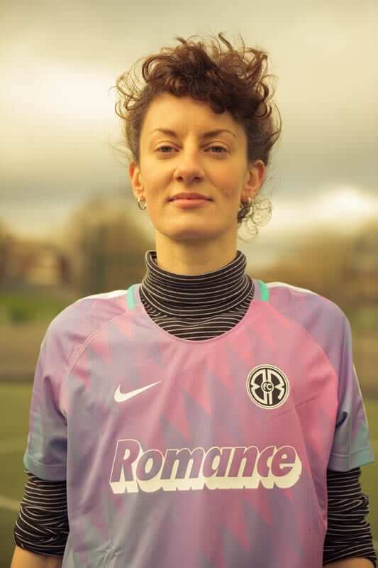
Twitter-er @Starkman55 recently pointed us toward an article about a grassroots women’s soccer team in East London called Romance FC, which collaborated with Nike to design a shirt that’s more, well, feminine than the typical women’s soccer jersey (as shown at right; click to enlarge).
That raises an interesting point, because women’s soccer — like many other women’s sports — often looks like an offshoot of the men’s game. Let’s start with the UK, where 32 of the 38 teams in the English and Scottish top two women’s tiers are affiliated with a men’s team.
The six outliers are English second-tier team Durham and five in Scotland: 12-time defending champions Glasgow City, top-tier teams Forfar Farmington and Stirling University, and second-tier teams Central Girls (which, incidentally, appears to use a derivative of Sporting KC’s logo) and Glasgow Girls.
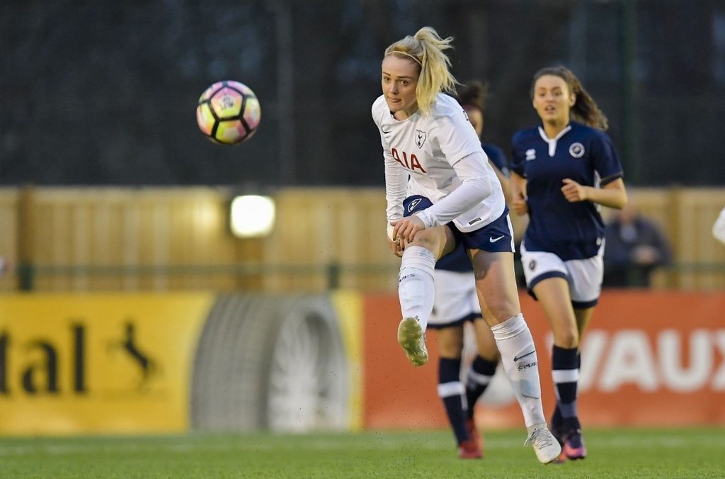
The other 32 women’s teams look pretty familiar, because they’re outfitted almost exactly the same as their male counterparts, with perhaps a few more ads plastered on (click to enlarge):
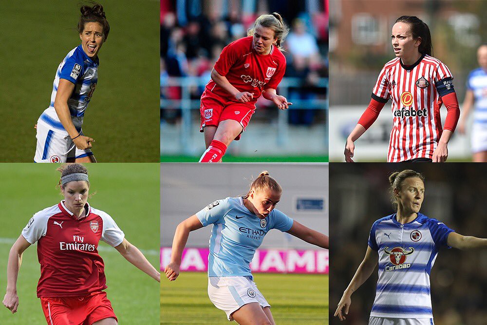
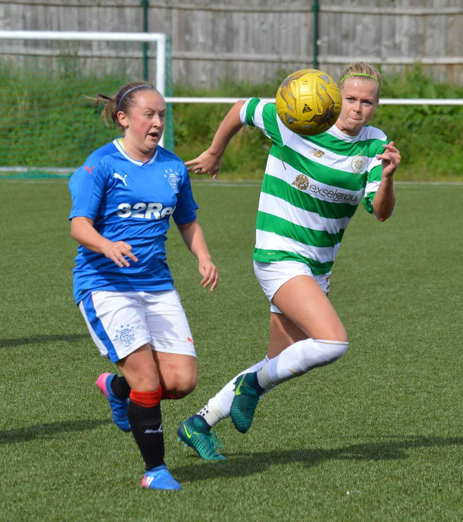
In the second picture shown above, Celtic’s shirts even have last season’s commemoration of the 1967 European Cup won by the men’s team.
It seems it hasn’t yet occurred to these teams that they can come up with designs that incorporate team color but nonetheless have a different look, as the U.S., Japanese, and German national teams have recently done.
Back home, four of the nine NWSL teams — Houston, Orlando, Portland, and Utah — are affiliated with and wear colors used by the MLS teams in their respective cities. However, three of those teams — all except for Portland — are the only ones in the league’s short history that haven’t used blue or red as their primary color.
That observation brings us to another point about the women’s game: It can be visually bland at times. Turn on most NWSL games and you’ll likely see the same colors repeated: blue, red, white, and black. Every team in the league except Seattle currently has a white shirt as second choice.
In the UK, thanks to low budgets, basic designs and manufacturers’ templates abound among unaffiliated teams.
There some potentially complicated issues at work here. On the one hand, outfitting the women to look more or less the same as the men may seem to give the women equal status and make them feel as “official” as the men’s sides, but it can also turn the women’s kits into little more than an afterthought or a rubber stamp. For example, why can’t Tottenham Hotspur Ladies — shown in the third picture above — make blue shirts first choice, rather than white? It would be distinctive and would also incorporate a design often seen in the team’s visual history.
Similarly, coming up with “more feminine” designs can give the women’s teams their own visual identity, but it also runs the risk of devolving into a clichéd ghetto of cutesy kit designs.
But at least for Romance FC, that risk was worth taking. It will be interesting to see if other women’s teams stake out their own aesthetic turf. It would also be interesting to hear what Uni Watch’s female readers think of all this — please let us know in today’s comments.
Update: As if on cue, just as this entry was being published, Everton announced that it was the first Premier League team to use its women’s team to reveal a kit — that is, before the men’s team.
(Thanks to Twitter-er @Starkman55 for sending us the article that initiated this discussion.)

Concussion discussion: College football conferences’ annual preseason media days are usually pretty rote affairs, but yesterday’s ACC Kickoff Day had a bit of juice thanks to UNC coach Larry Fedora, who made a fool of himself and gladly kept digging when someone offered him a shovel.
Fedora outed himself as a CTE denier, saying he believed certain medical studies and not others (spoiler: he believes the now-discredited studies that show low CTE risk from football) and offering up this whopper: “I’m not sure that anything is proven that football, itself, causes [CTE].” As many observers quickly pointed out, the link between football and CTE has been established right there at UNC, where Fedora coaches.
Fedora also cooked up an interesting conspiracy theory with a side of military jingoism. Check this out:
“Our game is under attack,” Fedora told reporters. “I fear the game will be pushed so far from what we know that we won’t recognize it in 10 years. And if it does, our country will go down, too.”
Fedora said he had talked to military personnel who had suggested the success of the United States military was due, in part, to the number of football players who went on to join the armed forces.
So when football fans chant “dee-fense,” they’re actually referring to our national defense. Who knew?
One writer has already responded to this nonsense by calling for Fedora’s dismissal.
Meanwhile, a new University of Michigan study shows that some of the school’s players had signs of brain injuries even though they weren’t diagnosed with concussions. Fedora could not be reached for comment, presumably because he was busy defending America’s national security (or maybe he was just dealing with UNC’s latest NCAA violations, which were reported last night and may result in as many as a dozen players being suspended).
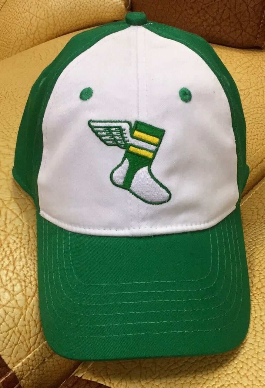
IMPORTANT cap update: As I’ve been mentioning all week, we’re now accepting pre-orders for the XXL size of the upcoming Uni Watch “alternate” cap. If we get enough XXL pre-orders to meet our suppliers minimum order requirement of 144 caps, we’ll go ahead and have the cap made in that size. (Otherwise we’ll issue refunds.)
Based on the early returns, it looks like we will not have enough pre-orders to move ahead with the XXLs. That’s a bit of a surprise, because when I asked if people would be willing to pre-order, 168 people said yes. But so far we have only 16 pre-orders. That’s not going to cut it.
I’m keeping the pre-order window open until the end of next week, so there’s still time to turn this around. But if you want the XXL, I suggest you get on board now.
Meanwhile:
• Fitted sizes of the Uni Watch “classic” cap, available exclusively from Ebbets Field Flannels, are back in stock (although several sizes have already sold out again). Order yours here.
• My epic stoop/open-house sale, which will feature a ton of uni-related books, dozens of pairs of stirrups, and more cool collectibles than you can shake a C-Flap at, will take place this Saturday. Full details here.
The Ticker
By Paul

Baseball News: Here’s a rare sight: former Reds SS Barry Larkin wearing No. 15, instead of his more familiar No. 11. He wore 15 only in 1986 and ’87 (from Jason Hillyer). … After the Tuesday-night kerfuffle about Brewers P Josh Hader having posted bigoted tweets when he was a teen-ager, his family members, who had been wearing Hader jerseys while attending the All-Star Game, were given generic NNOB jerseys. … At least one other fan wearing a Hader jersey turned it inside-out. … Something I missed from yesterday’s MLB All-Star Game roundup: Cubs C Willson Contreras was wearing a catcher’s helmet with a navy crown and a red brim — probably a Nats helmet. … The Asheville Tourists will become the Asheville Hippies for Thirsty Thursday (thanks, Phil). … Check out the uniforms for the Chicago Police Department baseball team. … All-Star Game batting helmet mix-ups aren’t limited to the big leagues. … Here’s a really great story: Up until now, the only footage of Ted Williams’s final game in 1960, when he famously hit a home run in his final at-bat and refused to tip his cap to the cheering fans, was in black-and-white. But now color footage — shot by a 19-year-old art student who was cutting class that day and buried since then in a desk drawer — has come to light (NYT link).

NFL News: SB Nation apparently told their NFL bloggers to fill some dead air with uniform musings. It’s all pretty rote, but if you’re so inclined you can read about how the Broncos should make their Color Rash helmet their permanent helmet; how the Pats should keep their Color Rash jersey; how the Cardinals need to update their look; how the Steelers could make a few tweaks; how the Bengals can improve their uniforms (no jokes, please); how the Packers shouldn’t change a thing; how one change could improve the Falcons; how the Ravens can improve their uniforms; how the Seahawks mono-neon uniforms should be mothballed; and how you can enter a Jets redesign contest (thanks, Phil). … A Bengals fan had twin babies whose heads need to be reshaped, so he’s had them fitted for Bengals-themed cranial helmets (thanks, Phil). … Steelers WR Antonio Brown is the first player ever to appear on a Madden box cover without a helmet. … The 49ers will wear their white throwbacks for a Week Seven game against the Rams. Here’s hoping the Rams wear their royal throwbacks. … Titans DL Jurrell Casey says he plans to continue protesting during the national anthem, even if he gets fined as a result. … This is interesting: Cowboys QBs don’t wear no-contact jerseys during practices, and nobody seems to know why.
College and High School Football News: New logo for the ACC Network (from James Gilbert). … An Alabama fan wore a clever jersey to yesterday SEC media day (from Josh Claywell). … Drew Canady’s father is working on a website that shows all of New York State’s high school football helmets. … Here are the new rules regarding logos appearing on NCAA gridirons this season. The big change is that corporate advertising logos can now appear on the field for stadiums with corporate-advertised names. Click through the three images in that tweet for the full details, and then scroll down to see the new rules regarding jersey patches (from James Gilbert). … Also from James: Someone at ACC Media Day had a healthy sense of irony.

Hockey News: The SPHL’s Quad City Storm haven’t even played a game yet, but they’ve already announced a logo revision. Apparently their first logo, released last month, was just a placeholder while they finalized the design.

NBA/WNBA News: Here are the uniforms for the 2018 WNBA All-Star Game. … Oooh, a St. Louis community organization has refurbished a local gym with the old Spirits of St. Louis logo (from @mrmichael21). … Timberwolves C Karl-Anthony Towns modified the team’s logo for his own kids’ summer camp logo (from Collin Kottke).

College Hoops News: Kentucky players have been wearing Jordan/jumpman practice gear, which led to speculation that the school’s game uniforms might also be getting the Jordan treatment. But that won’t be happening anytime soon (thanks, Phil). … Nevada tweeted a graphic showing the school’s 2018-19 nonconference schedule. Oddly, the graphic has an Adidas logo at the bottom but shows a player wearing a Nike uniform (from Phil Kudler).

Soccer News: The Thai boys who were recently rescued from a cave appeared at a news conference yesterday wearing their soccer team uniforms. … New home kit for Napoli (from Ed Zelaski). … New third kit for Arsenal. … A Brazilian fan had a Flamengo jersey tattooed onto his body (from Mike Chamernik). … New crest for Ascoli (from @klimberginho). … New kits for Ukraine Kiev Dynamo. … Loudoun United have joined the USL for 2019 and have released their badge (from Josh Hinton). … Defender Jaelene Hinkle has been recalled to the U.S. women’s national team, one year after declining a call-up because she did not want to wear the team’s LGBTQ Pride Month jerseys (thanks, Phil). … Here are the uni- and field-related rule changes for the 2018 NCAA soccer season (from James Gilbert). … New kits for Tottenham Hotspur (from our own Jamie Rathjen).

Grab Bag: New name and logo for the Nigerian national airline. … Interesting piece about the legal issues surrounding tennis player Roger Federer’s “RF” logo. … As we mentioned in the Ticker earlier this week, President Trump was thinking of giving Air Force One’s livery a red/white/blue redesign. Now it’s definitely happening (from @VerbDC). … The Illinois State Police announced the winners of a logo design contest. … New logo for the Trout Creek, Mont., Huckleberry Festival. … There’s a bit of a controversy surrounding a Tennessee company that makes zippers for U.S. military uniforms but has been accused of using some non-U.S. parts. … Nintendo has its own internal sports teams for company employees. Here are some of their uniforms (from Luke Plunkett). … Kim Kardashian is being sued for poaching another company’s logo for her new fragrance line. … New athletics identity for SUNY-Alfred (from Jim Wasko). … A new statistical analysis indicates that people wearing Nike’s top-of-the-line running shoe shave three to four percent off their times (NYT link). That article includes lots of fascinating info on how they crunched the numbers — highly recommended.
Typo. In the NFL section … You have Pakcers
Thanks. Fixed.
So roughly two minutes before this entry was posted, Everton claimed it was the first Premier League team to use its women’s team to reveal a kit – that is, before the men’s team.
link
I imagine cost has something to do with women using the same template as men. Interesting to see the budget for the women’s teams compared to the men. Additionally, isn’t it a benefit to have the women be associated with the men team. I assume you get a lot more fans by being associated with Tottenham Hotspur rather than just some random women’s team who plays in London.
Is it offensive to just design a purple/pink jersey and say that’s geared more towards women? (Not sure what women think about that) Clicking through, in the ‘benefits’ section of the explanation, they list three benefits which are exactly the same as would be for male jerseys, I expect (nice fabric, moveable arms, ventilation). I could understand if they were cut differently, or something, but the retail jerseys already are cut differently for women, so I expect the on-field jerseys do the same.
I like the Tottenham suggestion to use blue for the women, or maybe just switch the home/change jersey choice color, and obviously just don’t use the white. Or something like the USWNT who has used accents of gold/neon yellow while the men stay relatively consistent with red/blue/white.
Re: cost/budget, you’re right, that’s probably the case. The English top tier is required to be fully professional for this season, and I’m pretty sure the NWSL is, but the other leagues in this piece are varying degrees of semi-professional.
“I assume you get a lot more fans by being associated with Tottenham Hotspur”
Indeed, but the association doesn’t mean you have to look exactly the same, hence my suggestion. I actually realized after I wrote this piece that Heart of Midlothian (Scottish second tier) are usually wearing all maroon in pictures I see of them, while the men’s team only does that rarely and usually wears white shorts. A small, but noticeable difference.
That’s all I was getting at with THFC – their kits came out today (for the women too), so just flip which one is first and second choice.
I totally agree with your Tottenham suggestion. Something to keep it linked, but still unique.
I suppose having interesting or unique uniforms could actually get more fans (read, young girls) involved. In that sense, maybe the Romance FC uniforms do actually appeal to the right demographic (even if they look quite milk-toast and pandering to my adult-male eyes.)
Using the uniforms as a differentiator like minor league baseball clubs could be a big plus, though ideally not as garish or gimmicky and minor leagues. Certainly Germany women’s red or US women’s neon are unique identifiers not used by the men, and they work really well.
Don’t pander to woman by slapping pink on the jersey and call it done. I find it insulting and I truly hate it.
I remember a few years ago when US Soccer announced their “one nation, one team” slogan and introduced matching kits for the first time, the women of the USWNT were so thrilled to match their counterparts on the mens side. They finally felt like they were on an equal playing field (we’ll ignore the equal pay part for this conversation) or, at least that’s how it was portrayed publicly.
I like the idea of THFC womens club and other clubs wearing matching kits but flipping the script as mentioned in this post. Use the blue or 3rd kit color in their 2018/19 kits as primary.
As far as the NWSL or even the WNBA, I think it’s insulting that they basically get a generic template applied to every team in the league. That makes for a boring visual game. Spend a little bit of time and change it up, even if you have to do it gradually over a few years.
Out of all the NWSL white shirts, the only ones that are aesthetically worth mentioning are Portland’s (white and grey hoops) and Chicago’s, though it’s based off the city flag.
On the other end of the spectrum, some of them are just plain white.
As someone who grew up in the Chicago area and loves that flag they are my favorite kit! Their first couple seasons they had the best kit and didn’t use the same template that the rest of the league did. Now they’re on the same template but at least they’ve got those 6 pointed stars on there.
For people interested, here’s a rundown of all the Red Stars’ kits (except for the current black one):
link
I think the white/red/red combo that they’ve been wearing this season is a bit more interesting than the combos of white and sky blue, actually.
Also as someone from Chicago, the Red Stars jersey and aesthetic is amazing. Previous White/Sky Blue is obviously much better than the current black.
Especially without a sponsor, I wish the jerseys weren’t essentially single color, but get some design to break it up a bit on the front.
Your Epic Stoop Sale is almost worth making the trip from ATL to BKLYN. Will left-overs ever make it to eBay?
Hoping there won’t be any leftovers! And yes, you should definitely come up on Saturday — it would be great to meet you after all these years!
“Is it offensive to just design a purple/pink jersey and say that’s geared more towards women?”
– yes and also not a smart business move
“I could understand if they were cut differently, or something, but the retail jerseys already are cut differently for women, so I expect the on-field jerseys do the same.”
– I expected the cut and sizing of the kits to be the most important element of the design
My 8-year old daughter is a very passionate soccer player. She was very excited to learn that Manchester United was going to have a women’s team. It would be nice if she could wear a shirt that made it clear that she was supporting the women’s team
Man U’s kit release the other day was odd because there was zero mention of the women’s team until much later on the day of release.
(Compare that to THFC, who included the women in the reveal at the same time, or Everton, noted above.)
They’re restarting Man U WFC after 13 years – that might have been a good opportunity to, you know, better promote them.
On the last point, it irks me that USA Soccer sells replica men’s team shirts cut for both men and women, but only sells replicas of the women’s tram shirt for women. I care about the USWNT more passionately than the men’s team, so if I’m going to wear a replica jersey, I want it to be a replica of the women’s team’s jersey. Even if the only difference is the number of stars above the crest.
As a general matter, I prefer that national teams use the same uniforms for men and women, but the Netherlands’ recent women’s badge design with a female lion instead of a male was brilliant. (Covered here last year, but good images at this Buzzfeed link: link)
I seem to remember that the USSF sold men’s USWNT shirts after the 2015 World Cup, but, indeed, not just now.
I prefer to wear a mens or unisex cut vs a womans and I agree, I wish they sold the USWNT jersey in a mens cut so I have those two stars and get a Rapinoe jersey!
The England women are already referred to as the lionesses so it would make sense for to change the crest from 3 lions to 3 lionesses
meant to add that someone created exactly that – link
I have a USWMNT t-shirt (Johnston, who now goes by her married name, Ertz) in a men’s cut, but don’t recall seeing an actual UWMNT jersey in a men’s cut for sale.
Fanatics actually announced today the new USWNT jerseys in women’s sizes are available and men’s and youth sizes are coming soon.
Madden 18 also had no helmet for Brady on the cover
Also when it was only john madden on the cover he did not wear a helmet.
Baseball News Ticker: link says weearing…should be wearing.
Fixed.
The Cowboys dont wear red/no-contact jerseys because they are AMERICA’s TEAM!
Sincerely,
Coach Fedora
PS typo in the MLB section – extra E in “weearing”
CTE comment…that coach must have his head in the sand. In the school district that I work at students must watch a one hour proctored video about concussions (signs, symptoms, and possible long term consequences). They must watch this for every sport they go out for. This could mean they watch it three times a year.
On the concussion thing, that guy is just bonkers. Interestingly, I was a tweet from the new XFL yesterday asking fans if there was anything they’d change about the football uniform and surprising number of them said “no helmets”. I’d be on board with a non helmet, reduced-padding version of the game. I’m of the belief that more protection leads to more reckless players under the illusion that it will keep them safe. Of course we’d lose the iconic helmet designs but I think at the end of the day the game would benefit from it.
As for women’s soccer branding/kits, I think it’s a massive boost to legitimacy and support if a team is a part of a men’s club. I like the idea of the women’s side sharing the name, colors and crest but having distinct kit designs, but budget restraints restrict that. It is cool to see the team held up as just as an important part of the club as the men’s team. I think Arsenal even does a team photo with both teams included. As for NWSL, the teams that are affiliated with MLS would all probably share the names as their MLS counterparts if not for the convoluted marketing exclusivity deals MLS has for it’s teams and with Adidas (NWSL kits are all supplied by Nike since the league is basically run and subsidized by the USSF as a place for national team players to play)
Also bonkers: American history shows a clear and inverse relationship between the popularity of football and our nation’s success in war. Before Americans played football, we won or tied every war we fought, and also won almost all of our limited military campaigns. Since football has become our nation’s dominant sport, we mostly lose our wars and rarely even succeed in our limited military campaigns.
I understand that youth fitness is a real problem for the armed forces, and the government has tried to promote school sports as a matter of national military readiness since at least the 1970s. I know retired basic-training instructors who bemoan how out of shape recruits are today. But if ex-football players are among the best recruits these days, it’s not because they played football. It’s because they were athletes. If tomorrow we outlawed football, most youth football players would switch to different sports, and they’d be just as fit when they enlist later. After all, the countries where most military recruits played youth soccer tend to win the wars and campaigns they fight, unlike the United States.
This argument is pretty baseless. In the industrial age the size and “fitness” of your soldiers is much less critical to the success of a military campaign as compared to the weapons technology, intelligence gathering capabilities, and strategy of the military.
Do you think we we’re successful in Vietnam because the soldiers weren’t fit enough? Do you think we can’t fully wipe out radical elements throughout the middle east because those insurgents played youth soccer compared to US military members having played youth football?
A basic level of physical fitness is necessary for combat, but even if one army is full of olympic level athletes that isn’t going to mean much if their strategy is flawed and their are outgunned with their air force, tanks, etc.
Fedora’s assertion that there’s a relationship between football and the “success” of the modern American armed forces is what I’m calling bonkers. First, what success? We lose wars. As a matter of national policy, we choose to lose wars. The last time we were on the brink of maybe just barely winning a war, we literally held a vote and choose to stop trying to win that war and go start and lose another war at the same time instead. We could institute a policy of recruiting only the fattest, slowest 10% of 18-year-olds and we’d lose our wars just as badly as we do already. That’s my point. If we want to try to draw larger historical conclusions, we could look at the record of wars and campaigns prior to 1901 (wins or ties every time), from 1902-1960 (mostly wins, but a few losses), and 1961-present (mostly losses, one meaningful win, two minor wins). Which would correspond to the periods before football was a common sport, when football was a growing sport, and since football became America’s dominant sport. Now obviously football isn’t really the cause of anything, but coach Fedora said it was, so it’s worth comparing his bizarre logic against reality.
As to the rest of your comment, we vastly outgun any foe on the planet, and yet we still mostly lose wars and campaigns. So maybe something about the soldiery – their fitness or motivation – really does matter after all. Turns out that you can’t just throw money at the battlefield and win on the basis of better equipment or more bullets. Which you’d think we’d understand, having won our national independence against a better-funded, better-equipped, and better-trained army.
Where a lot of things discussed around here come together is the increasing division of Americans into passive spectators and ¨action men¨, where the former increasingly worship the latter while their real lives have less and less in common with them. Thus the National Anthem/Flag/military issues in sports dovetail with the writings of Andrew Bacevich, an infantry officer in Vietnam who has become an author critical of the use of the all-volunteer military to isolate the civilian population from the consequences of war in exchange for the latter having to obsequiously Support the Troops by never questioning their generals, and sit thru ever-growing mountains of military propaganda at sporting events. It creates a military that Bacevich views as a caste dangerously divorced from the nation and democracy. It´s not surprising that the post-industrial citizenry embraced this weird deal when it was becoming increasingly sedentary and passive (and obese). But the same thing seems to have happened with athletes. Soldiers, athletes, and superheroes all seem to be a merging fantasy-self that media-addicted Americans increasingly use as an escape from their physical reality.
As to why a society that screwed up can´t win wars against hungry teenagers, well, maybe people like that no longer are clear as to why they should make any material sacrifices to win one war (as opposed to sacrificing their responsibilities as citizens to question permanent war). As Bacevich argues, the military is quite happy with this. It´s not there to win wars, it´s there to perpetuate itself and its spending of our tax dollars.
I’ve often thought the same. That if you eliminate helmets, or go back to something like the old leather ones, things could become safer. The current helmets have created an illusion of protection that we now know simply isn’t there. It changed the way people played, and especially on the youth level, the emphasis on proper tackling technique disappeared when just hitting someone became an viable alternative to taking them to the ground.
I can see a future for football where there are no facemasks on the helmet, smaller shoulder pads, and as a result more form tackling and safer play.
I can’t recall the exact name, but there is a semi-pro football league out there where the players go helmet-less. I have no idea how this effects the quality of play or safety.
I do recall reading that in the pre-helmet days, a lot more severe head injuries such as broken skulls were happening, and in some cases they resulted in fatalities. Teddy Roosevelt famously suggested that the sport should be totally banned.
It does seem that modern football helmets do a very good job of protecting players from severe head injuries. It is only recently that we’ve learned about the danger from the accumulation of many years’ worth of sub-concussive blows to the head.
The game is called Townbeef. There´s a Townbeef Football League in the Northeast.
I’m really worried Air Force One is going to end up looking like the tour bus for the Charlie Daniels Band.
Ted Williams looks like he is wearing a shinguard on his right leg in that 1960 last game color film.
I noticed that too! You can see him taking it off after making the third out of an inning.
The amazing part of that story to me is how Bill Murphy tried to get ESPN and the Red Sox interested in his film and neither entity apparently even wanted to view it. I wonder if that was due to a low level associate making the decision based on avoiding extra work or just not feeling as if Murphy had any credibility. Either way, both organizations clearly missed out.
I was struck by the empty seats. Hey! This was Ted Williams last game in Boston… ever!
Attendance: 10,454.
Lee
Baseball’s dying. It’s always been dying.
The last 2 seasons of the NY Giants baseball team they averaged under 8,500 fans a game. With Willie Mays.
I like the XXL design, but hate flex fit hats. They just don’t seem to fit my head that well. I would rather have an adjustable or low crown version of it. But I wasn’t one of the 168 “yes” people…
Hate to be that guy again but in the baseball ticker section it’s Willson Contreras not Wilson. That’s always a tripwire.
Got it. Thanks!
I believe I was one of the 168, but I’m a size 8 on hats, and when I saw the XXL on the size chart didn’t get close to that, it was a no-go for me.
RE: Women’s soccer uniforms. I’m the kind of person who really loves that all Pittsburgh teams have the same color scheme. So to me, if a women’s team is in any way associated with the men’s team from that city/region, of course you have similar, if not exactly the same uniforms (since it is the same sport, they can wear the same thing). You are representing the same civic connection that the men’s team has, why not wear the same colors, etc.
Now if there is no association with an established men’s team, no need to force a connection.
As far as the use of pink, purple, or other more feminine elements, why not go for it. Pretending gender norms and the like don’t exist is silly. Forcing people into those norms is wrong, but they are norms for a reason, people gravitate towards that on their own due to the natural biological differences in the brain chemistry of men and women. It just so happens that one of those difference has to do with the use of the color pink. It is more popular among women, so why not have it in play as an option for the color of women’s sports teams.
Sorry, totally disagree on “gendered” colors. The use of pink as a feminine color, I believe is a social construct, I’m unaware of anything having to do with brain chemistry. Pink was a much more masculine color years ago; today’s Nantucket Reds (pink-ish pants) come from, I believe, fisherman from Brittany, France. Sure, there are “norms” but only because they evolve with time and place, and I doubt there’s a lot of rhyme or reason behind a lot of norms.
There is certainly a social component to it, that society reinforces the norms, but the norms tend to spring up on their own naturally from the way most people express masculinity and femininity. And no doubt the idea that pink is “a girls color” is a newer phenomenon. How it came to be that way? From what I understand pink was always associated with youth, vitality, and beauty. We generally regard beauty as a desirable trait among women, and with men, you often see strength as the desirable trait. So perhaps it is simply that, we associate pink as a beautiful color, and associate beauty, both the quality of being beautiful and the desire for beautiful things, as feminine things?
That Hader kerfuffle is reprehensible. A few “bad words” from years ago results in literal un-personing. Despicable. His cowardly “family members” should be ashamed of themselves. It’s as bad as all the retarded pearl-clutching about Josh Allen.
In the Ted Williams video, I love the burnt out grass in Williams’ LF positioning spot.
As a UNC alum, I’ll come to Fedora’s defense here…
If you read the unedited transcript of Fedora’s remarks, the media reports are misrepresenting what he said somewhat regarding CTE. He talks at length, in fact, about the efforts being made to make the game safer and points out that UNC has long been at the forefront of studying the effects of head trauma on players.
link … s-verbatem
And he is certainly correct that simply playing football does not cause CTE, even if his wording was clumsy.
Now, as far as the game being “under attack”, I don’t think I would have used that term but he’s not exactly wrong about it, and certainly he is not offering up a “conspiracy theory”. It’s mostly just a football coach saying football coach type things – he’s hardly the first sports coach to talk about the positive lessons that can be learned from playing sports.
To be fair, his remark about how the country will “go down” if we stopped playing football was pretty ill-advised, but at worst he’s simply expressing the opinion that a lot of the lessons learned by football players are similar to things the military instills in soldiers.
And while I’m very hesitant to tell Paul what he should and should not write about on his own blog, this entire entry seems a little out of place since it has nothing to do with athletics aesthetics in any way. So it comes across as a bit of piling on considering Fedora’s remarks have gotten plenty of somewhat hysterical coverage all over the sports media world, perhaps due to not having much else to talk about in mid-July. I mean, there is absolutely nothing he said that a reasonable person should conclude is a firing offense. I mean, if a football coach believes that playing football has nothing but negative effects, then he really shouldn’t be coaching, no?
this entire entry seems a little out of place since it has nothing to do with athletics aesthetics in any way.
“Concussion discussion” is and has always been relevant here because it pertains to protective headwear. As you know, I’ve written quite a few pieces, both on ESPN and here on the blog, about new helmet designs, all of which are based on protecting against concussions and, ultimately, CTE.
We can disagree about Fedora, but the topic is very much in Uni Watch’s wheelhouse.
Fair enough. Like I said, I don’t want to come across like I’m telling you what you should or shouldn’t write about.
But I do think that Fedora is getting a bit of a bad rap here, again if you read his full unedited comments on the matter he does agree that we need to continue to find ways to make the sport safer (and that UNC is at the forefront of this effort) and he is correct that simply playing football does not mean that a player is going to suffer from CTE.
I think in general, people tend to be defensive of the industry that puts food on the table.
Just to add that at least not everybody in the sports media is taking cheap shots at Fedora:
link
“Also from James: Someone at ACC Media Day had a healthy sense of irony.”
Link is either broken or the tweet was deleted. Assuming it’s the later, can anyone share what it was?
It was a sign that said “No Tripods” — and the sign was positioned on a tripod.
Re the color of women’s soccer jerseys: If the team is associated with the men’s team, I think they should wear the same basic colors as the men’s team even if the design is different. For example, Tottenham is known for having navy shorts and white shirts. Chelsea is known for having blue shirts and shorts. If someone were to wear a navy blue Tottenham kit or a white Chelsea kit you’d be able to recognize the team due to the badge (and the ads as well) but most people would think of that as the away/change/second/third kit. Having women wear a different color seems to put them in a secondary position as the alternate colors would again be seen as the away/change/second/third kit. I take the USWMNT as unique situation given that their historical success relative to that of the men’s team.
The USWNT isn’t quite supporting the point you’re trying to make, though, because even though there might be different accent colors they still wear white primarily.
As for me, if I saw someone wearing a blue Tottenham shirt, it’s still a Tottenham shirt even if it’s blue. I wouldn’t see it as secondary to white.
Loved the color footage of Ted Williams’ final game. Thanks for posting it.
It’s not surprising that NFL fans are constantly clamouring for teams to scrap 90’s redesigns and go to throwbacks.
90’s logo and uniform design is so dated. That era, ushered in by computer aided design, brought in 2 terrible trends that remain to this day:
1) Humanizing animal logos with features like teeth on birds, fingers on insects and expressive eyebrows and mouths. Everything got overly cartoonish and silly.
2) The end of hand drawn logos made everything look “too perfect” and sterile with as many extra layers and details that could fit in a design (creating overdesigned logos like Atlanta and Jacksonville)
It’s no coincidence that people gush over the cleanliness and simplicity of traditional unis like Dallas, Pittsburgh, Oakland and Green Bay. I’d take the gritty Kansas City logo with that awesome jagged arrowhead border over the CorelDraw generated Patriots logo any day.
So listen to your fans, Tampa, Denver, New England, Miami, Cleveland, etc. Modernising is ok (see San Francisco and Minnesota), but Disney-izing is just wrong.
DeMarcus Cousins’ intro press conference included him holding up a Warriors jersey with sans-serif lettering for the NOB (the on-court jersey since the team redesigned them in 2010, revamped by Nike this past season has always had serifed block lettering for the NOB). Do you think this was either:
-The W’s being cheap and using a knock-off jersey
– An update by Nike to the NOB lettering font
Cousins also was issued the number 0, most recently worn by guard Patrick McCaw who is a RFA whom the W’s have early rights to re-sign. Should they do so, McCaw likely has to chose a new number.
– another possibility: it might’ve been a rush job (though unlike a mid season trade or signing, this is during the off-season and several days after the team officially announced signing Cousins, so one would assume the team’s equipment guys would’ve had time to sew his NOB using the proper font).
That Bama fan certainly has a weird last name!! Oh, now I get it……