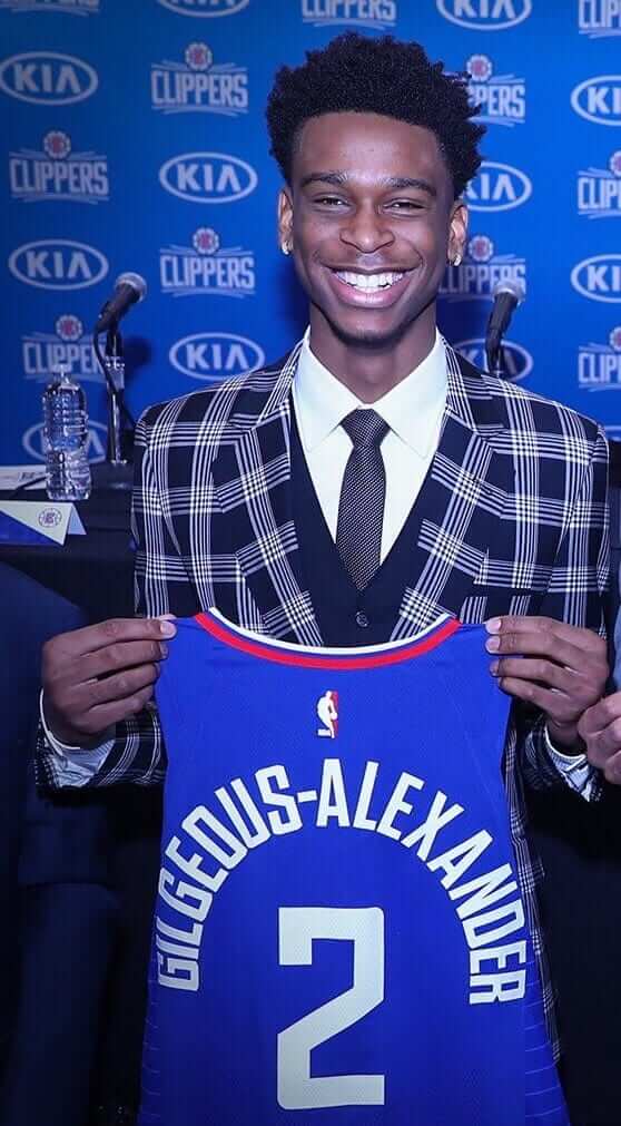
Last Thursday I wrote about some issues regarding hyphenated NOBs. Now we have NBA rookie Shai Gilgeous-Alexander, who was drafted last week by the Hornets and then immediately traded to the Clippers, who yesterday assigned him No. 2 and gave him his first jersey. His NOB — 17 letters plus the hyphen — is reportedly the longest in NBA history, eclipsing that of the previous record-holder, Michael Carter-Williams.
Long NOBs are trickier in basketball than in other sports, because tank top tailoring doesn’t provide as much space to work with as a sleeved jersey, but it looks like the Clippers did a good job of lettering up Gilgeous-Alexander’s name. Nicely done!
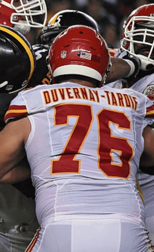
Gilgeous-Alexander’s hyphenated NOB isn’t the only one that’s been in the news lately. As we reported in yesterday’s Ticker, the NFL has decided not to allow Chiefs offensive lineman and recent medical school graduate Laurent Duvernay-Tardif to have “M.D.” added to his NOB.
Duvernay-Tardif already has a 15-character NOB, including the hyphen. If the NFL had granted his request, that would have added two more letters, plus two periods, plus a space. (It might have been a bit more efficient to put “Dr.” in front of his surname instead of “M.D.” after it.)
Most of the chatter I’ve seen about the NFL and Duvernay-Tardif has been of the “No Fun League” variety, chastising the league for being so uptight. Personally, I’m of two minds about it. I think it would be fun to see “M.D.” on a nameplate, just like it was fun to see Wahoo McDaniel’s nickNOB, Elvin Hayes’s assorted NOB oddities, and lots of other unusual NOBs over the years. On the other hand, in an era dominated by social media and “Look at me!”-ism, does anyone really believe Duvernay-Tardif would be a one-time exception? You know what would come next: “I’m the first person in my family to go to college, so I want ‘B.A.’ on my jersey” or “I just earned my master’s in communication during the offseason, so I want ‘M.A.’ on my jersey.” And so on, as everyone tries to burnish their “personal brand.”
On the other-er hand, sometimes a move like this can work out. When Ichiro Suzuki began playing for the Mariners in 2001 and received permission from MLB to wear his first name on his jersey, as he’d done in Japan, I thought for sure that other players would follow. As it turned out, that didn’t happen, and now Ichiro’s NOB is one of the many things that have made his career such an interesting chapter in baseball history.
Could things have turned out similarly with Duvernay-Tardif and his physicianly suffix? For better or worse, we’ll never know.
Collector’s Corner
By Brinke Guthrie
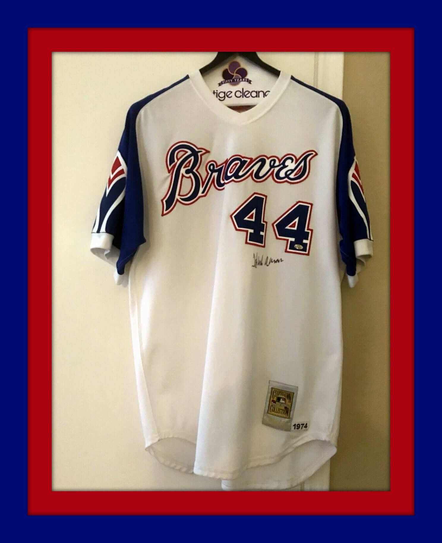
The Atlanta Braves wore these beauties this past Friday in honor of Hammerin’ Hank Aaron, and the Hammer himself signed this contemporary Mitchell & Ness reproduction. For my money, along with the Tequila Sunrise Astros, this was as good as design got back then! (Here’s an interview with the guy who designed the jersey, in case you missed it in the Ticker over the weekend.)
Now for the rest of this week’s picks:
• Here’s an item from another Atlanta team: Check out this Atlanta Flames T-shirt.
• DeLong made this 1970s NFL Alumni corduroy jacket.
• Ladies and gentleman, may I present this 1970s Montreal Canadiens beach towel, featuring a hockey logo that’s as timeless as the Yankees’ interlocking NY.
• Reader Matthieu Sossoyan sent along this NHL All-Star Game prototype jersey that was never used.
• This 1950s St. Louis Cardinals baseball cap was brought to you by Red Man Tobacco.
• Another one for the Cards from the same era: Alvin Dark says “Spalding Sets the Pace in Baseball” on this vintage point-of-purchase display stand.
• They didn’t get the look of the pirate quite right on this 1970s Pirates inflatable bat.
• This 1970s Bengals Riddell helmet plaque is in pretty good shape, I’d say.
• NFL thermal mugs are a mainstay here on Collector’s Corner. How about an entire set from the 1970s-1980s?
• The Bengals, Saints, and Niners among the teams featured on this set of two 1970s NFL wood burning plaques.
Seen an item on eBay that would be good for Collector’s Corner? Send any submissions here.
XXL poll reminder: In case you missed it on Monday, I’m still looking to see how many people would be willing to prepay for an XXL version of our upcoming “alternate” cap. Fully details here, and you can vote below (please don’t vote in this poll if you’ve already done so — thanks!).
[totalpoll id=”97844″]
The Ticker
By Alex Hider

Baseball News: The Angels and Royals played their Jackie Robinson make-up game yesterday, with all players wearing No. 42 (from Barry Katz). … We noted in one of last week’s tickers that home plate at MLB Network’s studio was backwards. It seems that someone took notice and fixed the error (from David Eng). … An Italian heritage group is canceling on the Staten Island Yankees over their Pizza Rats promotion (from Kary Klismet). … Speaking of the SI Yankees, one of their bat boys wore a road jersey at home on Sunday, and the team continues to use an inconsistent number font (from Eric Hoey). … The Catcher Was a Spy, a biopic about the incredible life of MLB catcher Moe Berg, was released last week. Our friends at Ebbets Field Flannels made the unis for the film, and this NYT piece about the movie offers some sneak peaks of their work (from Jerry Cohen). … Lots of Indians items available at this Ohio estate sale, including a copy of the infamous photo of Bert Blyleven mooning the rest of his team (from Don Leonard). … Reader Edwin Bonner is a Rangers fan and turned 34 yesterday, so he had himself a Nolan Ryan birthday cake. Happy birthday!
College Football News: New uniforms for Western Kentucky (from @TheMink9). … In 1969, 14 black players were dismissed from the Wyoming football team for staging a protest against racism in the Mormon church prior to a game against BYU. Later that year, the entire San Jose State team wore black or multi-colored armbands when they played Wyoming (from James Gilbert). … Hmmm, is this a new ECU jersey? (From ACC Tracker.)

Basketball News: Uniform designs for all 72 teams in The Basketball Tournament have been released. My personal favorites: Bearcat Jam, Johnnies and Gael Nation. … Former Cav Kyrie Irving, who wore No. 2 when he played in Cleveland, has no problem with the Cavs’ first-round pick, Collin Sexton, wearing that number. … The Jazz typically wore gold numbers with a white outline on their purple jerseys in the early ’90s. However, for at least one preseason game against the Knicks in 1994, the Jazz wore white numbers with a gold outline. Anyone know why, or if the Jazz ever wore these again (from Kurt Adison). … A Milwaukee city employee painted Bucks-themed fire hydrants that will be installed near the team’s new arena (from @mikeobs). … With James Harden having been named the NBA’s MVP last night, a Houston-area Papa John’s will sell Harden-themed pizzas (from Ignacio Salazar). … New court design for Rutgers (from Michael Romero). … Here’s an old photo, probably from the 1960s or early ’70s, showing Iowa and South Carolina going color vs. color. Belted shorts, too!

Soccer News: We have a New York Times editor to thank for getting accent marks added to the NOBs of Mexican players (NYT link). … This is a really satisfying look at all the World Cup jerseys (from @TezzaCFS). … A few notes from our own Jamie Rathjen: New second kits for the Scottish Premiership’s St. Johnstone (also from Ryan), and new first kits for Dutch team Feyenoord first kits for Cardiff City of the Premier League (those last two also come courtesy of Josh Hinton). … New home kits for Italian club Inter Milan (also from Josh Hinton). … New home and away kits for Swansea City of the EFL Championship (from Hunter). … Here’s World Cup teams reimagined as Formula 1 cars (from Chris Bisbee). … Four teams in J1, Japan’s top soccer league, have unveiled BFBS jerseys (from Jeremy Brahm). … Here’s why Ander Herrera of Manchester United goes FNOB.

Grab Bag: Over the weekend, the Philadelphia Flyers very quietly announced that they’ll be wearing black alternate uniforms this upcoming season (from Phil). … This may have been ticked before, but for those who haven’t seen it: A short film has been released about Milton Glaser and the history of the I <3 NY logo (from Max Weintraub). … Members of Okilly Dokilly, an Arizona-based metal band, all dress like Ned Flanders of The Simpsons when they perform (from @walbergLines).
So that ECU uni pic…I gotta say that the uni was NOT the part of the pic that most captured my attention.
Okilly Dokilly’s got nothing on Mac Sabbath, the metal band that dresses as McDonald’s mascots: link
The Jackie Robinson game was Angels, not A’s.
Fixed.
I know I’m going to come off like an old man yelling at kids to get off his lawn, but enough is enough with the letters. While Dr Duvernay-Tardif earned his letters and should be proud of them, they’re not his last name and his degree has no standing on a football field. I have a numeral suffix and a professional degree but neither belongs on a sports jersey. I’m proud of my family heritage and very proud of the letters I have earned, but outside of work correspondence, I don’t include them in other spheres of my life. Being a physician is irrelevant when I am renting a car or renewing my driver’s license. It’s “NOB”, not “NOB + fun facts about where I can from or what I do”. If your dad is on the same team, and you have the same first and last name, I get adding “Jr” and “Sr” for clarification (if the uniform number doesn’t do that for you already). But that’s happened a handful of times in sports.
Up vote this.
But..but…how can he show that he’s exceptional?
Agreed. But if the NFL is going to allow generational suffixes, which are not part of a person’s surname, then it has no grounds to refuse to permit titles, degrees, military ranks, and the like. Either both Griffin III and Page JD, or neither.
In other get-off-my-lawn-ism, enough also with the hyphenated surnames. This is the rare problem we can largely blame on my Generation X cohort. It seems like an easy solution to the problem of patrilinear naming conventions in which a wife is expected to subsume her own family identity under her husband’s. But it saddles children with hyphenated names that A) Are inconveniently long; and B) Cannot be passed down in the same way. John Smith-Jones may solve his parents’ problem with erasing his mother’s name, but what happens when he marries Jill Abbot-Costello? In one generation, we go from avoiding the problem of Mary Smith nee Jones to children with longer names than British nobles. There are ways to handle this that don’t descend into reducto ad absurdem for the grandkids!
When Paul brought this topic up a few days ago it caused me to search what happens to the hyphenated folk when they get married / have kids. I came across an NPR story from a few years ago noting that 1) the hyphen craze is slowly fading and 2) those faced with the name problem resort to just having to pick one of the many names, make up an entirely new name, or blend them into a portmanteau. None seem like great options and seem to defeat the purpose of the hyphen to begin with. While it might seem like a good idea at first it is not sustainable past one generation.
link
…She spent the last three months writing down her married name. “Mrs. Judy Hicks”, “Mrs. Donald Hicks”; “Mrs. Judy Mitchellson Hicks”, sometimes with a hyphen, sometimes without a hyphen. Sometimes, she spells the hyphen…
I’m actually replying to Peter. But that is an excellent deep cut reference. I literally laughed out loud. Well done.
Back in 1990, when the hyphenated name craze was getting started, I worked with a man who was married to a staunch feminist and refused to take his last name. When she got pregnant I asked him what last name the baby would have. He said the baby would have his last name. I asked if that was because it was a boy. He said no, he won the coin toss.
I also had a roommate in the army who got married and they took each other’s last name. He became “Jones-Smith” and she “Smith-Jones”.
Lord Zonker, Viscount St. Austell-in-the-Moor Biggleswade-Brixham
link
I’m really late to this party, but I wouldn’t just put this as a generational thing, it’s a cultural thing to carry parents’ names. In fact, my middle name is my mom’s maiden name. I suppose I could hyphenate, just never have, but standard naming conventions in my parents’ culture was to pass along two surnames.
In much of the Spanish-speaking world, it’s traditional that your full name is [given first name] [given middle name(s)] [patronymic last name] [matronymic last name]. With the matronymic often dropped. Or you’ll see it put in parentheses.
So for example my father might be Gerald James Smith Johnson, my mother might be Mary Catherine O’Connell Rogers, and I’d be Michael Lee Smith O’Connell. But usually go by Michael Smith. No hyphens. And it seems to all work out.
Swansea City was regulated to the championship this year
That’s immediately what popped up in my mind when I saw that in the ticker.
Those are Inter Milan’s change jerseys; their home jerseys are blue and black stripes.
Swansea City relegated, not in the Premier League anymore.
And the Inter kits are the 2018/19 away, not home.
Should be “perform” not “preform”. Also, I believe that’s Inter Milan’s away kit.
Besides the above, like, five comments, it looks like the J1 League black shirts (which actually are entire black kits) are to be worn on the field a couple times in August – and at home, at least for Cerezo Osaka – which wasn’t initially clear to me.
I usually don’t like calling soccer shirts BFBS, but those definitely qualify. Plus, I’m not sure what the sublimated numbers are supposed to be.
Also,
“This is a really satisfying look at all the World Cup jerseys”
It’s not all of them, only half (one for each team, it looks like).
Yep, one per team, apparently chosen in order to create a satisfying color wheel. Still a nice graphic!
I rotated the MLB Network logo and put the bat towards the point. I like the way the angularity of the bat and the helmet brim work with the angles of home plate. link
An improvement, but it’s such a poorly designed logo to begin with that no tweak to its basic form can make it good. It was pretty clear that the home plate prop was originally placed backwards so that the logo on the plate would read as right-side-up to the camera. Forcing MLB Network to choose between placing home plate backwards on a batter’s box set or displaying its own logo upside-down is very nearly the worst thing a logo for that network can do.
There would be a better looking black alternate uniform to the Flyers’ uniform design than what they have.
Trouble is that the Flyers cannot copy it. That design is the signature, iconic look of the WHL Medicine Hat Tigers and has been for decades. Great looking uniform in black with orange trim, with similar striping to the Flyers.
link
the Italian group protesting the Pizza Rats promotion is silly to me.
The Pirates logo in the Ticker looks like they made him Latin or African American. Manny Sanguillen?
I meant Collector’s Corner
I’d love to see what that Gilgeous-Alexander NOB would look like vertically arched.
Needs to be fixed in feed —
“New home and away kits for Swansea City of the Premier League”
AS a few have pointed out above, the Swans were relegated after the 2017-18 season. The feed should read:
“New home and away kits for Swansea City of the EFL Championship”
Fixed.
Good on San Jose State University again demonstrating racial awareness in 1969. Hopefully everyone knows SJSU’s role in the 1968 Mexico City Olympics.
I wonder how the major US sports would deal with a player with a “stage name,” like Pele or a myriad of other futbolers.
I couldn’t think of any off the top of my head. foreign players like Nene using their first name (or ichiro as paul mentioned) notwithstanding.
The Jazz wore that only in the 1994 pre-season — I believe it was a manufacturer thing? The Bullets did in the mid-90s as well.
link
I want to say the Pistons or another team did it too.
That happened to the Bullets in the ’97 preseason, but only certain players had the white numerals for some reason.
Kudos also to Dr. Harry Edwards for his role.
Apologies…meant to be a reply to muddlehead #26 above.
The estate sale with the Indians stuff is cool and all, but I think it glosses over one of the last pictures. It’s a football pendant and I think it’s from the Browns 1946 AAFC championship. I have a hunch it’s quite rare.
The kit I sent in was the away kit for Inter, not the home. Thought I said that in my email, but I may not have.
Re: Shai Gilgeous-Alexander’s jersey. Despite the 17 letters – plus hyphen – none of the letters actually touch each other at the bottom. Keeping that little bit of space open made the lettering job just a bit more challenging – but it looks great.
Right? Really nice job. They had a good font to work with, which helps, but they executed it really well.
There have been a lot of comments about World Cup teams wearing alternate jerseys to avoid questionable “clashes.” Did we ever confirm that the jersey choices were intended to avoid clashes?
I’ve noticed that every team that has played all 3 opening round games has worn both sets of kits, and only 3 teams who have only played 2 games have not worn their alternate kit: Germany, Japan, and Poland. If my suspicion is correct, teams are wearing both jerseys for other reasons (I suspect merchandising) than to avoid clashes.
The Television Match Official in rugby generally wears a suit or business attire.
I can’t speak for other states, but in North Carolina, most varsity football games have a fully dressed official whose sole job is to run the game clock. He participates in pregame discussions with the rest of the crew and, many times, walks out to the field with the crew before going up to the booth. Should an official on the field get injured, the clock operator would come down onto the field to replace him. If the injured official is able to, he would go up and run the clock for the rest of the game.
I’ve had that happen once in one of my games. The referee twisted his knee on a play in the first quarter where the QB fumbled and the defense recovered, returning the ball for a defensive touchdown. The R went up to the booth to run the clock for the remainder of the game. The back judge moved to the R position, while I (the line judge for this game) moved to the back judge position and the original clock operator took my spot at LJ.
The one lesson learned from all of this: Never eat too much food when working up in the booth. It was a cold night and the clock operator had just finished his second bowl of chili a few minutes before having to come down on the field.
Hey Paul … Uni-Watch is part of my daily reading. I’m on a fixed income, so thank you for keeping it free.
Now then, my three favorite TBT uniforms are: Purple & Black (I’m a K-State alum), Sideline Cancer (Power of Purple!) and Hilton Magic (I root for Big XII teams except KU).
Finally, a request: For Purp Walk 2019, could you switch to purple and silver instead of purple and gold? I think I’d buy a shirt in that scheme, providing my wife/CFO allows it.