As I recently mentioned here on the site, I’m going to be moving in with the Tugboat Captain at the end of the summer, so I’m going to be deaccessioning a lot of stuff over the next two months. But longtime pal/ally Scott M.X. Turner, who designs our membership cards, Naming Wrong T-shirts, and more, beat me to the punch — he and his family are moving across the country as we speak, and he recently sent me a box of cool stuff that he was getting rid of as part of his pre-move purge.
Let’s take a look, beginning with this excellent durene jersey (for all of these photos, you can click to enlarge):

I don’t think I’ve ever owned an orange shirt before, oddly enough. The orange tone is really nice, and the white on the UCLA inserts, cuffs, and collar is exceptionally clean and bright. It’s a smidge roomier than I usually like, but it’s close enough — I’ve already worn it once (you’ll see photos of that lower down in today’s post). Pairs really well with my blue/orange Gulf jacket, too.
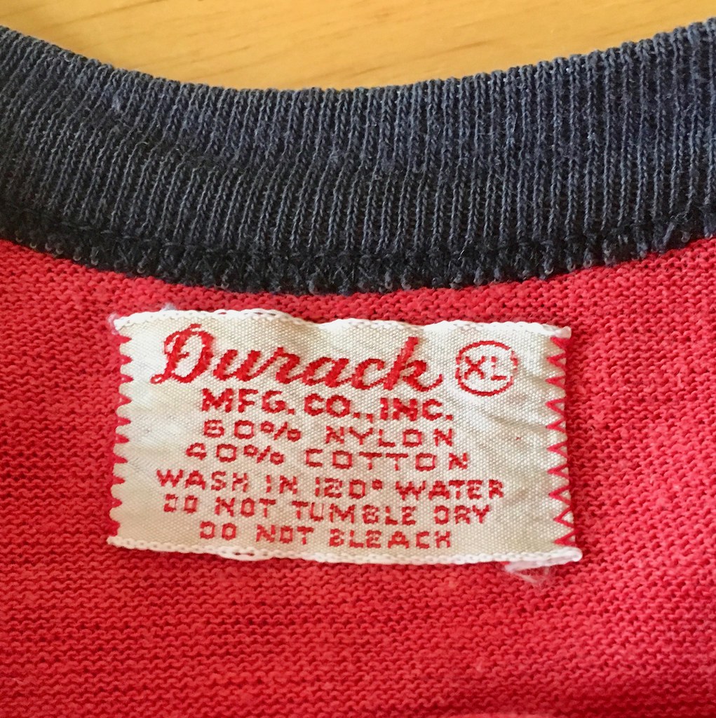
Here’s a look at the tagging (“Union Made”!), along with the name of the jersey’s original owner, which appears to be George, uh, somethingorother:

Next up is another durene jersey, this one apparently from the company softball team of a car dealership:
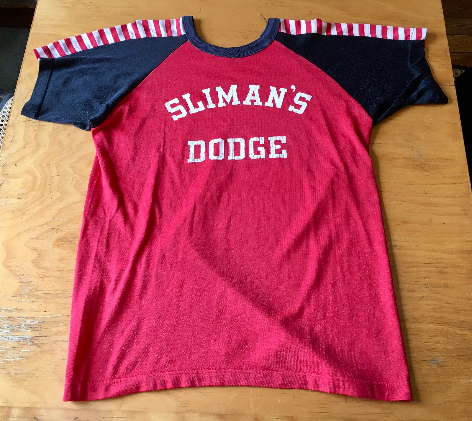
The Dodge dealership may be this one in Amherst, Ohio. I love the striping across the yoke, of course. I also like how the apostrophe appears to be slightly mis-oriented — it should probably be rotated a bit clockwise, but I kinda enjoy the imperfection.
The size is almost exactly the same as the orange shirt, so I’ll definitely be wearing this one too.
Next up is this excellent pair of woolen green stirrups:

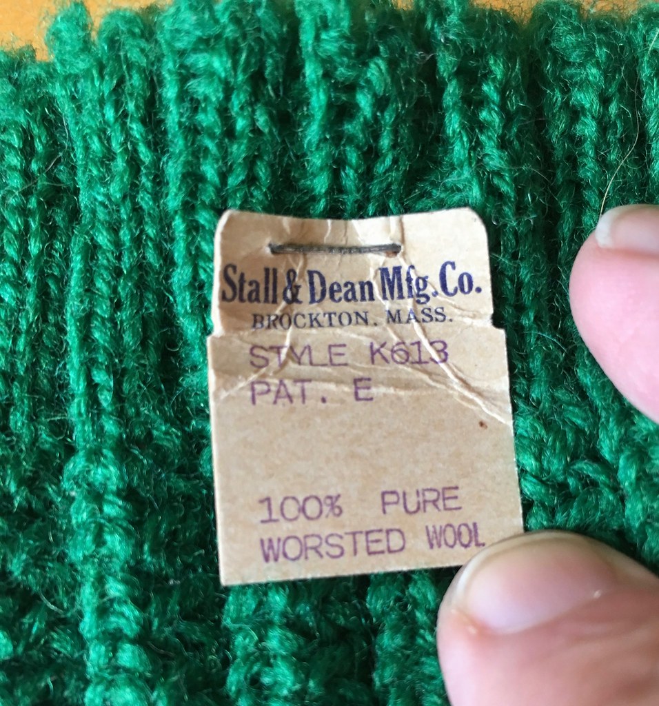
Naturally, these are right up my alley, Northwestern stripes and all. But the weather will have to get a lot cooler before I deign to try them on.
Next up is my favorite item that Scott sent me — check this out:

At first it sort of looks like a scarf, but it’s actually a durene swatch catalog. Each colored section is tagged with a color name:
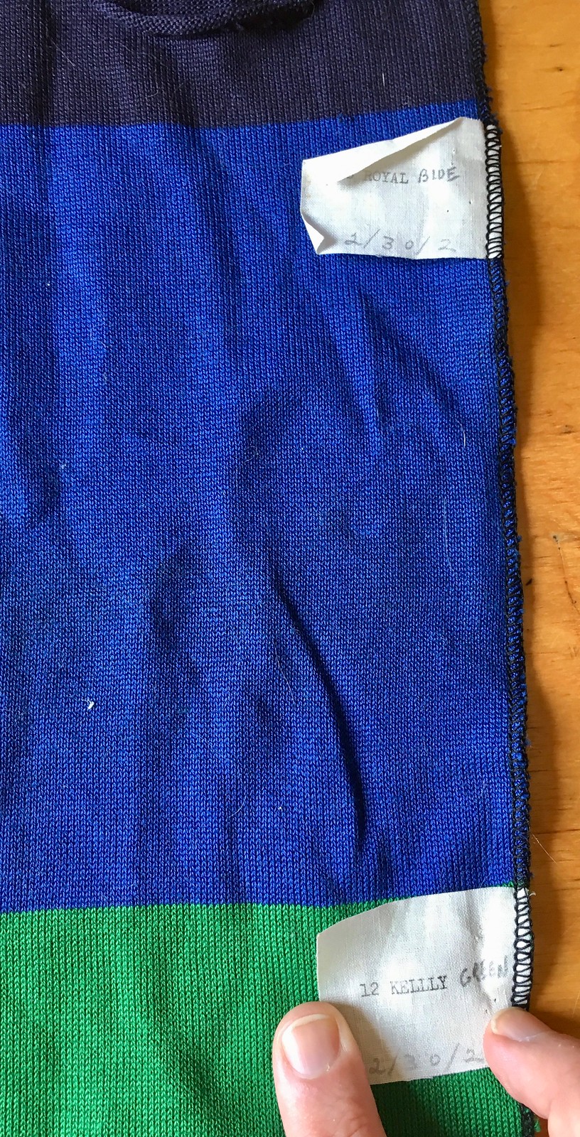
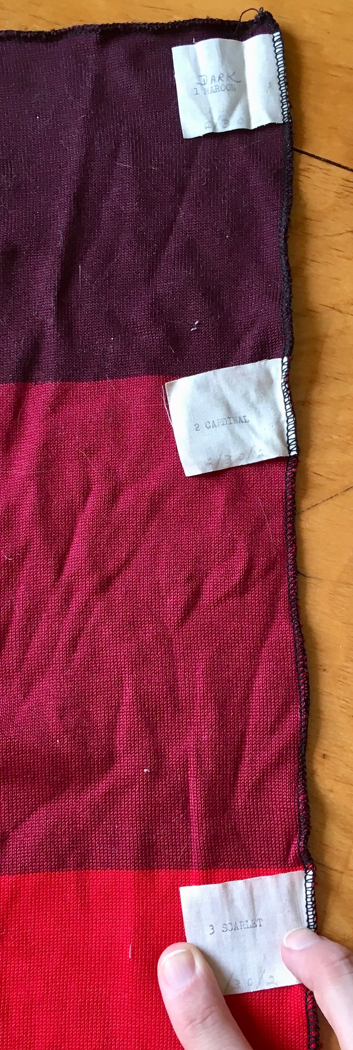
Scott doesn’t know which company or supplier it’s from, unfortunately. Still, I’m a huge fan of anything catalog-y, so I really, really love this item. But what am I going to do with it? I can’t wear it as a scarf — for starters, it’s more than 12 feet long, plus the little tags would be scratchy (plus-plus the purple section would give me a rash). I guess I could just put it on the shelf with all my other uniform catalogs, but that seems unsatisfying somehow. Maybe I could display it somehow. Hmmmmm.
Finally, there’s this:
It’s from 1963, 128 pages, and it should fit right in with my other vintage bowling publications.
I’m trying to lighten my load these days, not accumulate more stuff. But I’m so happy about all these items that I don’t mind. Thanks a heap, Scott, and travel safe for the rest of your trip!
XXL cap poll redux: About 10 days ago I told you about our upcoming Uni Watch “alternate” cap, which should be available for purchase around the end of July.
As I explained at the time, it will be a flex-fit cap, available in S/M and L/XL. We could do XXL, but there’s a 144-cap minimum order, and I wasn’t sure there’d be enough XXL customers to justify that investment, so I ran a poll asking how many of you would be willing to prepay (figure somewhere between $30 and $35 for the XXL, plus shipping) for an XXL cap. I think about 30-some people said yes, which obviously isn’t enough, so I figured that was that.
But reader Ken in Albany points out that the “Yes” vote is now up to 66 people — still not enough to justify ordering 144 caps, but getting closer. So I’m going to showcase the poll again today and over the next few days, for people who might have missed it the first time I ran it. If you already voted, please don’t vote again (I don’t think the polling software will let you vote twice anyway). But if you’d be willing to prepay for an XXL cap, please let your voice be heard here:
[totalpoll id=”97844″]
Thanks! And thanks also to Ken for poking me on this.

Culinary Corner: About a year ago I wrote about how the Tugboat Captain and I made ourselves an impromptu crawfish boil after stumbling across a Chintatown fishmonger selling live crawfish, which we’d never seen available for sale in NYC before.
We did that crawfish boil inside, in my kitchen. This year we wanted to try doing it outside, but we weren’t sure if my charcoal grill could generate enough sustained heat to bring a big pot of water to a rolling boil. Plus we kept procrastinating about trying this out, and suddenly we realized it was almost the end of crawfish season.
So after work on Friday I scooted in to Chinatown to see if I could score some live crawfish. Went to the same fishmonger we visited last year and was happy to see they had a big box of live crawdads. The clerk said they wouldn’t be available much longer this year — maybe another week at most.
I took the crawfish back home to Uni Watch HQ, where the Tugboat Captain met up with me. I put the crawfish in a cooler so I could rinse them off:
We decided to preheat the water on my stove so it would have a “head start,” and then put the preheated water on the grill. The spice mix that we put in the water included black pepper, coriander, cloves, allspice, garlic powder, onion powder, salt, cayenne, paprika, thyme, oregano, dry mustard, dill, and bay leaves.
While the water was preheating, I built a charcoal fire for the grill. When it was ready to go, we brought the pot of water out to the grill, where it soon began boiling — success! We added some corn, potatoes, and andouille and let them cook for a few minutes. Then we added the crawfish:
We let everything cook for a few more minutes, then removed the pot from the grill and let it sit for 10 more minutes. When I ladled everything onto a tray and we sat down to eat. A feast!


Now that we know it works, we want to try it again with some guests, so I’ve invited some friends over for tomorrow night. Can’t have too many crawfish!
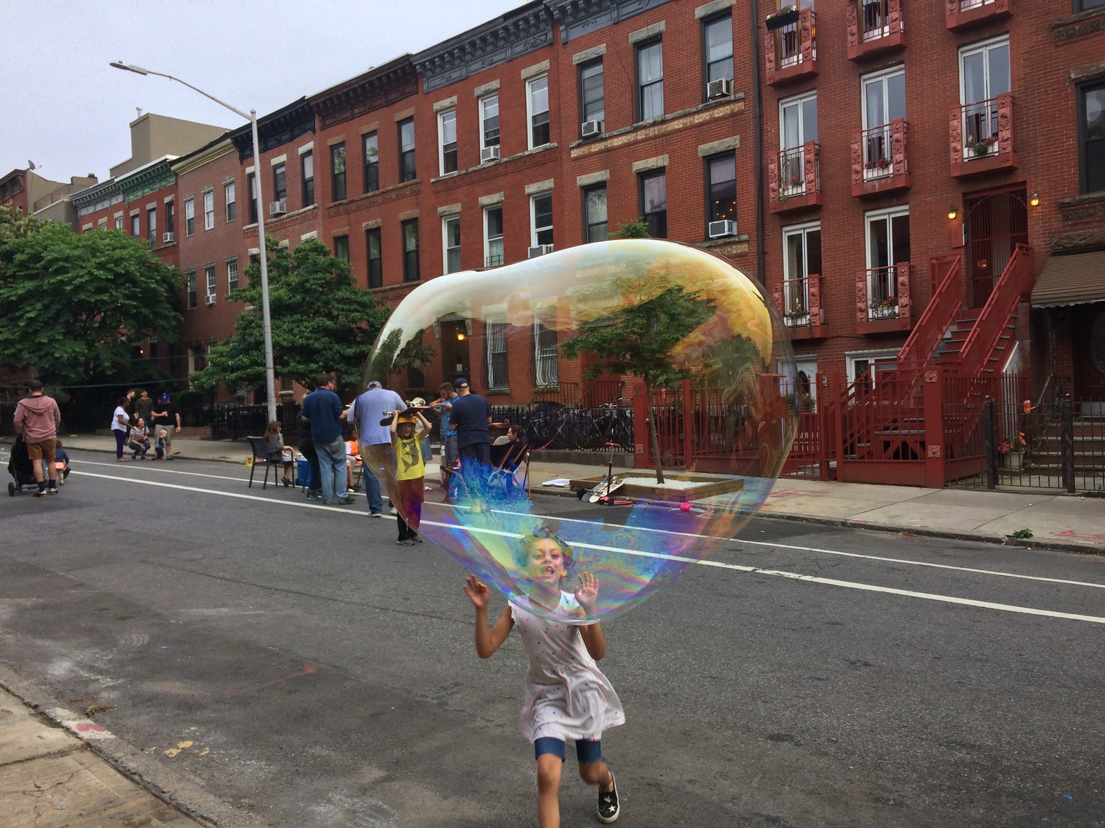
Fun with bubbles: My block association held a block party on Saturday. It wasn’t very well attended (the weather was kinda crummy for most of the day), but it had one very successful attraction: a giant bubble maker that one of my neighbors thoughtfully provided. The video above shows the Tugboat Captain making bubbles with some of the neighborhood kids.
In a digital age when we’re all obsessed with electronic thingamajigs, it’s pretty heartening to see that something as simple as a bucket of soapy water and two sticks with some string can provide so much entertainment — for kids and adults alike.
I found the whole thing mesmerizing. When the bubble breaks and reduces to liquid, there’s this moment when the liquid seems like it’s suspended in midair before falling to the ground — fascinating.
I tried it myself and managed to create a really good bubble that didn’t break (well, at least not until a little girl ran over and punctured it). As you can see, I was wearing the orange shirt that Scott Turner gifted me. For all of these photos, you can click to enlarge:

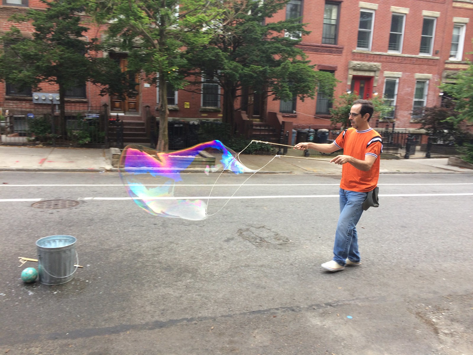
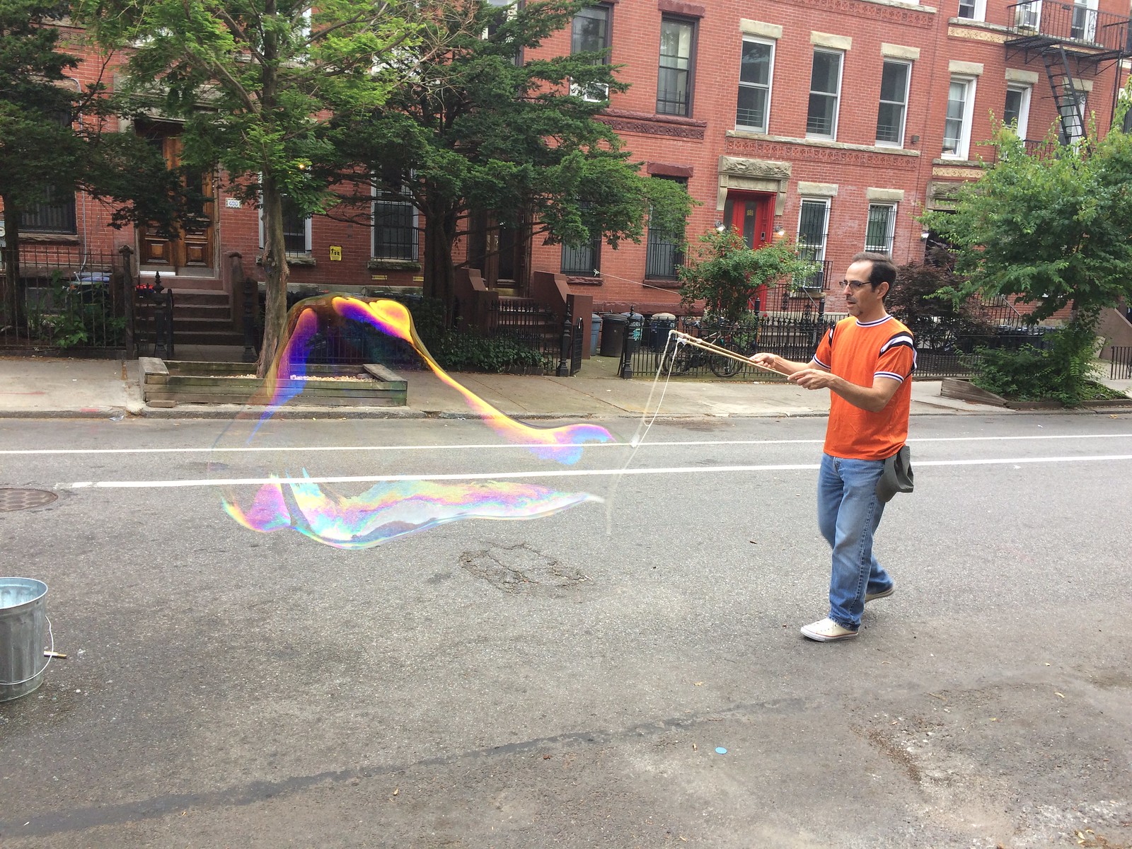


Interestingly, I later learned that the bucket of soapy water wasn’t just soap and water. It also contained baking soda and — get this — KY jelly. That got me curious, so I did a bit of Googling and learned that making giant bubbles is a source of great interest and passion on the internet. This guy’s page, which goes into considerable detail regarding soap mixtures, weather conditions, and more, is particularly entertaining. Recommended.

Click to enlarge
Annals of encroaching advertising, continued: Carshare programs seem like a good thing, so I can get behind the idea of my city reserving certain on-street parking spots for carshare vehicles, even though that means there will be fewer spaces available for my own car.
What I cannot get behind, however — and what I am frankly stunned and outraged to see — is the use of one particular carshare company’s logo on my city’s parking-regulation signs. Those signs, like the one shown above, just started appearing around the city.
Interestingly, there are additional signs explaining the program that do not mention any particular company. But the larger sign — the sign executed in the familiar, iconic template of NYC parking signage — is plastered with one company’s big, honking ad.
In some ways, this is a lot like ad patches on sports uniforms. The parking sign is similar to a uniform — iconic, familiar, instantly recognizable. And now it’s sullied by an ad patch. The difference, of course, is that sports teams are private entities that are free to turn their uniforms into corporate billboards if that’s what they desire (although they should be roundly criticized for doing so). Municipal government shouldn’t be doing that.
I’m writing a story about this for The Village Voice. More soon.
The Ticker
By Jamie Rathjen

Baseball News: The Rays wore their Devil Rays throwback hats with their light blue alternates (from Loren Richmond Jr.). … Brad Eenhuis sent us a White Sox podcast where the team’s vice president of marketing talks about the idea of the team wearing all-black uniforms around the 21:30 mark. … The Mets’ Rusty Staub memorial patch was missing from 1B/OF Dom Smith’s right sleeve yesterday.

Football News: The NFL told Chiefs OL Laurent Duvernay-Tardif, who is now also a doctor after graduating from McGill University’s medical school in May, that he can’t have “M.D.” as part of his NOB (from Brian Wulff).

Hockey News: Concussion discussion: Hockey Hall of Famer Ken Dryden has written a piece about how NHL commish Gary Bettman and team GMs are willfully ignoring the sport’s brain injury crisis (WaPo link). The piece makes it clear that the NHL is where the NFL was five to seven years ago on these issues.

Soccer News: New kits for the Scottish Premiership’s Heart of Midlothian (second shirt), the English Championship’s Birmingham City (first kit), Bristol City (third), and Preston North End (left to right: third, first, and second), the Scottish Championship’s Falkirk (first in the middle, second on the sides) and English League One’s Bradford City (first). Bristol City has a purple and lime green kit for the second season in a row, the idea of which dates to 1992. … Reader Derek Linn has an observation about the banded mowing pattern at the England/Panama game in the World Cup: the bands appeared to be five yards wide at the center circle, which is 20 yards long and covered by four bands, but six yards wide in the penalty area, which is 18 yards long and covered by three bands. … Yesterday’s game was also the first time England wore their traditional white/blue/white at the World Cup since their 2006 quarterfinal. … Three South Korea players — full-backs Hong Chul and Kim Min-woo and midfielder Ju Se-jong — are required to salute their country’s anthem at the World Cup because they’re currently taking part in South Korea’s mandatory military service. … South Korea is also wearing a flag patch on the sleeve; looks like the front of the shirt is crowded enough. … Japan winger Takashi Inui’s NOB looks the same upside down in Adidas’s font (from Everard Santamarina and @NaturallyKatz). … Senegal striker Sadio Mané appeared to have the plastic tag holder still attached to his shirt yesterday (from multiple readers). … Former Colombia midfielder Carlos Valderrama wore one of his shirts from France ’98 at Colombia’s game yesterday. … The Seattle Sounders wore rainbow numbers against the Chicago Fire (from Harry Higgins). … The spate of both teams changing at the World Cup leaked over to the NWSL in the form of the Chicago Red Stars (black) and Utah Royals (white). … New kits for Swansea City (from Josh Hinton).

Grab Bag: Since he showed up here recently, here’s a visualization showing the colors of all of Mr. Rogers’s sweaters (from Matthew Crooks). … Reader Jason Hillyer was watching an old Tom Petty and the Heartbreakers concert from Gainesville, Fla., where guitarist Mike Campbell had a University of Florida-themed guitar. … Here’s an article on how the the design of federal government challenge coins (NYT link) has changed under the Trump administration (thanks, Paul). … NASCAR Cup Series team StarCom Racing had two of its crew members wearing firesuits recycled from other teams yesterday in Sonoma, Calif. (from David Firestone). … In Gaelic football, the Leinster senior championship final between Dublin and Laois was blue-vs.-blue.
I think George’s surname is Woods
Agreed.
It looks like Valderrama pulled a bit of a “Dream Team” move by covering his jersey’s Reebok logo with some stickers.
Even Mr. Rogers went BFBS in the early 1990s?
If the NFL allows suffixes like Jr. and III that are not part of a player’s surname, what possible grounds can it have to disallow suffixes that reflect personal achievement like Dr. or PhD.? Alan Page played three seasons after he earned his JD, and went on to serve as one of the most respected judges on Minnesota’s Supreme Court. By what possible logic can we forbid PAGE J.D. for a player who put himself through law school while playing pro ball but permit GRIFFIN III for a player whose father couldn’t think of an original first name?
Well, but even JR or III are part of a name, arguably, not a professional title. They are different, at least to me.
JR or III are part of a name, yes. They’re part of a person’s given name. He’s Robert III, not Griffin III. If the logic is that it’s part of a player’s name, then every player must be given the option of having his first name or initial on his back. If the logic is that it’s a suffix, then so are certain titles and credentials. (Heck, if we ever again have military veterans in pro sports, a rank like SGT or CAPT would fall under the same treatment as MD or JD.)
I’d be on board with the professional suffix idea, if they’d also allow prefixes like Mr., Dr., Rev., Officer, etc.
We’d be so much closer to He Hate Me!
So silly.
I’m not a designer or artist by any means, but I can kind of see a U N I in the way that durene sample is spread out. Maybe there’s some way to frame it like that? Kind of like an Expo’s ELB hat? Might take up way too much wall space though.
With the durene sample you could hang it on your wall and above each color match a similarly colored hat and hang it above the samples…just thinking out loud
“Now that we know it works, we want to try it again with some guests, so I’ve invited some friends over for tomorrow night. Can’t have too many crawfish!”
Crawfish boils are the best. As a life-long Louisiana resident, I’m impressed you had andouille.
Tom Petty is from Gainesville Rock City, as are most of the Heartbreakers. So there’s your explanation on how that guitar ended up on stage. The excellent documentary on his life on Netflix used footage from that concert.
I’m not sure anyone was questioning why the guitar was there; we were simply noting that the guitar was Florida-themed.
Campbell’s guitar is an Epiphone – a brand owned by Gibson and is their import line. They did a run of these guitars with NCAA logos of most of the “Power 5” conference schools. These were pretty much low-end models more suitable for wall hanging than playing, but Campbell can make a cigar box with twine strings sound good.
I don’t think the logos on the parking signs are for advertising purposes only. There are 2 companies participating in the program, and each have their own designated spaces. The logos are there to tell the customers which spaces belong to which company. I have seen much larger Z logos both on signs and painted on the ground in other areas (e.g. Hoboken).
Incredibly enough, it’s possible to render the term “ZipCar” in the same typeface used on the rest of the sign, rather than using the company’s corporate logo.
That would require people to read.
I’m thinking someone will come back with some kind of visibility argument, such as it would be easier to see the logo at a glance than read the words…
Not a valid argument, in my opinion, but a predictable one.
That makes sense. Kind of like for rental car companies at airports, the signs are often their logos rather than simply the name rendered in standard fonts. As a volunteer in an adult literacy organization I can acknowledge there is some legitimacy to showing a recognizable logo rather than just the name for accessibility purposes. However it does reek of corporate logo creep.
A possible solution is to create a UNI-versal pay to ride share icon and use that to represent the rideshare companies involved.
Secondly, you could put the iCONS on the GROUND using painted color lanes as they do in Europe.
Just a thought.
Wow – those woolen green stirrup socks would be right up my alley as well. Throwback Saskatchewan Roughriders socks!
link
I look forward to reading your opinion piece in the Voice.
Just noticed the shape of your fingernails in the pics. Do you happen to have stub thumb? I prefer murderer’s thumb. But it’s classified as brachydactyly type D.
I only noticed as I have BDD too. I don’t often see many others with BDD, so when I notice the fingernails/thumbs it’s refreshing. I get it from my mom’s side, and have passed it on to all three of my kids (at least it appears they have it now, all are real young).
No, I don’t have that.
Thanks Paul! Just looked awful close to it. It’s rare for me to see others with it.
I’ve got it.
RE: parking sign.
I assume this isn’t for zipcar only, and any and all ride sharing services can use the spot? I suppose it is possible for cities to bid out exclusive contract and/or spots for various ride sharing uses within the city, sort of like taxi licenses?
The sign itself reminds of the type you see on highways now, where the road clean up is sponsored by a specific company. Those seem very disingenuous because they are basically just paying for the public works guys to do clean ups, rather than having their organization actually volunteer and do litter clean ups.
I assume this isn’t for zipcar only, and any and all ride sharing services can use the spot?
Actually, I think that space is only for that company. But I’ll be calling the Dept. of Transportation later today to learn more about that. Either way, the use of a corporate logo on municipal signage is unacceptable.
I am definitely an anti-corporate logo person, however for wayfaring signage logos are often important for those who are not English speakers or those who are not literate (a surprisingly large number of adults, around 10%, lack basic literacy skills). Certainly looks like logo-creep to me, but there may be a reasoning behind it. Sort of like the signs on highway exits that show the logos for gas stations or restaurants. A person who cannot read can still pick out a familiar logo when they need fuel, food, or lodging. It doesn’t seem this would be needed for this situation, but I’m not familiar enough with ride sharing, etc. to really know that.
a surprisingly large number of adults, around 10%, lack basic literacy skills
An interesting point, but not relevant to this discussion, because illiterate people cannot obtain a driver’s license.
Check that — turns out literacy is not required for obtaining a driver’s license. My bad.
But I would say that a person lacking basic literacy skills is going to have all sorts of issues driving in NYC that go far, far beyond finding a proper carshare parking space. And I still don’t think for-profit corporations should be granted the privilege of advertising on municipal signage.
But I would say that a person lacking basic literacy skills is going to have all sorts of issues driving in NYC that go far, far beyond finding a proper carshare parking space.
And the Native American community faces issues that go far, far beyond the minor indignity of sports team nicknames. Be careful with the logic of ranking other people’s challenges!
(As an aside, I’ve read analyses by both designers and engineers objecting to the reliance on signs with words on American roads. Most countries have fewer signs, and use signs with more iconography and fewer words. In part because most countries have simpler, more generally applicable rules. Such as, a road can either be residential, an artery, or a highway, and each class of road has a consistent speed limit. Whereas our speed limits are essentially random, and so a driver can only know the speed limit by reading a sign.)
What about highway signs that advertise businesses at upcoming exits with those business’ logos? Personally, I find that without thinking about it, I’m cool with “next exit” advertising, but not with the parking sign you share. But I honestly cannot think of a consistent principle that would permit the one but not the other.
What about highway signs that advertise businesses at upcoming exits with those business’ logos?
That is essentially a billboard. It is not stealth advertising; it is very overt advertising. The businesses’ names are not presented as part of a sign that serves some other function; the entire function of the sign is to advertise the proximity of those businesses.
Also, sometimes (but not always) the businesses’ names are presented in a generic font, not with a logotype.
I’m not in love with it, but it’s more honest and less insidious than a carshare logo on a parking sign. The parking sign already has a function: to spell out the parking regulations. It’s entirely possible to do that without a corporate logo.
In DC area, certain spaces are designated Zipcar, Flexcar, etc. I think it would be more confusing to NOT have the logo on the sign.
“KELLLY Green”…
I’m surprised the misspelling on the durene swatch sample wasn’t called out!
As an FYI, I was able to vote twice for the XXL poll – but I think I voted on a different computer last time.
As for your not-scarf, I think having it professionally framed would look pretty neat on a wall!
The White Sox podcast was disappointing on multiple levels.
1. Looking at all-black uniforms and dismissing them as not “Major League.” First of all, monochrome has a long and glorious history in the Majors (much of it chronicled here). Second, of all clubs, the White Sox have one of the strongest histories with all dark uniforms and they would afford them the chance to actually wear white hose. This smacks of Chris Sale incident and it bugs me.
2. The love for the 83 uniforms which I personally loathe and find to be a significant downgrade from 76 uniforms. Its nostalgia for an era that saw one playoff appearance and use too much blue and red in a town where the Cubs cornered the market on that palate.
[from yesterday] The 12 Miami Heat logo finalists to choose from (other than the REAL logo) were awful. Not that it matters, but I suspect the club ‘nudged’ the vote to the logo they wanted since they had over 1000 submissions. Makes the public believe they’re choosing when it fact, it’s been predetermined. The Colts did it about 10 years ago with a call out for the public to design the new alternate logo contest. Four finalists were selected from 1000’s of entries, 3 ridiculously crummy ones, and one artistically good one (which easily won). It was such a debacle, it turned out one of the crummy finalists they chose was reveled by angered graphic designers who submitted quality designs to be registered clip art. Eventually, the “winning” logo was buried on their website for a few years before being ditched altogether.
It’s a little thing, but hey, that’s what UniWatch is about, right? To all the ticker-compilers, I really, really appreciate the heads up for the NYT & WaPo links.
Happy to oblige!
That picture of the girl about to pop the bubble is amazing. Kudos to the Captain.
Never want to be under a giant bubble, or even a giant flurry of bubbles (first 45 seconds of this clip):
link
Paul, you’d mentioned a site redesign back in the wintertime when you were contemplating other site changes (subscription, etc.). If I recall, you were thinking that would be happening in April.
Any updates on this? I assume, with your impending move and all, you certainly have other priorities at the moment. Just an inquiry.
Thanks for all you do!
Within the next few weeks, I think/hope.
The NHL? Behind the times? Surely you jest!
I was lucky enough to be a part of a lot of wonderful things during my 7 years working at science centers–rats playing basketball, high-wire bicycles, a huge Tesla coil, exhibitions on Star Wars, Mars, movie FX, etc., etc.
Nothing was more popular than giant bubbles. :)
That 3M firesuit might only be a season or 2 old (Chase Elliot had them as a partial-season sponsor in 2016), but the Havoline one could be close to a decade old (Texaco ceased being a team sponsor in Cup in 2008 IIRC).
Maybe those crew members were on per diem and had to provide their own gear?
You needed this for your mudbugs.
link
Paul – In regards to your catalog swatch if you were willing to modify it (cut, fold and sew) you could have it turned into a quilt or a pillow. I’ve used Campus Quilt for two huge t-shirt quilts (of defunct football teams) and I’ve also had them make a pillow. All three experiences were great – I’m very happy with the finished products.
link
They have excellent customer service so you could always just send them the pics and see if they have any ideas on what to do with it.
Other than that do you have a 12 foot plus stretch of wall over your TV where the ceiling meets the wall? You could always wrap it around a bannister like people do with candy cane/wreath decorations at Xmas.
Ken in Albany
PS – I don’t work for Campus Quilts and am not being compensated.
PS2 – XXL Uni-Watch hat counter now up to 101 as of 2:39pm Eastern!
Paul,
Sliman’s Dodge in Amherst, Ohio actually has an on premise Softball field that goes by the name of Sliman’s Diamond. Good find.
Ah, interesting!!
As a proud Louisianian, please visit the state next year during crawfish season and go to a real crawfish boil. We will gladly show you how to do it right.
I’ve eaten crawfish in Louisiana many, many times.
If you feel I didn’t “do it right,” feel free to tell me what I did wrong instead of just broadcasting your home-state hubris.
Paul, your face in that photo of you and the full bubble is THE. BEST.
I can’t tell how large the green stirrups are but they look like hockey socks to me.