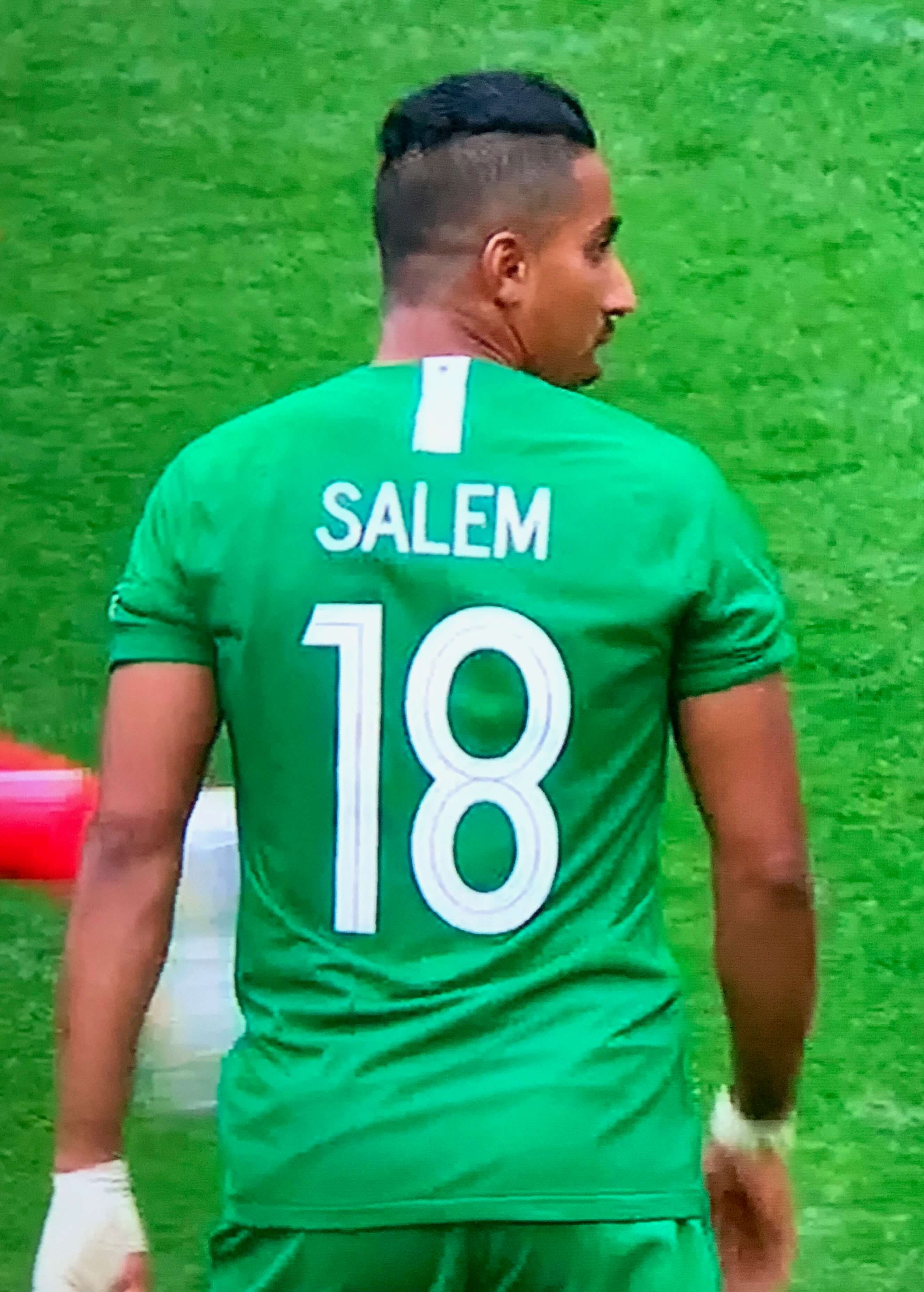
That sound you heard in the background yesterday was about half of the civilized world noticing that Saudi Arabia player Salem Al-Dawsari was playing with an upside-down “8” in Saudis’ World Cup opening-round match against Russia. (Rumors that the first person to notice was Uni Watch reader Jason Hillyer’s son, Jameson, who noticed the upside-down 8s on the seats at the Trop earlier this week, are almost completely untrue.)
Someone apparently got word to the Saudi team about the inverted digit, because Al-Dawsari had a properly oriented numeral in the second half.
Naturally, I’m too soccer-clueless to know if it’s unusual for Al-Dawsari (or for any Saudi player) to be wearing FiNOB. Can someone enlighten us on that point?
A few other notes from that game:
• It looks like one of the Russian players didn’t peel the protective backing off of his World Cup jersey patch.
• Here’s a look at the footwear for every player in the game.
• The color matchup was red vs. green, which caused problems for people with red-green colorblindness (just like the first Color Rash game).
(My thanks to @trickettengland and Josh Hinton for their contributions to this section, along with the many, many people who noticed the upside-down 8.)
Click to enlarge
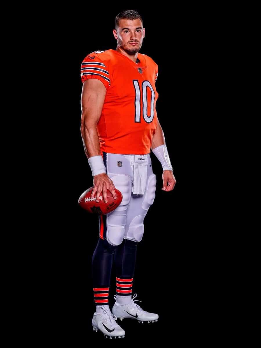
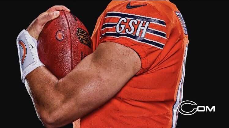
Bears soft-launch orange throwback jersey: The Bears were supposed to unveil their new orange throwbacks today, but they “leaked” the design yesterday by posting some photos on their official team app. Of course, it’s not really a leak if it comes from the team — more like a soft launch.
Here’s are some additional photos (click to enlarge):
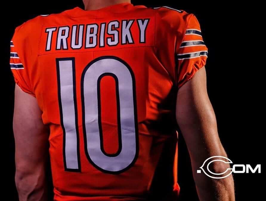
The Bears last wore orange jerseys in 2011. Is the newly revealed design the same as the one they wore seven years ago? Sure looks like it — here’s a photo of the Reebok-era version (click to enlarge):
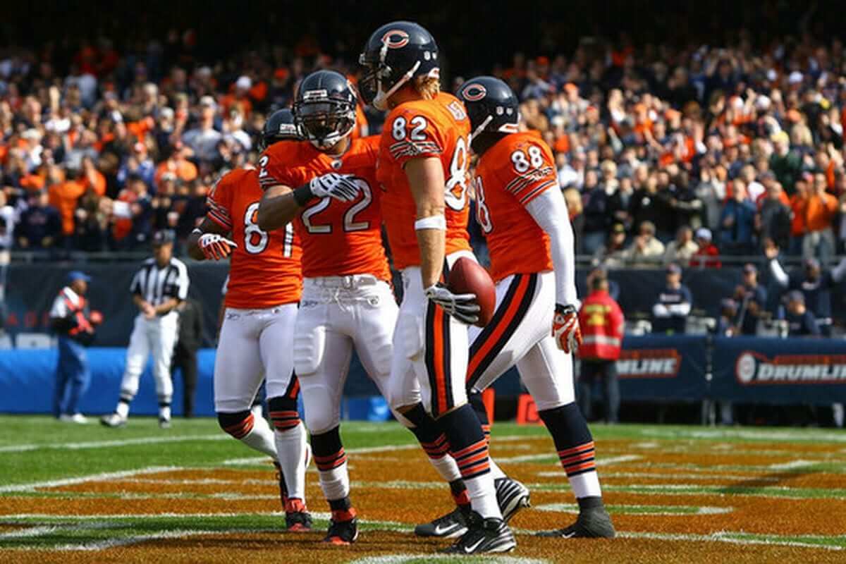
So it’s basically the same thing we’ve seen before. Personally, I prefer the Monsters of the Midway throwbacks, but the orange design isn’t bad.
Incidentally, look at the socks in that last photo, and then compare them to the socks worn by quarterback Mitchell Trubisky in the photo at the top of this section. I’m surprised they’d allow him to wear his stripes so improperly low in an official publicity photo. The stripes should be up around his calves.
Click to enlarge
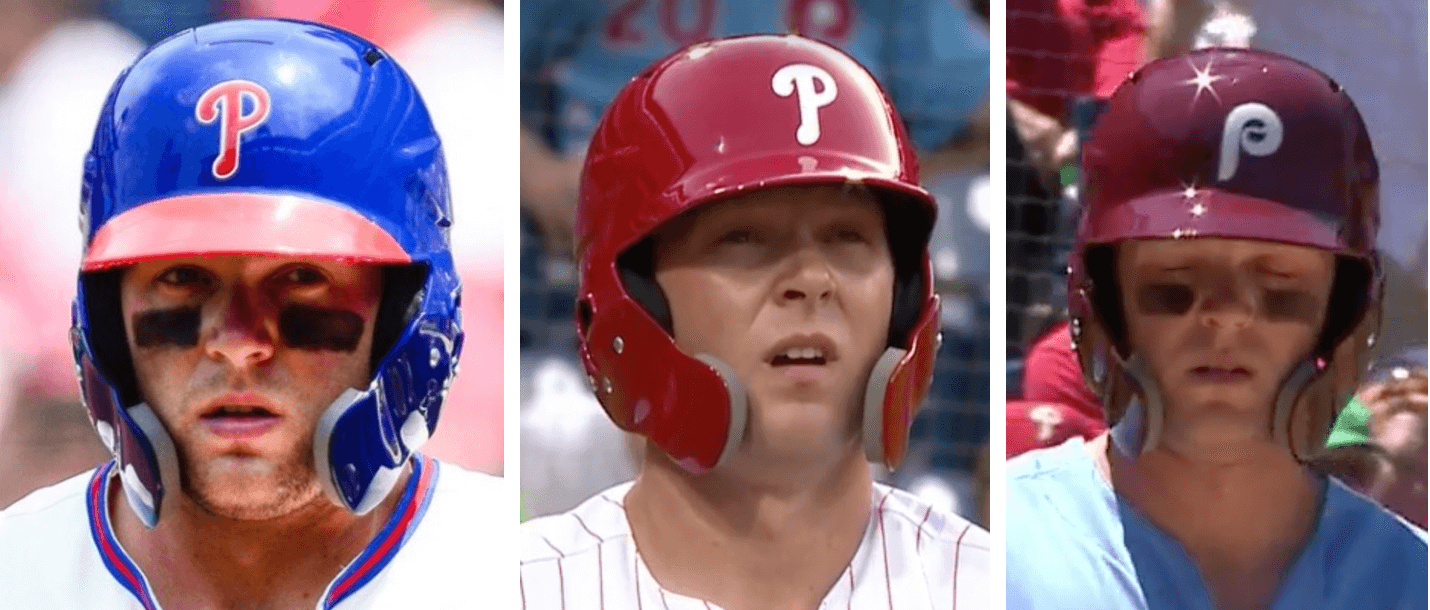
A triple-double, MLB-style: Remember how the Phillies had to wear their cream daytime uniforms for a night game because they didn’t have a red double-C-flapped helmet for Rhys Hoskins? That problem has now been solved. Over the past three days, the Phillies have worn three different uniforms with three different headwear colors — and Hoskins has worn three different-colored double-C-flapped batting helmets. (He homered again yesterday, too.)
Meanwhile, a Rawlings exec tells me that their own proprietary helmet flap should be ready to launch in July. Will that put a crimp in the Year of the C-Flap? Stay tuned.
Like father, like son: As you probably know, Ken Griffey Jr. and Sr. did not wear JrOB and SrOB when they played together on the Mariners in 1990. But here’s something you might not know (and I didn’t know about it either until reader Tim Dunn told me yesterday): The Griffeys joked about adding generational suffixes to their NOBs when the elder Griffey joined the M’s. Check out the video above to see them openly speculating about it. Great stuff, and a nice item as we head toward the Father’s Day weekend.
The Ticker
By Kris Gross

Baseball News: Rays C Wilson Ramos wore Franklin batting gloves with the Nike logo last night (from Mart). … Now this is a great prank: Cardinals P Adam Wainwright had his NOB and No. 50 ironed onto Padres coach Skip Schumaker’s polo. The two are former teammates and hung out when the Padres visited St. Louis (from Mike Chamernik). … FanJuicer polled 3,792 fans to rank team logos (from Ryan Bower). … The Tigers have adopted the “rally goose” after a goose invaded Comerica Park a couple weeks ago. You can now buy official rally goose gear from the Tigers. … Nationals P Sean Doolittle has ideas for a team bullpen cart (from Tom Turner). … Reprinted from yesterday’s comments: Although Davey Johnson wore No. 5 during his time managing the Mets in the 1980s, he posed with a No. 31 jersey at his introductory press conference (from Mark in Shiga). … Here are all the new logos for when the Staten Island Yankees play as the Pizza Rats. … The Delmarva Shorebirds become the Scrapple on August 18 (from John Kimmerlein). … Florida’s College World Series jerseys are ready to go (thanks María Canales). … Russell Athletic unveiled the 2018 Little League World Series jerseys yesterday. For the first time ever, each region will have their own unique jersey designs.

NFL News: The Eagles have revealed the design for their Super Bowl rings, which include a little underdog reference (from Mike Chamernik). … It’s team tradition that Cowboys players have to earn the star on their helmets, but rookie Michael Gallup found a way around that rule (from @texasbacon). … Brian Erni spotted what appeared to be a new Jets logo, but it turns out it’s a template for all teams (from Dan). … Not uni-related, but here’s a really good piece about the ’Skins’ bogus season ticket waiting list (from Jason Hillyer). … Good piece on how the ’72 Broncos sewed hand-warmer pouches into their jerseys.
College Football News: Here’s a look back at when Iowa State experimented adding navy blue to their color scheme (from Kary Klismet).

Basketball News: This trash company’s logo looks a lot like the 2011 NBA All-Star Game logo (from Wren). … Former Blue Devil and current draft prospect Marvin Bagley III is expected to sign a massive shoe deal with Puma, the largest rookie deal since Kevin Durant’s. The move is the opening salvo of what is expected to be Puma’s aggressive re-entry into the NBA sneaker market (from James Gilbert). … Rider University has a new court design. This time lapse video of the new design being put down is well worth your time (from Greg Ott).

Soccer News: Each Nike national team kit in the World Cup is made with at least 12 recycled plastic bottles. … Here is Nottingham Forest’s 2018-19 home kit (from Ed Żelaski). … Celtic FC’s 2018-19 away kit has leaked (from Josh Hinton). … I still call it St. Andrews (from our own Jamie Rathjen).

Grab Bag: The Naval Academy has sent a cease and desist to Nike over their new logo (from Tony Ravenscroft). … The Kentucky Derby 145 logo was unveiled yesterday (from Michael Kinney). … The Supreme Court has struck down a Minnesota law that prohibited politically oriented clothing at polling places. … A Philly chiropractor uses the Liberty Bell’s crack as a spine (from Chance).

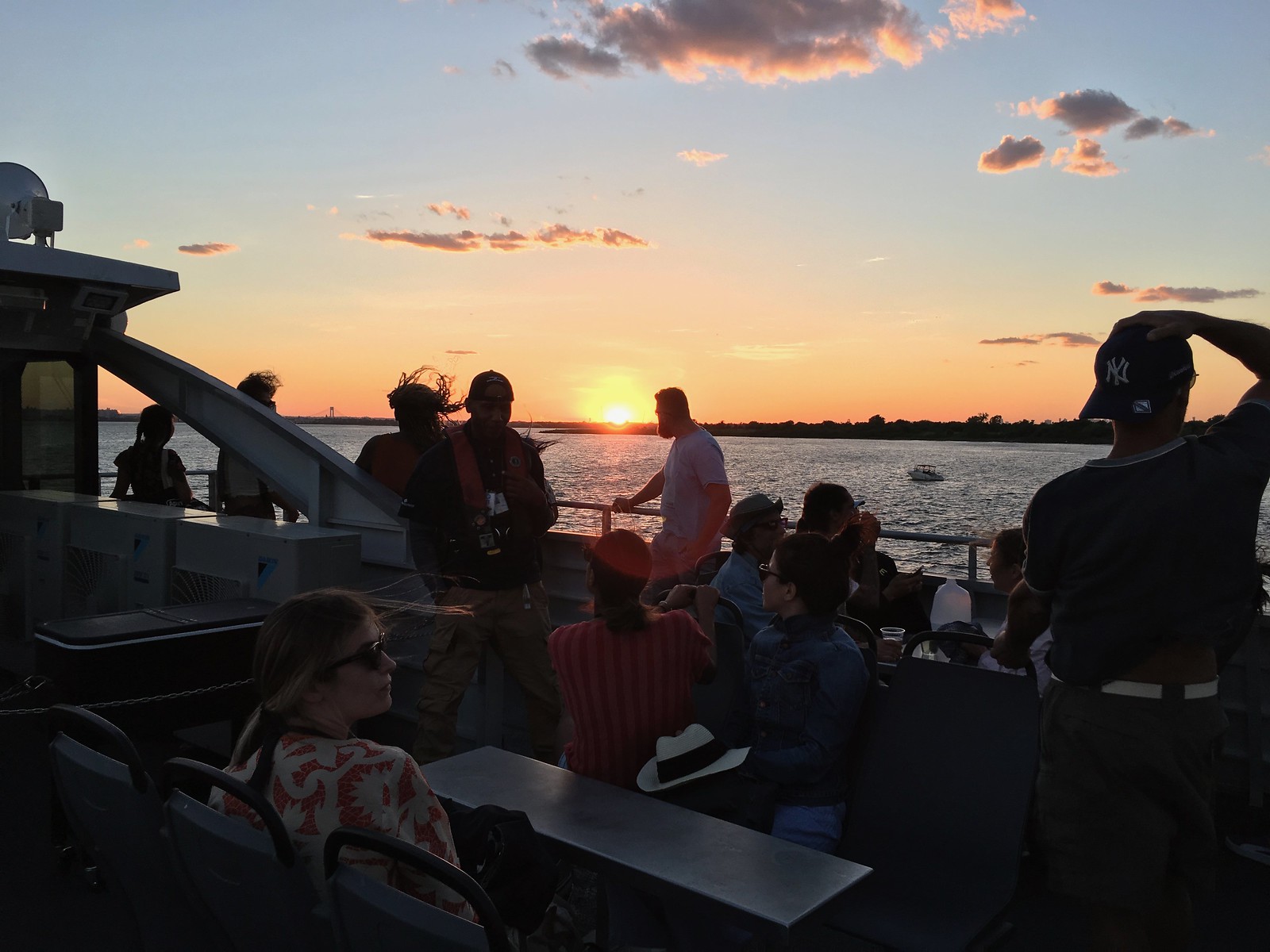
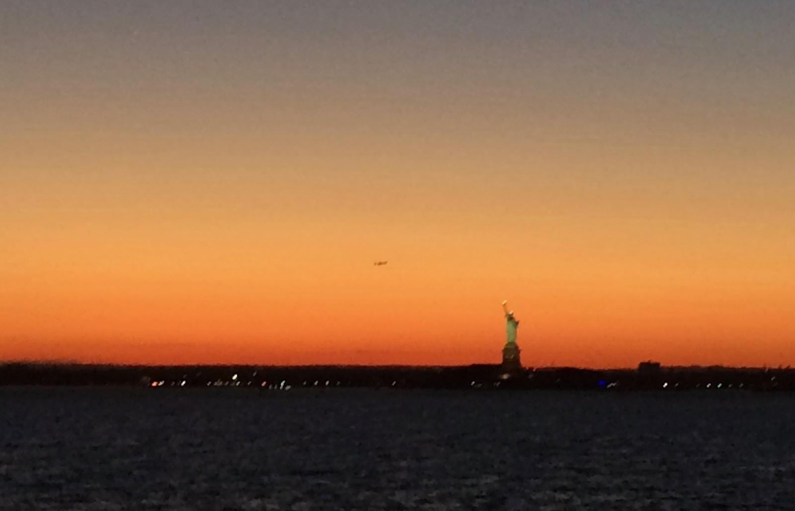
What Paul did last night two nights ago: Last year NYC introduced a new ferry service that runs from lower Manhattan to Rockaway. It was meant for commuters (Rockaway is a looong subway ride from Manhattan), but the reality is that it makes for a great hour-long pleasure ride. And since the city government is subsidizing the service to an absurd degree, the fare is only $2.75 — the same as a subway ride.
We had gorgeous almost-summer weather yesterday, so after work the Tugboat Captain and I grabbed some beers and snacks, hustled over to the ferry terminal, and enjoyed a carefree ride to Rockaway, where we briefly walked over to the beach before taking the last ferry back to Manhattan at sunset. Just a perfect, perfect evening.


The Bears cannot mess up a jersey. No matter what color these choose. The numeral font is outstanding, as is how they do the stripes on the sleeve. Even the GSH, which I would normally have a problem with, fits perfectly. Perfect. The teams that have crappy jerseys could learn a lot from the Bears.
My first thought was isn’t it time to give up the GSH!
Overall nice if not a bit Broncosy.
Agreed, this is a nice looking uniform, it just is completely derivative of the Broncos. This is why teams are better off sticking to home and away, possibly wearing a throwback once a year.
Maintain your identity. If I see that team I don’t think Chicago Bears, I think Denver Broncos.
Much like when Tennessee went to the navy helmet this year. It is not bad, but it doesn’t look like the Titans, it looks like the Bears.
The Bears wore orange jerseys throughout the 1920s and 30s, as well as in a few preseasons through 1954. They brought them back from 2004-2011 and now are bringing them back again. link
I don’t think you can call the Bears in orange derivative of the Broncos, since their history of wearing orange is older than the Broncos franchise history.
Just because the Bears briefly wore orange before the Broncos doesn’t mean that is their signature look. The Eagles also wore powder blue and yellow briefly, but most certainly when you think of those colors you think of the Chargers, not the Eagles.
People associate the Bears with navy on navy, and the Broncos with blue/navy on orange. Just the way it is. That is the Broncos signature look.
Just because the Bears briefly wore orange before the Broncos doesn’t mean that is their signature look.
Way to move the goalposts, so to speak. First you said they were derivative. Then you (correctly, in my opinion) said it wasn’t the Bears’ signature look.
Dave Bidini’s “Tropic Of Hockey” mentioned in the UAE chapter that players there went FiNOB because last names tend to be a little long.
And I guess insert timely Ramones lyrics about your trip *here*
Wait, Paul’s voluntarily writing about soccer….?
Re: the FiNOB question, the leagues I’m familiar with don’t really have any NOB rules because you can get whatever you want approved by the league.
Another player who’s going to wear FiNOB at the World Cup is England midfielder Dele Alli, who switched to that style about two years ago, but I’m sure there’s more. It’s common enough to not be super weird if you see it.
This me-first generation of soccer players seems to wear whatever name they want on the back of the jersey. It’s really silly.
Oh, I definitely think it’s kind of dumb sometimes and not helpful if you’re not familiar with the player.
However, some players have a good reason for doing it, such as Alli, who has been estranged from his parents since he was 13.
It can be strange. Don’t follow soccer extremely close, but I can think of an example with my local team that I follow.
When Kekuta Manneh played for the Vancouver Whitecaps, initially had his last name on the jersey:
link
Then he ended up switching to his first name on the back:
link
Don’t know the reason why to this day.
Not sure we can blame this on a “me-first generation”. Names on shirts was first introduced to the World Cup in 1994, but you can be sure that Pele would have gone NNOB as he did with the Cosmos.
Bernardo Silva also wears his first name on the back of his kits. Not sure why, though.
The “Me Generation” refers to the Baby Boomers, anyway.
I’d like to second Iain’s sentiment…
Someone can correct me if I’m mistaken here, but I’ve been under the impression that Brazilians have done this for some time–referring to players by their first names or nicknames. And as sports become more global, you see it spread to other countries, it’s not surprising that young athletes would want to copy players from the most successful soccer nation.
There’s also the fact that NOBs of any sort are a relatively recent invention (a couple sources I’ve cited below date this to around 1992, at least in England), and is tied to a given club or federation being able to make a little extra money off their players.
link
link
link
He wears Dele because he’s estranged from his absent father and doesn’t want his last name on the jersey. The team bought back people who ordered the Alli jerseys a couple years ago when he made the switch. Not really a “look at me” move.
That bears jersey is so beautiful. The orange is much more vibrant, and it works to their advantage.
because Al-Dawsari with a properly oriented numeral.
Seems to be some missing text here.
Yes. Now fixed.
Re: Pizza Rats: fitting for Staten Island.
A dumping ground for NYC that I associate with filthy animals touching my food. Perfect.
What was wrong with keeping the name Yankees?
It’s for Saturday games only. They are indeed keeping the name Yankees.
Looks like the new orange Bears jersey has the TV numbers on the shoulders whereas the previous one had them on the sleeves.
Da Bears.
Well, yes, that change was made throughout the Bears uni program in 2012.
Well, yes, but not noted in the article. ;)
Fair. All I meant was that it’s basically the same design as before, notwithstanding the team-wide template change.
It’s hard to call what’s left “sleeves” since they’re little more than shoulder pad covers anymore.
The new orange Bears jerseys have the TV numbers on the shoulders with the stripes taking up most of the sleeves, while the 2011 jerseys had the TV numbers on the sleeves with the stripes below.
dovetailing off the Sean Doolittle Nationals bullpen car ideas, here’s a link to a February Nationals Review piece featuring ideas for Nats bullpen vehicles, complete with pictures (fake? maybe!): link
Thought you would like to know that one of the ads I am getting today mixed into the blog is for a knockoff jersey site. A little ironic.
link
Sorry if this has been discussed before, but why are big-time soccer sleeve patches so often terrible? They are often, as with link, just a white rectangle with a design that fills very little of the patch. They look like they were designed in five minutes in some white-box template. Surely the WC patch would look better if just shaped like the trophy logo itself.
Then there’s the link, which would be an OK design on its own but would be way better on the jerseys with a thick white outline instead of the acres of white space around the lion head.
sorry for the double tap, but…
the Washington Senators bullpen car was a RED CORVETTE!?!?!?!?!
That’s what this article says: link
where are the pictures?!
About the C-Flap – don’t know if this has been discussed, but given its rising popularity is there any thought to molding them right on the helmet? Is that what Rawlings will be releasing?
On a separate note: I am using Firefox, latest update. When I used to post a comment, it would remember my name and email for the next time I comment. Guess it is a cookie. Now, as soon as I comment, it blanks the fields out. I have made no settings change. Anybody have the same issue?
I think there’s a good chance that Rawlings will be doing an all-in-one design, yes.
Same for me on Chrome and I haven’t changed any of my settings either.
Yup, I’ve had the same issue. Mildly annoying.
I am, Steve, but I think you’re right about it being a cookie. I’m using Microsoft Edge.
I don’t (today notwithstanding) comment enough that I really care, though. I can handle re-entering my name and email address without too much stress on my otherwise perfect and idyllic life. Re-entering it makes me feel like I’m connecting with the common man, in fact. Maybe I’ll use that as a campaign platform if I ever run for office: I re-enter my name and email address just like you. Vote for Max in 2034!
I have the same issue… For a few years, all my info was pre-populated, in the last month or two, its all blank.
Using Chrome.
I don’t post a LOT, but it is mildly annoying.
Lee
This has been happening to me for a while as well, and I did comment on it a few weeks ago, though at the time I thought it was just me and my particular computer.
One of the things this affects is when our posts end up in the moderation queue; we’re no longer able to see when that happens, and such posts just disappear until such time as whoever’s modding that day acts on it.
The LLWS Southwest Region Jerseys are spot on!! The rest actually look pretty decent as well.
Pretty cool. Two Tequila Sunrise jerseys, two Beach Blanket jerseys.
Hoskins’ throwback helmet seems to have the Phillies “P” logo way off-center to his left.
It may be the lighting in the photo, but it looks like Trubisky is wearing blue tights with stripes over white socks. They are super shiny and don’t look connected to the white socks.
MLB All-Star uniforms are out. The pinwheel game caps are a nice shoutout to the Expos, but everything else (the HR Derby caps win the stars and the BP jerseys) are horrendous faux patriotism crap at it’s worst.
Also, why does MLB insist that the blue in our flag is dark navy, when in fact it is not even regular navy, just a shade of blue that is a bit darker than royal blue.
I wonder if the players at the World Cup wear a different jersey for the second half anyway – one to keep and one to trade with opposing players at the end of the game.
Some players like to change to a new shirt at halftime. But as far as I know it’s out of personal preference rather than having to do with potential shirt swapping.
Like Jamie said, many players swap shirts at the half. It’s very likely that he had no idea and put on a fresh, proper kit.
You know, one could argue that it’s impossible for a numeral eight to be upside-down…I mean, you could design a font where all eight’s have a larger circle on top than on bottom and it would still be an “8”, no?
Is it possible? Sure. Many such fonts exist.
But is that the case for this font? No.
True. Just pointing out that an upside-down eight is still an eight. I don’t think this is really true for any other numeral.
In most fonts, an upside-down 0 is still a 0.
In certain fonts (the Bears’, for example), an upside-down 1 is still a 1.
While I’m sure there are some uniform fonts where a zero is not exactly the same either way, it’s hard to think of any offhand.
In other words, is there such thing as an upside-down zero?
When I clicked the link in the Ticker for the Little League World Series piece, it downloaded a .gif to my computer.
I’m using Chrome, by the way. I’m guessing that’s not working as intended.
Here’s how the Nationals pitchers should arrive from the bullpen:
link
“Not uni-related, but here’s a really good piece about the ’Skins’ bogus season ticket waiting list”
Yep – McKenna’s stuff is always good.
I’m shocked by that article with the MLB logo polling. For two reasons: 1) The public’s ranking of MLB logos is reasonable, and in most cases, quite sound; and 2) It’s presented with a thoughtful and at times interesting conversation with a professional designer. A designer who’s apparently quite naive with regard to MLB and its fans, which creates a little dissonance on matters such as his oft-repeated yet falsified by the polling data assumption that nostalgia and a dislike of novelty is a major driver of fan opinion of the logos. But still, an unexpected outbreak of reasonableness and quality on a subject where capricious superficiality is the norm. Thanks for sharing it!
Hopefully something like this gets to the MLB brand people, specifically those in the Pirates, Rockies, Padres, and Indians organizations. While it is important to have nice looking signature cap logo, that really shouldn’t double as your main logo. Rockies have the mountain logo, Pirates the pirate/bat logo, and Padres the friar that all could be used as a primary logo. Indians meanwhile need to develop some sort of real logo to go along with the block C cap logo (and also come up with a more unique C, maybe they one they used from 1921-1936).
Cap letter logo as primary is just lazy.
From the article on Sean Doolittle’s ideas for the Nats bullpen carts:
“[M]aybe, like, a presidential motorcade, and there are several carts, and you don’t know which one the guy is going to pop out of. Tinted windows and everything.”
Yes, and please!
I read the Davey Johnson comment yesterday and posted this, but it was late in the day and probably went unread, so I am reposting:
I don’t believe the Mets were going to give Davey Johnson number 31. That was a publicity shot for his introduction to the NY press before the 1984 season. The Mets obviously wanted to show a jersey for him, hence the picture. Davey wore 15 for the Orioles, but George Foster wore it for the Mets. They probably went into the locker room and looked for a jersey they could change the name on. They didn’t want to take the number of a current player, and Davey probably hadn’t given it any thought, so a logical choice was 31, ex-manager George Bamberger who was fired during the 1983 season. After some thought, Davey chose 5 which was available.
Minor point, but Bamberger quit, he wasn’t fired.
Boy does the 71-93 Phillies P look off center on Hoskins’ maroon batting helmet.