The Nuggets unveiled a new uniform set last night — at about 10:30pm Eastern, ugh, when I was busy with other stuff. Okay, let’s have a look, one uni at a time (as usual, we’ll skip the embarrassing corporatespeak about “editions” and just describe the uniforms using, you know, English):
1. The new primary white uni:
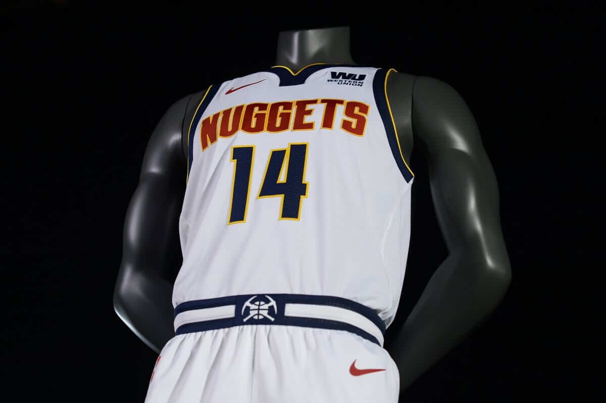
Association.#EVOLVE2018 pic.twitter.com/ktEQ21w9Qw
— Denver Nuggets (@nuggets) June 7, 2018
Comparison of Nuggets' white uniforms. Old version on left, new on right. pic.twitter.com/cvuTy8iTTc
— Paul Lukas (@UniWatch) June 7, 2018
Ugh — really don’t like that shade of red (or, really, any shade of red) for the Nuggets, and it’s a drag to see that powder blue has been completely excised from the design. I do like the separate colors of the NOB and the rear number, even if one of those colors is red. Hate the collar. The little mountainscape thingie on the shorts is nice. I like the new waistband striping. The ad still sucks.
2. The new primary blue uni:
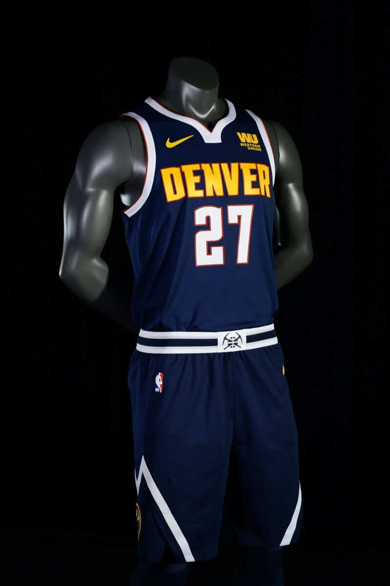
Icon.#EVOLVE2018 pic.twitter.com/3B6asIUvjZ
— Denver Nuggets (@nuggets) June 7, 2018
Comparison of Nuggets' blue uniforms. Old version on left, new on right. pic.twitter.com/vIhszj32a3
— Paul Lukas (@UniWatch) June 7, 2018
At least the red is just an outline color here, although it seems inconsistent that they used the red outlining on the collar and armholes but not anywhere on the shorts. Still hate the collar shape, still like the two-color treatment on the back, still like the mountainscape thingie and the waistband striping. The ad still sucks.
3. The new alternate blue uni:
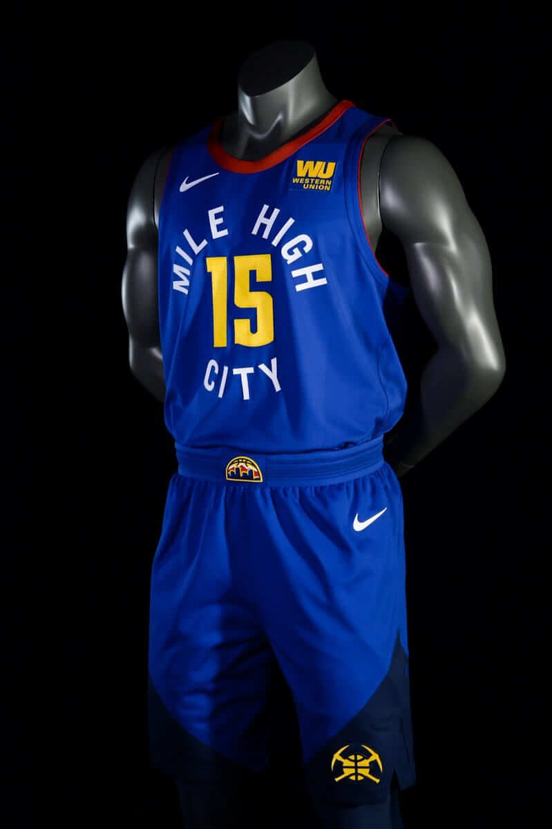
Statement.#EVOLVE2018 pic.twitter.com/vvkLLH7XEw
— Denver Nuggets (@nuggets) June 7, 2018
Comparison of Nuggets' alternate uniforms. Old version on left, new on right. pic.twitter.com/gBI767j57e
— Paul Lukas (@UniWatch) June 7, 2018
Now wait a minute — if you’re going to include the word “City” on your alternate uniform, shouldn’t that be reserved for the alternate whose embarrassing corporatespeak name is, you know, “City Edition” (aka the one that’s released right before the holiday shopping season, what a coincidence), rather than the one with the even more embarrassing corporatespeak name that I’m not going to print here because it’s just too tragic?
Such weighty issues notwithstanding: Love the color scheme — even the red works in this context. The circular type treatment would be awesome if the Pacers hadn’t already done the same thing last season, so instead it just looks derivative. How soon before we see a bunch of other teams doing that? Much prefer this collar shape. Kinda like the two-tone shorts. Too bad about the loss of the skyline motif. The ad still sucks.
4. The new logos:
BEHOLD! OUR NEVER-BEFORE-SEEN NEW LOGOS ARE HERE!#EVOLVE2018 pic.twitter.com/xwJzl0FfOe
— Denver Nuggets (@nuggets) June 7, 2018
The semicircular one — the one that appears on the waistband of the alternate uni — isn’t bad. And then there are two new roundelzzzzzzz….
Overall: A downgrade. But hey, at least they didn’t make any players pose with pickaxes this time. Additional info here.
Finally: Does anyone else think it’s a bit bizarre for an NBA team to unveil a new identity in the middle of a Finals game?
Naming Wrongs update: It’s been a long time since we had any new Naming Wrongs designs (and we may not have many more of them after this, because we’re close to the end of our list of shirt-worthy stadiums and arenas), but we have three good ones today. One at a time:
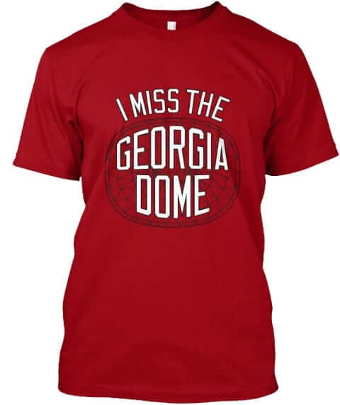
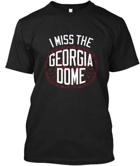
The Georgia Dome: Nice job by designer Scott Turner with this one, referencing the building’s distinctive roof design. It’s available in red and black:
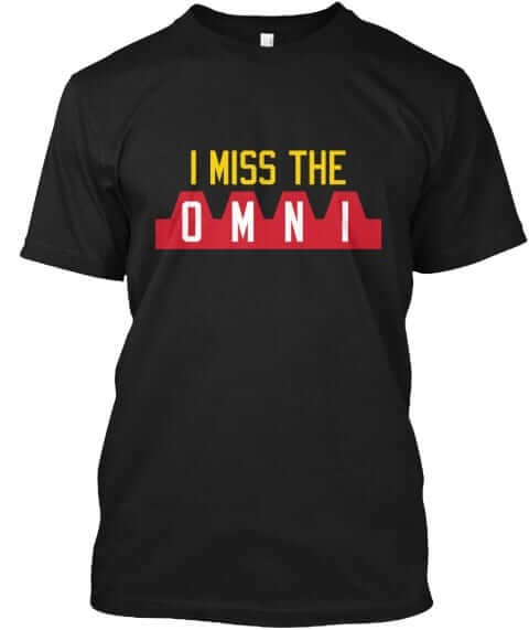
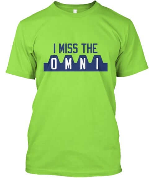
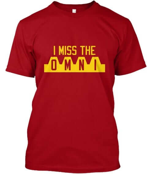
The Omni: Another Atlanta building with a distinctive roof. I really like this one, which is available in black, lime green, and red:
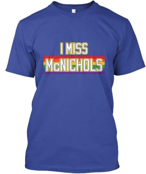
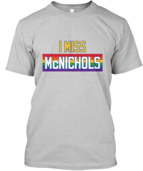
McNichols Arena: No roof-based design for this one. Perfect for anyone who thinks the Nuggets’ new uniforms should have included the rainbow motif (among any number of other potential improvements). This one’s available in royal blue and grey:
These designs are now available in the Naming Wrongs shop. They’re also cross-listed in the Uni Watch shop, where card-carrying members can get 15% off. (If you’re a member and need the discount code, send me a note and I’ll hook you up.) My thanks, as always, for your consideration.

Raffle reminders: We currently have two raffles in progress. First, illustrator Alex Bennett is currently raffling off two of his new “Football Mishmash” posters (shown above) to a pair of lucky Uni Watch readers. full details here.
In addition, the good people at Vintage Brand are raffling off a pair of their vintage sports-themed canvas prints. Full details on that one here.
The Ticker
By Paul

’Skins Watch: The baseball team at Bridgeport High School in West Virginia is working on a lose-lose-lose: The team is called the Indians, they poach Chief Wahoo for use as a sleeve patch, and they poach the KC Chiefs’ arrowhead motif for their batting helmets. That logo is also used by the football team. If they’re going to misappropriate Native iconography, can’t they at least come up with their own instead of stealing it from pro teams? (From Brice Wallace.) … Following up on last week’s Brannock Device Night promotion, I appeared yesterday on a Syracuse sports talk station. Nice interview.

Baseball News: The Northwestern football team is slated to play a game at Wrigley Field in 2020, so the school released a photo showing one of its helmets side by side with a Cubs football helmet (from Matthew Sampson). … Was Padres 3B Graig Nettles missing the “K” from his Ray Kroc sleeve memorial, or was it just the way the fabric was folded? (From Brian Wulff.) … Here are the hot dog-themed jerseys for the Chicago Dogs. … Celery-themed uniforms upcoming for the Wilmington Blue Rocks. … Orioles OF Adam Jones’s bat went helicoptering after a swing during yesterday’s game against the Mets, and SS Manny Machado, who was standing on deck, caught it (from Mike Chamernik). … Here are 50 years’ worth of minor league caps from Omaha (from Fitteds and Flannels). … Nats OF Bryce Harper tripped over his own helmet, which had fallen off his head while he was legging out a double yesterday. … Speaking of the Nats, skipper Dave Martinez wore a Washington Capitals cap during yesterday’s postgame interview. … Hartford Whalers-themed jerseys upcoming for the Hartford Yard Goats. … The Wisconsin Timber Rattlers will become the Wisconsin Brats, complete with lederhosen-style uniforms, this Saturday (from John Okray). … New caps for the Mexican League All-Star Game. “If you look closely, the Dbacks-style dots on the hats are actually mini versions of the main logos,” says @cesarcu52. “Here’s another view.” … I would rank this ranking of baseball uni numbers as one of the better ranking-based pieces I’ve seen (from Mike Chamernik). … Excellent story on the Omaha Storm Chasers’ radio broadcaster who’s been waiting for that break (NYT link) to make it to the big leagues. … MLB recently banned Cubs catcher Wilson Contreras’s Venezuelan flag-patterned compression sleeve, so now he’s wearing the flag colors on his catcher’s gear. He had previously worn a different color scheme (from Paul DeMay).

Football News: There’s a new professional flag football league, which has released its four team logos. … Cross-listed from the baseball section: Northwestern is slated to play a game at Wrigley Field in 2020, so they released a photo showing one of their helmets side by side with a Chicago Cubs football helmet (from Matthew Sampson). … Colorado State’s new stadium, which opened last year, now has a new corporate name (from Oscar Raab).

Hockey News: Cross-listed from the baseball section: Hockey/Whalers-themed jerseys upcoming for the minor league baseball team the Hartford Yard Goats. … Also from the baseball section: Washington Nationals manager Dave Martinez wore a Capitals cap during yesterday’s postgame interview. … Speaking of the Caps, they were almost called the Metros at the inception of the franchise, and now a DC website is running a contest to create a “What if” Metros logo. … This piece on the Golden Knights may set the record for most uses of the term “branding” (from Dave Kottler). … Are the Sharks bringing back the chomp font? (From @tward44.) … The new junior team in New Brunswick will be called the Grand Falls Rapids, and their newly revealed logo features some of the most ridiculous “storytelling” you’re ever likely to encounter. The first line of that explainer is particularly amusing (from Rob Lloyd).

NBA News: Younger NBA fans are more likely to favor brands that advertise with their favorite team (from @HitTheGlass). … NBA 2K19 is being marketed as the 20th anniversary of the game, even though it’s only the 19th season. “After they got the 10 year anniversary right, no less,” says Kevin Murphy. … Someone on eBay is selling a Cheeto that looks like the NBA logo! Well, sort of (from Mike Chamernik).

College Hoops News: For some reason — and it’s really hard to imagine the thinking behind this one — UNC’s athletics department posted two photos of freshman Coby White wearing No. 23 — which is, of course, retired (from Daniel Tarrant).

Soccer News: Nigeria’s World Cup jersey, which has sold out at retail, is reselling for big bucks online. … New kits for Port Vale (from Ed Zelaski). … A Russian mineral water company has released a World Cup-themed and soccer ball-shaped bottle — which, unfortunately, turns out to be a spherical magnifying glass perfect for starting fires if left out in the sun for less than a minute (from Max Weintraub). … Here are some World Cup kit concepts based on the teams’ national flags (from David Hirx). … Winnipeg’s new team in the Canadian Premier League will be called Valour FC (from Ted Arnold).

Grab Bag: In what seems to be an annual June ritual, some high school students who are also enlisted in the armed forces have been chastised for wearing their military uniforms to graduation, instead of the required caps and gowns. … Speaking of Michigan, police there say some imposters donned police uniforms and impersonated cops. … Russell Athletic, which was getting out of the team uniform market, is getting back in, thanks to a new partnership with Augusta Sportswear (from Ron Alfieri). … Formula 1 has enacted new helmet safety standards. Additional info here. … Virgin Trains celebrated Pride Month in the UK by running rainbow-themed trains, which has led to some social media controversy. … A lacrosse team in Nova Scotia will wear a patch in honor of missing and murdered indigenous women. … IHOP is changing its name to IHOB, but its new logo looks a lot like a well-known tampon logo. … Plans to have the great abolitionist Harriet Tubman replace Andrew Jackson on the U.S. $20 bill appear to be stalled (NYT link). … Delta Airlines’ new uniforms are causing skin rashes and irritation for some employees. American Airlines recently had the same problem with its new uniforms. … New uniforms for Syracuse men’s rowing (from Elijah Newsome). … Interesting piece on clothing worn by college presidents, who are expected to wear their schools’ colors (from Paul Friedmann). … An Australian rugby league team wore tighter-than-usual jerseys yesterday, to make it harder for opponents to grab them.

What Paul did last night two nights ago: I’m not the least bit religious (well, unless you count eating matzos during Passover), but over the past week or so I’ve had lots of religious stuff to think about. First, on Saturday, This American Life reran Jonathan Goldstein’s great interpretation of the story of Adam and Eve (which I’d heard several times before but this time I feel like I listened to it more intently). Then, on Monday, in response to a question I posed in my Utah travelogue, there was a very interesting discussion about Christianity in the Uni Watch comments section (all of it conducted very respectfully and without rancor — my thanks to everyone for that). And then two nights ago I saw First Reformed, the new movie written and directed by Paul Schrader, who among other things wrote Taxi Driver and Raging Bull.
The movie stars Ethan Hawke as the idealistic pastor of a small upstate New York church who begins to question his life choices — but not his faith — as several things around him begin to unravel. There’s a lot of intense imagery, including barbed wire functioning as a surrogate crown of thorns, along with what you might call suicide vestments, but the overall mood of the movie is very, very quiet. Hawke is tremendous, and so is Cedric the Entertainer, who plays the head of a megachurch and is basically the counterpoint to Hawke’s character. At one point he tells Hawke, “You need to live in the real world,” a line freighted with all sorts of irony and nuance when spoken in a religious context.
The movie leaves some things unresolved and asks you to take certain things on faith. Sound familiar? I haven’t been able to stop thinking about it since I saw it. Highly recommended.
I have an appointment in Manhattan this morning. Play nice while I’m away, yes? Thanks.
“But hey, at least they didn’t make any players pose with pickaxes this time.”
They didn’t make players pose with pickaxes then either, because those were mattocks.
But, really, the Nuggets screwed up in the first place by using mattocks instead of pickaxes, which appears to be the tool depicted on the logo.
What the heck are the official Nugget colors anyway? They’ve got multiple colors and shades going on there.
the Yard Goats item in the Ticker reminded me of this, but on this season of Archer, the character Pam is wearing a cap that looks similar to the Yard Goats logo. I don’t know the background on it and it has been bugging me.
link
Pam was established in an early season to have grown up on a dairy farm in Wisconsin, and a Poovey Farms logo was shown with a basically identical logo:
link
In another episode in the original timeline, Archer is briefly shown wearing a trucker hat with the same cow-pilot-head logo without lettering that Pam is wearing this season.
that’s a cow though. This season is a goat.
You can milk a goat, ya know.
My dairy-farming friends switched from cows to goats a few years ago.
Point is that the “Danger Island” goat cap logo is clearly a barely modified version of the Poovey Farms cow logo established in the “regular” series continuity. That’s the background of it, full stop, until or unless the final episode offers any further explanation next week. It’s rooted in an in-show element that predates the existence of the Yard Goats. It may be a nod to the possibility that this season, like last, is some kind of coma dream of Sterling’s, so visual elements from previous seasons that Archer might remember pop up seemingly at random.
Wow, a George Foster action shot (in the Graig Nettles pic)…didn’t get to see that very much in a Mets uniform…
Paul, what do you consider the Nuggets’ traditional color scheme? While the navy, powder blue, and yellow always looks good, I never thought it looked right on the Nuggets, more like they just went that way because it is popular, not because they are “their” colors.
I guess growing up in the 80s and 90s I’ve always associated them with blue/navy, yellow/gold, and red. So the new design is more Nuggets to me, which is an upgrade in a sense, even if it isn’t as aesthetically pleasing.
Thanks for the movie recommendation, hadn’t heard about this one, sounds very interesting.
For me the quintessential Nuggets look is the Alex English/Fat Lever era skyline uni’s.
The Nuggets new, half ball skyline logo rocks… the roundel logo looks like it was lifted from the Pacers/Fever sets.
I like that logo, too. Hopefully they skyline motif ends up on one of the jerseys at some point. Overall I’m not a fan of the new set, especially the fact that they have no red on the white and navy shorts (unless you count the red Nike logo on the white set, which I don’t).
I think the Nuggets’ new visual program is an overall upgrade. I thought that using that “Mile High City” insignia on the Statement instead of the City was odd, but I still think it looks good. I hope that they bring one of those old skyline unis back as a throwback.
I don’t mind the red as much on the Nuggets set, given it was part of the original uniform set back in the ABA days.
And I did appreciate that the language here: link wasn’t too insulting as to why the colors were chosen. And by that I mean I didn’t immediately hurl.
Too bad I can’t read some of that text because the text box that comes up when you mouse over the colors doesn’t cover up what’s behind it, causing a jumble of text and the top of it being cut off by the white background.
I tweeted this screencap to the Nuggets’ Twitter feed: link
“The Sydney Roosters, a rugby league team in Australia, wore tighter-than-usual jerseys yesterday”
This isn’t referring to the Roosters, because the occasion is the State of Origin series in rugby league between New South Wales and Queensland state teams. I guess you could call them quasi-all star teams because the criterion for playing for them is that you played your first pro game for a team in one of the states (hence the name).
Anyway, it’s actually New South Wales that wore the tighter shirts.
Ah, I was confused about the teams. The player referenced at the top of the article normally plays for the Roosters, so that’s what threw me. Will fix text.
“Northwestern ….. showing one of its helmets side by side with a Cubs football helmet ”
I think that’s a two-sided helmet–N’western on one side, Cubs on the other. A bit of the striping of the opposite side is visible–purple v. blue. A bit more visible in a larger photo.
link
They still need to make the cubs logo larger if they’re going to do it.
And for the love of Pete, make the helmet blue!
Hartford Whalers-themed jerseys upcoming for the Hartford Yard Goats.
I find it disappointing that they’re going with a fake lace-up design, particularly since during their 25-year existence, the Whalers never wore lace-up collars, only V-necks.
And that’s not even taking into account the over-simplified striping that just looks utterly generic, or that they’re going with blue jerseys rather than green.
For the second straight year, it looks like the Yard Goats are wearing Vancouver Canucks-themed jerseys instead of Whalers-themed jerseys.
The blue one this year and last year’s stripes looked more like what the Canucks wear than what the Whalers did.
link
Yep… and you know what? The Canucks have never worn lace-up collars either!
Maybe it’s just me, but I think that Nuggets third jersey looks something out of the 90’s era McDonalds All-American game.
I dub thee, the McNuggets Uni.
that was my immediate reaction too
UNC always shows pics of the new hoops recruits in #23 – Jordan Brand, some guy UNC (‘84) named Jordan went there, blah blah blah…
Re: Nuggets – I prefer the Alex English rainbow guts and always will but these aren’t bad. But they took all the good parts and spread them across all the uniforms.
The red/yellow/royal color scheme reflects the awesome Colorado state flag but the “MILE HIGH CITY” in circular text is a step back and no mountains on the shorts. The wordmark and font are meh and sometimes Nike needs to realize less is more, and Varsity Block works fine. Every team doesn’t need to be unique with its own bespoke font. I made my peace with restoring the Mutombo Era colors, so this is as good as it is gonna get, I guess.
The mountains are on the shorts in the royal blue uniforms; they’re rendered in navy.
I’m a UNC grad who follows the program pretty closely and have never seen a recruit wearing the number 23 in an official photo.
It doesn’t look like the incoming UNC freshman have been assigned numbers yet, as they have not officially enrolled at the school, so they probably just gave Coby White a #23 “off the rack” jersey to use for the photo.
Look at any Instagram with Coby or Nasir Little. They’re there. Started it this year for sure, once the Jordan Brand took over. Fellow UNC grad, Carolina blue through and through.
And you know the #23 isn’t coincidental.
Have no issues with the new Nuggets uniforms. Was not a fan of the change when I earlier saw the logo and new colour scheme. The reason is that the colour scheme looks the same as the Cavs and they just changed their uniforms. However, the uniform is different enough from the Cavs though so don’t have an issue.
Would have been cool if the primary colour scheme was the one they use for the alternate uniform. The royal blue, red and yellow would have been sweet as a primary white and dark uniform.
Those Nuggets uniforms suck. Major downgrade. NIke hasnt released a good looking uniform set in ANY sport this year. Shame Shame. It is worth noting that I think they are going for the color scheme similar to the Colorado flag. Colorado state had huge success with their flag alt in football i assume the nuggets are bandwagoning.
BONUS COMMENT: About a month ago I commented on this very site expressing my extreme distaste for the MiLB trend of naming teams after local foods. After Pauls Brannock Device night it has only heightened the lack of originality in the food concept. Todays ticker shows teams being renamed for a few games after bratwurst, celery, and hot dogs. STUPID. Kudos to Paul, the Syracuse Chiefs, and my beloved Hagerstown Suns for not selling out.
The Wilmington blue Rocks are not naming their team after celery, they are highlighting their mascot. My bad.
Side note: my beloved suns use a Wooley Bear Caterpillar as their mascot. That would be a fun one off.
Thanks for the bonus comment. Love two for one deals.
Yeah, I was going to say as well that the Nuggets’ color scheme, especially that of the alternate, now resembles the colors of the Colorado flag.
Grab bag: should “enrolled” be “enlisted?”
Baseball: “Ff you look closely” First F should be an I
Both fixed.
These Nuggets unis suggest to me that they went back to their 90s look for some inspiration, with the alternate’s blue being reminiscent of the era before that (even if there’s no rainbow).
I never really warmed up to the light blue/yellow combination. It just never felt right for them to me.
Finally: Does anyone else think it’s a bit bizarre for an NBA team to unveil a new identity in the middle of a Finals game?
Yes, especially without a month’s worth of social media teasers and gradual unveiling. The Nuggets just dropped all unis and logos at once. I like it.
Not sure I’ve seen any mention here, but the Gwinnett Stripers (nee Braves) Atlanta’s AAA affiliate have been sporting alternate jerseys based on the Braves’ unis from the 1970s. Kudos on replacing the sleeve “feather” with a feather-shaped bass.
link
link
link
Not in love with the neon color trend but the jersey is sweet and the bass in the feather spot is really cool. Font is a little edgey but i still like the outline as i believe the Braves did that in that 70s era as well
Paul, would you consider revisiting some Naming Wrongs designs? I’m sensitive to potential trademark problems, but can “I call it Skydome” use the Blue Jay font? (Or, heck, maybe mountains on a purple shirt to make a Raptors edition.) And the Habs Montreal Forum red shirts definitely need a tweak. If the tricolor torso stripe were in the design, I would have ordered one tout de suite!
Some Naming Wrongs shirts are triumphs of subtle creativity (Spectrum for the Flyers, Joe Louis in preseason and regular fonts, sea sick Nassau Coliseum, this Nuggets McNichols, etc.), but once these awesome designs came out, I can’t help but think of missed opportunities. Thanks for listening!
can “I call it Skydome” use the Blue Jay font?
Not using proprietary fonts for this project, sorry.
The more I look at this Nuggets change, the more I like it. They’ve really been an identity-less team lately, but red, yellow/gold, and blue has historically been their color scheme.
The logos all look spectacularly great, even the roundel. The uniforms are the weakest part – I think they could’ve used more red/yellow in the striping/trim to create less of a mono-tone look in the white and navy sets.
It was a bit of a recoil at first, but this is a really nice redesign all said.
I agree – I think the new uniforms are a tremendous upgrade. The power blue and yellow just never looked right … although, like a few have already mentioned, the rainbow skyline uniforms were the best in franchise history.
When you delve into studying Christianity, you have to be mindful that the different sects, churches and synods represent such a wide range of views, you have literal interpreters and those who hold most of the Old Testament and a lot of the New Testament as “moral mythology”. The blanket “Christianity” represents literally hundreds of different cultural and intellectual interpretations and beliefs. I admire your attempt at trying to grasp Christianity, but as an Anthropologist and a very lapsed Catholic, good luck in doing it in a few years, much less a lifetime. But do keep going, it is a remarkable trip into the study of cultural evolution and human psychology.
I admire your attempt at trying to grasp Christianity, but as an Anthropologist and a very lapsed Catholic, good luck in doing it in a few years, much less a lifetime.
I am not “trying to grasp Christianity.” I’m simply thinking about some issues related to religion (although that too takes a lifetime).
Is it just me, or do the belts on the Wisconsin Brats uniforms look unnecessary with the sublimated suspenders on the jerseys?
Suspenders and a belt seems to be kind of a look here. I suspect the state issues a set of both to men when they renew their licenses at age 60.
Well, my dad, who just happens to be a Wisconsin native over the age of 60, likes to say, “If it’s worth doing, it’s worth overdoing.” I suppose that applies just as well to keeping your pants around your waist as it does anything else.
These uniforms have soooo much win. They are perhaps as wild/weird as the Fresno Grizzlies’ Price Is Right jerseys.
Is it me, or is that Nuggets font hideous?
Echoing some comments above, it’s a bit odd to me the Nugs would choose to harken back to the 90s with their color scheme (likely the lowest era of the franchise). That said, the powder blues will always be their “Carmelo” uniforms to me, so maybe they’re trying to escape that. The dark maroon and blue are also reminiscent of the Avs, and I always love when teams from the same city/building have similar identities.
Proofreading: “..a very interesting discussion about Christianity the Uni Watch comments section…”
Missing “in”.
God is in the details. Fixed.
Well played.
Pessimist: someone who wears both suspenders & a belt
(all of it conducted very respectfully and without rancor — my thanks to everyone for that).
Rancor? Jabba’s pet that Luke killed in Return of the Jedi?
Spoiler Alert!!!
Regarding the Nuggets, I think it’s a shame that they went in this direction because they really were onto something with the 2015 update.
The home and road uniform had good color balance, the script matched the side panels, and the difference from home to away uniforms was only a matter of switching the white and powder blue colors.
link
link
It’s too bad, that could’ve stuck for a long time. (Or at least would have been a better way to sub in brick red)
You didn’t cover up the Corporate Advertisements on the uniforms this time?
As I’ve explained many times, I only do that when a *new* ad is announced. This is the same ad as last year (and it still sucks).
An plans for an “I still call it IHOP” shirt?
Nope.
NBA 2K19 is, in fact, the 20th game/season in the series. The first one (released for the 1999-2000 season) was simply called “NBA 2K,” making NBA 2K1 the second game, etc.
While 2K19 will be the 20th game, that doesn’t mean it’s the 20th anniversary. The 20th game is an ordinal, where an anniversary would actually be celebrated in 2019, which is 20 years after the first game’s release.
To steal Paul’s analogy, when your parents got married, they didn’t celebrate an anniversary on the first year. They celebrated their first anniversary at the end of year 1 and the beginning of year 2.
So in this case, the 20st anniversary of the first game would be in 2019, even though it’s the 21st game.
It’s a messy concept, but Paul did an admirable job at link
I’ll check one of the catgorey links on the side to get up to speed next time.
Is there another team in the NBA that has more trouble settling on a visual identity than the Nuggets? And they’ve had some really good designs in the past, especially the rainbow unis from the 80s and early 90s.
I like the Nuggets’ “fourth” jersey, truth be told.
That bit about the puck for the Grand Falls Rapids is indeed hilarious.
Now we need a new team in Michigan called the Grand Rapids Falls!
Today’s ESPN column is up:
link