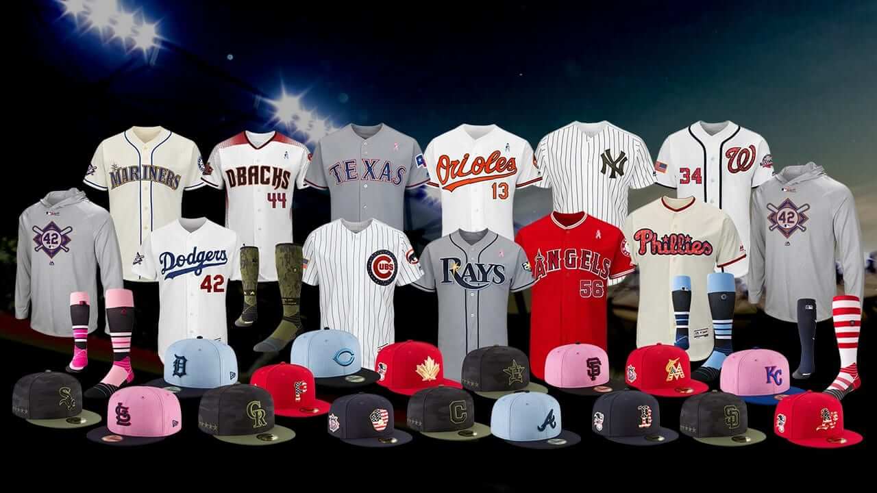
Click to enlarge
MLB revealed all of the 2018 holiday uniforms yesterday (much earlier than in previous years). SportsLogos.net honcho Chris Creamer had an advance on this one and did a really thorough job covering the basic info, so I strongly recommend that you start by checking out his report.
Once you’ve read and processed all that info, here are some thoughts from my perch here at Uni Watch HQ:
• I’m a big, big fan of Jackie Day, but that new “42” patch on the caps and jerseys is pretty much the dictionary definition of overkill. (On the plus side, Jackie Day falls on a Sunday this year, so every team will be playing and we won’t have teams doing the 42 thing on dates other than April 15.)
• A huge relief that they’ve backed off of the pink- and blue-trimmed jerseys for Mother’s and Father’s Day (I guess sales were weak, eh?) and are going back to letting teams wear their regular jerseys with pink and blue ribbons, which is how they should have left it all along. Too bad we’re still stuck with the pink and blue caps, but one thing at a time.
• The Memorial Day and Independence Day jerseys are essentially the same as last year. Have they run out of ideas, or are they opting for stability, or is this just the calm before the storm that will hit when Under Armour takes over next year?
• The league logos on the sides of the Independence Day caps seem like an odd choice. I mean, I’ve always liked those logos, but why use them now, for a holiday, when MLB has done its best to eliminate the separate league identities over the past two decades? There are no more separate league offices, no more league presidents, no more separate league baseballs, no more league-specific umpiring crews, and every single day has at least one interleague game. It’s almost like they said to themselves, “Hmmmm, the league logos both feature an eagle — that’s patriotic! Quick, put ’em on the Fourth of July caps!”
• We’ve seen MLB engage in bad civics before (like using camouflage to salute the military on non-military holidays), and now they’ve done it again with the Independence Day cap underbrims, which are imprinted with “We the People.” Fun idea, except that Independence Day is a celebration of the Declaration of Independence (that’s why it takes place on the Fourth of July), while “We the People” comes from the preamble to the Constitution (which was ratified more than a decade after the Declaration). But hey, they’re both important documents, and who really cares about historical accuracy when you have a merchandise program to run, right?
• The Cleveland jerseys retain the standard Wahoo sleeve patch for Mother’s and Father’s Day but, as in past years, shift to the block-C for Memorial and Independence Day, for obvious reasons. This just reinforces why Wahoo had to go. When you can’t use your basic sleeve patch for a holiday jersey, that’s a sign that there’s something wrong with your patch design. At least we won’t have to worry about this next year.
• Fun facts: The Dodgers, Yankees, and D-backs are home for all of the holidays; the Mets, Giants, and Twins are on the road for all the holidays; and the Angels are at home for some of the holidays and on the road for others but are wearing red jerseys for all of them.
Nine days until Opening Day!
NBA uni-scripting update: Earlier this month there was that Boston Herald article that revealed the existence of a “master schedule,” prepared by the NBA and Nike, to script what each team would wear for each game, right down to the color of the leggings. Now the league has decided to share that uniform schedule via a new (or at least newly public) website called LockerVision.
From a data standpoint, LockerVision is pretty great. You can go to any date in the 2017-18 NBA schedule and see what a team wore — or is scheduled to wear. For example, here’s what’s on top for tonight’s games (click to enlarge):
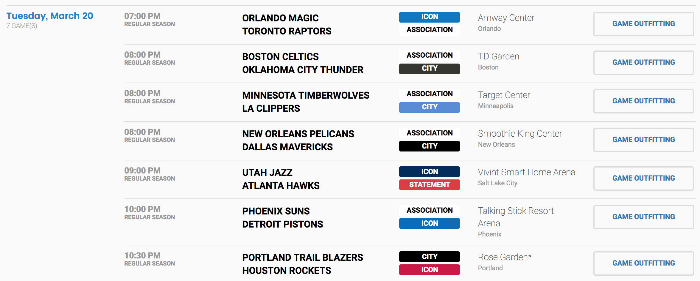
If you look in the far-right column and click on the “Game Outfitting” tab for any game, you get a pop-up window showing what each team is supposed to wear, including leggings, warm-up gear, and so on (click to enlarge):
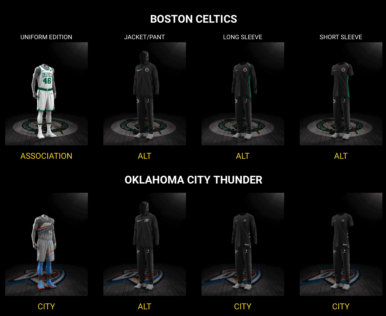
I can see positives and negatives to this approach. On the plus side, it helps teams avoid non-contrasting uniforms and also lets fans know what their favorite teams will be wearing. On the minus side, it eliminates any sense of spontaneity (so much for sticking with a certain design out of superstition, right?), seems to remove some decision-making power from the individual teams (although the Cavs say it’s more of a collaboration), and there’s something off-putting about all the uniforms being scripted in advance, especially by entities that primarily think of uniforms as merchandise. It may also mean that our weekly “NBA Uni Tracking” feature, written by Collin Wright, is now moot. I’ll have to discuss that with Collin.
In any case, if everything’s going to be scripted, you may as well make the script public, so I give the NBA major points for transparency. Wouldn’t it be nice if the NFL, whose jersey schedule (but not pants) is usually settled by about Aug. 1, offered something like LockerVision?
(My thanks to Nets equipment manager Joe Cuomo, who was the first of several people to let me know about LockerVision.)
Click to enlarge
Collector’s Corner
By Brinke Guthrie
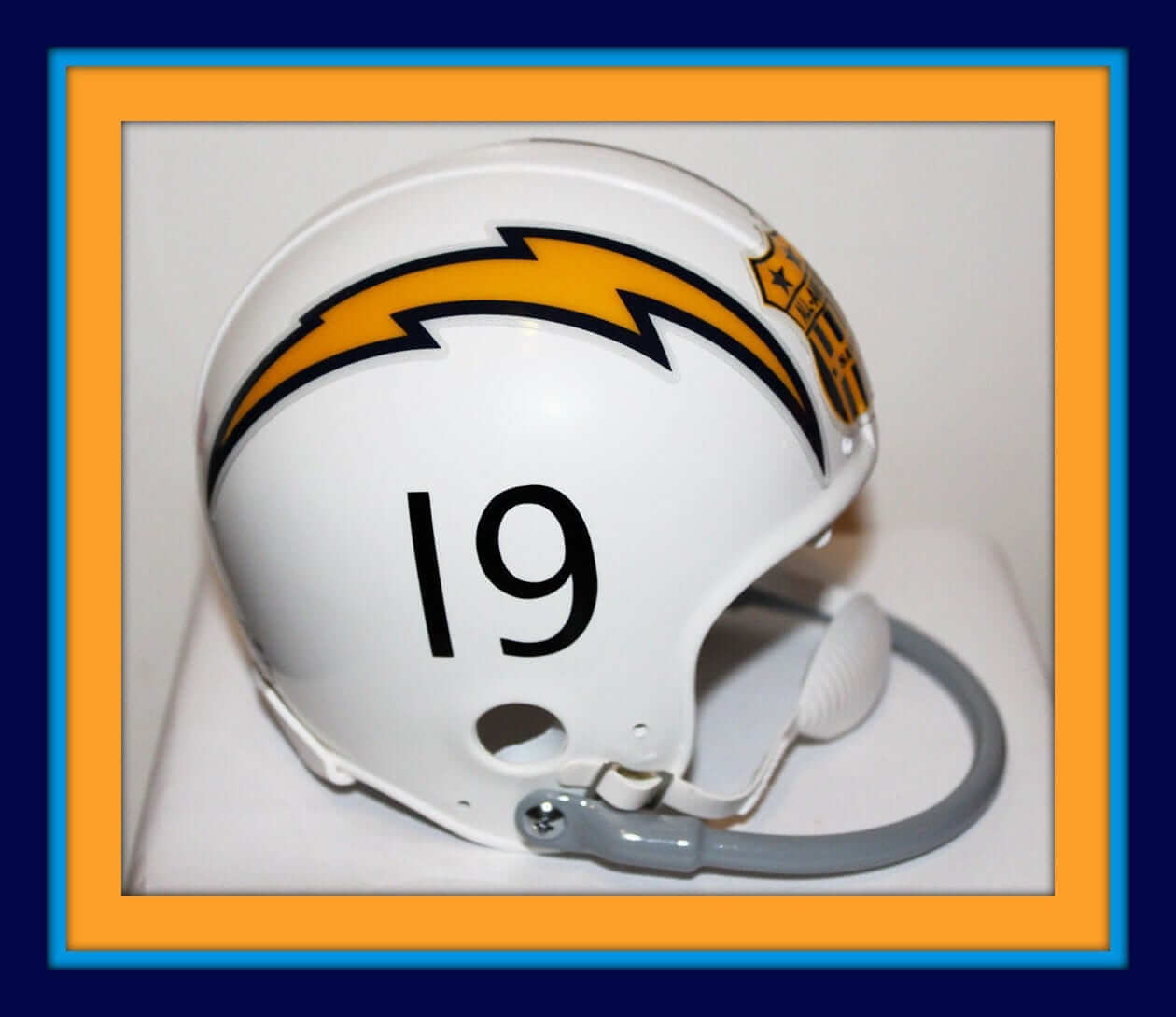
This is a DIY custom San Diego Chargers mini-helmet. Great detail on this and the seller says he will put any number on there you want (although the 19 shown in the photo, for Lance Alworth, is always a good option). He includes the All-America City decal too — nicely done.
Now for the rest of this week’s picks:
• One more from the Bolts: This 1970s powder blue Chargers helmet sticker comes courtesy of the coffee folks at Chase Sanborn.
• This Yankees poster was given out on Old-Timer’s Day, Aug. 8, 1970, and commemorated “Casey Stengel’s All-Time Yankee Team.”
• Another great NFL helmet sticker collection set. Seller says late 1970s, but it’s more like 1983 or 1984.
• This 1970s Baltimore Colts helmet medallion looks bright and glossy for its age.
• Check out this old 1960s Boston Red Sox lunchbox!
• Here’s a lot of three 1970s NFL football dolls. No, let’s say “action figures,” right? Seahawks No. 80 is Largent, and I thought Cardinals No. 12 might be Neil Lomax, but he wore 15. You also get a Vikes player with no jersey number.
• This promo button from the Atlanta Falcons and Louis Rich includes the name of Falcons player John Settle. They’ve “Teamed Up Against Drugs.”
• These NFL Los Angeles Rams “licensed” wristbands date back to their first era in the City of Angels. (Side note: Always loved that “Official Licensed Product” logo. The mark of quality!)
• Here’s a San Francisco Giants patch/decal/schedule/bumper sticker set from the 1970s.
• This “Juice” T-shirt was a promo item for O.J. Simpson’s Spot-Bilt football shoe line back in the day.
• Always loved the contrasting body/sleeve design for this style of MLB Diamond Collection jackets — this one is for the Phillies. Believe these were 1990s, not 1980s.
Seen an item on eBay that would be good for Collector’s Corner? Send any submissions here.
The Ticker
By Alex Hider

Baseball News: The Astros made note of their World Series championship on the logo sculpture in front of their spring training facility (from Ignacio). … Speaking of the Astros, they’ll be selling 112 World Series fan rings today at $11K a pop (from Phil). … The Brewers re-created a scene from the movie Sandlot in honor of the film’s 25th anniversary (from Tom Juettner). … Awesome pictures of old baseball equipment managers: BSmile sent along a picture of the Yanks’ Pete Sheehy from 1970, and Brian sent along a shot from the White Sox locker room in 1959. … New unis for Bravos de Leon of the Mexican League (AAA). As Cesar points out, they are ad-free, a rarity for the Mexican League. … KT Wiz, a team in Korea’s KBO league, will use artificial rain before games this season if the stadium is too dusty (from Jim Vilk). … The Yankees and Red Sox may play a two-game series next year in London, which would be an MLB first. … Alabama has already worn nine different uni combos in its first 21 games.

Pro Football News: Tyrann Mathieu will continue to wear No. 32 with the Texans (from Ignacio). … Not only is this ’70s fax machine ad featuring Roger Staubach awesome, but according to Scott Criscuolo, Staubach never used that mask design. … Interesting that the 49ers Foundation doesn’t use the same wordmark as the football team (from C.A. Bells). … Sir CC, the mascot of the NBA’s Cleveland Cavaliers, donned a classic Browns jersey last night as the Cavs honored Joe Thomas (from Robert Hayes). … The Canadian Football League will have a new game ball next season (from Wade Heidt and Nick Maibroda).

Hockey News: The Ottawa 67s painted a four-leaf clover — not a shamrock — on the ice for their game on Sunday for St. Patrick’s Day. At least they got it right on their St. Paddy’s Day sweaters (from Matthew Walthert).

NBA News: LeBron James’s jersey from this year’s All-Star Game recently sold at auction for more than $90,000 (from Rick Mueller). … Cross-listed from the NFL section: The Cavaliers’ mascot “Sir CC” donned a classic Cleveland Browns football jersey as the Cavs honored Browns offensive tackle Joe Thomas, who recently retired (from Robert Hayes).

College Hoops News: Reader Alex Gerwitz is tracking the uni color matchups throughout the NCAA tourney. Here’s what he has so far. … Bryan Black has collected more than 300 D1 jerseys to “take his mind off epilepsy and onto positivity.” Give him a follow (from Damon Hirschensohn). … Deadspin’s David Roth went after West Virginia coach Bob Huggins and Marshall coach Dan D’antoni for their, uh, interesting sense of fashion. … UConn women’s basketball star Gabby Williams got the full “athletes as superheroes” treatment in this promotional video shown during the Huskies’ first-round NCAA Tournament win over St. Francis (from Kary Klismet). … Don’t go to the dark side, UMBC (from Taylor Workman).

Soccer News: Puma officially unveiled 10 new away kits for national teams, four of which will be worn at the upcoming World Cup (from Phil). … Ryan found this Las Vegas Americans keeper’s jersey at a sporting goods store in Detroit. The Americans only played one season in the Major Indoor Soccer League before being expelled from the league for financial problems. … Turkish club Besiktas released a special prematch shirt, inspired by their 1933 jersey (from Ed Zelaski). … New kits for Tampa Bay Rowdies of the USL (from Kody Allenson). … Minneapolis City FC of the NPSL goes by the “Crows.” Their keeper’s shirts have a bird print on the sleeves — thus, #MurderSleeves.

Grab Bag: Retired tennis star Bjӧrn Borg is once again advertising with Fila (from Brinke). … Chicago welcomed Roger Federer to town for the Laver Cup with custom jerseys from all six of the city’s pro sports teams (also from Brinke). … The Alberta Luge Association has a pretty fun logo (from B.Q. G). … Disney is doing “March Magic” again this year, where they create sports-style logos for their theme park attractions (from Ryan Kelly). … Thursday marked the 119th anniversary of Pittsburgh naming black and yellow the city’s official colors. To mark the occasion, the city shared a timeline on Twitter (from Jerry Wolper). … Here’s some drone footage of the Cincinnati Gardens in mid-demolition.
The best of the best: Back in the early 1990s, when I was working in book publishing, I edited a book called The Savage Mirror: The Art of Contemporary Caricature. One of the many excellent caricaturists featured in the book was the great illustrator Robert Grossman, who’d been active since the 1960s. I’d been vaguely aware of him (he did a lot of magazine work), but working on the book really made me appreciate how brilliant he was. He specialized in depicting politicians, although his repertoire also included celebrities, including the occasional athlete (like his rendering of Joe Namath, shown at right).
Grossman died a few days ago. As it happens, I had seen him do a live presentation just a few months ago — the first time I’d ever seen him in person, which was a genuine thrill. Seemed like a great guy. And now he’s gone. (Crazy coincidence: I attended that presentation with my friend Nate, who’s an animator. Just met him a year or two ago. After the Grossman presentation, he said, “Yeah, I really got into Grossman when I was in art school and I got this book called The Savage Mirror.” He just about shit when I told him I had edited that book, and it was a nice shared touchstone that we both had with Grossman’s work.)
Although Grossman spent most of his career depicting people, his single best-known work had no people in it: He did the famous poster for the 1980 movie Airplane! It was his idea to show the plane tied in a knot. Nearly four decades later, it still holds up, as does most of his work. R.I.P.
The Puma kits that were unveiled are all away kits, not home kits.
Thanks. Got it.
Looking at those powder blue Father’s Day hats, I would love to see some of the blue-based teams, particularly ones who have worn powder blue uniforms like the Royals, Jays, Braves, and Cubs, make full powder blue alternate uniforms for that day.
I’m not sure why there isn’t a team, I’m thinking the Rays, that just makes powder blue / columbia blue their primary color for caps, etc. They could keep the traditional road grays, and wouldn’t have to go full solid baby blue road jersey like in the 70s. It is a great color, and with MLB being so dominated by navy blue teams, a good change of pace to give a team a unique identity.
Yes! Or better still, exactly that, plus powder blue road uniforms and/or home alternates. With 30 teams, one or two could wear blue on the road and there’d still be a more than sufficient amount of gray being worn on the road.
I agree. Outside of Oakland every team’s primary cap is blue (navy or royal), black, or red. A light blue cap and uniform would look great.
Yes. For the life of me I don’t understand why teams are stuck on the black/navy/red/royal blue primary design, so many look the same. I certainly appreciate and enjoy the more conservative and old fashioned nature of baseball uniforms, but with 30 teams it would be great if someone besides Oakland had a unique color. Ideally Rays would go light blue, Astros and Orioles to orange, Padres to brown, Marlins back to teal/aqua, and maybe when the Indians change things up they go burgundy as their primary color with light blue accents. Heck, I’d even support the Diamondbacks going back to purple, teal, and copper for something different.
My Rowdies are gonna be looking good at Al Lang this season!
Yeah, until Lou City comes down to Al Lang and wins ;).
Typo: “The Brewers re-created a scene from the movie THE Sandlot”
Video clip is not available in the link (when I checked this morning). Here’s the clip on YouTube:
link
Got it.
that new “42” patch on the caps and jerseys is pretty much the dictionary definition of overkill
Every player wearing 42 is overkill. Keep the patches and stop unretiring Jackie’s number already.
The Americans only played one season in the Major Indoor Soccer League before being expelled from the league for financial problems.
The *Las Vegas* Americans, yes. But they were the Memphis Americans for three seasons before that. Originally they were the Hartford Hellions.
…and there is still no love for Larry Dolby…guess being first in the American League means nothing…
*Doby
Exactly. It has always bothered me that Doby gets no recognition, especially in the American League. I guess following Robinson by a couple months and being “only” the second black player meant he encountered absolutely no hardship.
Straw man argument. Nobody has ever suggested that Doby “encountered absolutely no hardship.” I think the thought process has simply been that only one player was first, and that player happens to have been Robinson. It could just as easily have been Doby — but it wasn’t.
You can disagree with that line of thought (as I know some people do), but please don’t diminish your own argument by putting absurd words in other people’s mouths. That just creates a race to the bottom.
“Every player wearing 42 is overkill.”
I’d rather see every player wear it than see no players wearing it, on any team in either league, which is how things would be if not for that special day.
Another big plus is that we get to see NNOB jerseys for teams that normally have names on all their jerseys.
I would prefer MLB revert to the original celebration by having one player on each team wear 42. Less would definitely be more.
Give #42 to one player on each team all season long (perhaps the winner of the previous year’s Jackie Robinson award (better known as the Rookie of the Year) and you have a deal!
I sincerely hope Ryan picked up that Vegas Americans keepers jersey!
“Staubach never used that mask design….”
Seems they clearly just plopped the same (literally the SAME) logo-less (no star, no Riddell nose bumper) helmet on both him and Drew Pearson.
(Pearson did, however, wear that type mask).
That was my assumption when I saw it. Same set, same helmet…they were probably standing like 2 feet from each other.
Am I a horrible person (sports fan) for having never seen “The Sandlot”?
You’re killing me, Dumb Guy!
It is excellent. Especially if you enjoyed baseball growing up, and I imagine even more so if you grew up in the 1960s loving baseball.
It is tied with The Natural as my favorite sports movie.
I’ve never seen it either.
If you didn’t die before 1993, then yes.
I’m glad someone called out Huggins (and D’Antoni, but Huggy Bear is better known and more visible nationwide) for looking like slobs. I was always taught to dress the way you want the world to treat you. (Suit and tie to work daily, and I am in my early 40s.) You don’t have to go full-on Jay Wright, but take some pride in your appearance already. You’re representing your program and your school.
Similar to “Supe” to mean Super Bowl, I’ve noticed this site invariably uses “Jackie Day” to describe Jackie Robinson Day despite the fact that I’ve never seen or heard anyone else anywhere call it that specifically. Not a criticism, just an observation
“Supe” is not used “invariably” throughout the site, or even invariably by me. I just use it sometimes.
I do use “Jackie Day” pretty invariably, although I don’t impose that on any of our other writers. It’s a Paul thing, not a site thing.
How long has the winged stirrup been the Uni Watch favicon? Sure makes the browser tab pop!
“We the People” is not bad civics, at least not in the way that glorifying only the military on Independence Day or honoring living veterans on Memorial Day are. I mean, sure, “In Congress, July 4, 1776,” would have been more spot-on. But the Constitution of 1787 was the culmination of the revolutionary period, and the Declaration of Independence functioned as a part of the new republic’s constitution in addition to a notice of political separation. National independence was and is a bigger issue than just not having tax rates set by Parliament and judges appointed by the King. It’s about the formation of a republic out of a monarchy, and of an independent nation out of colonies. Both of which are matters wrapped up in questions of organic law, and that implicates both the Declaration and the Constitution (as well as the unloved but important Articles of Confederation). Many of the colonies had already declared their independence from British rule by July ’76, and towns in all of the colonies had already done so. The importance of Congress’ Declaration of Independence was not its novelty, because it wasn’t novel at all, but that it was national. Congress spoke for and as a nation, and in so doing spoke that nation, our nation, into existence. The Constitution came a few years later, but it was a vital part of the process of nation-founding that we celebrate on the Glorious Fourth.
The stars-and-stripes caps are the best that MLB has done since starting this dreadful league-wide promotion. Best of a bad lot, but still a better treatment of the stars and stripes motif within cap logos than we’ve seen previously.
The most alarming thing about the battery of holiday costumes is the socks. Having league-wide standard sock designs takes us a whole new step into stocking blasphemy. We’ve gone from stirrups as part of the team uniform, to stirrups as a limited player choice, to stirrups as a canvas for individual expression, to socks as a league-wide mandate unrelated to either team identity or personal expression.
Favicon: Yesterday, around noon. Been waiting for someone to notice. Glad you like!
“We the People”: Yes, very bad civics. Will invariably further our nation’s already alarming historical illiteracy. Too many people don’t even know the difference between the C and the DoI, much less which one is being celebrated on July 4. These underbrims will just add to that problem.
Socks: It’s reached the point where pajama pants are the better option, at least for MLB-wide promotions like these.
Love the new favicon.
How did we go from “stop hiding the socks/stirrups” to “cover those up” so quickly? It is like the merchandise people realized there was another part of the uniform they could make money on and instantly destroyed all the aesthetic value of it.
ahem
My sleuthing — okay, and the calendar in the shot — makes me think the White Sox locker room photo is from 1959, not 1950. :-)
On the NBA uni-scripting: Do we have any sense if this schedule is mandated and/or “set in stone”? In other words, could a team go “off script” for superstition or other reasons? Or change the schedule partway through the season?
In case this photo link
link
doesn’t show the entire post, it’s post 998 in this thread:
link
Showing some illustrations/artists’ conceptions for the WHA MIAMI SCREAMING EAGLES uniforms (a team that never came to be)
-Jet
Go to the thread link, the first link doesn’t show all the pics.
-Jet
The LockerVision website was very interesting, however, I wonder how accurate it is for the future. I have been tracking the Pacers Uniform Stats for the entire year, which I’ll send in after the season, and the LockerVision website definitely brings up some questions. LockerVision says that the Pacers will wear their gold Statement (alt) jerseys for 6 of the last 10 games, including 4 games in a row. The Pacers have worn these jerseys 14 times so far this season, and have only worn them once back to back. The most questionable note is the fact that they won’t wear their normal white or blue unis at all for the rest of the year. It just seems a little suspicious and I will love to see if it indeed holds up.
Morgan, is the info for *past* games accurate, at least as far as you can tell?
Here’s an idea for Jackie Robinson Day: Have all the players wear the patch and socks. Do all the in-stadium tributes the same in regards to Robinson. However, instead of all the players wearing #42, have each team wear the number of their first player to break the color barrier(Doby’s #14 in Cleveland) for example. It is still Jackie’s day and he was the one to lead the charge, but this would be a way to give a little love to the other players who had to go through a lot to break each respective team’s color barrier and inform the fans of their stories. If anything, the “Jackie Robinson Tree” would show another view of the charge he led and the legacy he left behind.
Many teams (i.e., most of those that came into existence after 1960, which accounts for half of all MLB clubs) don’t have a “first player.” They already had multiple black players on their inaugural rosters.
Jackie Day is fine as is. The 42-o-rama is one of Bud Selig’s few unqualified successes.
Nice work on the favicon Paul!
Thanks for noticing, and glad you like!
I want to second (or I think more accurately, third) the praise for the new favicon. The old one, with the magnifying glass, was fine, but the winged stirrup really pops, at least on my browser and theme.
Anyone know why the Ohio State women game was played on the most generic blank court? It was actually quite refreshing. I know that it was held at a different arena then where they normally play but did they not already have a court?
The permanent wood floor at St. John Arena is painted primarily for volleyball. There are basketball lines on there, but the court has thick red outlines around the volleyball boundries, which is very distracting for basketball. So they laid a generic portable court on top. (I think there was a layer in between to protect the court underneath.)
The White Sox clubhouse picture is from 1959. Note the posted schedule.
Got it.
Fascinating to think that there are three small homes built right next to the old Cincinnati Gardens. Zoning rules must’ve been pretty loose back in the ’40s and ’50s. I imagine any kids who lived there could’ve heard the rock concerts through their bedroom windows. Neat to think about. -C.
Cardinals #12 is link.
Did they just inadvertently show us a new/old Devil Ray patch on the Rays’ sleeves?
You mean this patch that’s been there all along for years?
link
It looks more like the old color, but then again, it’s on the Memorial Day template, so that probably explains it.
Would have been nice to have known the Robert Grossman “magazine work” link contained some NSFW material – albeit in caricature form.
Sorry about that. Having worked at home for 22 years, I sometimes forget. I’ll try to find a different link to his work.
The Independence Day hats should say “When in the course of human events….”. Or “We hold these truths to be self evident, that all men are created equal”.
Or if you wanna do crazy, put a diffrent line under every hat. You could even have each player read what is on his hat, put it all together in a video,and show it at the games.
I make a point to read the declaration every July 4th myself. I don’t know, maybe I’m weird but I like doing it.
I read it every July 4th as well.
That would have been really neat idea.
But of course these caps exist purely for merchandising purposes. So they had find the line that would sell the best, and landed on a passage from a different document altogether.
Or a fan could collect them all!
Paul, in your LockerVision screenshot it says “Rose Garden*” for tonight’s Trail Blazers game, but when I went to the site it said Moda Center, the corporate name. Was that thanks to your anti-corporate naming web plugin? If so, how come none of the other arena names (TD Garden e.g.) were changed?
Yeah, probably because of the plugin. Not sure why it’s working selectively.
Has anyone taken a look to see if there’s any correlation between playing in a nationally-televised game and both teams wearing unis heretofore known as alternates? I catch a game on ABC (so, Saturday or Sunday) maybe once every couple weeks, and as best I can recall, the teams I’ve seen more often–Cavs, Warriors, Rockets come to mind–have seemed less inclined to wear their “traditional” options.
So, basically, I’m asking if it seems like HQ is calling the shots on what to wear specifically in nationally-televised games to help drive merch sales?
Interesting little write-up here on the apparent different shades of “Midnight Green” the Eagles have used over the last 20 years. Nike apparently did change the color from “Sport Teal” to “Deep Teal” in 2017 in an attempt to make the jersey colors match the sideline apparel.
link
The Philies jacket listed on EBay is actually from 1993, not the 1980s.
Not getting favicon on iphone, will it update eventually? Want to see how it looks.
Appreciate the opportunity to throw up in my mouth annually when MLB releases it’s holiday nonsense. Paul, maybe you could update the pandering t-shirt design in your store to add pink,baby blue, & camo to the “stars & stripes pandering” shirt-have a real Frankenshirt
I have a sneaking suspicion that the Las Vegas Americans keeper jersey may have belonged to Keith Van Eron. KVE played several years with my hometown team, the Baltimore Blast, before moving on to join the expansion Vegas team for the 85-86 season or 86-87. Not too sure how it wound up in Detroit though.
I’d like to know if Ryan picked up the jersey, too.
The patch on the side of the MLB caps (especially that uneccesary league patch) is so they can sell them to minorities and people in urban areas. It’s why the postseason patch has been added alongside the world series patch. The whole snapback craze that was going on 5-6 years ago led to more vintage caps being produced like old world series cap reproductions (historically inaccurate reproductions like reds caps with a 1990 ws logo) and those patches becoming popular led to any old patch being slapped on a cap. I remember seeing lots of Mets and Yankees caps that featured a huge subway series 2000 patch (never worn, probably wasn’t designed until much later). My main point is that MLB have been going crazy with cap patches lately and it’s so that they can be sold to minorities. It hasn’t worked, they still prefer “vintage” reproductions.