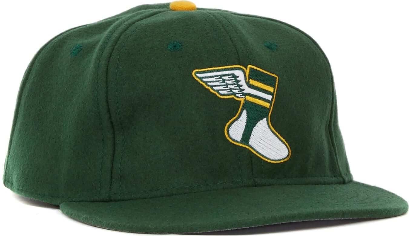
I’m happy to announce that the first Uni Watch cap is now available from Ebbets Field Flannels, and I’m really happy with the way it turned out. It comes in fitted sizes and is also available with a leather strap, and I’m proud to say that it’s made in the USA. You can click on the photo shown at right to get a better look at the embroidery.
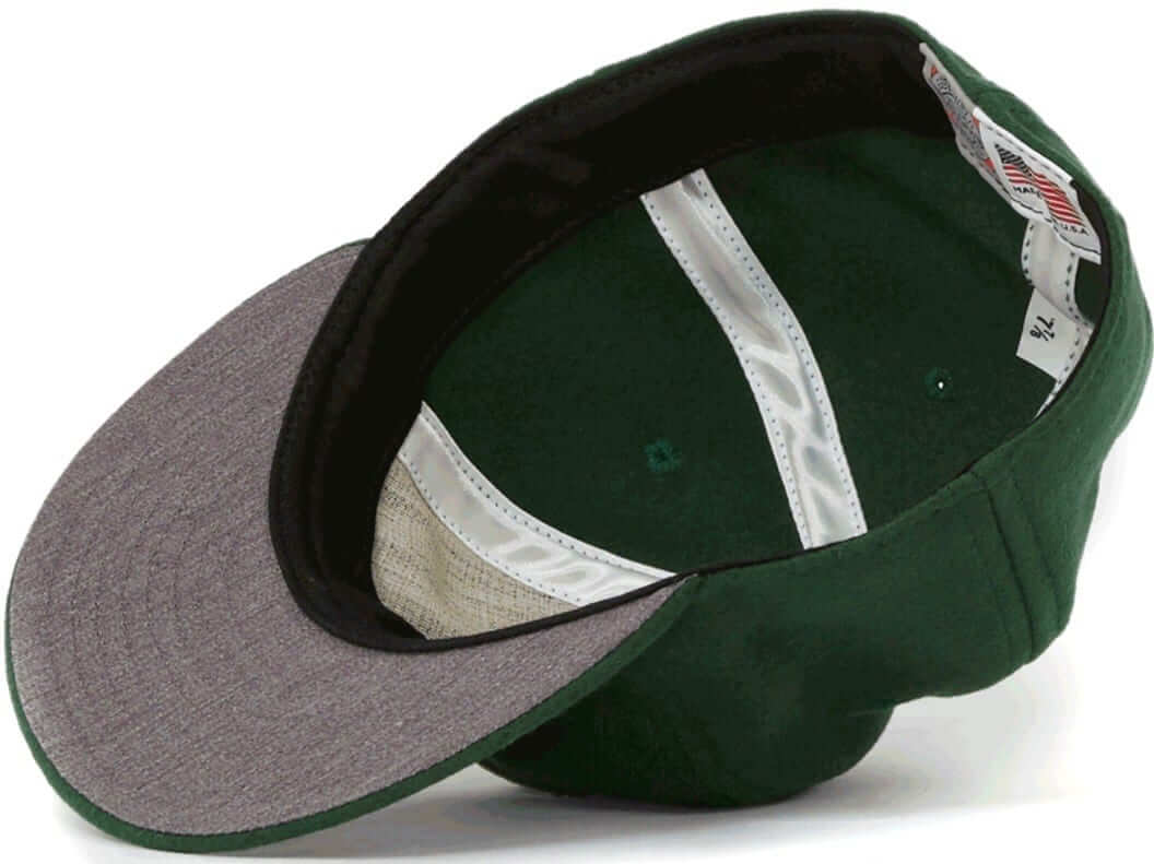
Here’s how it looks on the inside, along with a rear view of the leather strap (click to enlarge):
I want to thank the people at Ebbets Field Flannels for being so great to work with, and I also want to thank Bryan Molloy for coming up with the winged stirrup design, which looks great on a cap and will have a more prominent role on the website in the months to come.
Again, the cap is available here. We’ll have a purple cap available next Thursday for this year’s Purp Walk, and the “alternate” cap with the white front panel and the script on the back should be ready in late June-ish.
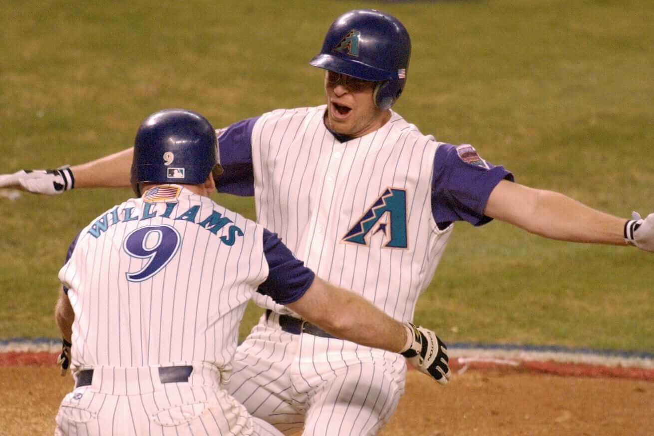
Friday Flashback: With the Diamondbacks wearing a series of throwbacks lately (they wore another one last night), I’ve written a Friday Flashback piece for ESPN about their original purple and teal set — which, you might be surprised to hear, I’ve come to like quite a bit. Check it out here.
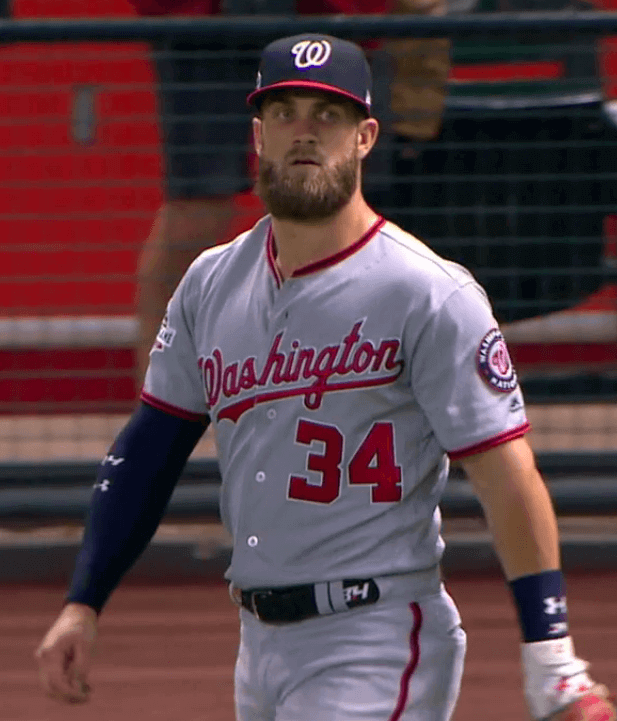
Belt watch, continued: I’ve written a few times now about MLB players wearing uni-numbered belts this season, and earlier this week I wrote about Matt Harvey’s personal logo. Those two trends converged last night on Nationals outfielder Bryce Harper’s belt, which carried his personal “BH/34” logo.
(My thanks to reader Evan Tvedt for spotting this one.)
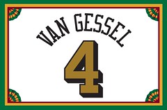
Membership update: Several new designs have been added to the membership card gallery (including Rachel Van Gessel’s card, shown at right, which is based on the 2000 Purdue basketball team). I have one more slot open in the current batch, which means the next person to sign up will get his or her card very quickly.
Remember, a Uni Watch membership card entitles you to a 15% discount on any of the merchandise in our Teespring shop. (If you’re an existing member and would like to have the discount code, email me.) As always, you can sign up for your own custom-designed card here, you can see all the cards we’ve designed so far here, and you can see how we produce the cards here.
Also: Remember that next Thursday, May 17, is Purple Amnesty Day — the only day of the year when I’ll accept orders for purple-inclusive cards. All you Vikings, Northwestern, and Rockies fans, get ready!
The Ticker
By Kris Gross

Baseball News: The Phillies have the National League logo in their on deck circle. … Speaking of the the Phillies, they wore their powder blue throwbacks yesterday, and PA announcer Dan Baker joined in on the throwback fun (from Blake Fox). … The Cardinals bought bulletproof cups after Yadier Molina’s groin injury (from Brinke). … Yankees pitcher CC Sabathia seems to be perilously close to violating the team’s beard ban (from Asher Hoffman). … Yankees slugger Aaron Judge will wear custom pink cleats on Mother’s Day (from Pablo Murphy). … The Chattanooga Lookouts will celebrate Star Wars Night tomorrow with Stormtrooper jerseys (from Mike Covington). … The Lakewood BlueClaws will wear jerseys with pictures of fans’ dogs for Bark in the Park tomorrow (from Minor League Promos). … We’ve got another orange vs. yellow matchup for you, this one between Sam Houston and SLU softball (from Chris Mycoskie). … White jerseys with difficult-to-read white outlined numbers for both Houston and UCF (from Jeff Sharon). … Check out this gorgeous 1983 Florida yearbook (from Eric Esteban). … Nats OF Andrew Stevenson’s helmet logo appeared to be stretched out last night. … Speaking of the Nats, reliever Sean Doolittle last night became the second player to use the D-backs’ helmet cart (from David Raglin).

NFL News: Cowboys rookies have to earn their helmet star. … @TomlinReactions with a cool find: Pittsburgh Pirates football jackets. “I think the video is from 1938, before the Rooneys changed the name to Steelers,” he says. … This is what happens you have to make a NOB into a FIOB after the fact (from Pro Football Journal). … Here are the uni numbers for Broncos rookies (from Clint Dickinson).
College Football News: Arizona State head coach Herm Edwards thinks Sparky, not the pitchfork, should be the team’s new primary logo (from Jason Hillyer). … Georgia Tech is getting rid of their “honeycomb” helmets (from Richard Musterer). … K-State has new turf (from Tyler Dreiling). … @pinkhippos10 spotted this awesome Penn helmet cart.

Hockey News: Here’s a look back at Blues jerseys through the years. … Elton John has often worn baseball gear onstage, but here’s a shot of him wearing a 1974 Team Canada hockey jersey (thanks Paul).

Basketball News: Skechers is suing Adidas for what basically boils down to secretly paying high school and college players (thanks Paul). … Skylar Diggins-Smith of the WNBA’s Dallas Wings has a double-decker hyphenated NOB (from @TheSkyShowCHI).

Soccer News: Charlton Athletic midfielder Jake Forster-Caskey can only fit the first initial of his hyphenated last name (from Liam Hanley). … Real Madrid’s 2018-19 home kits have leaked (from Josh Hinton). … Here is a look at all the confirmed and leaked Premier League kits (thanks Phil). … New home kit for Chelsea (from Ed Zelaski).

Grab Bag: It’s time for the Indigenous round of the National Rugby League in Australia, where all teams have jerseys designed by indigenous artists (from @TheBigJamesG).
Cap links only go to the jpeg image rather than the product page
Yikes. Now fixed.
Here’s the proper link:
link
the logo that Florida was wearing on the white 1983 jerseys looks like a coffee cup
Picture that on a football helmet, though.
No need to: the link doesn’t look much different from today’s.
that qb’s parents should have named him Warren instead of Wayne.
also I think dude meant picture the coffee cup logo from the white baseball jersey on a football helmet. I did. It ain’t my cuppa tea
Typo: “The Phillies have HAVE”
Is the NL logo on the Phillies’ OWN on-deck circle? And do they have one with an AL logo for their interleague visitors?
I’m 99% certain that the NL logo is in the visitor’s circle. And while it has been a while since I’ve been to an interleague game, I am also pretty sure they swap it out for an AL circle. I know for certain back in the days of the Vet that all the NL logos and such on the visiting team side got swapped out during interleague games.
Back in the Vet days, the visiting team’s logo was on their on-deck circle and it changed with every series. I think they stopped toward the very end (2000-2004).
Oh right. But the dugout had National League on it, correct? Which is what the changed out during interleague.
You are correct.
The Orioles used to have the AL logo in the visitor’s circle, and they definitely swapped it out for an NL logo vs an interleague opponent. I know this isn’t super helpful for the Phils, but the precedent suggests that they would swap it out, yes.
Tangentially related to the Elton John item in the ticker, if you want to see the Captain Fantastic pinball machine in all of its glory, head to the Asheville Pinball Museum in Asheville, NC. They have an original one there. I don’t remember if it was one of the dozens of playable machines they have, but it is certainly on display.
I love running into those old machines. There’s was a Captain Fantastic pinball machine in a great Route 66 diner called The Palms Grill Cafe in Atlanta, Illinois, the last time we stopped in.
Nearby is the Atlanta Route 66 Arcade Museum. link
If you ever need a break from the endlessness of I-55 in central Illinois, check it out.
The Team Canada jersey Elton is wearing was worn for just one series. It was the 1974 Summit Series. Canada was represented by WHA players against the Soviets.
I think it was a pretty good uniform. Like the maple leaf adornment along the arms and pant stripes:
link
I’m going to disagree with you. That was a terrible uniform.
The maple leaf with the 74, the blue pants, the blue sock striping. Maple Leafs everywhere. There was just too much going on. Putting “International” on the back of the jerseys.
An early case of “one more bumper sticker”
Adventures in hyphenated soccer NOBs:
Liverpool midfielder Alex Oxlade-Chamberlain just wore “Chamberlain” for both Liverpool and Arsenal (and England) this season.
The other players I can think of off the top of my head all wear the entire name.
Odd that Alexander-Arnold does, but Oxlade-Chaimberlain doesn’t
I remember when Nigel Reo-Coker played for the Vancouver Whitecaps, had Reo. C on the back of his jersey:
link
link
I can’t wait for the future date when two hyphenated people get married, have a kid, that kid plays sports and has two hyphenated names.
Something like “Jennifer Smith-Shuster Jones-Drew”
That Blues article is from 2014…
Not only that, none of the pictures in it are working, at least for me.
Also, 2007-14 as their best? I don’t think so.
Pics are not working for me either. I tried multiple Browsers and my phone as well
I love the look of the National League and American League logos. Hope they never update them.
Vintage/traditional look to them.
Yes. And I also like the simplified versions of the logos they created in the late 90’s. Both the traditional and the streamlined version are just great designs. Another reason to hope that with future expansion they don’t scrap the AL and NL in realignment (that and not expanding the DH).
They have updated them a couple of times, as they’ve added or subtracted teams they’ve changed the number of stars on each logo.
(I’m kidding, I know what you mean and I agree completely. The AL and NL logos look so awesome in this age of minimal logos.)
Love the Uni Watch ball cap. In its description: “gold button” and not “gold squatchee”?
How about a BFBS hat???
“We need you to help support the site and any amount is appreciated” – UniWatch
“You like a color that I have a pointless vendetta over? Keep your money” – Also UniWatch
Oh, please. There are lots of rules regarding the memberships. One of the rules is that we don’t accept purple-inclusive orders except on May 17. Simple.
“One of the rules is that we don’t accept purple-inclusive orders except on May 17.”
Which is literally what I’m making fun of you over. Someone so desperate for money shouldn’t have such a stupid stance on a color that a lot of people like. “Please go out of your way to support my site because I’m desperate, but only in ways that I allow.”
I am not “desperate” for money. There are many, many conditions under which I would not accept money. One of them is that I don’t accept purple-inclusive membership orders except on May 17 because I don’t like purple (which I fully acknowledge is a personal quirk).
If you think that’s “stupid,” well, that’s your prerogative. But consider the flip side: Purple Amnesty Day has become a fun annual ritual here on the site. If you don’t like it or care about it, that’s a pity. But try not to ruin the fun for everyone else, OK? Thanks.
From what I’ve understood, the profit margin on the cards, if there is any margin, is negligible at best. They’re not a high-volume item like the T-shirts, hats, or other items either, where economy of scale allows for a greater profit margin for even a limited production run compared to the cards, which are custom one-offs.
Actually, the cards have a reasonable profit margin, but they also entail a fair amount of time and labor — much more than anything else we sell.
Also, what Paul just said above.
Okay, I wasn’t clear on that. But I would imagine my other point about volume of sales is accurate, right?
In any case, it’s not like you’re forcing anyone to buy anything. And it’s not like purple is the only restriction you have, either.
“But try not to ruin the fun for everyone else, OK?”
The irony of you hating a color so much that you relegate it to one day of the year and then telling people to not ruin for it other people.
Yes, life is full of sooooooo many rich irones like this one….
Let’s please move on. Thanks.
“Actually, the cards have a reasonable profit margin, but they also entail a fair amount of time and labor — much more than anything else we sell.”
So they make you a lot of money as a result of your labor. That’s what margin is. It includes labor.
I want so badly to love your site because of what it is, but it so often seems to be successful in spite of you.
While it may seem pointless (at least to you) it’s his site. Also, question for Paul, could you make a membership card from the USL (the second tier of soccer in the USA, kind of like MiLB but the games really matter)?
We can definitely do a USL design, as long as you provide us with a good rear-view photo of what you want.
Okay, thanks Paul. I’m definitely considering a Louisville City FC one, not sure if I will buy one this year (because of money) or not but I’ll get one when I can.
I’m sure we’d all love to go to YOUR uniforms site jASSjASS.
Oh wait…..
This is why I was excited about paying to read Uniwatch.
“This is what happens you have to make a NOB into a FIOB after the fact ”
Technically that is a NickNFIOB: “Nickname First Initial on Back”
“Stump” Mitchell’s real name is Lyvonia Albert Mitchell
” Georgia Tech is getting rid of their “honeycomb” helmets ”
Makes sense since yellowjackets DON’T MAKE HONEY!
Although, yellow jackets to construct their nests in the same hexagonal (honeycomb) pattern.
*do construct
nice engineering!
I’m curious about the perspective(s) in Australia regarding the NRL’s Indigenous Round. It seems like a really cool way to honor the ethnic background of (I would assume) a large # of players, as well as the general population. Is there any sense that it’s a cheap gimmick to sell merch, or is it still fairly pure and altruistic?
I know it’s the exact point of it, but man, the Uni-Caps look so plain! So clean. So right.
I guess my eyes have become *so* accustomed to the jumble of “stuff” on caps these days!
On point, there’s a great quote from EFF’s founder, Jerry Cohen, in his blog on the EFF site. He’s describing the 1947 Durham Bulls cap EFF makes, but the sentiment could apply to this UW cap as well:
“In this era of overly-busy sports logos, graphic designers can learn something from this cap’s “less is more” aesthetic. The hat’s plain-spoken beauty is much more attractive to me than any of the highly detailed over-designed minor league caps of today.”
Sometimes, though, less is less. That Durham cap is such a case. “Less is more” when the less in question allows a well-designed element to shine without extraneous distraction. There is no such element to the Bulls cap in question, and it also contrasts clashily with the design of the rest of the uniform.
The Uni Watch cap, by contrast, is an excellent example of less-is-more. The logo is so well designed and the colors so well balanced, that the simplicity, the plainness, of the rest of the cap accentuates the logo the way a spotlight accentuates a performer on a dark stage. That’s how you do it. But the spotlight only works if there’s actually a performer on stage worth seeing.
The caps are great! I ordered a fitted and an adjustable.
Just a note to anyone thinking of buying one, they appear to be selling fast.
For fitteds there are less than 10 left in all sizes, with some sizes already sold out.
There are still a good number of adjustable available.
Just ordered. I was on the fence between 7 3/4 and 7 7/8. Since the smaller size was already sold out, the decision became easy.
I am not the type who wears hats, but damn, that uni-watch hat is FREAKING OUTSTANDING. Love the logo, love the color, love the yellow squatchee (sp?). Good work on the design!
Thanks, Rich!
Does Ebbets sizing run pretty close to that of New Era?
Ebbets runs truer to size the New Era. i.e. if you order a 7 1/2 you will get a 7 1/2.with New Era sometimes the caps run very large or can fit too tight.
So, if I normally wear 7 3/8 in New Era, I should be fine with 7 3/8 in Ebbets?
I wear a 7-3/8 cap. With New Era, sizing is hit or miss, but the miss is usually on the big side. With Ebbets 7-3/8, sizing runs very consistent from cap to cap. Tends to be a tiny bit small, but the caps also sit a bit higher on the head due to their lower profile construction, so they’re good fits for me.
Nice job on the Friday Flashback, Paul. And I agree – the Diamondbacks really did get it right the first time.
I’ll second that. One of my favorite of your ESPN pieces. Convinced me that those deserve a second look and more credit. Props to you for re-consideration!
Caps look awesome. Ebbets did a great job as always.
I laughed when I read the description of the winged stirrup logo as being “iconic.” It’s too recent for that adjective, no? I listened to that recent podcast that Phil and Todd Radon were on, and Todd mentioned the word iconic being overused these days. Since then I’ve seen it everywhere and noticed my own usage. It’s a shame that it’s being overused because it’s a great word. The repetition of the C sound makes it fun to both read and say aloud.
Someday the winged stirrup will be iconic, but let’s check back in twenty years.
*Radom
(Thanks, Autocorrect. Though that does remind me to get one of those radon test kits…be safe folks!)
Really looking forward to seeing the alternate cap design, if I recall it was going to be more of a relaxed fit / flex fit style.
Yes, it will be flex-fit.
I’m getting a Page Not Found error on the link for the cap and it doesn’t seem to show up anywhere on Ebbetts’ website.
Nevermind. Seems to be fixed now.
How long are the caps available for? Limited time? Catching me between pay periods is all.
No time limit. As we sell out of sizes, we will re-stock them.
The cap looks great Paul. I’ll be holding out for the alternate design next month.
Bighead Size gone (7 7/8). Thanks for the “email me when my size is available” feature!
Paul
Will the Purple Amnesty cap be from Ebbets Field Flannels or from the “alternative” cap maker?
Thanks.
Purp Walk cap will be a snapback from a different maker.
Thanks.
Hi Paul. Can you repost a pic or two of the white panel “alt” cap? Grazi.
Here you go:
link
Late June-ish is on the clock.
Did you notice Bryce Harper’s arm/compression sleeves have the number of them too?
Yeah, but those aren’t part of the uniform — they’re just accessories. Players have been wearing personal logos on accessories for a long time.
The belt is part of the uniform, so it’s more notable.
Where does an undershirt fall? Seems like a gray area.
I actually did a blog post on this a few years ago — came up with the term “uniquipment”:
link
Was Thursday night in the Bronx the first time Boston wore the navy jerseys for a non-Friday game?
omg why didn’t i see this until now how the heck is the cap sold out omg