By Phil Hecken
Follow @PhilHecken
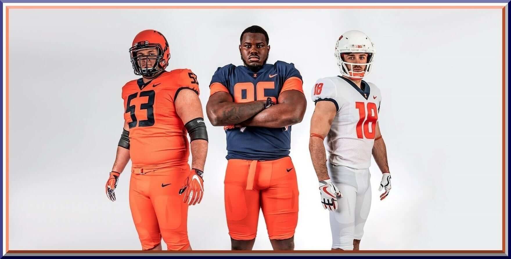
In a stealth move yesterday morning, the Illinois Illini unveiled four new uniforms, and one new helmet, that they will wear for the 2018 season. The team last updated their uniforms in 2014, and were one of the few remaining teams in the Nike stable to still wear the “Elite 51” (with the signature Flywire collar) uniforms. They’ve now upgraded to the “Vapor Untouchable” template. Corporate jingo aside, the new uniform template looks superior to the previous one.
The four new uniforms are in the following colors: orange, blue, white, and gray (which is a new “Gray Ghost” uniform — the previous one and new one both seek to honor Red Grange). The new helmet is orange. It appears as though the team will mix-and-match the blue, orange, and white tops, helmets and bottoms, but keep the gray components from the “Gray Ghost” uniform as a separate, worn once-a-year, set.
Let’s take a look at the new unis (click any image to enlarge):
ORANGE:


BLUE:


WHITE:


GRAY:


HELMET:


The new uniforms are exceedingly plain — no striping at all on the jerseys or pants. All jerseys have a blue collar, and all jerseys except for the blue jersey have small blue stripe around the armhole (the blue jersey has an orange stripe). Helmets are also plain (previous helmets did contain a center stripe, though that was removed from the orange, navy and white helmets for the 2017 season). The gray helmet is now stripeless as well.
The “plainness” is (so the story goes) a tribute to the “Dick Butkus era jerseys of the 1960s”:
The jerseys are inspired by the Butkus era #Illini jerseys from the 1960's.
Solid color, no number stroke, no white accents, no stripes. Classic. pic.twitter.com/mhNR63ZK0S
— Illini Football (@IlliniFootball) April 6, 2018
While you think there’s no “gimmick” (as Nike is so fond of), you’d be wrong — but it’s barely visible so I’ll allow it (from the Illinois release):
“A unique two-column pattern is set in both the jerseys and the numbers as a nod to the historic columns at Memorial Stadium, which represent Illinois soldiers who made the ultimate sacrifice.”
Whatever. If we don’t “see” it, is the tribute really there? (Similar to the slogans written inside collars — if they’re not outwardly visible, are they just for the players and fans who buy jerseys?)
The new orange helmet uses a shade that more accurately matches the orange in the uniforms and no longer has a metallic matte finish. The white, blue and gray helmets are not new.
I really like the new uniform sets (and I didn’t particularly dislike the old ones either). In case you don’t remember, here’s what the prior set looked like:


Of course, if you think new new uniforms remind you of another school that also wears orange, blue, gray and white, you wouldn’t be alone:
Illinois unveiled new uniforms. And they're exactly the same as Syracuse pic.twitter.com/NBwlja9htX
— Andrew Doughty (@Adoughty88) April 6, 2018
This fact was, shall we say, picked up on by many websites (there were more than that, but you get the idea). When your school colors are blue and orange, that will happen. But when Nike gives you a GFGS and an all-white uni, well…the comparisons abound.
Like I said, I like the new uniforms a lot — and as long as they don’t go mono-orange (dear God, please never do this), they should look pretty fine. Avoiding the mono (except for the all white, which is fine on its own) won’t be easy, but if they don’t try to wear a different combo every week, they should up looking just fine in 2018.

And of course, the obligatory reveal video:
Coming in 2018. #ILLINI | #WeWillWin pic.twitter.com/UN5wcyshu3
— Illini Football (@IlliniFootball) April 6, 2018
Thoughts?


Kreindler’s Korner
I had the distinct pleasure of featuring the wonderful artwork of artist Graig Kriendler on two occasions over the summer and fall of 2017.
For those who don’t wish to click the links, Graig paints baseball heroes (and regular guys) from the past, and is an immense talent.
Occasionally, I will be featuring his work on Uni Watch.
Here’s today’s offering (click to enlarge):

Title: “A Bewildered Bystander”
Subject: Mickey Mantle, 1951
Medium: Oil on linen
Size: 20″ x 46″
Here we see a young Mickey Mantle posing before his first regular season debut with the Yankees on April 17.
Being a cool, mid-April afternoon, I wanted to make some conscious decisions with my color choices. The sky was kept a little bit dusty and overcast, as it seems like there was mostly cloud-cover during the contest. We can tell that the sun is peeking out a bit here due to the shadow cast by the tripe deck stadium across the right field-side (near his belt). It’s not super bright though, as we can still make everything out in the shadows of the stadium and Mantle himself. Had it been overdone, all of that stuff would appear a value or two darker than it is, as well as the light grass being much brighter, and for whatever reason, just wouldn’t have felt like April.
Sure, the focus of the painting is obviously the young rookie, but I was just as concerned with putting him in the proper context of his debut – that sort of attention to detail is the kind of stuff I really strive for.
Thanks, Graig! You can (and should!) follow Graig on Twitter.
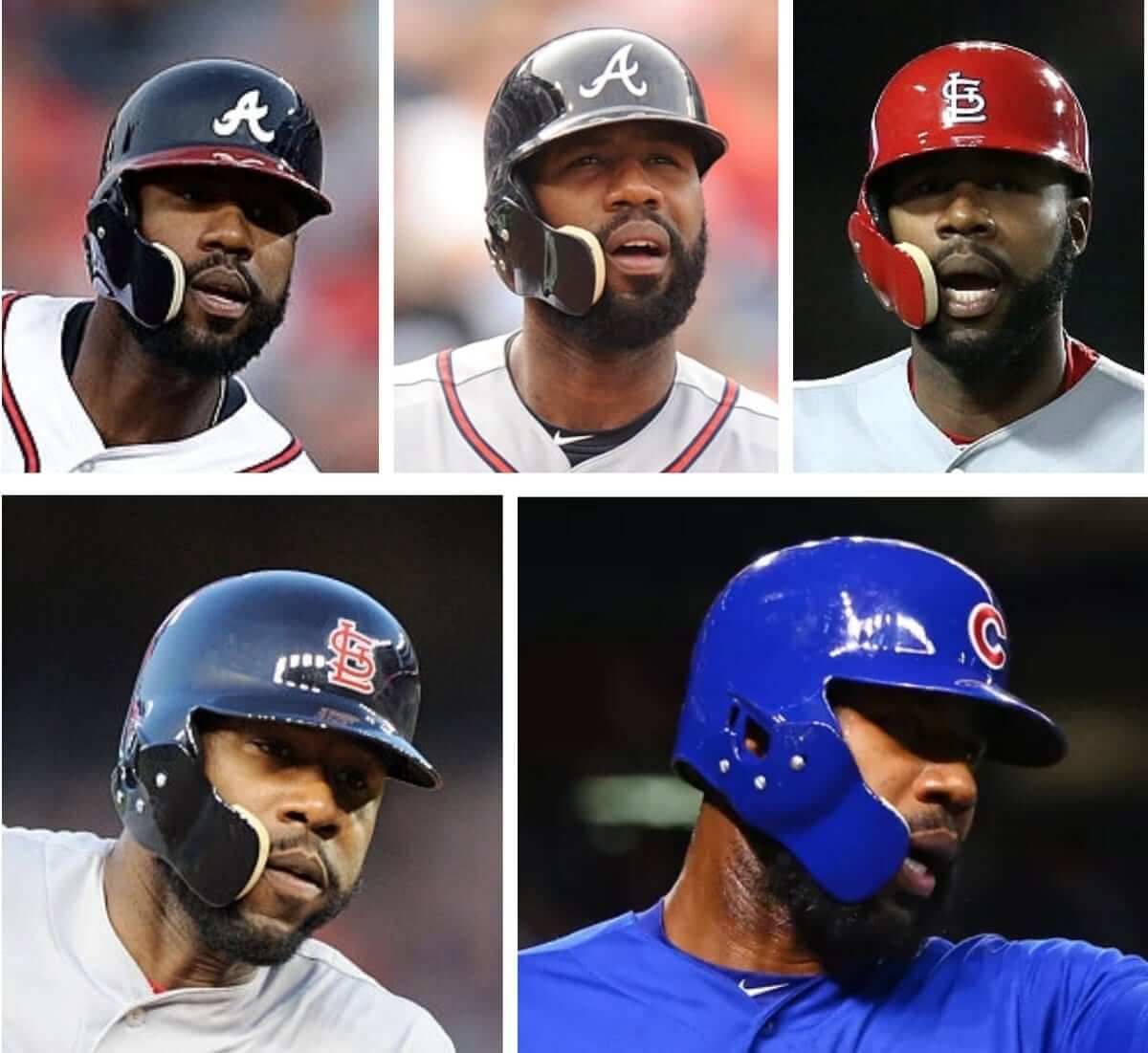
And now a few words from Paul: Hi there. In case you missed it a few days ago, I have a new ESPN column about the C-Flap, the protective faceguard accessory that is literally changing the face of Major League Baseball (thanks in part to its use by Jason Heyward, shown above, who holds the unofficial records for wearing the flap in the most games, during the most seasons, with the most teams, with the most helmet designs, and in the most colors). It’s a deep dive that explores the flap’s past, present, and potential future. I hope you’ll check it out here.
In addition, I ran some follow-ups to the ESPN piece on the blog yesterday. Look here.
Meanwhile: Todd Radom and I are so happy with the response to our limited-edition “Rain Check” print that we’re thinking of doing another print based on another one of his T-shirt designs. We’re trying to gauge how much demand there’d be for such a print and could use your input — full details here.
That’s it. We now return you to your regularly scheduled Phil-tacular.
The Ticker
By Anthony Emerson

Baseball News: Ian Desmond went with the knit cap over the baseball cap last night. I kinda like the look, but I’m sure most people will call that sacrilige (from Sam Klein). … Chris Bostic of Triple-A Indianapolis also went knit cap over baseball cap during a snowy opening day yesterday (from Dustin Smith). … Reds P Luis Castillo reached base during last night’s game, and first donned a hoodie before changing his mind and changing to a zipper-up jacket after one pitch to the next batter (from Jeff Walter and @piquedbyperique). … Jeff Walter and @piquedbyperique also sent along similar pictures of Adam Duvall’s helmet logo malfunction. … Speaking of helmet logo malfunctions, the Rangers’ Robinson Chirinos completely lost his (from Jonathan Shaw, Sean Deitrick, Kyle Kuban and @bigbuddycolin). … The St. Lucie Mets’ throwbacks on Thursday were really inconsistent: 1978-82 Mets jersey with 83-92 pants (from AJ Frey). … @mswanson3000 has been working on a model of Cleveland’s League Park. “It’s more art project than historic recreation, so artistic liberties have been taken” he says. Looks wonderful, though! … The Denver Post published a picture of Citizens’ Bank Park instead of Coors Field on their front page. Ouch (from Mike Chamernik, Erik Spoonmore, Brian Murphy and several others). … The Astros presented some wonderful Opie Otterstad paintings to Justin Verlander, Jose Altuve and George Springer yesterday. Respectively, Verlander, Altuve and Springer are the reigning ALCS, AL and World Series MVPs (from Ignacio Salazar). … Here’s a great pic of some White Sox players (Don Kolloway, Frank Klein and Skeeter Webb) in what appear to be Marine Corps. caps (from Ray Hund). … Detroit Athletic has a list of what they consider the worst caps in MLB history, and I am irate at the inclusion of the late-90s Astros, the Seattle Pilots and Angels’ halo caps. I’m sure you’ll find something to disagree with, too (from Jeffrey Sak). … Reader Daniel Daponde reports that the new “Pro Light” material used on New Era’s batting practice caps acquire permanent sweat stains even after only a few uses. … Some Boston College baseball players were wearing these amazing socks featuring the skyline of Boston (from Segev Goldberg). … Tequila Sun…Devils? Scott Cummings found that in an ASU team store. … Awesome powder blues and sitrrups for Heritage High in Littleton, CO (from Rob Montoya). … This may be the best Opening Day mohawk of all time (from Eric Bangeman).

![]()
NFL/College/High School Football News: New Broncos punter Marquette King will wear No. 1, as his usual No. 7 has been retired for the Broncos’ general manager (from @Greggo_82). … Paul, avert your eyes! Someone on Reddit imagined what the NFL would look like if teams became billboards for corporations (from Justin C. Cliburn). … Campbell will have a new field design next season (from Greg Enkers).

Hockey News: The NHL has updated their on-ice playoff logo. Here’s the old one (from Dom Hart). … Yesterday, the ECHL’s Tulsa Oilers wore these The Outsiders jerseys (from Mike Iles). … Both the Senators and Pens wore Jonathan Pitre memorial decals on their helmets last night (from Art Mah) Here’s Jonathan’s story (from Mike Styczen). … St. Louis Blues goalie Carter Hutton’s mask got a repair during intermission last night and the video was on Instagram (from @TheGoalNet).


NBA/College/High School Hoops News: Check out these awesome c. 1977 Sixers shooting shirts! (from Brad Eenhuis). … Jonathan Gibson made his Celtics debut against the Bulls last night, and became the first player in Celtics history to wear No. 60. According to basketball-reference.com, Gibson is also the first player for any team since to wear the number since 1949, when two members of the Indianapolis Jets (Walt Kirk and Dick Wehr) wore No. 60. … The University of Houston will now be outfitted by the Jordan Brand (from Ignacio Salazar).

Soccer News: Panama has formally launched their 2018 World Cup kits (from Josh Hinton). … The eMLS Cup kits have their own typeface (from @alarmingsirens).

Grab Bag: Matt Kuchar’s head covers feature some gorgeous paintings of Augusta holes (from Griffin Smith).
And Finally, due to a number of factors, I will be away from the PC for most of today, and the rest of the UW crew is busy as well — so we’re going to be going tickerless Sunday. Apologies in advance. I’ll still have content (and it’s a good one) tomorrow, so make sure you check in, but if there is any breaking uni news, it will likely have to wait until Monday. Again, apologies in advance. This is one of those rare instances when I won’t be around and no one was able to swap ticker duty with me.
I would say the Illinois uniform is an upgrade compared to the last.
Though they will mix-and-match, I hope they wear orange helmet/navy jersey/orange pant combo as much as possible.
Sorry for the disappointment Phil, but the mono-orange will happen. Fighting Illini have been doing it already:
link
At first glance I am reminded of Syracuse.
Overall I feel that it is more of a downgrade than an upgrade. Good news is that it will change again in a couple of years.
But didn’t Illinois and Syracuse already look very similar before these changes? They have both featured blue, orange, and white for a while now. At least Illinois doesn’t have the silly truncated pants striping that Syracuse has. Overall, I like Illinois’ new uniforms. I would think that all the uniwatchers who deride the clown suits that many football teams are wearing these days, would appreciate the simple classic uniforms here. True, the “gray ghost” gimmick uniform is unnecessary, but that’s only one game of the year (and they’ve been doing that for several years already). I just think it’s interesting that they have new uniforms again after only four years of their previous set.
I like the look a lot more than last year. Its simplistic no fuss look oddly enough matches its very plain jane state (am a resident in Central Illinois). It’s unfortunate that right down to the number type the look nearly matches Syracuse.
thanks for the great content today!
i cant believe that #1 hat in the “worst caps in mlb history” but figures it would be Boston.
Story does get some facts wrong. That Mariners cap is an alternate now, but was the home cap when first unveiled in the 1990s.
The Blue Jays cap was their short-lived regular cap during 2003.
Short-lived for a reason. It was horrible:
link
The alternate had the red bill:
link
That Blue Jays cap was an abomination during a dark time in their uniform history, as the uniform change to the “Black Jays” was imminent.
Some Tigers fans may not have liked it, but I did like the Tigers road hat that made this list.
Some ridiculous entries on this list. Forget looking at the worst caps in mlb history, just look at the Angels. The L.A. halo cap is worse than the 2000 Anaheim Angels? Really??
The LA halo and the Pilots caps are some of my favorites. I also liked the White Sox curly C.
The Illinois makeover looks awesome compared to what we got earlier this week in Tennessee. Still don’t care for the gray uni but it’s nice to see a team go for the “less is more” approach.
link
Here’s a look at this weekend’s (Matchday 33) Premier League kits.
The White Sox players are wearing Army headgear-that’s Army insignia
I like the matt orange helmet but if the logo is peeling off already what’s it going to be like after a game?
Those are Army hats. Besides Marine Corps wears covers, not hats.
Living in Syracuse I can say that Illinois got the better end of the deal. First their number font is better. They don’t have stripes in the numbers nor do they have the silly pant striping that Cuse has. Finally the Illini orange helmet is a nicer shade than Syracuse.
Illinois’ rounded number font isn’t bad; it’s legible and not cartoonish like many of the recent NFL makeovers. Probably because Illinois has a pretty generic identity since Chief Illiniwek was retired. I’m not saying that was the wrong decision, but now the Illini only have “residents of Illinois”, orange and blue, and past greats like Grange and Butkus to work with. That said, wouldn’t a block number font make more sense with the block I logo?
In the 2008 World Series, both the Phillies and Rays had cold-weather hats with Elmer Fudd-style ear flaps to be worn in the field. Are they no longer available? In a time where people are going balaclavas-under-caps or tuque-over-caps, this would seem to be another possibility. And a marketing avenue for New Era *dodges lightning bolt*
I have one of those caps. It’s the best winter hat I’ve ever owned. I don’t know why the stopped making them. Even from a marketing viewpoint, it makes no sense. Wouldn’t they rather sell pricey earflap caps than cheap knit caps?
“exceedingly plain” is probably the best description for an Illinois program that has had just ONE season of 2-games or more above .500 since 2002, and been to one Rose Bowl in 33 years.
With so many colleges with so many same color schemes, it’s tough to be super original these days. That’s how we get stuff like the a buccaneers, Oregon, Maryland. Some look-a-likes are bound to happen. No one complains about Oklahoma and Alabama looking almost exactly the same.
Any particular reason the Nats are wearing their stars-and-stripes gear today?
To celebrate Siete de Abril, of course…
Man City v Man United is the Lakers-Celtics or USC-UCLA of NBA/CFB, respectively.
I am not one for all the glitz and glam in today’s college football uniforms but those Illinois uniforms are so boring. They look my old high school practice jerseys. Add a stripe or an accent somewhere. There are lots of simple college football jerseys out there that don’t look so dull. Those mono orange uniforms are going to burn out some retinas.
It’s not even that it’s boring. It’s nearly identical to Syracuse. Plenty of schools have similar colors. But… block monogram helmet logo + orange/navy with no white outline + eerily similar “unique” numerals + orange/navy/white mix & match + GFGS (Red Grange or not, it’s GFGS). And both schools are Nike clients, which makes it even more baffling. Nobody at the Swoosh thought, “the Illinois gear, it’s derivative, like I have seen this somewhere…”???
All I can say is, love the site! I didn’t think there were others out there who also cared about things like unis, stadiums, etc.
Apologies in advance if this has already been known…
But the Orioles announcers just said on the broadcast that the Orioles will take the field on Earth Day in “special jerseys and caps”
They’re already doing a jersey tote bag (link) giveaway so I assume that’s the design.
Overall, I think the new Illinois uniform set is an upgrade. Is it very plain? Yes, yes it is. But it’s meant to be a tribute to the Butkus era & I think the simplicity gives it a timeless look. In other words, it’s a classic look with a modern twist.
But, one thing I absolutely cannot get over is the orange helmet, specifically the decal on the orange helmet. Who on earth thought putting a block “I” decal that is outlined in orange on an orange helmet would be a good idea? I imagine this went through multiple people at Nike, the UIUC athletic department, & the football staff, and no one briught up how awful that looks?
Replacing it with a solid navy block I or making the outline navy & the inside of the Block I the same shade of orange as the helmet would be such a massive upgrade.
Also, it’s the “Illinois Fighting Illini” not “Illinois Illini.”
Yes, I was just about to say that the team name is Fighting Ilini.
link
Another reason for me to be ashamed of living in Illinois. (and there are plenty of them) Those uniforms are awful and to bring Dick Butkus into this discussion about them is not right at all. I’m starting to they Nike destroys everything it touches.
Now for the baseball caps, 82-86 White Sox??? I fucking LOVE those caps. Seattle Pilots and the LA Angels. Im tempted to make wallpapers based off of those three caps right now.
Nike really seems to dislike traditional pants striping. Almost none of the college teams have a anything down the pant legs, and most of NFL teams have some sort of truncated abomination.
I guess I’m biased as an Iowa Hawkeyes fan, a team that has had essentially the same uniform since 1979, save for some historically (in)accurate one-offs and special unis. But, my question is…as in Illinois…is it no longer vital to try to tie a look to a program. I mean…Alabama and Penn State’s simplicity…Ohio State and Michigan…USC (except for the remodeled Trojan on the helmets in the 80’s and 90’s)…Florida State (with a minor modification to shell color)…just a few bluebloods that have essentially the same look year after year after year. Illinois can’t decide on what it is to make the program identifiable. I know uniforms are important to today’s players, but is changing your design every couple of years beneficial to branding? I remember they featured “ILLINI” for many years and then featured “ILLINOIS” on their helmets for many years after that. I like the Block I, but pick a helmet color and run with it.