[Editor’s Note: Today we have a guest entry from longtime Uni Watch reader and ally Marty Buccafusco, who’s done a deep dive on the surprising level of disarray in one of the sports world’s most famous logos. Enjoy. — Paul]
By Marty Buccafusco
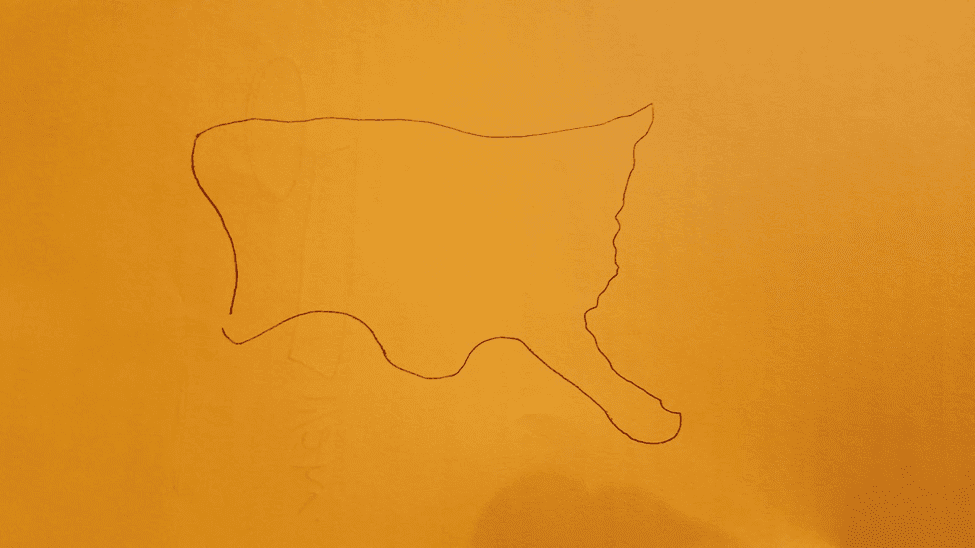
One of my favorite slow-night-at-the-bar games is to challenge a friend to draw a map of the United States. The buddy usually begins with an outline of the country, often starting at the Pacific Northwest and drawing eastward before continuing down the East Coast. We’re typically left with a squat, rectangular blob that features a squiggly dent for the Great Lakes states, a leaning chimney for Maine, an enormous panhandle for Florida, some random bumps that represent the Rio Grande, and very little room for the interior states. Here’s a version attempted by my wife, Jesse:
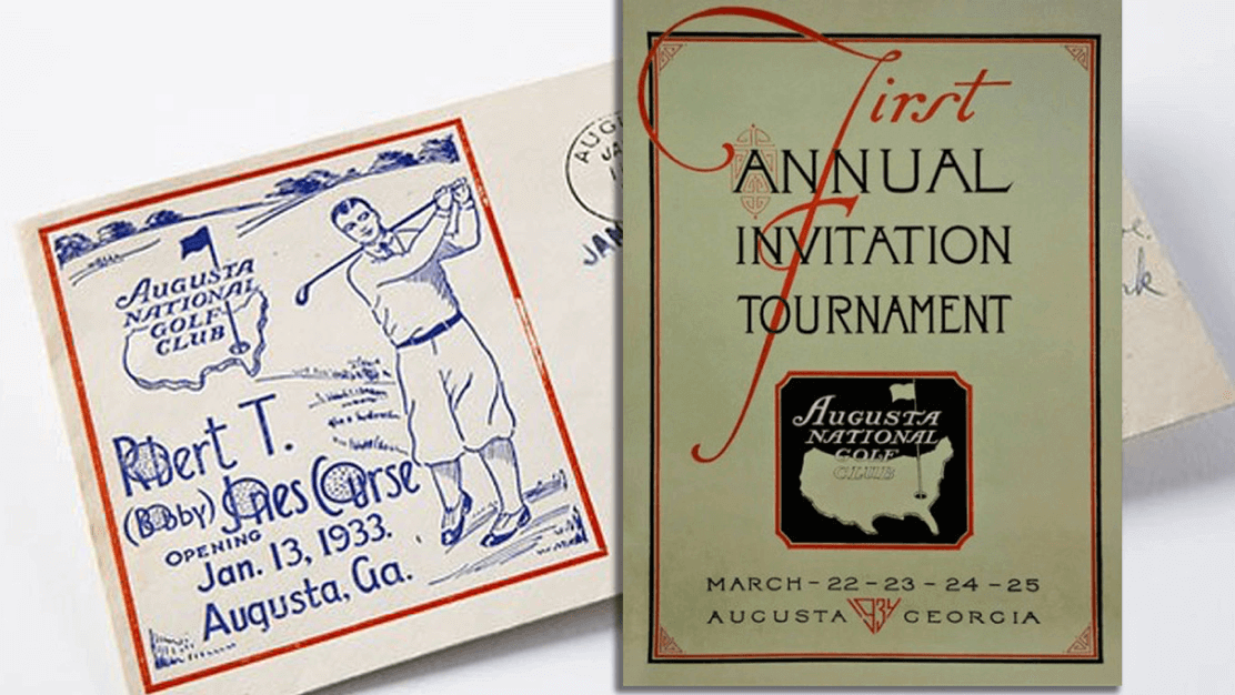
Maybe Cliff Roberts challenged Bobby Jones to a similar game back in 1933, as they designed an emblem for their newly minted golf course, which they called Augusta National Golf Club.
The New Republic has already explored the logo’s poor representation of the national silhouette (the article includes this helpful gif). But the real problem with the logo isn’t that it shows an inaccurate rendering of America — it’s that Augusta National can’t seem to pick one inaccurate version to stick with. There are lots of similar but distinct logos floating around out there.
This all came to light when Uni Watch reader Andrew Dailey recently pointed out to Paul that the Masters appears to have a lot of logo inconsistencies. Paul, knowing that I’m an Augusta native and that I even have a Masters-themed Uni Watch membership card, asked if I’d like to investigate.
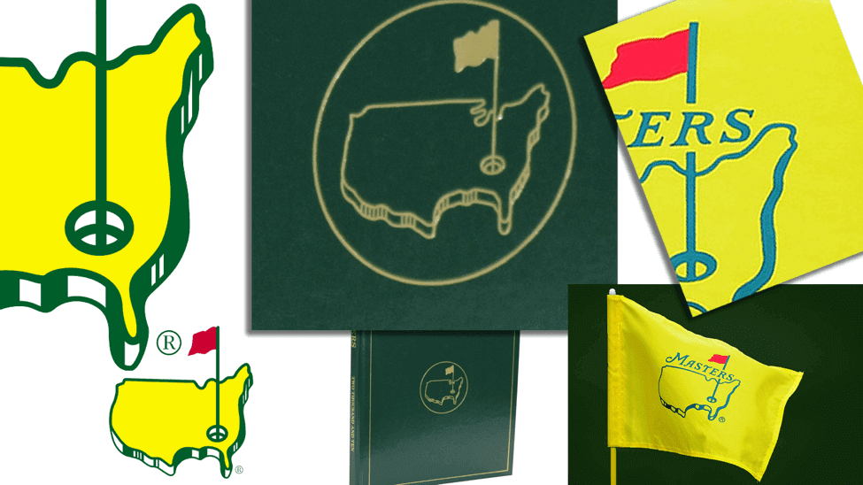
Let’s start with the logo that’s shown on the official Masters website:

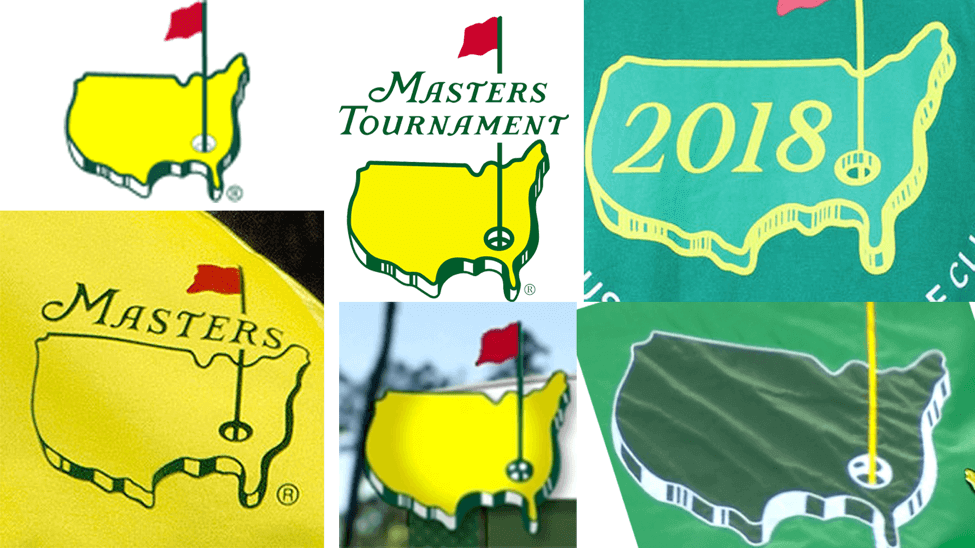
We’ll refer to that throughout this piece as the official logo. You’d think they’d use that version for everything. Instead, there appears to be a variety of logos that are used on-air, online, on merchandise, and on official documents (click to enlarge):

Let’s take a look at the logo’s problem areas and see how they’re rendered differently across the variety of Masters logos that are out there. One caveat before we begin: Unless otherwise noted, I’m only using logos and merchandise from the last two years that either came straight from a Masters webcast or from merchandise that’s currently for sale in the Pro Shop, so every logo you’ll see has been used by Augusta National.
1. Identifiable States. When we think of the outline of the United States, it’s the appendages that are the most defining features. Maine, Florida, Louisiana, and Texas each protrude out of the landmass, providing us barfly cartographers with specific reference points. The Masters logo designers were well aware of this, and different versions of the logo feature various depictions of each of these states. In the official logo, Maine resembles the profile of a gorilla’s head, with a peaked, almost forward-leaning dome and a rounded, stubby nose. The logo on the leather-bound Masters Annual, however, shows us a version of Maine that’s more akin to a terrier’s profile, with pointy, front-facing ears and a full snout. And on the pin flag logo, Maine looks similar to the official logo, but with a thicker “forehead” and shorter “nose.” You can see all three versions here (click to enlarge):
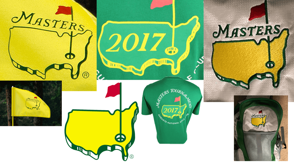
Heading south, we find several different depictions of Florida. It leans slightly eastward in the official logo, protrudes directly southward on the dated merchandise, points out into the Atlantic on the Green Jacket patch, and even hooks westward into the Gulf — America’s Comma! — on the yellow pin flag. Here are all of those versions together (click to enlarge):
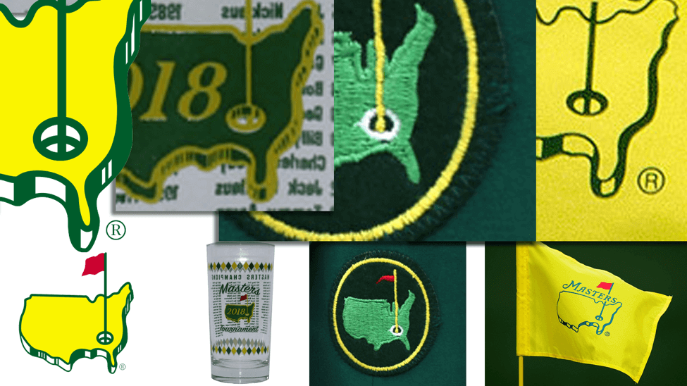
America’s southwestern border, from the southern tip of Texas to the west coast, comes off as an afterthought in most Masters logos. In the official logo, the Rio Grande is rendered as a featureless squiggle, losing its dramatic north/south bends and instead becoming a ploddingly lengthy westward slope. This mistreatment is consistent throughout most of the logos I found, except for the more cartographically-sound versions featured on the Green Jacket patch and in the “1934 Series” of merchandise.
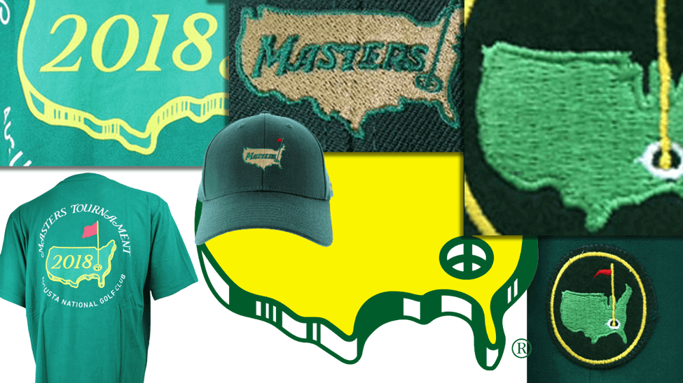
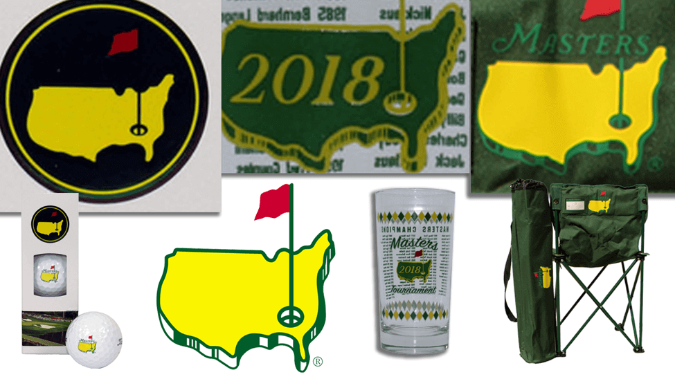
2. The Great Lakes. Masters logo designers included the Great Lakes in outline of America. But, of course, this region is rendered differently across the different logos. The official logo shows a single significant dip, due north of Louisiana. This makes no sense. The most southern point of this region occurs at Lake Erie, which is due north of Georgia. Since the cup in the logo is clearly meant to be placed in Augusta, the Lake Erie dip should appear west of the pin flag. Even when this official logo is used on merchandise, however, the eastern dip that intersects the pin flag demonstrates various degrees of indentation, as seen in golf balls and patron chairs.
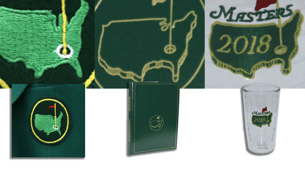
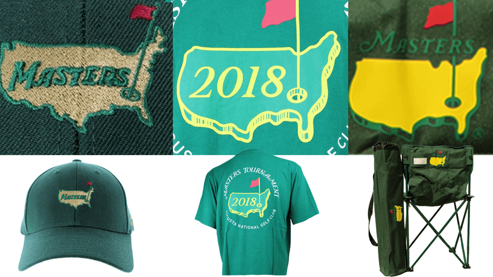
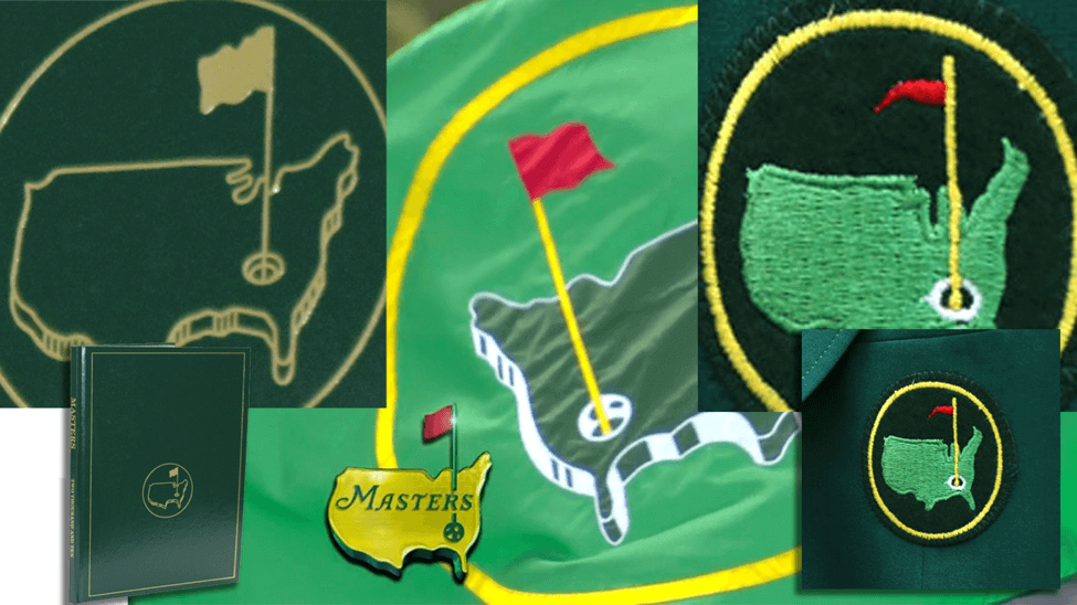
For the logo featured on the first Masters invitation, the designer didn’t put much effort into this region. Current merchandise borrows from this look, as seen on the dated items, such as this Masters tumbler, a green T-shirt, and a green hat. The Masters Annual cover rendering eliminates the lakes entirely, instead providing outlines of Minnesota and Michigan. A similar rendering appears on the Green Jacket patch, while its retro cousin on the 1934 Series simply depicts the Great Lakes region as a long, wide pothole.
3. The Block Shading. From its first iteration on the original invitation, the nation was illustrated as a three-dimensional outline with a block shadow. This look has been maintained, except on the Green Jacket patch and 1934 Series merchandise, which feature a two-dimensional rendering. The 3D versions have a downward-cast shadow, so horizontal lines usually get a white shadow, while vertically-oriented lines get green-shaded shadows. Sometimes these green-shaded regions are solid, and sometimes they feature multiple vertical lines. The biggest discrepancy, however, comes on the eastern seaboard. In some logos, there’s a block shadow with variegated shading; in others, the shading is solid green; and in some there is little or no 3D shadow whatsoever.
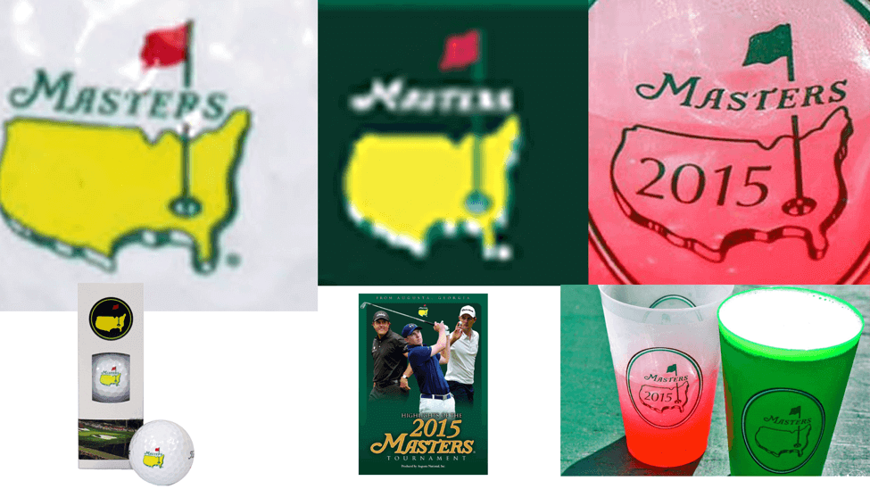
4. Flag, Pin, and Hole Details. Each version of the Masters logo features a cup that is clearly meant to be placed in Augusta, with a pin shooting upward through the nation and a red flag waving westward. This seems simple enough, but I want to take a look at an inconsistency that’s bugged me for years. The style that I immediately picture is the version I call the Death Star cup. This can be seen in some of the on-air graphics and it features a circle in the top-right corner, with lines emanating outward, similar to the bottom of a real golf cup (or, maybe, the Death Star). Variations of this design include the less memorable blank thin-rimmed empty cup on the official logo; the blank thick-rimmed empty cup on the Masters Tournament logo; the shaded-rim empty cup on the pin flag logo; the FUBAR cup on the Big Green Flag; the 2D cup on the Green Jacket patch; and the line-shaded empty cup that bisects the pin on the dated merchandise.
We can then begin investigating the different ways in which the flag and pin relate to one another and to the outline of the nation. As we saw in the section about the Great Lakes, sometimes the pin intersects at the Eastern Dip, sometimes at the Western Dip, and in the 1934 Series it leans eastward, across the Appalachian Mountains. As for the flag, its bottom point can fly well north of the northern tip of Maine, or almost in line with the state.
The flag itself is rendered in a variety of ways. In the official logo, it’s a red flag with one big dip on the top, one on the left side, and two upward crests on the bottom. The number of these flaps and folds can change depending on the logo, as can the flag itself, which is more of a pennant on the Green Jacket Patch. Then there’s the Big Green Flag, which shows the red flag covering the pin instead of extending from it.
5. Type Placement. The Masters wordmark has undergone some simple adjustments since its introduction, but its placement in relation to the artwork remains consistently inconsistent. Most often, the wordmark is above the nation, overlapping the pin and nestling into the western edge of New England. On the Official Masters DVD Video, however, the wordmark hovers a bit higher above the country, as it does on the patrons’ beverage cups.
There are plenty of other examples of the random interpretations of this logo, and it’s been fun to see the variations. From this 1960 Par 3 trophy, to this member’s bag tag, or even these hats that are only available in the Member’s Clubhouse (and seem to place Augusta somewhere in Louisiana). Oddly, when it comes to merchandise, for the products are meant to appear handmade and quaint, the Masters logo is the one design element that stands out as a cleanly produced corporate trademark. I don’t get it.
Of course, Augusta National isn’t known for its transparency, so I find it unlikely that we’ll ever be able to get to the bottom of this. What do you think? Does this add to the charm of the event? Does it suggest that the appeal of the tournament and its merchandise grew so quickly that its historically conservative members couldn’t maintain consistency among the many designs? Perhaps this is all part of that Tradition Unlike Any Other. I’ll admit that there’s something lo-fi and homey about the whole thing that feels appropriate to me. Despite all the hubbub, maybe it’s just that local tournament around the corner from where my best friend’s father grew up.
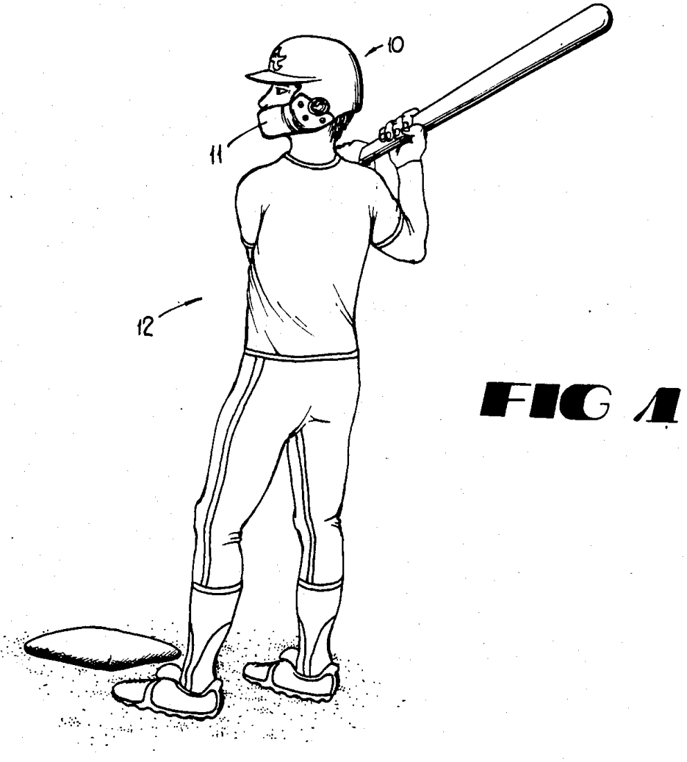
C-Flap reminder/update: In case you missed it yesterday, I’ve done a deep dive on the past, present, and possible future of the C-Flap, which is the faceguard accessory that is literally changing the face of Major League Baseball. It’s the most thorough treatment of this topic that I’m aware of, and I had a blast reporting and writing it. I hope you’ll check it out here. (The illo shown at right, which you can click to enlarge, is from the C-Flap’s 1987 patent. Note the very nice stirrups!)
As is sometimes the case with this type of story, Uni Watch readers have already filled in some additional details in the historical record. So far there have been three prominent developments:
1. I said that the first C-Flapped player I could remember seeing was A’s catcher Terry Steinbach in June of 1988, and A’s equipment manager Steve Vucinich confirmed to me that Steinbach’s flap was the first one he ever installed. But that turned out to be untrue. Reader Mike Brown recalled that A’s infielder Glenn Hubbard had worn the flap a month or two prior to Steinbach (Hubbard had broken his jaw during spring training of that year), and he found video to prove it. Here’s Hubbard batting in a game on May 30, 1988 — four days before Steinbach returned to action from his own facial injury:
Hubbard was probably wearing the flap earlier than that, because he returned to action from his spring training injury on April 15, which is likely when he made his C-Flapped debut. Either way, though, he definitely wore the flap earlier than Steinbach did.
So was Hubbard the first C-Flapped MLBer? That leads us to…
2. Reader Kirk Weindorff said he recalled seeing Giants infielder Chris Brown wear the C-Flap at some point in the 1980s. “I remember how I’d never seen a helmet like that before,” he said. “Of course, me and all of my baseball friends wanted one because it looked cool — never mind the protection aspect.” After a quick photo search, Weindorff came up with this photo to support his recollection:
The photo is undated, but Brown only played for the Giants from 1984 through 1987, so the photo definitely predates the Hubbard and Steinbach flaps. According to this article, Brown suffered a broken jaw in ’87, so there’s our answer. Until someone comes up with an earlier example, Brown now has the title of MLB’s first C-Flapper.
3. I said that Cardinals catcher Yadier Molina was the first player I was aware of to wear the C-Flap purely as a proactive precautionary measure, instead of in response to a facial injury. That was in June of 2016. But reader Jeff Cory said Cubs infielder Javy Baez was a proactive C-Flapper when he was called up from the minors in September of 2015.
I recall this because I was anxiously awaiting Baez’s return to the majors after drafting him for my APBA team that year on the heels of his .551 OPS performance in 2014. When he arrived wearing a face guard, I was concerned that it reflected poorly on his mental toughness, since at the time no other player had donned the C-Flap without having previously suffered a facial injury. I recall him explaining to the Chicago media that he had recently had some expensive dental work done and didn’t want to mess it up. The time frame is confirmed by this Patrick Mooney tweet:
Javier Baez said he's wearing a face guard with his batting helmet as protection after getting dental work done: "It's nothing."
— Patrick Mooney (@PJ_Mooney) September 16, 2015
I suppose one might argue that having a sore mouth from a trip to the dentist is similar to rehabbing a facial injury, but I’d say this is enough qualify Baez for the distinction of being the first proactive C-Flapper.
At least until someone discovers an earlier example, that is.
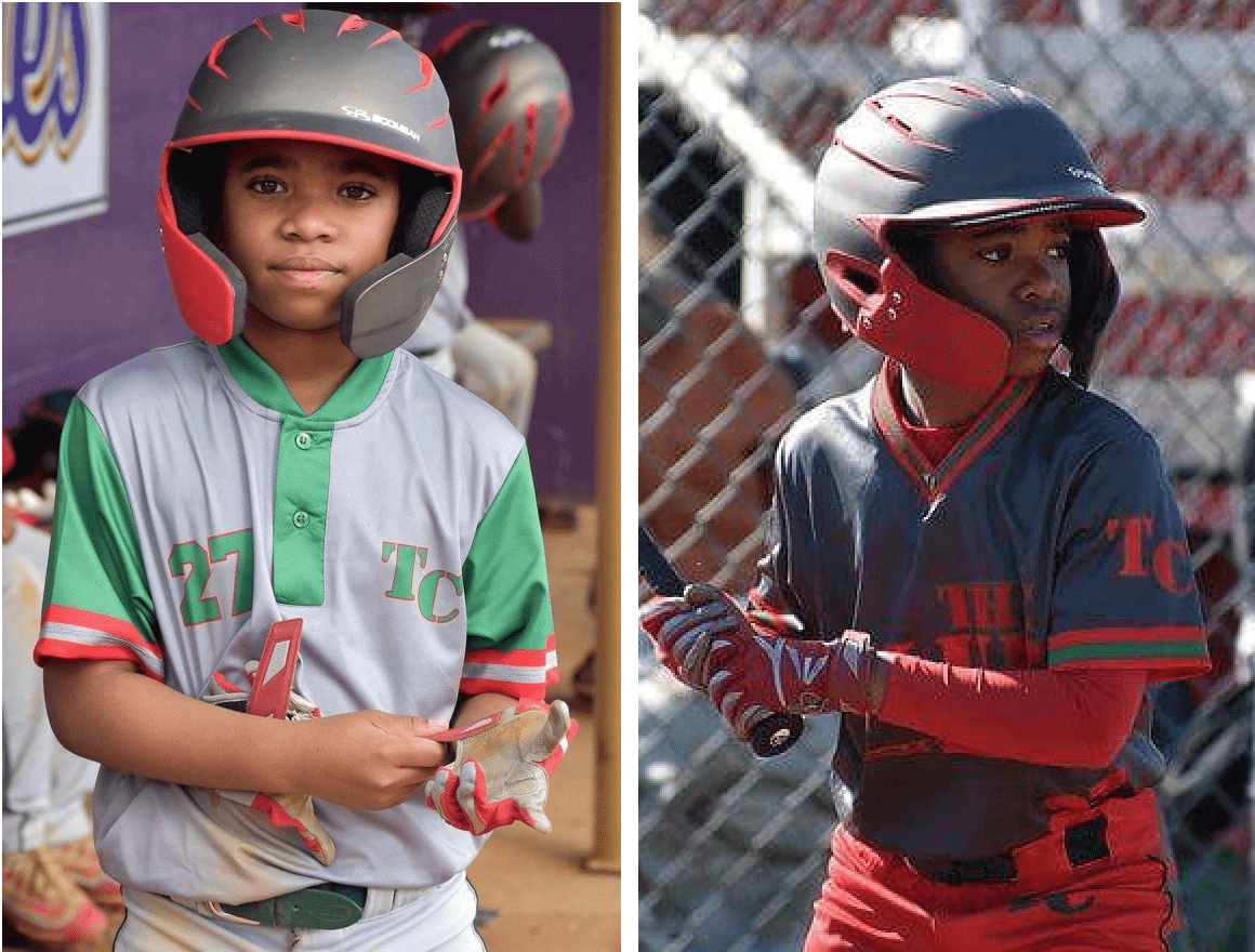
Finally, here’s a kid named Chance Dixon, who wears two flaps — one on each side. Technically speaking these are not C-Flaps (it’s a competing product), but the effect is the same (photo on left by Brooke Nelson, photo on right by Andre Torres; click to enlarge):
Collect ’em all: Todd Radom and I have been very pleased with the response to our limited-edition “Rain Check” art print — so pleased, in fact, that we’re wondering if we should do a similar print based on Todd’s “Hit Sign, Win Stirrups” T-shirt from last year. Here’s a the design (click to enlarge):
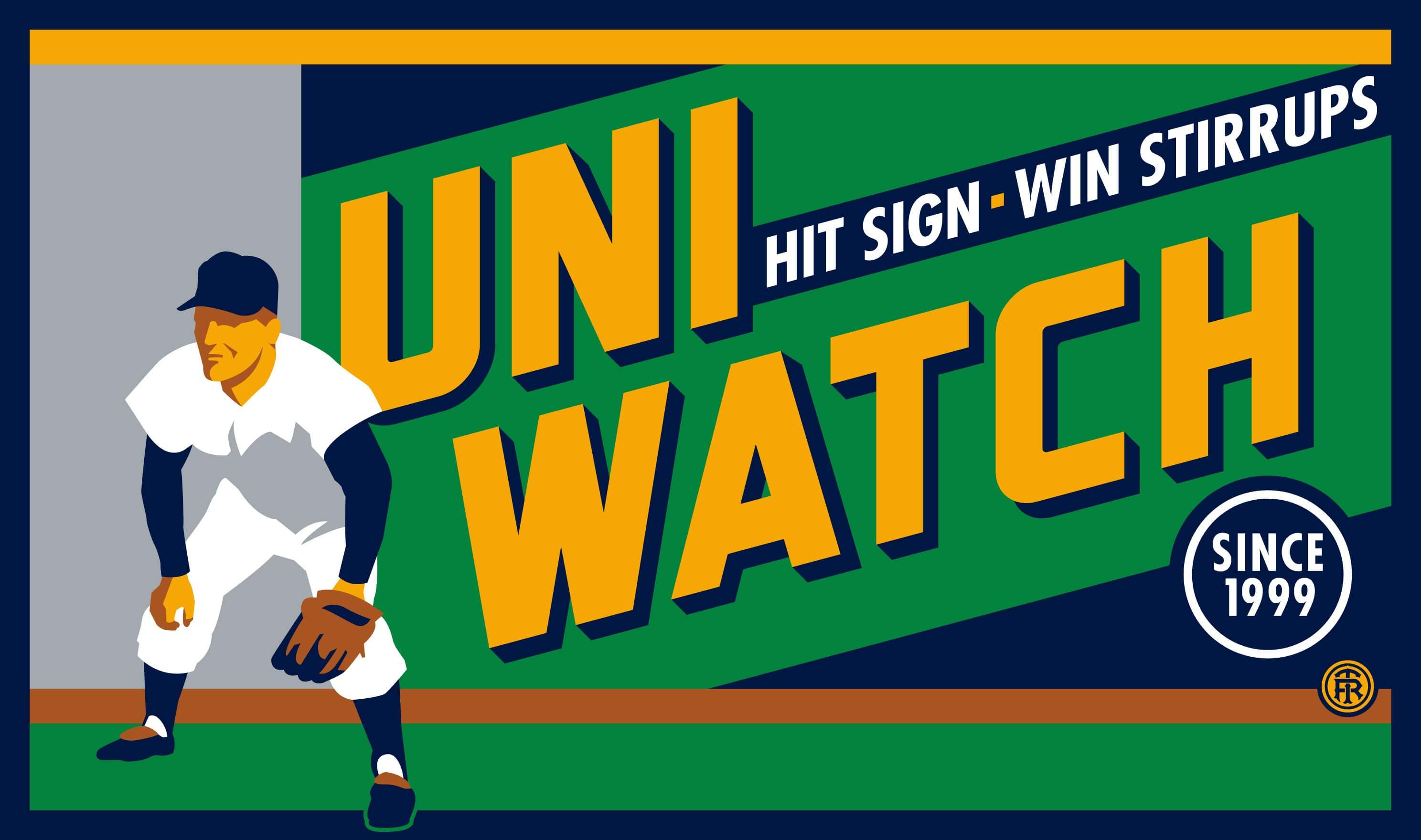
So: If we offered this as another museum-quality print — limited-edition, numbered and signed by Todd and myself, just like the “Rain Check” print, and similarly priced — would you be interested in that? If so, please check the box below:
[totalpoll id=”95649″]
Thanks. We appreciate your feedback.
The Ticker
By Kris Gross

Baseball News: The Pirates wore their military jerseys last night (from Noah Kastroll). As our own Alex Hider points out, they wore home pants, not the white pants they wore last year. … MLB The Show 18 features Babe Ruth in a batting helmet. “Even as a Red Sox fan, I find this utterly sacrilege,” reader Pritchard says. “Batting helmets didn’t become standard practice until two decades after Babe’s last at-bat!”. … Cardinals P Greg Holland made a relief appearance for Palm Beach, the High-A affiliate, while wearing his big league jersey (from Rob Krosley). … A local San Diego ad features Padres 1B Eric Hosmer with a Mike Moustakas bat (from Henri Bradley). … The Phillies have added a No. 34 Roy Halladay flag near the World Series flags (from @untillthenight). … Speaking of, Philadelphia Eagles head coach Doug Pederson wore a Roy Halladay jersey to throw out the first pitch at yesterday’s game (from Frank McGuigan). … From the Red Sox home opener against the Rays, home plate umpire Todd Tichenor covered up the Wilson logo on his chest protector (from Dave Garabedian). … The Nationals Park scoreboard has a new font and a mound visit tracker (WaPo link) (from Tommy Turner). … Yesterday was the 105th anniversary of the first game played at Ebbets Field (thanks, BSmile). … Huge NOB font for the Bowie Baysox (from Mark Johnson). … For some reason, the D-backs used the Houston Rockets’ team plane after their opening homestand (from Alex). … The St. Lucie Mets will wear throwback unis for Thursday home games. They are a Wilson jersey with Majestic pants, which as Niko Goutakolis points out are probably handed down from the Mets. … Speaking of Majestic pants: Josh Miller notes that the Majestic maker’s mark, which usually appears over the left pocket, seems to be missing this season. Additional examples here and here. … The Tulsa Drillers will wear tequila sunrise uniforms in July (from Dylan Goforth). … Navy will wear 1892 throwbacks next weekend. … Georgia Gets It™ (from Josh Butler). … Here’s a video showing the caps of each MLB team’s minor league affiliates.

NFL News: The Tampa Bay Times ranks the Bucs’ uniforms 32nd in the league, because there isn’t a 33rd. Well said! (Thanks, Phil.) … Also from Phil: This blog wonders, should Nike be allowed to overhaul the Broncos unis? … Cross-listed from the baseball section: Eagles head coach Doug Pederson wore a Roy Halladay jersey to throw out the first pitch at yesterday’s Philadelphia Phillies game (from Frank McGuigan). … It looks like Tiger Woods’s caddy apparently likes the Giants, as well as the NHL’s New York Rangers (from @cannolifactory and @jmanusewicz).
College Football News: Reader Bo Baize came across an old 1962 Texas A&M ticket stub. He wanted to do some research on the uniform on the ticket, and found a 1944 stub that’s almost identical. Great find, Bo!

Hockey News: Cross-listed from the NFL section: Judging by this photo, it looks like Tiger Woods’ caddy is a big Rangers fan, and also likes the NFL’s New York Giants (from @cannolifactory and @jmanusewicz).

NBA News: Really great work by Ray Hund who took a look at the Bulls home uniform variations. … Warriors F Kevin Durant talked about why his shoes keep coming off during games (from Mike Chamernik). … Oh, the irony: A thief in @wwpky’s neighborhood was stealing packages while wearing a Karl Malone, aka “The Mailman”, jersey. … Cross-listed from the baseball section: For some reason, MLB’s Arizona Diamondbacks used the Rockets’ team plane after their opening homestand (from Alex). … In this game, the Hornets wore purple at home with the Magic wearing white on the road. The notable thing there is that the game is from 1994! (Good find by J. Lassiter.)

Soccer News: The U.S. Women’s National Team debuted their new kits last night (from Ian Grubman). … Here comes some info from Josh Hinton: Tunisia have unveiled their World Cup kits. … Liverpool’s 2018-19 kits have leaked. … Louisville City FC of the USL released their promotional/theme nights schedule, which includes BFBS kits on April 14. … Manchester City has signed a deal with Tinder.

Grab Bag: Also listed in the NFL and hockey sections: It looks like Tiger Woods’s caddy is a big New York sports fan (from @cannolifactory and @jmanusewicz). … New uniforms for Stony Brook cross country/track and field (from Patrick Muffey).

What Paul did last night: My brother Roy and I have a nice ritual. Since his birthday is on Christmas Day, I take him out to dinner in early January, after the NYC holiday crowds have died down. And he returns the favor by taking me out to dinner about two weeks after my birthday — which, this year, was last night.
I asked to go to Sparks, a well-regarded midtown steakhouse. I had been there once before, nearly 30 years ago. My then-girlfriend and I were just kids at the time (looking back, I can’t imagine how we could afford to eat at such a pricey joint back then — we made, like, no money), but I remember that the waitstaff treated us exactly the same as all the bigshots at the other tables. Total professionals. That made a big impression on me.
So I was happy to see last night that that hadn’t changed. Great staff, great service. And they wore uniforms! Well, sort of — each waiter wore black slacks, a white shirt, and a black tie with a tie tack (click to enlarge):
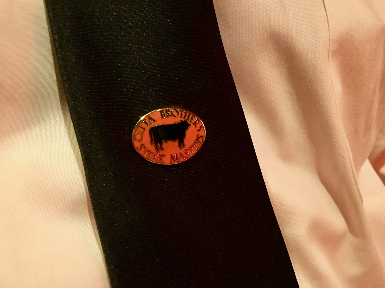
I asked our server why the pins say, “Cetta Brothers” instead of “Sparks,” and he explained that the Cettas were the original owners. Since I seemed so interested, he told me the maître d’ would give me a tie tack if I asked for one. I don’t wear tie tacks, but it seemed like a fun souvenir, so I got one on our way out.
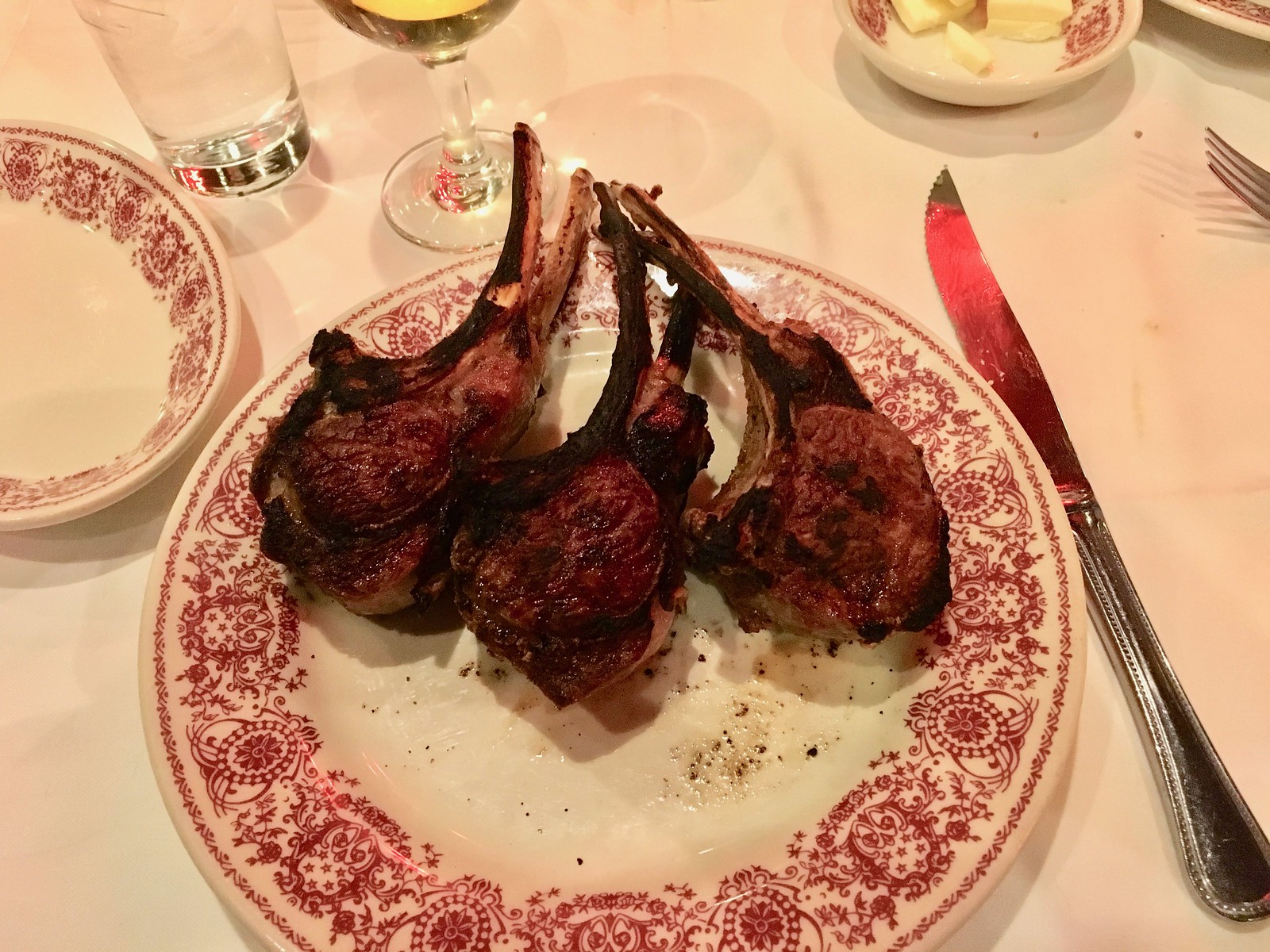
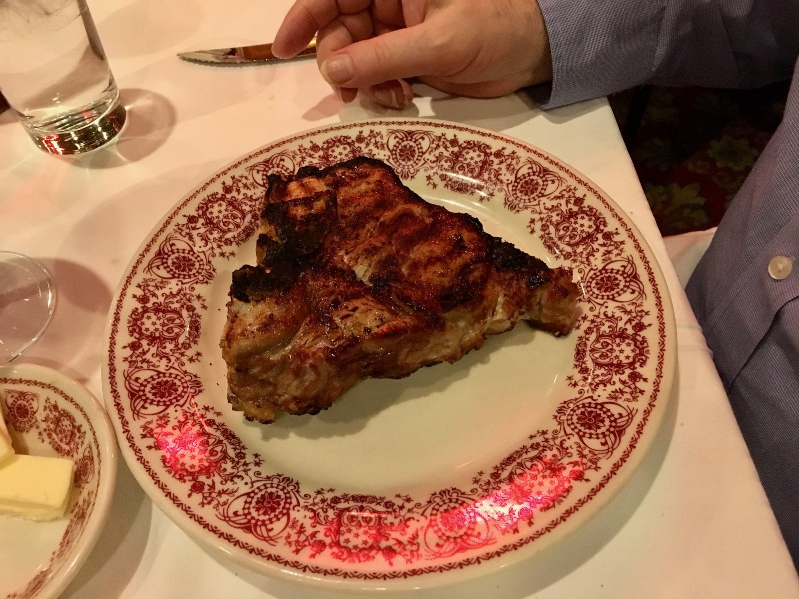
Although we were at a steakhouse, neither of us got steak. I got lamb chops and Roy got a veal chop, and then we shared — turf and turf. Sparks didn’t seem like the kind of place for food photos, but I snapped two very quick pics:
There were also appetizers, salad, and dessert (sorry, no photos of those). We talked about our hometown, our parents, and baseball — you know, important stuff. A very nice night.
Sorry about that, people — not sure why WordPress defaulted to not allowing comments on this post. Comments now open!
Was it A. Whitney Brown or Al Franken who could draw the contiguous 48 freehand on Saturday Night Live “Weekend Update”?
Franken.
Franken
link
I appreciate that Franken, a Gopher State resident, begins his map with Minnesota. It establishes the northernmost point and helps to define the Great Lakes. Also, Minnesota’s westernmost border, continued south, defines Texas’ eastern border.
Doesn’t the Sabine River define Texas’ eastern border?
Don’t know about that, but another geographical clue by Minnesota is that the Mississippi River (starting in Lake Itasca, Minnesota) makes the Iowa/Missouri/Arkansas/Louisiana eastern borders.
Those St. Lucie “throwbacks” are not hand-me-downs. The Mets never wore anything that looked like that. The stripes on the pants, particularly the orange borders, are way too thick; they almost look like the 1980s 49ers. Yikes.
The Tampa Bay Times actually did not rank the NFL uniforms themselves. They just reported on the Sacramento Bee‘s ranking of the uniforms. Original Bee article here: link
Correction…each waiter (not water)…
Anyways, I am glad you enjoyed your “second birthday.” Have a good weekend.
Nice try Marty Buccafusco, but your analysis is way off. Washington looks like a chipped tooth, Maine resembles an elephant’s trunk, and Florida is definitely a limp dick.
“… the more cartographically-sound versions featured on the Green Jacket patch …” Tell that to residents of Michigan’s Upper Peninsula. Yes, all 347 of them.
Cardinals catcher *Yadier* Molina
Ugh – not sure how I did that. Fixed!
Hearkens back to that great game show on ESPN “Name that Molina”!
It’s like rather than giving camera ready artwork to the manufacturers of the different products, the Masters just gives them a description (“It’s an outline of the contiguous United States, and there is a golf hole in Georgia with an oversized pin and flag extending up beyond the top edge of the country.”), and each manufacturer is drawing something up themselves.
Back before digital files – which for many companies could mean as recently as the mid-2000s – it wouldn’t be uncommon for there to be a literal folder of camera-ready artwork on paper. Each one would be essentially hand-drawn, or even if reproduced from earlier art, reproduced with a lossy mechanical process that required hand-drawn touch-ups and/or from-scratch hand-drawn reproduction when the generations became too lossy. And each time a new format was needed, there’s a chance the files wouldn’t contain quite the right piece, so a new one would have to be made. Plus, there being limited physical copies that had to be returned, every external actor might need to create their own physical copies to keep on file, which could require a whole new generation of hand-touched or hand-drawn reproductions based on the supplied art that would then be returned to the Masters office.
I worked in publishing a bit during this era, and these were all normal issues even for large, highly professional firms like ad agencies and publishers and movie studios. For the equivalent of a small business or a community organization, which is how the Masters has operated until quite recently, getting consistent art from project to project would have been a miracle.
The surprise then is not that the Masters has had a slightly different variation on the logo for every hole in the tournament. That was par for the course until not too long ago. The surprise is that the inconsistency seems to survive to the present day. With digital files, it’s actually easier to have a consistent logo than it is to have multiple, inconsistent variations.
Good points, Roger, and I can see how there are probably multiple digital versions of this logo floating around computers and hard drives at Augusta National, all called something like “Masters_logo.ai” or whatever. So when a new vendor needs the artwork, someone just sends the first one he or she can find.
I’m most surprised that CBS and ESPN continue to use various versions of the logo in their broadcast graphics.
I spotted this already today… 2 different logos, shown almost immediately back to back:
link
Solid-rimmed cup, no east coast 3D block, with comma-shaped Florida
vs
Death Star Cup, significant east coast 3D block, with slightly eastward-bending Florida
The greatness of this site – today’s discussion!
I remember the column on inconsistencies with the Cowboys uniforms – today’s column provided the same revelations for me.
Perhaps some of the inconsistencies come from the fact that there are SO MANY suppliers of merchandise and no one at AHGC assigned QC.
Surprised about them not nailing down the internal stuff, like documents – maybe they’re too busy with other things, or too sloppy to care (hard to believe).
This may just be me, so you might be right, but on #3 on the C-Flap reminder/update, as I die hard Cubs fan I’ve always seen Javier Baez’s name as Javi, not Javy.
I’m pretty sure that I’ve always seen it as Javy.
Paul – I was in New York last weekend for a bachelor party, and we started at Gallagher’s steakhouse, which seems very similar to Sparks. It was a real treat – in a lot of ways, I felt like I had stepped into a scene from Mad Men, and all the drinking we did certainly contributed to that feel! (I had my first glass of Lagavulin, and it certainly won’t be my last!
I know a guy who tried to make a reservation at Sparks after the Big Paul hit. The asked for his name which happened to be Castellano. They hung up on him.
Great story. My mom told me from personal experience that it is very difficult to get reservations at a restaurant after a mob hit. Insight into my childhood.
Seeing the photo of the first game at Ebbetts reminded me of something I saw in an old photo of Forbes Field.
How on Earth were scores back in the day not higher than today?
Every wild pitch or passed ball should have been 2 bases easily with all of the room behind home plate.
I can’t think of a single stadium now that has that much room back there.
But I guess the ‘dead ball’ limited home runs so maybe its an even trade – home runs now for WPs/PBs then.
Or did pitchers not throw as hard back then making the job of catcher easier?
Oh, the irony: A thief in @wwpky’s neighborhood was stealing packages while wearing a Karl Malone, aka “The Mailman”, jersey.
Package stealing is one of the worst trends in our society… but I did smile at this.
The new USNWT shirts are actually quite good.
The northernmost “point” of the contiguous US is the 49th parallel, between Minnesota and the Pacific Ocean. Maine only gets to about 47.5 degrees north latitude. Maps which show the New England states as reaching far north of the northern edge of MN/ND/MT/ID/WA are an abomination.
***yes I know about the northwest angle. Good discussion for another day
yep
link
I had originally written a couple paragraphs about map projections and I even found a few US maps from 1933 that might have inspired the original designer’s interpretation of the Rio Grande, but these topics didn’t seem pertinent to the inconsistency theme, nor am I the right person to be leading such a discussion.
1933 Map
link
While the northern border of the US is defined as the 49th parallel, I’m betting there are slight deviations from that line throughout the length of the border, due to surveying errors. (This is true of every “straight-line” state border within the country that I’m aware of.) So theoretically it should be possible to find the EXACT northernmost point (excluding the Northwest Angle) where the survey error brought it the farthest above the 49th parallel. It would take a lot of very tedious analysis of maps, but it could be done.
True.
link
Apparently that point is just east of Abbotsford, BC, 575 feet north of the 49th parallel.
How long before the day a helmet with a C flap built in is made
UW is on fire this week with stuff that you never knew existed, but now you can’t unsee (also with the article in the Grab Bag yesterday about the lowercase “g”, which was great).
Re: Louisville City in soccer, there seems to be a developing thing of American teams wearing black kits at home (see Sporting KC this season and Columbus a few years ago). I would say that a black kit isn’t automatically BFBS if it’s second or third choice, because distinguishing oneself from other teams is the priority, rather than the kit being in team colors.
Don’t know where I saw it first, but I call the minuscule “g” Paul was referring to as a “three-story g”, as opposed to the “two-story g” of most handwriting.
Yeah, but Columbus’ colors are black and gold, so that isn’t BFBS. I considered this year’s third kit to be BFBS because the club’s colors are purple and gold, and we’ve never done a kit that isn’t primarily purple or gold other than the black kit, so I considered it BFBS
If drawing the continental US wasn’t hard enough already, Time had a tool last summer whereby you could try to draw each state, with the end result being how your 48 states looked together: link
Otherwise, if I were to pine for a Manhattan chophouse, Keen’s is the one I miss: link Pipes on the ceiling, old Lincoln memorabilia and a fine place for mutton!
The thing that stands out to me about the NFL Uniform rankings is that with the exception of the Vikings and the Steelers number fonts, the majority of teams have not significantly altered their unis or have returned to using a classic uni from their past (49ers & Giants). I’m surprised that the Chiefs, Redskins, Jets and Bills were as low as they were.
That Hornets game was the first time a team had worn a 3rd uniform in the modern NBA – the team got special permission from the league to wear road unis at home.
I can assure you, almost without reservation, that the members of Augusta National Golf Club and the Masters Tournament couldn’t care less about inconsistencies with the logo.
As a PNW lifer, any time there’s a map of the US involved, my eye always draws to the NW to see how accurate Washington looks.
It’s a complicated coastline, with the Olympic Peninsula and Puget Sound.
I don’t expect a small resolution map to have detailed features, but omitting it altogether just looks bad.
The northwest corner of the US isn’t just a rounded off corner. It’s actually a pretty prominent point.
The variations of the logo for the Masters may seem lo-fi and homey, but club’s brand-new shop for selling their wares to the on-site patrons is anything but. At themasters.com/home scroll down to videos and find the one showing off these palatial digs. Wow.
Any ideas where I can get men’s Norwegin curling pants?
“But it’s incredible for have the opportunity again, to still come out here and play this golf course. Now I know I’m on the weekend.
“Does it suggest that the appeal of the tournament and its merchandise grew so quickly that its historically conservative members couldn’t maintain consistency among the many design”
not sure why the members being “historically conservative” has anything to do with their logo consistencies.