So was that the worst-looking game in NFL history last night? It’s certainly in the discussion. Too bad they couldn’t get the Browns to play a halftime scrimmage or something, just to put things over the top. Still, definite bonus points for the G.I. Joke waistband towels and captaincy patches, which made everything look just wee bit worse. Additional photos here and here, if you dare .
Meanwhile: The Seahawks wore military unit helmet decals just to the left of the American flag. Or at least most of them did — quarterback Russell Wilson didn’t have the military decal in the first half. Someone besides me must have noticed, because the decal suddenly appeared in the second half.
Also: As per their annual November habit, the Cardinals wore their Pat Tillman memorial “40” decal.
Click to enlarge
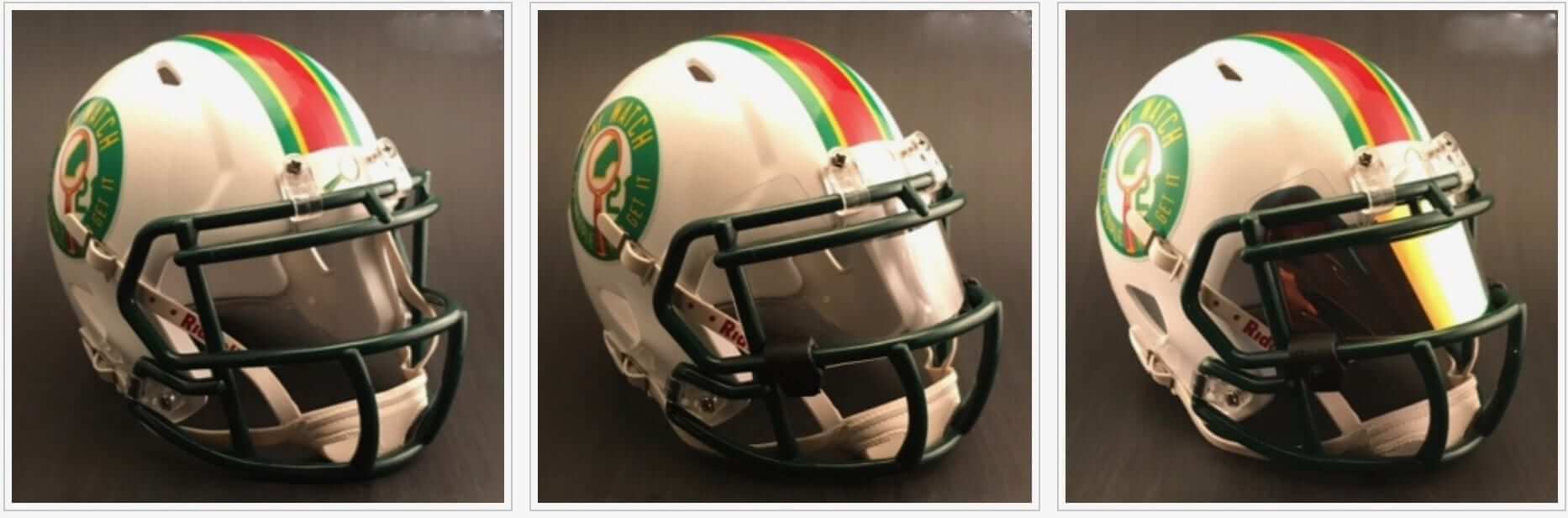
Mini-helmet update: Two weeks ago I told you about the Uni Watch mini-helmet sample that Rocker T Collectibles had made for me. Response to that sample was very strong, so today I’m happy to announce that the mini-helmet is now available for ordering.
A few notes:
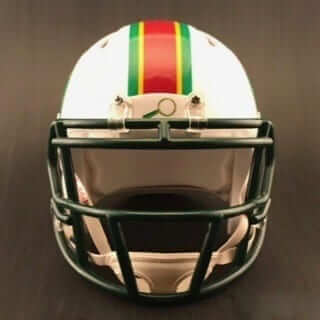
1. The facemask is not quite as dark as it looks in the photos shown above. If you look at the mask on the full-size helmet that the mini is based on, the mini mask is a very good match to that.
2. The sample helmet from two weeks ago had the Riddell wordmark on the nose bumper, but we’ve now replaced that with the Uni Watch magnifying glass:
Hope you like that change. If we do another mini-helmet design at some point down the road, maybe we’ll change the nose bumper to “Gets It™,” or something like that.
3. If you want to trick out your helmet, you can add an optional visor (clear or tinted), and display cases are also available. But the helmet is perfectly fine on its own, without any of those add-ons. (Just for the record, my cut of the proceeds is the same regardless of whether you order the optional items.)
4. A few of you have asked if I’d be willing to sign your helmet. I’d be happy to, but the helmets are being built and shipped by Rocker T Collectibles, which is based in Texas, not by me. So if you want me to sign yours, send it to me after you receive it (Paul Lukas, 671 DeGraw St., Brooklyn, NY 11217) and please include $5 for return postage. I’ll be happy to sign your helmet and send it back your way pronto.
This whole enterprise has been a really interesting learning experience. I knew exactly zero about mini-helmets until about two weeks ago, and it would never even have occurred to me to offer a Uni Watch mini-helmet until a bunch of you asked me to do so after you saw the full-size version.
I want to thank Casey Tierney from Rocker T Collectibles (aka @MiniHelmetGuy) for making all of this possible. He’s also made this entire process fun and easy, and he seems like a really good guy to boot. I’m proud to be collaborating with him. If you’re into mini-helmets, check out the rest of his site.
I also want to thank the many of you who’ve been so enthusiastic about this project. Like I said, I’m a total newbie to mini-helmets, and I’ve enjoyed hearing from those of you who are serious collectors. An interesting little scene.
One more time: The mini-helmet is available here.
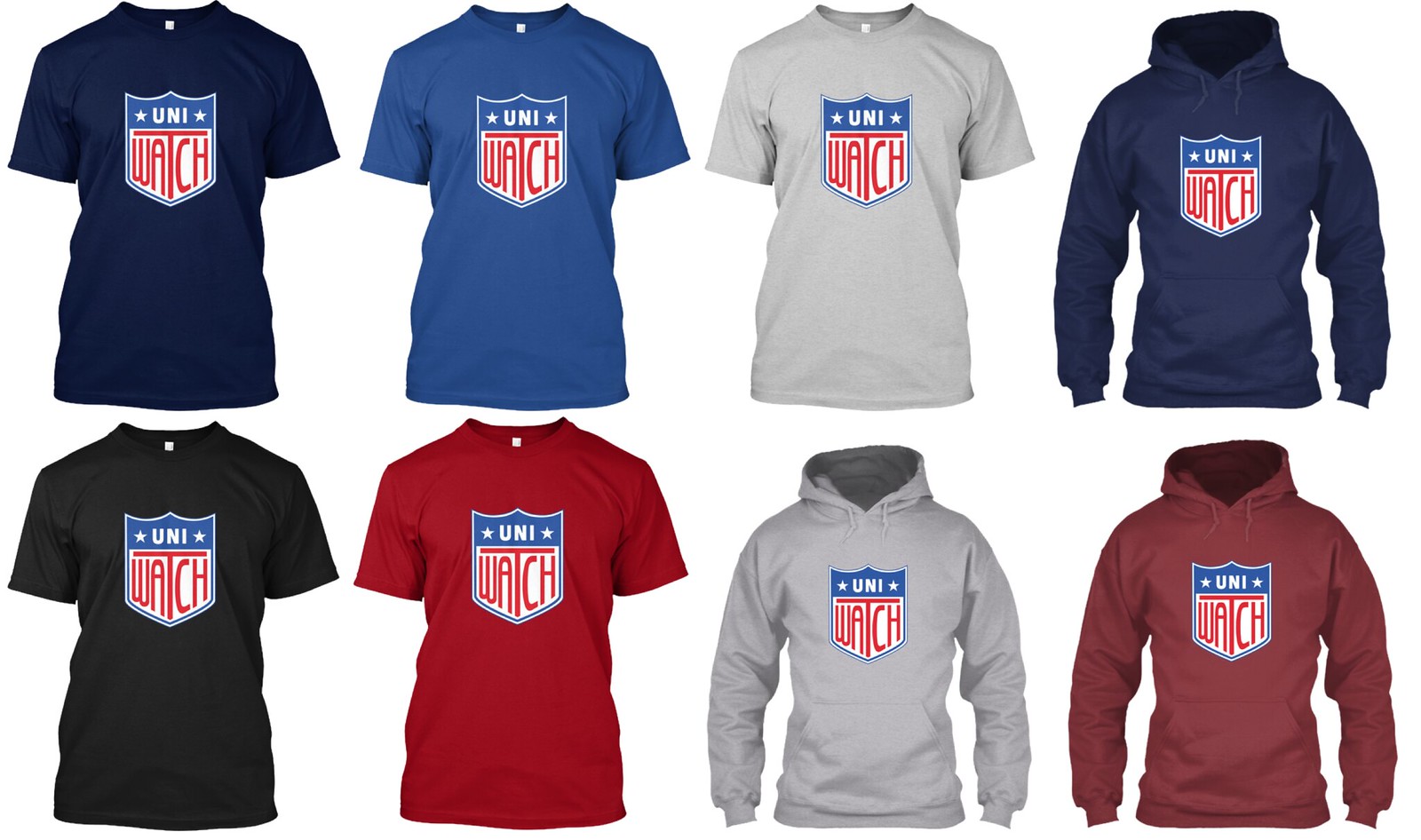
And as long as we’re talking merch: When the great Rob Ullman designed his Uni Watch Artist’s Series T-shirt back in August, one of my favorite things about his design was the glimpse of the Uni Watch shield chest logo. Rob based that element on the old All-American Girls Professional Baseball League logo, which in turn was based on the old Hale America “Health” patches.
I asked Rob if he’d be willing to create a clean version of the logo that we could play around with, and he agreed. He’s now done that, and the resulting logo is now available on a bunch of shirts and mugs (click to enlarge):

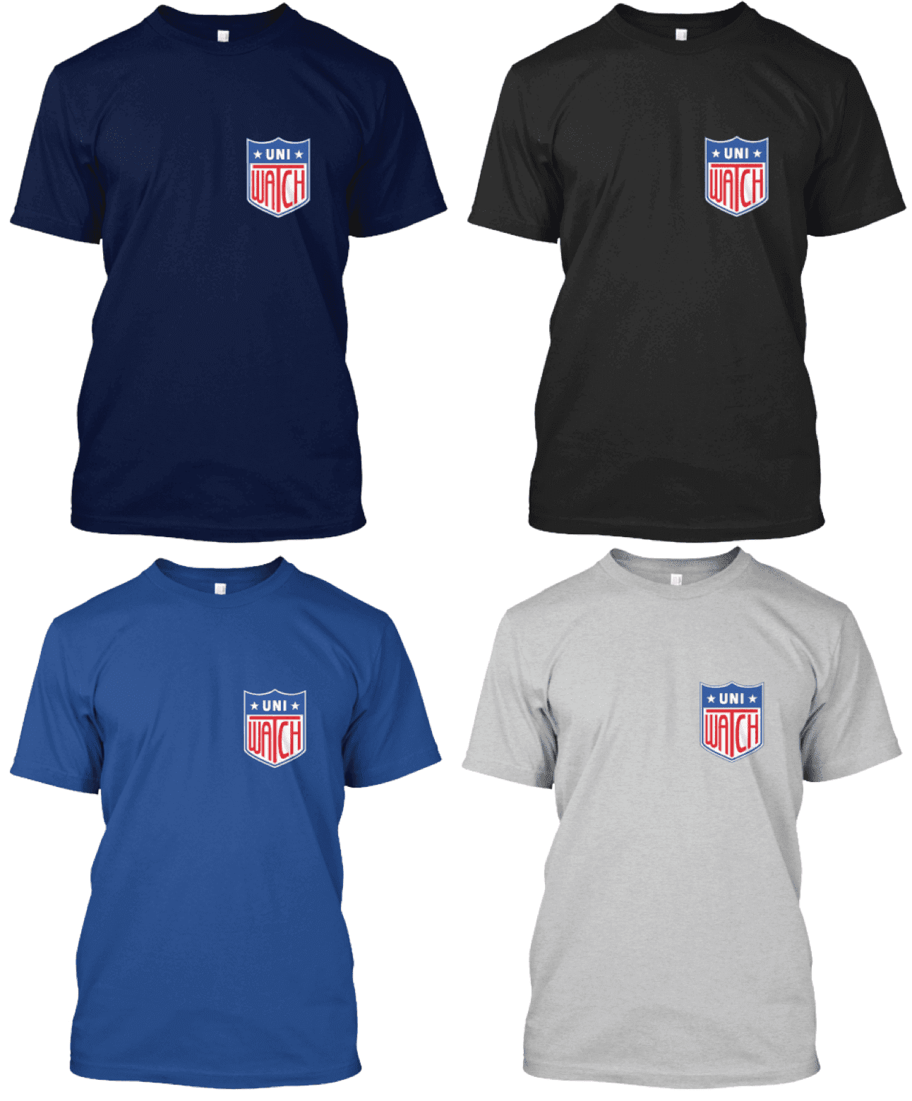
At the suggestion of reader/commenter Will Shoken, the shield logo is also available in a smaller upper-chest treatment (click to enlarge):
There’s a good chance that we’ll also be making the shield available on stickers. I would also consider an embroidered patch if there’s enough interest in it (shoot me a note if you think that might be you). But for now, just shirts (including the smaller version) and mugs. This is not a limited-edition design, so these shirts and mugs will be available indefinitely in the Uni Watch online shop. As always, card-carrying Uni Watch members get a 15% discount. If you have a card and would like to have the discount code, email me and I’ll take care of you. My thanks, as always, for your consideration.
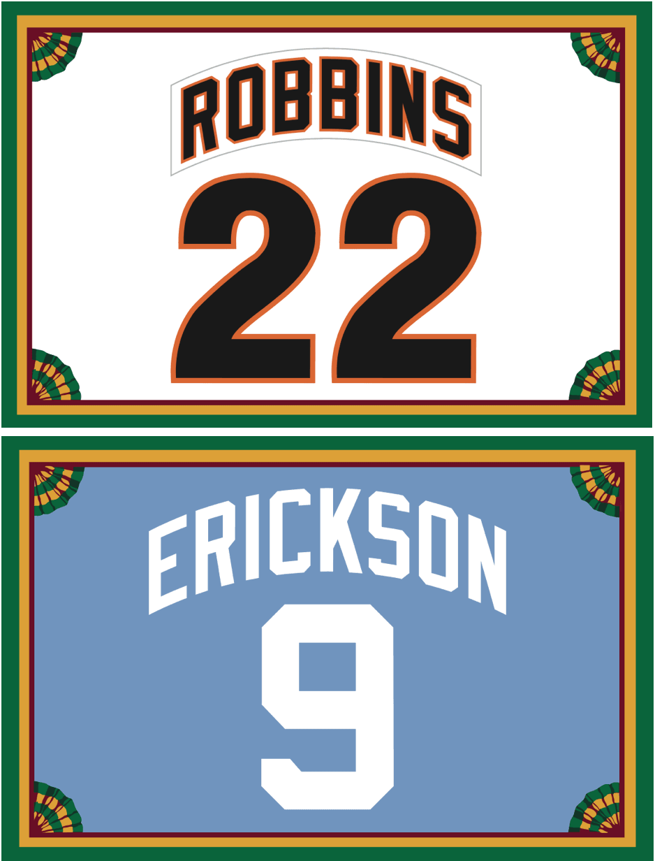
Membership update: As most of you know, I love vertically arched lettering, so I’m always happy when we receive a membership card order that includes a vertically arched NOB. We received two such orders yesterday: Sean Robbins requested a late-’80s Giants treatment and Tom Erickson asked for a 1970s Royals powder blue motif (both shown at right). Kudos to our own Scott M.X. Turner for executing both designs so quickly. The printed/laminated versions of these cards will ship out early next week. If you’d like to sign up and be part of that shipment, there’s no time like the present.
Remember, a Uni Watch membership card entitles you to a 15% discount on any of the merchandise in our Teespring shop. (If you’re an existing member and would like to have the discount code, email me.) As always, you can sign up for your own custom-designed card here, you can see all the cards we’ve designed so far here, and you can see how we produce the cards here.
The Ticker
By Kris Gross

Baseball News: Reader Ray Hund has passed along some great old shots from Polo Grounds, Ebbets Field, and Wrigley. Click through to see all the photos — it’s worth it. … Christopher Newport University softball has a new tequila sunrise-themed jersey (from Kristian Hill).

NFL News: Steelers OL Alejandro Villanueva, a former Army Ranger, handed out Army decals for his teammates to wear this weekend. … New 49ers QB Jimmy Garoppolo apparently hasn’t been with the team long enough to get his jersey tailored to his liking. He complained on Sunday about his sleeves being too long and loose (thanks, Alex). … Concussion research could lead to position-specific helmets (thanks Phil). … Check out this awesome cover of the 1953 NFL Yearbook (from Ray Hund). … If only program covers were still like this 70 years later (from BSmile).
College Football News: Man, did Pitt look good in their throwbacks last night against North Carolina. … Pitt QB Ben Dinucci suffered a jersey tear (from Don Schafer). … Both TCU and Arizona State will go mono-white this weekend. … Here is Youngstown State and Liberty’s uni combos for tomorrow. … Kansas State will wear white camo helmets (from Josh Hockett). … Continuing the Veterans Day theme, Troy will have a digital camo logo and helmet stripe tomorrow (from @thomasgleaton). … Minnesota will honor Veterans Day with starss/stripes helmets that feature names of Minnesota students and alums who have served (from Sam Plohasz). … The Texas Tech/Baylor matchup in Arlington this weekend is another corporate-advertised “rivalry.”

Hockey News: Sabres G Robin Lehner will honor a fallen Buffalo police officer with a warmup jersey featuring the officer’s name and call sign (from Jack Kehoe). … Veterans Day uniforms for Michigan Tech and Northeastern tonight (from Bryan Palmer). … The Springfield T-Birds, AHL affiliate of the Panthers, will wear David Ortiz-themed jerseys tomorrow night. … Want to see all the uniforms from women’s hockey leagues in one place? Click through this thread (from Joseph Pitirri). … Robert Hayes passed along this shot of a Terry Kath LP cover that showed Kath wearing a Rangers jersey. “Kath was known for wearing hockey sweaters and had a Blackhawks logo on his guitar.” … In a blog post by a former Southern Professional Hockey League player, he shared a story (head to the second-to-last graf) about the team having to help build their own rink after a concert at their arena (from Cassian Wykes).

Basketball News: In honor of Veterans Day, Nevada will wear camo unis tonight. … Looks like new uniforms for Eastern Michigan (from @AVKingJames). … The WNBA announced plans to increase on-court and jersey advertising starting in the 2018 season (thanks Phil). … The first 2,500 fans at the North Carolina season opener tonight get a replica championship ring (from James Gilbert). … It’s not often that you see a non-possessive apostrophe on a uniform, but UNLV’s new home uni has “Runnin’ Rebels” on the front. The new road design just has “UNLV” (from David Conrado). … Southern Illinois will wear its new black uniforms for tonight’s season opener against Winthrop.

Grab Bag: Oklahoma has made the switch to Jordan Brand uniforms in football and men’s and women’s basketball. … Not uni-related, but pageant contestants in Brazil wore meat bikinis in a statement against sexual harassment (from J. Max Weintraub). … Here’s an interesting piece on Johnson & Johnson translating their ads into 15 different languages in the early 1900s (from Alan Kreit).
interesting “logo” for the Packers on the ’53 NFL Yearbook. At first it looked like Vince Lombardi to me, but he wasn’t with the Pack in ’53.
??? Anyone?
Presumably a meatpacker, not unlike the steelworker.
I will assume as much too. But it looks like Lombadri in his overcoat and hat.
link
The way Green Bay’s logo is placed next to Los Angeles’ it appears that the (Meat) Packer just dispatched the Ram and turned it into mutton chops and the basis for Smalahove with the Packer’s hand saws he’s holding.
I love those Seahawk uniforms. That being said, once a year is enough.
Me, too.
I’ve always liked them in theory. But, gotta agree that was one butt looking game uni-wise.
1. I don’t think the all neon green looks great on the field, against the turf/grass background.
2. My absolute least fav look is the black alternate + mismatched regular helmet.
3. The combo. Ooof.
As much as I minded pretty much everything about last night’s uniforms, the Cardinals wearing so much black bothers me most of all. I’d rather have seen last night’s game, but with the Cardinals in all red, than a game between the same two teams in Sunday uniforms but the Cardinals in a black jersey with contrasting pants. When your team is named after a color – and the Cardinals of both baseball and football are named after the color, not the bird – then you wear that color, dammit.
Also, the vintage jersey subscription link is broken.
NFL won’t do all red versus all green again, after the 2015 All Red Bills played the all green Jets and they got a large number of complaints by folks who are red/green colorblind.
After looking at tomorrow’s Youngstown State uniforms, I’m of the mind nothing looks better on a helmet than an initial. Especially one curved to fit an oval outline.
Not sure why Pittsburgh doesn’t switch to that look full time. Easily one of the best football uniforms out there. While watching that game, since that look goes back to the Marino days, got me thinking that Pitt has two alumni that are in the conversation for best ever at their position in the pros (Marino & Fitzgerald). Pretty good for a 2nd tier college program.
Greg, I couldn’t agree more about Pitt’s football uniforms, and it’s looking like that switch will happen in the near future. We’ve seen this trend before, where a team will return to retro uniform full time. The NFL Redskins and Jets come to mind, and USC at the college level.
While Pitt is no Alabama in college football, it’s accurate to say they are roughly a top third program at the FBS level, if we’re talking the overall history. Unlike West Virginia, and many others, Pitt has captured multiple national championships.
I wasn’t trying to shortchange Pitt. By second tier I meant all time the program isn’t on the level of the likes of Alabama, Ohio State, Michigan, USC, Notre Dame, Texas, Oklahoma, Nebraska, and such. I would say they aren’t one of the blue bloods, but have a strong history and are in the group below them.
How about a subtler version of the Uni Watch shield tee shirt that features a small shield logo at the left breast?
Will, like this?:
link
Or even smaller/subtler?
Update: Just had a back/forth with Will. Smaller/upper-chest version of the shirt is now available:
link
Extra primo good!
I think the Seahawks have some of the most interesting designs of these Color R*sh uniforms. I’ve always been a fan of the Seahawks use of not-quite-neon-but-bright green instead of the forest green they used before. This set doesn’t look ridiculous when matched with the blue helmet.
The Cardinals on the otherhand looked terrible in all-black with their white helmets. Its the same effect the Bills had with their all-reds with white helmets last year.
I noticed the Seahawks numbers didn’t really match their trim/helmet color.
link
I wonder how many folks at Texas Farm Bureau Insurance are feeling a wee bit uneasy to be sponsoring a game called the “Shootout” after what happened at that church last weekend…
This is why Texas-Oklahoma stopped calling their rivalry series a “Shootout”, at least officially. Still a ways to go before removing the advertiser, though.
link
The lettering on that Terry Kath jersey looks more like the c.1928-41 era straight block lettering than the italicized, block-shadowed letters the Rangers have used almost exclusively since then.
Something that bugs me about the Cardinals jerseys is the truncated stripe on the collar.
link
When this set was first introduced, that stripe went all the way around.
link
link
Then when the Nikelass came in, for whatever reason the stripe was truncated to stop at the seam in the collar.
link
Now, despite the new collar being more similar in construction to a traditional v-neck, the truncation has remained with the stripe sticking out like a stump.
It’s a small thing and its far from the least of that uniforms problems but it bugs the heck out of me.
Even worse: the grey facemask. Makes zero sense with the rest of the uniform.
There are tons of little details that do not work and the really sad thing is that if you squint your eyes at the home uniform, a cardinal jersey with white helmet and pants looks really sharp.
There’s a great uniform in there somewhere but its trapped in a cage of odd piping.
Yep, it looks like this
link
Yep. There it is.
If the old adage “you have to look good to play good” has even a kernel of truth to it, then its a wonder that ANY Seahawks players emerged uninjured from last night’s Ugly-off contest. Seattle easily has the worst uniforms in the NFL, color rush or regular versions. Just plain ugh.
As the years go by, I do become fonder of the memory of this look for the Seahawks:
link
The expansion twins of 1976, Tampa Bay and Seattle, got it correct on Day One. They never should have changed a thing.
That is such a fantastic look for Seattle. Shocks me that there was a person or group of people that could possibly believe that should be changed. I’m a huge “get off my lawn” guy when it comes to NFL uniforms, but to me that is top 3-5 all time.
I don’t rate the creamsicles as highly as Seattle’s, but do wish they still were the Bucs uniform.
“Oklahoma has made the switch to Jordan Brand uniforms in football and men’s and women’s basketball.”
Can someone fill me in on why this is such a big deal? The Jordan brand is a sub-brand of Nike, which means, as far as I can tell, everything stays exactly the same in terms of uniform material, tailoring, etc., it’s just the Jordan logo instead of the swoosh.
What’s the big deal with this?
Who’s making a big deal out of it? Certainly not us. It’s buried in the Grab Bag.
Now, if you’re asking why *Oklahoma* is making a big deal out of it, that’s a fair question. And your assessment is accurate — it’s basically a distinction without a difference. Meaningless corporate theater.
Which is why it’s buried in the Grab Bag.
Apologies, I did mean why Oklahoma, Michigan, North Carolina, the Charlotte Hornets, etc., make a big deal out of this.
Thanks Paul!
Well, I can understand UNC (he’s their most famous alum) and the Hornets (he owns the team). The other schools, though, whatever.
I’m mildly surprised the Bulls didn’t go this way, though, all things considered. Not that I care either way, it’s just a curiosity.
Here’s a thought, and this is totally just conjecture on my part, but perhaps the Jordan Brand is seen as fresh/more hip by youngsters than the Nike Swoosh which has been around since the 70’s.
So maybe Nike will eventually move all of their sports uniform deals with colleges to the Jordan Brand and leave the Swoosh for the NFL or other pro leagues?
Didn’t get to read the column as early as normal, but I wanted to say that my car looks awesome! I can’t wait to see it in my hands! Thanks, Paul and Scott!
*card.
Stupid mobile keyboard.
Ever since it was explained on these pages, the trick to make vertical arch look “correct” by using a smaller circle for the baseline can’t be unseen. The Philadelphia Phillies were champs of this technique, and the chest lettering of the 1977 San Francisco Giants’ orange jersey came a close second.
“So was that the worst-looking game in NFL history last night?”
Can you make this a real article? A rundown of the worst-looking games in NFL history would be amazing – heck, do one for each sport!
That Carolina replica ring is horrible.
Is there any particular reason the magnifying glass in the bumber is “facing” right as all other merchandise where it “faces” left.
Just wondering.
I liked the feel of it facing that way for this application.
Thanks
The link to the picture of RW with a military logo goes to a picture of him without the military logo.
No it doesn’t.
Yup, will need one of those shield t-shirts, to add to my growing UniWatch collection of shirts that my friends and family don’t entirely get.
Now that we have a mini-helmet, could we revisit the helmet decal/sticker conversation and get this decal as a standalone option?
Sorry, but I don’t recall — you want the green disc logo (the one on the side of the helmet) as a sticker?
It’s the worst-looking game in NFL history
Not Uni-related, but noticed USAToday changed the font on their photo captions. It’s a sans serif font. Much like this.