Click to enlarge
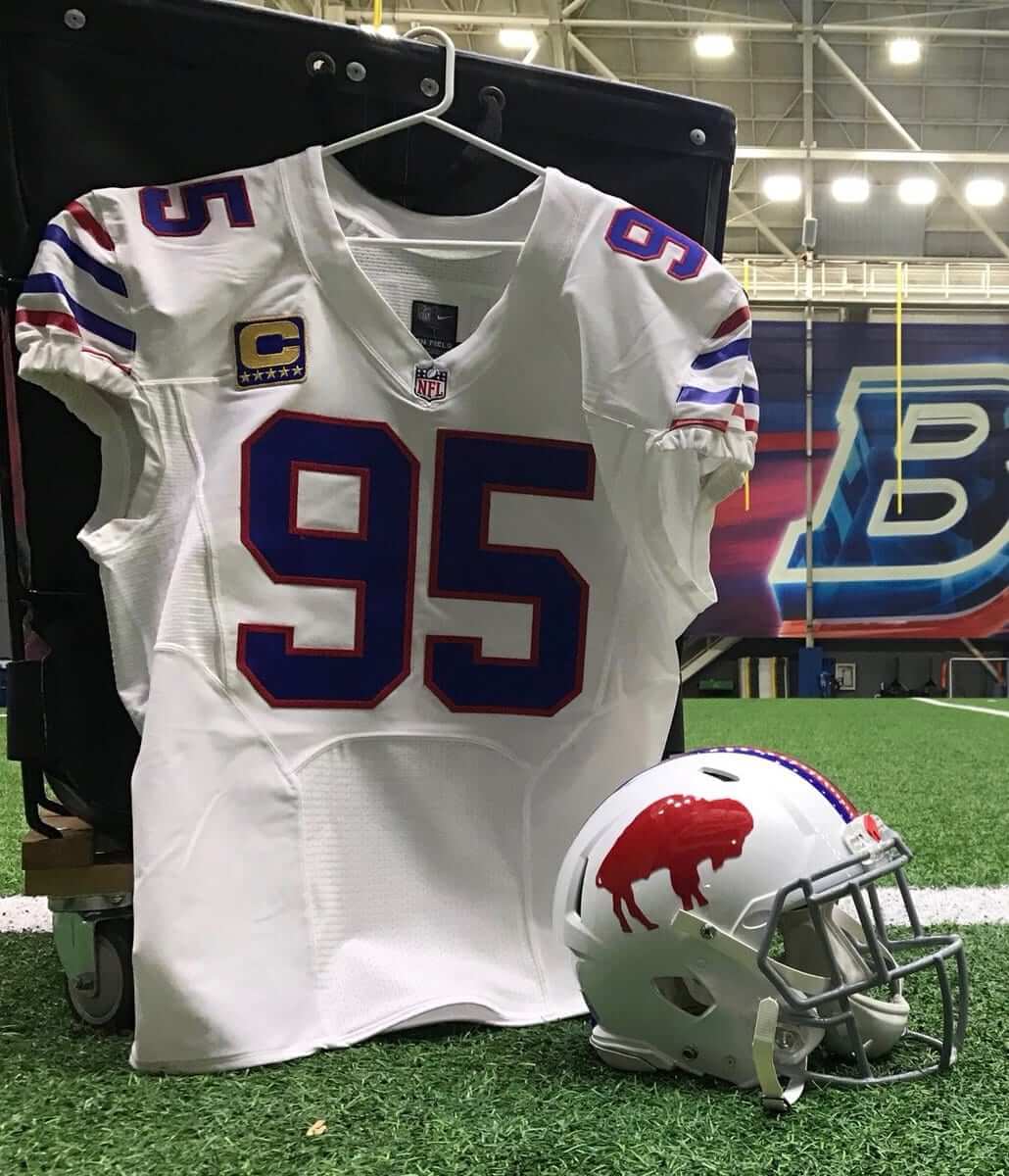
I went down a new rabbit hole yesterday. It began when the Bills announced that they’ll be wearing their white “standing buffalo” throwbacks this Sunday. They tweeted the photo you see above.
I immediately noticed that the jersey they used features the old Elite 51 tailoring template. But Twitter-er Matt Eichmann noticed something that I missed: Look closely at the photo and you’ll see that the captaincy patch has five stars!
For those who don’t know (or just need a refresher course): Prior to 2007, a handful of NFL teams had occasionally used a “C” to designate their captains, but the overwhelming majority of captains went “C”-free.
Beginning in ’07, however, the league began its current captaincy program with a standardized patch design. The patches, which are voluntary (the Steelers never wear them; the Packers only wear them in the postseason; the Eagles never wore them until this season; etc.), have always had four stars, with each successive star from the left side colored in gold to indicate how many seasons the player has been a captain for his current team. After the fourth season, the patch itself turns gold. I had never seen a five-star patch until yesterday.
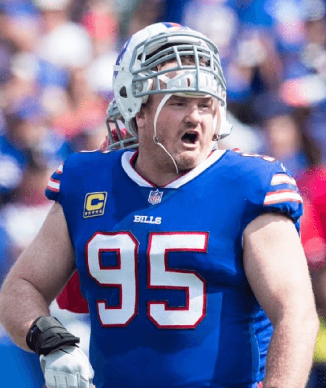
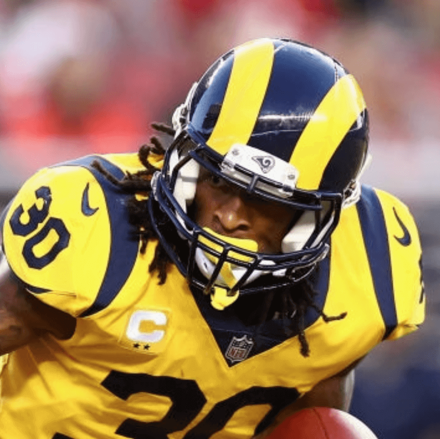
But wait, it gets better. The throwback jersey in the promo photo is No. 95, which is worn by defensive tackle Kyle Williams. So Twitter-er Nate R. went looking for game photos of Williams and found that, sure enough, Williams was wearing a five-star patch in the Bills’ season opener against the Jets — something I completely missed (although I think I can be forgiven for not spotting such a small detail). Check it out:
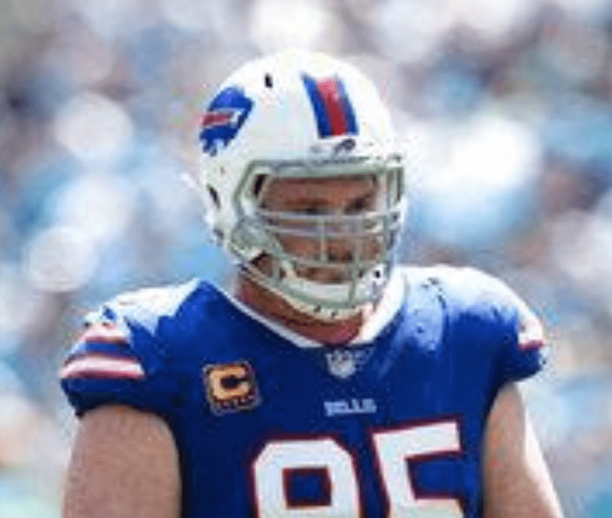
Williams also wore the five-star patch for Week Two against the Panthers (sorry about the image quality, but you can clearly see the five stars):
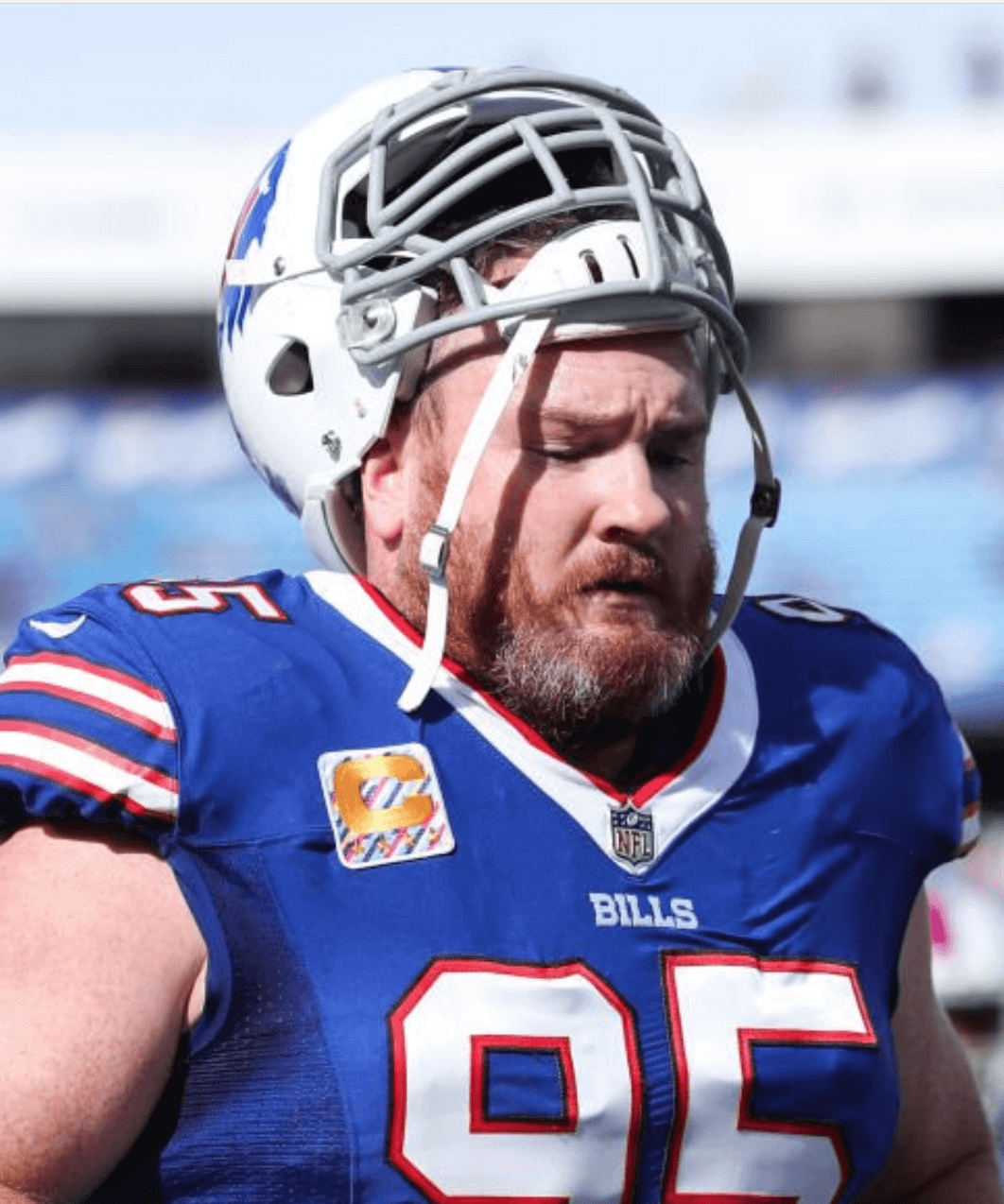
I’ve been unable to find any patch-inclusive photos of Williams from Weeks Three through Five, and then the Bills had a bye in Week Six. In Week Seven — last Sunday — the Bills wore the rainbow-striped “Crucial Catch” captaincy patches, and this time Williams was down to four stars:
There’s some additional backstory here: Williams was made a captain in 2011, so he wore one gold star that season. He then wore two gold stars in 2012, three gold stars in 2013, and four gold stars in 2014 — all very standard.
But then Rex Ryan became head coach of the Bills, and the team didn’t wear captaincy patches during his two-year coaching tenure. So Williams never got to have his patch turn gold for the fifth season. Now that the Bills are once again wearing the patches, Williams has his gold patch — but with a fifth star, something I’ve never seen any other NFL player wear.
I was wondering if this might be some sort of special thing that the Bills did for Williams — making him the equivalent of a “five-star general” or something like that. So I called the Bills to find out more and learned … that it was all a glitch. According to the team’s media relations director, somehow the team was sent a five-star patch, and it ended up on Williams’s jersey. The equipment manager didn’t even realize it until I pointed it out. Williams will have a standard four-star gold patch going forward.
Now, one might wonder just how a five-star patch got manufactured in the first place. One might also wonder if this might be the NFL’s way of phasing in a new uniform element. Hmmmm.
As long as we’re talking about the captain’s patches, here’s another detail that I’ve noticed for a while but don’t think I’ve mentioned on the site: The regular patches have four stars (or five, in Williams’s case) with the gold ones colored in to indicate the number of captaincy years and the other stars shown in white. But for the Thursday-night games this season, they’re skipping the white stars and just showing the one, two, three, or four stars, centered under the “C,” and in the team’s colors instead of gold:
So that’s presumably a Nike thing — they probably make those patches when they’re making the Thursday-night uniforms.
(Big thanks to Matt Eichmann and Nate R., who deserve all the credit for this one.)
Brim job: Bizarre uni-related moment in last night’s World Series game, as a base hit by Astros infielder Alex Bregman bounced off the cap brim of Dodgers center fielder Chris Taylor and caromed directly to left fielder Joc Pederson — literally a hat tip! Check it out (the first video is at normal speed and the second one is a slo-mo close-up):
The @astros strike first!
Alex Bregman with a RBI single off Chris Taylor's hat. https://t.co/jguQ5dy9Dd
— FOX Sports: MLB (@MLBONFOX) October 26, 2017
(h/t) chris taylor pic.twitter.com/LOg6XtZJyT
— Calhoun (@linkcalhoun) October 26, 2017
As long as we’re talking about last night’s game, here are a few other items:
• Astros pitcher Justin Verlander and Dodgers pitcher Josh Shields both wore caps that they had worn earlier in the postseason:
@UniWatch @PhilHecken you can see the residual glue from the old Postseason patch on Verlander’s hat. pic.twitter.com/dOd8HXXjU2
— Eric Lovejoy (@eblovejoy) October 26, 2017
@UniWatch Fields apparently requested the WS patch be sewn on his good luck hat. pic.twitter.com/YyifrDWNNI
— Aaron Trump (@Aaron_Trump) October 26, 2017
• Someone in the Astros’ dugout — not sure who — was still wearing the Postseason sleeve patch instead of the World Series patch.
• Dodgers outfielder Yasiel Puig came thisclose to making a great catch but came up short — and spiked his glove in frustration:
Puig on his horse, can't quite catch it, spikes glove pic.twitter.com/9Mpxj6TZ53
— That Dude (@cjzer0) October 26, 2017
• Have I mentioned lately that advertising is getting out of hand? Fox had a bit of a problem with an ad projected onto the outfield wall:
And to think, we've been worried about ads on uniforms we completely ignored them just branding the players. @PhilHecken @UniWatch pic.twitter.com/s6Tehqn4o8
— Garret Heinrich (@GarretHeinrich) October 26, 2017
• And as long as we’re talking about ads in the Series: When someone begins by saying, “For the most part I think [advertising] is benign,” and then writes a strong anti-advertising takedown about the Series, well, let’s just say it’s probably the best thing you’ll read today — don’t miss.
(My thanks to Ryan Bower and Jay Mazzone for their contributions to this section.)
For all pics, click to enlarge
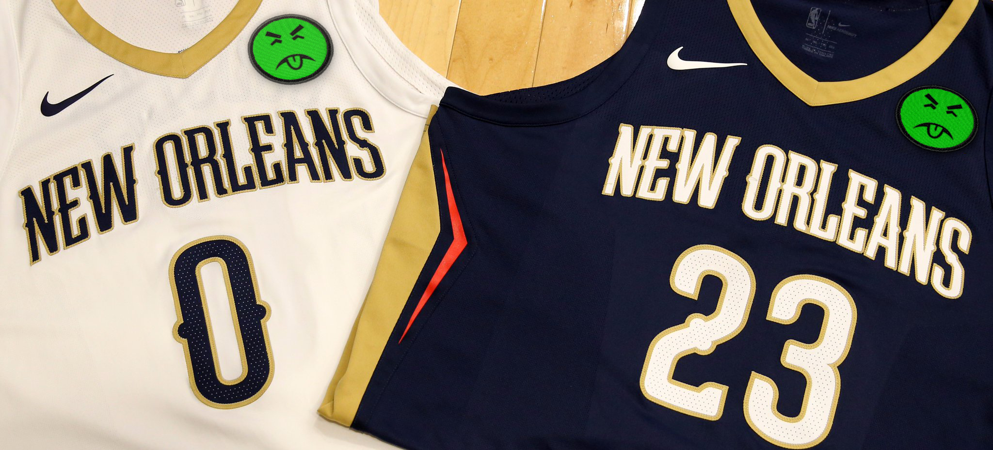
Another one bites the dust: The Pelicans yesterday became the latest NBA team to sell space on their jersey to an advertiser, and the first to do so since the start of the season. In keeping with our new policy, I will neither show the ad patch nor name the advertiser, but I will definitely show how the patch makes the team’s uniforms look like shit. Here:
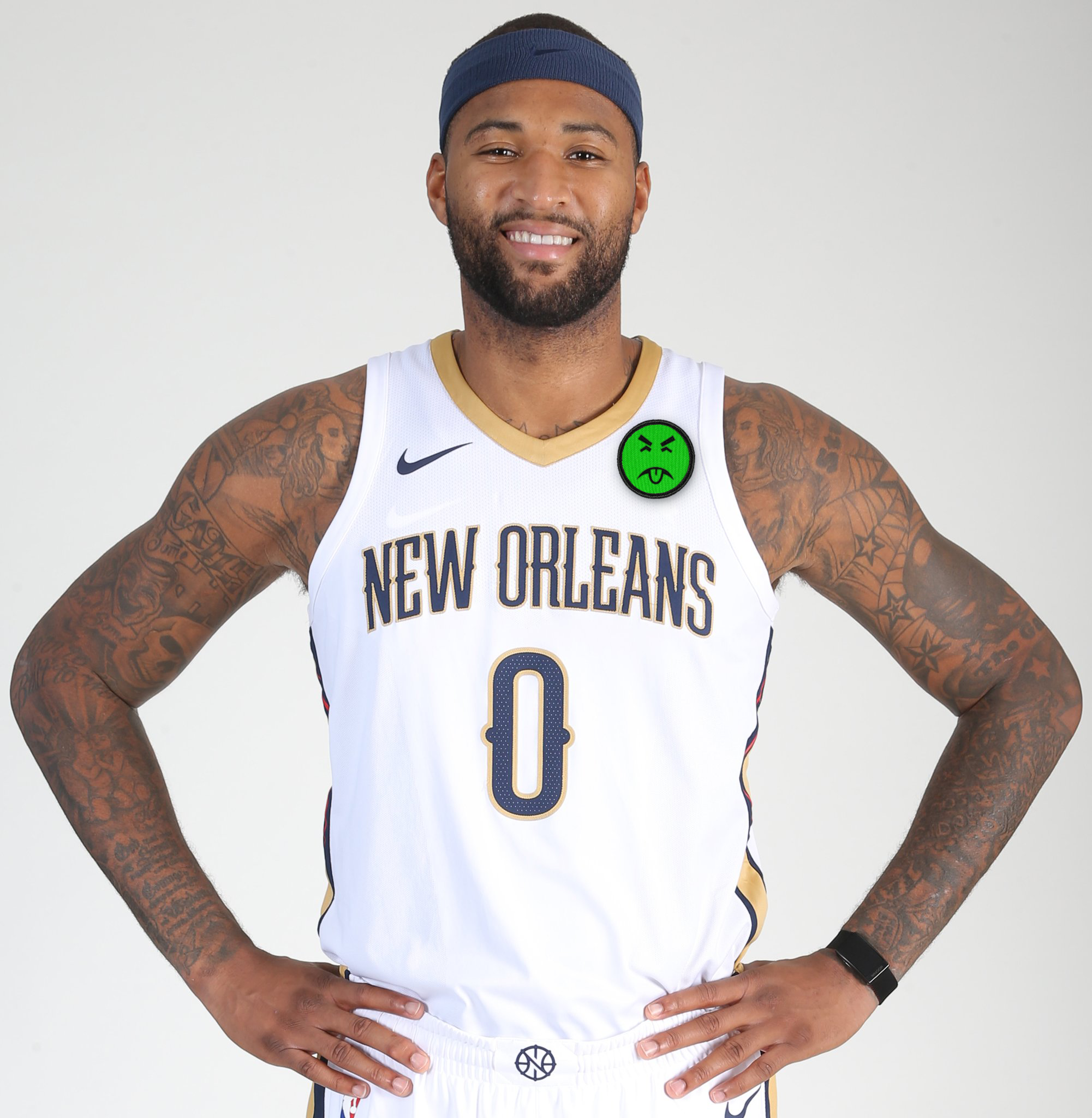
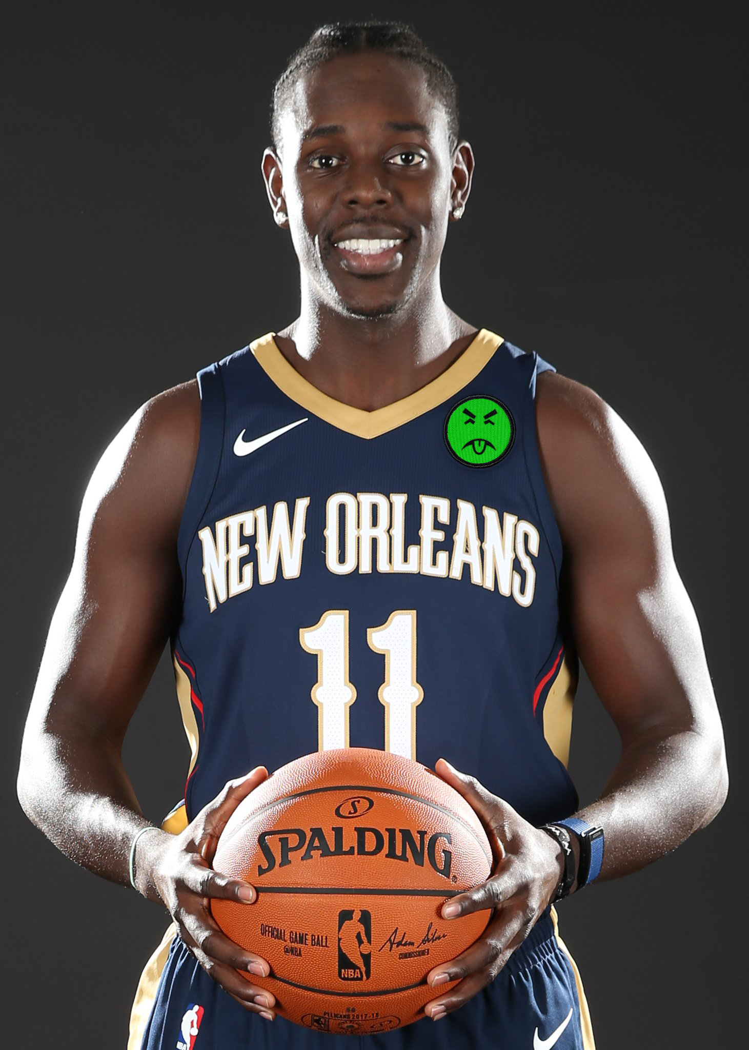
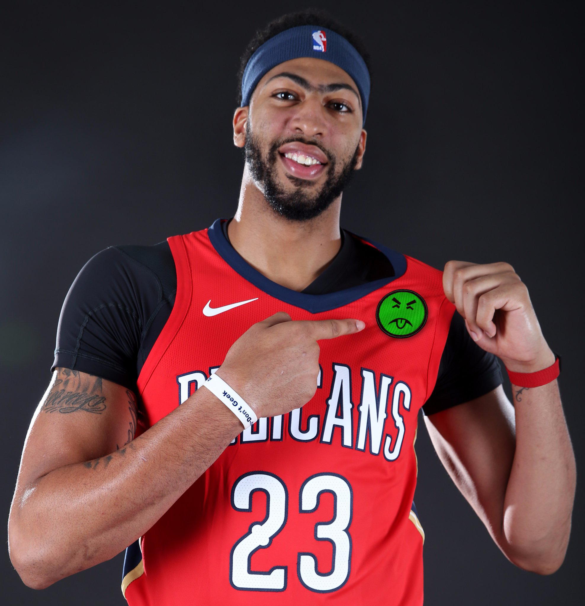
There are now 18 ad-clad teams and 12 ad-free teams. #NoUniAds
(Special thanks to Nic Schultz for his Photoshoppery.)
Click to enlarge
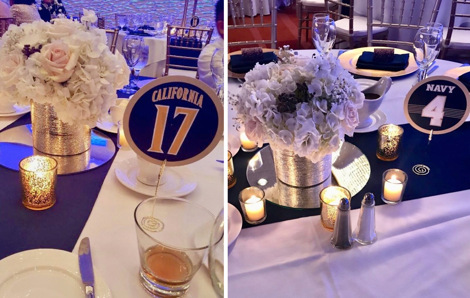
Uni Watch Wedding Services update: As longtime readers may recall, we sometimes create uni-themed table number cards for weddings. Our latest request on that front recently came from reader Ryan Maquiñana. Ryan is a Cal alum, and his bride, Roxy, is enlisted in the Navy, so they wanted Cal/Navy table number cards (see above).
One side was based on the 1996-97 Cal men’s basketball road uni (“My favorite uniform,” says Ryan), and the other side was based on the 2014 Navy football home uni (the year Ryan and Roxy met). Our own Scott M.X. Turner executed the designs, and the wedding took place last Saturday.
Big congrats to Ryan and Roxy. If anyone else is interested in hiring the Uni Watch Wedding Services Division, feel free to be in touch.
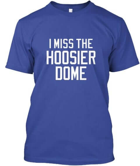
Naming Wrongs reminder: In case you missed it yesterday, we have new Naming Wrongs shirts for the Hoosier Dome (as shown at right), the L.A. Forum, the Salt Palace, and RFK Stadium (which we’d previously done in ’Skins colors but is now available in DC United colors). Additional info and images here.
We also recently launched four new shirts devoted to college basketball arenas. You can see those here. My thanks, as always, for your consideration.
XFL contest reminder: In case you missed it on Saturday, Phil announced our latest jersey design contest, this time to reimagine a team from the XFL if the league were still operational today.
The deadline is Oct. 31. Full details here.
The Ticker
By Paul

’Skins Watch: The Menominee tribe, which is based in the Oshkosh, Wis., region, has purchased the naming rights for the new arena being built for the Wisconsin Herd (the Bucks’ D-League G-League affiliate). The building will be called the Menominee Nation Arena, which I guess is nice, although it would be even nicer if the team named the arena after the tribe without charging them for it. … This article is mostly about a non-Indigenous artist in British Columbia who creates Indigenous-style art, but it includes a section on the Vancouver Canucks’ costumed mascot, Fin, and why First Nations people are okay with the designs on Fin’s Indigenous-style drums (from Greg Franklin).

Baseball News: Here’s an infographic of World Series facts and figures. … Employees at NASA’s Johnson Space Center in Houston supported the Astros yesterday by having an orange-out (from James Gilbert). … Astros OF George Springer, who’s a UConn grad, apparently keeps a UConn logo sticker, or tag, or something, in his shoe (from @Mike3783). … Former Cardinals third base coach Jose Oquendo, who had been away from the team since early 2016 due to knee replacement surgery, is returning to the team. His old No. 11 was worn this past season by rookie Paul DeJong, but DeJong says he’ll surrender the number to Oquendo (from @mrmichael21). … A very interesting project is about to unfold over at SportsLogos.net: A design firm is going to create a new visual identity for Baseball New Zealand — and is going to show how the project is coming along with weekly progress reports. The idea is that people tend to react poorly to new designs when they just see the finished product and have no idea of how the design team got from A to B, or what sort of input the client gave. This project, which will unfold over the course of several months, will provide more transparency for the design process, with the goal of creating greater acceptance by the public. Imagine if all teams operated this way with their new designs. … New logo for the Edmonton Prospects, a collegiate summer league team (from Steven Schapansky).

NFL News: Check out these Bills cornhole boards. Here’s another Bills design, along with a Buffalo Sabres version (from @SUEquipment and Brian Koperski). … The Browns, who are playing in England this Sunday, are using a faux soccer club social media avatar. If you scroll down to the first comment on that tweet, you can see what the various design elements are for (from Jerry Wolper). … Here are two charts that track the protests during the national anthem this season. Additional info and context here (thanks, Phil). … TV execs, citing an oversaturation of football broadcasts, want the NFL to cut back on the Thursday-night schedule. Since that would help contain the Rash, I’m all for it.
College Football News: New event staff jackets for Alabama. … Kansas will apparently be wearing limestone-numbered jerseys against Baylor on Nov. 4 (from @CStoppel). … Here’s a first, at least for me: blackout nose bumpers, which will be worn this weekend by Texas A&M (from Matt McCoy).

Hockey News: Cross-listed from the NFL section: Check out this Sabres cornhole board (from Brian Koperski). … Halloween jerseys this Sunday for the Allen Americans. … Speaking of Halloween, remember when it seemed like fans of every team from every sport were carving team logos into pumpkins? Haven’t seen any of that this year.

NBA News: San Antonio mayor Ron Nirenberg wore a Spurs yarmulke during visit to the Western Wall in Israel this week (from Sean Spitzer). … Speaking of the Spurs, Pau Gasol wore the wrong shorts, without the white piping, last night. Those are apparently the team’s practice shorts. Someone must have noticed, because he later had the proper shorts on (from @HitTheGlass). … Here’s a piece on how the Jordan Brand got its start with with top players (from Eric Hill). … The 76ers have worn blue wore their Minneapolis throwbacks last night. Here’s some video footage. … Last night’s episode of Law & Order: SVU included a shot of a four-digit Cavs jersey.

College Hoops News: New uniforms for Western Kentucky (from Josh Claywell). … New uniforms for Stony Brook (from Eric Wright). … Kansas will retire the jerseys of former players Sherron Collins and Cole Aldrich in February. … New uniforms for Arkansas State (from Mark Taylor). … Pretty cool new shooting shirts for Marshall (from Charlie Robinson). … New grey alternates for Penn (from David Elfin). … Nevada has eight different uniforms this season! (From @micahsoga.) … Texas and Texas A&M went red-vs.-burnt orange at a charity game last night. Yikes (from Chris Mycoskie).

Grab Bag: Quebec’s new law requiring people to show their faces in order to gain access to public services — a move widely seen as targeting Muslims — has sparked protests that strike at the heart of the province’s history and identity.

Ain’t That a Shame: Word came down yesterday that Fats Domino had died at the age of 89. I deeply regret that I never saw him play. I always meant to, but I never got around to it and then he stopped touring and it was too late.
In the late 1950s, Domino was rock and roll’s second-biggest hitmaker, trailing only Elvis Presley in record sales and hit singles. Despite his popularity, he was never as compelling a figure, at least in the public imagination, as some of his early rock and roll contemporaries. He didn’t create a genre like Chuck Berry and Elvis did, didn’t create a distinct style like Bo Diddley did, and didn’t scare the shit out of people like Little Richard and Jerry Lee Lewis did. He just made a ton of extraordinarily likable music, music that always sounded like a good time. As is the case with a lot of New Orleans artists, it was music that rolled as much as it rocked — music with lots of warm hugs, not sharp edges.
By all accounts, Domino was a class act, as warm and likable as his music. Thanks for sharing your gift with us, buddy. RIP.
Texas a&m is not red they are maroon in the basketball section
If the Aggies used red, the color-on-color thing would’ve been dead in the water (little contrast). I’ve never seen A&M associated with red until now and that’s for a reason.
And that reason is…?
That reason is that A&M is very well known for wearing maroon and white.
Wisconsin and Illinois played a red-v-orange game a couple of years ago, and it was as unwatchable as you might expect. I was amazed Illinois was allowed to wear orange for that game.
Especially nit-picky proofreading:
“Speaking of the Spurs Pau Gasol” missing comma
“(From @micahsoga.)” period on the wrong side of the parenthesis
First item fixed.
For the second item, the period is on the proper side of the paren, because that Ticker item had its own end punctuation (an exclamation point), which is why the credit was capped and had a period.
Noted.
The WS infographic refers to the A’s as the “Bay Area Athletics” and says the combined WS drought for the Dodgers and Astros is 83 years. Am I missing something (Dodgers in 1988, Astros in 2005)?
Also, the link for the Lakers throwbacks is incorrect.
Lakers link fixed. Thanks.
They must be referring to Series wins as opposed to appearances.
There seem to be a few other issues with the graphic. That section that mentions the “Bay Area Athletics” is confusing (it says “MLB’s highest TV ratings in 2017” underneath the Astros listing which is 21st – so, do they mean highest ratings each team got for an individual game? And if so, why does it bottom out at 29 when there are 30 teams? If there’s a tie for last, both teams should be listed…), and Verlander is mentioned as the “highest-paid Astros”, plural, right next to Kershaw being identified as the “highest-paid Dodger”, singular.
Also, those lips on the images of Kershaw. WHAT.
There are 29 US teams. They must be excluding Toronto.
Yup, obviously I was missing something
Since the Astros lost the 2005 series, i presume the 83 years is referring to world series wins, not appearances.
They have the Dodgers salary at $152 million. I think that’s off by at least $100 million. Dodgers are the highest salary in baseball by a lot, they’re definitely not less than the Astros (which this seems to indicate).
Good presentation hides shitty factchecking.
I’m kinda surprised that the death of Fats Domino received scant coverage in the media. He’s a legend, and IMHO, deserved more attention that he received.
When you say “the media,” where specifically did you not find coverage of Domino’s passing? Personally, I received notifications on my phone in rapid sequence from the BBC, the New York Times, and NPR, I saw headlines soon thereafter on Slate and HuffPo, and I heard an obituary on NPR. Then this morning, another radio obit and Paul’s appreciation.
There is no such thing as “the media.” There are thousands of media outlets competing with one other, and each of us chooses our own basket of a few or few dozen to follow. If news that matters to us doesn’t appear among the outlets we follow, this doesn’t mean that “the media” failed. It means that we have chosen the wrong outlets to follow, and therefore we need to seek and follow those media outlets that do cover the issues that matter to us.
Just wanted to “Like” this comment…
Me too
Yes, relative to Prince, David Bowie and Tom Petty, Fats Domino did receive less coverage, but I found out as soon I checked my usual news websites when it happened. Your go-to news source didn’t cover it? Ain’t that a shame ;)
The link for the video of the ball ending up in the jersey has been taken down.
Another note on the Bills jersey its already been noted that some of the Bills players were wearing old templates with the collar issue. On the image with Williams and the crucial catch patch he is wearing a template based on the collar.
Ah, too bad about the video. Now removed from the Ticker.
Odd that he’s wearing the new template earlier in the season, but switched back to the old template. Guess it took more than the preseason for him to figure out which one he preferred?
Those throwback stripes still bother me. It’d be nice if Nike could actually reproduce the correct vintage stripe pattern – the outer stripes being blue instead of red, and thinner than the inner blue stripes, and all of the stripes having thin red borders.
Here is the link to the new Edmonton Prospects logo:
link
Sorry, that was the link to the club’s Twitter page.
HERE’s the link to the new logo:
link
Got it. Now fixed in the Ticker.
Are Anthony Davis’ eyebrows always like that? I had to look up the roster to get his name (tells you how much I follow basketball), but his eyebrows seem to belie his apparent smile over that ad patch. So I’m not sure if he’s actually proud to be wearing that thing, or if he was just trying to get through that photo session without showing his disgust.
Singular. His eyebrow is always like that.
I tried not to look too closely at it…
Employees at NASA’s Johnson Space Center in Houston supported the Astros yesterday by having an orange-out
I wish the Astros would return the favor. Enough with the navy blue caps already. Bring back the orange caps and helmets and never take them off!
Darn straight! At home, at least. The navy cap is an excellent look, but a team can hardly be the Huston Astros without wearing an orange cap at least some of the time.
The Marlins and Astros have retired their orange caps, AFAICT, despite the sales figures supporting Miami’s orange hat. (Give me a few hours and I’ll bore you with how hard it was to scare up an orange Houston cap.) I think team owners are simply too fusty and conservative to embrace a brightly-colored hat.
If they’ve retired the orange caps, then Go Dodgers!
As for the I’m Still Calling Them Florida Marlins, you can retire the orange caps, but until you bring back the teal ones permanently, I’ve retired from rooting for you. I’ll take the all teal or the teal crown with the black brim.
The uniform travails of the Marlins have been hashed out again and again on these pages. To me, it was a mistake spiking an identity corresponding to a team never to lose a playoff series! They certainly passed the S.U.C.K. (Stale/Ugly/Calendar/Karma) test.
Right on, Jim!
Bad News Bears Good!
The 5 star gold captaincy badge leads to another question, how many 4 star gold captains are in the NFL at present? On another note, that standing buffalo helmet is simply awesome and the Bills should make that their full time helmet again.
I have respect for the tradition of the Bills and like that uniform, but I do prefer the present logo for full time use. The “Standing Buffalo” looks like he is sad and docile with his head down. Looking like he is willing to accept not being a playoff team. I feel this logo is one that works fine as a throwback and has its place in the past, not as a primary logo again moving forward into the future.
Though many Bills fans may be happy with present uniform, my favourite is the set worn during the Super Bowl years with the red helmets. These would look great today.
link
NFL has 32 teams and only one presently that wears a red helmet. Seems like too few.
I too prefer the standing buffalo. I think it reminds me the reverse side of the old “Indian head” nickel. Feels classy, well-done. But one question–the white dot in the head, presumably an eye, seems so imprecise and sloppy in a graphic that is otherwise meticulous.
All this discussion of the buffalo just reminds me that Buffalo buffalo Buffalo buffalo buffalo buffalo Buffalo buffalo.
I like the color rash patches better, outside of them being color rash. The centered stars under the C is more ascetically pleasing to me. And also the lack of filled in stars just looks better.
*ascetically
Also found in: Thesaurus, Legal, Encyclopedia.
Related to ascetically: aesthetically
as·cet·ic (ə-sĕt′ĭk)
n.
A person who renounces material comforts and leads a life of austere self-discipline, especially as an act of religious devotion.
adj.
Relating to, characteristic of, or leading a life of self-discipline and self-denial, especially for spiritual improvement. See Synonyms at severe.
[Late Greek askētikos, from Greek askētēs, practitioner, hermit, monk, from askein, to work.]
as·cet′i·cal·ly adv.
I was going to say the same thing, Brett.
The Pelicans’ jersey sponsor (a fitting one for their local metro area) is gonna donate meals to a NOLA food bank for every one of the team’s dunks, so some good came out of that deal. That’s why I won’t complain about the Pelicans’ patch.
Uni Watch bylaws require me to point out that it’s an advertiser, not a sponsor:
link
It’s nice that they’re donating to a food pantry, but these “dollars for dunks” (or for home runs, or for touchdown passes, or whatever) promotions are just another form of advertising. They’ve already crunched the numbers and have a good idea of how many dunks there will be this season, so they already know how much money will be involved. They could just give that money as a lump sum, but instead they’re doing it in a way that keeps their name circulating over and over again. It’s still philanthropy, and of course I’m not criticizing them for donating to a food pantry, but it’s also self-promotion. And they could certainly do the same thing without buying space on an NBA team’s jersey. In fact, they’d have even *more* money to donate if they didn’t spend money on the jersey patch.
Self-promotion for many of these companies appears to be part of the gig, though. I already know they’re gonna do it even with philanthropy. I’ve seen it enough times, even with hurricane relief ads (I was affected by Irma), that I already know off rip that they’re rarely gonna do it anonymously, even if they don’t promote specific products or lines of them. That aspect isn’t likely change and not just in the sports world.
OK, so it’s par for the course. Agreed.
But let’s go back to the original reason we’re discussing this:
1) You said the the food pantry donation is enough to keep you from complaining about the uniform ad patch.
2) I pointed out that the donation is really just another form of advertising and therefore not entirely selfless.
3) You just responded, essentially, “Yeah, but whaddaya gonna do.”
In other words, you basically agree with me that there’s a bullshit element to this form of philanthropy. And yet you still think that’s enough to give the Pelicans a pass on the ad patch?
Doesn’t make sense. At least not to me.
Also worth noting: The Jazz’s “Five for the Fight” patch doesn’t include the name of the company behind the initiative (Qualtrics). That’s the right way to be a go-gooder. Really throws all the other self-serving efforts into stark relief.
I remember reading about the “Five for the Fight” patch and it stands out for obvious reasons. With that said, I’m not sure who else is gonna go that route and I can’t realistically expect a whole lot of other clubs to follow suit (no telling what the ad-free clubs’ intentions are at this point). I completely understand what you’re saying about the companies not being entirely selfless, but I’m also all too aware of what they perceive as a need to put their names out there and the people running said companies aren’t likely to change their M.O.s (mainly profit-oriented) despite the massive outcry. As sad as it is to say (not saying it facetiously), money is all some people understand and that seems to be how that game works (at least from where I’m sitting). Over the course of the season, it probably won’t end with the Pelicans (who at least kept it local FWIW) and whoever they align with.
In other words: The situation sucks. And yes, I agree.
But I ask again: If the situation sucks, why give the Pelicans a pass? They and their advertiser are no better than the others.
Only because it was a local company strongly associated with the area and it’s at least doing something in SE Louisiana community. I know damn well it’s not the ideal setup for straight-up philanthropy, but I don’t recall that element being present in the other deals aside from what the Jazz did to the best of my knowledge (maybe I missed some elements of said deals, IDK). I doubt this deal won’t be the last one structured this way in the Association, but time will tell on that one. I hope the Hornets’ corporate partners will also do this type of philanthropy independent of the Pelicans, though.
The Pistons’ advertiser is a local company, and they’re working with the team on a community math education program. If they really wanted to focus on that effort, they could put the name of the program on their patch. But, nope, it’s the name of the bank that’s being advertised.
#NoUniAds
Exactly, Rob. These companies try to use community outreach as a fig leaf, but it’s bullshit. There’s a very simple and straightforward way to do this properly, and the Jazz and Qualtrics have already shown how it’s done. There’s no reason to settle for less than the standard they’ve set. #NoUniAds
Idea for Naming Wrongs: I Miss Municipal for the old Browns/Indians stadium
You are the first person to suggest/request that. I’ll consider it.
Probably because (sadly) not many folks seem to miss it. I know I sure do. It’s like the love you have for your first POS car.
I remember going to a game there when I visited in 1987. Even with it being Fathers’ Day and having a table-top grill giveaway, they drew less than 15,000. Until recently, I had their “special” Taco Bell cup that featured Julio Franco and Tony Bernazard.
I’d buy that.
I’ve never been a fan of the tenants, but I loved going to that stadium. I miss it every time I go to a Tribe game. In fact, three of the last four years someone got us tickets for the suite in left field. Very nice, and yet each time my first thought was, man, I’d rather be sitting along the left field railing at Municipal.
Ironically, even though I’m a Pirates fan, I would buy that before an I Miss Three Rivers shirt. And I do miss Three Rivers (yes, the new park is great…I can like two things at once).
And the only reason I haven’t requested an I Miss The Richfeld Coliseum shirt is because I have three shirts and a cap from there already. But others might like one.
First request I’ve had for that one!
How about, “I Miss the Mistake by the Lake” ?
I’m not a Clevelander/Clevelandian/Clevelandite, but I’ve heard it referenced this way before (I was only 12 when it was torn down), which could be why Craig’s request is the first. “I Miss the Mistake…” definitely has a nice ring to it.
Very nice eulogy, Paul. I always enjoy Fats’ music. As much as one can “know” a celebrity they’ve never met, he always seemed to me to be a genuinely nice, approachable man. “He just made a ton of extraordinarily likable music, music that always sounded like a good time” sums it up perfectly.
* Forgot to add that the eulogy’s title could not possibly have been better. Kudos.
Thanks, Marc. I assume you’re referring to the “Ain’t That a Shame” title. I originally had something else (which wasn’t as good) but then I changed it about an hour ago when the new idea occurred to me. Shame on me for not having come up with it to begin with.
I assume you’re referring to the “Ain’t That a Shame” title. Precisely. Excellent self-editing.
National Treasure gets bandied about way too often and undeservedly but Fats Domino fits the bill. I still listen to his music along with a bunch of great New Orleans artists (the disappearance of regional music styles is another shame). Check out Fats Domino: Walkin’ Back to New Orleans which chronically Fats return to the stage after Hurricane Katrina to see a tremendous talent and gentle soul.
On the Menomonee naming rights. The tribe owns a large casino in Wisconsin that competes with the a few other tribal owned casinos in the state. There has recently been a big political battle over the Menomonee tribe wanting to build a new casino south of Milwaukee which has been greatly opposed by the Potawatomi tribe who owns Milwaukee’s large casino complex. With that in mind this naming deal is just an advertisement, and if the arena were to be named after the tribe without asking for money in return that would just be free advertising.
Also, RIP Fats Domino.
Proofreading:
Kansas will apparently be making limestone-numbered jerseys against Baylor on Nov. 4
How the hell did I write that? Now fixed.
Those Lakers throwbacks look great.
However, in conjunction with the yellow
tightscompression leggings a bunch of the players were wearing, they look bad.I’ve noticed a ton of players are wearing leggings that match their uniform colors this year, and considering that the socks generally also match the unis, it creates a very displeasing leotard effect similar to what we’ve been seeing in the NFL for a few years.
Goofy leggings aside, it was a pretty game…teal vs. Red. Striking.
It does seem a little strange to me for a team to wear throwbacks from when they were located in a different city altogether.
It’s kind of like rubbing it the faces of fans that the team left their city.
Does anybody else do this besides the Lakers? I can’t imagine the Dodgers wearing “Brooklyn” jerseys or the OKC Thunder wearing Sonics throwbacks.
I can’t imagine the Dodgers wearing “Brooklyn” jerseys…
Ahem:
link
And that’s just one of the several times they’ve done it.
Yeah, I should have known that as often as baseball does “one-off” throwbacks to honor old teams that the Dodgers would have done it.
But would they do it as an alternate that was part of their regular rotation as the Lakers are doing?
I guess once enough time goes by, it’s no longer a sore subject with fans especially if the vacated city eventually got another team. It just seems weird to see any team wearing a city name that they’re no longer representing.
And while I’m thinking about it, how weird would it be for the New Orleans Pelicans to wear throwback Charlotte jerseys or the Baltimore Ravens to wear throwback Cleveland Browns uniforms?
The Colts have done it numerous times.
The Chiefs have worn Texans’ throwbacks, and yes, some Kansas Citians were testy about it.
Proofreading:
“Fox had a bit of a problem with an [ad] projected onto the outfield wall”
Also, it turns out that Uni Watch is not only the study of athletics aesthetics, but also the practice. Your call to the Bills will change an on-field jersey, pretty weird.
And this sentence has an extra with: “Here’s a piece on how the Jordan Brand got its start with with top players (from Eric Hill)”
Your call to the Bills will change an on-field jersey, pretty weird.
Agreed. Wasn’t my intention, of course.
Not the first time this has happened. At least two MLB teams (A’s and Braves) have tweaked their batting helmet logos in response to things I’ve written.
I wish my work had a greater effect on things like uniform ads and camouflage jerseys instead.
Just leave the Lakers’ “Forum Blue” alone LOLOL
…and RNOB too, pleeeeeeeeeeeeease?
Those limestone numbers for Kansas is 100% better than the chrome. If not white, then they should stick with limestone full time
I’ll feel like a rube if this has been mentioned before, but the Dodgers appeared to have some sort of World Series logo on the back of their batting helmets last night. It’s not often you get a from behind view so I’m not sure if the Astros do as well.
WS logo has been on the back of batting helmets for many years now. You know, just in case you didn’t realize you were watching the World Series.
Rube. ;)
Deserve that.
Thanks Paul!
Just curious…do you have any intel on what the 4th NBA jerseys will look like? I don’t expect you to be able to share if you do, just curious if you have any. If not, care to venture any guess as to what they may be? I’m curious if they’d be universally themed. If not, I hope it’s not all teams following the ‘Rip City’ motif…while i’m sure that would work for maybe a third of the teams, I think it would fall flat with a lot as well (ie Philadelphia, Boston, etc).
Also, I guess since the few teams that have released their uniform schedules show these jerseys popping up in late December, it pretty much nixes the idea of any Christmas jerseys. Just as well since the the recent editions were pretty good and the Nike versions would probably be a huge downgrade
I have no intel, wouldn’t tell you even if I did, and am not inclined to guess. Sorry!
I’ve always been confused as to why the Bills think their white “throwbacks” resemble any uniform they actually wore in the 60’s or early 70’s. It’s a “fauxback” at best – one that comes with the excuse, “Well, we can’t seem to get the narrow red stripes around the blue ones. So we did one red, one blue. Good enough, right?”
Thus concludes my yearly compliant about the Bills “throwbacks.”
I made a similar comment earlier up above. And, of course, I complained about their lackluster effort back in 1994 earlier this week. Their current fauxbacks are at least a better attempt than that year’s version.
Yeah. It’s kind of like they figure just putting some stripes on the jersey is good enough. The striping patterns of pro football teams became unique and distinctive as the sport grew in the 60’s. The subtle red outline on one thin, one thick blue stripe was the Bills. Yeah… most people probably could’t see the thin red outline, but the stripes sure didn’t look like red and blue lines of equal length from the stands.
And what’s funny is they get the blue throwbacks correct! Complete with thin red lines around proper sized white stripes. Go figure!
Too bad about the Pelicans’ new jersey advertiser. I always kind of liked them, but in keeping with my personal policy, I won’t be eating their products anymore.
I like the faux-futbol logo for the Cleveland Browns, especially the 8 stars to symbolize the number of Super Bowls they’ve won…or how many QB’s they will use this year…or how many points per game they will average, or…
Paul,
“and then the Bills had a bye in Week Six.”
Funny you should choose that wording, because that is an issue I’ve wanted to bring up to you for years and never do. A “bye” can be earned. A team may not have to play in the first round of a tournament because of successful play. They would have a first round bye. A “bye” can be assigned. If there were an uneven amount of teams in a euchre tournament, a team may have a first round bye. Specifically, a bye concerns moving on to the next round.
In the NFL and with NCAA football, it is not a bye. A team does not move on to the next round, such as the playoffs, the week after they don’t play. It could be said a team has an off week, an open week, or that they are idle. But it is incorrect to say they have a bye.
I’m not singling you out. I’ve heard Roger Goodell, Jim Nantz, Al Michaels, and just about every other announcer refer to it as a bye. Most journalists do the same. And printed team schedules almost always list it as a bye. (Including one or two of the people who contribute to your round up of what college football teams by conference wore each weekend.)
This issue bothers me as much as I assume the sponsor/advertiser issue does you. I’ve never known who to talk to, so I’m hoping to enlist your help. Could you possibly talk to the schedule makers or appropriate office types with the NFL for an explanation? Even suggest a correction in wording? Or at least get an on-the-record explanation? In the name of the aesthetics of athletics, I would love to get this egregious error corrected. Thanks.
This issue bothers me as much as I assume the sponsor/advertiser issue does you.
The sponsor/advertiser issue bothers me because I think it both masks and contributes to a growing problem in our society (i.e., the insidious spread of advertising and corporate culture).
I gather your objection to “bye” is more linguistic for its own sake, not for any deeper underlying reason.
Not trying to diminish or disagree with your point. Just saying that I think you’ve come up with an apples/oranges comparison.
All of that said: I had not thought about “bye” before. Good food for thought. Thanks.
What words mean is shaped as much by usage as it is by denotation.
I agree with Matt – originally, the “bye” was meant to strictly refer to a higher seed getting a free pass in a tournament.
But once the NFL and college football started the custom of giving teams a week off, there was no term for this, so it made sense to use a similar term that people understood, so people naturally started using “bye” in these cases.
I don’t see the problem – plenty of words in the English language have multiple meanings based on context. When somebody says “The Steelers have a bye this week”, everybody knows what they’re talking about.
At some point, the dictionary will be updated to include this definition.
Thank you for this. I asked this question while reading after reading the college football uni trackers. Some write bye, I wondered what had happened to idle. Idle was always used as I grew up, but was lost somewhere along the way. Maybe about the time the nfl added the open week to their schedule.
Whoops. Please excuse my poor self proofreading.
When I see the rainbow patches, I think Gay Pride and not cancer whatever. I wonder what other people think/see, if anything. Just commentary on the fact that a patch doesn’t mean anything without a referent.
That’s the old Leslie Knope accidentally becoming a gay hero by unwittingly marrying two male penguins gag.
I saw Fats at the Jazz Fest once, years ago; both Isaac Hayes and Ed Bradley were just off stage taking photos of him, will never forget that. He also dedicated a song to my parents in a club in the early 60s because (as my parents tell it) they let the wives of two of his band members sit at their table.
How many UConn or husky fans will be foot out by the idea of George Springer putting his foot on the husky logo in his shoe? It would be like some college putting their Indian head logo on seat cushions and native fans getting upset over people sitting on the logo, when the seat cushion could be flipped over and sat on the opposite side.
“Uni Watch Wedding Services Division”… that cracked me up. Are you going to start setting up booths at trade shows, soliciting brides-to-be (and their begrudging tagalong fiancés) for work?
That would be fun.
We’ve used that term (“Uni Watch Wedding Services Division”) for many years now, although it doesn’t come up very often.
I just watched the Pens-Jets game, and I can confirm pumpkins carved with logos made appearances.
I was all excited for the Namings Wrong shirt for Giants Stadium, had my money ready for when it came out. Was all ready, then I saw the shirt, “I still call it the Meadowlands”. Well of course you do, becasue it’s still called the Meadowlands. Disappointed for sure.
We’re not including any team names in this project. Sorry.