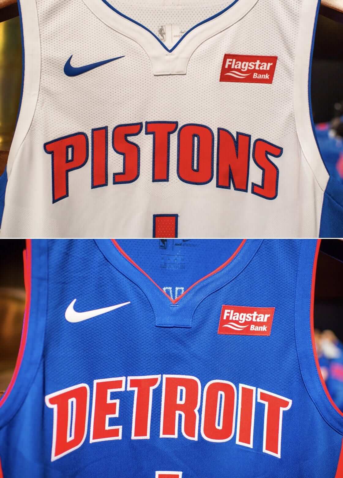
Click to enlarge
The Pistons yesterday became the 10th NBA team to have a uniform advertiser, as they announced a deal with Flagstar Bank. The bank is headquartered in the Detroit suburbs, so there’s a local connection.
There’s something sort of perfect about a bank getting in on the uni ad action. It really symbolizes what the whole program is about, no? And hey, the Pistons can take their check from Flagstar and deposit it at Flagstar. Perfect.
The Pistons also used the announcement as a way of unveiling their home and road white and blue jerseys. Here’s a better view (click to enlarge):
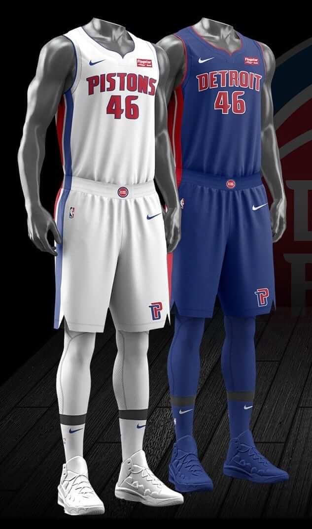
The main changes appear to be:
• They’ve gotten the same modified collar treatment that most of the other teams seem to be getting. No more wishbone.
• The color sequence on the home uniform’s side striping has been reversed. It used to have red facing forward and now has blue facing forward.
• The new interlocking “DP” logo has been added to the shorts, replacing the old “DP” logo.
• The triangular cutout on the side of the shorts is positioned a bit more toward the front. We saw this with the Kings as well. Probably a Nike-wide thing.
• The trend of every team having a waistband logo, which I mentioned yesterday, is continuing.
Also, this image has given us our first look at how the NBA will look with Nike’s coordinating tights and socks (in case you hadn’t heard, Stance is out). Get ready for a lot of swooshes.
Later in the day, the Thunder unveiled their new uniforms. We had already seen what their white uni would look like, thanks to a video game promotional screen shot, and the official photos confirmed that they’re mostly sticking with what they had (click to enlarge):
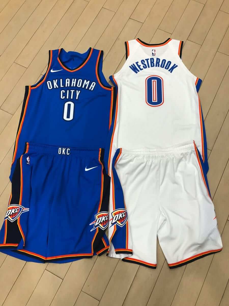
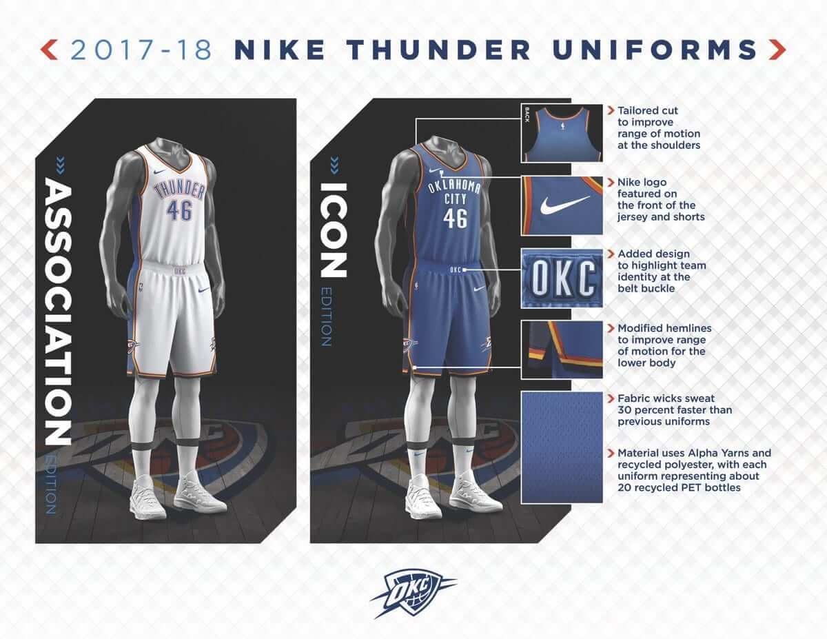
(Hmmm, the mannequin on the left didn’t get swooshes on his socks. Someone’s going to get fired over that, no?)
The changes here appear to be the addition of the waistband logo; an adjustment to how the piping wraps around the cutout at the base of the shorts (here’s how it used to look); and the truncated armhole piping on the back of the jersey. In short: the same basic uniform with some extremely subtle tweaks that most people won’t even notice.
Also, this unveiling would seem to confirm that the Thunder will not have a jersey advertiser this season. I suppose they could still ink a deal on the fly, but they probably wouldn’t be unveiling anything now if they were currently negotiating with an ad partner.
Meanwhile: It appears that Portland will be unveiling their new uniforms on Saturday.
Best ejection ever: Rangers third baseman Adrian Beltre is a folk hero this morning. If you missed what happened last night, here’s the scoop: Beltre, like many MLBers, tends to stray quite a bit from the on deck circle when he’s awaiting his turn at bat. Last night umpire Gerry Davis told him that he needed to be closer to the circle, so Beltre “complied” by moving the circle to his preferred spot, whereupon Davis ejected him:
I had never seen someone ejected for dragging an on-deck circle so thank you Adrian Beltre pic.twitter.com/8Trb8dbjN7
— Dave Lozo (@davelozo) July 27, 2017
This view provides a clearer view of Davis issuing the heave-ho:
Adrian Beltre is the greatest and Gerry Davis is in need of a sense of humor. pic.twitter.com/y9Mi5EMoC0
— Jeff Passan (@JeffPassan) July 27, 2017
And here’s a photo showing how far Beltre moved the circle:
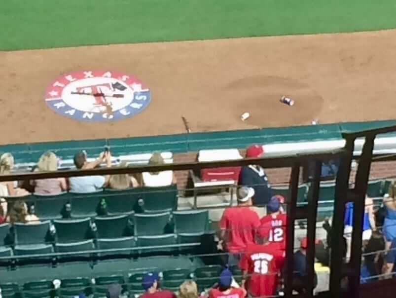
Additional info here. It’s worth noting, incidentally, that on deck circles used to be just circles of dirt, not logo-emblazoned physical objects (which can occasionally cause problems). Do any MLB ballparks still do it the old way?
(My thanks to our own Mike Chamernik for bringing this one to my attention.)
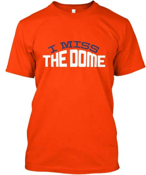
Naming Wrongs update: In case you missed it yesterday, we have a new batch of Naming Wrongs designs (including the Dome design shown at right). Full details here, or just go straight to the Naming Wrongs shop.
The Ticker
By Mike Chamernik

Baseball News: The logo for the 2018 All-Star Game, which will be held at Nationals Park, was unveiled yesterday. Here are the previous ASG logos that have included the Capitol Dome. … Justin Upton slammed his helmet after making the last out of the sixth during last night’s game. It bounced back and whacked him in the face. … The Hartford Yard Goats will wear Praying Mantis jerseys and hats tonight for “What If?” Night. The name was one of the five finalists when Hartford had a naming contest in 2015 (from Matthew Edwards). … One of the alternate uniform sets for the Charlotte Knights involves pinstriped jerseys and solid dark pants, which is a throwback to the 1990 season (from @dkipke12). … The Cubs are playing the White Sox this week, and a Chicago baseball fan wants it both ways. … Reliever David Robertson used to have a little circle on his glove with the White Sox’s “Sox” logo. Now that he’s with the Yankees, he’s apparently blacked out the logo (from @elgatogrande88). … White Sox skipper Rick Renteria’s cap didn’t have the New Era logo creep last night.

NFL News: The Falcons are having issues with operating the retractable roof on their new stadium, so the roof will remain closed for the early portion of the season, at the very least. … Two days after cutting WR Lucky Whitehead amid unusual and controversial circumstances, the Cowboys have already recycled his No. 13, which was given to rookie WR Marvin Bracy. Whitehead signed yesterday with the Jets, who have not yet assigned him a number (from Brinke).
College Football News: Clemson will use the new Schutt F7 helmet this year (from Chip Powell). … New jerseys for Tennessee, who have adopted Nike’s Vapor Untouchable model (from Chad Fields). … It had already been announced that Miami would have green and black alternate jerseys this season. Here’s a sneak peek at what they’ll probably look like (from Adam Apatoff). … This is pretty cool: A few dozen Big Ten players attempted to draw their schools’ primary logos. Though most of the logos are just stylized letters, Matt Vandeberg’s Hawkeye drawing was the most impressive effort. … Ashley Cooper spotted a guy with the College Football Playoff logo tattooed on his elbow. … A writer for the Tallahassee Democrat has an issue with the McDonald’s advertisement on the backside of the new scoreboard at Florida State’s stadium.

Hockey News: Here’s a look at the Stars’ new Adidas practice jerseys. “Looks like they might have screen-printed logos,” says Jarred Becker.

Basketball News: Evansville’s practice center has a new court design (from Scott Hurt). … The latest episode of NPR’s Planet Money podcast is about Starbury, the affordable shoe line headed by former NBA point guard Stephon Marbury. I tried to buy a few low-top pairs of Starburys last year, but the company doesn’t make shoes in size 14. Consider this a mini-QOTW: Do any of you have troubles finding certain sizes for athletic shoes or sports apparel? Leave your answer in the comments section so we can commiserate together (link from Kary Klismet).

Soccer News: Prior to last night’s International Champions Cup match against Manchester United at FedEx Field, FC Barcelona gave Washington D.C. mayor Muriel Bowser a personalized jersey (from John Muir). … A bunch of eye-popping jerseys will be on display at The Art of the Football Shirt, a new art exhibition in London (from Mark Coale). … Clemson’s new uniforms use the same tequila sunrise design as the Oklahoma State women’s team and the Houston Dash of the NWSL (from Scott Trembly, Matt McClain and Nick Linebrink). … A few notes from Anthony Zydzik, who is sorry for submitting articles in German. First, not everyone on RB Salzburg has the same uniforms. Nine of their outfield players will wear shirts with Red Bull ads on them, but their 10th player, who the Austrian club says will always be the youngest on the roster, will sport the logo of Rauch Fruchtsäfte, a fruit juice company. Second, Carl Zeiss Jena, a team in Germany’s third division, has experienced an uptick in jerseys sales across Japan and Latin America thanks to a new advertiser deal with the metal band Heaven Can Wait. Lastly, here are all of the kits this year in Germany’s second Bundesliga.

Grab Bag: New logo for sports teams at Marywood University (from Mary Lynn Delfino). … A hiking trail across the Pacific coast changed its logo because it too closely resembled the logo of the BoyLover. … New flag for the City of Orlando.
QOTW: as a pretty large man, I have very specific issues with Nike. When they were Manchester United’s uni provider, they always sold jerseys in 3XL. I know they do this for Barcelona and other club teams they work with/throw money at.
Nike have never put out a US national team shirt in 3XL. Ever.
Beltre is just one of the reasons that it is so hard to care about sports anymore. It’s all about him,how he thinks he is entitled and that the rules do not apply to him. I’m tired of rooting for jerks.
All I’ve read about the Beltre ejection (so far) points to Beltre’s status as a future Hall of Famer and the humorlessness of the umpire, Gerry Davis.
link
link
I’ll won’t be in the Baseball Hall of Fame, so I know I could never get away with doing something like this.
Nothing about Beltre’s actions suggested he was joking around.
Full disclosure: I’m a lifelong Rangers fan.
Everyone is entitled to an opinion, but if this is what you think of Beltre, I’d say you probably don’t ever watch him. Is he quirky? Unique? Yes. But I’ve never heard him described as a jerk.
This hasn’t been a great year for the Rangers. And there are a few players on the team I don’t really care for. But watching players like Beltre and Andrus is a joy because they are damn good, clearly have fun playing the game, and don’t take themselves too seriously.
Seriously? I don’t even follow baseball that closely, but Beltre is pretty well-known for being a likebale, fun-loving player.
Beltre is absolutely, unequivocally not a jerk.He is a super star who takes the time to sign for kids while other players walk past.He is one of the reasons you should care about sports.
If you think future hall of famer Adrian Beltre acts like an entitled jerk and is ruining sports for you, please do us all a favor and stop watching sports and commenting on sports-related websites. Thank you.
Beltre is an archetype of the professional ballplayer who is a reason people do like to watch sports.
Mike: How tall are you?
6-foot-2.
Problems with the new Falcons roof, maybe they should start to consider building their third new stadium in the last 21 years :)
No other city seems to cycle through stadiums faster. (Both baseball and football)
ON DECK CIRCLES: I’ve seen the warm up mats, but there are parks where these are cut out of the grass. Here’s a picture of Tiger Stadium with not one, not two, but THREE cut-outs. Granted, one set may be for coaches hitting infield during BP. But still…
link
OK, but Tiger Stadium hasn’t existed since 2009 and hosted its last MLB game in 1999.
Are there any *current* MLB stadiums that use dirt circles?
Fenway Pahk…
link
Wrigley too, with a cut-out for the mat!
link
There are images of Wrigley w/o the cut-outs, so this must be a season-by-season thing.
Just to clarify: In the photo you linked to, Wrigley has the dirt circles, but they’ve put the team-logo mats on the dirt circles. I’m interested in knowing which stadiums *aren’t* using the team-logo mats.
It appears Camden Yards isn’t using mats, but cirlces:
link
But that’s it from what I’ve seen. Work beckons, or I’d dig around more!
Re: on-deck circles in Fenway Park, I think they may have ditched the rubberized mat after Jason Varitek broke his elbow while diving/falling on the mat to catch a foul ball. link
I haven’t tracked down a source to confirm whether the Varitek incident is why the rubber mats were axed, but at least one commenter on an old Uni Watch post had the same recollection I did. link
I know it’s an obvious point but the circles at Fenway are decorative only, as players still stand in the dirt track behind the circles.
The Fenway circles are fungo circles, not on-deck circles. Officially the on deck circles have a link.
“Each circle is 5 feet in diameter, and the centers of the circles are 74 feet apart. A straight line drawn between the centers of the two on-deck circles should pass 10 feet behind home plate”
The Orioles circles used to be mats until Caleb Joseph slipped on them (seen in the link that Paul provided). Buck Showalter had the team stop their use permanently.
To be clear, those are not ALL on-deck circles.
4 of the 6 in the Old Tiger Stadium photo are Fungo Circles.
The ones from Fenway are Fungo Circles.
I believe the White Sox are currently the only other team to have Fungo Circles on their field.
That is a quite dated photo from Wrigley and they no longer have any of those, but 2 closer to the field were Fungo Circles as well.
I am pretty sure the multiple fungo circles at Tiger Stadium were put in for when they used it to film the movie about Roger Maris 61*. The movie was done after the stadium had closed and it was used for most if not all of the Yankee Stadium scenes in the movies.
In a quick google search I found some on deck information. Teams were using either mats or possibly even thin wooden platforms for on deck circles as long as 50 years ago. Mickey Mantle (Yankees 1960s), Pete Rose (Reds 1980s). Hank Aaron (Braves 1970s). I’m suspect there are more but these were the first three I found.
I think the Nats and MLB did a nice job with the All-Star Game logo.
Question about the Pistons. Looks like both of the figures are wearing — not sure what to call them — compression pants? One figure is blue and the other white. Do players actually wear those? I don’t watch a lot of basketball.
Or are the figures just wearing them to emphasize the colors? The Thunder figures are wearing them, too, but are white for both versions.
Yes, lots of players wear these.
Compression shorts are link as well.
By FIFA rules, the compression shorts must be the same color as the uniform shorts.
By NBA rules, such tights must be black, white, or a team color (presumably one that matches the shorts).
Didn’t realize how many BIG 10 schools have logos that are just letters. Rather boring, IMO.
And many of the schools’ mascots coincide with the state nickname.
Need to do an “I miss the Dome” shirt in Falcons colors.
From how it sounds, they are still in a dome. What I need to have explained to me is why any football team needs a roof, let alone a team from the south. Football should be played outdoors in whatever weather nature brings!
As much as NBA has stopped using home/away uniform designations, I wouldn’t be surprised if teams fail to break out of the box of using team names on white jerseys and city name on coloured jerseys.
Miguel Sano of the twins was practically standing behind home plate when he was on deck in a game against the Yankees last week (no pic though, unfortunately). He was plainly visible during the at bat (captured by the traditional CF camera) which I’d never seen before, and he was much closer to the plate than Beltre. He was not told to move (nobody, including the announcers, seemed to even notice). I’m guessing the umps are catching on to this and trying to put a stop to it.
the logos on the belt seem tacky to me
They often won’t be visible, because many players wear their jerseys baggy/bloused enough to cover the waistband:
link
With basketball’s range of motion, it seems inevitable that the jerseys would blouse at the waist. Has the NBA ever experimented with link or a fight strap to keep them tucked in?
I don’t think I’ve ever seen that feature on a basketball jersey. (I also don’t think anyone cares too much of a jersey blouses a bit at the waist.)
I can’t believe NBA teams are now including the superlative tights under the shorts as part of uniform unveilings. I’ll never understand that fashion trend. First those stupid arms sleeves…then came the tights. What’s next….hoodies?
If they get rid of words on the player’s butt, I’m for it.
I like both Tequila Sunrise jerseys (Clemson and the Houston Dash), and especially the Dash for the nod to their hometown originals.
Also if it’s summer in Houston and you’re playing soccer, there’s worse combos to wear than orange and white. I’m sorta wondering why Houston Dynamo didn’t get on this earlier.
I wear a 14, too. I used to run in Mizuno shoes, but they appear to go up to only 13 now. The Brooks Pureflow is my new squeeze now. Great shoe.
the lack of symmetry with the triangle cut outs on the new NBA shorts is an OCD nightmare.
It’s also just not a good look at all.
13 triple-E shoe with a pretty large bone spur on one big toe; very difficult to find cleats or wrestling shoes (for coaching, I’m 43) without going up in size. Then they don’t fit right. Torture!
I wear anywhere from a 13 to a 15 depending on the shoe company. Finding running shoes is hell. I’ve finally found a go-to everyday shoe (Skechers) after spending most of my adult life having to repurpose basketball or indoor soccer shoes. But even now, I have to go to a specialty big and tall shop to get shoes since most places, even sporting goods stores no longer stock anything over a 12.
For all the bigfoots out there: When you are looking at sizes, stick with the Japanese number which is simply centimeters. I’ve found it to be the easiest solution regarding different companies sizes being incongruent. The issue I’ve faced with that is that you don’t know if the measurement is being made on the inside with padding sewn in or without, or if it is an external measurement.
Personally, I’ve accepted doing what is best for my feet and back, and that is to stick to New Balance. Large sizes & large widths available, and they make shoes for all sports. Might not be the hottest stylings, but I’ve yet to find a better fit.
Ok, I’m a bit late to the show here, but isn’t it a little sanctimonious to sell t-shirts for $22-24 each that are designed to strike down corporate greed?
From the t-shirt website:
“Reject the corporate nonsense and reclaim your sports venue’s dignity with Naming Wrongs. Our shirts let you tell the world that your stadium or arena’s identity is not for sale.”
Alas, your stadium’s identity is not for sale, but for $24 worth of dyed cotton, it seems like something is for sale.
I guess the point I’m trying to make is, why is it not ok for a team to monetize its brand, but you can?
I don’t quite follow your logic.
Yes, of course “something is for sale.” I’m not opposed to the basic notion of selling things, nor have I ever claimed to be.
I simply think certain things should not be for sale to corporate interests — space on a team’s jersey, for one example. Stadium/arena names, for another.
If you think those types of corporate “brand monetization” are somehow equivalent to my selling commentary on a T-shirt, and if you further think the profit margin on a $22 print-on-demand T-shirt is somehow equivalent to the greed that motivates corporate naming rights deals, well, you’re welcome to those opinions. I respectfully disagree. For starters, my gripe with corporate naming rights is that they highjack public space and civic assets and turn them into corporate advertising. They take something that should have (and usually already did have) its own identity and turn it into a commercial.
My shirts don’t hijack or transform anything. They’re simply a form of commentary and protest. If I wrote a book in which I critiqued stadium naming rights, would you also have a problem with that, because the book was for sale?
The bigger issue here is a common problem that occurs in the comments section (and, increasingly, in our gotcha-obsessed culture in general): You’re busy trying to indict the messenger (i.e., me) instead of dealing with the message. And the reality is that the messenger doesn’t matter nearly as much as the message. So if you want to believe I’m a hypocrite, that’s fine. And now that we’ve established that I’m a hypocrite, at least in your eyes, can we please get back to discussing corporate naming rights? Because that’s what matters. The rest is just noise.
Shirts are definitely over priced
The bank ad on the Pistons puts an exclamation point on how bad this is. The souls of all these teams have literally been sold. Other teams at the crossroads must choose the right path.
I’m not sure if this is still the case at Camden Yards but here are some old school on deck circles ordered up by Buck Showalter.
link
I saw the top ticker story and naming wrongs shirt and thought something happened to the capitol building. I haven’t been sleeping well.
Camden Yards does it the old way ever since Wellington Castillo slipped on the On deck Circle fielding a popup and went on the DL.
“….Big Ten players attempted to draw their schools’ primary logos…”
Ask them to draw the WuTang or Van Halen logo!
If Adidas had to do their 3 stripe thing on the NHL jerseys/sweaters/who cares what we call em, I’m glad they’re limited to the practice jerseys.
The 2018 MLB All-Star logo looks a lot like the 2015 NHL Winter Classic logo, also played at Nats Park.
FC Barcelona should have given the jersey to county exec Rushern Baker of Prince George’s County since it was played at FedEx. If it were at RFK however…
The German heavy metal band is actually called Heaven Shall Burn. Confusing it with the name of a sports-related movie IS funny, though!
Really enjoyed the Planet Money episode on the Starbury’s – thanks for sharing!
The on deck mats reminded me of the time Earl Weaver forfeited a Toronto game due to tarps placed over the Blue Jay’s bullpen mounds. He didn’t want a player to get hurt.
link
Make a I Miss The Kingdome in Mariner and Seahawk colors as well. That I’d buy both of those. :)
I wear size 12 shoes. It’s kind of the gray area between having normal sized feet and having abnormally large feet, so naturally, finding the shoes that I want in the right size is hit or miss. Nike has been the most consistent in having my size in stock at stores for the color I want. Shopping online is the way to go if you don’t mind waiting on the shipping. As a side note, does anyone find it absurd that if you do buy something online, it usually takes 7-10 business days to get to you? I feel like it should only take 4 or 5 at most
Uni ads and naming rights fall into the same category as rampant use of benefits-less temporary workers in the US economy–shameless profit-extraction measures that cannabalize the very assets (team image, labor force, etc.) that should used to be integral to the organization’s core.
I’m old enough to remember a time when producing a quality product or service and cultivating business practices that did not lack integrity were the way a successful, respected operation was grown.
Now, the question is, “How quickly and cheaply can a buck be made, ideally in a manner in which that buck must only be shared with the minimum amount of individuals possible?”
Good times, good times.
“How quickly and cheaply can a buck be made, ideally in a manner in which that buck must only be shared with the minimum amount of individuals possible?”
Hard to state the central problem of American corporate culture more effectively and succinctly than this. Well done.
No #13 for Whitehead with the Jets. Retired for Don Maynard.
QOTW: I’m an absolutely ordinary sized guy. Medium shirt, 32 pants, size 10 shoes.
My problem is that everything sells out. If I want to pick up an older style of running shoe on clearance, or save a couple of bucks on a slightly out of date shirt, its just about impossible. Shoe sizes for clearance shoes are usually 6-7-8 and 12-13-14. Gotta pay full price for everything.
I’ve noticed that also. I had been an 11 or sometimes a wider 10 1/2 in shoes – though with the inconsistent sizing of manufactures of late sometimes even a 12.
Most of the clearance shoes I see are of the smaller sizes (with a minority being larger) and very few in my size.
Makes me wonder if any company has changed their ratio of production of sizes for adult sized shoes in the past few decades to match the increasing average size of adult feet with each generation.
Mayor Muriel Bowser may have had the busiest uni day of a public official ever with the receipt of a Barca jersey and being at the debut of the 2018 All-Star Game logo earlier in the day.
As a person who wears size 15, the main place I buy is Eastbay or EBay. It is infuriating as a golf coach to see an ad for the latest Matt Kuchar Sketchers shoes or even Tiger’s shoes, and know they are not made above 13. I relish people like my family who can just waltz into Kohl’s, have a look around, try on some shoes, and leave with a pair. That hasn’t happened to me since my early days of high school. I wish my feet stopped at size 13…lol!
I know this is super late, but I have trouble finding sports apparel: I love fitted caps but I got a large noggin and it’s next to impossible to find fitted caps in 8 and 1/4. I don’t think I’ve found a website that sells hats in that size and I know of only 1 store in my hometown (Chicago) that sells hats in that size and when they do it’s for teams I don’t like. Because the sizing isn’t always consistent I’ve found one or two hats in size 8 that fit me, but for the most part shopping for hats is futile.