When it comes to the Pirates’ 1973 memorials for Roberto Clemente, we all know the drill by now: The team wore black fabric swatches during spring training and then wore the “21” patch during the regular season (and as a bonus, that photo shows Manny Sanguillen’s flocked helmet). It marked the first time that an MLB wore a memorial patch instead of a black armband.
But reader Stephen in DC recently sent me a UPI wire photo of Pirates manager Bill Virdon showing off the “21” patch on March 30, 1973 — a full week before the team’s season opener, which took place on April 6 (click to enlarge):
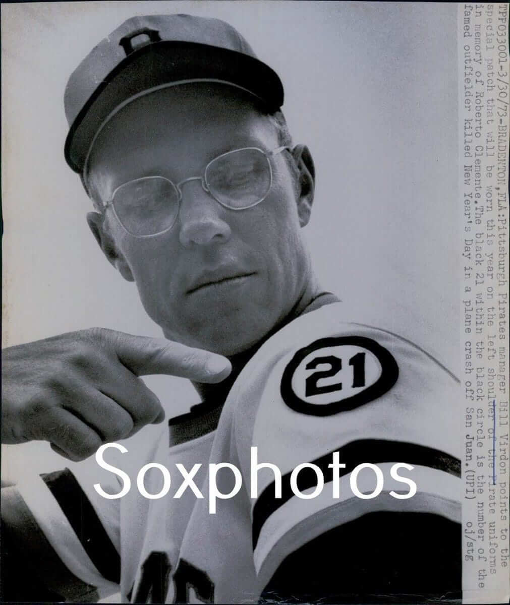
That raises a question: Did the “21” patch actually make its on-field debut toward the end of spring training? Or did Virdon just wear it for a photo shoot?
I put that question to several of my go-to people: uniform designer/historian Todd Radom, Hall of Fame curator Tom Shieber, and Pittsburgh sports researcher Jerry Wolper. They turned up some additional photos and info, as follows:
• Tom found an AP wire photo of Virdon wearing the patch, possibly from the same photo shoot as the UPI shot, which ran in many newspapers on March 30, meaning it was likely taken on March 29:
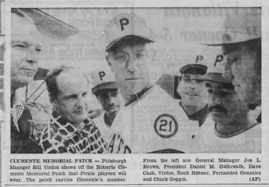
The photo is annoyingly cropped to show only Virdon’s sleeve. It would be much more helpful if we could see the surrounding players’ sleeves so we could know if they were also patch-clad. But everyone seems to be looking toward Virdon’s sleeve, which suggests that he’s the only one wearing the patch.
• The photo was accompanied in many papers by an AP story about the patch:
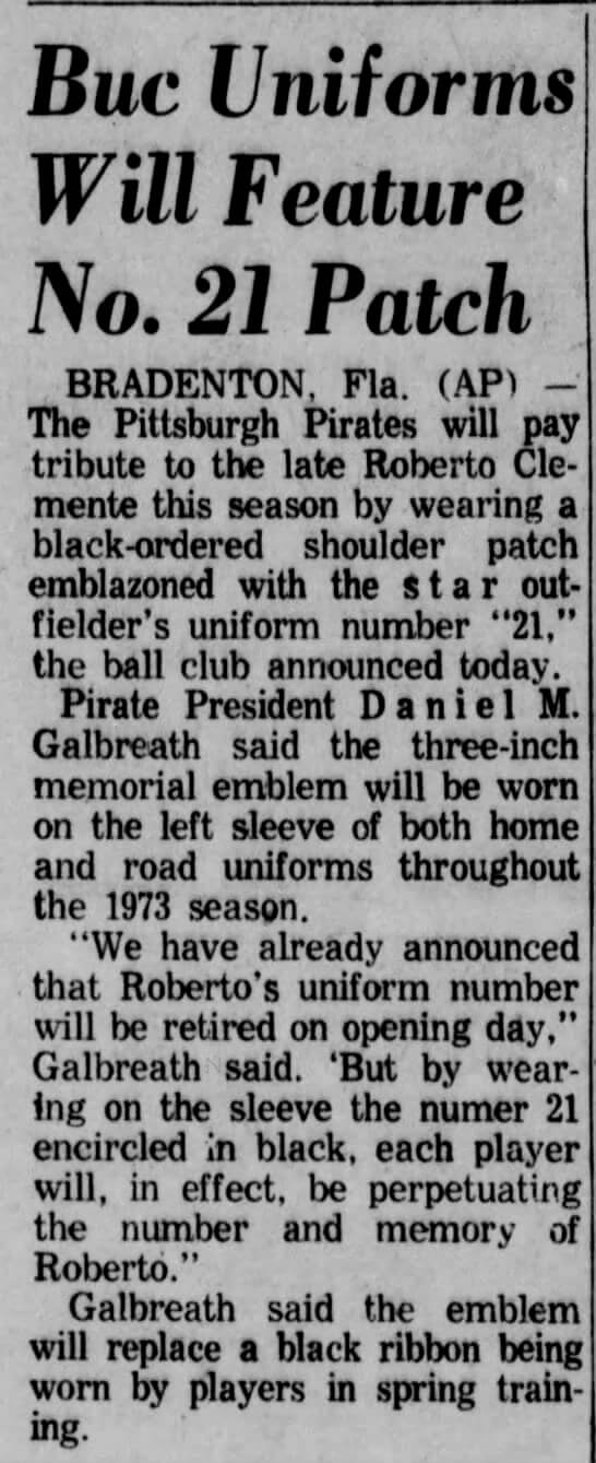
The article, much like the photo, is frustratingly vague. It doesn’t explicitly state that the team will begin wearing the patch when the regular season starts, but that’s the clear implication.
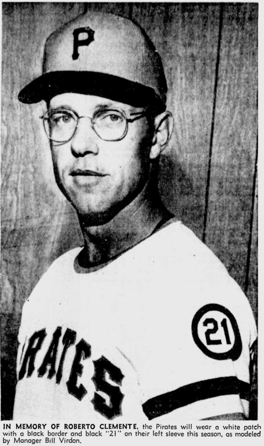
• Jerry found yet another photo of Virdon wearing the patch, this one clearly from a different photo shoot, which ran in The Pittsburgh Press on March 30, meaning it was likely taken on March 29:
So it’s pretty clear that the Pirates announced the patch’s existence on March 29 by having Virdon wear it. But did he wear it just for photo-shoot purposes, or did he wear it while skippering the team for the final week of spring training?
We haven’t yet found a photo of Virdon during that time period (nor are we likely to find one — spring training game photos of managers are pretty rare, and finding one from a one-week time window in 1973 is needle/haystack territory). But Jerry did find an AP photo from the April 2 edition of The Pittsburgh Post-Gazette, showing game action from the previous day. Although the image quality isn’t great, it shows Pirates baserunner Dave Cash wearing the black fabric swatch on his left sleeve (click to enlarge):
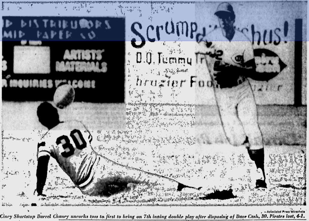
That’s enough for me to conclude that Pirates players did not wear the “21” patch during the final week of spring training. It’s possible that Virdon wore it during that period, although it seems more likely that he wore it only for those photo shoots.
This was a fun rabbit hole to explore. My thanks to everyone who contributed.
Click to enlarge
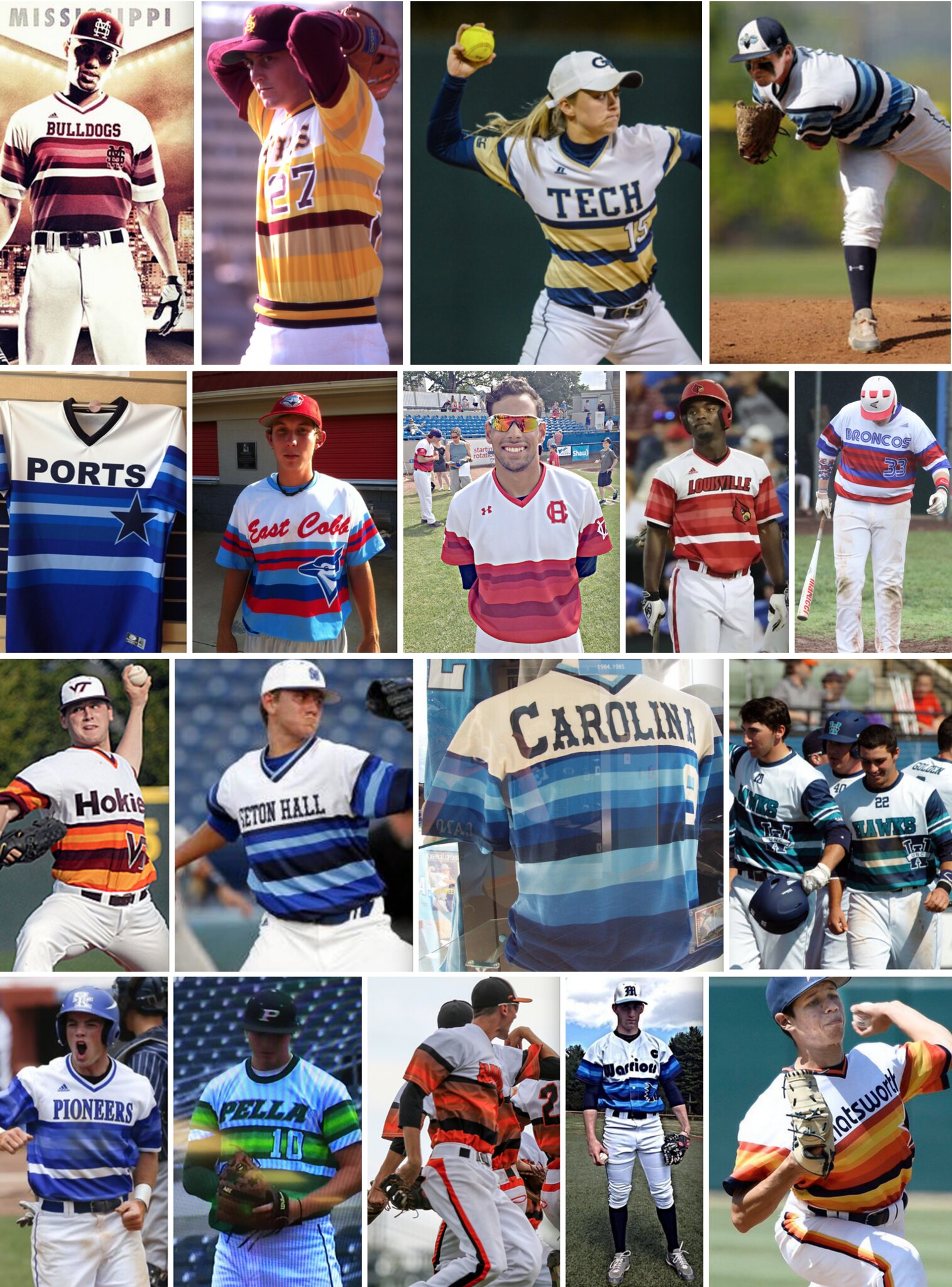
Friday Thursday Flashback: With the Astros having recently worn their tequila sunrise throwbacks, my latest Flashback column on ESPN (which we’re running on Thursday instead of Friday because we figure half the world will be traveling and/or goofing off tomorrow) examines 10 things you might not know about this classic uniform, including its impact on other teams, as shown above. Check it out here.
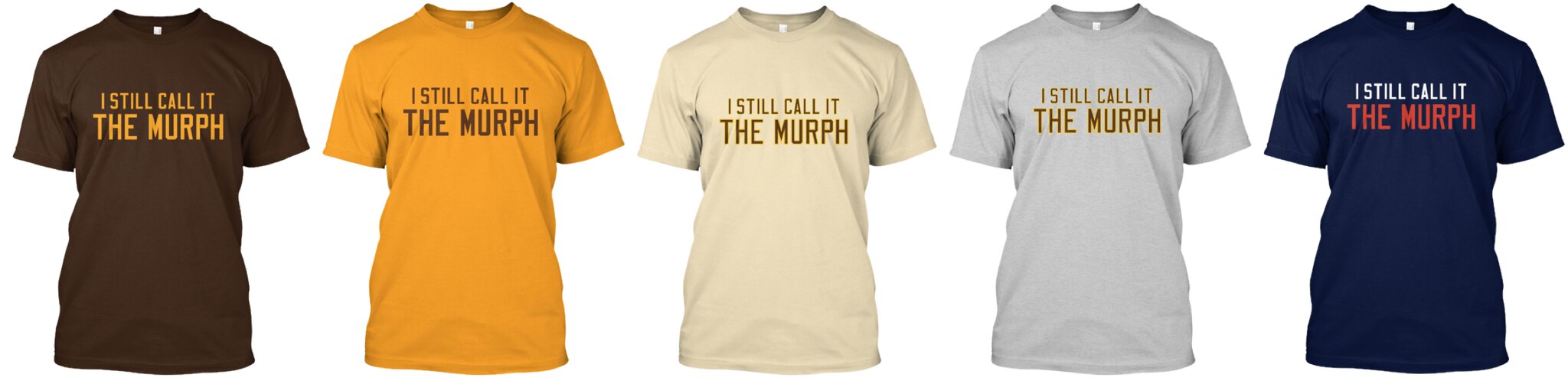
You talked, we listened: When I announced the latest round of Naming Wrongs T-shirt designs last week, I explained that the shirts for the Murph and the Ted would have a new phrase: “Just Call It” (instead of our usual “I Still Call It” or “I’m Calling It”).
To me, the new phrase made sense for those particular buildings. But I heard from a fair number of people, both in the blog comments and via email, who said they don’t like the “Just Call It.” The general sentiment was basically, “I don’t want the shirt to tell other people what to do. I want it to express what I’m going to do.”
I had actually thought about that issue when we were working on this round of shirts, because I like the first-person declarative voice we had always used. I thought the circumstances of these particular stadiums called for a different phrase, but I was wrong. So we’ve discontinued all of the “Just Call It” designs and replaced them with new versions.
The Murph shirts now say, “I Still Call It The Murph.” Just like the previous batch, they’re available in brown, gold, tan, grey, and navy. Here’s a group shot (click to enlarge):
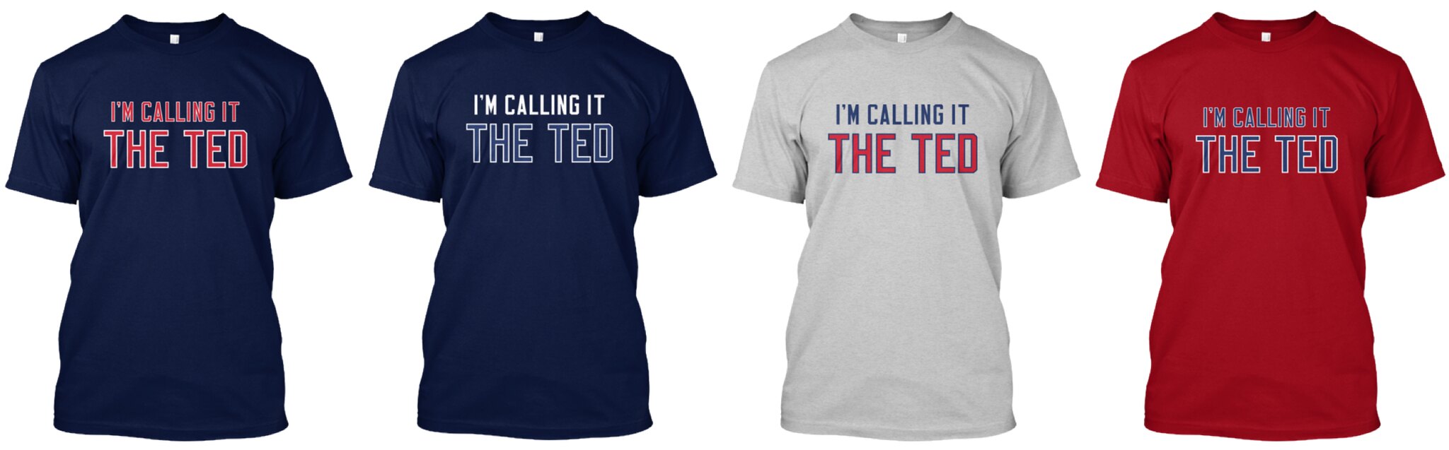
Similarly, the Ted shirts now say, “I’m Calling It The Ted.” Just like before, it’s available in navy with red type, navy with blue/white type, grey, and red, as seen here (click to enlarge):
So if you bought one of the “Just Call It” shirts, congratulations — you now have yourself a collector’s item.
Also! I heard from some people who love the idea of a shirt for the Rose Garden in Portland but didn’t like our designs with the rose illustration. The basic sentiment was, “Love it, but I’m not wearing a shirt with a big flower in the middle.” We like the rose-centric design and are going to keep it in print, but we’ve created an additional line of Rose Garden shirts with our standard type treatment. It’s available in black with white type, black with red type, red, grey, and white, as seen here (click to enlarge):

All of these designs are now available in the Naming Wrongs shop, and are also cross-listed in the Uni Watch shop (where card-carrying Uni Watch members can get 15% off; if you don’t already have the discount code, get in touch and I’ll hook you up). My thanks to everyone who submitted suggestions and feedback. We’ll have more designs soon.
Click to enlarge
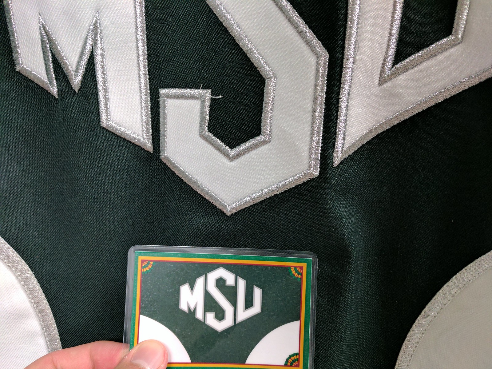
Membership update: One of the more interesting membership card requests we recently received came from Evan Blanchard, who wanted a card based on the Michigan State marching band unis. When I sent the finished card to Evan, I was concerned that the shade of green might have been too dark (our printer sometimes prints things a bit darker than the images files indicate), so I told him we’d make a new card for him if he wasn’t happy with the color. Yesterday he sent me the photo shown above, just to reassure me that we got the color right. Nice!
Remember, a Uni Watch membership card now entitles you to 15% off of any of the merchandise in our Teespring shop (if you’re an existing member and would like to have the discount code, email me). As always, you can sign up for your own custom-designed card here, you can see all the cards we’ve designed so far here, and you can see how we produce the cards here.
The Ticker
By Mike Chamernik

Baseball News: Diana Taurasi of the Phoenix Mercury set the WNBA scoring record earlier this month by scoring her 7,489th point. Last night, the Diamondbacks honored her with a jersey with the four-digit number. … The Marlins’ David Phelps has stars-and-stripes spikes for July 4 (from Megan Brown). … Some of the Cubs stopped by the White House yesterday. They gave President Trump and Vice President Mike Pence personalized gold-accented jerseys (from Brinke). … The South Bend Cubs will wear star-spangled jerseys over Fourth of July weekend (from Kevin Mikel). … A baseball exhibit featuring lots of old Expos artifacts opened at Montreal City Hall.

NFL News: A football fan in England wore a Dolphins helmet during his wedding. He said his vows through the facemask (from Chris Flinn). … Football helmets usually have two separate clips to hold the facemask. Gene Sanny noticed that David Humm, a Raider in the 1970s and ’80s, had a two clips connected under the bar of the mask. … Also, Gene theorizes that the Cardinals’ original logo had a curved bottom so that it could conform to the bulges on the sides of old-fashioned helmets.
College Football News: New home uniforms for California (from Phil). … New helmet for Samford. … New logo for UNLV, which the school is calling a “spirit mark” (from Ed Wright and David Cleveland).

Hockey News: New Ranger Anthony DeAngelo received permission from Phil Esposito to wear his No. 77 (from Alan Kreit). … The Hershey Bears unveiled a logo to commemorate their “80th anniversary season.” That’s technically inaccurate, as 2017-18 will be their 80th season but not their 80th anniversary. You can brush up on the distinction here. … Arizona State’s women’s team will wear digi camo jerseys in November (from @ASU_Uniformity).

NBA News: The Spurs haven’t yet officially unveiled their new alternate logo, but it’s starting to appear on merchandise (from Conrad Burry). … During a cross-sport promotion, new Timberwolves forward Jimmy Butler was given a customized No. 23 Twins jersey. It’s most likely his new number with the Wolves. He wore 21 with the Bulls and 33 in college; 21 is presumably off-limits (it will probably be retired for Kevin Garnett someday), and 33 is currently taken by Adreian Payne. … Jazz rookies received their jersey numbers and took the mound in Jazz-themed jerseys at a Salt Lake Bees game. … Repeated from the baseball section: Diana Taurasi of the Phoenix Mercury set the WNBA scoring record, scoring her 7,489th earlier this month. Last night, the Diamondbacks honored her with a custom jersey with the four-digit number.

College Hoops News: New unis for Tulsa (from @UtahDust). … In the early 1980s, the Youngstown State women’s team wore sleeved jerseys with “Youngstown” as the NOB (from Robert Hayes).

Soccer News: Here’s a look at the USMNT Gold Cup kit, which will be worn for the first time on Saturday against Ghana (from Conrad Burry). … New uniforms for Hertha BSC, a German club (from Ed Å»elaski). … Also from Ed: New shirts for KAA Gent, a Belgian club. … One more from Ed: New away shirt for Hajduk Split, a Croatian team. … League One team Plymouth Argyle unveiled a new away kit. … Through a few mishaps, several Tottenham players didn’t have the ad for Holsten Brewery on their jerseys in the 1987 FA Cup Final (from Iain Landon).

Grab Bag: Nike has started to make its products available on Amazon in an effort to undercut third-party sellers and counterfeiters. The move will help Amazon become even more dominant and weaken its traditional brick-and-mortar competitors (from @GKG_77). … Here are the uniforms for Under Armour All America 2017 lacrosse game (from @jrh0well). … A Trader Joe’s store in Texas has a painting showing Nolan Ryan and Emmitt Smith, their logos and numbers replaced by “TJ.” A Trader Joe’s in Oklahoma City takes the same approach with OU football (from Jonathan Dodd and Daniel Kenworthy, respectively).
Uniform numbers for the San Francisco Giants starting outfield Wednesday afternoon: LF-63 CF-66 RF-53. No rules broken, just depressing. Made it look like a game in March.
21 probably wasn’t an option for Jimmy Butler. 21 will most likely be retired for Kevin Garnett by the Wolves.
Right. Or, for now, mothballed because Kevin Garnett holds a grudge with the Wolves over not giving enough respect for the late Flip Saunders.
Good call, guys. Totally forgot about KG. I updated the text.
Proofreading: “distinction” is misspelled in the Hershey Bears hockey item, and the end of the basketball section has an item “repeated rom” the baseball section. Also, the UNLV logo link isn’t working for me, but that might be on my end.
Typos fixed. Link works fine for me.
Unlv link is broken for me too
It works for me now, FWIW.
The “Flying Elvis” Vegas chapter!
link
… that’s what happens when 11 people give their input. Crap by committee.
Counter that with the Chicago Bulls logo … designed by one man … on a bar napkin.
Liking San Antonio’s new color & logo
Judging by the Twitter machine, the UNLV logo is pretty polarizing. I’m on the side that likes it, but doesnt love it. I had to look at the negative space a few times to see the Rebel, but I’m digging the Las Vegas sign shape and star. It’s a good call out without being right on the nose.
Judging by the Twitter machine…
This would be a good time to remind everyone that Twitter is not a good gauge of anything but Twitter. The vast majority of people do not use Twitter. In fact, the vast majority of *internet users* don’t use Twitter. (It’s roughly 3:1.) And the people who *do* use Twitter are not a representative sample of the populace.
Twitter is a very useful tool for all sorts of things. Assessing the public’s reaction to something is not one of them.
The “Spirit Mark” (oh, for pete’s sake) adds context to the Rebel mascot, allowing some separation from any Confederate meaning people might infer to it.
It looks like an old Cavalier. I couldn’t help but think of UVa and Cleveland.
Not only did the Cubs stop by the White House, Cavs owner Dan Gilbert crashed the party at the urging of President Trump.
link
Regarding Jimmy Butler wearing 33 for the Timberwolves, Adreian Payne, current holder of that number, is an unrestricted free agent this summer who almost certainly won’t be back. The 33 jersey should be available soon on an official basis as opposed to the current unofficial status.
Today’s ESPN column is up:
link
Mad love for the Astros’ rainbow guts. In the 1970s, I remember being electrified by them, while my parents chuckled at the amateurish, untraditional team saying “LOOK AT ME!” with their loud orange uniforms. I knew this underperforming Houston squad had to think outside the box to gain attention. It was one of the first sparks to drive my nascent interest in sports.
Houston’s hat was also the first baseball cap I mailed away for. The cheap logo patch was hastily stuck to an orange cap, which upset me. So my first lesson about souvenir apparel vs. the real deal came thanks to the Astros.
Really enjoyed the Astros column, Mr. Lukas! One interesting detail – from what I can make out, it appears that Ron Paul wasn’t wearing a helmet when he homered in 1979. I realize this isn’t an “official” game by any league standards, but surprising that hard hats weren’t de rigueur by this point.
I need to know something that ties back to my childhood. When I was a kid someone told me that the star on the Astros jerseys was put there because the high ASTROS word mark made it tougher for umpires to measure the strike zone -“knees and letters”. The star served function as well as fashion, as an anchor for umpires.
Any truth to that story? I notice today many Tequila Sunrise-inspired shirts put numbers there, which perhaps adds to the possibility there’s something to the story.
RSB
I’ve never heard that before. That doesn’t mean it isn’t true, but it would be news to me.
The Astros were a terrible-hitting team, and the giant strike zone the horizontal orange stripes provided could not have helped. Maybe that’s why the stripes start so much lower nowadays that they have to float the back number half in the white.
Hershey Bears do refer to the 80th logo correctly on their Instagram account, however: link
I still like the old Cardinals logo so much better than the current one.
RE: Jazz Rookie jersey numbers
Is it just me, or did anyone else notice that it seems like NBA players with hyphenated surnames are more inclined to take single-digit numbers? Or if they do take double-digits, the number usually contains a 1 to slim the number down and fit the long name around it?
During my brief research, I’ve come across only a handful or players that do not follow this trend have been Kareem Abdul-Jabbar, Mahdi Abdul-Rahman, Zaid Abdul-Aziz (majority of his jersey #s do not), Rondae Hollis-Jefferson, and Willie Cauley-Stein.
That is a *really* interesting observation. Keep researching!
Again, just an observation. There could very well be more double digit numbers for longer names.
Nigel Williams-Goss #0
Michael Carter-Williams #7
Kentavious Caldwell-Pope #5
Michael Kidd-Gilchrist #14
Marcus Georges-Hunt #13
Dorian Finney-Smith #10
Shareef Abdul-Rahim #3 (also wore #33)
Mahmoud Abdul-Rauf #1 / #3
Something about the slimmer numbers paired with the longer names seems more pleasing to the eye.
Checked some non-hyphenated longer names (went with >10 letters). Some followed suit, but still not long of enough list to make it conclusive.
Juan Hernangomez #41
Willy Hernangomez #14
Jonas Valanciunas #17
Pat Connaughton #5
Georgios Papagiannis #13
Wilt Chamberlain #13
Giannis Antetokuoumpo #34
Isaiah Hartenstein #55
Rudy Tomjanovich #45
Dave DeBusschere #22
Timothé Luwawu-Cabarrot wears #20 for the 76ers.
Never heard of him, but I’m sure there’s a bunch more I missed too.
How do I view this site without the page automatically moving to the advertising video?
Sigh. Shouldn’t be happening. Working on it.
Grand Junction Rockies, minor league affiliate for the MLB Rockies, have purple tequila sunrise unis.
link
That video actually showed the Idaho Falls Chukars in those unis.
“Football helmets usually have two separate clips to hold the facemask. Gene Sanny noticed that David Humm, a Raider in the 1970s and ’80s, had a two clips connected under the bar of the mask.”
Not so sure that’s two clips that are connected. Looks like the horizontal piece that appears to span b/w the two front clips could be just a part of the padding/truncated nose bumper.
There’s no nose bumper there though, that’s why it caught my eye in the first place. The nose bumper comes from inside the helmet and wraps up and then under the mask clips normally. You can see here right below the strange clip the silver of the helmet, and the stripe.
Well, maybe not the stripe I guess, but you can clearly see the silver helmet there… the whole set up is strange, look at the screws in the clips… it has square allen wrench type holes in the screws vs the normal Phillips or standard screws.
It should be noted the Pittsburgh Press was the city’s evening paper and might have run same-day photos.
I am glad the UNLV diagram pointed out where the hat was on their new logo – couldn’t find it at first!
“It marked the first time that an MLB wore a memorial patch instead of a black armband”
That should be the first time that an MLB TEAM wore a memorial patch.
/editorbytrade