Click to enlarge
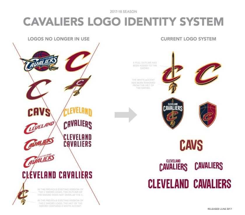
The NBA Finals tip off tonight, but the Cavaliers don’t feel like waiting. Yesterday they released a new set of logos that will go into effect for next season. You can see the transition from the old logo set to the new one above (my thanks to Rob Lopez, who posted that graphic on Twitter), and there are further details on the new graphics program here.
I’m always a little uncomfortable assessing logos without seeing the uniform set in which they’ll be used, but here are a few quick thoughts:
• It’s fine to use black or navy. But using black and navy seems like a bit much. Quoting from the press release:
Navy remains a complimentary [sic] color, while black is officially introduced as a new and permanent addition to the Cavaliers color palette. Black is a nod to the historic turning point in the 2016 NBA Finals when the Cavs wore their black-sleeved uniforms in games 5 and 7 of the NBA Finals when they beat the Warriors in Golden State.
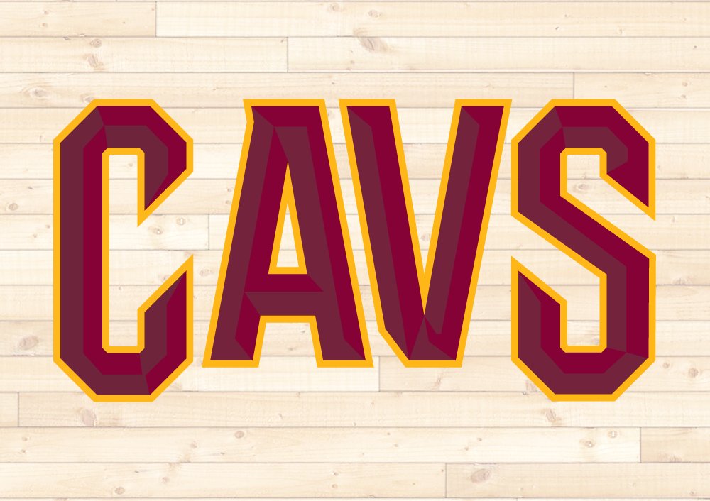
• Really, really dislike the typeface. Even worse, the “Cavs” wordmark has completely unnecessary beveling, as you can see in this close-up that was posted on Twitter yesterday afternoon by Conrad Burry (click to enlarge):
• I like the two shield-shaped logos, especially since shields make sense for a team called the Cavaliers. But there’s a subtle inconsistency to their shapes — not a big deal, but it seems like a sloppy oversight:
The two different shield shapes are killing me. pic.twitter.com/sCp4PH6iuN
— rcb05 (@rcb05) May 31, 2017
Overall, this feels like another slight step backwards for this franchise. I always thought the Cavs’ uniforms from the first LeBron era were fantastic. When he left, they switched to their current set, which is snoozers. And now they appear poised to become the latest sports team to slap an “aggressive” typeface across their chest. We’ll find out for sure when the new uniforms are unveiled, which the team says will happen “later this summer.”
On the plus side, the press release did not include the term “blue collar.”
Meanwhile: The Cavs will wear their blue road jerseys in Game 1 tonight in Oakland. They are saving the black sleeved jerseys for the “right moment.”
Click to enlarge
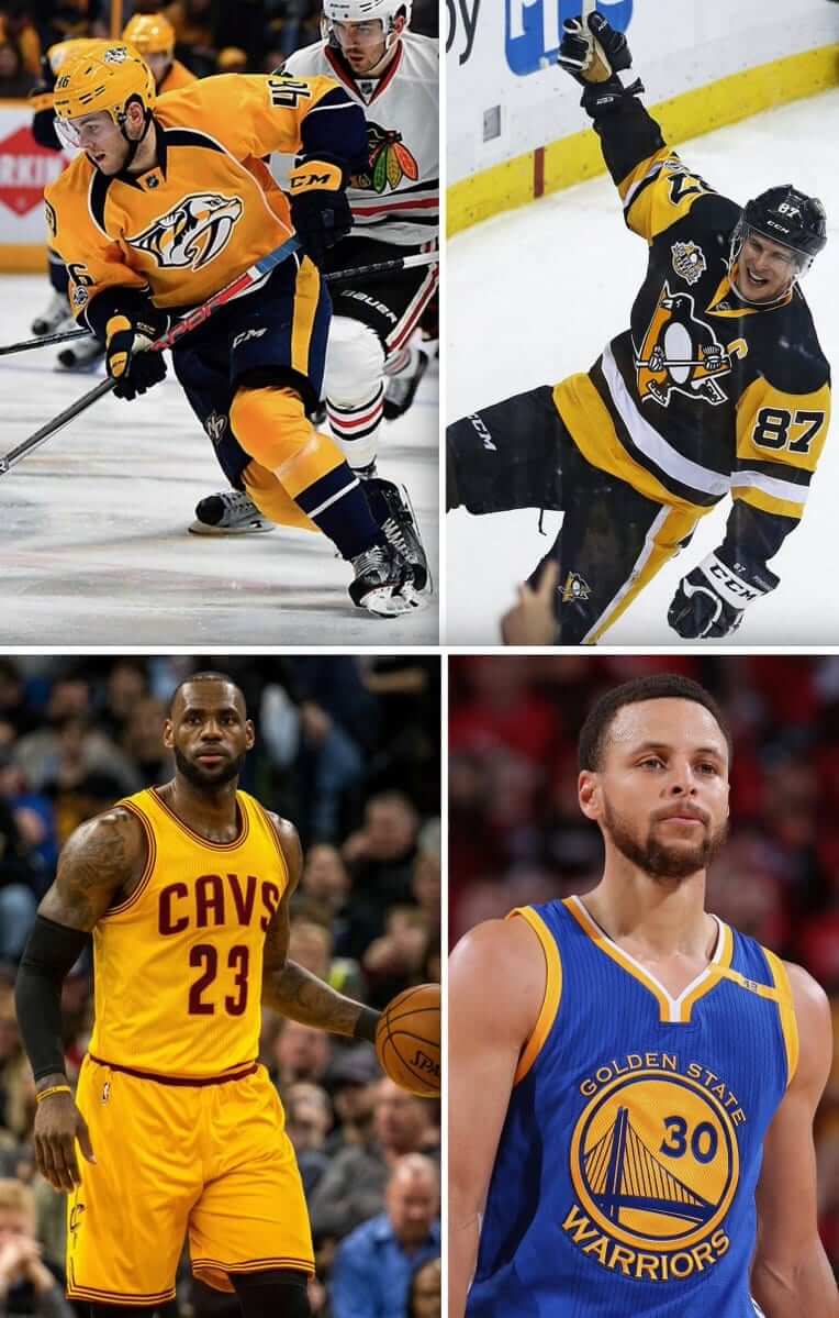
New ESPN column: All four teams in the NBA and NHL finals make significant use of yellow in their uniform programs (yes, I know most of them refer to it as gold, but come on, it’s yellow), so today I have a new ESPN column that looks at the use of yellow in the uni-verse, including my picks for the teams that have done the best job of wearing yellow in each of the major pro leagues. Check it out here.
Whenever I get immersed in color minutiae, I think of the great Cary Grant film Mr. Blandings Builds His Dream House, which has a priceless scene featuring Myrna Loy discussing paint colors with a contractor. Sometimes I wonder if uniform design sessions play out in a similar fashion. Check it out (the audio levels seem to be a bit low, so you may have to increase the volume on your device):
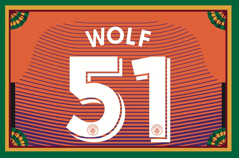
Membership update: A bunch of new designs have been added to the membership card gallery, as we continue to work our way through all the Purp Walk orders. The new designs include Noah Wolf’s Manchester City treatment (shown at right; click to enlarge). Here’s the jersey that served as the basis for that card — great job by Scott Turner to capture that design treatment.
The printed/laminated versions of these latest cards should ship out by this weekend.
Remember, a Uni Watch membership card now entitles you to 15% off of any of the merchandise in our Teespring shop (if you’re an existing member and would like to have the discount code, email me). As always, you can sign up for your own custom-designed card here, you can see all the cards we’ve designed so far here, and you can see how we produce the cards here.

Photo by Mary Bakija; click to enlarge
Feeling blue about green: As many of you know, my favorite color has always been green. When I was a kid, I made sure my parents knew that my first bike had to be green. I currently have a green sofa, a green living room chair, green sheets and pillowcases, green bathroom towels, and green kitchen walls. There’s also all the green on this website.
For the past 10 years I’ve also had a green car, which has been extremely satisfying. Every time I saw that color, I got a little endorphin rush. Unfortunately, that car has been dying, and I was unable to find a suitable green replacement for it. So my new car, which I bought a few days ago, is silver ”” like all the other cars on my block.
I do like silver. I’ve always said that I’d rather win a silver medal than a gold medal at the Olympics (and if I did somehow win a gold medal, I’d have it silver-plated). So silver isn’t so bad. Still, I’ll miss having green.
The photo above shows the old buggy in the foreground and the new one in the background. Man, just look at that beautiful deep green — I kinda miss it already. Sigh.
Signal flare: Can anyone recommend a good NYC-based entertainment lawyer? I need someone to look over some paperwork regarding a potential TV project. A lawyer, not an agent. If you know someone good (or if you fit the description yourself), please shoot me a note. Thanks.
The Ticker
By Mike Chamernik

Baseball News: Brewers P Junior Guerra had a poorly kerned NOB last night (from Steve Dodell). … After a fan vote, the Fresno Grizzlies will wear the Lehigh Valley IronPigs’ “Fighting Bacon” cap during a game against the Sacramento River Cats on June 22. … The Twins are giving away hats in the colors of local schools, along with a Minnesota Wild-themed cap, throughout the season (from Erik Siemers). … The Toledo Mud Hens will celebrate 20 years of Harry Potter with themed uniforms on July 14. … Joe Kuras spotted a hilarious knockoff Blue “Jars” jacket at a Niagara Falls gift shop. … The Players’ League, a competitor to the National League, launched in 1890. In addition to signing some of their rival’s best players, PL clubs would steal the colors and look of NL teams that played in the same cities (from Craig Brown). … Mariners P Steve Cishek was wearing someone else’s glove last night. The name is hard to make out, but the surname clearly starts with a D and ends with an s, which doesn’t match anyone currently on the Seattle roster.

NFL News: The Steelers have put their wordmark on the fronts of their practice jerseys. … Miami coach Adam Gase wore Dolphins attire with throwback logos on them during a press conference yesterday (from @305miamiteams). … Speaking of the Fins, Gase is making the team’s 21 rookies earn their helmet logos this spring. … @ProFootballJournal found the minutes from the NFL’s annual meeting in 1952, which among other things spelled out the league’s numbering-by-position guidelines.
College Football News: Here’s a good look at the College Football Playoff patches for next season (from Robert Hayes). … Indiana State will soon unveil a new look (from James Schmeits).

NBA News: The artist Asur drew her illustration of the NBA Finals matchup. She incorporated visual elements of the teams that the Cavs and Warriors defeated during the playoffs. … Here’s a good story on the NBL, the pre-NBA league that featured lots of corporate-owned and -managed teams, including the Akron Goodyear Wingfoots and the rival Akron Firestone Non-Skids (from Ryan Keberly). … The Minnesota Lynx of the WNBA will reveal a new logo this summer. Their NBA and D-League counterparts recently unveiled new logos of their own.

Soccer News: New home and away kits for Olympiacos (from Ed Å»elaski). … A 23-year-old student who runs an apparel start-up company is supplying soccer uniforms to African national teams that are overlooked by the more established brands (from Simon Harrow).

Grab Bag: A pair of Canadian fans are rooting for both teams in the Stanley Cup Final. … A recent episode of Mystery Science Theater 3000 had a bit where they sold the naming rights to the hours of the day. Included are “Three-bok o’clock,” “Miller Time,” and “Nine-ke o’clock” (from Jeff Wilk). … Congrats to Kentucky, which is celebrating its Quasiquicentennial today (from Josh Hinton). … Once a hit with kids of the 1990s, the apparel manufacturer Champion is once again culturally relevant (from Tommy Turner). … Ryan Jones of Uproxx wrote a good piece on uniform ads. One of his big points was that, though fans only care about the team and not about the corporate logos on the jerseys, after enough time passes, they will develop a subconscious attachment to the ads (from Phil). … New logo for Ubisoft, the video game publisher. … You’ve heard of 3D printers? Now there are 3D knitters, which can produce a custom-made blazer in 90 minutes (Tommy Turner again).
I used to be a Uni-number-by-position purist, but I’ve come around to the view that, on offense numbers should only distinguish between eligible ball handlers and ineligible ones. On defense I’m not sure the numbers much matter.
Needless to say this concept is too reasonable and straight-forward to be considered by the NFL.
Shouldn’t D-League be crossed followed by G-League?
Paul, the Asur illustration link goes to a one pixel file
Works fine for me.
Sorry, just realized it’s blocked by my network. Apologies.
Regarding the illustrations… I don’t quite see how defeating the Spurs leads to a full suit of armor for the Warriors’ character, seeing as how the Spurs’ character was a cowboy.
I’m guessing the armor is for the “warrior” and just the spurs on the shoulders are for the, well, Spurs.
But if you look at the illos for the previous rounds, the Warrior doesn’t have the armor.
Misspelling on a press release, mismatched shields, unnecessary beveling. I can’t tell if it’s amateur hour in Cleveland or another “fun times” moment!
i am the opposite, i never liked the old Cavs unis, i always felt they were too busy. especially the navy colored one with the checkered arm and neck bands..
i like the current set because they are simple and could be used in any generation of the sport..
My favorite has always been their first CAVS with the orange basketball, great logo. Although the CAVALIERS/CLEVELAND was unique for the word sequence.
Proofreading:
“there are furthers details”
The disappearance of the Cavs’ red unis this postseason is disappointing.
Fixed.
Another
“Ryan Jones of Uproxx wrote a good piece on unform ads”
‘uniform”
Fixed.
I had pretty much the exact same thoughts on the Cavs new logo set. No team ever needs both navy AND black in its logo/unique set. We happened to wear these hideous sleeved jerseys for Game 7 and now we’re stuck with it in our identity program for the next 3 years? Until of course they decide they need to sell more merch, oops I mean “modernize their look”. And yes I too don’t really like that wordmark. Too many bizarre angles. It looks cheap.
I actually liked most of their current uniform set. Some may call them boring but if they’d just stick with a look, what is boring now becomes “classic” in 10 years. Talk about a ‘signature’ look, thanks to the Cavs frequent uniform machinations we have no single identity to associate with the Lebron-era Cavaliers. We HAD the pre-Decision Cavs (the one with the basketball and Cavaliers script) and the post-return Cavs (the current look). Now we’ll have yet another “look”. Ugh.
I agree. If you want to build a unique identity with black and navy as the star color combination, then by all means, but you can’t casually do both black and navy as supporting colors. It just looks sloppy, like you just need a dark color and don’t care which one it is. The Avalanche are another team that needs to choose either black or navy as its dark accent color, because using both the way they do waters down the identity.
I also think you nailed it on the typography: cheap. It’s not polished, and there’s no soul. I like the current uniform as well. I think it could have been jazzed up a little, but overall, it’s a pretty unique look in the league. The current typography is also devoid of much personality, but it’s crafted with more care than this new one.
I concur with Mr. Harrington’s assessment of the typography on the new CAVS woidmark.
What in the Wide World of Sports is going on here? If you are gonna use a bevel effect, than in the name of Todd Radom… Own it. No half measures here, sorta takes away from the whole point of beveling in the first place. (see LA Angels for proper use of the bevel effect), this designs bevel is so subtle it is pointless and fails to cover up its other flaws.
In the second place, he says there is no “soul” in the design. It’s a turn of a phrase that art appreciators use when they know that something in a design is “askew”. More times than not, it is in the way the artist tweaks the font and letterform so that it appears more dynamic, action oriented, hip and in this case, unnecessary.
To get to the point, notice the flow between the letters? Not likely since there isn’t much. The letter individually are very fine constructs, when combined, not so much. This is what flow is all about. each letter should naturally flow to the other one. Most likely culprit is that too much tweaking spoiled the flow in the design and compromised the overall execution.
I always liked the Cavs Blue & Orange uniforms, reminds me of the Mark Price era.
The 1994-1997 uniforms are the worst.
When they made the switch to blue as the primary with orange trim, the uniform was nice but looked a lot like the New York Knicks.
Does anybody recall if there was any backlash from the Knicks back in the 80s when the Cavs changed their look to the blue primary with orange trim?
Speaking as a New Yorker, I don’t recall anyone saying anything about it. Of course, in those days people didn’t talk as much about uniforms in general.
Which would make the Bruins’ protesting of the Penguins’ mid-season switch to black and gold in 1980 all the more notable.
And I’ve always found that rather strange, for reasons I’ve mentioned before: black and gold have always been part of the Pens’ logo, and the Bruins trying to claim color exclusivity rings hollow in light of multiple NHL teams at the time having the same color schemes (Blues/Sabres blue/gold; Islanders/Oilers blue/orange; multiple teams with some combination of red and blue).
Even worse, Montreal and the Rangers said nothing in the 70s when the Washington Capitals entered the NHL. The 1980 protest will definitely go down in history as a bad move by the Bruins. As a Pens fan, it was enjoyable seeing the black and gold set win back to back Cups for the first time, something Boston has never accomplished.
When it comes to teams wearing the same colour scheme in hockey, there are not many seasons as remarkable as the final WHA season in 1978-79.
Of the 7 teams in the league that started the season, 3 of them wore primary royal blue with red trim. Close to half. This is not counting the Nordiques who wore lighter blue and had red just show up in their logo. Plus, the All-Star uniforms featured blue and red.
link
225 should be “quasquicentennial”. I was wondering if there was supposed to be a “b” in there so I had to check…
Fixed.
Agreed that the new Cavs font is underwhelming, and the beveling is definitely annoying. Remove the beveling, though, and the new font is really no worse than the milquetoast outgoing font. And without the wordmarks from whence it came, the C logo is now orphaned. Finally, it’s sad that they’re embracing BFBS.
Peeve: “whence” means “from which” or “from where.”
So “from whence” is redundant (but annoyingly common!).
Exceedingly common, to the point where it just doesn’t sound right to me without the “from”.
The English language is weird, especially in the way it gets used – or misused.
I saw something on Facebook the other day explaining why expressions like “tick-tock,” “ding-dong,” “clip-clop” and “splish-splash” always have the “i” sound first, then the “a”, then the “o” (as in, “tic-tac-toe” or “big bad wolf”). It’s just an unwritten rule that native speakers instinctively know; no one says “tock-tick” or “clop-clip” or “bad big wolf”.
There’s a place in upstate New York called Bash Bish Falls, which for as long as I can remember everyone who mentions it calls it “Bish Bash”. The latter just sounds right even thought the former is correct.
Correction: Bash Bish is in Massachusetts.
Re: Graf Zepplin: If you’re interested, check out Old English Strong Noun and Strong Verb sound changes. Sing, sang sung; ring, rang, rung; goose, geese etc.
Those sound change patterns is very, very old
A-freaking-men on the green car thing.
My 1998 Saturn sedan was green. Beautiful car. When I upgraded to the coupe in late 2001, the green had been discontinued for the 2002 model year and replaced with a sickly shade of brownish-orange, and the dealer couldn’t find me a leftover 2001 coupe in green, so I got it in red. That was a beautiful car too, but it would have looked better in green.
Same with my current car, which I actually picked up four years ago yesterday. None of the cars I shopped for in 2013 could be had in green. Only black, white, blue, red/maroon, or silver/grey, in multiple shades of each. It’s even hard to find new cars available in gold these days.
I really don’t know why no one offers cars in that beautiful dark metallic green anymore (although I would guess it’s because the color didn’t sell well). I sure wish they would.
There’s always the Mini, which comes in British Racing Green. But that’s not the right car for me, unfortunately.
A couple of years ago, you could still get a Chevy Cruze in green, or a BMW 3-series. There are always some esoteric cars like Minis and Fiats and link that come in all sorts of colors, but most cars these days come only in about a half-dozen shades of black, white and silver/grey, plus maybe one blue option, one red/maroon option, and one brownish option.
It’s weird; I’ve had five cars, and could only get the color I wanted on one of them (the green 1998 Saturn).
Had a Mazda Miata once in red, and the next Miata is going to be their British Racing Green with the tan interior. Because it’s the right thing to do.
Sounds lovely, but I don’t think link offers the Miata in green…
Coincidentally, I’m going in to replace the tires of my 2000 Miata today. I’ve always referred to it as “British Racing Green,” but when I checked the ownership papers I discovered it was actually “emerald,” apparently a darker and glossier shade of green.
I don’t like these cars at all, much prefer the Civic, but the Toyota Corolla still comes in green, as of 2016. Unfortunately it looks like they replaced the green with “galactic aqua mica” for 2017.
My dad drove a green Jeep Grand Wagoneer when I was a kid and my mom had a hunter green Mazda 626. Hated the Mazda, but the Wagoneer was just beautiful.
I had to part ways with my green Subaru Legacy two years ago. Fortunately I found a sweet Toyota Camry also in green, but the tint is slightly off/lighter. Kinda bugs me from time to time that it’s not exactly the same, but at least it’s still green!
Lemme guess: the Indiana State Sycamores’ new helmet will have “S’mores” as the logo.
When the Cavs state that they are saving the black sleeved jerseys for the “right moment”, I hope that “right moment” is the time they start a bonfire and toss those jerseys into it.
Ugh, congrats on the new car but did you have to join the silver car cult? You know what color that car is under that paint? SILVER! Oh well, at least you admit that every stinking car on your block is silver too.
I don’t think you can call something a “cult” when it’s actually the norm.
Like I said, I’m OK with the silver but I’m not nuts about it. I’ll no doubt have plenty of instances of being in a parking lot and mistakenly thinking that someone else’s car is mine because they all look the same. Short version: Aside from negotiating the price (which I rather enjoyed, because I got a very good deal), the entire process was dispiriting. So yeah, I have a new car, but I’m not excited about it. No tingle, no buzz. Just a box that needed to be checked, so I checked it. Next.
Despite the constant negative press covfefe
As heard on Anderson Cooper:
If you’re not part of confefe, you’re part of the profefe.
What a doofus I am, I’ve misspelled a misspelled word, maybe to add to it I should misspell, “misspelled”.
I usually ignore the ads on the site, but for some reason the one for Gray Flannel in the top left caught my eye this morning. They’re offering a baseball autographed by “Babe Rust”!
I guess this can go into the Redskins section tomorrow…
Petition for LSU to change their mascot from the Tigers because it is considered “the most prevalent [C]onfederate symbol in the United States.”
link
1) Will not be in ’Skins Watch, because it has nothing to do with Native issues. ’Skins Watch is not a clearinghouse for protest issues; it is specifically about Native-related issues.
2) Also will not be in Ticker, because it’s absurd. (Came across my radar yesterday, I ignored it.)
well, regardless, I learned something today if Confederates were truly called “tigers” during the Civil War.
I thought the most prevalent Confederate symbol was the variations of the battle flag.
I’d say you are correct, Rob
Welcome to the silver Honda club Paul, we have t-shirts and cookies.
Today I am reminded of the time Lisa Simpson ordered fliers from that super cynical, super sarcastic sales guy.
Lisa: I would like 25 on canary, 25 on lemon, 25 on goldenrod, and 25 on daffodil.
Salesman: Ok… 100 yellow.
*Im probably off on my shades of yellow, but y’all get the gist.
Forgive my non-designer vocabulary:
Regarding the new Cavs identity system, something looks not quite right about the spacing between C/A and V/S in “CAVS.”
The top of the C points down and to the left, while the diagonal of the A makes it lean up and to the right. Similar with the right diagonal of the V and how it feels really far away from the bottom of the S.
The “CL” in CLEVELAND doesn’t look too bad, nor the “RS” in CAVALIERS, especially in the version where the C and S are dropped a little, but all I can see in the CAVS wordmark is empty space at the upper left of the A and the bottom right of the V.
Not a single comment about the addition of the drop shadow to the Cavs logo? I can’t believe you didn’t take them to task for that, Paul.
The drop shadow isn’t actually new. The swordless C logo carries over unchanged, while the only change to the version with the sword is the removal of the white highlight from the hilt.
It’s fine to use black or navy
I respectfully disagree. You already have the sublime and unique (to the NBA, at least) combination of wine and
yellowgold. Why add anything else? *Especially* since the blue and black jerseys have very little contrast to them.They are saving the black sleeved jerseys for the “right moment.”
How about for game 8?
Color me decidedly underwhelmed and cynical about the Cavs’ change.
Here’s a question: What do the following teams have in common?
Yankees, Dodgers, baseball Giants, Celtics, Packers, UCLA basketball, Steelers, Indiana basketball, Lakers, 49ers, Bulls, Patriots
Answer: They all established looks during an era where they had once-in-a-generation type talent(s) or culture and have felt wrong wearing anything other than those looks since.
– 1920’s Yankees (Ruth, Gehrig)
– 1940-50’s Dodgers (“Dem Bums,” Robinson)
– 1950’s Giants (Mays)
– 1960’s Celtics (Russell, Cousy)
– 1960’s Packers (Lombardi)
– 1960’s UCLA basketball (Wooden)
– 1970’s Steelers (Noll, “The Steel Curtain”)
– 1970’s Indiana basketball (Knight)
– 1980’s Lakers (Abdul-Jabbar, Johnson, “Showtime”)
– 1980’s 49ers (Montana, Walsh, Rice)
– 1990’s Bulls (Jordan)
– 2000-10’s Patriots (Brady)
We could probably come up with a number of other examples as well.
Sure, all have maybe made tweaks over time, but the fact of the matter is that all have either stuck with the look that they wore when they became truly great or, it felt kinda wrong when they went away from it. The Giants in script is alright, but it’s not quite the same. The Lakers changed their cut and added an alt, but that’s basically it. The 49ers went a little haywire for a while with the pants and the helmet, but it felt right when they went back to their 80’s look. Sure, there’s an affinity for Pat Patriot, but it’s difficult to see the Patriots going away from Flying Elvis since he’s been to seven Super Bowls.
The Cavs are in about the same spot right now: LeBron’s the top player of this era, they brought a title to Cleveland for the first time in eons, and they’ve got a chance to grab their second. Keep the current look and it’s basically their look for the rest of time.
But think about how that also limits a team, or at least the apparel manufacturers who produce gear for that team. You probably couldn’t get away with changing the Bulls or Lakers’ uniforms or logo significantly now — and if you did, fans would keep buying or wearing all the old stuff. It’s not like it is with the Minnesota Wild or Tampa Bay Rays, and that means you can’t get fans to buy all new stuff.
So how do you proactively counter that? Change the uniform and style multiple times while the generational player is there so that no one look gets established! See the long-term benefit!?!
Alas, it goes against every principle of “don’t mess with what isn’t broken” and “establish consistency,” but what do those things matter anymore, particularly when there’s a buck to make?
So yeah. If I were a Cavs fan, I’d be ticked. Let’s face it, you have LeBron and this is the golden era of the franchise, and yet it still feels like their most recognizable, established look comes from the Nance/Price/Daugherty/Ehlo era. That kinda stinks, if you ask me.
I think when Brady-Belichick eraends, I bet the Pat’s redo the uni.
I think the Pats might move over to something similar to the color rash jerseys (but with contrasting pants) from last year (keeping the primary colors and flying Elvis while adding the throwback sleeve striping and didtching the piping and other dated elements) but I doubt they change up their visual too much.
Also, I completely agree with the original comment, though the nitpicker in me must point out that Flying Elvis has actually been to eight Super Bowls.
These are fantastic points. I do like the use of the sword-through-the-C logo and was never a big fan of the ball logo, but the wordmarks and gratuitous use of black piss me off. The current uni set is fine (if they stick with the home whites, road wines, and alt navies); I’m terrified to see what we get stuck with later this summer.
Good points, and I’ll add that while the Carolina Panthers certainly haven’t had a dominant era, team owner Jerry Richardson seems to understand the value of a constant look and he has said that the uniforms will never change while he is in charge.
So you’ll note that the current set looks exactly like the original 1995 uniforms, with the only changes being the addition of the blue alternate jersey and the fairly minor updating of the team logo a few years back.
Contrast this to their 1995 expansion sister franchise in Jacksonville, who seems to overhaul their look every five years or so. Usually for the worse.
Thanks for the Myrna Loy clip…always loved her work in The Best Years of Our Lives and The Thin Man films (“Ever hear of the Sullivan Act? That’s all right. We’re married.”).
I disagree with the idea that a shield is appropriate for a team called the Cavilers. A link would most likely be carrying a sword, but probably not a shield.
Unless of course the mascot is referring to the DnD link. That’s unlikely as the DnD class was introduced a full link after the basketball team made it’s link.
I agree…I don’t understand the statement at all…cavaliers were 17th century, a few centuries after the golden age of knights..Paul?
Should’ve found yourself a nice 2014 Forest Green Corolla coming off of a lease. Great little car that will run forever and not cost an arm and a leg to fix.
The first name on Cishek’s glove is definitely “Manuel”. The last name might be “Domingos” but a google search only brings up an Angolan politician of the same name. There’s also no Manuels on any of the Mariners minor league affiliates
Tried to find a green Corolla. Test-drove one, in fact. But it had issues, and I was running out of time. That’s the way it goes sometimes.
I’m surprised you call the current Cavs uniforms “snoozers”. I think their road blues are the most beautiful uniform in the league.
Paul…
How do you reconcile owning a car while living in a city like NYC?
I own a car, and live in San Francisco. Honestly, the only time nowadays that I drive in SF is when I am actively leaving the city.
If I am going to a restaurant, bar, park, theater, store, etc that is in SF, I walk, take public transportation, or Lyft.
The hassle and cost of driving to a destination in SF makes it not worth it to drive.
How often do you drive in NYC? I know you take a lot of road trips out of NYC. I also know you bike a lot.
What are your car driving habits?
I am seriously contemplating getting rid of my car altogether. If it wasn’t paid off, I probably would have already.
Just curious.
Lee
If it were just about me, I would consider not having a car. It’s not necessity for the way I live (although it does come in handy for exploring far-off corners of the city where the subway doesn’t reach, and for road trips, etc.).
But it’s not just about me. My mom is 93 and lives in a place I can only access by car. Renting a car every time I need to see her would be a bigger hassle than I care to deal with. So: I own a car.
Paul, FWIW (and I imagine you’ve already considered this, but maybe not), since your new car will not need any body work, you probably could get it repainted in green for a fairly reasonable price. It might be more expensive in NYC but around here it can be done for $300-$500.
Hmmm. Worth a think!
I would have mixed feelings about repainting a car whose factory paint job is still intact (i.e., that does not need repainting), just to change the color. I thought about it a couple of times while I still had the red Saturn (which was, by the time it was 5 or 6 years old, covered in key-scratches and other blemishes), but never went through with it. As much as I’d love to see my 4-year-old Acura in green, the maroon paint job from the factory is beautiful and I wouldn’t want to mess with it, let alone with any risk of lower-quality paint.
Also, it would behoove one to first find out if it’s legal in one’s state to re-paint a car a different color. At a minimum, it would probably have to be re-registered under the new color.
Legal but expensive.
P.S. neither the DMV nor your insurance cares about the color as long as the VIN stays the same. YMMV.
Vinyl wrapping is probably a better idea – but I don’t think it’s cheap.
I knew the wordmark on the front of the Steelers set was coming sooner than later. If you look at the NFL, the Steelers were in a group of but a handful of teams still holding out. And the NFL loves them some uniform uniformity.
It’s only on the practice jersey.
The team name is also on the game jersey — as part of the front logo patch. Which is why they won’t be adding the wordmark.
So Paul, what is the exact color of your car?
Metallic Pewter?*
Extreme Silver Metallic?*
Matte Silver?*
Metallic Bay Silver?*
Metallic Extra Bright Silver?*
*Official Riddell colors
Alabaster Silver.
Mine is maroon; or, excuse me, Crimson Garnet Pearl.
Mine is “smokestone” which sounds like something for sale at a headshop. It ends up being a getaway-car-color since it looks different depending on the light: gold, silver, beige or (too infrequently) green.
A few weeks ago, a Uni-watcher wondered which team’s uniform had the most changes. I’d posit the Cavaliers, with token competition from the Canucks, Brewers, Padres, and Texas Rangers.
The Atlanta Hawks have got to be up there. The Jags in football, especially if you go by average number uni changes per seasons in existence.
Paul, if you’re really jonesing for a green car, check out something along the lines of peelable sprayed vinyl. One option is link (no affiliation to me) – they have an authorized installer in Astoria. Usually cheaper/easier than a full repaint and it actually protects the factory paint.
Today’s ESPN column is finally up:
link
I’m a little disappointed that the Pacers and Steelers didn’t get any love in the honorable mentions.
Though it is not a uniform in the Big Four pro sports, when I think of yellow football uniforms, I automatically think of the famous look of the Queen’s Golden Gaels in the Canadian university ranks.
They have worn their iconic full mono-yellow uniform (trimmed with navy blue and red) as their primary for as long as anyone can remember. Worn both at home and on the road. Here is the team photo in mono-yellow in 1955:
link:
And a shot of how they looked this past season:
link:
Soccer:
FC Cincinnati wore their black alts again last night at their US Open Cup game against Louisville City.
Personally. I would like to see only the refs wear black, like it used to be.
On the Ciskek glove – I looked through his teammates during his career, and the closest match I found was probably Matt Dominguez, but it’s clear that glove does not say “Matt Dominguez.” Other than that, he’s had a few more teammates with M.D. initials but none come close. Probably came from the minors, but a look through his minor league teams still comes up with Matt Dominguez. Perhaps we’ll never know.
Also, not liking the new logos/typeface – like they for some reason decided it needed to be more angular and inconsistent. Not seeing the reasoning there, but the C does look nice.
I may be crazy (and definitely an amateur when it comes to design) but it seems to me that the green lines that appear to show that the two shields have different angles, are actually the problem. There are horizontal boards in the background that you can use for orientation. It looks to me like the shields are identical in their angle, and the green lines are off. What do you think?
The name on Cishek’s glove is Manuel Domingos, his grandfather (who passed away in 2003)
MLB.com article from August 29, 2015: link
Using the word gold instead of yellow has more to do with medieval heraldry than the term for cowardice, “yellow-bellied” that came much later. In fiction – GRRM has House Lannister as Red and Gold not red and yellow. Teams like Pittsburgh use the word gold because their color schemes are based off the city flag and seal which is officially black and gold (sorry Wiz).
The one professional American team that uses yellow is the Columbus Crew. The school I coach for is black and gold. If I order yellow for their attire it is a different color than their school color. If I order gold I get the right color, if I order Vegas Gold I get a different one.
This has more to do with history than masculinity.
This video about Minnesota North Stars goalies Gump Worsley and Cesare Maniago from 1972 has a few interesting items in it:
link
At 4:58 you see Minnesota defenseman Barry Gibbs with a football-style facemask attached to his hockey helmet.
Also the opposing goalie for the Flyers in Don “Smokey” McLeod, who only play in 4 games for Philly. He was the first goalie to use a curved stick and later went on to the WHA where he had 43 assists in only 6 seasons…
-Jet