As you all know, the NBA and NHL will both be getting new uniform outfitters once their current seasons are over, and news about the new designs is starting to emerge, drip by drip. Yesterday there was a particularly interesting sequence of events regarding the Trail Blazers. Here’s how it unfolded:
1. Conrad Burry, a designer and uniform writer who’s been very good at ferreting out NBA information in recent years, spotted a retail listing for a shirt with an updated version of the Blazers’ pinwheel logo. He made some screen shots and announced the leak yesterday afternoon on Twitter and in a short piece for SportsLogos.net.
2. About an hour and a half after that, the Blazers formally released the updated logo. And in an unusually candid move, they pretty much admitted that they were acting in response to Conrad’s report on the leak:
Welp, the cat's outta the bag…
We've got a fresh look for 2017 and beyond.Details » https://t.co/sW4wIuiNBD pic.twitter.com/10WWjejA8e
— Trail Blazers (@trailblazers) May 8, 2017
3. The link in the Blazers’ tweet leads to a very nice interactive page. It’s pretty much standard procedure now for NBA teams to have these pages set up to accompany their logo and uniform changes. They’re really good, and I wish every team and league would do something similar. (To be fair, the Detroit Lions did exactly that for their new uniforms last month.)
4. A bit later in the day, this article about the new logo went up on the Blazers’ website. Lots of good info in there — recommended reading — including this:
[T]he plan was to launch the new pinwheel logo around the Draft Lottery, which is scheduled to take place on May 17 [actually May 16 ”” PL]. But as is often the case, the logo leaked on Monday thanks to new merchandise with said logo filtering onto official apparel sites. The team knew that a pre-launch leak was possible, even probable, so they had a plan in place to go live with the new logos in the event that what happened on Monday, happened.
It’s interesting to see a team talking so casually and conversationally about uniform leaks. Leaks used to be something only hardcore uni enthusiasts talked about; now they’re being normalized. (The same could be said for discussions about uniforms in general, I suppose.) As if to reinforce that point, the article also includes this: “[The] new standard home and road uniforms with the updated logo will be released in ‘late summer’ or after they leak, whichever comes first. The changes associated with the new uniforms will be more much more noticeable than the changes to the logo.”
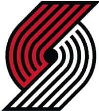
All the theater notwithstanding, the new logo is pretty similar to the old one (old version on the left, new on the right:
The new @trailblazers logo next to the most recent iteration. pic.twitter.com/uiAaM85w2y
— Miles Custis (@MilesCustis) May 8, 2017
Meanwhile, in other NBA and NHL developments:
• It looks like the Pistons’ long-rumored (and long-denied) new logo is on the verge of becoming a reality.
• Over in the NHL, the word is that the new Adidas designs will be unveiled at the NHL draft, which is taking place in Chicago on June 23-24.
• That story also includes a link to a tweet confirming that the Wild’s home jersey next season will be green.
I can already hear some of you getting ready to ask some questions. Allow me to anticipate some of them:
Don’t you think the Blazers intentionally “leaked” the logo by putting the merchandise out there with the new design? That’s probably why they’re talking so casually about leaks, right? And that’s why they had the interactive page all ready to go!
Despite my general opposition to conspiracy theorizing, I agree that those are somewhat reasonable dots to connect. For reasons of my own, however — reasons that I’m not at liberty to divulge — I don’t think yesterday’s events were an orchestrated faux-leak. Just my opinion.
If the Blazers went and revealed their new logo once it was leaked, why didn’t the Pistons do the same?
Good question. That new Pistons logo has been floating around since last year, but the team has steadfastly refused to acknowledge its existence, even though it’s obviously going to be their new logo.
When will they finally go public with it?
”¨”¨I don’t know. But that article on the Blazers’ site said the new pinwheel logo was originally slated to be released in connection with the draft lottery on May 17 16, so maybe that’s when the new Pistons mark will finally make its official debut.
When will the new NBA uniforms be released?
”¨”¨I don’t know. Definitely not before the end of the Finals, though. I was thinking they might be unveiled at the NBA draft, which is scheduled for June 22 (the day before the NHL draft). But that Blazers article says Portland’s new home and road designs won’t be released until “late summer” — or until they leak — so maybe the plan is to keep everything under wraps until then.
The NHL draft takes place over two days. Which day will the unveiling of the new Adidas uniforms take place on?
I don’t know but will try to find out.
Have you seen any of the new NBA or NHL designs?
No. Keep in mind that a change of outfitters does not necessarily mean a major change in team designs. When Reebok took over the NHL’s uniform contract, most teams’ uniforms did not change in any appreciable way. Ditto when Nike took over the NFL. If I had to guess, I’d say the NBA will have more changes with Nike than the NHL will with Adidas, if only because the NBA has a much more freewheeling approach to its uniform program than the other leagues do (and also, okay, because of a few things I’ve heard through the grapevine). But I haven’t seen anything specific.
What do you think [some specific team] will do?
Like I just said, I haven’t seen anything yet, and I’d prefer not to speculate. We’ll all find out soon enough.
A crisis in their homeland: If you think America’s political situation is messy, you should see what’s going on in Venezuela, where protesters have been taking to the streets every day for more than five weeks now due to social and economic repression. The situation has led to the social media hashtag #SosVenezuela, and at least three MLB players with Venezuelan ties have referenced that hashtag on their eye black in recent days.
The first to do so, at least that I’m aware of, was Pirates catcher Francisco Cervelli, who was born in Venezuela to an Italian immigrant father and a Venezuelan mother. For Sunday’s game against the Brewers, he wore “SOS” under one eye and “Venezuela” under the other:
In the opposite dugout that day was Brewers infielder and Venezuelan native Hernán Pérez, who did the same thing as Cervelli, but with an abbreviated version of the country name:
Giants outfielder and Venezuelan native Gorkys Hernández must have noticed, because he put the hashtag on his eye black for last night’s game against the Mets:
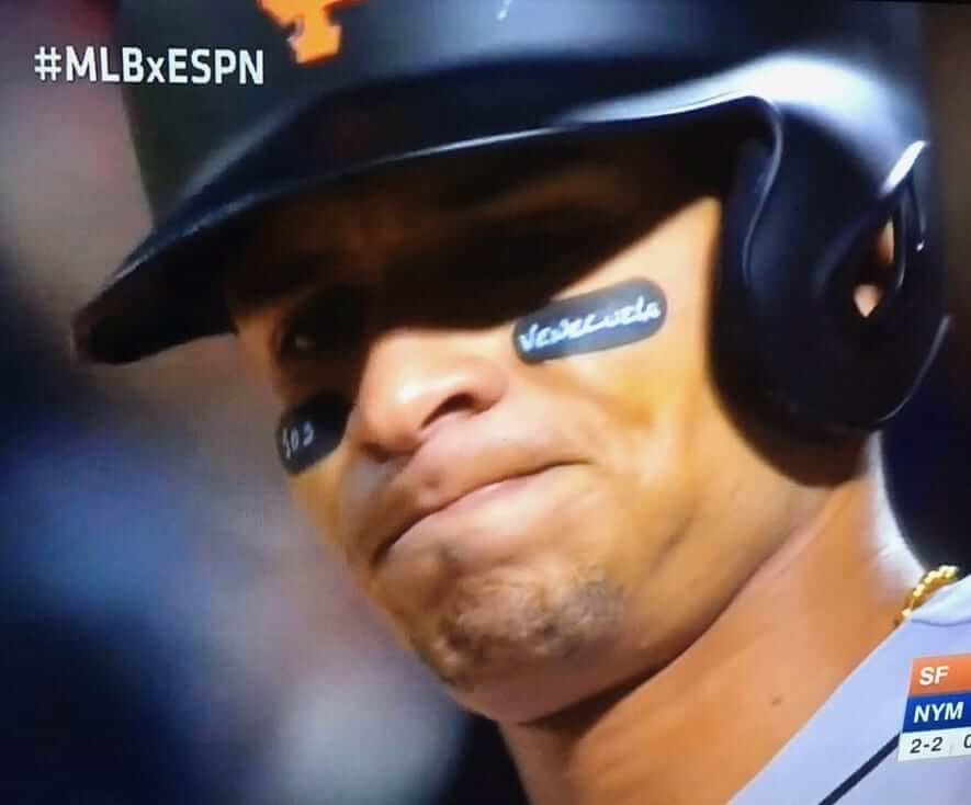
Man, it must suck to be far away from home when your country is in crisis. According to this Wikipedia listing, there are currently 74 MLB players from Venezuela (although it looks like some of the players on that list are free agents and therefore not currently active). I suspect we’ll be seeing more of them adding messages to their eye black soon.
Too good for the Ticker: The NHL has put out an animation showing how the league has spread across North America in the past century. It covers franchise relocations, renamings, redesigns, and more. SportsLogos.net poobah Chris Creamer, who’s been doing some logo-history consulting for the league, had a hand in this one, and it shows. Really nice job — totally worth your three and a half minutes.
(Big thanks to John Chapman for letting me know about this one.)
Click to enlarge
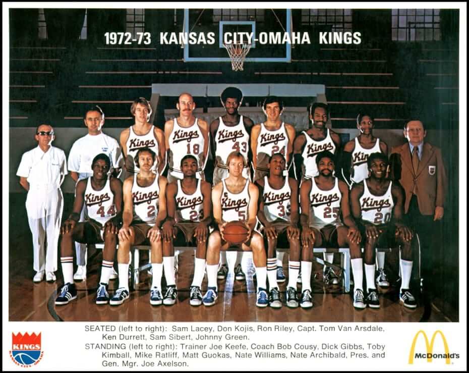
C Section, revisited: My most recent ESPN column, from last Friday, identified 43 NBA players who’ve worn the captain’s C. But reader Kevin Rogers came up with one who we missed: Tom Van Arsdale of the 1972-73 Kansas City-Omaha Kings. That’s him seated in the center of the front row of the team portrait shown above.
But wait, it gets better. I wanted to see if I could find a game shot of Van Arsdale wearing the C for the Kings, instead of just a team photo. I struck out on that front, but I did find game shots of a C-clad Van Arsdale playing for the Cincinnati Royals — the Kings’ previous incarnation. In fact, I found him wearing the C on two different Royals uniforms:
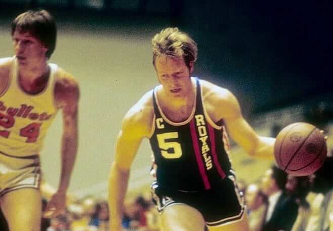
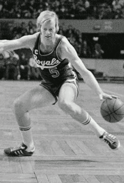
So Van Arsdale actually wore the C for two different teams (albeit the same franchise). Based on our current research, he’s the only player in NBA history with that distinction.
Click to enlarge
Collector’s Corner
By Brinke Guthrie
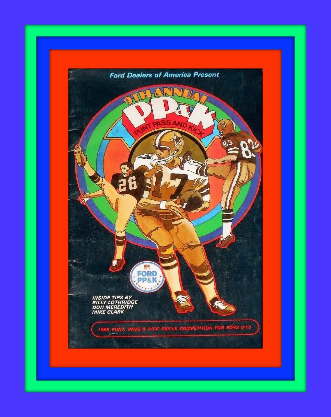
Check out the groovy artwork on this 1969 PP&K booklet. You’ve got The Danderoo, Don Meredith, on the cover (odd that they show him handing off instead of, you know, passing, right?), as well as Cowboys kicker Mike Clark and Falcons punter Billy Lothridge. Back then, PP&K was boys only, ages 8-13. We’ve come a long way, baby.
Now for the rest of this week’s picks:
• Did I say groovy? That word totally goes with this Super Bowl III lunchbox.
• This 1970s Steelers belt buckle looked like a DIY to me. But sure enough, it’s got the stamp of league approval on the back.
• Here’s a 1970s St. Louis (baseball) Cardinals ringer T-shirt, still sealed in the bag!
• I moved to Dallas in August of 1971, so the cover art for this August 1971 Cowboys at Rams game program caught my eye.
• One more Cowboys item: this 1960s American Airlines carry-on bag for coach Jim Myers.
• If you wake up in the middle of the night and look right at this 1970s Atlanta Braves bank, it might just scare you a bit.
• One more Braves item for ya, a 1970s helmet buggy.
• Speaking of helmet buggies, here’s a Steelers model, and of course the decal is only on one side. And while we’re at it, here’s a Vikings helmet buggy, as well as a Chargers helmet with that unofficial bolt on the side.
• Couple of different San Francisco Giants megaphones here. Cheer ’em on in the Candlestick cold with an orange or black version.
• One for the San Francisco G-Men: Not much in the way of style for this 1960s rain poncho.
• Nice-looking Colts cardigan sweater of unknown vintage with some varsity sleeve striping via your local Sears Put-On Shop, whatever that is.

IMPORTANT! Updated discount info: In case you missed it yesterday, all Uni Watch membership cardholders are now entitled to a 15% discount on any of the merchandise listed in our Teespring store. The discount code will be provided to new enrollees when their cards are mailed to them.
Existing enrollees can obtain the discount code by contacting me. Once I confirm that you are indeed a card-carrying member, I’ll email the discount code to you. HOWEVER, if you tried to do that yesterday and didn’t hear back from me, it’s because I idiotically misspelled my own email address in the email link, so your emails went to someone else. Ay-yi-yi. So if you asked me for the discount code yesterday and didn’t get a response, please ask me again today.
That’s probably the most embarrassing of the many typos I’ve been making lately on the site. The truth: I’ve been having terrible problems with insomnia over the past several months, and it’s definitely made me sloppier at the keyboard. Apologies for that. (I’m already getting professional help for it, so no need to tell me about melatonin, earplugs, sleep hygiene, etc. Thanks.)
As always, you can sign up for your own custom-designed membership card here, you can see all the designs we’ve done so far here, and you can see how we produce the cards here.

KRC update: The latest installment of Key Ring Chronicles is about a miniature “Miffy” figurine. It’s a really great little story — check it out here.
The Ticker
By Mike Chamernik

Baseball News: A fan at Sunday’s Brewers/Pirates game wore a wooden Brewers cap that he carved himself (from Yancy Yeater). … Derek Jeter wanted to wear No. 13 when he first came up with the Yankees, but the number was taken by Jim Leyritz. Jeter says that he believes he was assigned No. 2 because it was the smallest jersey the team had (from Chris Flinn). … The Indianapolis Indians will wear Guardians of the Galaxy jerseys for Marvel Superhero Night on Saturday (from Phil). … Saint Joseph’s College in Indiana is closing, and the school hosted its final home games in a doubleheader on Sunday. In a ceremony before the final game, senior 3B Josh Handzik wore his graduation medal and tassel while giving his valedictorian speech, and dozens of alumni threw out first pitches simultaneously (from Eric Bunnell). … The West Virginia Power and Lexington Legends have quite the rivalry: The teams have an ongoing Hatfield and McCoy-themed feud this season, and they squared off yesterday. The Power have Hatfield NOB jerseys, the Legends play as the McCoys, and the winner of the series gets this trophy. The promotion is inspired by the warring 19th-century families that lived in the West Virginia-Kentucky region (from Joshua Exline). … The Reds have a video of their logo history projecting on a loop in a club at their ballpark (from Jorge Cruz).

NFL News: The Rams are asking fans when the team should wear its Eric Dickerson-era throwback uniforms. In a video to promote the fan vote, Dickerson wore a jersey with a cut neckline, which was one of his visual signatures when he played (from Chris Cruz). … FNOB alert! That’s Bears DB Jerry Moore during the early 1970s (from Pro Football Journal).
College Football News: The 2017 SEC helmet schedule is now available (from Phil). … Southern Mississippi will have 1997 throwbacks this season (from Phil). … Penn State coach James Franklin discussed the possibility of pink jerseys at some point in the near future. Before adopting dark blue and white, the Nittany Lions’ original color scheme was black and pink (from Mike Wissman).

Hockey News: The Golden Knights’ draft cap has been leaked (from @SinBinVegas). … Check out this splendid old jersey for a dentistry school team [too small for me, otherwise I’d be all over it ”” PL] (from Jesse Thorn). … The Blackhawks are holding a Lollapalooza T-shirt design contest (from Matt Mallonee).

Basketball News: SportsCenter ran a graphic about Raptors G DeMar DeRozan, but showed the Rockets logo (from Corey Buck). … New blacktop court design for Doane, a NAIA school (from Ben Belletto).

Soccer News: New jerseys for Real Madrid (from Patrick Thomas). … Also from Patrick: New third kit for Marseille. … New kits for Stoke City (from Josh Coles). … The Bolton Wanderers launched a design competition for a new logo for their 20th year at Macron Stadium (from Craig Ackers). … Sporting KC will wear retro rainbow wave jerseys on May 17. The club wore those uniforms in 1998 (from Benny Armstrong).

Grab Bag: New logo for HLN, the cable news station. … New logo for the athletics program at Spring Arbor College in Michigan. … Jerry Bruno found some very cool old invitations to his dad’s and uncle’s bachelor parties, which were actually called “Bachelor Dinners” at the time. No matter the name, Jerry says that the parties still featured beer, fried chicken, and X-rated stag films. … While walking to the 18th green to finish off a victory at the Insperity Invitational on Sunday, John Daly kissed the Arnold Palmer logo that was painted on the fairway. … Paul Palmer sends in an excellent old PF Flyers animated commercial. Sneaker marketing sure has changed a lot since then. … While photographing a high school girls’ lacrosse game in New Hampshire, Tris Wykes spotted a goalie with her hair braided after it was pulled through the top two holes of her helmet.
Loved the NHL montage. Never saw the NY Islanders Fish Sticks logo, though.
1995 @2:10. Right where it should be!
Here’s a Flickr slide show of that groovy 1969 PP&K booklet, which I still have. It was featured here on Uni Watch when Paul wrote about PP&K memories way back in February 2008.
link
link
Nice! You have a better memory than I do, Jeff!!
And notice on the inside pages, the Saints are showing the black helmet for the 1969 season…
It’s really interesting how often the Blazers have “flipped” their logo through the years. From 1970-90, the black half of the pinwheel was pointed up and the red was pointed down. Then from 1990-2002, the red was pointed up and the black down. From 2002-2017, they changed the black to gray, and the gray was pointed up and the red was pointed down. Now they’re returning to red up, black down.
For something so inconsequential, they’ve revised the direction of the pinwheel a whole lot.
link
I wonder if they do it because it implies that the pinwheel is constantly spinning, thus the colors switch ends each time there’s a new logo.
I don’t buy into any of the story that’s behind this change. “45 degrees of the logo in honor of the 45th parallel”…Really? How much pot was smoked to come to that one?
Just the usual “We have to have x number of ‘stories’ built into the design.”
Nobody cares, nobody will remember 10 minutes from now, nobody should take any of it seriously.
If Penn State does wear pink jerseys at some point, they should wear them for a game at Iowa, so that they feel at home in the visitors’ locker room.
Draft lottery logo unveilings make sense because it can change the conversation about a crappy drafting position.
The SEC helmet schedule uses an outdated Kentucky logo on the helmet
I suppose I’m in the minority here, but I’ve always thought the Blazers logo and uniforms are terribly dated and just really ugly. The color scheme is great, but that pinwheel looks like something you’d see in an educational film from the late 70s.
For the record, I tend to like clean, classic uniforms (Alabama/Texas football, Oakland Raiders, NY Yankees, etc.), but the Blazers logo has always struck me as awful.
I totally disagree. The Blazers’ logo and diagonal stripe manages to be completely unique without being cartoonish or gaudy. There aren’t many other design elements on NBA uniforms that are as instantly recognizable through the years – the Sonics’ arch probably comes the closest, but that’s obviously defunct.
I agree, J.D. I think there are clean ways to execute their signature design, and there are cluttered ways to do it, and I think the Blazers have experimented with both over the years. My favorite version of the mark is the 1990s one because it looks so much cleaner without the outline holding it in.
Yeah, it’s just a personal taste thing. I just never have liked the logo. Yes, it’s unique and recognizable, but I still think it’s ugly. To each his own, I suppose.
The Trailblazers’ insignia is a favorite of mine because of the abstraction and lack of a basketball. But I’ll confess being converted their championship year since that was when I first followed the sport. I like their original typeface but I admit to it being dated.
My personal dislike may stem somewhat from being a lifelong Rockets fan. I’m conditioned to dislike my team’s opponents’ gear. For example, I’ve always thought the Spurs logo was terrible. But I’ve always disliked the Spurs, so that colors my assessment quite a bit.
I still think the Blazers logo looks dated and ugly, but it’s personal taste.
Since the draftees come on stage and put on a sweater (jersey) for a post-pick photo op, it would be a major upset if the unveiling didn’t take place on Day 1 of the draft (at the very least for teams that own first-round picks)
For the sweaters anyway. The full uniform unveil is another matter
That touching Key Ring Chronicles story really resonated with me. My dad passed away unexpectedly a couple of weeks before Christmas about 8 years ago, at the age of 58. When we opened our presents at Christmas that year, there were several from him that he had purchased before he died, which of course led to many tears. He was good man.
If the Ottawa Senators change their uniforms (please do!), I always thought this one would be a good option for a primary crest on a black jersey. It has never made it to the uniforms:
link
How do the Blazers get away with a logo that doesn’t have a basketball in it? I thought that was a league requirement.
Back when NBA officials were still talking to me, they told me the inclusion of the ball was a strong preference, not an iron-clad rule.
May I direct you to the Chicago Bulls;)
Braiding hair outside of the helmet is a terrible idea and should be banned. If there is ever a medical emergency, you want to get that helmet off as quickly as possible.
I thought the same thing. They’d likely just cut the braid instead of untying it.
As someone who grew up in the NW in the 80’s and 90’s I’ve always liked the blazers logo. I actually never noticed the flipping of colors on the pinwheel, but never cared for the pointed tips on the latest logo.
Glad to see them nod back to the glory days of the 90’s with this one. Much better IMO
Looks like a T-B to me.
Did you post the Venezuela flag upside down on purpose (SOS-style, I’m assuming) or by accident? Because it’s upside down. Which has the unintended effect of a smiling row of stars, when the situation is truly sad.
Let’s see. The story is about about the #SosVenezuela hashtag. The subhed refers to the word “crisis.” And an upside-down flag is a symbol of distress.
Hmmmmm.
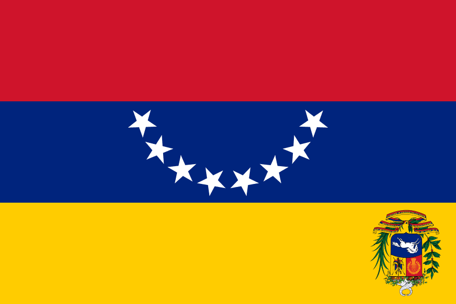
Hate to be “that guy”, but the flag itself is out of date. An 8th star was added in 2007.
Fixed!
The Blazers logo is weird for me.
Normally I dislike logos that have a narrative built into the graphic design. “The four stripes represent our four championships” or “the blue represents the spirit of our fans”.
Somehow the Blazers logo, five stripes meeting five stripes representing five on five basketball, actually works. You can look at it and it tells its own story – someone who doesn’t know the story of the logo would get it immediately. Its not forced like most logos, its self-evident.
Proofreading:
“Yesterday there was a particularly interesting sequence of events regarding the Trail Blazers. Here’s out it unfolded:”
– Here’s how it unfolded:
Fixed.
Since I’m not an MLS soccer fan, I was unaware that Sporting KC wore rainbow wave jerseys back in 1998. Those jerseys are truly heinous.
As a lifelong Blazers fan I like the new logo better than what we had. I was hopeful when I saw they removed the silver. Not as hopeful when I saw it was still considered a secondary color. As to the question about their potentially having a faux-leak situation due to their response. As a proud Pacific Northwesterner we tend to be a little more go with the flow then in other areas of the country. When I visited New York there were constant car horns, whereas here in the PNW the only time you hear a car horn would be to avoid getting in an accident or if the person hasn’t moved at the light after like 10 seconds. Just one example of our laidback-ness. Also, as a pastor, it is totally normal for me to wear a t shirt and jeans on a Sunday morning where in other parts of the country I would need to wear a suit just to not stand out if I was attending a Sunday service. Just two real quick examples about our region that could be the reason the organization’s response seems a little too easy going about the leak.
“WE MUST HAVE A FULL INVESTIGATION OF THE LEAKS” -GOP Senator
User Name: Podesta
Password: Password
Nuff said.
Are you sure Tom Van Arsdale wasn’t wearing the “C” for “Cincinnati”?
I’m not a fan of players wearing the “C” on their uniforms unless it’s for hockey; it seems too derivative to me. On the other hand, I like the captains’ patches issued by the NFL to all of its teams; it looks better when it appears to be a league-wide practice. I guess because basketball players can’t wear armbands on their–wait, you don’t suppose this is why they started coming with sleeved alternate uniforms in the NBA, do you?
On the other hand, I like the captains’ patches issued by the NFL to all of its teams; it looks better when it appears to be a league-wide practice.
But it’s *not* a league-wide practice. The NFL captaincy patches are optional, and several teams don’t use them, such as the Steelers, Packers (except in the postseason), and others.
I actually find it much more interesting when it’s a team-by-team thing, instead of a top-down initiative from the league office. Team stuff is almost always more interesting than league stuff.
“When Reebok took over the NHL’s uniform contract, most teams’ uniforms did not change in any appreciable way”
I would have to disagree with this statement, Paul. When Reebok took over in 2007, many teams overhauled their designs, introducing both new uniform templates and new logos in several cases, and others drastically changing their striping patters or removing them wholesale.
Drew, I’m busy juggling a few other projects at the moment. But if you have a bit more free time than I do, go to nhluniforms.com and do a team-by-team count of how many clubs overhauled their looks and how many mostly stood pat (slight Edge template modifications notwithstanding). I don’t know what the numbers are, but I’d be interested in seeing them.
I actually had it up as I typed this, just to jog my memory. I must concede that I was mistaken in my timeline. Reebok took over the NHL uniforms in 2005, and they made no real major changes a glance, though Anaheim and Buffalo (*shudder*) got new uniforms. Other than that, it was more changes to or introductions of third jerseys for a few clubs.
When I wrote my initial post, I was thinking of the introduction of the Edge template the following year. My apologies, Paul.
Having said that, here are my comparisons from pre-Edge to post-Edge, team by team:
Anaheim Ducks – Same, though waist striping no longer wrapped around the waist due to the Edge template.
Atlanta Thrashers – Eliminated their patterned waist stripe on both home and away jerseys, and changed the location of the name plate on the away jersey
Boston Bruins – Sleeve and shoulder striping changed on the home jersey, and waist stripe size reduced considerably. Logo also slightly modified with a serif and a border around the B.
Buffalo Sabres – Same, as it was designed with the Edge template in mind. Oh the memories.
Calgary Flames – Changed their waist and sleeve stripes, and added extraneous piping. Also retired the horse secondary logo.
Carolina Hurricanes – Same.
Chicago Blackhawks – Same.
Colorado Avalanche – Changed their sleeve striping, and eliminated their waist striping. And the infamous piping aka “Bettman stripes” added to the front.
Columbus Blue Jackets – Old primary logo retired, third jersey logo promoted to their sole primary logo, eliminated their waist stripes, and changed their sleeve stripes.
Dallas Stars – Complete uniform overhaul.
Detroid Red Wings – Same.
Edmonton Oilers – Changed their sleeve and waist striping, removing the waist stripes entirely. Replaced by Bettman stripes on the front.
Florida Panthers – Changed their sleeve stripes and removed waist stripes entirely.
Los Angeles Kings – Eliminated waist stripes entirely.
Minnesota Wild – Same, but retired their green home jersey, and promoted their faux-back to home jersey status.
Montreal Canadiens – Same.
Nashville Predators – Changed sleeve striping, eliminated waist stripes entirely, added “Nashville” to their logo on the away jersey.
New Jersey Devils – Same.
New York Islanders – Completely changed their sleeve pattern, shoulder yolk added to both home and away jerseys.
New York Rangers – Same.
Ottawa Senators – Complete overhaul of logo and uniform using a template shared by them, Pittsburgh, and Tampa Bay.
Philadelphia Flyers – Completely changed sleeve striping.
Phoenix Coyotes – Eliminated waist stripes entirely.
Pittsburgh Penguins – Overhauled the uniform using a template shared by them, Ottawa, and Tampa Bay.
St. Louis Blues – Overhauled the uniform using a template that would later be adopted by Nashville in 2011.
San Jose Sharks – Overhauled the logo and uniform entirely.
Tampa Bay Lightning – Overhauled the logo and uniform entirely, using a template shared by them, Ottawa, and Pittsburgh.
Toronto Maple Leafs – Eliminated waist stripes entirely.
Vancouver Canucks – Overhauled the uniform entirely, and tweaked the color scheme of the primary logo to match the new blue and green color scheme.
Washington Capitals – Overhauled the logo and uniforms completely.
I may have forgotten some small details, but at a glance, that’s what I remember about the Reebok Edge takeover in 2007.
Good stuff, Drew. Thanks for the tally!
Anytime, Paul! Very curious to see if the Adidas takeover will yield similar changes, big or small.
Spring Arbor *University
That Vegas draft cap is hideous. Looks like a German national team soccer hat color wise.
Great content today. Went from the fun of that NHL video with the moving/changing logos to that totally bittersweet key ring story. An emotional ride. Thanks Paul.
Thanks, Tim. Not often that we have so much content in a single day, but that’s how it works out sometimes. Glad you liked!
The shot of the Bears Jerry Moore is also distinctive since if reflects the Bears changing their number font on their road jersey for one season, if my teenage memory is correct.
That image displays a block font numeral common to just about every NFL team in that era, except the Bears. The home uniform numeral went unchanged.
Thankfully, the Bears restored their distinctive numeral font after this venture into generic land.