Back in February of 2016, four of the NHL’s six 1967 expansion teams unveiled anniversary logos, which have been worn as patches during the 2016-17 season. The two teams not getting in on the fun were the California Seals, a franchise that no longer exists, and the Minnesota North Stars, who later moved to Dallas and exist today as the Stars.
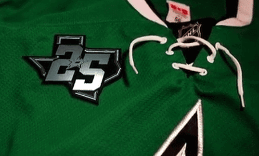
More than a year later, the Stars have now unveiled their own patch, commemorating 25 years in Dallas. Much like the Cincinnati Bengals patch that appeared two weeks ago, it appears to be plastic, not woven, the latest sign that the plastic, which had previously been used only for special events like the Super Bowl or the MLB postseason, may be becoming the norm for standard team patches.
It’s interesting that no years are shown on the patch. For the record, the Stars’ first season in Dallas was 1993-94, so the upcoming 2017-18 season will be their 25th in Dallas. In other words, this is an ordinal patch, not an anniversary patch. (The other expansion teams’ patches were for their 50th seasons, so they were also for ordinals, not anniversaries.)
Also interesting: The patch design doesn’t have even a hint of green. How often does a team patch omit the most prominent team color?
Update: As reader/commenter Lou immediately pointed out, the 2004-05 NHL season was wiped out by the owners’ lockout. So, technically speaking, the Stars’ new patch really represents 25 years, not 25 seasons (and the other four expansion teams’ patches were for 50 years, not 50 seasons).
(My thanks to Matthew Spencer for bringing the patch to my attention.)
Click to enlarge
Collector’s Corner
By Brinke Guthrie
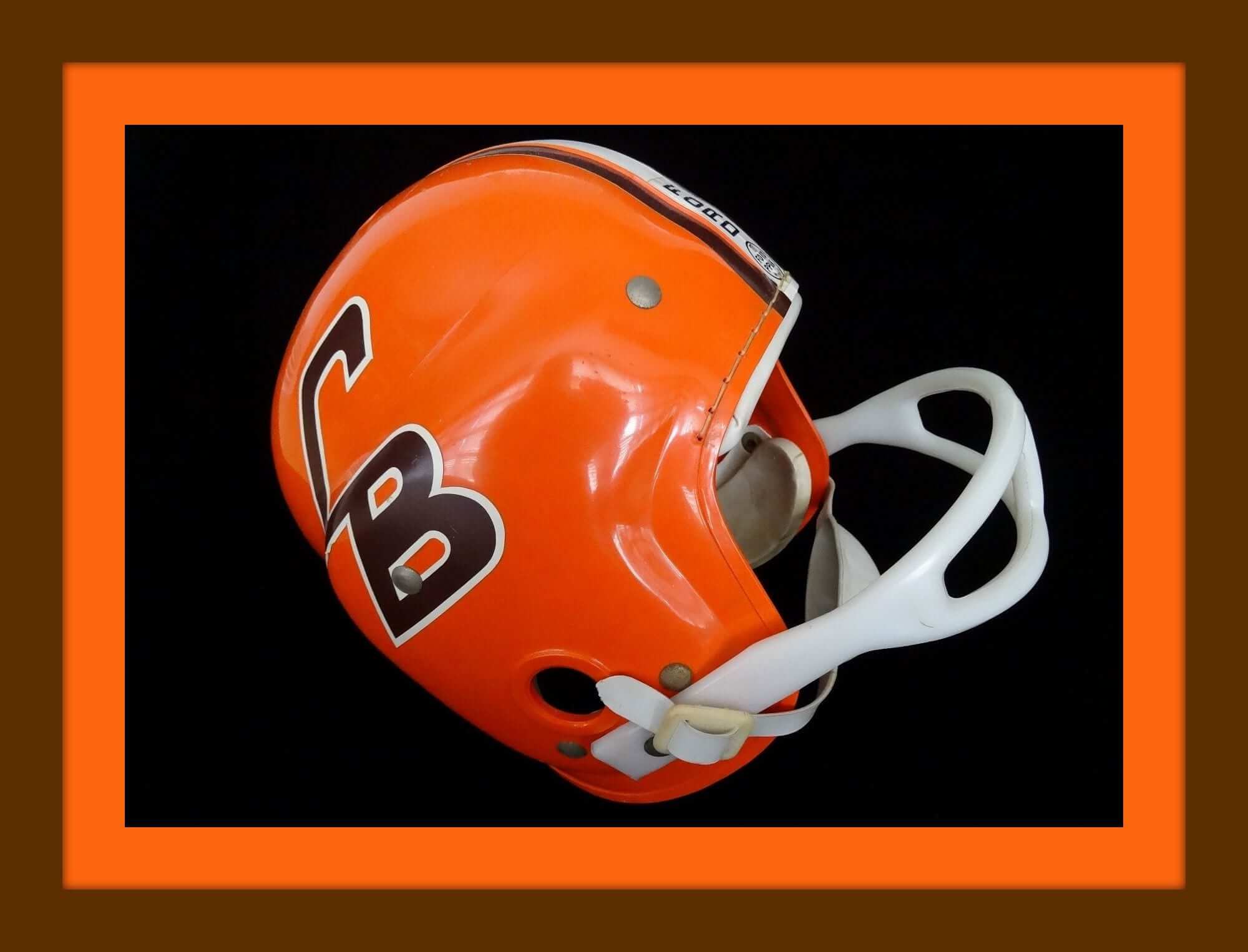
Browns fans, today is your day. Check out this 1960s MacGregor Ford Punt, Pass & Kick helmet, complete with the “CB” logo that never made it onto the field! Now, shrinking the scale a bit, here’s something I don’t think I have ever noticed: This is a 1970s Brownies helmet buggy, right? Notice that it has a blank orange sticker on the side, to match the helmet. Why not just skip the sticker, like these? It would be more authentic that way. And of course we have the mimi-helmets with the “CB” on the side. Oh, and here’s a Browns mini-helmet with a white sticker on the side. Wait, what?
Now for the rest of this week’s picks:
• Here’s a rare left-facing helmet graphic, this time for the San Diego Chargers on this promo glass from Dr. Pepper/Taco Bell.
• The folks at Ed Stinn Chevrolet wanted to be sure you knew they were the guys giving you this Cleveland Barons (NHL) T-shirt.
• This vintage Kansas City Chiefs bobble is in great shape. Looks like one minor nick on the side. And notice the KC arrowhead logo pointing the wrong way!
• Nice sleeve striping on this 1970s kids St. Louis (football) Cardinals coat, made by Stahl-Urban.
• Look at this 1960s ski cap. It’s purple and yellow, with a patch in the front showing a Vikings helmet. Not a Vikings football helmet, just a plain Vikings helmet. That’s the way to get around NFL Properties, eh?
• This 1960s-1970s Green Bay Packers/Ford PP&K winner’s jacket somehow made its way to the UK, where it’s now available in this auction. Hang tag says “Nordic Pyramid Outerwear Corp, with the requisite “My Name Is_____” and “I Live at_____” fields ready to fill in. My name and address would always fade or blur after Mom ran the jacket through the wash a few times.
• They cared about concussions way back in the 1960s. This brochure details the new “ultra high impact plastic” in Paul Hornung’s Packers helmet.
• One more Packers item: a nice-looking Colts/Packers print done by Bruce Bomberger and sponsored by Mobil gas stations. Must have been tough living in the shadow of The Master, Dave Boss.
• The Astrodome and adjacent AstroWorld theme park were showcased on this 1970s koozie.
• One more for the ’Stros: a yellow 1970s men’s polo shirt made by Goodman’s of Los Angeles.
Follow Brinke on Twitter.
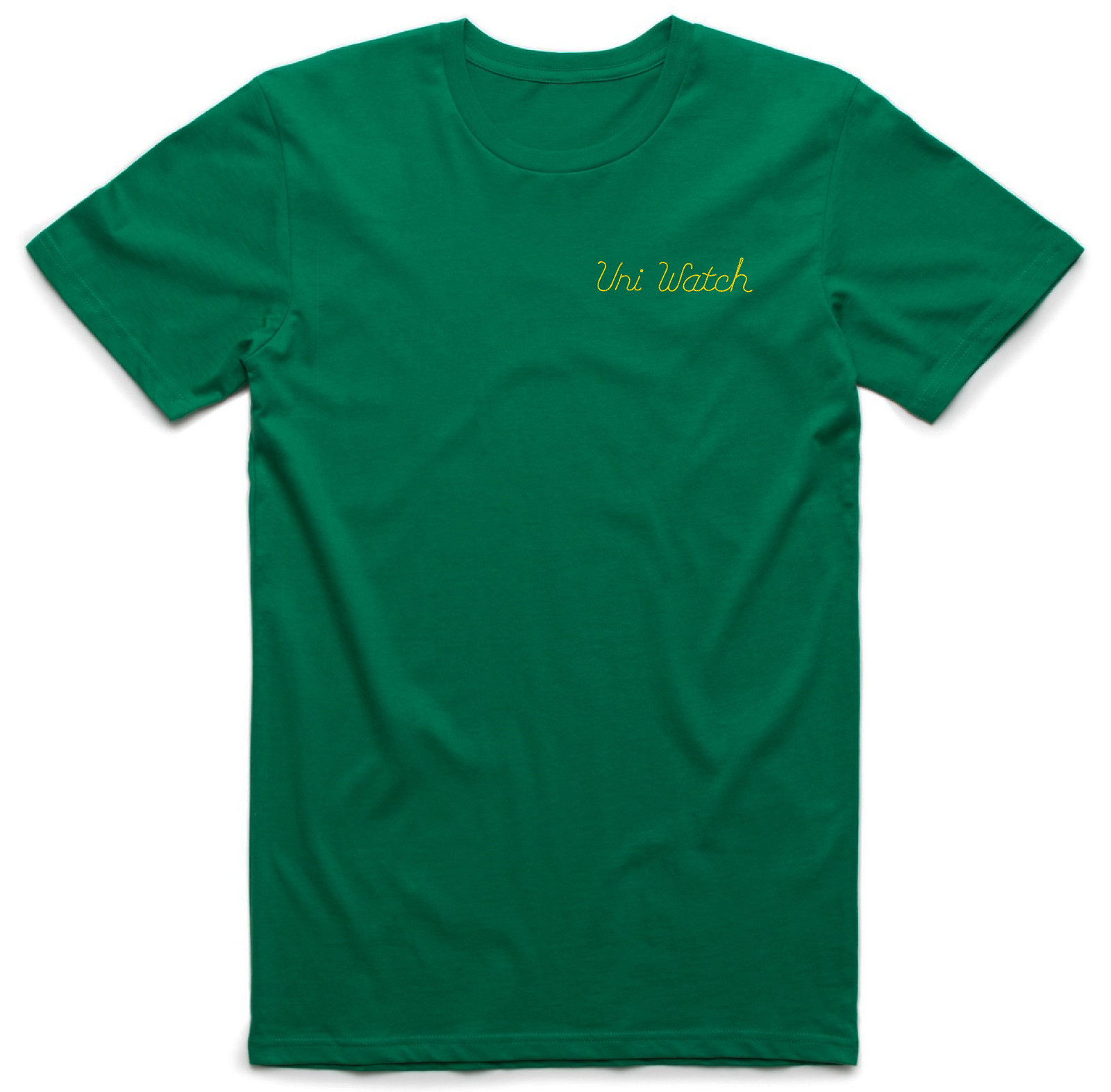
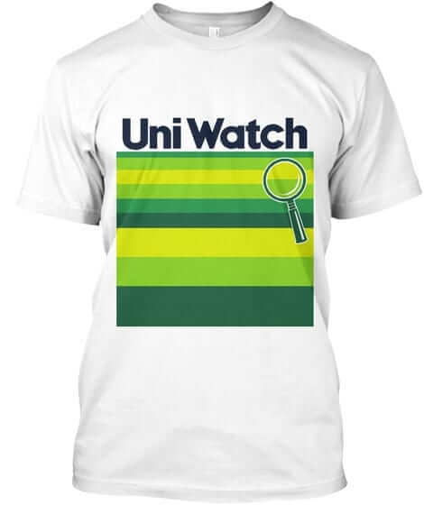
New T-shirt reminder: As you probably know by now, our latest limited-edition T-shirt in the Uni Watch Artist’s Series, designed by the great Scott M.X. Turner, is now available, and it’s a doozy. It’s basically a T-shirt version of a classic bowling shirt, with a simple “Uni Watch” insignia faux-chain-stitched on the front-left chest and a spectacular design faux-chain-stitched on the back (for all of these images, you can click to enlarge):
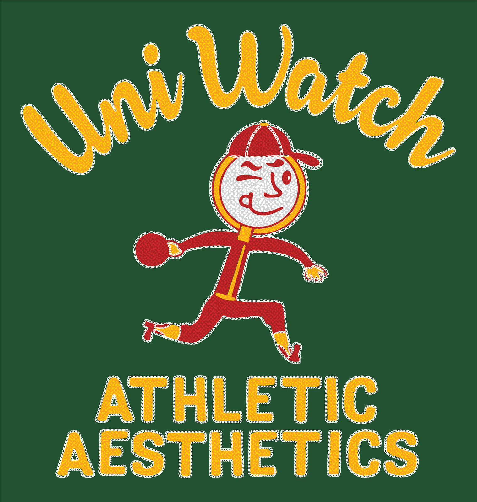
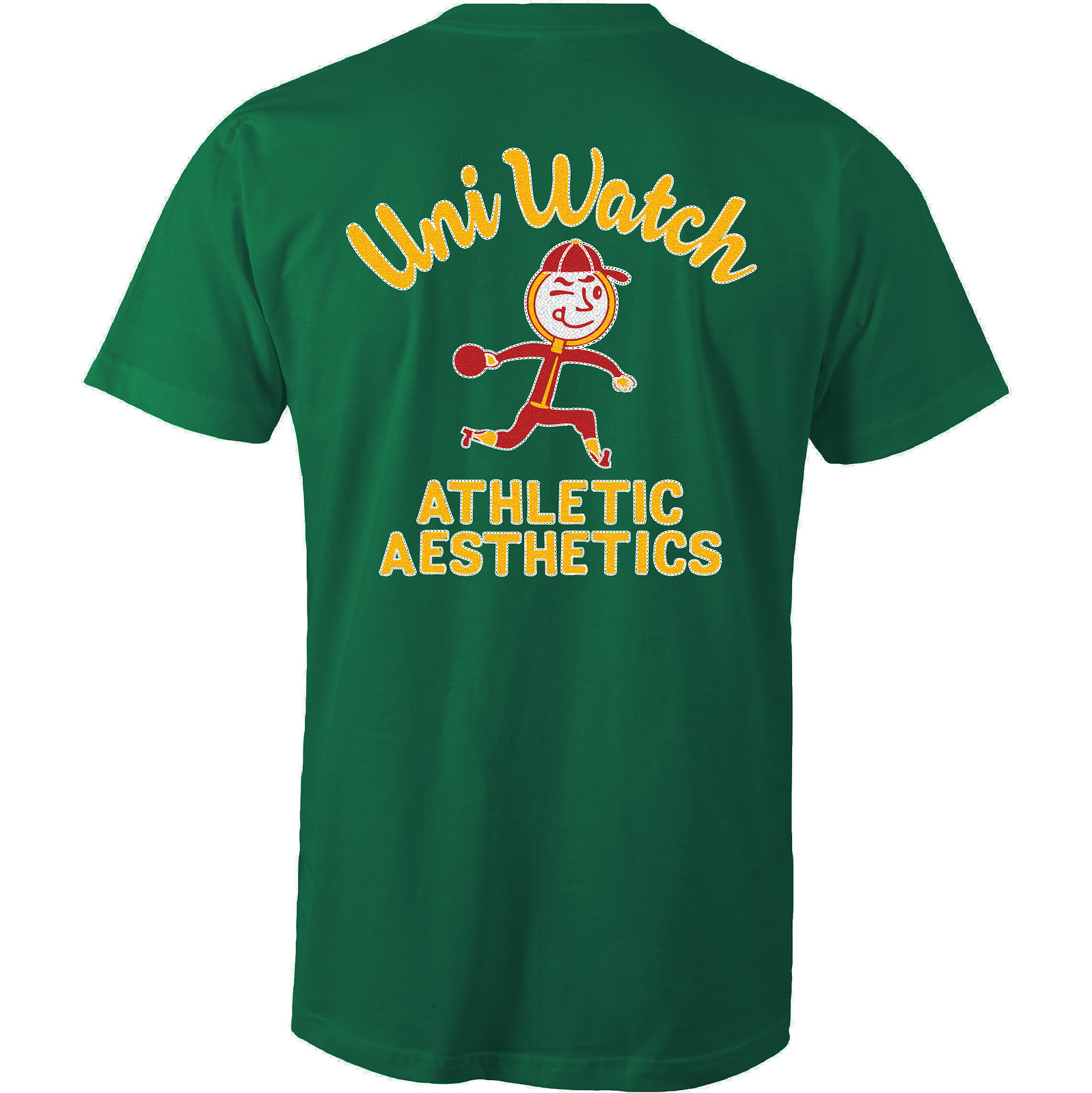
The anthropomorphized magnifying glass wearing a ballcap and stirrups is completely awesome, and the design works well in a wide variety of shirt colors. Here are some of the ones we’re offering (there are several more on the sales listing page):
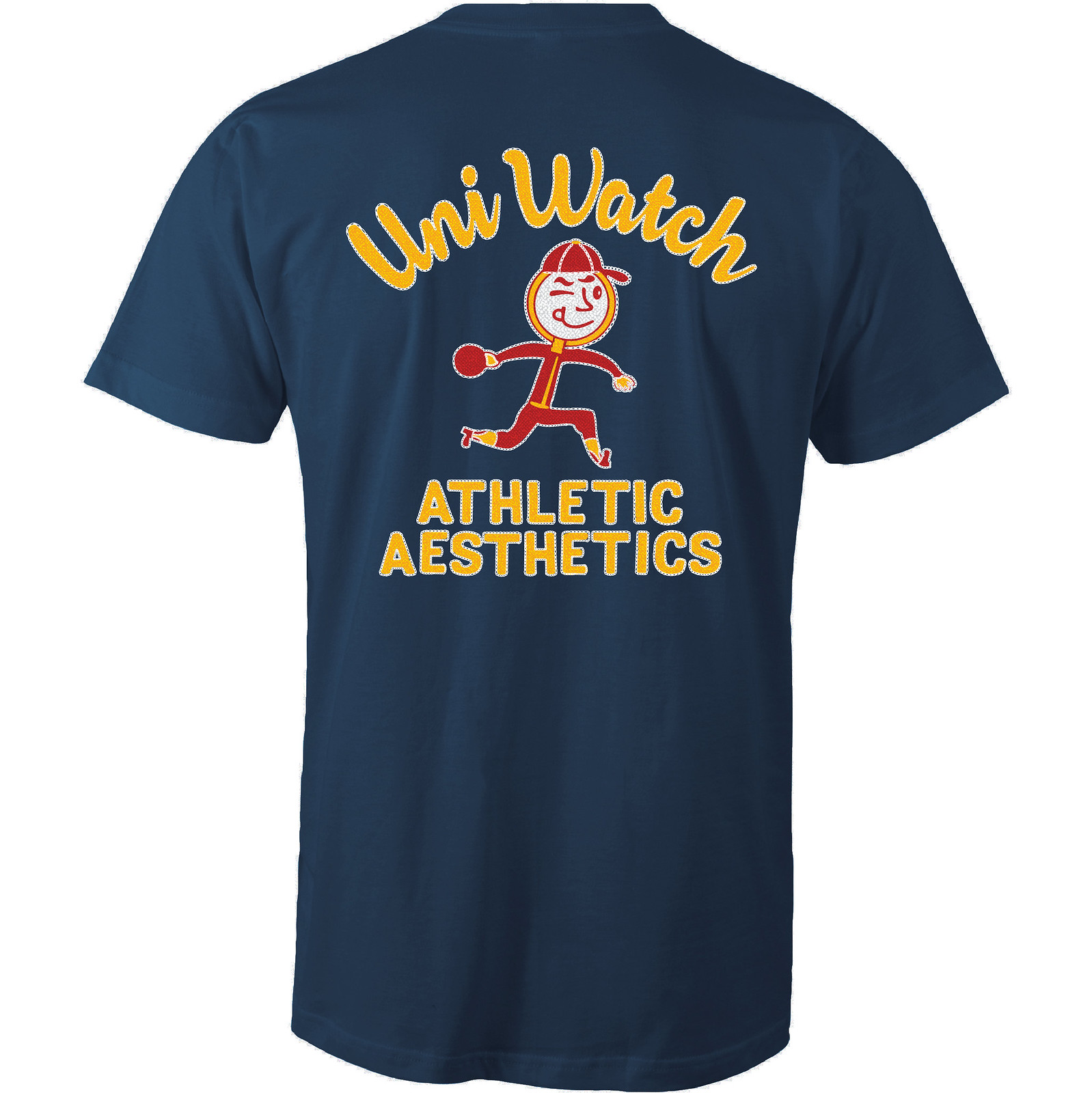
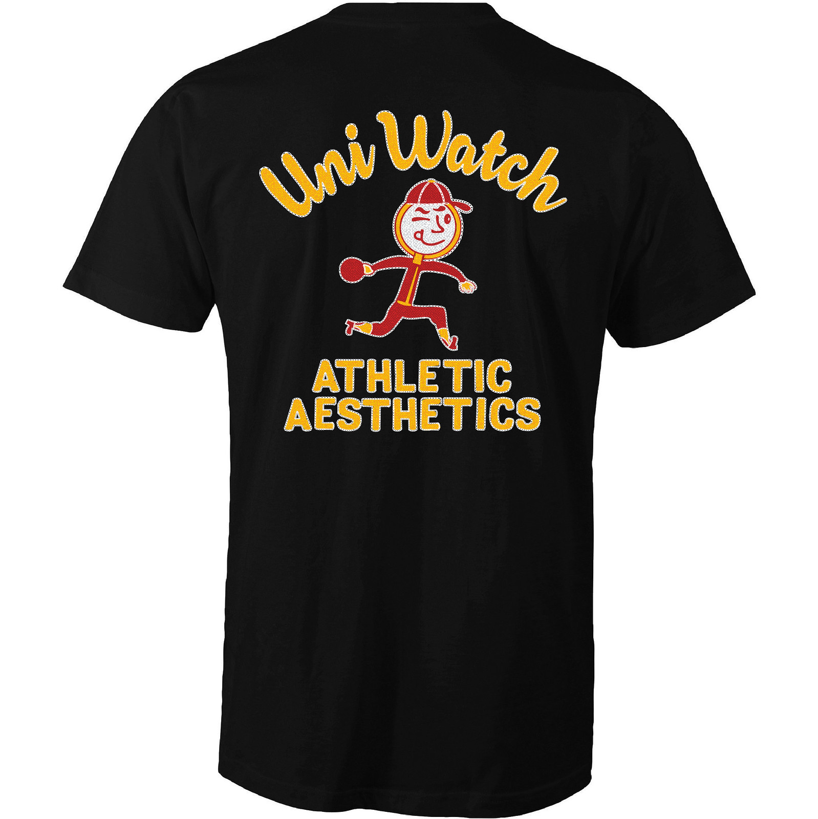
Like all of our Artist’s Series shirts, this one is a limited edition, available through 11pm Eastern this Thursday. You can order it here. My thanks, as always, for your consideration.
ITEM! New merch store: We now have a bunch of T-shirts, coffee mugs, and a few other things available in a new Teespring online shop. Here are the details:
• The designs include some basic items, like our caricature logo, gold disc logo, green disc logo, and basic script.
• I’ve also revived several designs from the 2015 and ’16 T-Shirt Club. From 2015, we have tequila sunrise (a screen-printed version, not the sublimated design we did with the T-Shirt Club), stars and stripes (complete with the “Pandering” NOB), and BFBS, and from 2016 there’s the baseball design and the home and road versions of the basketball design. All of these are standard T-shirts — no sleeve patch or jock tag graphics like they originally had when they were part of the T-Shirt Club. (Most of these designs are also available as mugs, and I think they look really good in that format, especially tequila sunrise.)
• Two designs you may not have seen before (or may not remember, because they were only available for a very short time): vertically arched and radially arched.
• Most of the shirts are available in a variety of styles (long-sleeved, hoodies, etc.) and colors (with some obvious exceptions, like BFBS, which is obviously available only in black), and most of the mugs come in a wide range of colors, so don’t feel constrained by the thumbnail images in the shop — click around and explore the possibilities.
• Unlike the Artist’s Series shirts, which are limited editions, I expect to keep these available for the foreseeable future. (I may also revive our ugly sweater design when the winter holidays roll around, but that’s obviously a long way off.)
That’s it. You can see the full storefront here. My thanks, as always, for your consideration.
The Ticker
By Mike Chamernik

Baseball News: Rawlings is MLB’s official helmet provider, but Pirates first base coach Kimera Bartee wears a Wilson skull cap. It’s also used by a few MLB catchers (from reader M Skuz and Jeff Hanten). … Clicker beware: One observer has ranked the 30 best MLB uniforms of all time. Here’s the full list not in slideshow form (from Phil). … The Pittsburgh Post-Gazette has tracked the Pirates’ uniform combinations over the last two seasons. Pitcher Tyler Glasnow says he would pick to wear black jerseys on his start days, but no one has asked him (from Alex Iniguez and Phil). … The Japanese Baseball Hall of Fame has dozens of uniforms on display (from Ron Yaworski). … New hat and uniforms for the Plymouth Pilgrims, a collegiate team in New England (from David Finer). … Fanatics has officially acquired Majestic’s parent company, VF Corporation. … In the Northwoods League, the Kalamazoo Growlers will wear corn dog jerseys and the Battle Creek Bombers will wear burritos tops for Food Fight Nights this season. … Though they played their home games in Death Valley, where summer temps can reach 130 °F, the Shoshone Indians wore wool uniforms back in the 1930s. That uniform is part of a display at a museum in Death Valley (from David Goodfriend). … Charlie Brown’s signature shirt is yellow, but Christopher Noice spotted a lunchbox where he’s on the mound a blue shirt. It’s a little like The Simpsons: Bart has always worn a red-orange shirt, but early-1990s Simpsons merchandise had him in blue. … Tigers minor league affiliates, including the Erie Seawolves, are wearing the Mike Ilitch “Mr. I” memorial patch for Mike Ilitch (from Sean Combetty). … Mike Morse of the Giants wore one of the new sock designs as an arm sleeve last night (from Frankie__Doodle). … Throwbacks upcoming this summer for the Hokkaido Nippon Ham Fighters.

![]()
NFL & College Football News: Two notes from Andrew Cosentino: Ravens WR Breshad Perriman will switch from No. 18 to No. 11, his college number, and the Vikings announced the jersey numbers for their draft picks. … Here are the jersey numbers for the new Cowboys rookies. … Gene Sanny got some new markers and drew illustrations of Ray Guy and Ron Mix. … The Broncos experimented with an odd, and cumbersome, helmet cam back in 1963 (from @BroncosQBClub). … Another corporate-named stadium: Kentucky’s Commonwealth Stadium will be renamed Kroger Field (from Josh Hinton).

Hockey News: Looks like the Penguins’ Patric Hornqvist was using teammate Oskar Sundqvist’s stick last night (from Tim Franzone). … Alex Ovechkin’s drawstring was exposed last night (from Toby Moleski). … Profession name on back? As the Oilers battle the Ducks, nurses in Edmonton are wearing shirts for Oilers defenseman Darnell Nurse (from Mike Styczen). … New logo and alternate logo for the Kootenay Ice of the WHL (from Matt Geiger and Jim Wooley).

NBA News: The Celtics will retire No. 34 for Paul Pierce, who played his last NBA game this past weekend after his Clippers were eliminated in the first round (from Phil). … The Celtics’ Terry Rozier lost his shoe during a play on Sunday, and the Wizards’ Brandon Jennings did his best to prevent him from putting it back on.

Soccer News: This week the Mexican soccer team Club América modified their numbers to resemble blood bags to encourage people to donate blood (from Diego Yanez). … New home unis for Benfica (from @mike3783).

Grab Bag: New black and orange jerseys for the Dutch national ultimate frisbee team (from Eric Bangeman). … A 12-year-old girl in Malaysia was forced to withdraw from a chess championship for wearing a dress that was deemed to be “seductive” by tournament officials (from Brinke). … The logo used in the new dystopian film The Circle looks a lot like the Uber logo (from Yancy Yeater). … Here’s a good collection of bizarre high school mascots and nicknames (from Kurt Esposito). … In the Australian Football League, Gold Coast will wear its usual red and gold jumper against Port Adelaide for a game in China on May 14. Port Adelaide wanted Gold Coast to wear white instead, with the fears that their red uni would garner too much support from the Chinese crowd. … New helmet for Funny Car driver Ron Capps (from David Firestone).
It was actually 50 years for the teams this year and 25 years for the Stars. As there was no 2004-05 season, neither represent the number of seasons.
Ah, good point. Will adjust text accordingly.
Notice too on the Peanuts lunchbox that when Charlie Brown is getting rocked off the mound, THAT shirt is red.
Also, Lucy’s dress is yellow, when it’s normally blue.
Also, Lucy is in a yellow dress and she always wears blue.
Guess I shoulda refreshed the browser sooner. ;)
Charlie Brown was known to wear a red shirt at times in the Sunday comics. Not sure if he did in any of the TV shows.
Bart Simpson has sported a blue shirt on a handful of occasions.
Me thinks the orange stickers on the side of the Browns buggy is likely a case of “Just doing my job. Stripes down the middle. Stickers on the sides. Next!”
Also, I always had/have a problem with people putting the “white stripe” on helmets that don’t have stripes. Or putting the stickers on the wrongs sides. Or putting the facemask on upside-down.
Yes, I am too into gumball helmets.
Exactly… that’s the result of a template sticker sheet and someone who doesn’t really follow football getting the helmet for a kid or whatever.
EEeeesh!!
link
I think the mask is even “inside-out”. Yes, that matters too!
DG – You’ll have to forgive me. When I was a kid I never got a Browns helmet so I peeled the stripes off an extra Bengals and peeled the helmet stripe off the an extra Packers to make a Browns helmet. Didn’t have a sharp enough eye back then to tell the difference in color between Packers and Browns stripes.
That Cleveland Barons shirt is great! Ed Stinn was a fixture on Cleveland TV screens in the 70s and 80s. Here’s a link to one of his commercials with MLB legend Mudcat Grant!
link
Brooke mentions the Packers print by Bruce Bomberger in today’s Collector’s Corner. I wrote about those here in December. link
Holy crap, I love the illustrations by Gene Sanny! Great work, Gene!
Thanks Marc… I didn’t know they would be included, I was just sharing them with Paul and phil cuz i thought they might dig them… thanks fellas :)
is Funny Car a proper noun?
When referring to a dragster, yes. When there are clowns involved, no.
Is that mutually exclusive?
if they are both, they are considered Hilarious Cars
For some reason, whenever I discuss NHRA categories, I will capitalize the category…I don’t know why I do it either.
Ovechkin drawstring.. that is his norm. It is funny watching youth hockey players in the area try to copy it
In the ticker, the 25 High School Mascots article is listed twice.
Fixed.
FWIW the linked “30 best” has several errors, the funniest being: “The Philadelphia Phillies currently utilize a classic looking uniform set at home that ranks among the best in the American League.”
I really like those Plymouth Pilgrims unis & hats. I just like nautical motifs.
Maybe that’s why I was disappointed with the Clippers went with what looks like “clip art” as their theme, rather than a clipper ship.
Proofreading in hockey ticker. It should be Kootenay Ice. Not Kooteney.
Fixed.
There’s something weird going on with that story – the first photo link goes nowhere, and the second link is to a logo that isn’t in either the league’s or the team’s press releases.
link
link
That a TWELVE-YEAR-OLD GIRL could be thought to wear a dress that was too seductive says a lot more about the tournament officials that about the girl or the dress.
Agreed.
Malaysia is an Islamic country. They’re not exactly keen on women (or girls) wearing anything that could be considered revealing.
I’ve always had an issue with that. I find the idea that men or boys can’t (or shouldn’t, which is perhaps worse) control themselves insulting.
In any case, she shouldn’t be punished for their sexualization and objectification of her.
Just my two cents.
Jon, Malaysia is not “an Islamic country” any more than America is “a Christian country.” It is not a theocracy, and while its population is majority-Muslim, it is also 19.8% Buddhist, 9.2% Christian, 6.2% Hindu, and 3.4% other.
From Wikipedia: “The constitution declares Islam the state religion while allowing freedom of religion for non-Muslims.” If a country has a state religion, I’m comfortable referring to that country as a (religious adjective) country, even if large numbers of the populace do not adhere to that religion.
And we’re not talking about the Church of England here. All ethnic Malays by law are Muslim and are forbidden by law to leave the faith. Non Malay Muslims are only allowed to leave the faith with permission from a Sharia court, which, as I understand, pretty much doesn’t happen.
Upon further review: I stand corrected. Thanks for setting me straight!
Whether it’s an “Islamic country” or not, that doesn’t make the reaction to her dress any less lamentable in my opinion. Sadly predictable, yes.
Seems to me that there are many fundamentalist faiths that have similar thoughts about women and women’s attire, including fundamentalist Christianity, fundamentalist Judaism, fundamentalist Mormonism, and a lot more. I think the moral of this story has a lot more to do with hardline fundamentalism in general than with any one faith (or country) in particular.
Avoid orthodoxy of any persuasion.
Frankly, disturbing and discouraging.
Lee
While the Pilgrims jerseys look better than their original set, I’m kind of disappointed. I liked their old look. Pit striping aside, it was fairly clean, almost Nationals-like. And this is coming from a Danbury Westerners fan/board member. Oh well.
Good question and point on the Dallas Stars logo.
On one hand, it’s guaranteed that one logo will look good on all jerseys with contrast and not too matchy-matchy. And I guess it’s the silver ordinal-anniversary/the lockout messed up all counting.
But on the other hand, a little splash of green in the little Stars logo within the 25 wouldn’t hurt and could have gone a long way.
Glad the BFBS shirt is on the new website. Wife has been wanting her own “Big Fucking Black Shirt” as she thought BFBS meant.
Always thought the Dallas Stars missed an opportunity by not using Lone Stars.
I’ve always assumed they went with just “Stars” because they wanted to keep green & yellow/gold in their color scheme. If they had gone with “Lone Stars”, there would have been pressure to be yet another red, white, & blue team.
I remember hearing that they went with “Stars” in case another future move ever became necessary.
Stars would fit just about any city in any part of the United States or Canada (until recently, even Las Vegas).
I remember when they moved, most fans I knew in Minnesota sort of assumed they’d become the Lone Stars. A real missed opportunity for an interesting relocation name change that would have combined continuity with new local specificity. And there’s no reason they couldn’t have kept the green, gold, and black scheme with a Lone Stars name. Even in the same state, there’s nothing about space exploration or NASA that makes blue and orange a sensible color scheme for the Astros; it’s OK for teams to have colors that don’t directly illustrate the meaning of their names.
Calling a team the Lone Stars makes the copyeditor in me cringe. Singular-plural confusion!
What about Lone Star?
Like “Magic” or “Heat”.
Not for a million spacebucks.
No more so than Minnesota Twins suggests a team of just two people.
Not really. Could be a team of 12 sets of twins and one guy who is a twin whose sibling isn’t on the team.
Using the “Lone Stars” identity would also have saved us from the undesirable “Dallastars” elision that is almost unavoidable unless the team is referred to as “The Stars of Dallas”. For a similar reason, I was grateful the Hornets retagged themselves as the Pelicans, because it was impossible to say “New Orleans Hornets” without sounding like David Brenner.
As a North Texas hockey fan, I can assure that we absolutely, unequivocally did not want that.We love our state, but that’s just corny. Same with South Stars.
Dallasite here as well. No Texans wanted Lone Stars. Would be the laughingstock of the NHL!!!!
Kootenay was well overdue for a logo overhaul. I’m digging the yeti
Hey kid… get your ERA under 7, and maybe you’ll get some say in the uniform choices.
Any list of odd high school mascots & nicknames is incomplete without the Cairo (Georgia) Syrupmakers: link
I can’t believe that guy ranking the uniforms seriously thinks the Cubs should swap the alternate logo with the main logo on the alts. The main Cubs logo is weak and honestly, as a Cub fan, I find it really, really ugly. It almost looks cheap…..a circle and the word “Cubs”…throw in that stupid TM and it’s just not a good look.
Sorry for the vent…..
As a Cub fan I have to agree that the primary logo has never really appealed to me except for the association with the team. The C without the circle or rest of the word Cubs is much better but they really don’t have any great modern logo.
The new released shirts are quite simple.
I would love to see for more technical t-shirts.
Thank You
“Technical”?
Also interesting about that plastic patch is that the “D” between the two and five is not over the location of Dallas. Obviously they were making it so that it was in the middle of the patch, but I think the “D” is too small for anything other than a location marker. And yes, go ahead and snicker about me talking about a small “D.” :P