Click to enlarge
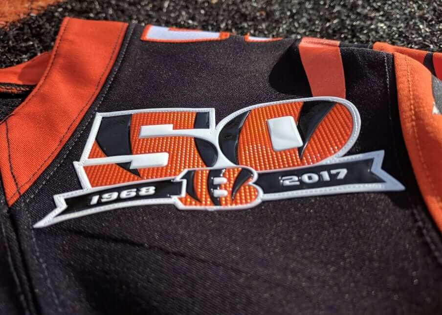
This fall will mark the start of the Bengals’ 50th season, and yesterday the team announced a series of moves to mark that milestone, including a new jersey patch.
The interesting thing, as you can see above, is that the patch isn’t embroidered. I’m not sure if it’s Chromaflex or some other newfangled process (I’m trying to find out). For now, let’s just call it plastic.
These plastic patches have been knocking around the uni-verse for a few years now. The leagues clearly like them, not only because they seem high-tech but also because they’re harder to counterfeit. They’ve mostly been used for postseason logos (the Super Bowl, the World Series, the MLB playoffs, etc.) or for other special occasions (like the team logos on this year’s MLB Independence Day caps). But I think this may be the first time a Big Four team has gone the plastic route for a basic commemorative patch. And that raises a question: Are embroidered patches on the way out? And if so, is that a good thing or a bad thing?
It probably won’t surprise you to hear that I’m a big fan of traditional embroidery. But I can also see that plastic patches offer some advantages, primarily because they can reproduce small details more faithfully. Having had a bit of experience with patches myself, I know first-hand that embroidery can be tricky. And even if you’ve never designed or produced a patch, we’ve all had that experience of seeing a flat-color jpg of a great-looking patch design and then being a bit underwhelmed by the embroidered version. Take, for example, the patch that the Braves are wearing this season to mark the opening of their new ballpark (for both images, you can click to enlarge):
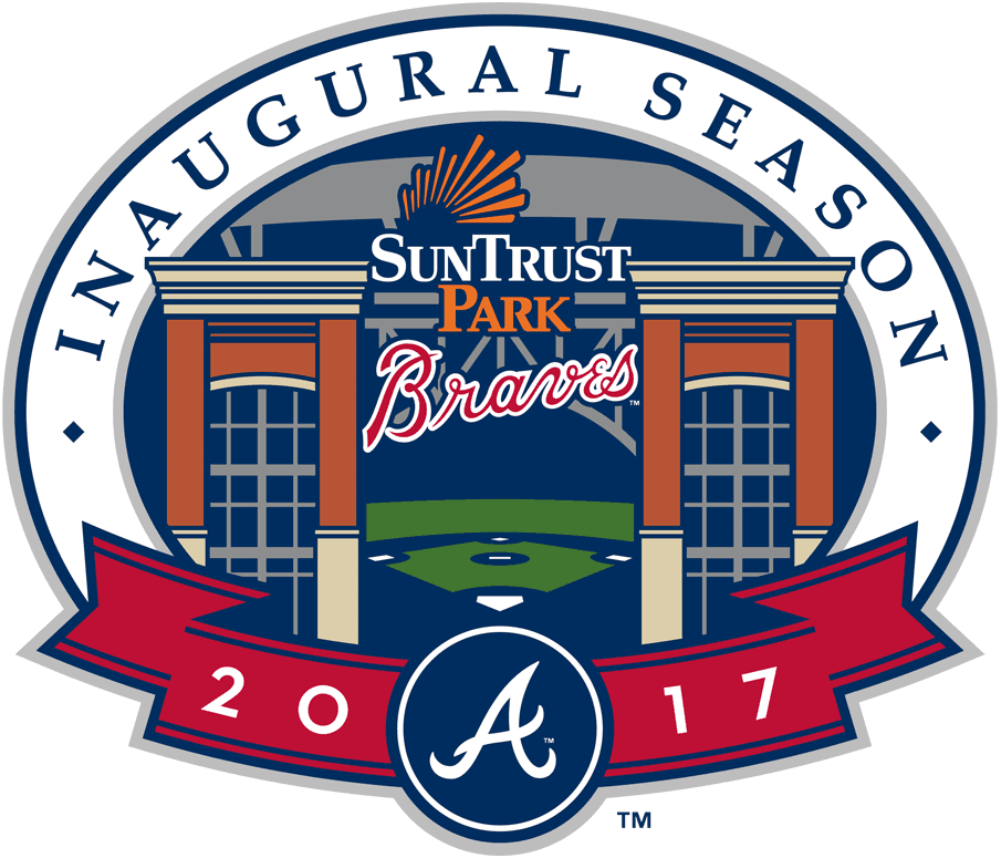
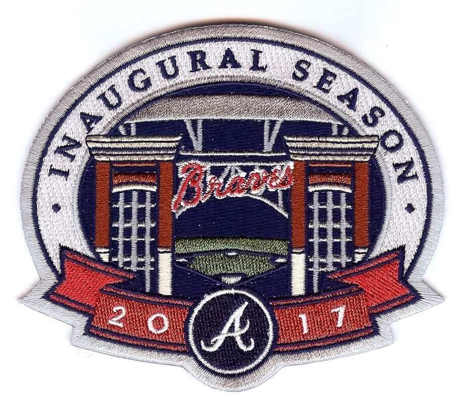
Leaving aside the fact that the embroidered version doesn’t include the ballpark’s name (that’s due to MLB’s longstanding prohibition on corporate advertising on uniforms), it’s pretty obvious that certain aspects of the digital design didn’t translate particularly well to the embroidered version — most notably the Braves’ own script! I’m pretty certain that would have looked better if the patch had been rendered in plastic.
Longtime Uni Watch pal/ally Todd Radom has designed many a patch over the course of his design career, so I asked him about this. His response:
I always design with the “Will it embroider?” question firmly in mind. I’ve never been tasked with an assignment knowing that the most visible application of it would be in plastic, at least not yet. Even if I knew that the patch would be plastic, sleeve patch logos are utilized extensively across all kinds of other stuff, so it wouldn’t necessarily affect my design.
Seems to me that there are varying levels of execution here, much like embroidery. I generally like the Super Bowl patches — the design decisions that involve texture and use of lines can enhance the overall look if done well. Lighting matters, as witnessed by what the World Series patches looked like in the dim lights of an illuminated Wrigley Field, as opposed to what these might look like during a day game (or indoors).
All very interesting, and something to keep in mind as the embroidery-vs.-plastic situation plays out in the months and years to come.
Meanwhile: I find it disappointing that the Bengals are celebrating an ordinal instead of an anniversary. Look at the dates on the patch — 1968 and 2017. So unsatisfying! Would’ve been better if they’d waited to do a proper anniversary patch in 2018.
ESPN reminder: My latest ESPN column, which went up yesterday, looks at various reader-submitted proposals to redesign the Raiders.
The Ticker
By Paul

’Skins Watch: In Virginia, where ’Skins owner Daniel Snyder wants to build a new stadium, two candidates running for the state’s Democratic gubernatorial nomination both oppose the team’s name (from Tommy Turner). … Student leaders at San Diego State have narrowly voted to keep the school’s “Aztecs” team name. There had been a movement to change it because it was viewed by some as being culturally insensitive. If the motion had passed, it would only have been a non-binding recommendation that would have been passed along to the school’s administration, which has resisted previous efforts to change the name (from Daron Nowak).

Baseball News: Red Sox P Chris Sale, who famously took a pair of scissors to a throwback uniform last summer, now appears to have cut a small notch in the back of his cap (great spot by Kyle Barber). … New ALS-awareness uniforms for NC State. Note that the “Strikeout ALS” NOB is grammatically incorrect, because “strikeout” (one word) is a noun, not a verb. The proper form would be “Strike Out ALS” (from James Gilbert). … The Twins are showing their players wearing civvies on their scoreboard this season (from Peter Burns). … The Pirates had planned to do a Starling Marte replica jersey giveaway in July, but that promotion has been scrapped in the wake of Marte’s PED suspension (thanks, Phil). … Earlier this week we Ticker-mentioned that the St. Paul Saints are changing their name to the Duck Duck Grey Ducks later this season. Here’s an article with mockups of the other finalists for the name change contest (from Michael Blomquist). … The Nationals are providing uniforms to DC-area Little League teams. … As an aside, that last item refers to the new unis as “new digs.” I see that usage semi-frequently and don’t understand it. “Digs” is slang for a place to live. I think the slang term for clothing that people mean to be using — but for some reason aren’t using — is “duds.” … Padres players Ryan Buchter and Hunter Renfroe wore team jerseys while serving as baggage handlers at the airport yesterday. Some of the baggage must have belonged to SDSU lacrosse players, because that video includes a shot of Buchter trying on a lacrosse helmet (from Jared Buccola). … Here’s the uniform that the Albuquerque Isotopes will be wearing later this season when they become the Albuquerque Green Chile Cheeseburgers for a day. Additional info here (from Rob Montoya). … New pink anti-cancer uniforms for Northwestern State softball. … The Rangers tweeted this photo of baseballs at their ballpark. But if you look closely, you can see that some of the balls have the Mariners’ 40th-anniversary logo. “Might have been left over from the last trip,” says Drew Solka). … They showed a close-up of Phillies INF Andres Blanco’s personalized bat knob decal during SNY’s Phils/Mets broadcast last night. “Gary [Cohen] and Ron [Darling] then mentioned the Billy Ripken ‘Fuck Face’ incident,” says Dave Rakowski. … Pretty funny backwards jerseys last night for the Fresno Grizzlies. … If you watch this video clip, you’ll see a Nike maker’s mark in an unusual place: on the brim of the cap (from Zachary Loesl). … Yesterday’s Ticker had a photo of Copa Airlines plane with an MLB logo as part of its livery. Trent Guyer points out that this is because Copa is MLB’s official airline for Latin America and Canada.

NFL News: Here’s an old shot of Eagles QB Ron Jaworski with a badly off-center NOB. … The investigators who tracked down Tom Brady’s Super Bowl jersey also recovered Broncos LB Von Miller’s helmet from Super Bowl 50. … Giants QB Eli Manning angrily denied recent allegations that he provided fraudulent “game-used” gear to a memorabilia dealer. … Lots of great old NFL posters, ads, and other visuals on this Pinterest page. That sound you just heard in the background was Brinke Guthrie drooling. … Here’s this year’s Thursday-night NFL schedule, which was released yesterday. I haven’t had sufficient time or masochism to map out what the Color Rash pairings will be, but I’m sure someone out there is already taking care of that, yes? … The Lions’ sideline mascot, Roary, has made his first appearance in the team’s new home uniform (from @dmoon).

NBA News: With Carmelo Anthony’s days as a Knick apparently numbered, SI imagined what he might look like as a Piston. But the photo they chose to Photoshop was from a game when he was playing against the Pistons, so the resulting image was Pistons vs. Pistons (from Austin Fowler). … Here’s a time-lapse of the giveaway T-shirts being laid out at the Pacers’ arena (from @tasty_magic). … And here’s a similar time-lapse for the Grizzlies’ rally towels (from Kendall Cruse). … The Bucks wore their black alts and used their alternate court design for last night’s playoff game against the Raptors. And although there’s no time-lapse, here are the T-shirts they gave out. … Down in Mobile, Ala., there’s a landscaping company called Laker Man. They use the Lakers’ logo, and the guy in that photo is even wearing a Lakers cap! (From Stephen Rains.) … The Wizards’ stars/stripes uniforms, which they’re wearing for home playoff games, are sold out, so fans can’t buy them during the playoff run (from Craig Kirkpatrick).

Soccer News: A Korean team, Gangwon FC, has a ski jump at one end of its stadium, thanks to the Pyeongchang Olympics (from Saurel Jean Jr.).

Grab Bag: Back in December, American Airlines flight attendants said that their new uniforms were causing bad skin reactions. Now AA’s pilots are saying the same thing about their new uniforms. … New 45th-annivesary logo for the World Wide Fund for Nature Malaysia. … Long Beach, Cal., has updated its city signage with a more user-friendly design (from Andy Garms). … Star Trek bathing suits? Sure, why not. … More “family friendly” uniforms on the way for Hooters (thanks, Phil). … Here’s an interview with the designer who created Air Canada’s new black-centric livery (from Edward Hahn). … Police uniforms in Wichita, which had been khaki, are changing to blue. … Duquesne athletics is switching from Adidas to Nike. … A Chinese court has fined Puma about $420,000 for creating a “Year of the Goat” logo that infringed on the trademark of a Chinese company (from @GKG_77).
Paul, your lede is also a NFL ticker item. Not sure if you meant that to happen or not
Fixed.
Duquesne got new unis
Sorry didn’t read grabag
Just a heads up, and no pics at the moment, but I saw a Nationals BP (I believe, may have been fashion) hat at a retail store with a plastic W logo. It was the Diamond Era fabric that they’ve been using for BP. Not sure if it was a manufacturing mistake or the Nats will be going with that for BP this year. My apologies if this was covered before.
Update, found a link to the exact hat I saw:
link
Interesting that the sales listing says the logo is “embroidered,” when it clearly is not!
Are/were any of the Chromaflex labels on any of the teams sown on?
The plastic jersey patches are all sewn on. Look again at the photo at the top of this page and you’ll see that the Bengals’ patch is sewn on too.
No idea about caps, though.
I can confirm that the cap “patch” is indeed sewn on. Honestly in person with the shape of the crown and the emblem, it looked like someone tried to combine a cap and a replica batting helmet.
My White Soc BP cap had a chromaflex St. pattys patch and I removed it by setting my oven to its lowest setting(150F) and baking it for a couple of minutes. Came right off. Otherwise leave it in your car on a hit, sunny day.
A great example of how not to do plastic cap logos. The red “background” around the white curly W and its navy outline makes it look like a patch tacked on in the roughest possible way. If it were just the logo itself – like the 3D batting helmet logos some teams are using – I think it could look terrific.
Minor quibble: In the baseball section, you refer to a lacrosse mask. They’re helmets. (Even though he was trying on a goalie helmet)
Thanks for setting me straight on that. Now fixed.
Line 1 typo: “Begnals'” should be “Bengals'” instead.
Ay-yi-yi. Can you guess who’s been dealing with insomnia lately?
Fixed.
“strikeout” (one word) is a noun, not a verb. The proper form would be “Strike Out ALS”
11th commandment: That shalt not use a play on words on a sports uniform. So let it be written……
I excommunicate your heretical 11th Commandment. The Minnesota Twins have been underlining the “win” inside their name on their jerseys for decades. And both the Texas Rangers and the Buffalo Bills have existed for longer than many fans have been alive. Wordplay and puns have an honored place in sports uniformery!
. . . not to mention the infamous Macon Whoopies
And the Macon Trax…
from the backwards jersey article….
” the Grizzlies wore their jerseys as the Kriss Kross band used to wear…”
The Kriss Kross band?? The? Band??
Infuriating!
“Ladies and Gentlemen, The Led Zeppelin!”
yeah, that went over about as well as a lead balloon
The “Cool Ghoul” John Zacherle had a DJ gig with New York’s WPLJ in the 1970s, and was in the habit of adding an unnecessary article; “The Pink Floyd”,”The Deep Purple”,”The Three Dog Night”, and the aforementioned zeppelin-themed combo.
FWIW, Pink Floyd actually did start out calling themselves “The Pink Floyd” early in their career.
The Smashing Pumpkins were originally just “Smashing Pumpkins”. They added the “The” to their name around the height of their fame simply because that’s what everyone called them.
That’s quite a transformation … to become the thing that you originally smashed. Ha!
They went from an activity to a adjective assisted definite article!
Typo: Ski jump in one end of soccer stadium is for the Winter Olympics in PYEONGCHANG next year.
The two times I went to Hooters–one time in Baltimore, the other time in Manhattan–my server wore a sleeved uniform. You can’t get more “family-friendly” than that!
Fixed!
The winter Olympics next year are styled as Pyeongchang.
Interesting that the Saint Paul Saints will be the home team, but are wearing gray for that Duck Duck Gray Ducks promotion, while the visiting Cleburne Railroaders will be wearing white as the Duck Duck Goose. It makes sense that the gray ducks would wear gray, but when was the last game that had a hinge team in gray and a road team in white?
Also, interesting to note that they are not using the plural “Geese”.
April 18, 2013 at Coors Field. The Colorado Rockies were throwing back to their very first game in 1993 against the New York Mets. The game in ’93 was played at Shea Stadium so the throwback game featured the home team Rockies in road grey and the visiting Mets in their 1993 hone pinstripes. It was the second game of a doubleheader played in cold, snowy Coors Field. I damn near froze my ass off at the game which was compounded by the Metsies losing, in large part, on a throwing error by Reuben Tejada.
Obviously that was supposed to say “home”, not hinge.
Happened in May of 2013 in Minneapolis, when the Twins and Brewers link. It was supposed to be the same throwbacks for a home-and-home, but for some reason the second game at Miller Park was dropped early on.
I find it amazing how a team that is worth hundreds of millions of $$$ can not find or use the best embroidery maker to make a patch. Anyway the chromoflex or whatever cheapens the look.
I hear this a lot — ChromaFlex and other plastic patches look “cheap.” They’re actually much more expensive!
I’m neither defending nor decrying the plastic patches. Just making an observation regarding the “cheap” commentary.
Folks around Cincinnati have already started mocking the plastic patch as being cheap. Whether it’s cheaper than embroidery or not, it looks like it and fits with the Browns’ modus operandi
See my response to previous comment.
MLS has been using these plastic patches as the team crests for two seasons now. Comparing them to previous patches they seem to be much lighter and more flexible.
I am surprised it wasn’t noted in the ticker item that the Twins players are wearing civvies as part of an advertisement, effectively turning the scoreboard into a catalog page.
Came to comment on the same thing. Never let an opportunity to sell more advertising for to waste!
Twins in civvies not new this year. They also did so last year. I don’t mind it – makes players more relatable I think. But, yeah it’s an ad…they never miss an opportunity to make a buck.
Not sure if this was reported before: While watching the Canadiens playoff game last night I noticed that the small NHL logo on the front of their jerseys says LHN which I assume i the French version of NHL.
Yes, they began wearing that at the start of the 2015-16 season.
It’s like those French have a different word for EVERYTHING.
The Rangers vs. Canadiens is a great looking series uniform wise.
You can’t beat original six teams squaring off. If they could go blue vs. red it’d be the best ever.
In regard to the anniversary patches-An argument I have been involved in: A birthday celebration can only be on the day you were born. A birthday “anniversary” party is what most people hold usually around the date of your birth. Silver, gold, etc wedding anniversaries could be used for birthdays-your 50th would be great if it was gold themed. Instead of black balloons, black crepe, and the ubiquitous “over the hill” banner. Imagine a 50th wedding anniversaries with the sentiment “it’s over”. Just wondering.
The first distinction makes no sense to me. If anything, an anniversary must be on the date itself; a celebration would be what you hold at some more convenient nearby date. We often celebrate things not on the day on which they happen; sports championships, for example, are often celebrated with a parade or a gathering many days after the title-winning game. A celebration can be delayed or extended, whereas an anniversary is an anniversary. Today is not the tenth anniversary of something that happened on April 18, 2007, but it would be perfectly normal to celebrate the ten-year span since that thing today, if it was more convenient to do so on a Friday than on a Tuesday.
Interesting point on the distinction between how we observe anniversaries versus birthdays. Perhaps it’s because we regard anniversaries as marking a discrete moment when something happened or began, whereas we regard birthdays as marking duration and an in-the-present characteristic of a person who lives. That is, my wedding anniversary is a thing external to me, an object, whereas my birthday marks my age, something internal to me, a subject. Also, as tired and cliche as “over the hill” decorations are, in my experience they’re usually done tongue-in-cheek, in good cheer, and amount to a joke, generally at the expense of all the people of similar age, not just the celebrant. Also, they’re literally true: The meaning of the “hill” metaphor is that one is nearer the end of the journey than the beginning, and for the vast majority of people, this is a true fact of one’s life by age 50. A fact one may rue or regret, and so making light of it is a normal, indeed probably healthy, way to cope with awareness of one’s mortality. Whereas making similar claims on a wedding anniversary wouldn’t have any obvious similar therapeutic benefits.
I think what Rick is saying is your birthday is the day you were born, and each year you celebrate the anniversary of your birthday. Technically he is correct but I’m not sure it’s something really worth arguing for when the alternate is so universally accepted. You’d probably also be labelled as “you’re probably not very fun at parties.” (Especially birthday parties.)
All of the color rush games look like they will not have to do the white uniforms like they did last year except for the Bills and Jets. I don’t know why they scheduled that for Thursday night football for the 3rd straight year if they know about the color blind problem with it.
They didn’t have to use white uniforms for most of the games last year either, but they still did it, because traditionalism or something. The freakin Packers wore white at home because apparently making a yellow jersey to wear with their normal pants & helmet was just too difficult of a concept.
Seeing the Lions mascot with actual Lions cheerleaders (instead of majorettes and H.S. cheer teams like back in the Silverdome) makes me wish the McCaskeys could get with the times and bring back the Honey Bears.
Hey, I liked seeing the high school cheerleaders on the sidelines at the Silverdome. I thought it was a kind of community outreach or goodwill gesture on the part of the Lions’ ownership at the time. On the other hand, those were the days of the older Lions mascot costume, which was on a par wither the Bears’ mascot costume back then.
I always thought the Bucs or Browns were the worst NFL uniforms.
Jags are in the discussion, too.
Kinda depends on what mood I’m in on a given day.
Falcons and it isn’t close
Jags. Hands down. Especially considering how good they once looked. Tragic.
Jags are the worst because of their helmet. Browns are a close second.
Broncos home uniforms. Thus it shall be until they at least bring back the old helmet.
The Bengals’ uniforms have serious shortcomings but aren’t close to the worst. It’s hard to past the Broncos due to the spacesuit precedent they set and the fact that the all-blues are among the ugliest uniforms in sports history, but now that they’ve moved to orange, I’d entertain a conversation of any other team going with the high-school dark monochrome look. (The Bengals do this sometimes, but it’s safe to assume Paul wasn’t referring to that specific putrid look.)
That said, the patch is truly hideous, and I’ll share those thoughts below.
Spoiler: The patch sucks because the Bengals have the worst logo in the league.
When is the movement for banning the nickname Canadians from the Montreal Hockey Team going to begin?
It will begin as soon as someone comes up with a good argument for why “Canadiens” is a problematic team name.
I have never heard such an argument myself. Would you like to offer your critique of the name and thereby add to a constructive dialogue?
Or are you just here to troll?
because an a non-canadian I’m offended by it. They should be known as what they truly are. North-North Dakotans.
He would have bee better off going after the Canucks in this case but neither are a RACIST term, since Canadians aren’t a race.
As Paul pointed out as well, the Montreal hockey team are the Canadiens, with an ‘e’.
Unsuccessful troll is unsuccessful.
*been
Don’t think most Canadians think of ‘canuck’ as a negative term or nickname.
You’d be much more like getting Canadians using ‘yankee’ in a more negative connotation in regards to Americans (and I suspect many in the U.S. south towards the U.S. north).
[I am disregarding how people feel about the Vancouver NHL team and that particular New York MLB team in the above]
Again with the Jets and the Bills on Color Cash Night. As much as I dislike seeing white at home (and thus not seeing the proper green-over-white home uniform), I’d rather the Jets wear the all-whites they rolled out last year against the Bills in red, than revisit the all-kelly-greens from 2015 with the Bills in white.
I don’t think all-blue vs. all-green would look any better, or be any better for colorblind viewers, than green vs. red.
Blue/green colorblindness is much less common than red/green. It still wouldn’t look great with the same color sock garbage, but there’d be less complaints. Of course, the easy solution to keep it color vs color is to either dump the one shell rule so one of them can wear a throwback colored helmet, or stop forcing the monochrome and have one team in white pants. Or both. The Jets in head to toe green with the Bills wearing white/blue/white would be perfectly fine.
Late in his career, former Indians pitcher Charles Nagy started to snip the side of his cap…
link
It doesn’t look like the habit has carried over to his career as a pitching coach…
link
link
Wow — never knew that! Great player-specific detail!!
You have the Nationals providing uniforms to Little Leagus in DC. The Pirates did the same to at least one Little League, with Dick’s sponsorship.. Brighton Heights. The held a “pre-season” dinner at PNC Park with Steve Blass and the Pierogies.
The Padres also provide uniforms to local Little Leagues. I wrote about it for ESPN back in 2012:
link
All teams should do this. Aside from being a nice gesture, it’s a smart way to build your future fan base. If you outfit a bunch of 10-year-olds in Padres uniforms, they’ll be all the more likely to grow up as Padres fans.
I really don’t know about that.
For one, how would a team like the Tigers do it without looking silly? You can outfit a group of teams easily when you’ve got multiple uniforms to pick from. When you’ve worn nearly the same thing for 80 years… not so much. Maybe they could pay for the uniforms, but not have them be authentic designs? (But then it’s not as cool and doesn’t really work as a marketing thing, does it?) Secondly, if the kids are already in San Diego, they’re likely to be Padres fans by default. I doubt that you’re going to gain a lot there. However, as little league can be just a little bit less fun when you’re on a team that loses a lot, some kids may actually grow to dislike that Padres uniform and, should they continue to follow baseball, actually root *against* the Padres because of their negative experience.
Don’t get me wrong, it’s not a bad thing for them to do, but I really wouldn’t try to bank on future fandom with it.
Back in the 70s, my little league team was the Phillies. I was then, and am still now, a Yankees fan, but the Phillies are still my favorite NL team to this day. Pete Rose going to the Phillies didn’t hurt either.
Wait, the Albuquerque Isotopes are a real team?! I thought they just existed on The Simpsons!
The Albuquerque Isotopes adopted that name after the Simpsons episode in which the Springfield Isotopes were going to move to Albuquerque.
Don’t see anything “culturally insensitive” about the SDSU name or logo. It was the Spaniards, not the USA, which destroyed the Aztecs. This is far removed from the Chief Wahoo conversation.
Given the USA didn’t exist at the time, kind of a specious argument. I don’t think it’s really relevant who the destroying party happened to be. I think the key is whether or not you consider Aztec to be a viable ethnicity, or a name from antiquity like the Spartans, Trojans. You don’t hear anyone claiming to be ethnically or racially “Spartan”, but it may be a possibility with groups indigenous to the western hemisphere, as that is a much more recent historical set of events. If you do consider them to be a viable ethnicity, then that makes it more like the Fightin’ Sioux. You might even stretch it to include the Fightin’ Irish. (Just my opinion).
I’m actually curious as to what anyone remembers about the discussion that went on when Syracuse changed their name from the Orangemen to the Orange. Was that primarily a gender issue or does that have a religious element given the original meanings of Orangemen?
Winter, it’s not a specious argument, because SDSU has nothing to do with the destruction of the Aztecs. It’s clearly a name from antiquity like the Spartans. No one complaining about this issue can prove they are descendants of the Aztecs.
Regarding the Orangeman, that was a gender/political correctness issue.
I have a Super Bowl XLIX authentic patch (Chromaflex) and I do love the detail on the patches. In an HD/4K world, these details are easier to pick out. With that said it makes it very hard to find the correct patch if you are into collecting authentic memorabilia. I spent way more than I’d like to admit on that patch because it’s rare.
I understand the “Skins” name and “Chief Wahoo” being insensitive or downright offensive. However honoring a past civilization of the Aztecs seems similar to honoring the Spartans and Trojans. It’s been centuries since the Aztecs. Someone can say they are decendants of the Aztecs the same way someone could be ancestors to the Spartans.
Thoughts on the Bengals patch. It’s hideous, mostly because it’s based on the Bengals’ hideous B logo and hideous custom typeface.
It’s also interesting to see a numeral-based patch with a different typeface than the jersey numeral. I’m sure this happens all the time, but I think I noticed it because A) it was revealed on a No. 50 jersey, so the contrast was pronounced, and B) it’s in the hideous custom typeface.
I have no problem going with the 50th season instead of the 50th anniversary, but if they were going to do that, they should have included the “th season” on the patch. It’s weird without it.
I used to love looking thru the MLB ticker; now I just skim it and rarely look at the links. All of the alternative unis and caps and special looks have worn me out. I love the site and will continue to visit, but for me what was once special is no longer unique as every team seems to want to out- do others in its attempt to be cute and clever and, of course, sell more stuff.
If you find it exhausting/depressing to read much of what’s in the Ticker, imagine what it’s like to *compile* it. ;)
I feel your pain. I am uninterested in which minor league team will name themselves after food next.
I am hopeful in a future trend when minor league teams go back to their great nicknames from the past that they shelved for cutesy ones. A reversal of trends. In Triple A alone, I miss the El Paso Diablos, New Orleans Zephyrs, Albuquerque Dukes.
When I was a young guy, I was really into collecting minor league caps. They were fairly uncommon, unique, and sported interesting design ideas. Now, they’re all overly busy, and they all look the same. And definitely aren’t something a grown man would want to wear.
At the top of he Pinterest posters, the “NFL Greats” with full helmet logos, but the Chargers jersey is bolt-less.
And, as you look at the posters you get pumped up. The Oilers have a fast rusher. The Bears have a strong pass rush. The Steelers have a quarterback and a receiver. What is the strength of the poster for my Bills? Getting sacked. Just beautiful.
I’m very late to the discussion, admitted.
Is the Bengals the worst uniform in the NFL? When did “we” establish that?!
Dont the ‘Bucs offend “us” on all levels? Isn’t Cleveland’s latest attempt just an obnoxious assault to the senses?
I strongly object to the phrasing of the lede.