It’s been the most compelling storyline of the past week: A landmark legislative proposal emerges out of Washington with the potential to reshape American life, both sides brace for a titanic vote — and then the proposal is pulled at the last minute because the legislation’s sponsors conclude that they don’t have enough votes.
I’m referring to, of course, the Washington NFL team’s proposal to allow teams to opt out of wearing Color Rash uniforms for Thursday-night games. NFL owners were set to vote on that yesterday, but several media outlets reported that Washington withdrew the proposal because it didn’t have enough support. At least one other owner — John Mara of the Giants — would have voted in favor of it, but it’s not clear who else would have done so. (Rumors that the proposal was torpedoed by a small cadre of hardline owners who want to do away with Color Rash altogether, and who referred to the opt-out idea as “Color Rash 2.0,” are almost completely untrue. Paul Ryan could not be reached for comment.)
As for the Eagles’ proposal to allow teams to have an alternate helmet, thereby effectively killing the one-shell rule, that one never came to a vote either. According to this NJ.com story, the proposal “was withdrawn after [team owner Jeffrey] Lurie was told it would not pass.”
But the people who speculated that the Eagles’ proposal might indicate the team’s desire to revive their kelly green throwbacks turned out to be correct. That same article included the following:
Lurie did not hold back when asked about adding a kelly green uniform to the team’s wardrobe.
“We’re going to keep at it,” Lurie said. “We’re determined.”
Could a permanent change be coming, from the team’s midnight green to the throwback kelly green they last wore in 1996?
“First I want to try it as an alternate,” Lurie said. “Try it for two or three games. See if people like it. That was the goal, to try to make that happen.”
Too bad about the kellys. But the worst part is that they didn’t even bother to have a vote. Why not go ahead and see where each organization stands? Like, were they worried about a filibuster or what?
(My thanks to Uni Watch’s own majority whip, Phil Hecken, for sending me the news about the NFL votes.)
Click to enlarge
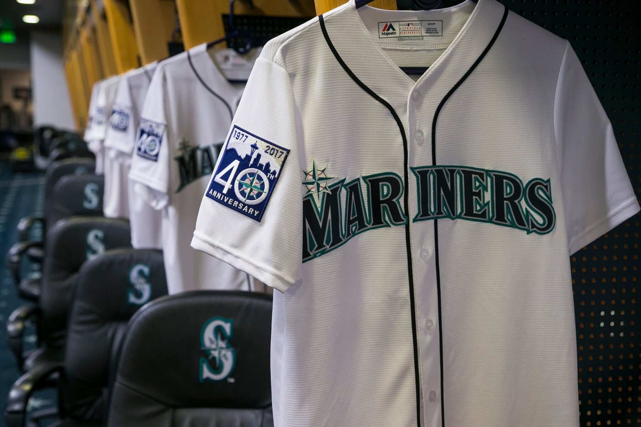
Play ball! It’s one of my favorite days of the year, people: the day we publish the Uni Watch MLB Season Preview, now in its 19th annual edition, featuring a comprehensive rundown of all of this season’s uniform changes (well, at least the ones that I’m allowed to talk about). That includes the Mariners’ new 40th-anniversary sleeve patch, shown above. They’ll also be wearing a cap patch for their home opener on April 10, but not for the rest of the season.
Check out the full MLB preview here.
Contest reminder: In case you missed it yesterday, my latest ESPN design challenge is to redesign the Raiders for their move to Las Vegas. Full details here.
T-Shirt reminder: In case you missed it yesterday, our latest limited-edition T-shirt in the Uni Watch Artist’s Series is by the great Larry Torrez (aka Eltee of DC). In the spirit of his Meatscots caricature series, he’s imagined a fictitious Japanese baseball team called the Kyoto Yakitori, whose mascot is a baseball-playing samurai with a sword that serves as a baseball bat and as a yakitori chicken kebab skewer (click to enlarge):
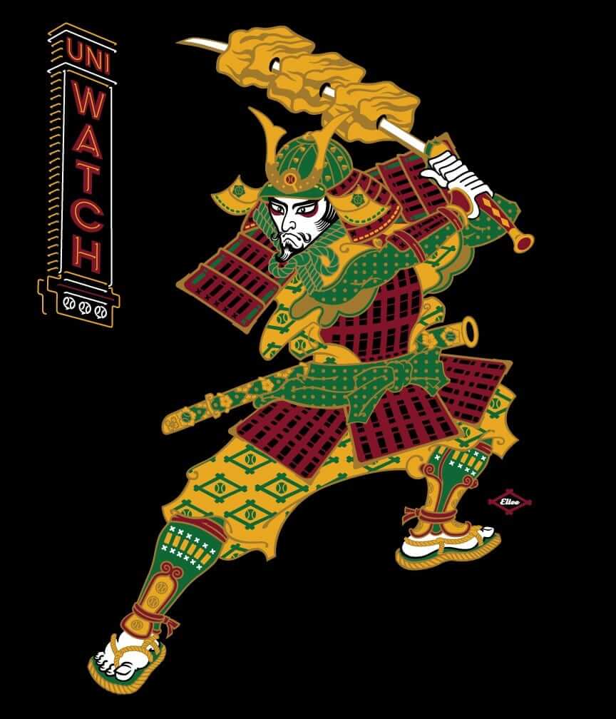
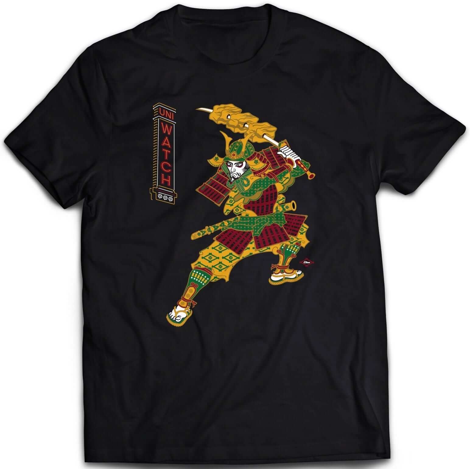
It’s available in three different black short-sleeve options (two of which come in sizes up to 5XL) and one long-sleeve option (up to 5XL). Plus I’ve also made the design available as a sticker. Haven’t done that before with any of our T-shirt designs — let’s see how that goes.
Some of you have also asked why I’m okay with this design if I have issues with Native American-based sports designs. That’s a perfectly valid question, and I’ve created a separate page to address it. Look here.
The shirt is available here through next Thursday, April 6. My thanks, as always, for your consideration.
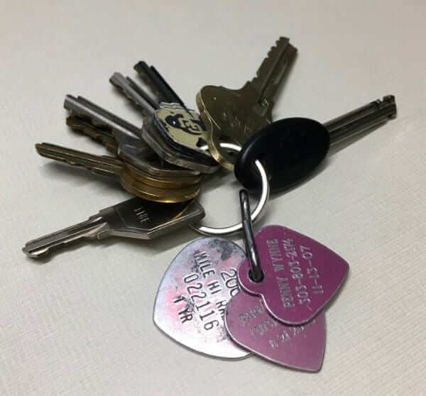
KRC update: The latest installment of Key Ring Chronicles is about a guy who has the tags from three cherished pets on his key ring. Check it out here.
Incidentally, I am very much in the market for new KRC content. If you have a special item on your key ring with a good story behind it, please get in touch. Thanks.
The Ticker
By Alex Hider

Baseball News: Red Sox P Joe Kelly, who usually wears No. 56, was wearing a NNOB No. 80 jersey for yesterday’s spring training game. His uniform apparently didn’t make the trip (from Brian Dankese). … Here’s a list of the new features at Nationals Park this season (from Tommy Turner). … Remember Precious Moments figurines? They’ve made a series commemorating the Cubs World Series win (from Chris Viel). … Burrill Strong found this old Tigers pennant in his Dad’s office. … If the designers of this pack of tissues were trying to make the packaging look like a Yankees jersey, they got it wrong. They used the cap version of the logo (from Anthony Nuccio). … These are Scranton Wilkes-Barre RailRaiders batting practice caps for this season (from Mike Slesinski). … Arizona State wore Barry Bonds-era throwbacks yesterday (from Joe Farris). … LSU wore throwback uniforms last night (from Sean Vanderbrook). … Alexandria High School in Alabama has some pretty slick Orioles-inspired unis (from Phillip Tutor).

Pro and College Football News: Check out the FIOB nameplate on former Bronco Jim Turner’s 1972 jersey: It appears they had to hastily add the “J” after another Turner was added to the team (from @BroncosQBClub). … The Chargers are giving a free Philip Rivers jersey to all season ticket-holders (from Brinke). … James Gilbert noticed an error in a display in at North Carolina’s football facility ”” the decal is on the wrong side of the helmet.

Hockey News: The Wild will wear North Stars jerseys during pregame warm-ups before their regular season home finale against the Hurricanes on April 4. … Nick Jones caught ESPN using an old Maple Leafs logo in one of its stories. … This logo mocked up for a story in The Onion looks suspiciously like the Blue Jackets’ logo (from Kevin Pedigo). … Check out these classic North Dakota hockey programs from the 1950s and ’60s (from Greg Enkers). … When the Sabres played the Rangers at MSG in their first game after the Sept. 11 attacks, Buffalo expressed solidarity with NYC by wearing jerseys with Rangers-style “New York” lettering. A fan was wearing one of those jerseys at last night’s Sabres/Blue Jackets game in Columbus. Were those ever offered at retail? If not, it’s possible that the fan was wearing one of the gamers that were auctioned off for charity back in 2001 (from Joe Pitzonka).

NBA News: The Wizards will wear their stars and stripes unis at home during the playoffs this season. … Michael Kidd Gilchrist, a Kentucky alum, lost a bet with North Carolina alum Marvin Williams over Sunday’s game, and had to wear a Tar Heels varsity jacket (from James Gilbert).

College Hoops News: Here’s a story behind the guy who wrote the CBS March Madness theme ”” you know, that song that’s been stuck in your head for the last two weeks (from Gabe Oppenheim). … Cutting down the net after winning the national championship can be a risky operation. … Sometimes, moms force you to get creative (from Kevin Pedigo).

Grab Bag: This story about the Raiders moving to Vegas shows a guy wearing a hat and shirt with what appears to be a modified old Columbus Crew uniform (from James Walker). … NASCAR driver William Byron visited the officers for Axalta ”” a company that paints some stock cars ”” and received a branded football helmet (from Dell Michaels).
There must be more to this “one-shell” rule we don’t know about, because it’s lunacy that the NFL insists on it. The Eagles equipment guy even said that players wear multiple helmets throughout the course of the season anyways. Just doesn’t make sense, but we shouldn’t be surprised that the NFL does something in contrast of making sense.
It is a travesty of justice that the NFL has 32 teams and not one of them wears a kelly green helmet. This ridiculousness must end!
It’s a means of mitigating future liability, viz., the NFL can say that it made an effort to address head injuries.
You’re asking for “sense” out of Goddell and the NFL?
The MLB preview is up:
link
From your column …
“Nothing new has been announced for the Rays, but word through the grapevine is that they will likely be reviving the road version of their fauxbacks — a design that was previously worn for a 2014 game against the Cubs at Wrigley Field — for a game this August. No word yet on the exact date or opponent”
I think you provide the answer to the last sentence in the Cleveland section of your column:
“Also: According to an exchange in this Q&A column, Cleveland will be breaking out the red blood-clot throwbacks on Aug. 12.”
The Indians visit the Rays on Aug. 12.
That will be the matchup of the year!
The Diamondbacks got it backwards…they should’ve made their numbers lighter instead of the NOB.
Rockies – I like the new purple.
Pirates – nice alternate cap. Wish the jersey matched it.
Padres – you continue to be dead to me. If you’re not going brown, then the wrong team left town.
Giants – major upgrade with the black jersey.
Long live single-digit pitchers!
Padres — you continue to be dead to me. If you’re not going brown, then the wrong team left town.
You are not only a poet, but also extremely sage.
I agree re: the new Pirates cap–though the cynic in me has a feeling that their and the Reds’ scrapping of the camo versions has something to do with the New Era logo showing up better
But from the right side, it’s pretty darn fresh
No idea what Lurie is up to. Agree that he should have just let it stand for a vote. And his whole “let’s go Kelly green as an alt on a trial basis” makes no sense either. Safe to say the vast majority of the fans want the Kelly green back. Unless he and Nike are looking to do something outlandish, no need for a trial run. And, as it’s been 22 years since they changed primary colors and uniforms, the 5 year rule doesn’t matter. Just send a letter to NFL HQ within the proper time frame and voila, Kelly green.
My guess is that it involves other members of the ownership group. It has been stated that while Jeff’s (now ex) wife has say, Kelly green isn’t returning. So, she may still have enough power to veto Kelly Green outright (I have no idea about the power structure of the Eagles ownership group) But, could be open to testing how well a Kelly Green jersey would sell.
““First I want to try it as an alternate,” Lurie said. “Try it for two or three games. See if people like it.”
Where has Lurie been living? Is he that tone deaf? People have been screaming for the Eagles to go back to kelly green since the moment they introduced the midnight green.
My guess is those comments are more to others within the ownership group than to the fans. Lurie’s ex-wife has famously hated the Kelly Green, and last I checked she was still in the ownership group.
Proofreading:
“Haven’t done that before with any of out T-shirt designs”
Fixed.
Best Key Ring Chronicles I have read yet. Such a loving/great idea
Agreed. I teared up at the thought of putting my dogs tag on my key ring.
Matte batting helmets for the Marlins? What an ugly decision. I like matte helmets in general, but it doesn’t work for every team. The only good thing about the Marlins uniform is the Miami-like brightness of their accent colors. The gloss shine on the helmet accentuates that; a mate finish deadens it. If the Marlins used black as an accent and bright colors as the primary element in their uniforms – say, orange or light blue caps and helmets – then a matte finish would help tame an otherwise too-bright look.
Nothing official that I know of in terms of announced changes, but the Brewers 2017 promotional graphics have been pushing the navy and yellow color scheme of their 2016 alternates. Also deemphasizing the barley-M cap. Several print and web graphics I’ve seen, including the team’s pocket schedule, have altered the colors in player photos to make the normal navy-and-metallic-gold uniforms elements appear to be navy-and-yellow. I’ve also seen several instances of player photos cropped to partially or completely obscure the barley-M logo.
Noooooo! Why can’t the Brewers give up on the old. The barley M uniforms are great. I’m glad it’s Friday games when they insist on wearing the 80’s uniforms. I just light a fire and listen to them on the radio. Wear those once a year if you must. And start wearing all white and all gray more. Enough with the overuse of blue jerseys!
Here’s a story behind the guy who wrote the CBS March Madness theme – you know, that song that’s been stuck in your head for the last two weeks
Glad to hear he gets a royalty for Every. Single. Time. it’s played. Sad to hear the NCAA considers it “canonical” though, because I’ve heard it way too much.
I wouldn’t mind if they had it as the opening and closing number, then played different bumper music for breaks, but noooo…it’s played before the game, going to commercials, coming back from commercials, at halftime, for every break in the second half, after the game…enough!!!
And it’s not just played during the tournament, but all season long. For a quarter of a century. Makes me wish NBC would get the broadcast rights again.
I think if the Eagles wanted to try a kelly green throwback uniform with the midnight-green helmet shells (presumably with the solid-silver throwback wing decals), that wouldn’t be the worst look in the world.
Hadn’t thought of that before, but it just might look good. Differing shades of the same basic color can make for a terrific combo. And really, dark green is a fine color. The issue with the Eagles is not that dark green looks bad, but that their old kelly green unis looked better.
Both the Rams and Giants used navy-blue helmets with royal-blue jerseys from the late ’70s through the late ’90s.
Yes they did, and it looked terrible.
I don’t think it looked terrible. I don’t think most people even noticed.
The solution with the 1 helmet rule is to change to white helmets.
From what I can find, changing helmet colour would count as a significant enough change to lock the Eagles in for 5 years. Getting the rule change would not lock that in for the primary uniforms, and they would be to change quicker.
Hey Paul, the Reds have not officially announced this, but they are replacing their camo alt hat with this olive & moss number. I assume it will still be worn with the camo jersey.
link
You are correct — I missed that. Will have it added to the MLB preview. Thank you!
Your Stance socks related tweet embedded in your ESPN article shows white socks and different/new striped socks for the Cards, Pirates, Giants and others than has been worn in the past. Are these official changes to the uniform and will the White Sox be wearing white socks?
I tweeted about the scissors last year when the first incident happened. link I mean look at those things. They might be okay seated at a workstation with both feet on the floor, but at the top of a ladder?!
Trainers/nurses/bandage scissors used for cutting off athletic tape have been used for the longest time and worked pretty well from what I can tell, and are designed with a blunt end, but unfortunately Fiskars doesn’t make them. I suggested they go with these: link
Maybe he just needed some practice.
link
You know what I miss? Gromm-It.
You appear to be the only one!
Well, that’s not true — I miss it myself. But it feels like it ran its course. A fun project, and I’m really happy with how it played out, but I think it’s done. Glad you liked it!
I miss it too!
If that means you are considering divesting yourself of the grommet kit, I’d be interested in it.
Sorry, I’m definitely holding onto it. Might come in handy down the road!
Me too :)
I miss it too
Pleasant surprise to see a family friend in the ticker this morning. The guy on the left in the ASU baseball pic is a family friend that I have known since he was in diapers. Funky to see him here.
Minor, MINOR, detail about the three college hockey programs from the 50s-60s: the one on the left (without illustrations) is actually a Michigan Tech program. It likely was part of a collection from a UND fan that made the trip to Houghton, because the Sioux were the visiting team in Dee Stadium that night.
No (reason to) Sioux with those North Dakota hockey programs, as the nickname does not appear on the covers.
Perhaps you don’t want to get into this today, but I was AWOL from the site the last few days.
I have no problem with samurai inspired t-shirt design, but I find your attempt to separate its relationship from native imagery to be pretty flimsy.
“It seems to me that samurais, who existed centuries ago, long ago crossed over from being a Japanese thing to simply being a pop-cultural thing.”
Couldn’t the same thing be said of the native warriors usually depicted in cultural settings? The headdresses, face paint, buckskins, feathered arrows/spears, etc. reflect elements of native culture that are not practiced anymore outside of ceremonies and special occasions. Would native themed movies (there’s plenty of them), comic books, action figures (those exist too), and video games make the Washington Redskins imagery okay?
“Larry’s depiction, with the samurai’s sword serving as a baseball bat and as a kebab skewer, is so obviously silly (in the best way) that the whole design clearly falls into the realm of parody.”
Couldn’t the same be said of Chief Wahoo? Where is the line between parody and racially insensitive stereotyping?
Yes, Native Americans were once treated more or less as elements of pop culture — cigar store Indians, Lone Ranger and Tonto, etc. — and almost all of those depictions have now been abandoned because they were called out as being demeaning stereotypes. Indeed, Hollywood depictions of Native Americans came under mounting criticism for many years. I am not aware of any similar criticism of Hollywood depictions of samurais. (That doesn’t in and of itself mean the samurai depictions are OK, but it suggests to me that samurais have not been treated with the same stereotyping that Native Americans have.)
Chief Wahoo is stereotypical caricature rendered in a contemporary graphic style that has nothing to do with Native Americans. It’s a white person’s concept of Native Americans. Larry’s depiction, on the other hand, is an attempt to capture the ukiyo-e style, which was created by Japanese artists. If you think Larry’s design is “racially insensitive stereotyping,” then do you also think that ukiyo-e artwork — which was created by Japanese artists and spread around the world, having a huge influence on Western art — is also racially insensitive stereotyping?
I agree that these lines are fuzzy, and I understand that reasonable people may disagree on where to draw them. I appreciate the dialogue and thank you for your feedback.
Am I correct in assuming that changing the colour of the helmet would be considered a major enough change to kick in the 5 year rule?
Meaning the Eagles can’t just change to a silver or white helmet (That, IMO would look better with both Midnight and Kelly green than Midnight would look with Kelly jerseys) because then they wouldn’t be able to change anything else for a 5 year period.
Those North Stars jerseys are too good for just warm-ups.
Though there may be obstacles, I contemplate a Hornets/Pelicans scenario for Minnesota and Dallas someday. Honestly, The Wild ought to merely devise a green and yellow “W” where the North Star resides above the final stroke and call it a uniform.
Too bad they got the logo wrong. The drop-shadow on the N wasn’t implemented until the 1975-76 double-striped jerseys. A correct 1967 replica would have a regular outline instead.
Those are good – but do not beat my favourite North Stars uniforms:
link
The Sabres “New York” jersey worn by the fan appears to be missing the shoulder logo patches visible in the game-action photo. So this is probably a retail replica jersey, if not a DIY job, and not game-worn.
There were no retail replicas of those or the Rangers jerseys from that game but there have been DIY versions done. I have a DIY (actually done by a talented friend) Rangers authentic. He stripped the ‘RANGERS’ wordmark from the front and replaced it with ‘NEW YORK’ lettering purchased from a customizer. Mine has the 9/11 patch that was worn as well.
Not sure if the Raiders fan is wearing a repurposed Columbus Crew uniform, but the original Crew crest is hard to miss on the sleeve. Maybe one of the Raiders’ fan groups took the crest and altered it for their purposes; wish we could get a closer look.
Hat crest and sleeve crest match.
Don’t know what it says. Looks like about 8-10 letters. Starts with either LIUNA or UUNA…and letters beyond that I can’t see.
Other difference between this and Crew crest (aside from the lack of yellow on top) is the middle construction worker has something across the front of his hardhat in this Raider fan’s version.
link
Thanks for the catch, 1vox! The Raiders fan is wearing a football uniform that reads, “LIUNA NATION 872,” for Laborers International Union of North America Local 872. Still can’t determine the modification of the Crew patch, or how widespread the design is among the union members.
link
No worries! I had seen that photo yesterday so I knew there was a larger version available. Nice research yourself following that lead. :)
Side note: I live in Cbus and hate the current Crew logo. Wish they’d go back to using the shield again. I even have a full size flag with the shield (and some autographs on it) hanging up in our studio.
Weird that the Mariners jerseys shown in that clubhouse image are replicas–you can tell by the fabric texture, the neck tag and the screen printing on the compass logo. The image of the Canó jersey in the preview article is a replica too. That must’ve been all they had the day of the 40th anniversary patch photo shoot.
I owned a retail Sabres jersey of that “New York” style so yes they were available.
Can anyone tell me why it is so hard for a team to change its uniforms? Who do the Philadelphia Eagles need to convince to outfit the team in a Kelley green jersey or helmet? Why do NHL teams need to hang on to designs for five years before they redesign? I am just curious why that would be a contentious issue for owners of sports teams.
For the Eagles, I think it is simply a matter of internal politics. (At least 1 member of the Ownership Group does not like Kelly Green) They could drop the black alts for Kelly Green ones, but due to current rules, (The NFL 5-year rule) any other change (like to the helmet, for example) would lock them in for 5 years. If their proposed rule had been voted on, and passed, then they could change the alts to Kelly Green, and have a Kelly Green helmet, and then still change full time to Kelly Green in under 5 years.
Because retail.
After reading comments about the Browns’ uniforms from yesterday, I see why they have a 5-year rule.
Just out of curiosity, who was the last NFL team not to be bound by that rule?
The Jaguars got an exemption to change their uniforms in 2013 due to their ownership change in 2012, after only four years with the previous design.
Don’t know about before that, though.
Well, the Patriots changed uniforms in 1993(white & red to silver & blue), 1994 (red numbers to white numbers), 1995 (italic numbers and sublimated striping) and 2000 (current). I don’t know when the actual rule started though.
*Color Rash* x2
Intentional x2.
That’s the term we’ve been using here for about a year and a half now.
Seattle Mariners have some of the more interesting Uni-Sets in the MLB. They could have changed them 10-15 years ago to go more “modern” or “Retro” but besides some alts, they kept with the Navy and Teal. Guess what? Fashions cycle and I believe they cycled back to this color scheme looking modern again! Wait to keep with it Mariners!
Lions possibly leaked their new unis
link
Maybe if teams started wearing throwbacks with the current helmets just to make things look ridiculous the NHL would reconsider the stupid one helmet policy?
Bugs in creamsicles with the pewter helmet. Eagles wear those blue and yellow throwbacks with the current helmets. Seahawks go to the 80’s look with the current helmets, etc.
If teams want to get rid of the rule they need to start working within the tight rules to make things look stupid so the NFL finally relents.
Accidentally typed NHL the first time, was watching NHL and thinking about how many stupid things that league does as well, but they do throwbacks right (mostly), so they don’t deserve scorn here.