I received an interesting note on the other day from reader Erik Siemers, as follows:
I came across an interesting tidbit regarding the recent rebranding of my alma mater, the University of North Dakota.
The state’s attorney general ruled on Monday that the preliminary Fighting Hawks designs created by SME Branding but not chosen by UND will not be considered public records, despite the fact that they were created under contract with a public institution. The AG ruled that the unused preliminary designs are trade secrets because SME may later want to pitch them to other clients, so releasing them publicly would diminish their value.
It reads like SME wants the chance to resell old designs but doesn’t want future clients to know they’re getting old designs.
In other words, the preliminary designs that were presented but not used by UND might later be sold to someone else. Of course, that raises the question of whether the designs presented to UND were new in the first place — maybe they’d been prepared for an earlier client and were recycled for UND.
It’s no surprise, of course, that something on the cutting room floor might be repurposed for another project. I’ve done that plenty of times myself. But we don’t usually think about that aspect of the creative process. When we see a design (or read an article, or hear a song, or watch a comedy sketch, or whatever), we tend to perceive it as having been cut from whole cloth, or immaculately conceived, or some other strained metaphor. And I’m sure clients like to think that the ideas presented to them by designers and other vendors were created just for them.
The reality, as I’m sure you know if you’re creative professional — and if you’re a savvy consumer, for that matter — is that lots of creative projects are hybrids of old and new material, resuscitations of old ideas that had been back-burnered, repurposings of ideas that had previously failed to pan out, or flat-out recycling. If you’ve ever heard a band’s early demos or unissued takes, for example (or if you’ve ever been in a band yourself), you know that the “official” version of a song often contains lyrics, melodies, and ideas from an earlier version of another song. Every now and then a creative project may proceed in a linear fashion, but I think that’s more the exception than the rule. More often, creativity is messy.
I don’t think there’s anything wrong with that, but it challenges our default notion of how things work. That notion — the intuitive sense that creative ideas are individually hatched — is a very romantic way of looking at the creative world, but it isn’t accurate. It’s the creative process’s version of the Wizard of Oz; the UND/SME case exposes the man behind the curtain.
If you’re a creative professional, I’d be interested in hearing what you think of all this. And if you’re a client who purchases creative services from vendors, do you care if the work you’re paying for isn’t fresh or new, as long as it’s good and hasn’t been used by another client?
Discuss.

Contest reminder: In case you missed it over the weekend, Phil is running a contest to design new World Baseball Classic jerseys and caps for Team USA. All the details are in this post. Get your designs in to Phil.Hecken@gmail.com by tomorrow, midnight Eastern. Get crackin’!
The Ticker
By Mike Chamernik

Baseball News: White Sox season ticket holders are in for a treat this year. All 81 tickets will feature period-based artwork designed by Todd Radom. More info here. … The Cubs’ season ticket package comes with a replica World Series lineup card (from Zach Pearson). … The Orioles will wear green caps tomorrow for St. Patrick’s Day (from Andrew Cosentino). … This is pretty cool: Mark Willis designed new hats for all 16 teams in the WBC, and almost all of his designs are better than what the teams are currently wearing on the field. … New purple logo and color scheme for the Lake Erie Crushers. The club is named after the numerous vineyards in Northern Ohio (from Yancy Yeater). … The Lansing Lugnuts unveiled three new caps. They will reveal new uniforms in April. … Tony Dow, of Leave It to Beaver fame, played on a Little League team sponsored by John Wayne (from Ronnie Poore). … A Missouri player was wearing some sort of belt buckle cover yesterday. When Paul posted that photo on Twitter, the consensus was that it was a cheat sheet for coaches’ signals, like a quarterback’s wristband with play calls. Here’s a photo of how it looks without the cover-up Nike logo (from Chris Edwards). … Oklahoma State has 3D helmet logos this season (from Matt McClain). … Southeastern Illinois College has new gold-over-gold uniforms. … Remember when the New Era logo was shaped like a cap? (From Luke McCarnan.) … Manny Ramirez just signed a contract with an independent team in Japan. Among the terms: His uniform will be No. 99 with a “Manny” NOB. And he gets unlimited sushi!

Hockey News: The Flyers wore their Stadium Series jerseys last night against the Penguins. Reader John M notes that the jerseys did not have the Stadium Series patch, the 50th anniversary patch, or the NHL Centennial patch. … Not official yet, but it looks like Citi Field will host the 2018 Winter Classic between the Rangers and Sabres. … Here’s a cool pictorial about how the Maple Leafs produced their St. Patrick’s Day uniforms (from Zach Spencer). … The Bruins’ David Pastrňák uses minimum effort to tape his stick. … Most teams have their players all wear the same uniform when posing for a team portrait, but the Sharks used a mix of home and road unis (from Shayne Pasquino).

Basketball News: Call it holiday creep: St. Patrick’s Day isn’t until tomorrow, and the Bulls and Celtics are both playing that day, but they both wore their holiday uniforms last night. The Bulls wore their green uniforms at home against the Grizzlies, who wore light blue, and the Celtics wore their gold-trimmed green unis at home against the Timberwolves, who wore black (from @_cap22). … The Delaware 87ers of the D-League will wear Pink Ranger uniforms for tomorrow’s Nickelodeon Night. … A fan sent Dirk Nowitzki a potato with his image on it. … New Cavaliers center Larry Sanders doesn’t own a suit jacket, so he’s already on the bench in his uniform even though he hasn’t played since December 2014. Sanders checked in during garbage time against the Pistons on Tuesday. … Many Mormons grew up playing ball on carpeted courts. … As Dwyane Wade points out, former Celtics guard Gerald Henderson once played in a neck brace (from Graham McCullough). … Look at the beautiful uniforms worn by Fort Wayne Bible College in 1986 (from Burrill Strong). … A menswear shop in Melbourne, Australia, rips off the Spurs’ 1990s logo (from Teddy Huff). … Some Providence players didn’t have the NCAA logo patch last night (from Braden Pretzsch).

Soccer News: New uniforms for FC Edmonton of the NASL (from Ed Å»elaski). … Hernan Grana of FC Dallas got cleated in the back of the head and was forced to change into a blank blood jersey last night (from Jose Palacios).

Grab Bag: A Puma marketing exec explained how his company surpassed Under Armour and is now challenging Adidas (from Andrew Cosentino). … New logo and tagline for Columbia, S.C. (from Joel Mathwig). … The debate team at Harlem East High School in NYC has snazzy new jackets (from Paul Friedmann). … From the “How come nobody ever thought of this before?” department: A new flexible tape product has a Lego surface on it. … Tennis legend Rod Laver used to wear shoes with large spikes, which gave him better traction but really tore up the court. The cleats were later banned (from Mike Clary).
While Citi-field makes sense for the Winter Classic – i.e. New York has yet to host it and Yankees stadium is a non-starter because of the Pinstripe Bowl, I find it strange the other team is the Sabres, who rarely make it on national television.
If it is the Sabres, I guess the thinking is, Buffalo fans will help ensure it’s a sellout.
While it’s true NYC has never hosted the Winter Classic, back in 2014, Yankee Stadium did host TWO Stadium Series games (NYR vs. Devils and NYR vs. NYI).
Were those the week of the Super Bowl at the Meadowlands?
Buffalo hosted the first Winter Classic, right?
You’d think Citi Field would be more of an Islanders venue. Hey, maybe the Isles can move there!
I agree and think it should be a Rangers vs. Islanders game.
Agree it would be the better match up, but NBC usually wants two major US cities. I say usually – as they have made exceptions, Montreal at Boston, Toronto at Detroit.
Buffalo did host the first one, I suspect because of a lack of certainty on how the event would sell. Pittsburgh at Buffalo, allowed both cities to fill the house (not to mention tap into the Southern Ontario market). Since then, the game has generally proven to be an easy sell – although that’s starting to wane, and with NYC being the weakest north east hockey market (relative to Boston, Phila and Washington), there’s probably some worry on filling the place.
It should be Islanders vs. Devils, the only area matchup that hasn’t happened outdoors.
Isles did not sell all their allotted tickets for the stadium series and are a flop in tv ratings. They wanted it in buffalo but the world juniors are there around that time so they can’t do that. Buffalo always does well on NBC and NBC sports so that’s why they’re the team.
And I’m an isles fan saying this.
Buffalo is often the highest US TV market for hockey, so using them as an in state rival makes sense. Also, glad its not the blackhawks again.
Small market though. A 6.0 in Philadelphia, is more significant than a 15.0 in Buffalo, the Sabres are a relatively face-less team nationally – with the possible exception of Eichel, it is however a great hockey city.
While it would be bold and risky (and contradict what I’ve said previously) – maybe Edmonton – and promote the shit out of Connor McDavid as his arrival onto the US scene – he is truly an exciting player. (The risk being he gets injured ahead of the game)
Pretty sure that Liverpool anniversary logo is fan-made. Official website says it won’t be revealed until April, when the new shirt is launched. @AnfieldHQ never actually claimed that the logo they posted is the official one. (The tip-off is that it’s really, really badly done! That typography! Eesh.)
You’re right. Will remove it from Ticker.
It’s all about what the contract says and what the two parties agree to. If SME wants to retain ownership of the unused work in a given project, and the client agrees that it doesn’t need that unused work or doesn’t mind it being used in other projects, then that’s really all there is to it to me. If they disagree, there needs to be a compromise or someone is just going to decline the project and it will end there.
The interesting part of this is that unused work for state entities is apparently documented and archived for the public to view. I was definitely not aware of that, though I can see the sense in it because the public is technically paying for it.
If SME retained the rights to that unused work, then it should have the right to control its release, in my opinion. Admittedly, this does get into a gray area. It’s proper to obtain the permission of the client if you do want to release unused work from their project. The last PR situation a client wants to address in this day and age is an angry internet mob unleashing some combo of, “OMG! How could they not have picked THIS one!? SMH! Your tax dollars at work! A third-grader could have made the one they chose!”
Conversely, If UND bought the rights to all the unused work, then I think it should be released, since it was technically paid for with public dollars in that situation. I think the whole thing hinges on whether or not UND owns the unused work, because that is what determines whether it was actually paid for with public funds.
But, there’s also the argument of whether the money buys the product (the designs/images) or the service (the expertise, brainpower, and talent used to create them). Are the two separate? Can UND buy the service to create the unused work without owning the actual work produced as a result of said service? I guess it all goes back to the contract?
Really a mess of a situation if you think about it.
As far as new designs not being new, it happen a lot because there’s a lot of good work that doesn’t make the final cut of every project, but really, your designs should ideally be so tailored to your client that they can’t be straight recycled, and after you’re done tailoring a previously created piece of design for a new client, it’s probably going to be unrecognizable by that point.
I am an architect, and I know that we are paid for services, not products. Some clients mistakenly believe that they own both the design itself and also the copyright to our drawings.
Regarding the design, sometimes a client will hire another architect to copy the original architect’s design for a building. This can get a little murky about where exactly is the line between copying someone else’s design and paying homage to/drawing inspiration from another design.
Regarding the copyright, the client may make additional copies of the drawings and try to build other similar buildings off of the original set of prints to avoid the cost of hiring the architect again. First, even if is the exact same design for the building, this is illegal since the architect owns the copyright so they owe the architect for the copies. But also, they almost inevitably end up making some changes to the design. Then you’ve got parts of the building that haven’t been designed or reviewed by a licensed architect so there may be aspects that are not up to code and present a danger to the health, safety, and welfare of the occupants.
Admittedly, architecture is a little different from graphic design in that when a university hires somebody to come up with new logos, wordmarks, etc. they need to end up owning the copyright to those images so that they can actually use them. Whereas an architect’s drawings are not the final product, the building they depict is. Nobody is going to try to sell a t-shirt with my floor plan of a doctor’s office on it, or use my cabinet detail as the logo on their website.
Nobody is going to try to sell a t-shirt with my floor plan of a doctor’s office on it…
Actually, I think t-shirts featuring architectural drawings would be really cool. Has anyone ever done that before?
T-shirt designer here, I’ve seen it done for tourist-y type shops. NYC Subway map, Route 66 Highway map, that kind of thing. I’m sure I’ve seen architectural drawings of at least a few buildings show up on shirts in similar ways.
Proofreading:
“but T=the Sharks used a mix”
Fixed.
No surprise that Mark Willis’ WBC cap designs are so good. If I owned a minor league team, I’d want Brandiose to conduct the market research, and I’d want to hire Clean Sheet to execute the logo and uniform design.
Early in the century, I saw an excellent exhibition of Van Gogh’s early work, diary and letters, and his artistic influences, at a museum in Amsterdam. His sketches and studies included many details and motifs that didn’t make it into the particular painting he was working on at the time, but would show up in later works. So not just designers, but artists, call on discarded early draft elements for later work.
arrScott,
A round of applause for your discussion of Van Gogh’s lust for life in his art – who knew that his style of impressionism/minimalism would connect with the world and still does today. Going to see some of his masterworks in May.
Now about MiLB designs.
Why would you double your marketing budget for another angry bird logo and/or clip art?
Here are the key market research numbers that you are going to get from Minor League Baseball Market Research no matter who you throw money at.
Minor League Baseball fans who purchase products break down like this… numbers are approximations based on existing MiLB research in the past 6 years.
Â57% of fans are 18-44 years of age
ÂMore than 50% have children 17 or under living in the household – not counting millennials’ who live in the basement and/or sleep on the couch.
56% male, 44% female – higher % of female fans than most professional sports.
It is obvious who they are designing for… kids and Moms who own kids. Not a bad strategy as MLB average age is in the Jurassic period (You kids get off my lawn! No wait, go Nats!)
You want to see how this plays out in design? I would suggest you take a trip to the local super duper grocery store and take a walk down the breakfast cereal aisle and you will see dozens of kid and mom friendly designs that are light years better than anything that Brandiose delivers.
(note: please avoid the Whole Paycheck chains, they cater to a different age group, those who want to live forever and would eat cardboard to do it).
However, if you do decide to purchase a Minor League Baseball team allow me to compete for the design and logowork – I can design a mean “Angry Lawyer” mascot.
It makes a lot of sense for design firms to maintain unused designs as intellectual property and re-use them. I’ve always found it odd the process of just “throwing out” great designs and ideas, simply because they’re unused right after inception. TV pilots are a big example; if a fantastic pilot get made but not picked up that season, the traditional process has dictated that show can now never get produced. It feels silly.
NBA teams with St. Patrick’s unis have been creeping around the calendar with them for years, so this isn’t really new. I feel it made some sense for the Celtics to wear them last night since it’s their closest home game to 3/17 – they’re on the road on the actual day as the Garden is hosting the Hockey East semifinals.
I realize it isn’t new. But that doesn’t make it a good thing.
The idea isn’t to wear the holiday uniform at home; the idea is to wear the holiday uniform on the holiday.
If the idea was to wear the holiday uniform at home, half the MLB teams would have to wear the Memorial/Father’s/Mother’s/Independence Day uniforms twice — once on the holiday and again on their next homestand (and let’s not give them any ideas about that).
Maybe they were celebrating St. Urho’s Day, a day early.
At the firm where I work, most of our clients are auto showrooms whose campaigns change monthly. If a client rejects one of our ideas, it goes into an archive where it will likely be regurgitated for a different client a year later. Waste not, want not.
While I understand that the design firm wants to retain control of their work, that should be something noted in the contract. Did the school pay to choose only one final design or do they get rights to the everything in the design process?
Keeping the designs private because “preliminary designs are trade secrets because SME may later want to pitch them to other clients” is where this issue goes too far. Preliminary designs should stick with each specific project or client. This ruling is ironic as it is a small victory for the design firm but exposes their real trade secret: bullshit. See: “Melania Trump Lawsuit Argues ‘Once In A Lifetime’ Chance To Make Millions.”
This ruling is ironic as it is a small victory for the design firm but exposes their real trade secret: bullshit.
Or, to put it another way (and as today’s lede has already explained), you have a romantic but inaccurate view of how the creative process actually works.
All those WBC caps are fantastic!
Those need to be on the field in the next WBC. At least he should get them made up for retail. Love them!
I like most, but absolutely hate the USA. Without being told, I would NEVER guess this is USA cap.
There are many reasons Uniwatch is a daily must-read. Today’s main post is one if the reasons this blog stands out: Thiught-provoking, reasoned and we’ll written.
Another tip of the Cao to Mr. Paul Lukas.
Cao Tipping!
Another Uni Watch first!
Sacred caos are one of my pet peeves.
Thanks, Flip!
” A Missouri player was wearing some sort of belt buckle cover yesterday. When Paul posted that photo on Twitter, the consensus was that it was a cheat sheet for coaches’ signals, like a quarterback’s wristband with play calls. ”
Is baseball so overcoached now that a baserunner needs a cheat sheet?
I may be a few years out of date, but its not like there’s hundreds of plays and variations like on a football playsheet.
It’s not necessarily “overcoaching” as it could be the change of signals. The usage of hand signals is going away with baseball coaches.
Now, many coaches are using a numerical signal. This is a system that is intricate, but easy for players to learn and harder to steal signs. My guess is the “cheat sheet” is the numerical system that’s being utilized.
The Missouri baseball player with the belt cover is a signal sheet (just like the QBs use in college football). Some college coaches use them to relay numbers or signals to their players. Coach could call out a short series of numbers that stands for a certain play (bunt, steal, squeeze, etc.) Used to keep teams from stealing signals or trying to figure out what signs are being used
I would even further the “creativity is messy” thought by saying that it’s even messier when commerce is the purpose of the creativity (like the UND project or what I do). Most specifically that commercial interests often take precedence over what’s good (quality and socially), smart or creative. The main function of my job is to develop, articulate and present creative advertising ideas and programs to clients and potential clients. The word “repurposed” gets used all the time. However, one thing that I try to do and stress to my team is to make sure that the direction provided by the client is always front and center when it comes to what we deliver. We look at each brand as a living and breathing thing and we try to marry each one uniquely to the project.
We often get asked for ideas that have “never been done before,” or “to break the model” or other cliche type phrases to describe the simple fact that advertisers like to stand out and want something “new.” But the reality is, very little is actually new. What’s new is how each brand or product connects with an idea or insight. An idea for Pizza Company A may not work well for Pizza Company B because their brands stand for different things in the eyes of pizza consumers. What’s more likely is that an idea that works for Pizza Company A actually originated, in one form or another, as an idea for Car Company A. Maybe there are key words that are similar or things that consumers feel about the product that are similar. But, “in-category” ideas rarely end up working out.
My take on today’s lede, as someone who has done a bunch of work in the public records / access to information space.
There’s a weird dance that goes on. Things paid for with public money are presumptively public under access to information laws, but neither governments nor their contractors want to obey the laws that make information public. So when a request for a public record gets made, the government body and the contractor get together and make up a bunch of stuff why its “proprietary” or “secret”. Usually having to do with putting the contractor at a competitive disadvantage versus its competitors.
Access to information commissioners have no sympathy for governments that want to keep information secret, but they have more sympathy for contractors.
If you’re a contractor that’s really on the ball, you write information into your retainer agreement with the government that lists five or six reasons why the information you’re giving to the government should stay secret and why disclosing it would harm you as a contractor. The language of the reasons is pretty closely tailored to the exceptions in the access to information law. You make it easy for the commissioner to keep it secret.
Its less fun than you’d think, trying to get government to comply with its own “open records” laws.
Both Miami and North Dakota play hockey in the NCHC, and changed names in recent years. They are now the RedHawks and the Fighting Hawks.
Also, drive north from Iowa and you will find Sioux City and Sioux Falls, and a region known as Siouxland, not to mention a punk rock band known as Siouxsie and the Banshees.
But we cannot have the University known as the Fighting Sioux!
Actually, yes, the university CAN have teams known as the Fighting Sioux. Nothing has ever prevented the university from sticking with that name.
They just can’t have that name and remain as a member in good standing in the NCAA.
They decided that the latter was more important than the former.
Well, I would say that since the NCAA has the monopoly power to inflict negative economic consequences on UND, they are doing at least something to prevent the use of the name.
False, on several levels:
1) The NCAA is not a monopoly. There are several other organizations schools can affiliate with, including the National Association of Intercollegiate Athletics (NAIA), the United States Collegiate Athletic Association (USCAA), and so on. Are those organizations smaller and less prestigious than the NCAA? Sure. But so what? If keeping the name is so important, then that should be more important than prestige. And if the name *isn’t* more important than being in the NCAA, then accept the reality that you’ll have to follow the NCAA’s rules.
2) Schools are free to operate their athletics programs on a club level.
3) The NCAA does not have the power to “inflict” anything on UND. You are speaking as if NCAA membership is an entitlement, which is false. It is a privilege that must be applied for and can be granted or denied based on stipulated terms. If a school doesn’t like those terms, it is free to (a) not join the NCAA or (b) work to get the terms changed.
UND was (and still is) free to keep the Sioux name while operating outside the auspices of the NCAA. They’ve chosen instead to change the name and remain in the NCAA, which shows that they value NCAA membership more highly than they valued the team name. Simple.
We’ve covered this many times in the past and I’m not interested in relitigating it now. I’m not arguing for or against the NCAA’s rule; I’m simply pointing out that organizations have rules for their members, and members who don’t like those rules are always free to opt out. Again, simple.
Let’s move on. Thanks.
Not be inconsiderate on the “move on” – just wanted to add that these schools don’t have to be part of the NCAA either. Years from now, schools with successful football programs could start their own athletic association (paid players, tv money, whatever).
This is a pretty clear cut white and black topic.
Work-for-hire
The SD brand identity project falls under a standard “work made for hire” agreement . It refers to original work made by an employee, in which copyright ownership automatically belongs to the employer. It can also refer to original work made by an independent contractor or a design firm, in which copyright ownership might automatically belong to the client, but only under certain limited conditions. If the work doesn’t meet all of the criteria, copyright will belong to the originator unless an assignment is made to the client. The work must be specially ordered or commissioned, a written agreement must be signed saying that it is a work made for hire.
At the NBA, their attorneys included clear FULL RIGHTS AND BUYOUT of the “selected” design in perpetuity, which came along with an additional buyout fee (like a bonus) for the final artwork rights to be transferred over the the NBA.
Other designs (not bought out) continued to belong to the design firm and they could use for other projects as they saw fit. This can be a tricky process only in that League Creative Director’s often are the originators of the “original idea” and the design firms would bring those sketches and concepts to life more as a production resource.
In those situations, the NBA would still pay a buyout fee to the outside design firm just to ensure a clear, clean transfer of rights so there would be no claims at a later date by the external resource.
Another wrinkle to the unused work question:
Say, for example, UND owns the unused designs (per the contract) and they are made public. The school obviously isn’t going to spend the money to register these designs as their own trademarks if they’re unused, and SME isn’t going to register them since they no longer own them. What will stop another team/business/entity from simply ripping off those unprotected designs and using them if there’s no trademark to defend? I think that makes a decent case for unused work being considered a “trade secret” of sorts.
I could be wrong here, as trademarks differ from copyrighted written/musical work in many ways, but it seems that one could claim that they own the rights to even untrademarked artistic work as soon as they create it.
For example, in the famous case of the original Baltimore Ravens logo, it was ruled that the fan who created the logo and sent it to the Ravens was entitled to compensation even though he didn’t trademark it.
In other words, the rights to the unused designs still belong to somebody and are not just free for the taking.
(I think)
The new designs for the WBC team hats is indeed worth a look. Paul was right, almost every design is an improvement over the teams’ actual caps.
Strangely, at least IMO the one for the US team was the worst…it didn’t seem to represent America at all to me, and in fact reminded me a little of the Third Reich’s eagle logo.
Live by the eagle, die by the eagle.
I love China, Taiwan, and especially Cuba. Most of the others are take it or leave it for me. I really dislike the USA design. That “eagle” is unrecognizable as a national symbol. Plus, it looks like a damn trucker hat.
What’s interesting about the idea of creativity being born on the spot and generated precisely for a given project (in the biz world) is interesting. I liken it to songwriting. Much of the great songs we’ve heard before are mishmashes of a songwriters ‘portfolio’ to that point. Some of the Beatles’ great songs were half of an unfinished Paul song plus half of an unfinished John song…written years before ever being published. Hell, we even love covers of songs, which are inherently unoriginal to an extent.
And now I’ve read your entire intro…in which you covered this… :|
It’s interesting to see how some people comment before they’ve finished reading the text. I sometimes do it myself, on other sites. One of those bad instant-gratification habits that the internet has spawned. We should all try to do better!
Ha! I appreciate your understanding! I am glad you made that reference in the article. I think the reality that creativity is usually a collection of old half-ideas and borrowed ideas is fascinating. I find myself intimidated by the creative process at times when I see ‘genius creators’ come up with such magical ideas, so it’s helpful to be reminded of this. I stumbled upon this Steve Jobs quote some time ago…quite relevant..
“Creativity is just connecting things. When you ask creative people how they did something, they feel a little guilty because they didn’t really do it, they just saw something. It seemed obvious to them after a while.”
You want to get your comment seen early, unlike this one I’m leaving right now
Nope, don’t like those WBC cap redesigns at all. When I think of the perfect baseball cap, I think of ones with the city letter or letters on the front. By the logic of the redesign, it would be better to have a top hat rather than the NY on a Yankees cap, or Mr. Met rather than the NY on a Mets cap.
By the logic of the redesign, it would be better to have a top hat rather than the NY on a Yankees cap, or Mr. Met rather than the NY on a Mets cap.
I don’t see why there has to be a rule regarding designs with or without letters. Personally, I don’t care whether a design has letters or not; I just care if it’s a good design. Some good designs have letters; some, like the WBC project posted today, do not.
By *your* logic, great caps like the Orioles’ cartoon bird design and the Brewers’ ball/glove “mb” design would never have happened.
Some of Paul’s salient points from the lede are expressed in Stetsasonic’s golden era classic, “Talkin’ All That Jazz” (Tommy Boy, 1988), a defense of the art of sampling. And the track still sounds good almost 30 years later.
Spot on comparison with music – first thing I thought of a few sentences in.
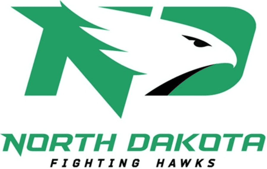
The irony of the North Dakota Fighting Hawks logo is the University choose a pretty lame generic mark (Air Express looking) instead of a more aggressive hawk symbol.
link
Pretty tame.
Chalk this up to UND purchasing the pie, but having no rights to the “recipe.”
Probably just legalese to use the reasoning stated — designed to avoid the “Gap-ification” of public uproar (esp. among folks who probably won’t know good from bad design).
Any competent design firm would NOT pitch them, as is, to another institution. Yet, typefaces or iconography “concepts” may apply in another project and be tweaked.
One would hope the firm hired would start from scratch, conceptually, and do their research. Yet it’s not usual to dig thru old designs, concepts, other people’s work, historical records, and so forth, in the research phase. Hence, the use of existing typography versus creating new type styles every time, or iconography that could be customized, etc.
The story does expose SME as being a bit underhanded and shifty by admitting to the fact they have recycled conceptual work for clients in the past when they strongly suggest a thorough and thought out “process” creating unique brands that “standout”. I wouldn’t engage their agency after learning if this since it feels very off the shelf branding…
The story does expose SME as being a bit underhanded and shifty…I wouldn’t engage their agency after learning this…
Yeah… except that, as today’s lede and comments have already made clear, (a) there’s nothing shifty about it, (b) most creative professionals do the same thing, and (c) good luck finding another agency that *doesn’t* do it. It’s simply the nature of the creative process.
Regardless of discussion about the nickname and the logo, I find North Dakota hockey uniforms to be fabulous. I love how they have the 2 sets of helmets and pants. The black helmets/pants worn with the green unis and the green helmets/pants worn with the white unis.