Click to enlarge
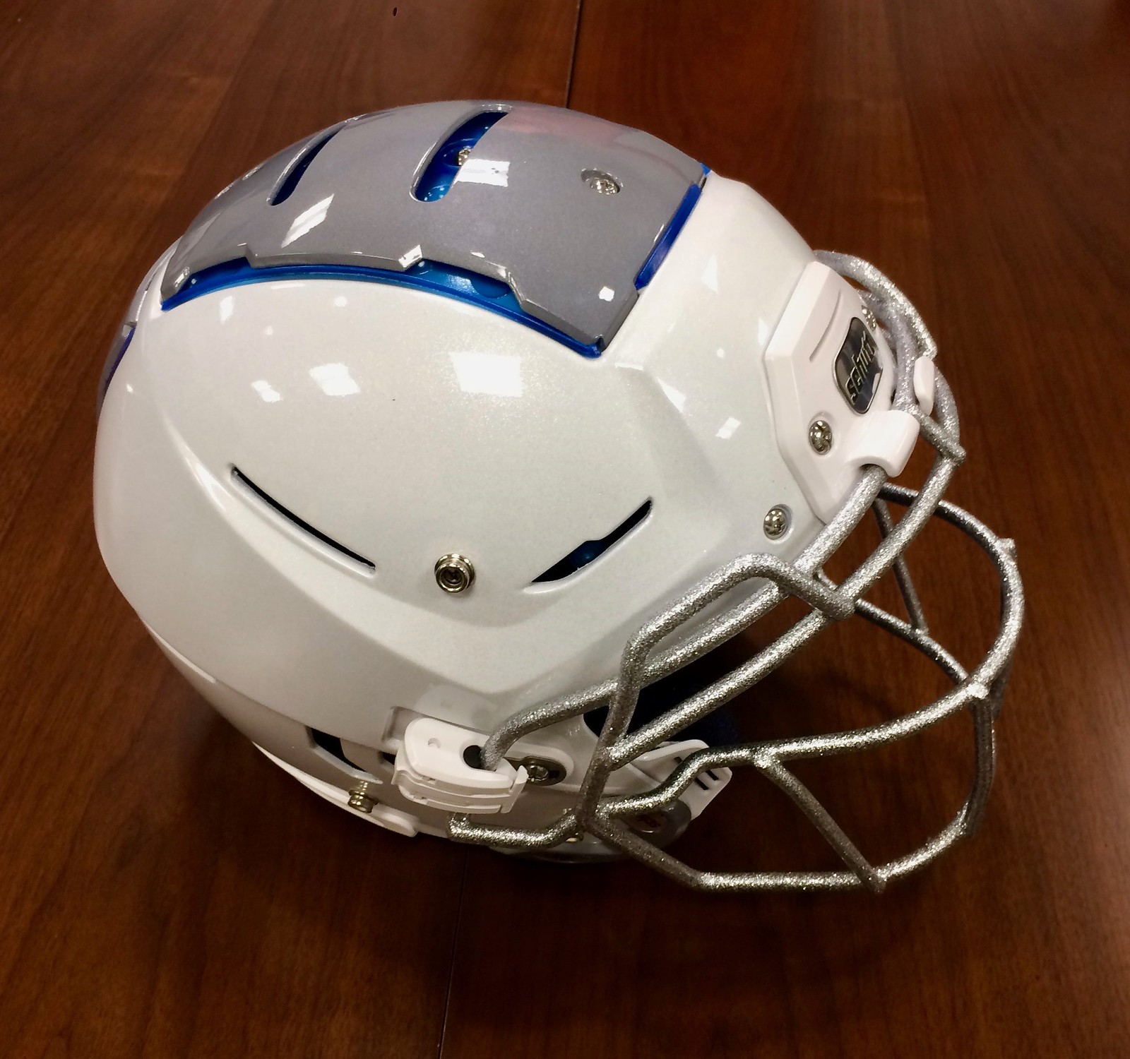
Behold — the new Schutt F7 helmet, the latest round in the anti-concussion wars. As you can see, it has an exterior plate situated across the top of the shell (and there’s another one in the back). It has a very clever way of removing and reinstalling the facemask, too. Nothing quite like it has ever been seen on a football field before, but that will likely change this spring, when college and pro teams are scheduled to start test-driving it. It could be used in games this fall.
The F7 is a variation on a helmet concept I wrote about for ESPN six years ago, almost to the day: the Bulwark, which was designed by longtime Uni Watch friend Michael Princip. That article from six years back led Michael to a partnership with Schutt, where he ended up being the lead designer on the F7.
The F7 is a really interesting piece of engineering, and I was given exclusive access to tell its story, which I’ve done in a new ESPN piece that will be running today. Check it out here.
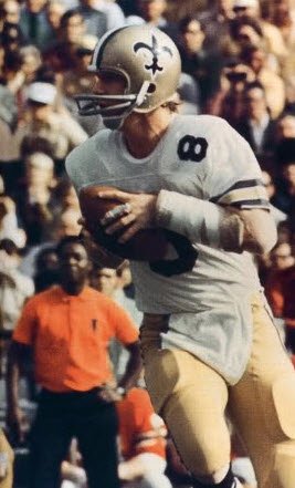
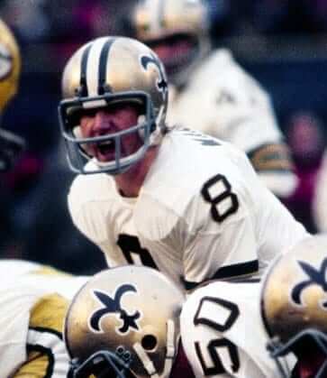
More Manning masks: Following up on yesterday’s entry about former Saints quarterback Archie Manning’s unusually high number of facemasks, @ProFootballJournal came up with two Manning masks that I missed.
The first is a simple two-bar model:

The second is a model that’s similar to several of the other ones on yesterday’s list, but it does appear to be distinct from any of those:

So that means Manning wore at least 13 different facemask designs during his time with the Saints — and counting.
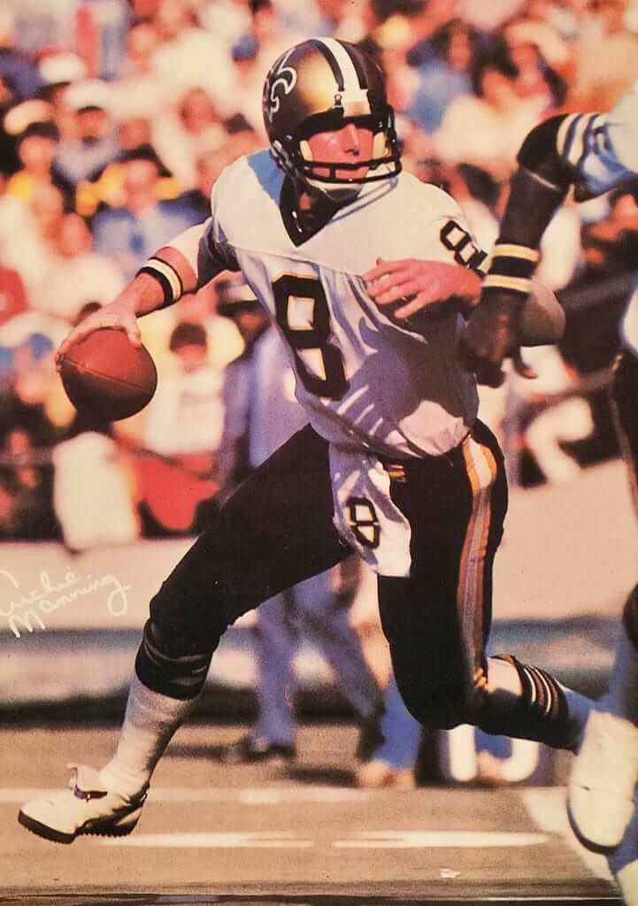
Meanwhile, as long as we’re talking about Manning, longtime reader Ben Traxel found a shot of him with his jersey number mirrored on his waistband towel:

LAST CALL ”” design contest reminder: Today is the last day to enter my “Redesign the Chargers” contest. Full details here.
LAST CALL ”” pets in uniform: In case you missed it last weekend, Phil had a post on pets wearing sports uniforms. He’s planning a follow-up post and wants to feature photos of your uni-clad pets. If you have a photo for him, use this link to send it his way. Thanks.
Raffle results: The winner of the IceJerseys $100 discount code is Jon Chichwak. Congrats to him, and thanks to all who entered.
The Ticker
By Mike Chamernik

Baseball News: The Memphis Redbirds unveiled a new logo and uniforms. Meant to capture the spirit of Memphis, the redesign incorporates a neon light motif and features an “M” in the shape of a music note (from Phil). … The Giants updated their black alternate jersey, changing to solid orange numerals and SF logo (from Phil). … The Blue Jays will unveil an red alternate cap and jersey on Friday. The uniform will be worn on Sundays this year (as reported by Chris Creamer). … Here’s a look at how the Orioles’ Camden Yards 25th-anniversary patch will look on their sleeves this season (from Robert Hayes). … North Georgia’s softball team showed off its stirrups. … Back a few decades ago, Tim Raines wore a shirt with an Andre Dawson caricature on it (from Patrick Sesty). … Bob Frigiano spotted a briefcase made of Rawlings-branded leather, and @DTABR notes that there’s a company in England that makes watch bands out of old baseball gloves (from Phil). … The Akron softball team has added a memorial helmet decal for a player’s mother.

NFL News: The Chargers will keep their current uniforms for next season, though they may consider a redesign a few years from now. … The Packers showed how their seamstress sewed on their captaincy patches for the playoffs (from several readers). … The Packers’ G logo was created in 1961. When the U. of Georgia introduced a very similar logo a few years later, the school had to get permission (from Phil). … The Steelers and Patriots will play for the AFC title this Sunday. The QBs share respect for each other: Ben Roethlisberger asked Tom Brady for his jersey earlier this season, and it now hangs in his office (from Phil). … Much like Archie Manning, as profiled here yesterday, Bears QB Mike Phipps wore a bulky facemask in 1979. He wore it to protect a broken nose (from Bill Schaefer). … Inspired by the Chargers’ promotional logo flop, here are a dozen of the worst logo changes in sports. Unclear if the writer understands that the Bolts aren’t changing their primary logo, though (from Trevor Williams). … More hints towards a new color scheme for the Rams: They still sell stuff with gold, but the logo on their NFL Shop page is just blue-and-white (from Yancy Yeater). … Southern New Jersey native Mike Trout made his buddy wear a full Eagles uniform to the gym after winning a bet on the Packers-Cowboys game. Trout is a birds fan, and presumably a Cowboys hater (from Phil). … The starting lineup for this year’s Puppy Bowl has been announced (from Phil).
College Football News: Cal-Berkeley has an extensive uniform history. That article tracks the Golden Bears’ record in each different uniform set over the last decade (from Sam Felder).

Hockey News: Lots of readers sent this in, but Chris Mizzoni wrote the blog: Here’s how NHL players spent their offseason in 1961. It looks like the Canadiens had a baseball team at the time. … USA Hockey’s Under-17 Team will wear Star Wars jerseys next Saturday.

NBA News: Buried within the middle of this piece about the Warriors’ new San Francisco arena is a tidbit that they might get Oakland jerseys before the move. … The NBA is switching uniform suppliers next year, so graphic designer Jesse Nunez created a Nike uni concept for each team. Props to Jesse for subtle tweaks, not full-on redesigns. … The Kings wore black at home last night, creating a color-on-color game with the Pacers (from Zachary Loesl). … Also from Zachary: The Hornets’ arena has an American Airlines ad on one backboard post and a Tissot ad on the other post. “This is the first time i’ve seen a team advertise different companies at different ends of the court,” he says.

College Hoops News: Providence will wear throwbacks next Wednesday (from @joeymisdemeanor). … Iowa players have a bump under their nameplates. Josh Sandin says that it’s because the Hawkeyes wear GPS and heart rate trackers.

Soccer News: The name and logo for a new NPSL team, Napa Valley 1839 FC, was revealed last night. … Swansea City midfielder Ki Sung-Yueng has KI. S. Y. as his NOB. Unclear why there’s a period after KI (from Robert Baker). … Fans will design a new badge for Ayr United, a low-level club in Scotland. The old one was considered a Coat of Arms, which broke an ancient heraldic law (from Kevin McNeil). … According to this news clipping, the Kansas City Comets of the MISL had to wear makeshift uniforms for their first ever game at Kemper Arena in 1979 (from Marc Viquez).

Grab Bag: Masonite Doors unveiled a new logo, which replaces this. … At Madeira High School in Cincinnati, boys teams are known as the Mustangs and girls teams are called the Amazons. In addition to separate logos, the school uses a combined logo, too (from K.C. Kless). … The UNC gymnastics team will wear rainbow-patterned leotards tomorrow (from James Gilbert). … NASCAR has a new sponsor/advertiser, Monster, for its premier series. It looks like drivers names will be moved from the top of the windshield to the back window, with a Monster logo taking its place in the front (from David Firestone). … Also from David: New racing suit for NHRA top fuel driver Leah Pritchett.
Love the lede today. Congrats
Michael!*
Oops, hit publish before finishing the thought.
The new helmet would pose some really interesting issues with decals and striping down the middle. Cut or not cut for the vents. It looks like there are screws that may need to be accessed so cutting would be necessary. It will be interesting to see how that works out.
All of that is addressed in my ESPN piece. Stay tuned.
I understand the need for the designers to achieve the primary goal of safety, but there has to be a solution out there to achieve aesthetics. For instance, could they apply an outer shell around the entire functional shell, that is somewhat flexible and elastic allowing impacts to temporarily warp the outer shell, in order to not impede the purpose of the design. This could be smooth and opaque giving a perfect surface for decal application. It could also be transparent/translucent in order to showcase the inner workings of the safety cage for the brain.
Just curious: Are you an engineer or an industrial designer?
I would love to see one in Iron Man colors!
I grew up in Madeira…hopefully this means they won’t be poaching the Broncos logo anymore. Here’s more backstory on the history of two mascots. link
Indeed – the Broncos logo is gone!
And I went to Mariemont and also lived in Madeira, and never knew that. How long have they had different names?
I believe since the ’70s, according to that story from WXIX.
Inspired by the Chargers’ promotional logo flop, here are a dozen of the worst logo changes in sports. Unclear if the writer understands that the Bolts aren’t changing their primary logo, though
He’s also apparently unclear about the concept of primary logos for some of those… also, he provides virtually no commentary (just a couple of side remarks and one GIF), and on behalf of NHL fans everywhere, link. All in all, it’s just a very poor piece.
Rawlings has an entire line of specialty leather goods. I have one of the wallets.
link
Yeah, but those items are just made from leather and stamped “Rawlings.”
The watch bands featured in today’s Ticker are, I think, salvaged from actual Rawlings gloves.
Not the same thing, at least to my way of thinking.
Sorry…should have been more specific. I was referring to the Rawlings briefcase in the ticker.
I love the watch bands, but 85 bucks for a watch band, and that doesn’t even include the buckle? I’ve never heard of a buckle costing extra.
Common for high-end watches where people want to use the buckle that came with the watch that has the watch brand logo on it.
I did not know that. Then again, I’ve never owned a fancy watch either.
Proofreading:
“Tim Raines wore a shirt with a shirt with an Andre Dawson caricature on it” Looks like there’s an extra layer of shirt there.
Fixed.
Good job Blue Jays. You just cheapened your color centric brand AND you diluted the Canada Day look, which is the most distinctive special occasion look in sports IMO. Compared to the black days, I’ll grant that the red might look a little better, but it already feels just as stupid.
Totally agree with you Mike. Was exactly what I was thinking when I heard about this.
The Jays should only wear the red on Canada Day. If they wanted another colour softball jersey, they should bring back a powder blue. This was once their road jersey colour and one of the trim colours. They could wear that with the hat that has the white front panel to give it a modern-throwback look.
Creamer writes that it might be a one-year only thing to recognize Canada’s 1867 founding.
I have a vague memory of seeing Dan Fouts wearing a facemask like the one Phipps is shown wearing in that photo, but I’ve never been able to find visual or anecdotal evidence of it. It’s very possible that I’m imagining it….
Nope, you’re not imagining it. He wore the same older-style lower-face mask through at least ’84:
link
then got his nose broken…
link
and while it was healing, wore a closed cage for a few games like Mike Phipps did:
link
(this is the ONLY picture I could find of him with the closed cage)
and then reverted to the open cage, but in the newer style:
link
Wow; thanks so much for finding that. I was never sure I that I saw or remembered it correctly. A major white whale, mystery solved. Thanks again.
Thinking about it now, I remember noticing it at the time because Fouts was one of the last players to wear that “older-style lower-face mask” (which I actually wore in 10th grade, in the fall of 1985) without that wide triangular side bracket that had begun to appear around that time. I remember seeing video footage of him wearing the “closed cage” with the side bracket and then seeing him in a game wearing the “lower-face mask” with the side bracket, and I remember thinking at the time that maybe his old facemask broke during a game and he had to use the “closed cage” for the rest of that game, and switch to the new “lower-face mask” (as shown in the last photo) for the next game. I guess I got that part wrong; I don’t recall being aware of his nose injury. But the image stuck with me because I had never seen a pro QB wearing a facemask with a center bar in front of his eyes.
Amazing, what you remember….
Here’s a larger version of the “closed cage” photo, plus another from the same game:
link
It appears to be 11/29/1987 vs. Denver.
I had that same memory and even thought I remembered it being a Monday night game against Seattle. I did a real quick search and while I couldn’t find any visual proof either I did find a story about Fouts breaking his nose in a game in 1986 against the Raiders and the Chargers did indeed play the Seahawks on Monday night the following week in the Kingdome. Pretty sure both of us didn’t imagine it.
Definite props to Jesse Nunez on those Nike uni-concepts. I really like the concept for the Clippers. It keeps their new font and logo, but fixes the issues I have with their present uniforms.
“Iowa players have a bump under their nameplates.”
Can we stop referring to NOBs as nameplates when they don’t use actual nameplates and are direct sewn/heat pressed on the jersey? It just doesn’t make any sense.
Yup, you’re right. I should have caught that when editing the Ticker.
Today’s ESPN column is up:
link
With those helmets we would probably start seeing hand-painted logos and graphics and who knows where that might lead.
If teams go along with the blue TPU color to respect Schutt’s branding over basic aesthetics, a lot of these helmets are going to look like schitt.
Fans will design a new badge for Ayr United, a low-level club in Scotland. The old one was considered a Coat of Arms, which broke an ancient heraldic law
The club’s site doesn’t include a pic of the badge they’re replacing, but it looks like link.
I wonder what the “ancient heraldic law” is? Could it be the use of the flag? It’s not uncommon for English clubs to use elements of their city’s coat of arms.
If they’re talking about the actual “laws” of heraldry itself, they could be referring to the argent (silver) colored rope on the argent colored chief. It was frowned upon to put metal on metal (gold on silver, or vice versa, and I’m assuming, gold on gold and silver on silver). The rope should be a color if placed upon a metal.
Not sure if the snap clip feature on these new helmets will actually hold up in a game situation. Don’t know if tests can come close to replicating the angles of violent impact on a football field.
Just curious: Are you an engineer or an industrial designer?
Somewhat related to this, my company makes the quarter-turn screws that hold the facemasks onto the current Schutt helmets (like the SC helmet seen in the ESPN article). Those are spring loaded screws that to be installed or removed, are pressed down on, then, as their name implies, turned 90° in either direction to be removed from a slotted receptacle. When we started making these about 7 or 8 years ago, it was seen as an improvement as the time to remove the facemask was drastically decreased (around 5-10 seconds), but still required a hand-held screwdriver. The new design takes it to the next level by eliminating the need for a tool altogether. My company also makes latches, but I don’t know if we made the ones on the new helmets, or even submitted a proposal. I will shake some trees and see if I can find out.
If those helmets become prevalent, the graphics will need to become like those on hockey helmets, wordmarks and/or small logos.
Minor note: Red Wings wore their white sweaters at home last night, as Bruins wore their 2016 Winter Classic throwbacks.
That combined mascot logo at Madeira is really cool. Though for consistency’s sake I’d have the mustang always facing left when by itself, but that’s just me.
There’s a high school near me with two different team names. They just use a wishbone C as a logo.
The Schutt helmet reminds of the chip and dip helmet. (Sorry I can’t post a pic. I am at jury duty)
Or a helmet phone! link
I have enjoyed the pictures of Manning in various facemasks.
In four pictures over the past two days, he was wearing a large pad on his left forearm. Anyone know the specifics as to why? Was it recovery from a one-time injury or was he getting repeatedly hit there?
In that picture of Ki Sung-Yueng, there’s a period after the “KI”, as you point out, but there isn’t one after the “Y”, which actually is an abbreviation. It’s almost as if they’re using them more just as spacers than an actual indicator of abbreviating.
“The starting lineup for this year’s Puppy Bowl has been announced”
At first glance I thought you meant “Starting Lineup” as in the action/sports figures that were noted recently to be produced again. Oh well.
Great piece on Michael and the F7. The innovation sounds fantastic, but aesthetically, it is a huge leap backward from the Bulwark.
While that helmet was pure (functional, I presume) elegance, the proportions and angles of this one are not as pleasing to say the least. The surfaces seem over designed, though I’d love to know if and/or how those ridges support the helmet’s function. It would seem to me ridges that stick out could potentially catch, latch onto, or otherwise grab parts of helmets or pads, thus increasing the forces transferred through the helmet to the head and neck.
If these types of designs are the future, I do suspect the helmet will have to go back to being a solid colored piece with only striping as decoration. The logos on the jersey may return to being the more prominent team branding.
I’d love to know if and/or how those ridges support the helmet’s function.
I was told that the side ridges are for added cushioning/protection/etc. In other words, they’re not just design embellishment or branding accents.
Anyone else see the new Memphis Redbirds logo and think immediately of this?
link
Didn’t think of that, but you’re spot on in that observation.
Nice article on the new Schutt helmet. Thanks to the Memphis Redbirds for not going Brandiose. The new look is nice and clean.
Good news on that Saturday night Giants Metallica Fade To Black jersey. Never could read it right!
I was hoping the Chargers would flip their uniforms and wear light blue as their main uni and have the navy as their alternate.