
Click to enlarge
The uni-related high jinks for last night’s MLB All-Star Game began well before the first pitch, as Pirates pitcher Mark Melancon lined up for the National League team portrait while wearing a Mets BP cap (that’s him in the third row, far right — you’ll be able to see it much better if you click to see the larger photo, and you can also see it here). Not sure why — did anyone hear an explanation?
Other notes from the game:
• As has been the case in recent years, this game was completely white vs. grey (or, in one instance, white vs. charcoal) — no softball tops or other alternates. Hell, the Dodgers even wore their “Los Angeles” greys. Shocking!
• I got about a bizillion emails and tweets from people who hadn’t gotten the memo about the American League being the home team in San Diego (and who were too lazy to google it themselves). Obviously, I didn’t expect every single baseball fan to know about that, but it’s interesting that there were so many people who knew enough to contact the Uni Watch guy but didn’t know about the American League wearing home uniforms. This may mean MLB didn’t do a good job of getting that news out there, or maybe it means I didn’t do a good enough job of spreading that news.
• In a related item, the Padres’ representatives were wearing a grey version of their home whites, and it looked fantastic. This, or something like it, should have been their road uniform all along. Never made sense for them to add yellow to their home color palette but not to their road set. Here’s hoping they go with this new look next season.
• Unlike at the Home Run Derby, where players were apparently required to go high-cuffed (the better to expose the new socks from MLB’s latest corporate partner), players in the All-Star Game were permitted to wear their pants however they chose — and almost all of them chose pajama pants. But a few players did go high-cuffed and showed the new All-Star socks, including Jose Altuve, Manny Machado, Marcell Ozuna, Mookie Betts, and a couple of others. Several other players just wore their regular team-issued solid socks, including Xander Bogarts, Brandon Belt, Ian Desmond, and Miguel Cabrera. And Francisco Lindor wore his usual striped stirrups.
• All players wore an All-Star Game sleeve patch (which was Chromaflex, by the way, not embroidered). For the Diamondbacks’ and Reds’ players, that meant their memorial patches were
bumped from the sleeve to the chest. But the Giants’ memorial patches for Monte Irvin and Jim Davenport just moved higher up on the sleeve.
• The caps looked okay. Not great, and certainly not an improvement over the teams’ regular caps, but not an embarrassment either. Definitely the best of the three special All-Star editions so far (although that isn’t saying much). Best thing about them: the grey underbrims. Sooooo much better than the current black ones. Change it back to grey, New Era!
• Players once again wore little gold stars flanking the MLB logo on the back of the jersey and the back of the cap. Somewhat amazingly, however, there were no stars added to the MLB logo on the back of the pants. Someone’s probably gonna lose their job for not having thought of that, am I right?
• In a related item, the MLB logo on Altuve’s pants was rendered in Padres colors. Must’ve been from the previous day’s workout or the Home Run Derby. (Yes, I realize Altuve didn’t participate in the Derby, but lots of non-participant players showed up to watch.)
• Not sure if this was new or a holdover from previous years: The umpires wore gold stars on the front of their caps. Also, as you can see there, the color sequence on their MLB logo was inverted from its usual blue-white-red. Odd.
• The Royals’ players wore their Friday-night gold-logo batting helmets. (As you may recall, the Royals originally wore gold-trimmed championship uniforms for their season-opening series against the Mets and then received permission to keep wearing them for Friday-night home games all season long.)
• Catching gear: Salvadore Perez wore gold-trimmed equipment, but that was nothing compared to Matt Wieters’s cyborg look. Here’s a close-up of his shinguard.
• Why did they give the Brewers a royal cap to go with a navy-trimmed uniform? Makes no sense.
• Let’s just say there was a lot of footwear silliness and leave it at that.
• Several players wore red belts — maybe left over from the Home Run Derby? — during pregame warm-ups, including White Sox pitcher Jose Quintana and several Red Sox and Orioles players. All of them wore their proper belts in the game, however.
• The baseball had blue and yellow stitching — Padres colors.
• Mets pitcher Noah Syndergaard’s name was misspelled at a display inside the ballpark.
• Former Padres pitcher Randy Jones threw out the first pitch and wore a nice Padres throwback jersey. Former Padres closer Trevor Hoffman was also part of the pregame festivities and also wore a period-appropriate jersey, but — and I know many of you will never forgive him for this — he tucked it in.
• In a related item Robinson Canó did the untucked thing during postgame high-fives. He was also one of several American League players who went untucked before the game started. Don’t think I’ve ever seen that before.
• Someone in the crowd was wearing an American League Home Run Derby jersey with “Trump 16” as the NOB and number.
• Finally, during the top of the 8th, Fox broadcaster Joe Buck said that National League manager Terry Collins had told him “that he feels it’s important to get every team’s uniform in the ballgame.” Nicely stated, Terry (although it’s worth noting that the only Mets uniform in the ballgame was that of Collins himself).
(My thanks to all contributors, including Matt Bond, Andy Brandl, Mike Chamernik, Andrew Cosentino, Dan Erbach, Brandon Fischer, Ben Forman, @KeyvonPahz, @phixated, Tyler Stern, Mike Vamosi, @ZJL00, and of course Phil. Apologies to anyone I missed — it was a hectic night!)
Blame Canada: Remember how we recently discussed the Padres’ frequent use of lip-synchers to do the national anthem? Well, we certainly know there was at least one national anthem that was not lip-synched prior to last night’s All-Star Game: “O Canada,” which was sung by a Canadian group called the Tenors, whose lead singer took it upon himself to change some of the anthem’s lyrics to “All lives matter” and also held up a sign with that same slogan. The other Tenors later said they had no idea he was going to do that and have suspended him from the group.
Here’s some video of the key moment in the anthem:
You can actually see the other #tenors slowly like at him like "what the fuck" when he starts his solo.@bruce_arthur pic.twitter.com/awZGTHjyk0
— Andy Cole (@AndyCole84) July 13, 2016
I’m not interested in debating the merits of the specific message (at least not here), but I do want to address how this incident will affect the lip-synching debate, because I’m sure there are some people out there — especially in the MLB offices — who are thinking this is precisely why it’s better to have the anthem lip-synched. But it’s actually the opposite: As I’ve been saying all along regarding this issue, the essence of live performance’s appeal is that anything can happen — including something really stupid, like a singer deciding to insert a political statement into the lyrics of “O Canada.” That’s a big part of why live performance of all types (music, theater, sports, etc.) is so compelling — it leaves room for surprises. The trade-off for that element of surprise is a slight loss of control over the finished product. In the long run, that trade-off is always worth it, despite the occasional hiccup like what happened last night. But corporate decision-makers tend to place an insanely high value on control and try to eliminate surprises as much as possible, so I suspect what happened last night will hasten the move toward lip-synching in the sports world.
Many of you have no doubt grasped the delicious coincidence at work here, namely that last night’s anthem stunt took place in Petco Park — the same stadium where the Padres frequently use lip-synchers. They’ll no doubt view last night’s episode as a validation of that approach, which is too bad. It’s really the other way around.

Raffle results, and today’s new raffle: The winner of the Phillies cap is longtime reader Jimmy Lonetti. Congrats to him, and thanks to all who entered.
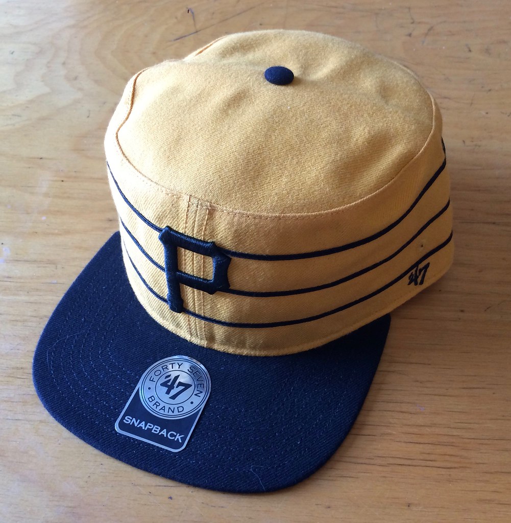
Our next ’47 cap up for raffle is this Pirates pillbox snapback:
To enter, send an email with your name and shipping address to this address (not to the usual Uni Watch email address, please) by 8pm Eastern TODAY. One entry per person. I’ll announce the winner tomorrow, and I’ll also announce tomorrow’s raffle cap, and then we’ll keep repeating that process for each remaining weekday this month. If you win one of the raffles, please be nice enough to step aside and stop entering the remaining ones. Thanks.
StripeRite update: In case you missed it earlier this week, I’ve partnered with Scott Turner and American Trench to produce a new line of crew socks with great stripe patterns down toward the ankle, where everyone will be able to see them.
When I announced the launch of these socks two days ago, I said we were doing small quantities — only 60 pairs for each of the four colors. That was the minimum order from the mill, and we had no idea how you folks would respond to this product line, so we played it conservative and went with the minimum. I figured there was a decent chance that it would take months to sell through all of the inventory, and a slight chance that we’d end up being stuck with some unsold socks.
Shows what I know. After two days, we’ve already sold out of all four colors. We’re already ordering more, so don’t worry — all orders we’ve received (and continue to receive) will be filled, although there might be a slight delay before we can ship the socks from the second batch. I’ll have updated info on that in a day or two.
THANK YOU for supporting this project. We put a lot of work into it, and it’s really gratifying to see that we came up with a winner.
If you haven’t seen the socks yet, here they are:
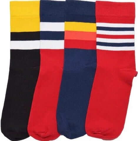
The socks are available here, and there’s lots of additional info here.
Middle me this: I don’t have a middle name or middle initial (for more on that, look here), so I’m admittedly no expert on middle name-related matters. But I’ve noticed something interesting about people who enroll in the Uni Watch Membership Program.
A small-ish subset of the enrollees — if I had to guess, I’d say maybe 10% — request to have their middle initial included on the front of their card. Of those, the vast majority — maybe 75% — do not include a period when making that request. In other words, they say something like, “For the front of the card, please put John P Doe” (or whatever).
Whenever this happens, I always double-check with the enrollee and ask, “Did you mean to omit the period after your middle initial, or should a period be included? I’m happy to do it either way — just let me know.” Almost invariably, the answer that comes back is, “Oops, forgot to include the period. Yes, please include it. Thanks for asking!” This has now happened dozens of times (most recently yesterday, when Kevin P. Jarvis signed up and initially asked for “Kevin P Jarvis” on the front of his card).
Again, I’m no expert on this stuff, but is it common for all you middle-named and -initialed folks to skip the period, sort of as a casual shorthand kind of thing? Seems odd that you’d forget to include the period when you actually want it there.
There’s a school of thought among some copyeditors and grammarians that a middle initial shouldn’t include the period when it isn’t short for anything. Harry S. Truman, for example, didn’t have a middle name — his parents simply gave him a middle initial — so some copyeditors prefer to style his name as “Harry S Truman” (although Truman himself didn’t sign his name that way; further info here). Whenever I get one of these membership card requests, I always think, “Maybe this person is like Truman, with the initial not standing for anything.” But whenever I double-check, they always say, “Oops, forgot — yeah, please include the period.”
Well, almost always. My records show that we have at least three members who specifically requested middle initials but no periods. They didn’t say why (or if they did say, I don’t remember). Maybe their initials don’t stand for anything, like Truman’s “S,” or maybe they just think the period looks clunky.
As it happens, back in 2005 I dated a woman named Ruth B Janson. The “B” didn’t stand for anything, and she felt strongly about not including the period. Unfortunately, the Uni Watch Membership Program didn’t yet exist (and neither did this website, actually), so I wasn’t able to present her with a card showing her preferred styling.
The Ticker
By Paul

Baseball News: Here are some rare shots from the 1962 All-Star Game, including Willie Mays batting without a helmet. … Darth Vader jerseys this Friday for the Spokane Indians (from James Gilbert). … Lots of great uni-watching to be had in this 1947 spring training video (big thanks to Patrick O’Neill). … Look closely and you’ll see that New Era ran an ad that lists Andrew McCutchen as a member of the Giants (from Andrew, who didn’t give his last name, although I’m pretty sure it’s not McCutchen). … The Round Rock Express will become the Round Rock Fire Ants on July 21. … The Birmingham Barons wore UAB-inspired jerseys last night. “Garish as hell, but I love seeing my hometown team supporting my alma mater,” says Nick Salyers. … The great BSmile posted lots of photos of All-Star Game hardware, including a pendant, a belt buckle, another pendant, a ring, and another ring. … HSt. Paddy’s Day (in July?) jerseys last night for the Duluth Huskies. … We’ve talked before about the logo decal that the 1975 Cardinals wore on the side of their batting helmets. Here’s another shot of it, one that I hadn’t see before (from @CHShelmet). … Nice item on the guy who authenticates the Astros’ game-used stuff (from Chris Flinn). … Nutria-themed jerseys upcoming — yes, really — for the New Orleans Zephyrs (thanks, Phil).

Pro Football News: How do you start an argument? You pick the three best NFL helmets (from @LukeTesselink). … Not sure which season or game this is from, but someone has spotted an old Bills pants inconsistency. … TSN’s penalty flag graphic CFL games now matches the flag color.
College Football News: Looks like UNC is switching to Xenith helmets. … Here’s a Virginia Tech concept that’s better than most (from Andrew Cosentino). … Ranking the SEC’s uniforms? Sure, why not (thanks, Phil). … Looks like Temple is going BFBS (from Tommy Mancuso).

NBA News: Whoa, check out this beautiful Washington Capitols jersey (yes, that was also the name of a basketball team, in the old BAA, forerunner of today’s NBA) that’s up for auction (from Tommy Turner). … After four Minnesota police officers walked off the job at a Minnesota Lynx game due to the players wearing pregame “Black Lives Matter” T-shirts, the Lynx have decided to stop wearing the shirts (thanks, Phil). … Speaking of T-shirts, Spurs coach Gregg Popovich wore a Tim Duncan tee to Duncan’s retirement press conference yesterday (thanks, Mike). … New college hoops uniforms for the Milwaukee women’s team.

Grab Bag: Here’s an article about what Atlanta FC’s soccer uniforms might look like (thanks, Phil). … This is pretty awesome: Pro golfer Phil Mickelson is using a binder clip to keep his too-large cap in place at the Scottish Open (from Ty Maple). … Rolls-Royce created a bowling-themed logo for the first RR Trent 1000-TEN engines on a Boeing 787 (from Jeremy Brahm). … More Zika-proof Olympics uniforms for South Korea (Phil again).
R. Scott, from yesterday:
“If I were emperor of the world, I think I might outlaw football [color]-outs even before I outlaw the wave. And I really, really hate the wave.”
I may have said this here before, but I’ve always thought that if The Wave had stayed where it started, we’d all think it was awesome and look forward to going there and participating. But once it became ubiquitous, it lost all of that charm, and now it’s just something that bored people everywhere do to obstruct the views of people who want to watch the game. Too bad.
Oh no, my view is obstructed for all of two seconds.
In all seriousness, I’m pretty indifferent about the wave. I don’t hate it, but I’m not likely to participate in one either.
As for color-outs, I definitely don’t care for those, in any sport. I remember going to a Michigan-Michigan State hockey game at Yost about a decade ago, and the Wolverines were pushing “Go Blue, Wear Maize”. Well, I was wearing a blue Michigan jersey (1997-98 vintage), and I wasn’t going to buy a t-shirt just for that, especially when it wasn’t probably more than a third of the crowd actually wearing “maize”.
Even if it’s a giveaway shirt, you shouldn’t be obligated to wear it. Wear what you want to wear.
My objection is not to my view being obstructed. It’s to being surrounded by people who are deliberately not paying attention to the game on the field, and having opprobrium directed at me for valuing watching the game more highly than participating in a ritual dance. I mean, at a football game? Fine. As boring as football is on TV, it’s even worse in person. So by all means, fill that commercial break with a little coordinated group dance. And at a baseball game, between innings? Fine, whatever, no harm done, and children enjoy it. But while the game is being played? Siddown!
I know it makes me sound like an old codger, but I tend to wonder how many people came to the game for the game, and how many came to do the wave.
The wave is very rare in English league football (soccer) games, but once at Wigan the game was so boring one started up.
At the time I was steward in charge of the tunnel area, stood next to Wigan’s manager, whose comment was “why the eff don’t they effing well sit down and watch the effing match”. It was a distraction to the players.
I avoid doing the wave, as well. Seems pretty disrespectful to the players on the field. The earlier in the game it makes its appearance, the more disrespectful. To me, it’s basically fans saying, “I’ve given up paying attention to the action on the field.”
I think that the belts last night were orange, not red. Looks good on the Orioles, bad on the Red Sox and White Sox…
Pretty sure the Bills pants-stripes issue has been covered before, albeit a good long time ago. I think it was Kent Hull whose pants stripes were reversed compared to the rest of the team; not sure if he was the only one.
link
link
More:
link
link
link
One neat detail of the caps last night was that the starred eyelets were actually brassy looking metal rather than embroidered. I kept thinking David Price would have ripped them out.
My biggest gripe with the caps in both the game and the derby was that there was no difference between AL and NL caps.
A lot of the special event caps have been featuring gray underbrims. I personally prefer the black. It definitely cuts down on Sun glare. Then again, if they ever decide to bring back old school green, I’m down with that.
I always used to include the period for my middle initial, but many online forms don’t allow it, so I’ve just stopped using it entirely for consistency’s sake.
Garr, the eyelet stars was my least favorite thing about the whole event. Ugly, gaudy, distracting. For many reasons, last night’s were by far the worst of the three “special” ASG caps we’ve seen so far, and possibly the worst league-wide special event caps MLB has ever worn, but the eyelet stars are #1 on that ignominious list in my book. I was sort of hoping that at least one player, preferably a Yankee, would cut his finger on the eyelet star and have to miss a game or two after the break, and in reaction MLB would permanently go back to players wearing their own actual real caps at the ASG. Pretty much the only circumstance that I can imagine producing that outcome; dignity, taste, class, and respect for the game don’t seem to factor into MLB’s uniform decisionmaking anymore.
It seems kind of insane to me to prefer gray undervisors to black. That’s a functional part of the cap, and black simply works better than gray. Sacrificing performance for no better reason than to look prettier is bad design. You know what looks pretty? Old-fashioned skeleton keys. But if I take the ugly standard house key off my keychain and put a beautiful brass skeleton key on instead, I will no longer be able to get back into my house, and therefore I will by that substitution not have made my keychain a better keychain.
I would have preferred if the stars were silver or pewter colored rather than gold. It would have gone with the gray color scheme better. I’m not a fan of gold anyway. It always looks tacky to me.
Didn’t get to see more than two innings of last night’s game. As I told Phil, the only things that made sense to me were the Astros in white and the Brewers in gray in a National League park.
Yes, green underbrims were the best.
Maybe Paul Grommited them. ;)
Are there stars for each all-star appearance on the untucked portion of the jersey in that Cano pic?
Yes, good spot. I’d forgotten about that detail. I never cared about it to begin with, because it’s strictly a retailing/merch gimmick (i.e., that part of the jersey isn’t visible when the player is wearing it — or at least when he’s wearing it tucked in).
My credit card has my middle initial with no period (just the way they sent it after I signed up with my full name). Whenever I order something online, it asks me to enter my name as it appears on card– no period. But I don’t think I would ever write it that way in any other context.
Same situation with me. They ask for a middle initial when signing up for the account, obviously, but there’s nothing that says to include the period if that’s how the card should read. It really bugs me having to type it without the period when an online retailer asks for NAME ON CARD. I don’t know if including the period will trigger a decline, but I never include it because I don’t really want to find out.
Even though my card has a middle initial, a lot of times I leave it off when an online seller asks for the name on my card. Never had a problem. There might be if there were a specific “MI” field and I left it blank, but if it’s just a Name field it doesn’t seem to matter if I include or exclude the MI.
Now, as for the All Lives Matter v Black Lives Matter movements I think there is a double standard at sporting venues when BLM sport supporters get priased for making a statement at their venue (They’re free to do so outside of the game though) but ALM gets shamed. People go to a sporting event to see a game not a political statement. I don’t know if that’s ignorance on my part or if it’s really a somewhat popular opinion.
That Pirates hat would be great for my wife, even though I am a Cards fan.
As I already stated in today’s text: We’re not going to debate the merits of last night’s message (just as we haven’t debated the merits of BLM messages). No more of that, please. Thanks.
Per Paul’s request, I will avoid talking about the politics of the thing, so I’ll just say that there’s a difference between wearing a shirt with a political message and actually changing the lyrics of a country’s national anthem.
On a completely unrelated note, it’s not anywhere close to halfway to St. Patrick’s Day. Did the Duluth team actually bill it as such?
No, they didn’t. Somehow got my brain wires crossed — thinking it’s halfway to Christmas. My bad. Will fix.
Agreed. Despite my agreement with the message, I hate the fact that they adulterated the lyrics to a national anthem. That is just something you DO NOT DO. It it happened again, I could see a greater move toward more canned anthems, which I an TOTALLY against.
Also, “We’re all brothers and sisters, all lives matter to the brave” is a horribly written lyric. “With glowing hearts we see thee rise, the True North strong and free” fits the meter of the song and is poetic. His substituted version had no respect for poetry and musical verse, let alone for Canada’s anthem.
I would be all for a canned anthem…an instrumental, so the fans can sing along as they’re encouraged to do but can’t. How can you sing along when performers are always adding their own interpretations to it?
I know I’ve said before how much I loved Marvin Gaye’s performance at the ’83 NBA All Star Game, but I’m also saying it shouldn’t have been allowed to happen. Just play the anthem the way it’s meant to be played.
If it takes more than 70 seconds to sing the Star Spangled Banner, you’re doing it wrong.
RE: 1962 ASG shot of Willie Mays
At that time, instead of a helmet, some players wore a liner that fit under the regular cap. I’ve seen a few of these occasionally; recollection is that there was no crown. Looked a bit like a shallow baking pan, turned upside down, then fit into the cap.
Ernie Banks was another who often went this way. Check out pictures on some early baseball cards
Yes, many players wore the liner. The last one to do so was Red Sox catcher Bob Mongomery in the early 1970s.
But to my knowledge, Mays never wore the liner.
My father and his twin have middle names that are just one letter with no period that stand for something. My father’s middle name is B because he waste second twin. His brother of course was A.
That’s funny, right there.
George W. Bush, or George D. Bush?
“D” is the abbreviation of the abbreviation “Double-u”, right?
Dude, George D. Bush is not the preferred nomenclature. George Dubya Bush, please.
Ever since I was a little kid, it’s always bothered me that it’s called “double u”. It should be called “double v”. Amirite?
Why is it double anything? We don’t call the letter A “inverted V” or the letter B “pregnant P,” we make the letter’s sounds. Aay, Bee, See, Dee, Eee, Eff, Gee, Aich, Aye, Jay, etc. So shouldn’t we say You, Vee, Wee, Ex, Why, Zee?
If you wanna make “wee” a thing, I’m all in!
“There’s wee, not-so-wee, an’ friggin’ huge!”
-Stuart Rankin
I would prefer “wah” rather than “wee.”
In french it is “double vee”, but with a French accent, mais bien sur.
“doob-luh-veh”
One of the first things you learn in radio is to say the call letters ‘double u’, not ‘dubya.’ As in my station, WKRQ. I literally remember where I was standing when our Music Director taught me that one, that’s how much of an impression it made on me.
My college station (WUTK) and the NPR station at which I also I worked (WUOT)had the unfortunate W-U combination.
Regarding that Ted Simmons pic:
link
He does look rather dazed and confused. Definitely was in need of either concussion protocol or some greenies.
The photo of the Pirates’ pillbox hat reminds me of the “Is it a blue dress or is it a black dress” brouhaha. At first it looked like a white hat with blue stripes.
You mean to tell me it isn’t a white hat with blue stripes? As I scrolled past it, I thought hmm, that’s an odd color combo for the Pirates, but then I moved on as I’m not a Pirates fan and won’t be entering today’s raffle.
Dude, it was a white dress.
With gold stripes.
Dude, it’s been confirmed from the dress manufacturer that it was blue and black. The lighting in the photo made it open to different interpretations, but the actual dress was blue and black. That is fact. Look it up.
That was my first impression, too! I saw it and thought, A Pirates pillbox in blue and white? Kind of a meta-fauxback that covers a broad range of the team’s visual history. But this was on a tablet in bright sunlight. Looking at it in more normal light on the same screen, it was clearly black and yellow.
Looks blue and cream-colored on my screen.
So weird — looks black and gold to me!
The Phillies cap looked purplish to me yesterday.
wait…..it’s not blue and cream?
It definitely looks blue and cream for me!
I even pulled up the site on my phone – still blue and cream
Blue and cream to me too – on phone and laptop.
I agree that it definitely looks blue and cream. Paul, are you confirming that the cap is actually black and yellow in real life?
Yes. But the raffle is now over!
Really interesting to hear all the color chatter. The photo definitely looks black/gold to me — the original photo on my phone, the uploaded photo on my Flicker page, and the inline photo on Uni Watch today. I also tweeted the photo, and it looks black/gold to me on my Twitter page.
Maybe it’s just me! Or maybe it’s just you. Or something….
Blue and cream here, too.
I was about to write the same thing. It looked white with blue stripes to me until I knew it was a Pirates hat, at which time it turned yellow with black stripes.
I’m seeing blue and cream as well and it’s freaking me out
Also seconding that the Phillies cap looked very magenta
“As has been the case in recent years, this game was completely white vs. grey (or, in one instance, white vs. charcoal) – no softball tops or other alternates. Hell, the Dodgers even wore their “Los Angeles” greys.”
I don’t think there has been a jersey color other than gray or white in the ASG since around 1997, which I find disappointing. I would suspect it’s an MLB mandate, especially if the Dodgers are wearing their LA grays, which are probably designated as their official road jersey.
I miss the days of the A’s lining up in different jerseys and just seeing some color pop here and there instead of the drabness and uniformity of gray and white. One reason I like the MLB ASG the best is that the players wear their regular uniforms, and it’s one reason the game caps all being the same template is disappointing.
Yeah, I really miss color. Gray is *boring* and in an All-Star Game, where gaudiness is part of the fun, it’s doubly boring. I would rather the visiting team be required to wear something in color instead.
White vs gray jerseys isn’t the problem. Just look at that NL team photo…red, blue and black caps only. No brown, no orange, no teal, no mustard, no purple. You get the teams that used to wear those cap colors to go back to them and you’ve got a color palette special while still maintaining the white/gray jersey tradition.
I read elsewhere that MLB changed the All-Star Game rules to require home team members to wear their white team uniform and road team to wear grey (or charcoal if you will)during the actual game. I’m Ok with this since there is so much other uniform shenanigans in batting practice and home-run derby.
New Everton away kit link. A little boring but good. Wish they’d gone with that slight V on the neck on the home shirt.
Are the Zephyrs gonna wear rat hats to go with those jerseys?
Two Things:
My Top 3 Helmets (not including the Browns because I’d be biased)
1.Eagles. Those wings are classic
2.Vikings, I love the originality of having pig tails on the helmet
3.49ers. Steeple in tradition and the gold and red just pop
Secondly, as you can see above, I gave a reasoning for my rankings. That’s what you just need to do when making lists like the SEC one up there!
pigtails?
His name is “The Ham”. Everything looks swine to him.
Lee
I like to use my middle initial for anything where my name is displayed for purely aesthetic reasons. I like the way it breaks up my name. Same for my use of period. I just like the way it makes my name look.
I also read once that using a middle initial can make you seem smarter to people (link). People seem to think I’m smart… maybe this has something to do with it. But, then again, people thought George L. Costanza was smart, too (link)
I have a middle name and when I am signing I purposely leave out the period on the middle initial and leave a little bit more space in between my first name and my last name. But when I have my name on a government document for example I prefer a period, it looks more official when it is typed out rather than handwritten.
I’ve never written out my full name now for years when signing something, unless, like at a bank, I’m required to.
Always BGuthrie, then I loop a J over/between the B and G.
And I always add a period after my last name. No idea why, done it for years. Always will.
I’ve got a bad feeling about those new Stance official MLB socks. The logo creep is distracting to begin with, but those ASG socks were horrible when paired with the uniforms. No sense of overall design. They were trying to make a statement unto themselves. Found myself actually preferring the pajama bottoms instead of the ASG socks. Lindor has it right though! Forever a stirrups guy, having grown up watching baseball in the 70’s.
The gray Padres jersey is a definite winner. Their uniforms have been so disjointed for years, but I’m really liking the blue and yellow set.
I remember when I was buying my house they made me sign my name with my full middle name. I thought I was going to break my wrist trying to sign my signature with a whole extra word in it!! So unnatural!!
What I enjoyed most about last night’s game was that the Cubs’ players wore their grey tops, which I think look fantastic. Normally, the Cubs opt to wear those painfully ugly blue tops as their road unis. Instead of looking classy they prefer to look like a weekend softball team. Why, Cubs, why??
Every time I see those blue uniform tops, it makes me think of Leon Durham.
link
And Leon Durham looks great, because his two-toned uniform has a sansabelt and a pullover jersey. These two things are necessities if the shirt and pants are two different colors. If your team rocks the belt and buttons, the jersey and trousers must match.
Maybe in that photo, but not so much in this one…
link
Why? Because blue is awesome and gray is dull, boring, and link. If the fact that the jersey color is not the same as the pants color, then the clear solution is to give them blue pants!
I’ll have to disagree. I’m a fan of the grays. Your “awesome” is my “eh…”
As far as the Wave guys, take a couple young kids to a game and have them experience the Wave for the first time. You’ll get off your high horse.
I was just at a birthday party for an adult with a lot of children around. We had lots of games for the kids, including water-balloon toss. It was a blast! The kids had so much fun that all of us grown-ups were practically reduced to tears playing along.
Is it therefore OK to bring water balloons for the kids to throw around at a restaurant, or an art museum, or an orchestra concert? It’ll be fun! The kids will enjoy it! We grown-ups will enjoy their fun vicariously! Either the answer is “yes,” and it’s OK to let the kids throw water balloons everywhere, or objecting to the wave during a game is not actually a “high horse.” Nobody objects to the wave because they’ve never been a child, or brought a child to a game. Yes, the wave is fun! But “it’s fun!” and “kids enjoy it!” are not actually reasonable justifications, on their own, for any behavior outside the home.
Do the wave between innings, or basically anytime during a football game. What the wave really needs is a cultural limit on the time, manner, and place, as well as the number of times around the stadium. But because this is America, and we don’t do limits, even if the wave starts during a break, it inevitably continues even after play has resumed on the field, and people inevitably try to keep it going long after the actual fans have given up and turned their attention back to the game they’ve paid to watch.
arrScott, are you okay? I was worried you might sprain an ankle on that slippery slope.
But a foolish consistency of water balloons in restaurants is a much more fun mental image than boring old Kantian analysis of the implicit principle of “if it’s fun for one child, then it’s OK for everyone always everywhere,” which is what was being argued.
Whoa…. I was just arguing against the grumpy, bitter SOB approach to life. Relax and have some fun pal. Get laid. Jerk off. Whatever floats your boat.
In re: the Brewers cap…
What is the Brewers primary logo these days?
The ball-in-glove or the M with the wheat? I seem to see the ball-in-glove far more than the other these days.
An instance where “primary” depends on whether one believes that a team’s uniform is what the team says in its marketing materials, or that a team’s uniform is what the team actually wears on the field. On paper, all official-like, the Brewers’ primary cap logo is the white M with the gold barley on navy. On the field, in practice, the Brewers primary cap logo is the ball-in-glove logo in yellow and both navy and royal. Looking at Reuters photos of Brewers games – not a complete archive – I find only three instances of the Brewers wearing their M caps in the last month, versus at least 12 instances of wearing either of their ball-in-glove caps.
re: VA TECH concept
I like it except the UCLA stripes really make their uniforms look good. (This could be said of lots of teams, but UCLA and VT seem to do it the most.) Without them, it doesn’t look like VT to me.
Congrats on selling out the sox in two days! Glad I got ordered early. Can’t wait for mine to arrive.
I’d be shocked and dismayed it that “UNC” helmet was official and not a fan project. They don’t use that shell color anymore, that they ever did is lamentable, and those are old stickers.
Leaving out one topic and focusing on lip syncing or not
San Diego is the magnet of National Anthem malfunctions starting with the
Rosanne incident from years ago.
The picture of the new UNC Xenith helmet shows the old striping instead of the argyle… Is that change to last years uniforms official?
Ever since I was a kid, the All Star Game was always a drool-fest for the simple reason that you got to see ALL the MLB teams’ uniforms on display ALL TOGETHER AT THE SAME TIME!!
-Jet
Wow… how is it possible that I’m seeing those 1975 Cardinals “swinging bird” helmet decals for the FIRST TIME?!?!
-Jet
Top three helmets:
– Rams – they became my favorite team as a kid based on those helmets. I prefer the white horns but the yellow will do fine
– Vikings – another team with horns that give the helmets the feeling of depth and motion. Plus I liked the purple look as a kid (sorry, Paul)
– Eagles – I must like the idea of a graphic that looks like it could be a 3-D element coming off the helmet, this time the wings. But it has to be the green wings on white helmet version.
-Jet
I definitely thought “nutria” was an artificial sweetener.
I noticed Miguel Cabrera wearing a hoop earring last night during the game. Has he done that before?
Were the Duluth Huskies actually honoring Saint Patricia with those St. Patty’s jerseys?
I go by my first name, but when filling out most forms & other paperwork, I usually write only my first two initials (with a period after each), and my cursive signature follows suit (with no periods). This is because it pretty much obliges the functionaries whom I fill them out for to call me “Mr. [last name]”. It makes me want to go berserk when someone who’s not a family member or friend decides we’re on a first-name basis.
Middle initial… I only ever present my middle initial when required to, so that’s really only on applications/online forms really, and virtually never is a period requested in such scenarios.
I wouldn’t be one to request my middle initial on something like my Uni Watch Membership card in the first place, but I suppose if I did, I’d include the period.
Lee
When I sign my name, I usually add the middle initial with a period.
If you have a middle name and only use the initial, use the period. If you just have a middle initial, don’t.
My stage-name includes a middle initial, and I include a period when signing autographs. The period, however, may meld into the entire signature when signing lots and lots of items quickly.
Amen, Brother!
The fun of experiencing something is a knife-edge away from losing it is part of the thrill. Musicians fumbling lines or breaking a head/string is why it is thrilling to be there, in person, for the magic of performance. Certainly sports teams and leagues should understand this as it is the same thing that brings people to the stadium/arena/ballpark instead of watching the game on TV. Certainly.
Keep up the good work!
Period after middle initial – to some extent, it’s a British English vs US English usage thing. As I Understand It, in British English, the preference is to only use a (period|dot) to indicate the end of a sentence; in US English, it also indicates an abbreviation.
Yikes! Paul wasn’t kidding when he told me not to wait for Christmas to get the socks!
Bing’s homepage display has the All-Star Game result…but they are using LAST YEAR’S ASG logo instead of the National League logo.
All these years later, people in the UK still call it “the Mexican wave” i think stemming from the 1986 World Cup.
“Best thing about them: the grey underbrims. Sooooo much better than the current black ones. Change it back to grey, New Era!”
I’m for old school green!
I’d like green even more, but I’m figuring that ain’t gonna happen. So I’ll settle for grey!
Anyone notice that Kris Bryant of the Cubs changed spikes between his 1st and 2nd at bat. Powder blue-ish in the first ab, and bright red thereafter.
He actually changed again — three different cleats. Corporate shoe shenanigans.
Re: the Minnesota Lynx t-shirts. The shirts also had the emblem for the Dallas Police Dept on them. If those 4 officers want to stand up for what they believe in, that’s fine, but don’t blatantly ignore the fact that it was an all-encompassing tribute to both the black victims of police violence, and the officers lost by the Dallas Police Dept. It’s short-sighted and a danger to the public to walk off the job. Find another argument that actually fits your agenda before you decide to abandon your post.
Wow. Is this the first time a custom-made uniform was made for an All-Star Game?
I remember the white versions of the Red Sox jersey which were worn after the Boston Marathon terrorist attack.
Half joking, but when the Astros wore brick red softball tops every damn road game, the real official gray road uniform was basically a special make for the All Star representative(s).
Same with the Marlins in the 2014 All-Star Game, I believe. They’d worn black or orange tops for most (all?) road games until their reps were in Minneapolis for the ASG.
Somewhat related to the middle initial thing, Robin Yount is officially know as Robin R. Yount – having only a middle initial. Although, some claim online that his middle name is Rachel.
On another mildly related note, I use my middle initial for professional appearances (writing mostly), and always use the period.
Well, my stance on my middle initial stylization is a little inconsistent… I think the letter in the middle looks too clunky, as Paul said, and that it is an unnecessary stroke of the pen or keyboard to put it in there over the many years of life. However, if my name was Elijah Bradford Shelton, and thought my given first name was a burden, I would stylize it E. Bradford Shelton…with the period. On a side note, I was pleasantly surpised to see my card featured, and you can bet I forwarded today’s entry to all of my friends.
The reason I use my middle initial for every is simple. I use David G. Firestone as opposed to David Firestone because when I started The Driver Suit Blog, there was a David Firestone who wrote for the New York Times. As such, I started adding the G. to differentiate myself from him.
Name styling. My official personal style guide is, either Mike Engle or Michael B. Engle in print. Full middle name for the most official of official documents. Absolutely never “Michael Engle” alone, if I can help it. The middle initial breaks up the rhyme, and I also don’t like the way just two initials sound like Tarzan. (“ME’s food?”) And always with a dot in the initial, because my middle name stands for something. If an online form doesn’t want a middle initial or can’t take a dot, c’est la vie.
Dammit! The one hat that I really wanted to take a shot at shows up on the one day I have no internet access.