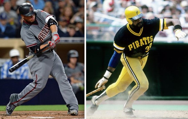
I was being interviewed on a sports radio show recently, and the hosts and I talked a bit about the Diamondbacks’ new uniforms, which we all agreed are pretty awful.
Then one of the hosts said, “Okay, enough with these newfangled designs. Let’s talk about the Pittsburgh Pirates ”” they’re going old-school with those classic 1979 throwbacks this season, right?”
I had to laugh at that. As I explained to the radio guys, it’s funny to refer to the Pirates’ late-’70s uniform set as “old-school” or “classic.” When it was introduced in 1977, it was considered groundbreaking and, in many people’s eyes, radical. The team mixed and matched three different jersey and pant patterns (black, gold, and white with thick gold pinstripes). Some of the resulting combos — black jersey with black pants, pinstriped jersey with gold pants, etc. — had never been seen before on a baseball diamond. Meanwhile, the caps, stirrups, and undershirts were all available in two colors (black and gold), and the caps were pillbox holdovers from the National League’s 1976 centennial celebration, which made no sense. Traditionalists hated the look.
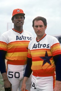
Nearly four decades later, though, those uniforms are now widely viewed as classics of their era. The same can be said for several other groundbreaking uniforms that, thanks to a bit of hindsight (and, in some cases, a bit of nostalgia), have made the transition from eyesores to eye candy. The Astros’ tequila sunrise uniforms come to mind, as do the Coyote’s “peyote coyote” look.
I explained all of that to the radio guys, and then I asked the obvious question that was hanging in the air: “Will the same thing happen with the new Diamondbacks uniforms that we were making fun of a minute ago? Will we look back at them in a few decades and think they look old-school? Are they actually destined to become modern classics and we’re just too set in our ways to see that?”
I thought about that question when the D-backs’ current set was unveiled back in December. In fact, I think about it every time I look at a new uni design, because uniforms don’t exist in a vacuum — they exist in the larger context of the world we all inhabit, and that world is fluid.
When I was a senior in high school, I got a copy of Christgau’s Record Guide, a compendium of rock critic Robert Christgau’s 1970s album reviews. In the introduction, Christgau explained that when he gives a grade to an album, “part of its intent is predictive — it asserts that I will (or won’t) find rewards in a given record six months or six years hence.” That notion of a review functioning as a prediction has always stuck with me, and I’ve tried to apply it to my own work as a critic. So when I gave those D-backs unis a negative review back in December, I wasn’t just saying I don’t like how they look now; I was saying I fully expect not to like how they look five or 10 years down the road (assuming they last that long, which I frankly doubt).
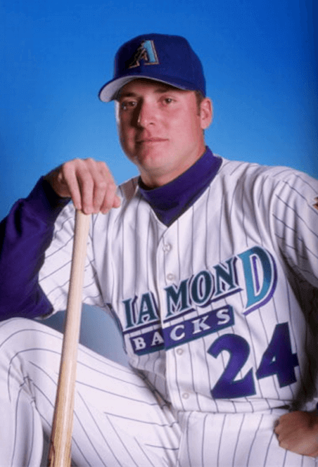
Sometimes, of course, a prediction turns out to be wrong. In fact, I’ve been wrong before about the D-backs: I thought their inaugural purple/teal set was hideous (Uni Watch didn’t yet exist when that set debuted in 1998, but I remember what I thought at the time), but I now think it’s aged extremely well and looks great, trendy color scheme and all. Maybe I’ll end up being wrong about the D-backs’ current set as well, although of course I don’t think so. (That’s the whole point of a prediction: You might end up being wrong, but you never think you’ll be wrong.)
Anyway, the question lingers: When it comes to newfangled designs that challenge the prevailing orthodoxy, how can we tell the difference between the ones that will sizzle and the ones that will fizzle? How can we foresee which ones will stand the test of time and which ones will end up on the “What were they thinking?” scrapheap?
There’s no magic formula ”” that’s part of what makes the question so interesting. It’s a question I’ve been asking myself for years, and I still don’t have the answer.
Membership update: The next batch of membership cards is off and running (beginning with Lucas Cochran’s Steelers bumblebee throwback treatment, shown at right). If you’d like to add your own card to this batch, you can sign up here.
While we’re at it: We’re now less than four weeks away from Purple Amnesty Day (May 17), the one day of the year when I’ll accept orders for purple-inclusive membership cards. Mark your calendars, all you Vikings, Rockies, and Northwestern fans!
May 17 will also mark this website’s 10th anniversary — not a bad run, eh? (This milestone shouldn’t be confused with the 17th anniversary of the first Uni Watch column, which will take place on May 26.)
As always, you can order your own custom-designed membership card here, you can see all the cards we’ve designed so far (over 1700 of them!) here, and you can see how we produce the cards here.
The Ticker
By Mike Chamernik

Baseball News: The Marlins gave Dee Gordon a diamond pendant for winning the batting crown last year, when he hit .333. The team gave Hanley Ramirez a less flashy one when he won the ’09 batting title. … Though he’s in seclusion during the game, Brett Weber, the Yankees’ replay monitor, wears a team uniform. Weber watches the action on two monitors and calls the dugout when a play should be challenged. In addition to the monitor duties, he throws batting practice and stands in as a first baseman during infield drills, which is why he probably needs a uniform (from Steve Flack). … During the late 1980s, the Class-A Palm Springs Angels wore the city name as the NOB (from Francis Smith). … Vineyard Vines makes expensive ties and belts with MLB team logos on them. Chief Wahoo is still an option (from Douglas Ford). … The Rangers’ Ian Desmond wore nice stirrups last night (from @KingStuDog). … Rare treat last night in Cleveland, as both starting pitchers — Cleveland’s Danny Salazar and Seattle’s Taijuan Walker — went high-cuffed with striped hosiery. But Salazar loses a few points for pairing stirrups with high-top spikes (from John Kimmerlein and Trent Perkins). … Will Sinnott found this 1955 photo of Orioles OF Chuck Diering. The O’s didn’t wear shoulder stripes in the 1950s after their move to Baltimore, so Diering’s jersey may be a prototype (the Orioles got new jerseys for 1955) or a recycled minor league version. … During Spring Training, Cubs manager Joe Maddon coined a new slogan, “Try not to suck,” which has been emblazoned onto T-shirts. The Cubs played the rival Cardinals in St. Louis this week, and officials at Busch Stadium banned spectators from wearing the shirts. The Cards say that it’s not solely an anti-Cubs move, as they disallow all T-shirts with the word “suck” on them, including “Cancer sucks.” ”¦ Southeast Louisiana wore camouflage last night. ”¦ The Blue Jays have created a life-size bobblehead.

![]()
NFL & College Football News: A reader named BirdsForBrains noticed that the Eagles’ practice jerseys have circles sewn into the shoulders. They most likely have to do with player-tracking devices. … Alabama has a logo for its tenth season with Nick Saban as coach. Here’s another look. Anyone recall seeing a anniversary/ordinal logo for an active coach before? Especially for a track record as relatively short as 10 years? (From Matt Lesser.) … New black helmets for South Carolina.

Hockey News: Capitals play-by-play man Joe Beninati is quite the dapper dresser. Beninati and his color analyst, Craig Laughlin, wear red ties during the playoffs (from John Muir). … Wade Heidt says that the yellow stanchions between the glass at the Predators’ arena this year remind him of the Rangers at Madison Square Garden back in the 1970s. ”¦ Former Blues G Marek Schwarz, now playing in a Czech league, has a new mask designed by his kids (from Timmy Westside).

NBA News: Comedian Chevy Chase wore a Lakers uniform for a 1985 appearance on The Tonight Show (from Ferdinand Cesarano). ”¦ TNT used Angry Birds-themed team logos during the broadcast of last night’s Blazers/Clippers game. … NBA players love to check their smartphones during halftime.

College Hoops News: Former Syracuse star Pearl Washington died yesterday. ESPN’s obituary of him included an incorrect photo when it was first published. That’s former Nets G Foots Walker, who, as far as I know, had no connection with Washington. The site has since fixed the error (from Rick DiRubbo).

Grab Bag: Coca-Cola is launching the “One Brand” campaign in Mexico, where the can designs for its various flavors will look more similar (from Andrew Hoenig). … Here are the helmets worn by NASCAR Sprint Cup pit crew members (from David Firestone). … HP, which introduced a new logo a few weeks ago, originally planned a rebrand for 2011 (from Deli Alley). … Brazil unveiled its men’s and women’s indoor and beach volleyball uniforms (from Jeremy Brahm). … Tomorrow, Denver will open a new rail line from downtown to the airport. “They sold the naming rights to the University of Colorado even though the route doesn’t stop at any of the four CU campuses,” says Denver Gregg. “Doesn’t include any discounts for students or faculty, either. No word on the conductors’ uniforms though.” … Back in the 1970s, my dad collected beer cans and displayed them in my grandma’s basement. The collection is still intact! I’ve always loved the old can designs.
That Chevy Chase appearance on The Tonight Show with Johnny Carson originally aired May 30, 1985. Carson is shown nightly on Antenna TV.
He definitely was on Carson to promote “Fletch”!
Exactly! 6’5″ with the afro 6’9″ !
link
Not just the #99 jersey, either, but shorts, socks and warm-up jacket. I’m sure they were really hard to come by in the 80s for an average fan, but he shared scenes with Laker players and Chick Hearn, IIRC.
I thought that was on two nights ago.
That Busch Stadium policy is consistent. I went to a game there maybe 6-7 years ago. I am Cardinals neutral but my dad lived in St. Louis for a few years. The only thing red that I owned which isn’t Phillies-related was a shirt that said “TRAJAN SUCKS” – a typographical shoutout after Kansas changed from their traditional circus font (for basketball) to Trajan (for everything). I was told I couldn’t wear it. But it is OK for young girls walking around in T-shirts declaring “I (heart) BUSCH”.
Best Fascists in America…
The cultural evolution of “sucks” is fascinating. 40 to 50 years ago, it was essentially a coded gay slur; now it’s just a synonym for “stinks.”
As someone who grew up in that day & age I don’t know about “sucks” being a gay slur, at least when used in that particular context. But I can guar-an-damn-tee you it was the closest thing to a swear word you could utter, and one that could get you your mouth washed out with soap.
That Busch Stadium policy is actually kind of refreshing, IMO.
It was totally a coded gay slur, whether you realized it at the time or not.
One reason “Disco sucks!” was such a catch-phrase, for example, was that the disco scene had a significant gay element.
I’m 54 years old and this is the first time I ever heard that “sucks” is a coded gay slur. Back in the 70’s/80’s there was no hesitation among pre-pubescent or teenage boys to use actual slurs to describe gays. There was no obtuseness.
Also if “disco sucks” was/is a coded gay slur, did the White Sox in ’79 invite a bunch of homophobes to a double header to revel in their prejudices? A bridge too far for me.
link
“Sucks”‘s connotation could certainly be a gay slur.
I mean if you say/said “You suck” to someone, you are/were really just being “polite” by leaving out the word “dicks”.
Clearly its connotation has morphed.
Early 1980s, “sucks” became hugely trendy almong school kids my age. It happened in all three of the states my family lived in over a four-year span. I was not aware of any connotation for the word other than “stinks” – but then this was before puberty, so I don’t think anybody in my cohort understood why the also very trendy “gaylord” was anything other than an innocent synonym for “weird” or “wimpy.” Anyway, I recall a lot of teachers being really upset about “sucks,” but they couldn’t explain to kids why it was worse than “stinks” or “stupid.” You’d get verbally reprimanded for any insult, but “sucks” was often punished beyond that in the same way that one of Carlin’s seven words would be.
It’s funny the words that are fads among children that do or do not stick around. “Sucks” definitely did; so did “awesome.” But “radical,” “max,” and “gaylord” from the same era did not. In thirty years, will we all be saying “adorbs” but have no idea what “totes” is all about, or vice versa?
Two things: You live long enough, you witness words coming in from the cold. In 1970, you couldn’t say “butt”. Since then, “suck”, “ass”, “dick”, “douche” and “fart” have moved from the playground to the script of an average network sitcom. Perhaps things are more genteel in St. Louis, but this sounds more like the politeness observed in Salt Lake City during the Olympics. Prediction: in 2020, “asshole” will appear in the headline of a New York tabloid.
Also, I have little sympathy for those who have the zeal of the recently converted, because it seems to give them license to blurt inappropriate language and use “the good fight” as their shield. Witness the Carman album, “Addicted to Christ”. I’m glad for folks who won’t surrender to cancer; I don’t need to see their “Fuck Cancer” t-shirt.
The election this year could theoretically lead to the NYT using most of the “words that can’t be said on television” in a single headline, perhaps even as a quote from a candidate.
I had no idea, though objectively I guess that isn’t surprising. Good knowledge.
I thought “…sucks” was a shortened version of “sucks eggs”.
Why eggs?
Probably a regional expression, like “Go pound sand”.
MJ, that’s a risky move, wearing a KU shirt in Misery. Do you think you could’ve gotten away with wearing a “Muck Fizzou” shirt in Busch Stadium?
Life’s an adventure. It would have been worth the risk. But I also wear my team’s colors in enemy territory. If you’re looking for trouble, you’ll find it. I try to be an amiable guest and I can’t recall getting more than good-natured ribbing from people around me. Trying to dispel the myth of the Philadelphia sports fan, one game at a time.
I was told to turn my “Yankees Suck” shirt inside out when trying to enter Camden Yards during my high school years in the late ’90s.
I was ordered to turn my “MADOFF” shirt inside out at Citi Field!
RE: beer cans…
Brings back memories. Removable tab tops. Seamed cans.
My Dad was a Black Label man for years.
Interesting regional(?) permutations shown as well:
Ballantine and Falstaff both with the Liberty Bell motif.
Fun stuff.
Ahh, Falstaff. The Thirst Slaker!
link
In college you could buy a case of returnable bottles for $6 (so, net price = $5). And not only that, but they were a source of intellectual stimulation while you got your drink on!
link
My family is from Waukegan, IL, so the Liberty Bells must be a Bicentennial thing. There is a Philly connection, though: I forgot to snap a photo of it, but one of the cans is an early 1960s Philadelphia Eagles-branded beer. It’s tremendous! I’ll have to get more details the next time I’m at the house.
Success will always be a factor in whether or not a uniform set will become a classic. The Astros enjoyed their greatest season in 20, when they nearly won the 1980 NL pennant. They also had an iconic player like Nolan Ryan during that era.
The Pirates were WS champs and fielded contenders with that set, and had players like Willie Stargell and Dave Parker during that era as well. Younger fans would be surprised how many other baseball teams copied the pillbox hat look, from the Yankees top minor league affiliate, to Vanderbilt University, and countless others.
By contrast, teams like the White Sox had a unique look, but never reached the playoffs. And Carlton Fisk is still known better as a Red Sox than anything he did in Chicago.
I agree to a degree…
Chicago Cubs unis of the thirties were definitely classic. Still hold up today. Overall not so great teams but great sleeves!
Back in the 80’s (when I was learning how to compose and design) we thought a good design that would stand up over time had “Legs”. As in “that logo’s got legs”.
AGood logotype, say for example, the TG Todd Radoms Milwaukee Brewers interlocking logo stands up over time because it is an example of good composition, using presentation standards established over the previous 500 years of design, (Golden Ratio to Petruvian man, et al.). It’s all there. It lasted for around a decade or so before ownership went full beer label.
The old/new ball in glove logo turns out – has legs. It was pretty good when it came out decades ago and is pretty good now, just not in pink – but that is another story.
You’re wrong—the White Sox won the division in 1983, which has come to be mythologized here as the year of “winning ugly”—that is the whole reason they’ve continued to wear the 1983 throwbacks for several years now. Up until the 2005 World Series that season was their biggest recent success.
Also, I can guarantee people wouldn’t care half as much about the Diamondbacks original unis had it not been for the 2001 championship. You don’t see anyone, let alone the team, giving a crap about the Devil Rays’ rainbow jerseys these days (yes, they’ve worn them as throwbacks once or twice, but their primary throwback is a uniform for a team that never existed).
I can guarantee people wouldn’t care half as much about the Diamondbacks original unis had it not been for the 2001 championship. You don’t see anyone, let alone the team, giving a crap about the Devil Rays’ rainbow jerseys these days…
You talk about those two uniform sets as if they’re on a par, as if they’re roughly equivalent examples to compare. Do you honestly believe that?
One of them happens to be the worst uniform set in MLB history. Maybe that’s why nobody “give[s] a crap” about it.
How bad does a uniform have to be that even the “first-year expansion team” vibe can’t help it?!? That’s some serious malpractice!
I think of those two teams and their uniforms as being connected contextually to their 1998 debut. They were both outlandish and trend-jumping at the time, featured unusual animal mascots and inhabited a warm-weather climate that was still relatively foreign to professional baseball. I think viewed from today, both sets look equally dated, though the D-backs’ unis did conform a little more to baseball standards (the left chest logo, the cream and pinstripes).
Your assertion that Arizona’s 2001 set is a ‘classic’ is your opinion. I think people look on those uniforms more favorably given their two subsequent sets have been so terrible, and because of the cinderella championship—the ugly duckling defeating the mighty Yankees.
Your assertion that Arizona’s 2001 set is a ‘classic’ is your opinion.
Actually, I never said it was a “classic.” I said it has aged extremely well. And yes, of course that is my opinion — I never claimed otherwise.
I am not a D-backs fan, and so my own feelings about the design have nothing to do with the team’s on-field performance, since that performance means nothing to me.
Worst in big-league history? Dude, I can’t even. Top ten worst? Absolutely. Top five? Arguably. But there’s some stiff competition at the bottom. The current Diamondbacks. The current Marlins. The black-era Mets. The Disney-era Angels. The White Sox, several times over their history. The Toronto Black Jays. The 1970s Twins, sad to say.
The D-Backs are an interesting case. The original unis now seem classic in a general sense, but the unis had a lot of bad or near-miss details. The team made a bunch of relatively slight tweaks in 2001 that vastly improved on the original. It’s like the original set had the potential to be a classic, and the second uni set realized that potential. In fact, I think I might get my 2001 D-Backs cap out of the closet to wear for a few days, what with that and a Rockies cap being pretty much the only purple I own.
Fair enough, you didn’t say classic. But don’t you think it’s possible that those D-backs uniforms have been so top-of-mind for you recently because the team revived them as a throwback alternate? If they hadn’t done that, I wonder whether you would’ve taken the time to give them as much consideration and ultimately change your opinion of them. That was part of my point—that success in a uniform keeps that uniform relevant (if nothing else than through repeated highlights) and doesn’t allow it to be forgotten so easily.
I loved that story about Yankees assistant Brett Weber. Windering what number such a staffer might wear (and knowing how few are left with the Yankees), I discovered link, which indicates that he wears number 89.
I’ve always wondered why I’ve missed “Purple Amnesty Day” and now I know. It’s my anniversary…and my high school is Purple & Gold (though it’s more of black & gold with purple accents), it was originally “regal violet” and “Arabian gold” in the 1930s, a pair that is much better than the 50s-00s base purple and crayon yellow that it turned out to be.
And, no we don’t have pictures in color for that, just a couple of murals that were painted over and a newspaper clipping somewhere in the old records room.
In light of some of today’s content: “You’re in the records room… The records’s room?… yes, can I get you anything?..Yes, do you have The Beatles White Album?”
I listened to a little Mike & Mike this morning (which I never do). They had Adam Silver on and discussed “sponsor” patches on unis and the North Carolina controversy. After Silver left, Greenberg made a point to highlight that the patches will not be on retail merch. That got me thinking, though. When you order a replica St. Louis Cardinals jersey, it doesn’t come with the uni number on the front. When you order a replica Premier League shirt, it doesn’t come with league patches on the sleeves. You have to pay up to get the authentic, “on-field” look. So, my guess would be, maybe not the first year, but eventually, the ad patches will become a mark of authenticity. “This Grizzlies replica jersey is $100, but for $250, you can get the authentic jersey with the FedEx patch.”
That scares me.
Scary, yes, but an easy prediction to anticipate.
Should be the other way around, with the ad patch subsidizing the cost of the garment, or the tickets, or the food. Something!
The Pirates bumblebees and the Astros tequila sunrises were functional. You could read the names and numbers. You can’t say the same for Arizona, at least not with the dark gray uniforms. Without tweaking them (teal numbers, perhaps?), they won’t last long and will only be considered classics by contrarians. The Diamondbacks never should have strayed from their originals.
Agreed. The new Diamondbacks jerseys are unreadable. Until they fix that problem, they are literally the worst in MLB history, including TATC.
“Comedian Chevy Chase wore a Lakers uniform for a 1985 appearance on The Tonight Show (from Ferdinand Cesarano).”
That’s probably because he wore a Lakers jersey in the movie “Fletch”, which also came out in 1985. Wore a purple jersey in a few scenes and was in a gold jersey during his dream of playing for the Lakers.
link
link
link
DenverGregg mentioned the new rail line from downtown Denver to the airport. It’s definitely been part of local news the last few weeks and the naming rights conversation popped up last night on local news.
As a staff member at the Denver campus of the University of Colorado it’s pretty sickening…for me at least. The Denver campus is the closest (of any of the four campuses) to that rail line (3/4 mile walk through downtown) and while those naming rights don’t include any discounts for students or faculty, this is also happening at a university where staff/faculty have felt the cold dead arm of budget restraints in the past 2-3 years.
Interesting to see that they’ve utilized funding they could have invested in their staff and faculty and facilities for the purposes of branding a rail line. Classic move.
Typical higher ed move, I agree DenverBill.
I work in higher ed, and it’s all too common to see these moves. Wouldn’t it be nice to reward us who do so much for the institutions…
We all work in higher ed because we want to empower students. How can you expect staff/faculty to empower the student population when you make the staff/faculty an afterthought? Or simply make financial decisions like this, when you could utilize funding for resources to enhance services and empower the student.
But it’s money that’s the driving force these days…here in the good ol’ USA. Land of the free, home of the Whopper.
Sorry, this has been WAY off the topic of any Unis. But naming rights has definitely started to sting so many things it touches.
What really caught me off guard (and irritated me) was the ‘no discount’ policy for CU or UCD students/faculty. CU shells out a hefty price to get naming rights, but completely misses the mark on taking care of their own.
I mentioned in another comment that the line doesn’t even go to Boulder. We’re getting a stop in Westminster soon, but I have no idea when the Boulder stop will open.
Wow, the amount of douchebaggery in that piece about the train in Denver is staggering:
“‘People don’t go to Coors Field expecting a brewery tour,’ he said, “and they don’t go to Sports Authority Field at Mile High expecting to buy skis.
‘The point of naming rights is to elevate your brand and make people aware of who you are.'”
Yes, because people in Denver aren’t aware of the University of Colorado. I thought universities tried to position themselves as more than just companies like Coors or Sports Authority (especially the latter, now that, well, it’s bankrupt).
So gross.
That’s honestly just the tip of the iceberg. Over my time at the University (close to a decade) there’s been a drastic shift in “how we do business” specifically related to how funding is spent.
To add to that, It’s the University of Colorado. Anyone with half a brain would relate CU to the surrounding area (being that all advertising currently used pushes that we have multiple campuses in and around the Denver area (Boulder, Denver, Colorado Springs, Anschutz Medical Campus)) but perhaps their next step is to start airing TV spots during day-time TV… Stellar reputation.
Bet this has been shown before, but always wondered how an Buccaneers v. Oilers Super Bowl would have looked.
link
Like candy!
Giants replay assistants also uniformed personnel. Chap Chop (#91) is listed as BP pitcher and replay analyst and Shawon Dunston (#21, although others wear #21 at the same time) is listed as assistant coach and replay analyst.
I hate the D-Backs set as much as the next guy, but I have a feeling that the shade of grey on the road set could catch on around the league – possibly the new powder blue?
I think the dark grey used by the D-Backs could work, if the letters and numbers were in a light color such as white, yellow or orange. See for example Tennessee’s baseball uniforms this year:
link
But the D-Back uniforms are illegible (not to mention poorly designed in general).
One MLB team that I think could really make a dark grey uniform work is the White Sox. The darker grey could let them do their letters, numbers and symbols in white, similar to the way the Royals’ powder blues allowed them to use light numbers and letters.
Looks like my link to the Tennessee uniform was clipped. Let’s see if this one works better:
link
Yes, but because silver is also in the Sox’ color set, the use of light gray away uniforms works very well.
When the Blue Jays introduced their previous uniform set (the ones with very little blue, and mostly black), I seem to remember charcoal road uniforms being part of the unveiling.
Somehow, from the time the unis were introduced to when they actually were worn on the field, someone decided to go with a more traditional shade of gray.
Did I imagine this, or did this actually happen? Amd are there pics of the dark gray prototypes?
Scroll down to the Blue Jays section of this piece:
link
Thanks
The “Black Jays” prototype made it into MVP Baseball 2004. Is Eriq Jaffe still around here to talk about it?
I think that whether a uniform set becomes a “classic” depends, at least in part, as to how well it encapsulates and influences their peers. So the Pirates get a sort of “it was the 70s” shrug, while maybe the solid orange Orioles uniforms didn’t catch on. The Royals’ powder blues are obvious classics, but maybe we don’t feel the same way about the Mariners or Cardinals light blue uniforms. The Hornets’ teal and purple seems classic now, and we can even give the same sort of “it was the 90s” shrug to the Raptors – but the Hawks and Rockets uniforms of the era are eyesores. So maybe the current D-Backs uniforms potential classic status depends on whether others follow suit. Please, god, no.
I meant to say “encapsulates an era.”
I think the idea behind advertising on the airport train was not to increase visibility of CU to Denverites, but to out-of-towners. Our state support has dwindled to nearly nothing, and we’re a small-population state, so we’re quite financially dependent on tuition, and in particular non-resident tuition. It’s how we’ve been able to remain relatively affordable for Colorado residents, who are in part subsidized by the out-of-state students. The unfortunate reality is that higher ed is a competitive marketplace.
I hate the increasing corporatization of higher ed as much as anyone, but until the taxpayers show more willingness to step up and support public institutions, this is the direction we’re heading.
until the taxpayers show more willingness to step up and support public institutions, this is the direction we’re heading.
If taxpayers do not step up and support public institutions, they essentially cease to be public institutions. That is the larger issue confronting us as so many basic public functions (prisons, schools, etc.) become privatized.
Agree 100%
Taxpayers do support public education…unfortunately, politicians seemingly see public education as some of the first cuts they need to do for budgets.
You make it sound like there’s no connection between taxpayers and politicians. The former elects the latter.
You make it sound like there’s no connection between taxpayers and politicians. The former elects the latter.
(Insert the “Giant Douche vs Turd Sandwich” South Park episode here)
No, voters claim to support public education when opinion polls call them on the phone. But when they get to the voting booth on election day, a governing plurality of Americans vote for politicians who promise either to cut spending or not to increase taxes, or both. As a matter of simple arithmetic, this means education will be cut, since education represents the bulk of local government budgets and a sizable chunk of state budgets. If you have to cut spending because you’ve promised to cut spending, or because you promised not to raise taxes and the cost of everything has gone up as it does every year, then you’re going to cut education.
The thing about democracy is that voters get the government we want. By definition. If voters didn’t want to starve public education of resources, they would have voted for other people.
Someone on the radio in 1992 – ‘You think this logo has run its course? It has been 15 years now..’
He referred to Brewers ball in glove logo, by 1994 they scrapped it – it took about a decade for it to be realized as a lost classic, and slowly returned since.
Does “classic” even actually mean “good”, or just “old and memorable”?
Re: the Nick Saban logo, Virginia Tech had a 25th season Logo for Frank Beamer back in 2011. Unfortunately the only copy I can find online is small:
link
The idea of a train name being misleading because of branding really rubs me the wrong way. Have they never heard of wayfinding? Will out of towners get on the wrong train?
The correct analogy isn’t going to Coors Field for a brewery tour. The correct analogy is getting on a train marked Coors Field which doesn’t actually go to Coors Field because the train name is only a brand. Which would be stupid.
. . . to make matters worse, we’re a few months away from another rail line opening that will go to the CU Medical School campus. But it won’t be named after CU because of the advertising rights.
Will one of the stops at least be named after the University so that people riding the train will know where to get off? Or is that stop named after the highest bidder?
Neither. It will be named after the Army base that closed about 20 years ago where the Med School is now housed. Though if I had a zillion dollars, I might buy the naming rights and name it after ‘The Voyeur’s Motel’, the site of which is right nearby.
Why is there a deduction for wearing high-tops with stirrups?
Just doesn’t look good:
link
If my recollection is correct, Chipper Jones started wearing high tops at some point to help with ankle issues, and he lamented that he couldn’t go high cuffed anymore (or more accurately didn’t want to ’cause it looks like crap).
It appears that most “classic” uniforms are those which embraced a clean slate approach, and the correlation with success on the field is tentative, at best. Which would explain the esteem the Cleveland “Caveman” uniforms have, as well as Houston’s tequila sunrise jerseys (1986 notwithstanding), or any first-year expansion team. Trickier is trying to explain why a bygone look hasn’t caught on; say, the season the Mariners switched to button-fronts, the Pirates 1997 reboot, the Brewers of the early ’70s. My guess would be combination of poor play and what is perceived as uninspired design.
I didn’t consider sports outside of baseball, despite Paul’s mentioning the Peyote Coyote. But that would, for practical purposes, fall under “first-year expansion team” rules. In the other sports, the unused uniforms that seem to most lift everyone’s spirits are the powder-blue Chargers’, the green Hartford Whalers’ sweater and Golden States’ “The City” suit. Of that group, the outlier would be San Diego who seem simply to coast on an attractive color.
The bygone uniform which defies all my explanation is the Flyers’ “Cooperalls” set, which was both outside-the-box and worn during a period of success, but has been rejected for being butt-ugly.
As for anticipating whether my predictions will be correct, I used to think I was a contrarian. People laughed at my opinions in the here and now; but I witnessed people recently referring to the creamsicle Tampa Bay uniforms as “classics”. I have to admit I thought that would never happen. And now I hear the Flying-V Canucks, the bumblebee Pirates and the “Thanksgiving” Padres remembered in the same exalted terms. All favorites of mine at the time; my first impressions usually turn out to be correct. So for that reason, the Diamondbacks’ uniforms are not classic.
As a Diamondback fan that was embarrassed for the players every time they trotted on the field last year (except in their Saturday home blacks), I quite like the new road jerseys, with the exception of the teal outlines, that looks terrible with the red.
I am so happy they seem to have ditched the “D” snake cap logo (I haven’t seen them in it this year that I can remember), and I haven’t noticed the diamond gradient on the caps worn on the field yet, which is good because those look horrible. The red away jersey with the dark grey pants looks pretty good with the “A” cap.
As a Diamondback fan that was embarrassed for the players every time they trotted on the field last year (except in their Saturday home blacks), I quite like the new road jerseys, with the exception of the teal outlines, that looks terrible with the red.
I am so happy they seem to have ditched the “D” snake cap logo (I haven’t seen them in it this year that I can remember), and I haven’t noticed the diamond gradient on the caps worn on the field yet, which is good because those look horrible. The red away jersey with the dark grey pants looks pretty good with the “A” cap (what they were wearing last night with Greinke pitching).
Not sure if this has been mentioned before but in addition to the ad patches, when Nike takes over the NBA jerseys their logo will also be visible on the left chest, similar to their college jerseys. This would make the first time a makers mark will be viable on NBA game jerseys.
Also teams are not requiem to participate in the program. I wonder if certain teams that have been in the NBA for a while (boston, ny, lal) will go the Barcelona route and not wear advertising on their uniforms.
Nike logo will actually be on the upper-right chest, not left. Ads will be on left.
The current Diamondbacks uniforms will never be classic because of three main details. One, pajama pants (vs. stirrups/long socks) will never be “classic”, and are made worse by the coloration. Two, pants which have partial striping will only be trendy, not classic. Three, coloration on the shoulders will never be considered a classic look either.
As for the shade of gray and the unreadability of the numbers and names, those can be tweaked and improved. I refrain from full judgement on those until I see them in-person vs. on TV. The gray, particularly when paired with the red tops, reminds me of the T.B. Buccaneers pewter, which really hasn’t caught on with other teams.
link
Truncated pants stripes have been trendy for almost two decades now (Denver Broncos).
As for jammy pants, believe it or not (and it pains me to type this), there are actually people who prefer that look to even the most perfectly-bloused pants.
One factor in whether a particular design or color combination becomes a “classic” or a tragic mistake can just be sticking with it (and in the Astros and Pirates case, reviving it). As Noah Cross says in Chinatown: “‘Course I’m respectable. I’m old. Politicians, ugly buildings, and whores all get respectable if they last long enough.” To some extent, uniforms can work the same way.
Perhaps Purple Amnesty Day can be extended as a Prince tribute?
Sign o’ the time: I learned of Prince’s passing when I was standing in line over my lunch break. I checked Facebook on my phone, and noticed purple-tinted profile photo updates from all of the Minnesota sports teams I follow.
link
link
link
Seems pretty much every team in the Twin Cities is already on board that particular tribute bandwagon:
link
link
Even the link joined in, turning their logo black and white with a “purple rain” themed background.
To me, “classic” is the wrong word. “Classic” are the cardinals chain-stitched chest logo, or the Yankees pinstripes. The Tigers (in their standard home whites) are “classic.” With the exception of some differences in textiles and tayloring, those uniforms aleays work, in any era.
The tequila sunrise unis, and the pirates unis from those years are iconic of an era for sure. They represent the best (or best known) examples of uni design I’m a given era but that doesn’t make them “classic” uniforms. Case in point, the DBacks’ inaugural unis were not classics, but they have aged well because they encapsulate well many aspects of uniform design in the mid to late 90s.
“Classic” uniforms are more timeless. Think the raiders or packers in football, or the red wings in hockey.
These new DBacks unis are not ever going to be classics. They may end up being a great example to point to that encapsulates the trends of design in the mid 2010s. We may be able to call them “iconic,” but for these unis to be considered “classics,” that ship has probably already sailed.
Love your Christgau reference. He wrote my favorite line on music. It was about a Billy Butler in NYC. He said:
Played the guitar solo on “Honky Tonk” and will go to heaven for it.
I meant a Billy Butler gig in NYC
Not only does the Denver light rail not stop at any of the CU campuses, the rail system doesn’t even go to Boulder. There is a stop opening soon southwest of Boulder (by about 20 miles), but as of right now it doesn’t go anywhere near CU.
How can we tell what will become classics? Interesting question. I think it’s a totality of the circumstances between staying power and relative success.
San Diego Padres? Not sure whether any one brown and gold is the most classic, but it’s their classic palette.
Denver Broncos? It’s fascinating how orange is famous enough to become the main color once again, even after Super Bowls in navy.
Boston Red Sox? Bet you all forgot for a second that they have a championship with the no-red lettered road jerseys.
The Padres had a stretch between 1974 and 1980 where the uniform changed in a substantial way every year! If pressed to pick one that was superior, I’d say 1977 since they straightened out their hodgepodge of trim on the home uniform and standardized the gold outlining around their brown tackle-twill graphics. The brown road jersey with its yellow raglan sleeves and Windsor Condensed “San Diego” was pretty.
I’m in the clear minority preferring the Broncos’ navy blue home uniforms. The fans just don’t like them, Super Bowl or not.
The Oakland A’s uniforms in the 60’s and 70’s were groundbreaking.
A uniform I happened to dislike but pegged as a potential classic was the 1986 Texas Rangers’ jersey. Too dull for my tastes but it was the Nolan Ryan era, after all. The no-hitters he threw wearing them should have burnished their status. But posterity seems to have written them off as boring Dodgers’ clones.