For all photos, click to enlarge
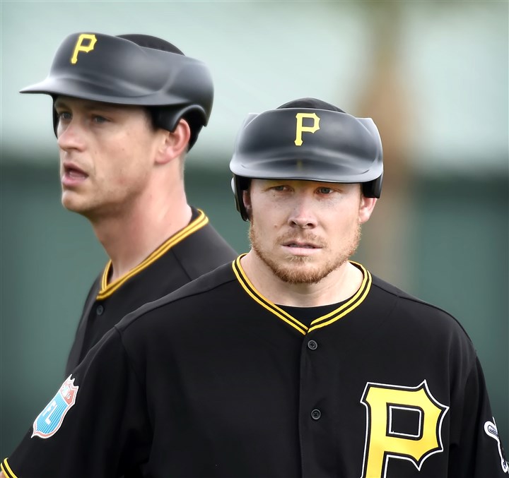
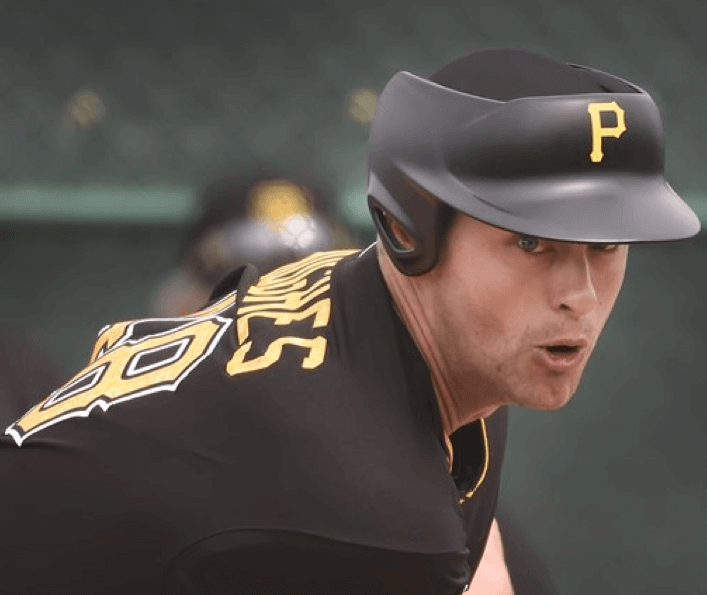
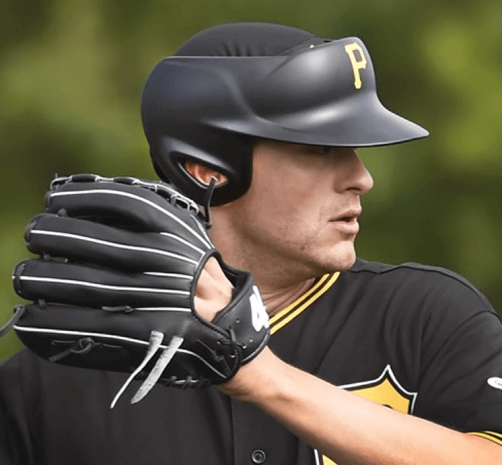
Pirates pitchers Jared Hughes and Mark Melancon, shown above, became the first MLBers — at least that I’m aware of — to try out the new protective headwear for pitchers during yesterday’s workouts. Here are some additional shots, all of Hughes (first photo by Zane Heiple):

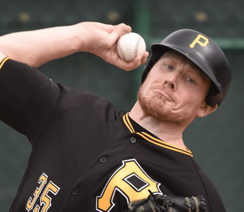
As you can see, there appears to be a thin layer of mesh fabric over the top of Hughes’s head. According to this article, “Instead of a regular cap, the pitcher wears a thin skullcap underneath the headgear. The design makes it seem like the player has an extreme flat-top haircut ”” or perhaps only half a head.”
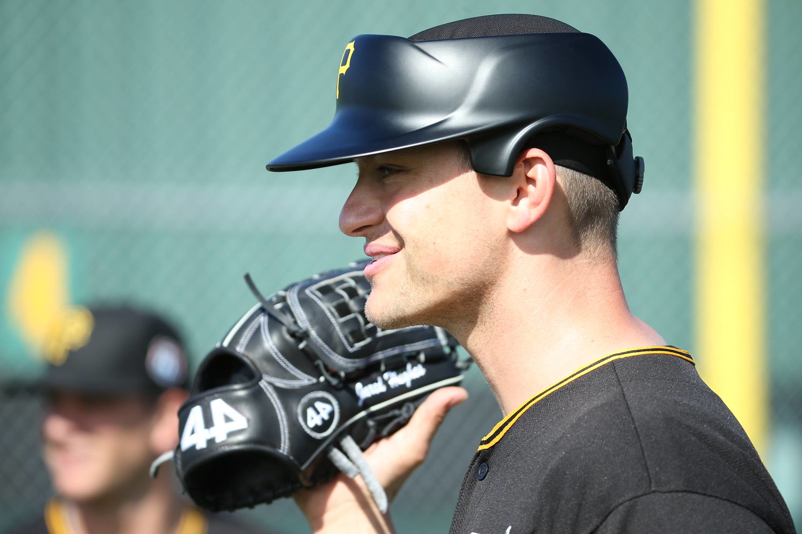
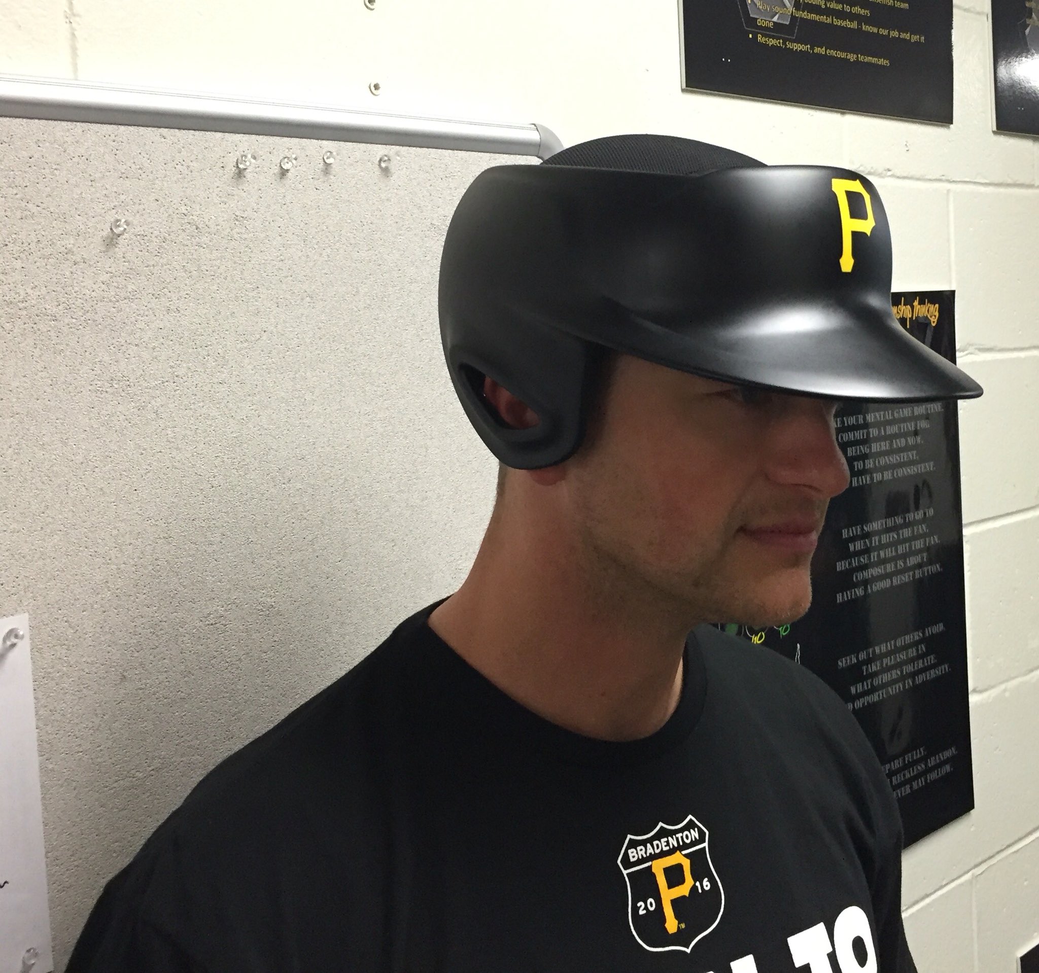
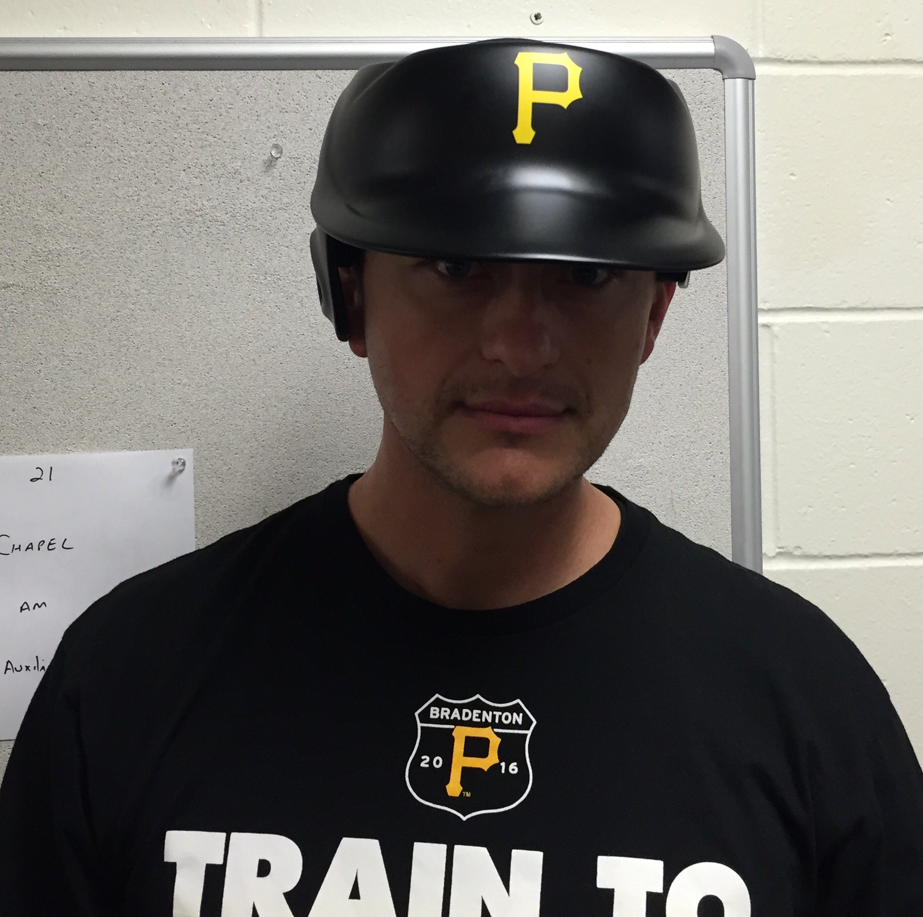
You can get a better sense of the skullcap in these next two shots:

Afterward, Hughes said, “It felt like a normal hat. I plan on wearing it in a game and seeing how it is against hitters.” But Melancon was less enthusiastic: “It looks funny. Just because of the looks, it might not be something that I wear during the season. As shallow as that seems, and I’m definitely not that guy ”¦ I don’t know. I’m just not there yet. Give me a little time, and maybe I’ll get there.”
There are lots of additional photos at the bottom of this page, and here’s some video:
Finally, in case you missed it, Phil took an extensive look at the new gear two weekends ago.
Click to enlarge
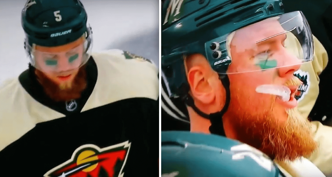
St. Paddy’s Day comes early to Minnesota: We’re used to seeing eye black in the NHL’s outdoor games, but it’s not often that you see eye green. That’s what Wild defenseman Christian Folin was wearing for yesterday’s Stadium Series game against the Blackhawks. As a lifelong green-ophile, I heartily approve.
A few other notes from the game:
• While Folin wore eye green, several other players wore eye black:


• As you can see in that last photo, the Blackhawks’ collars and merch had stars inspired by the Chicago flag.
• As is typical for these outdoor games, the coaches wore really awesome varsity-style jackets:


• The TV numbers were comically oversized, especially for the Wild. I know, I know — it’s so the people in the stands can see them (even the “best” seat in the house was really far away from the ice). Maybe so, but it still seemed like a bit much:


• Similarly, I see no reason for the Blackhawks to have had wider spacing on their sleeve and sock stripes:

These last two elements — the TV numbers and the striping — fall squarely into the “It’s a Stadium Series game, so we have to make some kind of change to the uniforms” category. That’s bullshit. I love these outdoor games, but I’d love them more if the teams just wore their regular unis, or if they wore throwbacks. These “special” unis aren’t special at all — they’re just change for change’s sake (or for merchandising’s sake, which is even worse).
Click to enlarge
Gromm•It update: Decided to put some round pegs in square holes. Additional photos (including some with butter and syrup) over at Gromm•It.
The Ticker
By Paul

Baseball News: Tequila sunrise jerseys the other day for Hawaii. … Maryland’s new striped stirrups would be awesome if not for the insipid logo creep (from Alex Bearson). ”¦ Here’s a close-up look at the Blue Jays’ 40th-season patch (from Ian Okorofsky). ”¦ San Diego State and Oregon had an Xmas-themed color-on-color game yesterday. ”¦ Check out the Texas Rangers cowboy boots that skipper Ted Williams bought the team in 1972. ”¦ Powder blues yesterday for Mississippi (from Alex Wilson). ”¦ Very nice cream throwbacks for Tennessee (from Adam Ingle).
College Football News: In last Thursday’s post about college football players who’d worn No. 100, I said that WVU’s Chuck Kinder had worn No. 100 in 1963, in conjunction with West Virginia’s state centennial. That’s true, but it’s incomplete — it turns out Kinder kept on wearing No. 100 in 1964 and ’65, as explained on this page: “Kinder continued to wear [No. 100] until the 1966 season, when he was asked to stop wearing it by the new coaching staff due to all the questions they were receiving about the odd number.” And sure enough, you can see Kinder wearing the century mark in the team portraits for 1964 (he’s in the second row, slightly right of center) and 1965 (front row, slightly right of center). Big thanks to Too Tall Paul Deaver for setting the record straight on this one. ”¦ Buried within this article is the following quote from former Illinois coach/AD John Mackovic: “I saw a picture of Josh [Whitman, Illinois’s current AD], and next to him was the traditional jersey and helmet. I like the traditional look, the way we were branded at the time. It ticks me off when people try to change things. I call them costumes. I hope Josh will consider returning to the classic Illinois uniform” (from Kenny Kaplan).

Hockey News: New logo for the Kontinental Hockey League (from Mark Grainda). ”¦ Here’s an unusual sight: Two NHL teams wearing same-colored socks. That’s from the late ’60s, when the Bruins inexplicably wore white socks for all of their games, even when wearing their black jerseys (from Tom Donnelly). ”¦ Colorado College G Jacob Nehama wore a tuque over his mask in Saturday-night’s outdoor game against Denver (from @oddmanrushnews). ”¦ The Connecticut Whale went pink in the rink yesterday.

NBA News: Contrary to what had been previously reported, the Lakers are not opposed to advertising on uniforms (thanks, Phil). … Here’s something I didn’t know: The SuperSonics’ new uniforms weren’t ready in time for the 2001 preseason, so they had to wear old ones.

College Hoops News: Penn wore blue at home two nights ago, forcing Yale to wear white on the road (from Robert Brashear). ”¦ More women’s teams wearing pink: Syracuse and Pitt (from @NY_Raider). ”¦ Also Michigan State and UNC (thanks, Phil). ”¦ Throwbacks yesterday for Indiana State.

Soccer News: The new U.S. Men’s National Team jerseys and a new crest will reportedly be unveiled before the World Cup Qualifiers in March (from Terry Mark).

Grab Bag: No photo, but the crew of the U.S.S. Constitution — also known as Old Ironsides — wore period uniforms to mark the 201st anniversary of the ship’s final battle in the War of 1812. ”¦ New interview cap design for the winner in the NHRA Mello Yello Drag Racing Series (from David Firestone). ”¦ Here’s your ballot to vote for the latest NASCAR paint scheme of the week.
On those Pirates pitchers, I’m curious as to what that 44 logo is. Anybody know?
Glove manufacturer. 44 Professional Globes. Hughes is one of their athletes:
link
Folks, I’m hurting for cash and had to put my stirrups from comrade Marshall on Ebay. If interested, just search “stirrups” with either “1969 Padres”, “1969 Seattle Pilots” or “Brooklyn Americans”. If this type of post is against the site’s rules, I apologize and please delete.
-Jet
Just an aside but you seem to waste a lot of food with this Grom-it thing. Maybe you should match all the food you waste with some sort of donation to a soup kitchen.
You’re assuming that the food goes to waste.
That assumption is incorrect. Further details on Gomm-It’s “About” page:
link
I love throwbacks for hockey but I like that the Stadium Series differentiates itself from the Winter Classic by not wearing throwbacks. I thought the Hawks and Wild stayed true to their regulars and just blew everything up which actually looked great on tv.
I agree about the value of differentiating the Stadium Series from the Winter Classic. And I sort of agree in principle with Paul that event uniforms are gratuitous. But for the most part, the changes-for-change’s-sake that the NHL has been doing with these event uniforms have been good. Sure, there’s no need to change Chicago’s stripe pattern. But the Stadium Series stripes looked better than the normal Blackhawks stripes. If you can look better, you should. My wife, who watched the first period with me but doesn’t care for hockey at all, and who is a Minnesota native, was rooting for Chicago just because she liked Chicago’s uniforms so much, especially the sleeve stripes.
My only gripe with either uni was the too-narrow side stripes on Chicago’s pants. Otherwise, it was a better-looking game than any regular Wild-Blackhawks matchup.
Anyway, the NHL gets an exemption from my usually objection in principle to these kinds of event uniforms as long as it continues to make such excellent event uniforms. No other league comes anywhere near the thoughtfulness and quality of the NHL’s one-off uniforms.
Minnesota had special breezers (I think they were breezers) for the event with the fancy script “M” on the side. Perhaps the Hawks could have worn breezers with a wider white stripe and four red Chicago Stars, the better to match the rest of the uniform.
CCM put four five-pointed stars on Corey Crawford’s pads instead of the six-pointed stars of the Chicago flag.
link
Also, not shown, but he was wearing the same white socks as the skaters. He usually wears his old black socks from his days in (AHL) Rockford.
I’ve been tweeting at CCM for three days about this to no acknowledgement. They also tweeted multiple times the last few days, with pictures, bragging about the look.
Oh yeah, and way to go CCM on not fixing the incorrect stars on Corey Crawford’s pillows for the Stadium Series. It isn’t like they had any reference of the correct ones on the toques, sweaters and Crawford’s mask(sarcasm).
My lord those protective hats look like the kind worn when someone has a brain injury. I hope they work.
“…those protective hats look like the kind worn when someone
haswants to prevent a brain injury.”~~~
Hopefully, that’s how we should all look at the Boombangs (capmets).
I hope no pitcher is looking (falling) down when the ball is coming back at them off the bat.
I like the Stadium Series uniforms. It seems to me that the larger TV numbers for the Wild and wider spacing on sweaters and sock of the Blackhawks stays true to the design adage that “form should follow function.” As noted this is particularly true when the fans are far from the ice.
There was a comment the other day about how football stadiums are better for baseball stadiums for hockey. At the football stadium, it seems like everyone is equally far away. At baseball stadiums, fans along the first and third base side are reasonably close, and those in the upper decks have great views.
Love those Blackhawks stadium series uniforms! The neck inlay with stars is a really cool design feature. My team designed our own logo for our team Blackhawks winter classic’s a few years back and these would be great as our home jersey option. A team gofund me page maybe in order.
@mike engle
That ’44’ is a custom baseball glove company. They specialize in custom designed baseball gloves.. Mainly colors and webbing variations, it’s not like you can get a popcorn dispenser on the back end of it or anything.
All I see when I look at those pitcher helmets is the helmets the Rebels wore on Endor in RoTJ. Anyone else?
link
Apparently that first link doesn’t want to cooperate. Here’s a link to the Google search:
link
Ha! You’re right; they do look similar.
That’s been the direction fielder helmets have been evolving for a while. Since that’s my favorite Star Wars headgear, I’m psyched that thr circle is now complete.
The TV numbers were comically oversized
PFFFT. They were just right. Every team’s normal jersey should look like that, and you might as well make the back numbers bigger, too.
I think the skull caps on the protective headgear would look better if they had squatchees.
I’m surprised they don’t have the MLB logo in the back, to say nothing of the ST logos. Particularly in light of the extra league branding MLB is undertaking this year on uniform pants.
The first thing I thought of when I saw the Pirates’ headgear: link
Ticker/college hoops: link for Mississippi State supposedly wearing pink goes to video of Michigan State definitely wearing pink.
Fixed.
Buried within this article is the following quote from former Illinois coach/AD John Mackovic: “I saw a picture of Josh [Whitman, Illinois’s current AD], and next to him was the traditional jersey and helmet. I like the traditional look, the way we were branded at the time. It ticks me off when people try to change things. I call them costumes. I hope Josh will consider returning to the classic Illinois uniform”
This is the tension that I enjoy observing. The John Mackovic quote sounds like grumpy “get off my lawn” stuff, and I hope I’m not that guy yet, although I often feel like that guy.
The Pirates pitcher’s helmets look insane–like the pitchers have been lobotomized. Am I being the “get off my lawn” guy?
The first time I saw the oversized TV numbers on a stadium series jersey I thought they look ridiculous. But now they look kind of cool. Maybe I am not the “get off my lawn” guy yet…
We’re way past time for NHL teams to seriously experiment with TV numerals no the shoulders.
For that reason alone I’m happy they tried something different.
WHA’s Alberta Oilers did it in the 70s, as we are being treated to this year in their retro alternate uni.
The 1980 Penguins and 1978 Barons, among the brotherhood of NHL teams, had the TV numbers up on the shoulders. It ought to be tried on a team with crests up there, such as the Lightning or Capitals, so the position of numbers and crests were swapped. On a team without crests, such as the Islanders, it might not register.
most likely posted but
rejected Diamondback designs
link
The TV numbers for the NHL game is a good idea… provided there isn’t a large screen at the stadium/arena where the fans are also watching the TV feed. That one Wild player with # 11 — the ones are too close together.
An unusual look for the Blackhawks with the shoulder yoke. But having it all black gives the overall uniform more black than red… when technically black is the trim color in their design because their dark uniforms are red. Looks like there should be more red in the design to better define them as the Blackhawks. Normally I don’t like when a team eliminates the waist striping because it is such a historic hockey design element, but in this case it doesn’t look too bad on Chicago since the pants are a contrasting black. It’s when the pants and jerseys are the same color that it bothers me, looks like it really needs that waist striping to define the shirt separation from the pants…
-Jet
“… when technically black is the trim color in their design because their dark uniforms are red. Looks like there should be more red in the design to better define them as the Blackhawks. …”
You do see the irony in this statement, yes?
You could say black is the trim color on their home uniform, but on their white uniform, black is and always has been the dominant color, with red being the trim color. The numbers, lettering, breezers and 2/3 of the stripes are black, not to mention a large portion of the logos that appear on the uniform.
I go back and forth on these protective head pieces.
In reality, I should applaud MLB for at least providing an alternative for those players who want to wear them. No harm in that.
But something about this just doesn’t feel right. Is this really safety or the illusion of safety? What is percentage of batted balls that strikes a pitcher? Is this goofy as hell design really the best alternative? Couldn’t pitchers just wear the same coolflo helmets that the base coaches wear?
And this whole thing reminds me of the base coaches. A horrific freak accident occurs and MLB requires all base coaches to wear flapless helmets? Not sure how much more protection that adds.
And can base coaches opt for this new design rather than a helmet? What about batters? I would imagine that batted ball speeds are the same as thrown balls.
I don’t know. In the wake of the heat that the NFL is taking for concussions, I feel like this whole thing is a marketing endeavor to say “Hey! Look how much we care about safety!”. And in the event a pitcher is knocked out cold, MLB can wipe their hands of it considering there were tools in place to try and prevent it.
No different than baseball going overboard on protective netting. Teams are putting up netting in places where foul balls are rarely hit, all in effort to keep fans safe. Eh, probably even safer if fans don’t bother coming out to the ballpark…
Commenting on yesterday’s post about the North Stars – Blackhawks alumni game, yeah those coaches’ varsity jackets look sweet! I like that the North Stars jacket had a lot less emphasis on the black than the jerseys – I think there was just some black trim around the color and that’s it. The logo over the heart didn’t have the black trim but I think it should have been reversed, i.e. a white “N” on the green jacket instead of green on green. Still a great look though. Would have liked to see an earlier iteration of the North Stars jersey but I understand that most if not all of the guys in the alumni game come from the era of the jerseys they were wearing, with the black trim…
-Jet
Correction – I just watched a video of Minnesota “coach” Lou Nanne addressing the team in the locker room before the game, wearing the varsity jacket… and there is NO BLACK at all.
-Jet
Every Ivy League basketball team wears their road uniform at home on Saturdays. With the Friday/Saturday back-to-backs every weekend, the home team wears white Friday and dark Saturday (and vice versa for visiting teams)
Ah, interesting — didn’t know that. Thanks!
Thanks everybody on 44. I had never heard of that brand before. Figured it was either a brand name or a custom logo for a person.
Tequila sunrise jerseys the other day for Hawaii.
It seems the Rainbow Warriors should always have some variation of this design as their workaday uniforms.
Re the Supersonics’ unis not being ready – it used to be standard practice in the NBA for teams who’ve redesigned their unis to wear the old ones in preseason and only bust the new ones out for the first game of the season proper (not sure if that’s still the case).
So, the Sonics uni mishap promoted a question between my friends and I. I thought it might be a good topic of discussion for the UW community. Seattle has retained the rights to the Sonics name, as the Browns did when they moved. We’re the NBA to expand, wouldn’t they make a 32nd team as well? And if they did, where would they be located? What would they be called?
Also, if the 32nd was to be added, they could add a 4th division to the East and West and have 4 teams per division. How would they divide the teams up? By location? What rivalries would we lose? It’s enough what is to make your head spin. Love to see what you guys think.
I think it would make most sense to group them geographically. Every team plays every other at least twice every season, so I think the rivalry thing is a non-issue, personally.
I apologize for the typos. Damn auto correct.
I think they just need to accept that they are trying to make pitcher’s helmets. All the missing chunks, pads, skull caps blah blah blah, is what makes them look weird. These things make John Olerude playing first base with a helmet look like Clark Gable in a tuxedo.
Never seen NHL team with TV numbers on shoulders before…
My hope for the USMNT/USSF is that the “Waldo” jerseys return. I feel like that’s a pretty distinct look in int’l soccer, so if you use it regularly, it becomes synonymous with US soccer, the way Germany *always* wears white over black, Spain *always* wears red over blue, etc.
link
As for the crest, I was always partial to the Nike’s US Soccer badge with the Gadsden flag’s snake (“don’t tread on me”) until that flag became synonymous with the Tea Party movement. Then they came out with that awesome, kick-ass centennial crest a couple of years ago, and that’s my new favorite:
link
Either way, definitely some combination of appropriately-colored stars & stripes without the ascending soccer ball.
Couldn’t agree more! Though the “Don’t Tread on Me” crest still works for me. Tea Party folks pretty universally use the yellow-and-black version of the flag, so rendering the iconography in red-white-and-blue divorces it from contemporary politics for me. Plus, it’s a mistake to let any narrow partisan interest “own” any national symbol.
The main thing Team USA needs is to pick a basic look and stick with it for a while. Preferably using actual national sporting colors, rather than black and neon green. Red-and-white hoops would be my preference, but basically anything would be fine by me. Navy with a white sash (and white with a navy sash), red with a navy center band, white stars on blue, red shirt with white shorts, whatever, I honestly don’t much care, so long as it’s distinctively Not-England, and so long as Team USA sticks with the basic look for a good decade or so.
Very true about England. Going back to ’94, for which England failed to qualify and the US had an appallingly distinct look, I can only find ’98 in which the US didn’t appear in a match dressed similarly to England. In recent years, both have gone white over white. In ’02 and ’04, the white over navy look was more prevalent. In ’98, the US wore white over white for two matches and red over blue for one, while England wore white over blue for two and red over white for one. Of course, England ruined it by wearing all-white in their knockout stage loss to Argentina.
Point is, time to come up with something different that even chance wouldn’t allow to come up looking the same. But not the “Bomb Pops” shirt again…
For anyone who voted for this week’s paint scheme of the week, I have made the results public. Just click the ballot link and then the “see previous responses” Link. For anyone wondering here are last week’s top-10 results:
1. Kevin Harvick Busch Beers (39.5%)*
2. Dale Earnhardt Jr. Tax Slayer (33.8%)+
3. Jamie McMurray McDonalds (30.3%)+
4. Brian Vickers Mobil 1 (28.7%)
5. Kyle Busch M&M’s 75th (25.1%)
6. Brad Keselowski SKF (22.1%)
7. Kurt Busch Monster (21.5%)
8. Greg Biffle KFC (20.5%)
9. Kyle Larson Target (17.4%)
10. Danica Patrick Nature’s Bakery (11.3%)
*Denotes paint scheme is eligible for end-of-year tournament
+Denotes paint scheme is eligible for 12 race runoff voting
One thing to remember: every piece of new safety equipment gets laughed at at first. Because we’re not used to it.
The first guy, and I forget his name, who put a plastic mask on his football helmet, got made fun of…yet when people started seeing how he was better able to play the game, they adapted, and the game went on, and now nobody thinks twice about facemasks in football.
And the first time a baseball hitter put on a helmet, it looked goofy, but now nobody thinks twice about that either.
Safety equipment improves sports because players don’t have to be afraid of hurting themselves.