Good Saturday Morning, Uni Watchers. I hope everyone had a good week.
About a month and a half ago, guest author Chris Diamond embarked on the first of a multi-part think piece in which he imagined every American city giving its sports teams a “Pittsburgh” treatment — that is, what if all the major sports teams from a given city were to adopt the colors of their city flag as colors for all their sports teams, much the way Pittsburgh does today? Two weeks ago, Chris returned with Part Two and today he’s back with Part III. So, I’ll just turn it over to Chris now as he asks…
What if Every City’s Teams Were Like Pittsburgh’s — Part III
by Chris Diamond
In Part 1 and Part 2 I looked at what other city’s teams would look like if they all shared the same colour scheme of their host city. Here in Part 3, I look at six more cities that have (or hopefully soon to have) the “big four” sports teams – Boston, Dallas, Denver, Phoenix, Toronto and Seattle. Like with Part 2, some of these cities are straightforward and some aren’t!
Boston
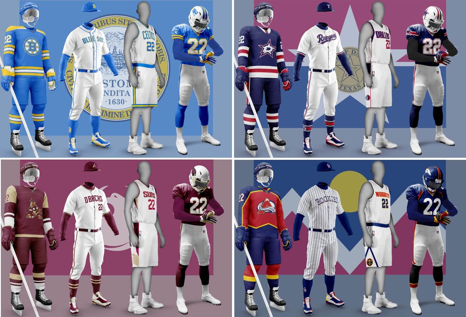
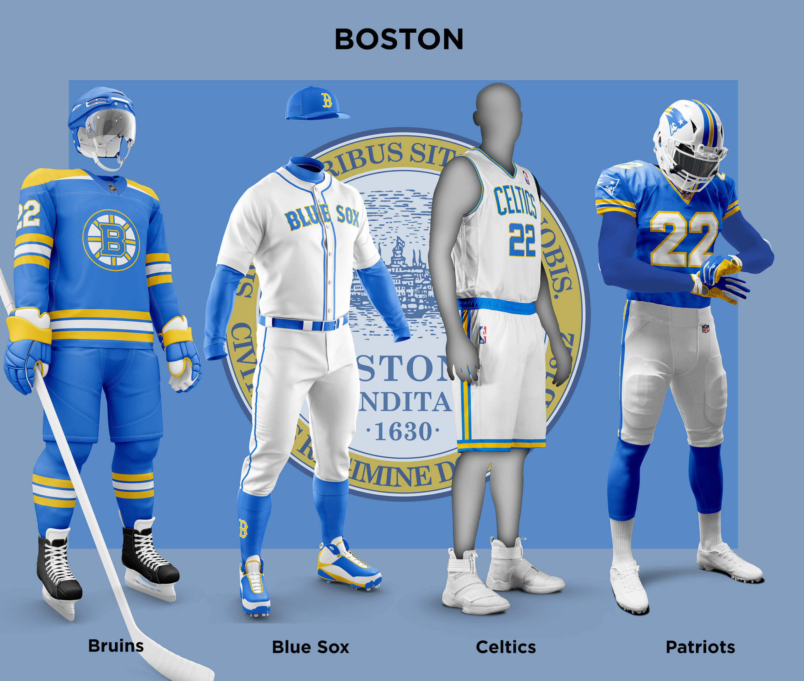
The Boston colours of blue and yellow are already well known thanks to the Boston Marathon and the Red Sox City Connect uniforms. But what would a Sox home uniform look like in these colours? And what about the name? Like the Red Wings, it would be odd to have the RED Sox play in blue so the only sensible option is for them to be the Blue Sox instead! For the Patriots, it would be unlikely that they would use UCLA stripes as the blue and yellow are too close to UCLA colours. So instead I’ve gone with their 1970-73 pattern. Of all the cities I think Boston’s teams look most out of whack using the city colours as none of the teams really use them (apart from the Bruins’ yellow which makes them look like ghost versions of the unis).
Dallas
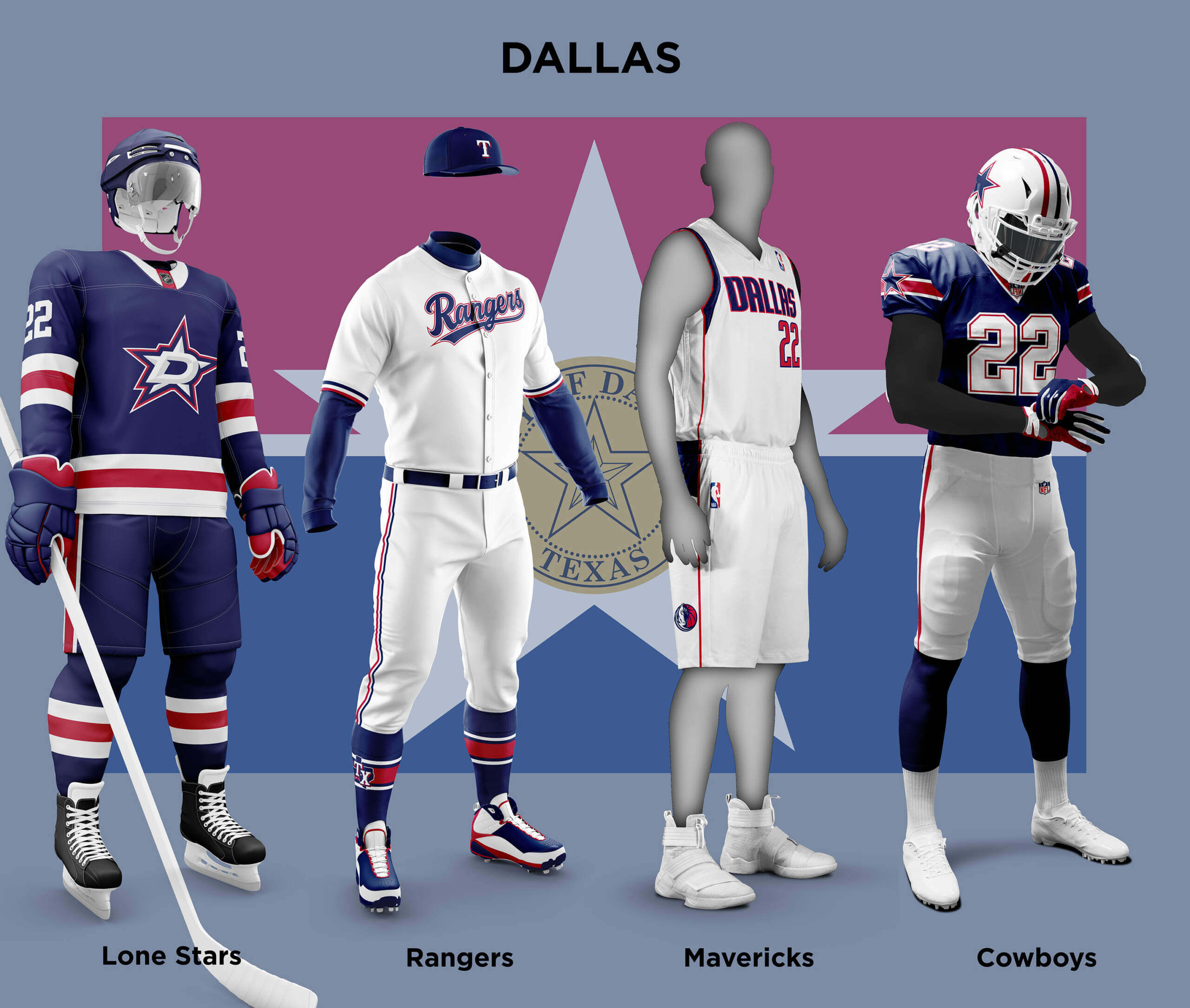
The Flag of Dallas leans quite heavily on the Flag of Texas for inspiration, both using red, white and blue and a star. The 1976 Cowboys added a red stripe to their helmet for the Bi-centennial, something the team also did in Week 13 of this season, so they have a little history here. For the rest of their uniform it was just a case of removing the silver-blue and adding some red. The Mavs current scheme is quite sharp, but replacing the black/blue with blue/red also looks pretty good to my eyes. The Rangers already use red/white/blue so not much difference here. The Stars are obviously the relocated Minnesota North Stars, but in the previous part I let the Minnesota expansion franchise keep the name. So here rather than just the Stars, I’ve called them the Lone Stars. Does it seem ungainly having two teams called Stars in the same league? No more than two called Sox 😊
Denver
Although they are all in Denver, two of the teams are called Colorado. But luckily, the flags of Denver and Colorado both feature the same colour scheme. For the Broncos I felt that having them in blue was better than red which would have seemed too much like faux-orange. The Nuggets already use a very similar colour scheme so little difference to see here. I’m sure Paul will be happy to see the Rockies de-purpled, even if it means another baseball team using red and blue! The Avalanche already use red and blue so just a case of changing the shades and adding yellow.

Phoenix
Phoenix is an interesting case as three of the teams are actually called Arizona and two play outside the city (Glendale and Tempe). But for the sake of the article I have included them as one, as Phoenix is the largest metropolitan area. Strangely enough the Flag of Phoenix is a similar red to that already used by three of the teams so it seems like providence too! The Diamond Backs and the Coyotes both feature a desert sand shade in their uniform set. So I have adopted this as the second colour for the city. The Cardinals currently have one of the worst rated uniforms in the league. Various re-designs have been attempted, but this project now gives another possibility. I have replaced the yellow and grey with sand and removed black entirely apart from the cardinal head itself. The Suns are the second team to be de-purpled and I do prefer this look. Like the Cardinals, the DiamondBacks already use a dark shade of red so this doesn’t look too out of place. Finally for the Coyotes I have combined their old ‘howling wolf’ jersey with the peyote coyote logo. All-in-all I think the maroon/sand makes for a really great and meaningful set for the teams!

Toronto
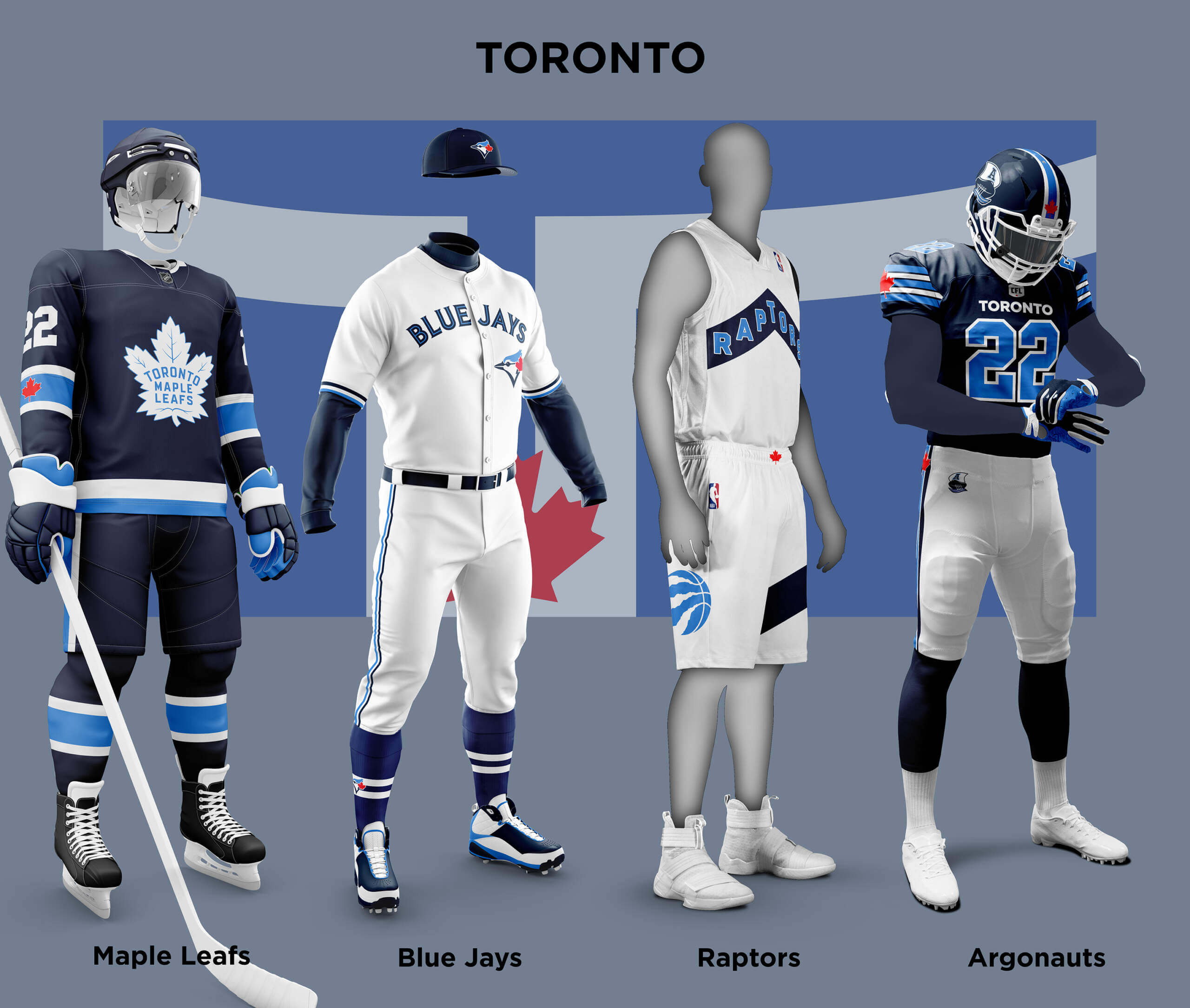
Toronto is the only Canadian city with the big four and the city is associated with blue as shown by the flag. For its sports teams, apart from the Raptors, blue also dominates. For both the Blue Jays and Argonauts it is light and dark blue so I have extended that scheme to all four teams as well as incorporating the Maple Leaf. I think they Jays look better with the restoration of the dark and light blue trim. I also think the Raptors look 100% better in these colours than the current black and red which is really too Ottawa! I also like the Maple Leafs with the addition of the light blue, but I can see some fans really not liking the deviation from the pure blue and white!
Seattle
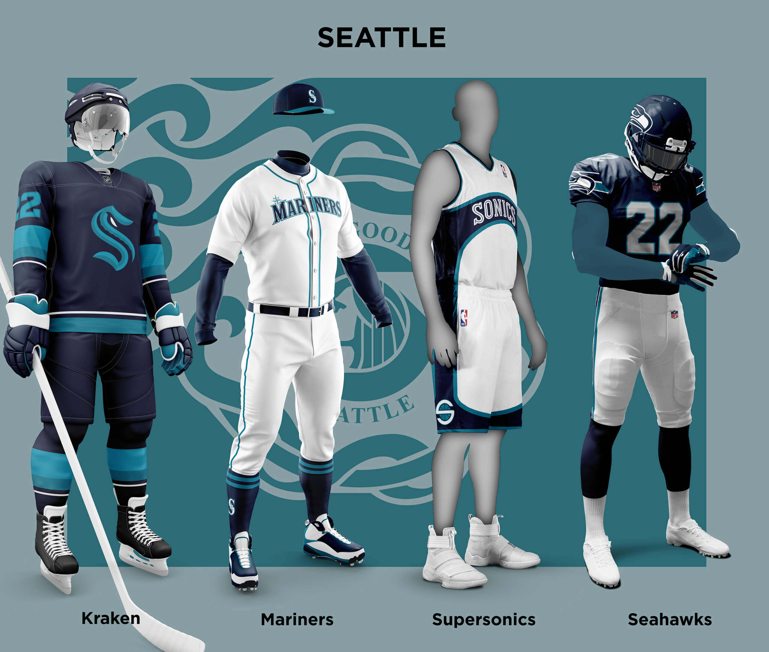
Finally we come to Seattle. Of course it doesn’t currently have an NBA team, but hope springs that it may happen in 2024 so I have included them! A bit like Toronto, blue (navy in this case) features heavily in all three current teams. All three also feature either some kind of green or greeny-blue and the Flag of Seattle is this shade so I have adopted it with Navy as the city colours. For the Seahawks I de-nikeified them somewhat for the sake of my sanity with all those little wings if nothing else! For the potential Sonics I adapted the last uniform before they moved to Oklahoma. The Mariners are almost the same except for the absence of Silver and I gave them blue/green soutache trim. The Kraken look more or less identical apart from the absence of red which I feel does detract slightly from their excellent unis.
So that’s it! I hope you enjoyed checking these out as much as I did doing them. Apologies to anyone whose city didn’t make an appearance, maybe in the future there can be a redux version!
Thanks, Chris! Another stellar job with this. It’s been so much fun, I hate to see it end … so maybe we can convince you to make a Part IV with cities that have only three major sport teams? I’ve been loving every minute of these “What if” pieces!!!
Readers? What say you? Please let Chris know down in the comments below!


So, there’s another pro basketball team in Seattle we could have used here instead of resurrecting one…
If we mean “men’s major sports teams,” then please say that (and I also disagree that that doesn’t include soccer).
Please accept my apologies Jamie, that is very true – the men’s major sports teams was implicit which is a bit arrogant. It’s also poor form given I am a fan of the WSL so I have no excuse! I guess the reason why I left out both women’s teams and other non “big-four” sports was not because I’m not a fan of either (see above), but because this piece relies on changing-up colours and uniforms that most readers are intimately familiar with over many years. That is why the Yankees in blue and orange or the Dodgers in green provided such strong reactions. I think one day the same could be true of the WNBA or MSL teams too, but even in 2023 I think the “big four” are still hardwired into a lot of fans consciousnesses in a way that other sports are not. So no slight was intended :)
No worries, I’ve just noticed most of the time on Uni Watch we can always be a little more inclusive. It’s a fun idea and well executed.
Chris, I’ve really enjoyed your color-switch articles. Thank you for not including soccer. Other than Seattle (neon green), I don’t know the colors of any MLS team. And I don’t really care to see giant corporate ads on shirts in different colors. Since you’re including a basketball-less Seattle, I would love to see you do Cleveland’s uniforms (they had the Barons of the NHL for a few years.) Again, well done.
Thanks! I think there will be a Part IV now to cover Chicago (see comments below) and the three sport “cities”. So that is: Cleveland, Atlanta, Tampa Bay Area, San Francisco Bay Area, Houston and North Carolina. Any other nominations?
I watch soccer games to help me when I have insomnia.
Lol, still with the massively effeminate kvetching about NaTiVe iMaGeRy. Sad!
Girl… quit being such a snowflake.
Not very kosher to use “girl” derogatorily these days, kiddo. Maybe you need some more diversity and inclusion training?
What a low effort comment. Try to do better.
You could have used any number of premises to complain about criticism of Native American imagery, but you chose “effeminate”. Which has some interesting implications. Do you imply that the White
conquest of Native Americans and the treatment of their memory as a commodity to be exploited for profit was “manly”? That not wanting to get thru existence by conquering and consuming other human societies is a feminine trait? That it is inherently masculine to say “The strong do what they will, while the weak do what they must”?
Suicide by a thousand effeminate words. Sad!
chief (n.)
c. 1300, “head, leader, captain; the principal or most important part of anything;” from Old French chief “leader, ruler, head” of something, “capital city” (10c., Modern French chef), from Vulgar Latin *capum, from Latin caput “head,” also “leader, chief person; summit; capital city” (from PIE root *kaput- “head”).
The meaning “head of a clan” is attested from 1570s; it was later extended to headmen of Native American tribes (by 1713; William Penn, 1680s, called them kings). Commander-in-chief is attested from 1660s.
I wonder if actual racists are excited that so many teams are erasing “ethnic” mascots? I know if I were one of those silly modern Norse pagan wannabes I’d be rather pleased that the proud Vikings are doing fine while American Indians have nothing now.
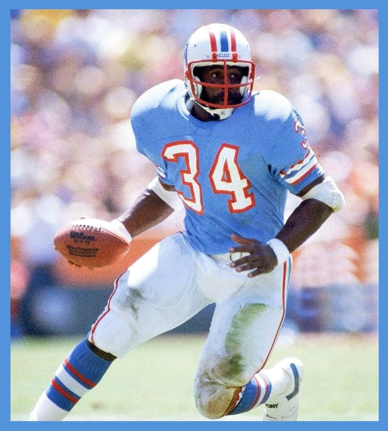
GTFFTU: Oilers at Rams, season opener September 6, 1981. First year of red facemasks for the Oilers, they wore white at home so they only wore blue in the preseason and games 1 and 2 (against the Rams in Anaheim and the Browns in Cleveland), and they only wore those reversed-striped socks (red/space/white/space/red) in those 2 games. With the blurred background it was hard to tell between the two games but it looks more like Anaheim Stadium than Cleveland Stadium.
Great job John. From Jimmy himself, on the answer:
My hat goes off to you John! great job! I didn’t even think about the face mask, I went by the socks.
Excellent work, John!
Excellent choice, Jimmy!
There’s no reason why this set…even with the off-putting(or awesome, YMMV) sock striping…should not be brought back immediately for the Titans to wear occasionally.
I couldn’t agree more! Love those old Oilers uniforms, I would even take them with those two games only 1981 socks.
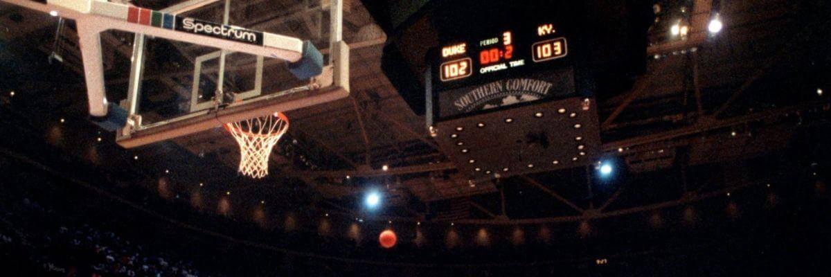
GTGFTS, the game is clearly the Laettner Game – 1992 NCAA Men’s East Regional Final, Mar. 28, 1992, the Spectrum in Philadelphia. That appears to be Christian Laettner’s game-winner in flight, which would make the final Duke 104, Kentucky 103.
I respect Duke. I don’t like Duke, but I respect them.
Man I wish the Bills would wear the white pants with the blue jerseys. White/blue/blue isn’t terrible but it could be so much better!!!
Paging through the Cowboys/Niners uniform matchup history, I noticed the NFC championship for the 71 season took place in Dallas, but the field was painted as a neutral site. Each team had an endzone and the NFL shield was at the 50. Was that normal back then? When was the last time a home team painted an endzone in visitor’s colors?
link
Paging Jimmer Vilk
Yes, that did happen on occasion back then (I’m old enough to remember that), opponents names & colors appearing in one end zone in conference championship games, but not all that time. I believe if you watch highlights of the 1973 NFC Championship CBS broadcast, you see VIKINGS in one end zone. When Pittsburgh played Houston 2 straight years in 1978 & ‘79 in the AFC title game, I’m pretty sure it said Oilers at least one of the years. After that, I never remembering seeing it anymore, just had the home team names.
Going just from memory:
Raiders did it vs Seattle (’83)
Dolphins did it vs Patriots (’85)
Rams did it vs Vikings (’77)
Steelers did it vs Dolphins (’72)
There were others.
The last time was the 1986 (played in Jan. ’87) AFC Championship, Denver at Cleveland.
I hope it’s not the last time ever.
In fact, if this year’s AFC title game gets played at a neutral site, they really ought to bring back this practice.
Not only was this common practice in the 70s and early 80s title games…
In the sixties and early seventies, it was common practice for some teams’ *regular* season games
I’d love to see the Chicago teams get the city treatment!
I was actually surprised Chris hasn’t (yet) tackled that one! Hopefully in (if there’s a) Part IV!
Well I didn’t think I could do Chicago given site policy about not showing Blackhawks uniforms (even in the wrong colours)!
You could always change the crest.
True, but wouldn’t the team name would still be a problem? -It’s not like the Chiefs where you can change the meaning. But if just changing the crest is OK I’ll add them to Part IV :)
Since 3 of the 4 “Phoenix” teams are called Arizona, and the Phoenix Suns are of course in the state of Arizona, I’d rather see the use of the iconic rising star Arizona state flag. The red and yellow rays, blue, and the copper star, is an awesome look. The Cardinals could use the red more, with the yellow and blue for trim. Also an alternate copper helmet would be a good option. The Suns uniform could be great with this flag look, with the copper star be appropriate since of course a star is a sun. These colors would also look great for the D-Backs, with maybe red being the home hat, and blue being the away hat. And lastly, the Coyotes uniform would also look great, with the jersey having the flag on the front, with a Coyote superimposed over the copper star.
I did consider going the Arizona State Flag route, but decided against it in the end. When I did my Alt-History NFL piece the Arizona Wranglers were done in this style and I felt the combination of the flag colours plus copper looked a bit too busy. Which isn’t to say it couldn’t be used! But in the end I just felt the combination of the dark red plus sand looked better. Maybe I’ll do an Arizona Redux in Part IV
Sign me up for the NY Giants ditching the Northwestern stripes pants and jersey altogether. I dont even wear that jersey anymore since I have the Landon Collins white color rush.
This is a cool concept. But if we get a new NBA team in Seattle, anything other than green and gold is going to be a big disappointment to a lot of us
Most of us in Seattle would like to see the Hawks go back to the Silver helmets and pants, with Blue or White jerseys. A nice alternate jersey would be something in the Kelly Green range.
The sonics in navy and teal would look allright, just add a touch of red like the Kraken do. I know green and gold are the true Sonics colors, but Boston and Milwaukee have the color green even more locked down since the move of the Sonics to OKC. Maybe incorporate green and gold as outlines or for details in a navy and teal scheme (in that case drop the red or it will be too many colors. On the other hand, why not?).
I had heard that when the Dallas Stars were doing their latest redesign they strongly considered changing to a blue color scheme to match more with the other big 3 teams. Glad they stuck with green.
Also really like the Leafs concept but Winnipeg already lays claim to those colors