Tired of seeing annoying ads (like this one!) on Uni Watch? There’s a simple solution: Join Uni Watch Plus. You’ll get an ad-free site experience, plus exclusive access to our UW+ discussion forums, push notifications whenever a new blog post has been published, a special UW+ badge accompanying all your comments on the blog, and a 20% discount on our Teespring merchandise.
Good Sunday Morning, Uni Watchers. I hope everyone had a pleasant Saturday.
Unfortunately, I was a bit under the weather yesterday (felt like food poisoning, or something equally unpleasant); hopefully this will be just a 24-hour thing.
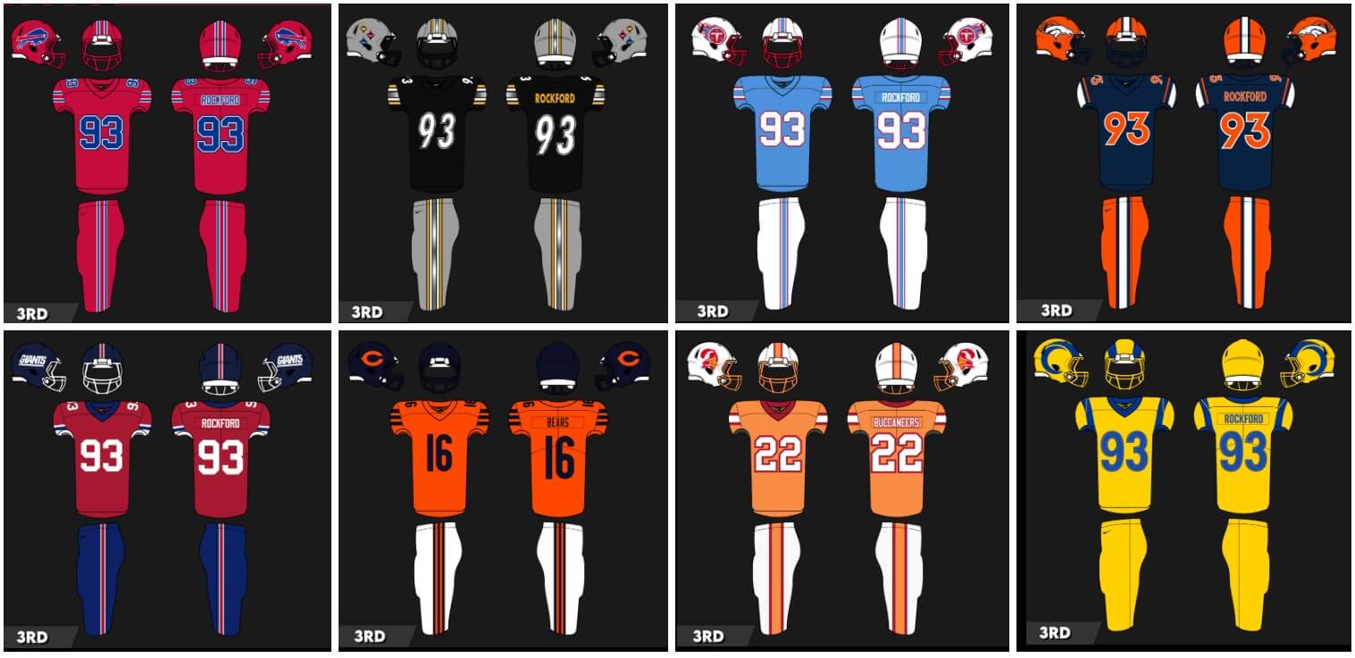
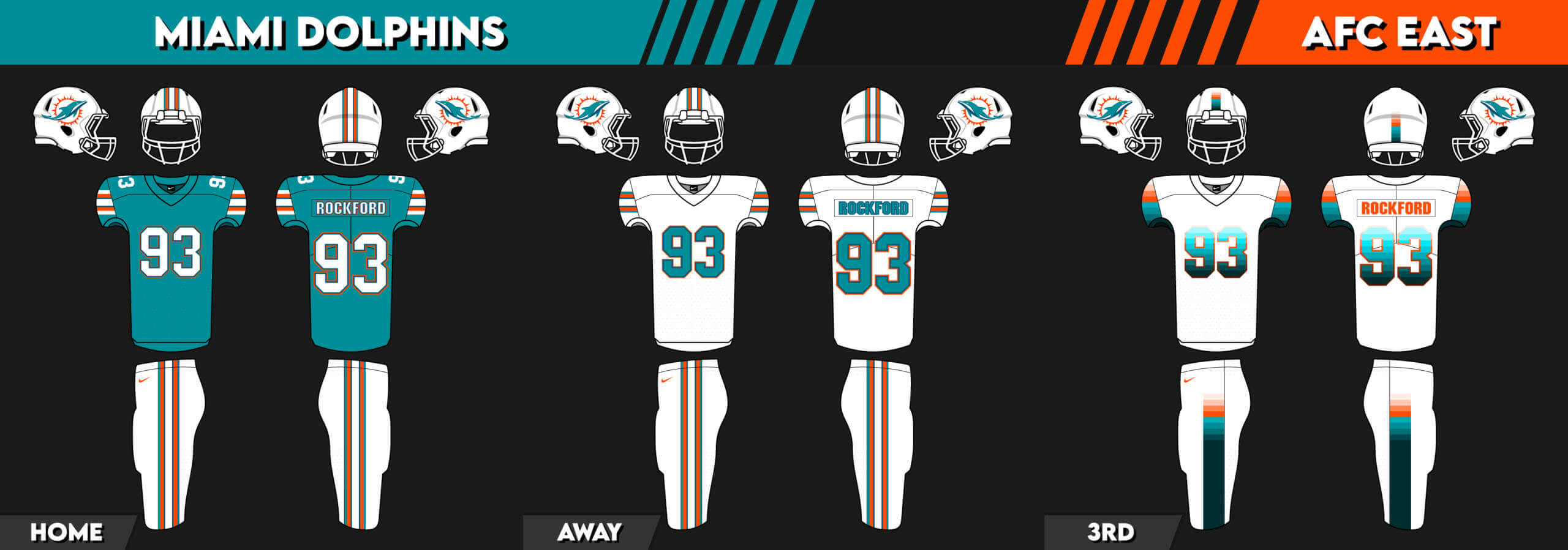
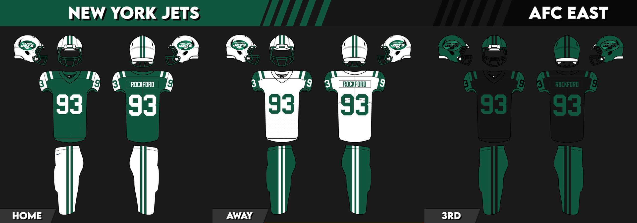
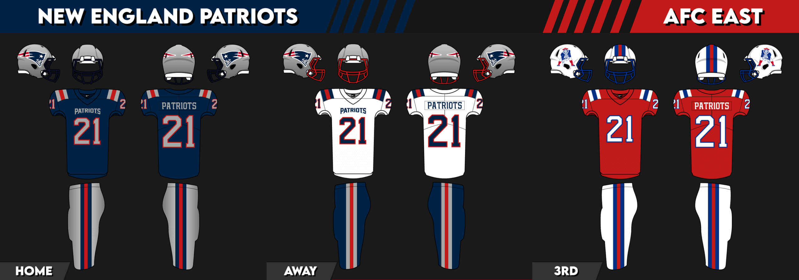
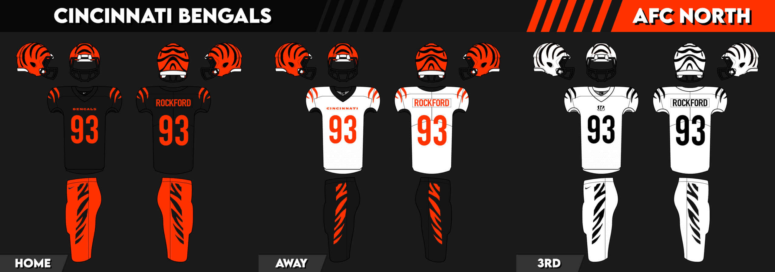
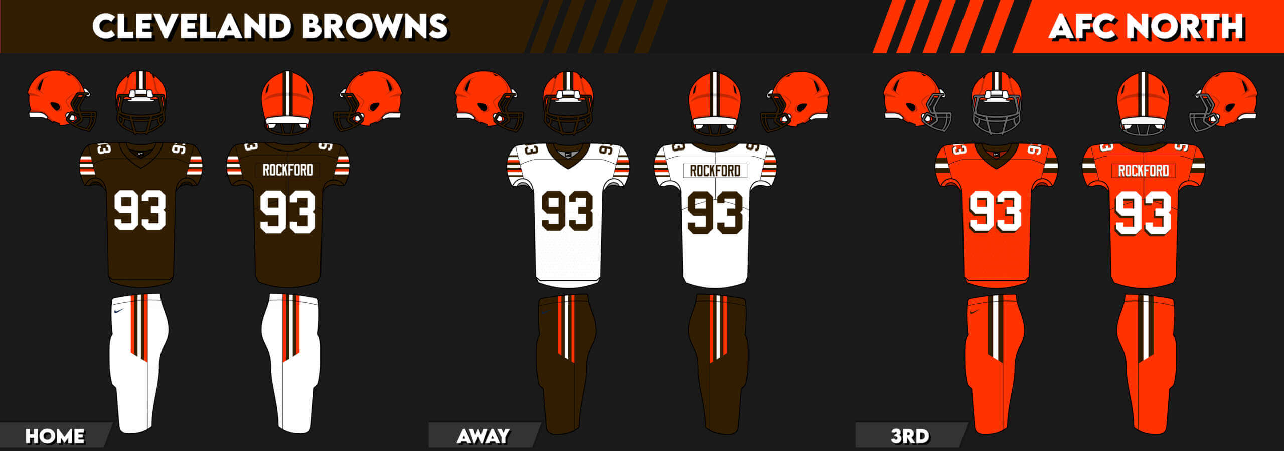
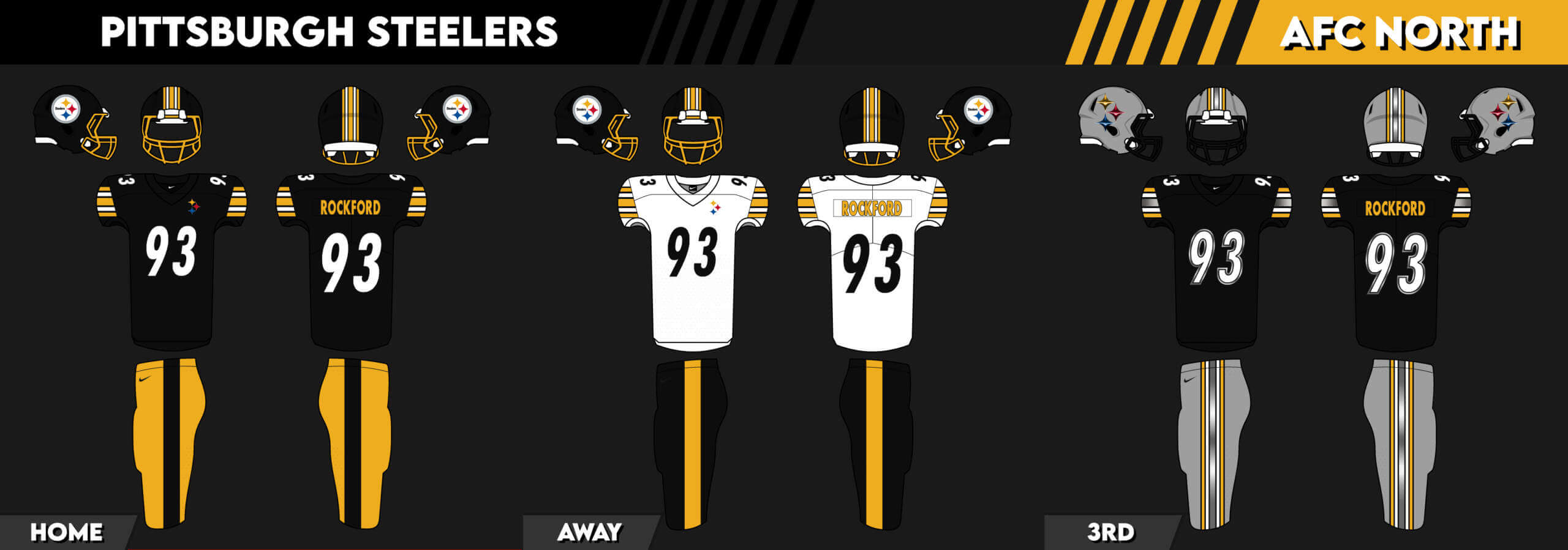
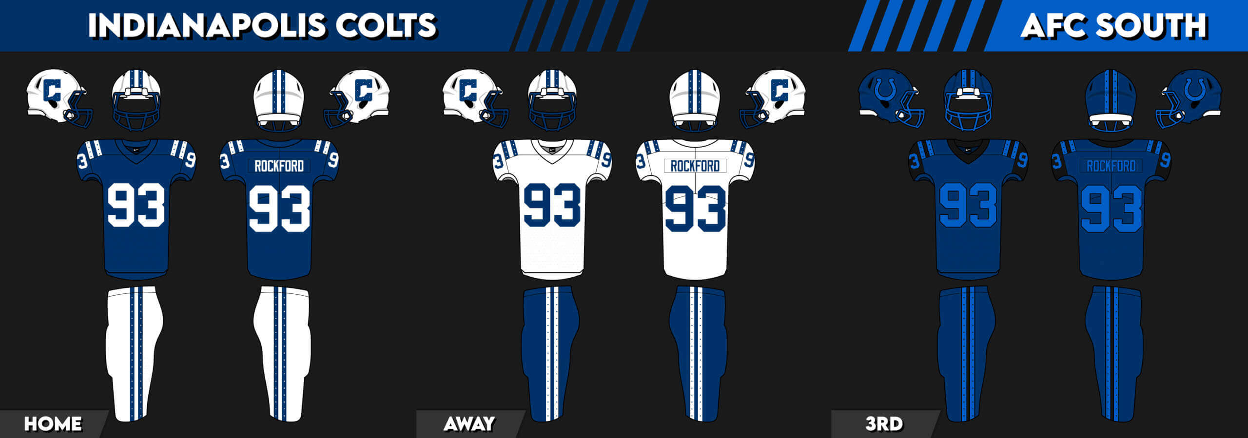
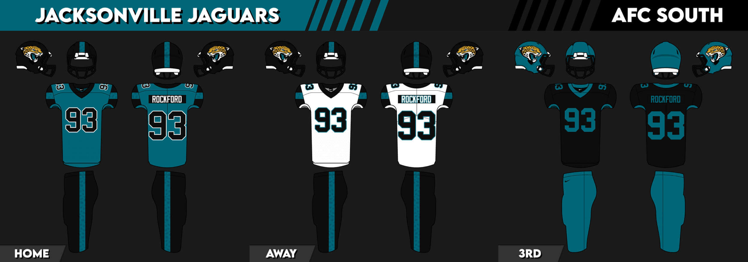
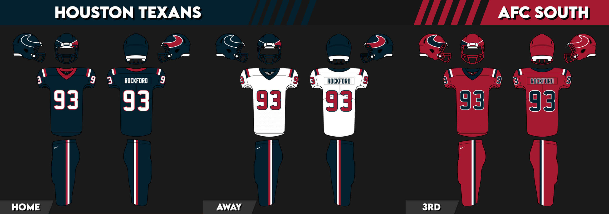
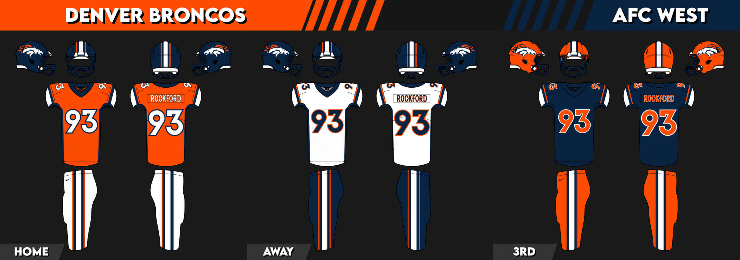
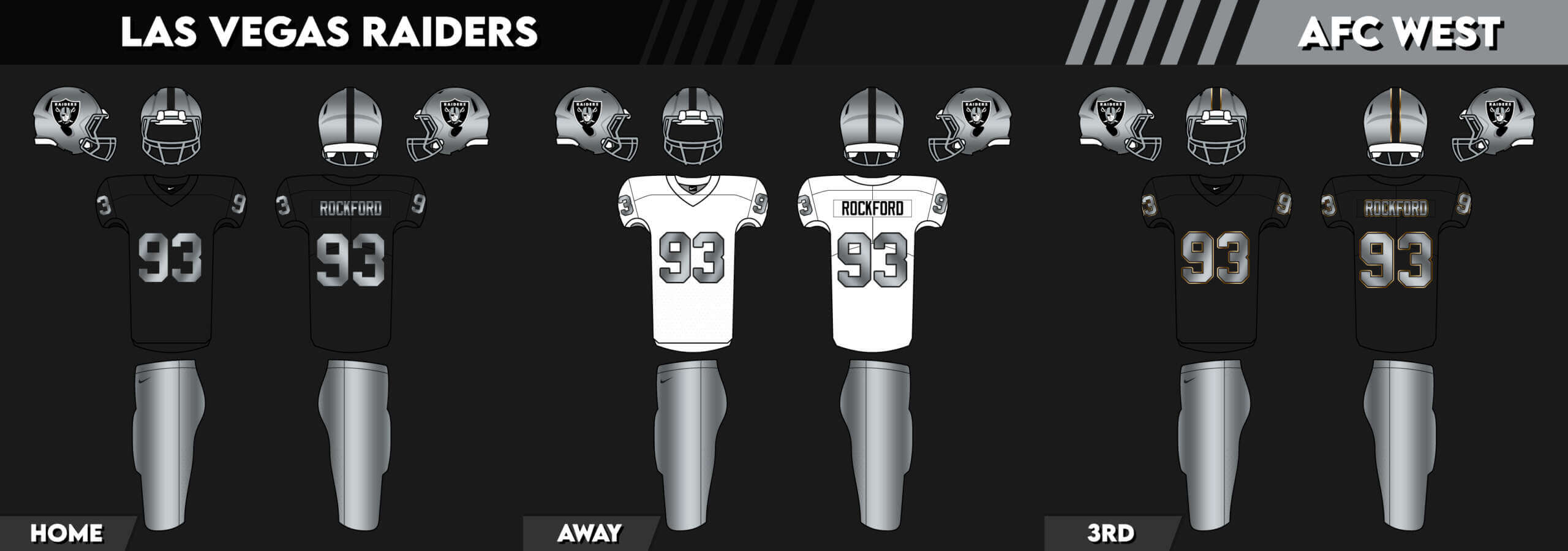
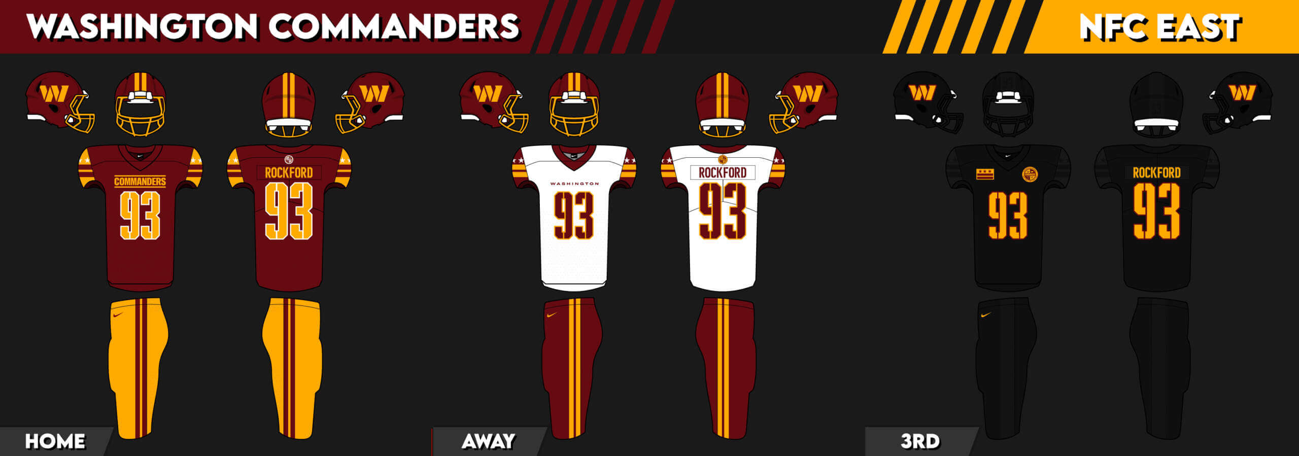
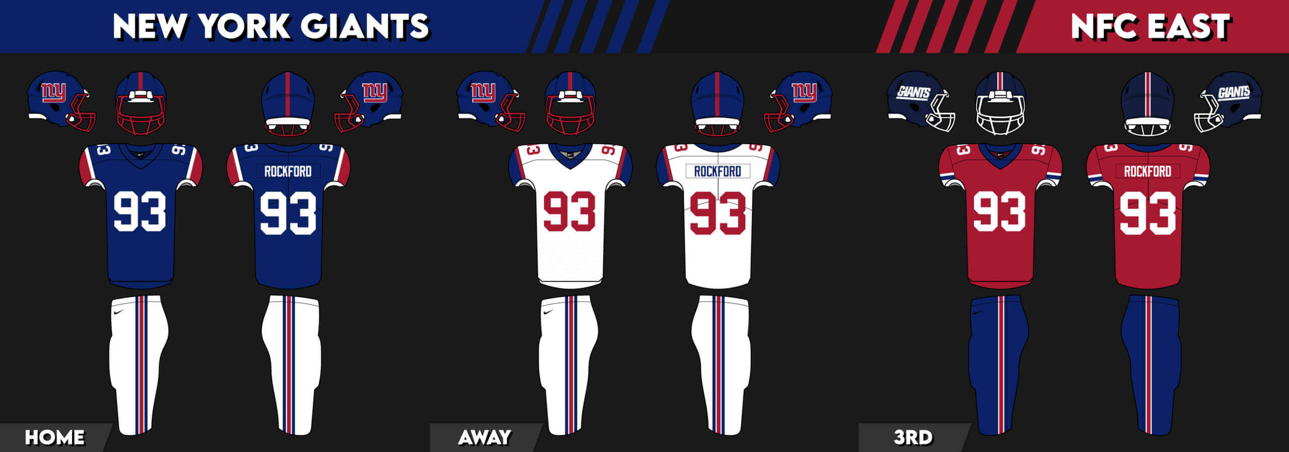
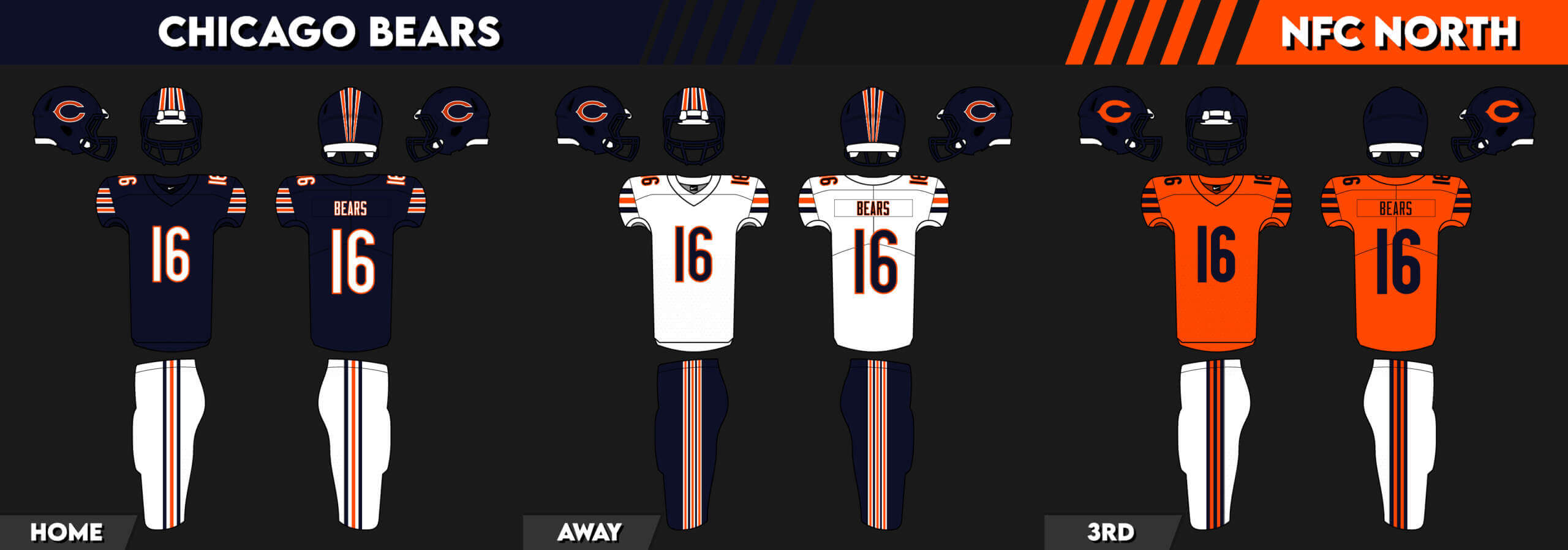
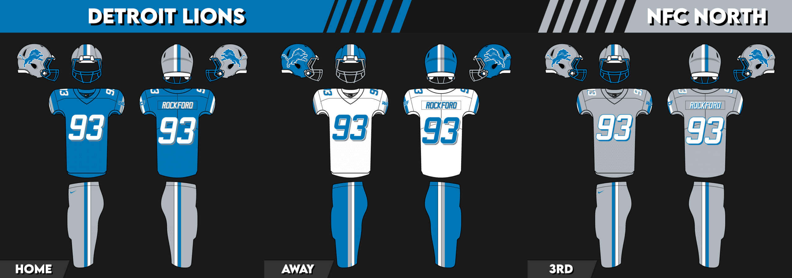
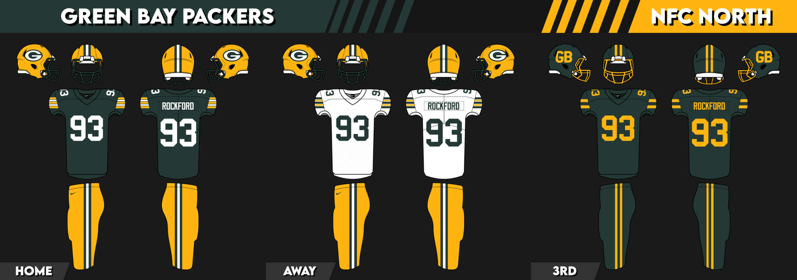
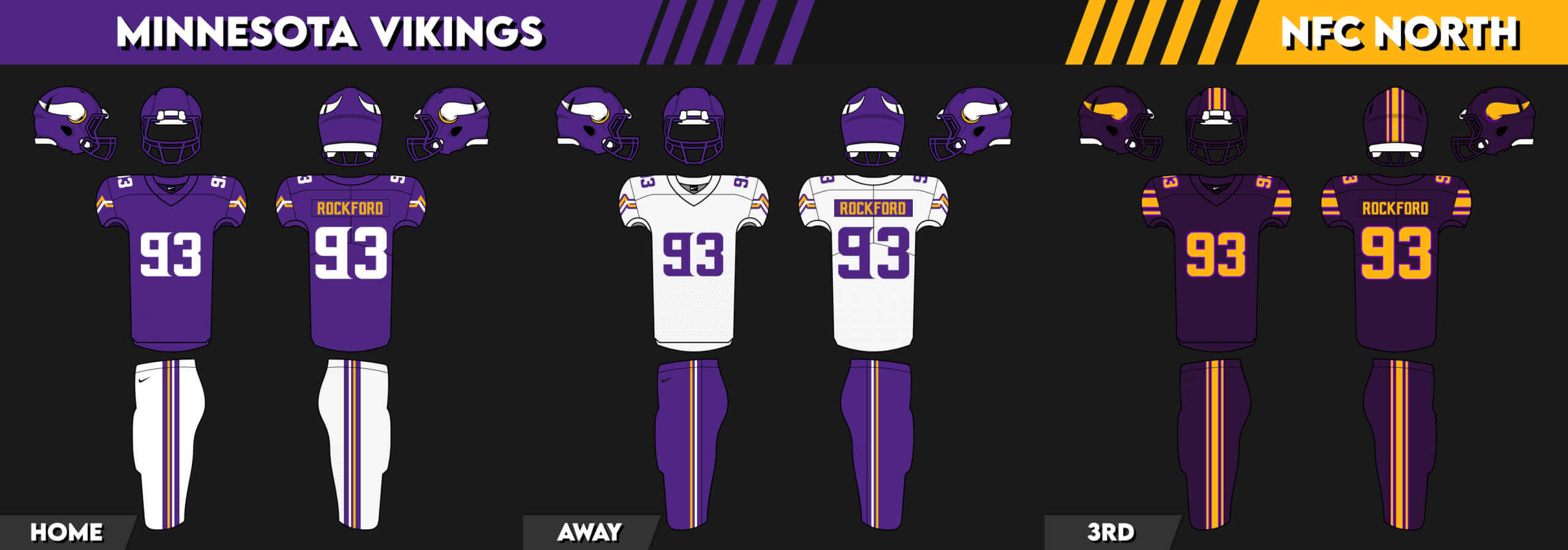
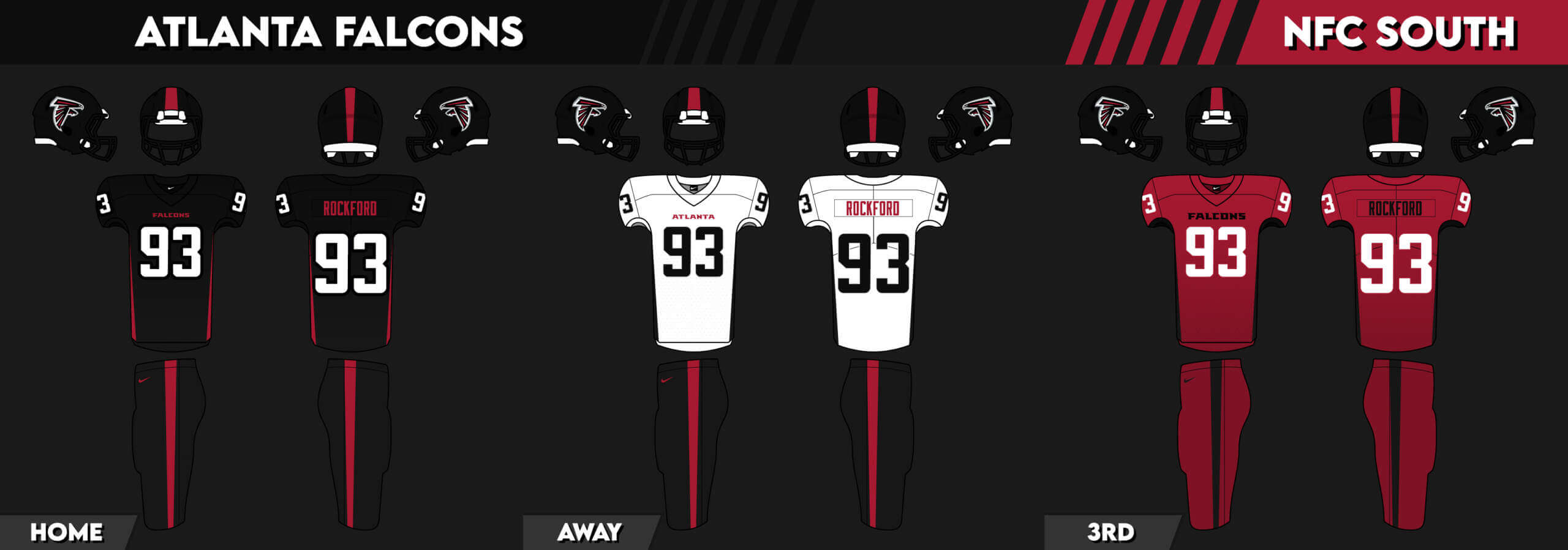
I will have very truncated coverage (below) of yesterday’s Army/Navy game, but for today’s lede, I am pleased to bring you an entire set of NFL concepts sent in by reader Jon Robertson. He had actually sent me these way back in September, but I just hadn’t had a chance to get to them until today. Jon didn’t provide any descriptions of the individual uniforms — and that’s fine because the designs speak for themselves, so you’ll just have to click on each to enlarge to check them all out. For some teams, especially those with uniforms we’d consider “classics,” he didn’t change much, if anything, but some teams have gotten quite a treatment. So please enjoy these concepts (and some are more like tweaks) and let him know what you think in the comments below. Here’s Jon:
• • • • •
Hey Phil,
Not sure you remember me but I sent over some NHL Jersey Concepts around a year or so ago on the recommendation of Shawn Anderson of Hall of Very Good Podcast. I now have some NFL Uniform Concepts I wanted to send you if that’s alright. Got 3 uniforms for every team, but grouped together by team!
Jon Robertson
+ + + + + + + + + +
AFC EAST
Buffalo Bills
__________
Miami Dolphins
__________
New York Jets
__________
New England Patriots
+ + + + + + + + + +
AFC NORTH
Cincinnati Bengals
__________
Cleveland Browns
__________
Baltimore Ravens
__________
Pittsburgh Steelers
+ + + + + + + + + +
AFC SOUTH
Indianapolis Colts
__________
Jacksonville Jaguars
__________
Houston Texans
__________
Tennessee Titans
+ + + + + + + + + +
AFC WEST
Denver Broncos
__________
Los Angeles Chargers
__________
Kansas City
__________
Las Vegas Raiders
= = = = = = = = = = = = = = =
NFC EAST
Washington Commanders
__________
Dallas Cowboys
__________
Philadelphia Eagles
__________
New York Giants
+ + + + + + + + + +
NFC NORTH
Chicago Bears
__________
Detroit Lions
__________
Green Bay Packers
__________
Minnesota Vikings
+ + + + + + + + + +
NFC SOUTH
Tampa Bay Buccaneers
___________
Atlanta Falcons
__________
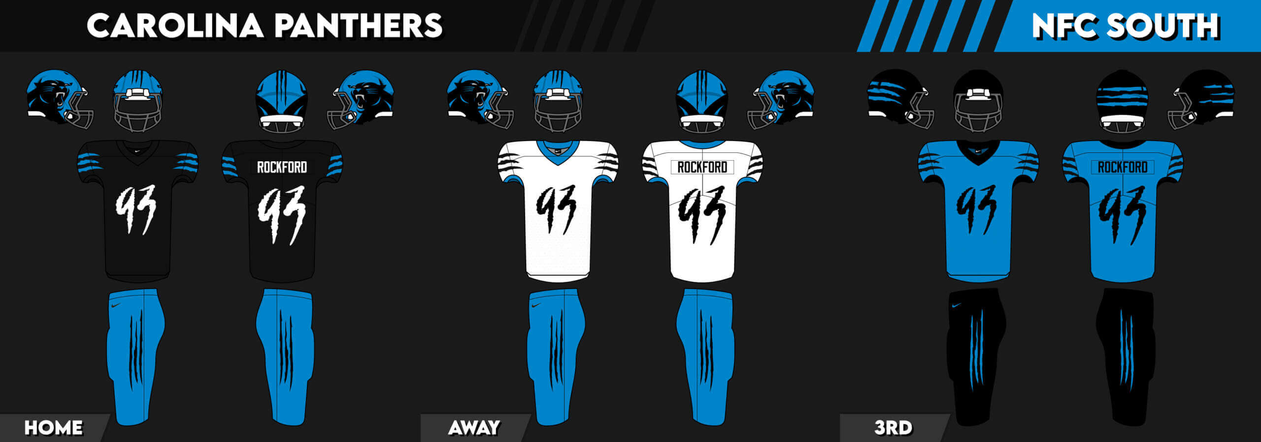
Carolina Panthers
__________
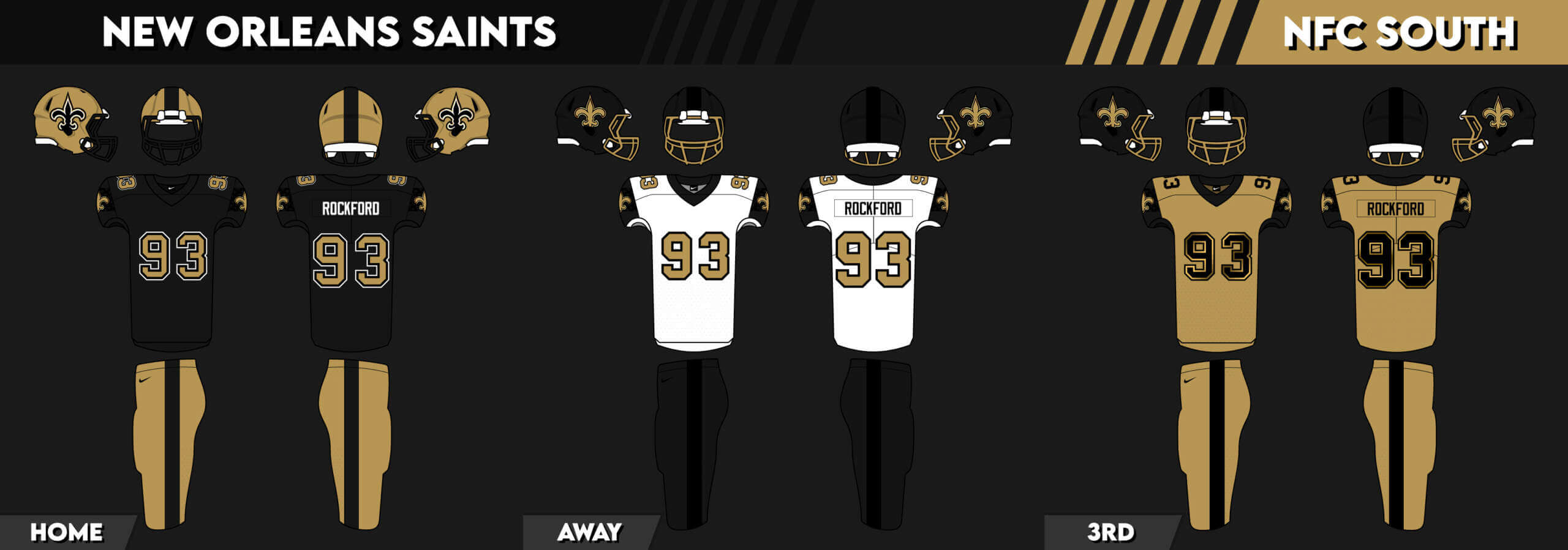
New Orleans Saints
+ + + + + + + + + +
NFC WEST
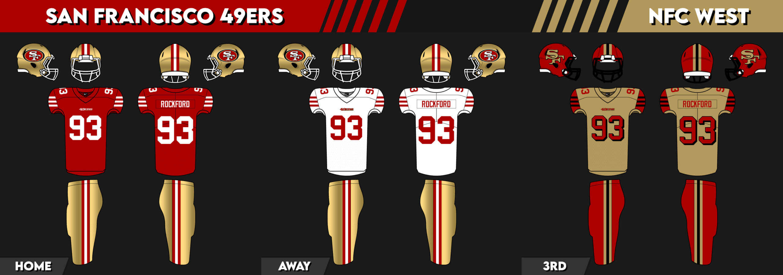
San Francisco 49ers
__________
Arizona Cardinals
__________
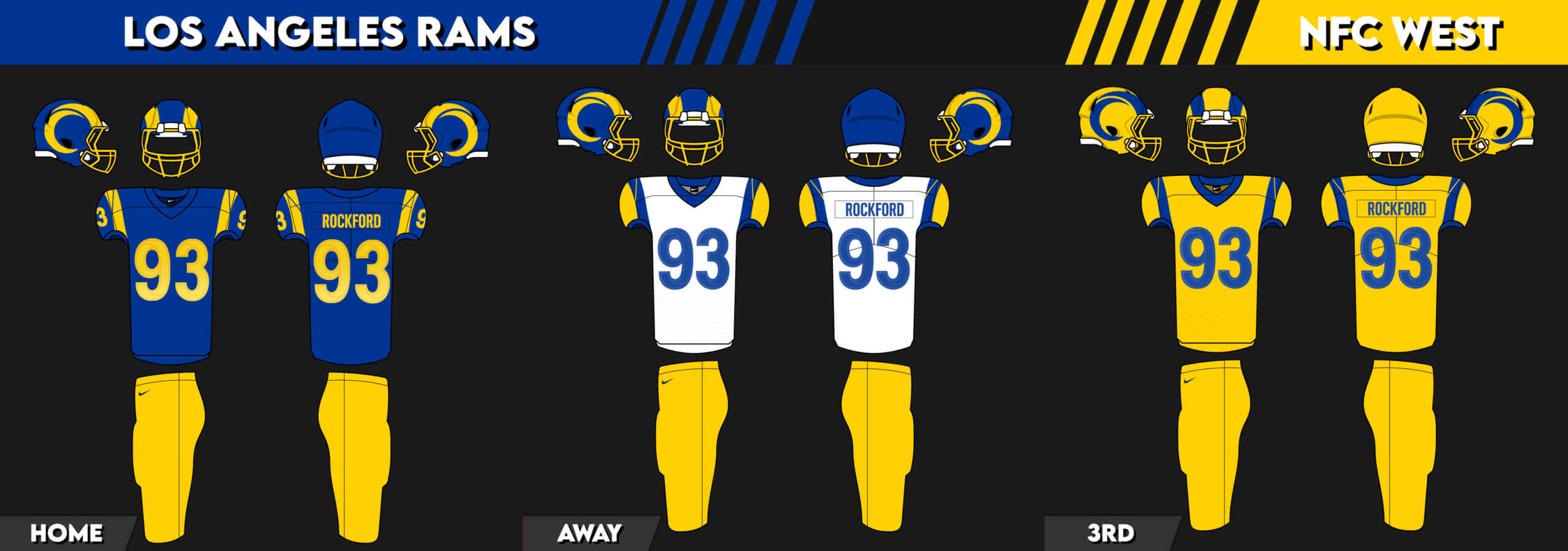
Los Angeles Rams
__________
Seattle Seahawks
• • • • •
And there you have it! Thanks, Jon. Readers? What do you think? Any of these really stand out as something a team could or should move to going forward?
Believe it or not, in the 123 times Army has played Navy, yesterday’s game was the first to go into overtime, with Army emerging victorious.
Obviously, one can’t really comment on either team’s uniforms without including the backstories behind them. So, if you’re interested, Army’s uniform story is here, while Navy’s is here. There are far, far too many details to get into, so I’d like to divorce the unis from their storytelling and focus solely on how they looked as uniforms.
Army may have won the actual game, but Navy won the uni battle.
Navy’s white uniforms with red stripes were crisp and clean, and their fonts were legible and bold. They looked good, even if they didn’t convey a traditional Naval look.
Army’s uniforms, especially with the “mud splatter” gradient going from jersey to pants, looked more like costumes than uniforms, and their numbers, both in color (gold) and font, were hard to read. Were the numbers not large enough to be seen from space, I might have had difficulty identifying the players.
On the other hand, I really liked Army’s helmets, and wasn’t particularly a fan of Navy’s. The olive color with the muted splatter pattern worked well on the hats, while Navy’s “NASA” logo on one side and Astronaut painting on the other felt disjointed.
Of course, we can’t legitimately divorce the uniforms from the storytelling; without that context, the unis look just as I described: a clean, crisp white uniform with legible numbers vs. a drab, gradient one with hard to read numbers. We find this “problem” with the MLB City Connect uniforms as well as the NBA’s City uniforms.
Uniforms exist to differentiate two teams at their most basic level. Obviously, that box is checked, but as much as folks these days are wont to accept uniforms that bear little resemblance to a core “look” (and this trend is not about to go away), the less and less I appreciate them. Army/Navy with their “unique” one-offs have been, and continue to be fun, but they’re no longer the only ones doing it. You now have two leagues who will have entire sets of “special” uniforms that barely resemble anything the team wears or has worn. Army/Navy’s one-offs were never created with a merchandising angle (or at least naive me would like to think that), but clearly they have been the inspiration for uniform-by-storytelling for MLB and the NBA. They may be “City Connect” in name, but they’re becoming uni dis-connect for me.
Based on the suggestion of long-time reader/contributor Jimmy Corcoran, we’ve introduced a new “game” on Uni Watch, which is similar to the popular “Guess the Game from the Scoreboard” (GTGFTS), only this one asked readers to identify the game based on the uniforms worn by teams.
Like GTGFTS, readers will be asked to guess the date, location and final score of the game from the clues provided in the photo. Sometimes the game should be somewhat easy to ascertain, while in other instances, it might be quite difficult. There will usually be a visual clue (something odd or unique to one or both of the uniforms) that will make a positive identification of one and only one game possible. Other times, there may be something significant about the game in question, like the last time a particular uniform was ever worn (one of Jimmy’s original suggestions). It’s up to YOU to figure out the game and date.
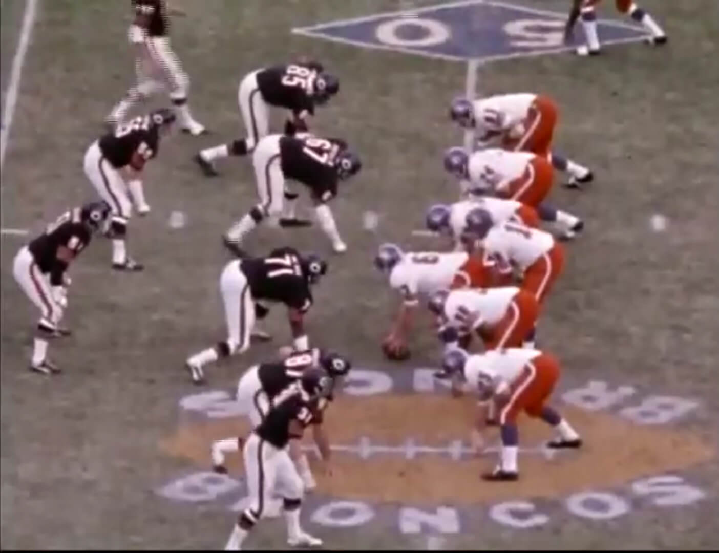
Today’s GTGFTU comes from Jimmer Vilk.
Good luck and please post your guess/answer in the comments below.
GTGFTU -- A Follow-up
Yesterday, I posted a GTGFTU from Jimmy Corcoran, and explained Jimmy had a backstory to accompany it. In case you missed it, Jimmy’s “clues” for the Guess The Game From The Uniform were as follows:
A couple readers correctly identified the game. But the game in question was much more personal for Jimmy, and I’ll let him explain.
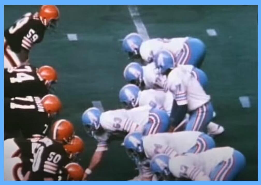
Phil, at first glance this appears to be a meaningless game between two teams that will not be in the playoffs, but for fans of the Houston Oilers uniforms from this era it was much more than that, can anyone guess this game?
This game between the Houston Oilers and Cleveland Browns was played on Dec. 15, 1974, in the Houston Astrodome. The score was Browns 24- Oilers 28 and it was the end of an era for a short lived but beloved helmet. This was the last game the Houston Oilers wore their light blue helmets. But these helmets never really faded away thanks to uniform aficionados like Uni Watch’s own Jimmer Vilk who reminds us that this was the Houston Oilers best look in team history. They only wore these helmets for three seasons 1972-74 and had losing seasons wearing them so when Bum Phillips came in for the 1975 season they switched to white helmets. The white helmets still looked good, and this was great era of Houston Oilers football, the Luv ya Bue! Earl Campbell era. But as Jimmer has noted in the past, nothing popped on those unis quite like the light blue helmets! Forty-eight years after they last wore them, they still look magnificent.
Though this was a meaningless game, there were a couple of odd circumstances that stood out to me, first Billy “White Shoes” Johnson is wearing black cleats, I know he also went by Hummingbird Johnson, but I have seen him wear white cleats in the Astrodome with the light blue helmets, why the black cleats? Also, Billy Johnson catches a touchdown pass in the game but does not do his funky chicken end zone dance that he made famous in the 1970’s. In this last game of 1974, it is a different version of Billy Johnson.
At the end of the game the players lift up Sid Gillman in a victory celebration, at first glance this would seem odd considering the Oilers finished 7-7 and did not make the playoffs, there really isn’t that much to celebrate. But this was the last game as a head coach for Hall of Famer Sid Gillman, Sid started out as the Oilers general manager, but things were such a mess when they got rid of their head coach Sid took over to try and get things back together. Sid could be a screamer; I have seen him in action as a kid but there was also something very nice about him, he would but his arm around you and say how was your day kid? And it looks like those players are lifting him up and giving him the respect because he came to the end of a brilliant coaching career.
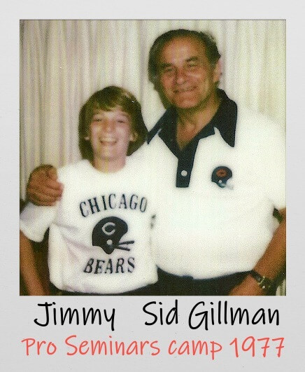
Three years later I was a ball boy for Sid at Ron Waller’s pro Seminars camp, I was hoping I got to work for Jack Faulkner or Ray Malvasi of the Rams, I had worked for them before at other camps and they were fun guys to be around. Ronny told me I was with Sid since he would be working with the QB’s, he would need me to carry the bag of footballs and make sure he always had a new football to give to the QB. My father would be with Ron Waller throwing to the WR’s. As we were walking onto the field my father grabbed me and said, this isn’t Ronny Waller (Ron was a family friend and like an uncle) He said don’t talk to Sid unless he asks you something and stay out of his way when he is coaching, he doesn’t play around.
I had not been a ball boy for two years since the Philadelphia Bell folded but I was confident that I still had the skills to get the job done and I would not let Sid Gillman down. Everything went fine in the morning practice and Sid was happy with the job I did. I listened to him explain how he wanted it done in a calm voice to the players but when they would screw up, he would let them have it. In the afternoon practice I held his clip board while he was showing the QB’s the proper mechanics. Sid came over and said Jimmy you don’t talk very much what’s the matter? I said my father told me not to talk to you unless you ask me something. He said are you kidding me? King Corcoran is giving advice on how to talk to coaches? the guy who has been cut by 5 teams and not one coach in the league can stand him? that’s rich. I couldn’t stop laughing, he had my father’s number, and it was all true what he just said.
Sid had a dry sense of humor, when the QB’s would drop back he would say, you see where he points his foot? don’t ever do that. You see where he holds the ball by his chest? don’t ever do that. After the second practice the coaches went to Sid’s hotel room, he went into his suitcase and said Jimmy you did a great job for me today I want you to have this. He gave me a team issued Chicago Bears t shirt. I put it on, and Ron Waller took a picture of us. I couldn’t have been happier, I always liked having the gear you couldn’t buy in a store. I miss those light blue Oilers helmets from a bygone era, and I miss Sid Gillman, what a coach.
Jimmy Corcoran
Thanks for sharing Jimmy! And yes, those were at one time (and may still be?) Jim’s favorite uniforms (or at least the helmet). Jimmy included a couple extras too:
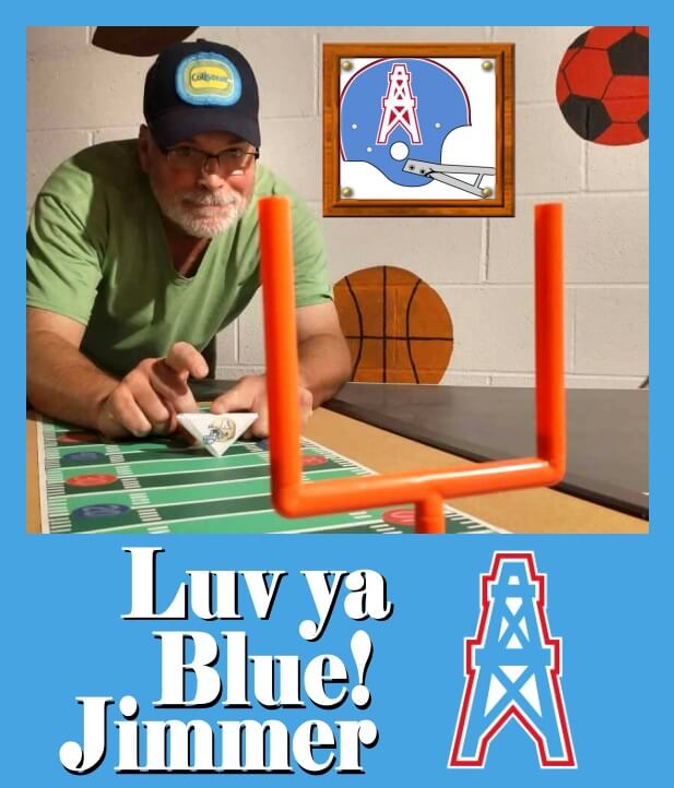
And one for Jimmer:
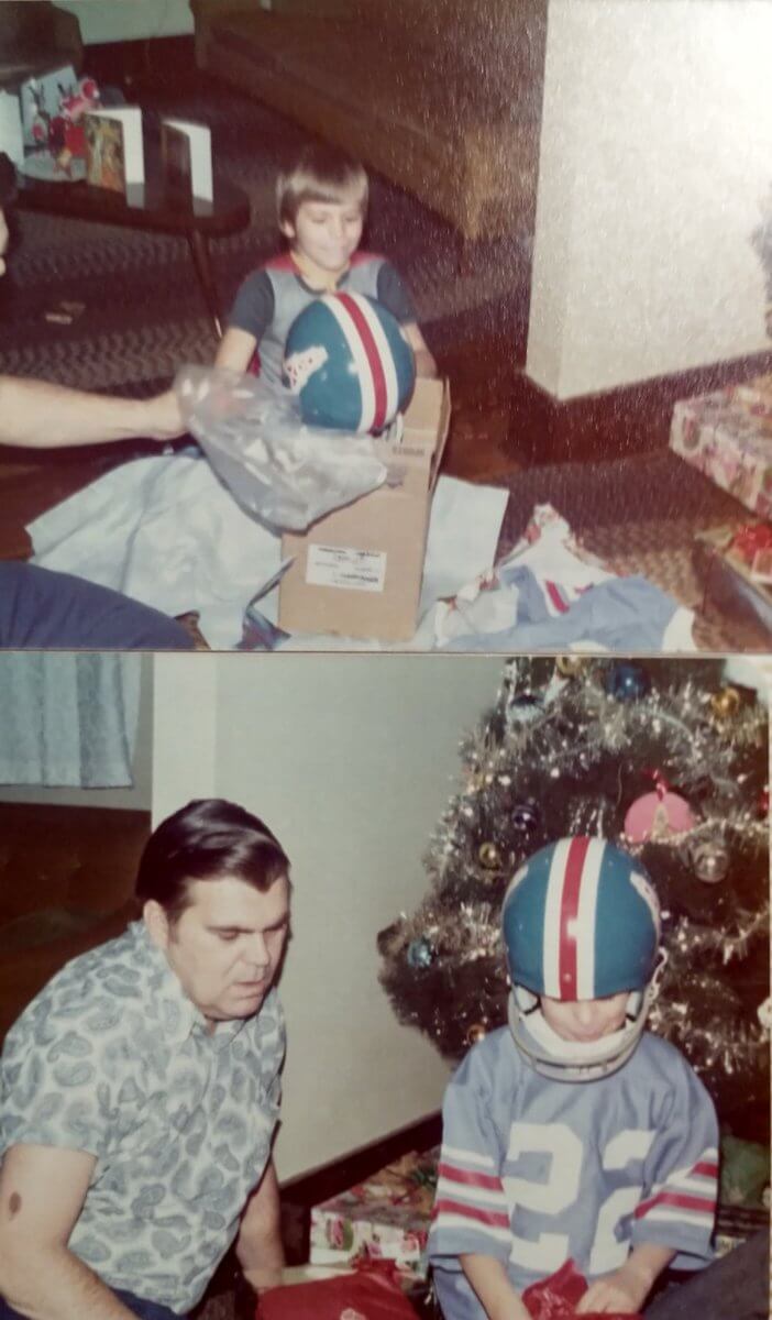
And Jimmer has told this story before, but just in case you hadn’t heard it. He was so enamored of that Oilers blue helmet that he asked for one for Christmas waaaaaaay back in the day.
Here’s a look at the happy camper one Vilkmas morning…
Broncos Contest Reminder
Paul here. In case you missed it on Thursday, the results of our Broncos-redesign contest are now available over on Substack. You can read the first part of the article here. In order to read the entire thing, you’ll need to become a paid subscriber, which I hope you’ll consider doing. Thanks!
And finally...
…that’s all for this morning. I’ll have a special “All Army/Navy Five and One” with Jimmer Vilk later this morning, as well as a ticker. Big thanks to Jon for his NFL concepts and to Jimmy for his heartfelt thoughts on his GTGFTU submission.
Everyone have a great Sunday and a better week, and I’ll catch you all next weekend.
Peace,
PH
Comments (31)
Awesome concepts, Jon! I really like the Ravens asymmetric helmet and the purple alternate with the black Maryland flag sublimated shoulder yoke.
Some of these are great. Jets “Home” and “Away,” yes, please. Jets “3rd,” umm…. no.
Way, way, way too much mono-color and BFBS. Please don’t give these guys any ideas, they already have enough bad ones.
Yeah, I realized I had alot of mono-tone about 3/4 of the way through… You live and learn haha.
That was my takeaway on these as well. Taking the 32 teams as a group, this concept created as many problems (49ers, Colts, Saints 3rd sets, Browns pants stripes, ghosted numbers, so much monochrome) as it fixed (Seahawks, Cardinals, Falcons).
Kudos for putting a yellow horn on the helmet of the Vikings alternate uniform, to go with the yellow numbers.
Guess the game by the uniforms — Bears at Broncos, Dec. 5, 1971, a 6-3 win for Denver. I have the “This Week in Pro Football” episode covering that week (a favorite due to the 34-13 upset the Patriots pulled on the Dolphins and the 23-20 upset the Eagles pulled on the Lions) and have seen the Bears-Broncos highlights many times.
You got it!
Jim Turner 6
Mac Percival 3.
The only time Chicago wore the white wishbone C against Denver. Loved that helmet, loved Denver’s orange pants and field design.
Loved the model rocket that was launched prior to the game.
Brutal game: 8 turnovers, 12 sacks, 5 missed field goals. I guess you could say there was a lot of action :-(.
The link is to a youtube recap of the game. The uniforms and the field are really sharp.
’71 was the final year for those diamonds around the yard line numbers. The following year, the NFL standardized field designs, so no more shields around the Raiders’ numbers, no more diamonds around San Diego’s numbers and Buffalo couldn’t have numbers every five yards. I miss that.
Kudos to Jon for some cool, imaginative concepts. My favorites include the Oilers-themed Titans alternate, the mono-yellow Rams alternate and the really nice green-and-silver Seahawks alternate.
Also really liked the all black-and-orange (no white) home Bengals and the light-blue-over-dark-blue Titans home unis (similar to what I think is their current best look).
Putting the Texans’ horns on the front of the helmet (a la the Eagles and Vikings) was also an appropriate touch.
December 5, 1971 — Denver 6, Chicago 3
I like the Vikings concepts! I always wondered how plum instead of purple would look, and that alternate looks good, like a cousin of the Gophers. Love the gold horns of that set too. The sleeve stripes on the home and away set are an upgrade. Still not crazy about that font though…nice work!
The flag on the shoulder for the Bucs is superb, but then adding black into KC’s uni concept is a strong NO. Same with the number font for Carolina. Lots of good, some bad.
Can’t win em all, right? lol. I was stuck on the Bucs for a LONG time before I came back with the flag idea. I honestly think it looks better than I thought it would and I’m very proud of it.
Thanks for the comment!
I’m not a fan of that Carolina number font either, but I like a lot of the other ones. Niners get the shadows back and not too many weird bespoke-for-its-own-sake fonts.
I also like the Flyers shout-out for Philadelphia with those contrasting NOB plates.
Uni Concepts: The Browns 1/2 pant stripe, although more interesting if it ranged the entire pant, is a NO from me. Too reminiscent of those horrible 2015 unis… The mono 3rd says, “construction barrel”. No, no, no. I hate that socks are no longer factored in for obvious reasons.
I wish the template had included socks. I found it on SportsLogos.net’s forum page.
Thanks for sharing Jimmy! And yes, those were at one time (and may still be?) Jim’s favorite uniforms (or at least the helmet).
Still my favorite helmet and uniform. And always will be.
I love what you did with my photo, Jimmy! And as Phil said, thanks for sharing.
Thank you Jon! Finally someone gets how the Bears orange jersey should look!
You are welcome, Jimmer! I see you got the 1972 helmet with the 1971 style Zeke Moore jersey. Sears could never get everything on the same page, I got a black Archie Manning jersey with no numbers on the side and a gold number 8. Archie never wore a gold number, where was NFL.com in the early 70’s when I needed them? Today I can get a Philadelphia Bell #9 jersey or a 1971 Norfolk Neptunes jersey, but at 58 years old I have no place to wear them?
It was very frustrating asking those NFL coaches about uniforms, they had no idea what I was talking about? To them they were just what they had to wear to play in, nothing more. Ron Waller would just make stuff up so I wouldn’t bother him. One time he was honest with me, I asked him why the Bell never wear the blue jerseys at home in JFK stadium, he said I don’t know.
Yeah, I got the jersey because back then my favorite number was 22. Paul Krause was my favorite Viking, Roger Wherli was my favorite Cardinal, Cyril Pinder was my favorite Bear, and when I latched on to the Oilers I chose Zeke. I would have loved Skip Butler, Billy “White Shoes” and Ken Burrough jerseys too!
So many concepters do the same type of scratch theme for the panthers. That’s not it, and trite as well. Not NFL worthy – too unprofessional.
New England natives who were patriots had very little silver to speak of, hence the reason to try for independence. Granted, silver was an easy go-to for a uni overhaul in 1992, but there is simply no need for it 30 years later. The concepts are solid, but we need to return to the palette of red, white, and blue.
I actually tried going white pants and helmets but reverted when I wanted to do the throwback. I may go back and see what white instead of silver will look like.
great job on the unis, jon!!! they all make sense. jets will need their beloved black pants. lol. bengals orange jerseys? nice nod to the oilers for the titans. chiefs finally get yellow pants. raiders should get black or white pants? bears should get the orange helmet? bucs nod to the orange jerseys is good too. also, like the panthers number font! and nice old school nod for the seahawks as well.
I’d like to add alternate version of each of these with maybe different helmets. I think the Bears’ orange helmets would look best with either the blue or white jerseys and orange pants. the Orange/Orange/white is too much. haha!
A truly “lost” NFL Uniform is the Bengals original uniform as publicized their inaugural season. Same “BENGALS” helmet, but with center stripes, and ORANGE jerseys with Black numerals and white trim. Truly good looking, unique uniform.
For whatever reason, despite issuing posters and playing cards and schedules with the Orange jerseys and center-striped helmets, they took the field for the inaugural season and the next 11 seasons with the uniform we all saw and got to know until the 1980 reboot.
Would love to see them wear that original “lost” uniform ….
Some of these were fantastic (the Seahawks alts), Ravens alternate dark purple helmet, the Eagles finally switching back to kelly green, the return of the Bucs’ creamsicle unis, and the Chargers getting a navy blue alternate. Really didn’t care for what you did to the Texans and Panthers helmets (particularly the placement of the decals going all the way to the back), or most of the monocolors, and not sure why you changed the Colts’ helmets to a block C? Felt like there were some missed opportunities for changes for a few teams who really need them: the Cardinals, the Falcons, and my Dolphins, who need to make a return to the old helmets immediately. You have far more talent than I ever will in this department. I’ll keep my eye out for any of your future work. Good luck!
That was a little nod to my best friend who is a Colts fan. He prefers their alternate Indiana C logo to their horseshoe one. That was really the main reason. I feel the Cardinals have the worst uniforms in the league and tried to do something clean but something “Arizona” so I went with the very unoriginal Arizona flag sunbrust on the sleeves. I tried to go out of the box for the Dolphins Alt… I feel like those will get alot of mixed reactions.

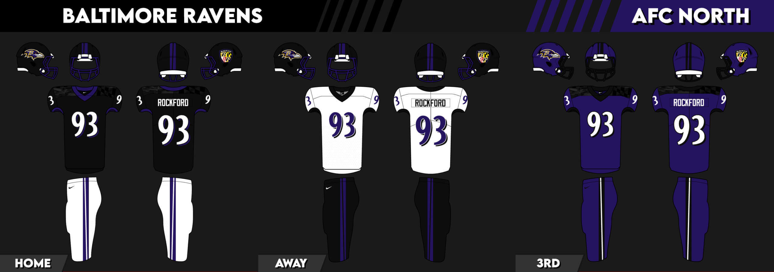


Awesome concepts, Jon! I really like the Ravens asymmetric helmet and the purple alternate with the black Maryland flag sublimated shoulder yoke.
Some of these are great. Jets “Home” and “Away,” yes, please. Jets “3rd,” umm…. no.
Way, way, way too much mono-color and BFBS. Please don’t give these guys any ideas, they already have enough bad ones.
Yeah, I realized I had alot of mono-tone about 3/4 of the way through… You live and learn haha.
That was my takeaway on these as well. Taking the 32 teams as a group, this concept created as many problems (49ers, Colts, Saints 3rd sets, Browns pants stripes, ghosted numbers, so much monochrome) as it fixed (Seahawks, Cardinals, Falcons).
Kudos for putting a yellow horn on the helmet of the Vikings alternate uniform, to go with the yellow numbers.
Guess the game by the uniforms — Bears at Broncos, Dec. 5, 1971, a 6-3 win for Denver. I have the “This Week in Pro Football” episode covering that week (a favorite due to the 34-13 upset the Patriots pulled on the Dolphins and the 23-20 upset the Eagles pulled on the Lions) and have seen the Bears-Broncos highlights many times.
You got it!
Jim Turner 6
Mac Percival 3.
The only time Chicago wore the white wishbone C against Denver. Loved that helmet, loved Denver’s orange pants and field design.
link
Loved the model rocket that was launched prior to the game.
Brutal game: 8 turnovers, 12 sacks, 5 missed field goals. I guess you could say there was a lot of action :-(.
The link is to a youtube recap of the game. The uniforms and the field are really sharp.
’71 was the final year for those diamonds around the yard line numbers. The following year, the NFL standardized field designs, so no more shields around the Raiders’ numbers, no more diamonds around San Diego’s numbers and Buffalo couldn’t have numbers every five yards. I miss that.
Kudos to Jon for some cool, imaginative concepts. My favorites include the Oilers-themed Titans alternate, the mono-yellow Rams alternate and the really nice green-and-silver Seahawks alternate.
Also really liked the all black-and-orange (no white) home Bengals and the light-blue-over-dark-blue Titans home unis (similar to what I think is their current best look).
Putting the Texans’ horns on the front of the helmet (a la the Eagles and Vikings) was also an appropriate touch.
December 5, 1971 — Denver 6, Chicago 3
I like the Vikings concepts! I always wondered how plum instead of purple would look, and that alternate looks good, like a cousin of the Gophers. Love the gold horns of that set too. The sleeve stripes on the home and away set are an upgrade. Still not crazy about that font though…nice work!
The flag on the shoulder for the Bucs is superb, but then adding black into KC’s uni concept is a strong NO. Same with the number font for Carolina. Lots of good, some bad.
Can’t win em all, right? lol. I was stuck on the Bucs for a LONG time before I came back with the flag idea. I honestly think it looks better than I thought it would and I’m very proud of it.
Thanks for the comment!
I’m not a fan of that Carolina number font either, but I like a lot of the other ones. Niners get the shadows back and not too many weird bespoke-for-its-own-sake fonts.
I also like the Flyers shout-out for Philadelphia with those contrasting NOB plates.
Uni Concepts: The Browns 1/2 pant stripe, although more interesting if it ranged the entire pant, is a NO from me. Too reminiscent of those horrible 2015 unis… The mono 3rd says, “construction barrel”. No, no, no. I hate that socks are no longer factored in for obvious reasons.
I wish the template had included socks. I found it on SportsLogos.net’s forum page.
Thanks for sharing Jimmy! And yes, those were at one time (and may still be?) Jim’s favorite uniforms (or at least the helmet).
Still my favorite helmet and uniform. And always will be.
I love what you did with my photo, Jimmy! And as Phil said, thanks for sharing.
Thank you Jon! Finally someone gets how the Bears orange jersey should look!
You are welcome, Jimmer! I see you got the 1972 helmet with the 1971 style Zeke Moore jersey. Sears could never get everything on the same page, I got a black Archie Manning jersey with no numbers on the side and a gold number 8. Archie never wore a gold number, where was NFL.com in the early 70’s when I needed them? Today I can get a Philadelphia Bell #9 jersey or a 1971 Norfolk Neptunes jersey, but at 58 years old I have no place to wear them?
It was very frustrating asking those NFL coaches about uniforms, they had no idea what I was talking about? To them they were just what they had to wear to play in, nothing more. Ron Waller would just make stuff up so I wouldn’t bother him. One time he was honest with me, I asked him why the Bell never wear the blue jerseys at home in JFK stadium, he said I don’t know.
Yeah, I got the jersey because back then my favorite number was 22. Paul Krause was my favorite Viking, Roger Wherli was my favorite Cardinal, Cyril Pinder was my favorite Bear, and when I latched on to the Oilers I chose Zeke. I would have loved Skip Butler, Billy “White Shoes” and Ken Burrough jerseys too!
So many concepters do the same type of scratch theme for the panthers. That’s not it, and trite as well. Not NFL worthy – too unprofessional.
New England natives who were patriots had very little silver to speak of, hence the reason to try for independence. Granted, silver was an easy go-to for a uni overhaul in 1992, but there is simply no need for it 30 years later. The concepts are solid, but we need to return to the palette of red, white, and blue.
I actually tried going white pants and helmets but reverted when I wanted to do the throwback. I may go back and see what white instead of silver will look like.
great job on the unis, jon!!! they all make sense. jets will need their beloved black pants. lol. bengals orange jerseys? nice nod to the oilers for the titans. chiefs finally get yellow pants. raiders should get black or white pants? bears should get the orange helmet? bucs nod to the orange jerseys is good too. also, like the panthers number font! and nice old school nod for the seahawks as well.
I’d like to add alternate version of each of these with maybe different helmets. I think the Bears’ orange helmets would look best with either the blue or white jerseys and orange pants. the Orange/Orange/white is too much. haha!
A truly “lost” NFL Uniform is the Bengals original uniform as publicized their inaugural season. Same “BENGALS” helmet, but with center stripes, and ORANGE jerseys with Black numerals and white trim. Truly good looking, unique uniform.
For whatever reason, despite issuing posters and playing cards and schedules with the Orange jerseys and center-striped helmets, they took the field for the inaugural season and the next 11 seasons with the uniform we all saw and got to know until the 1980 reboot.
Would love to see them wear that original “lost” uniform ….
Some of these were fantastic (the Seahawks alts), Ravens alternate dark purple helmet, the Eagles finally switching back to kelly green, the return of the Bucs’ creamsicle unis, and the Chargers getting a navy blue alternate. Really didn’t care for what you did to the Texans and Panthers helmets (particularly the placement of the decals going all the way to the back), or most of the monocolors, and not sure why you changed the Colts’ helmets to a block C? Felt like there were some missed opportunities for changes for a few teams who really need them: the Cardinals, the Falcons, and my Dolphins, who need to make a return to the old helmets immediately. You have far more talent than I ever will in this department. I’ll keep my eye out for any of your future work. Good luck!
That was a little nod to my best friend who is a Colts fan. He prefers their alternate Indiana C logo to their horseshoe one. That was really the main reason. I feel the Cardinals have the worst uniforms in the league and tried to do something clean but something “Arizona” so I went with the very unoriginal Arizona flag sunbrust on the sleeves. I tried to go out of the box for the Dolphins Alt… I feel like those will get alot of mixed reactions.
Thank you for the kind words! You’re to kind!