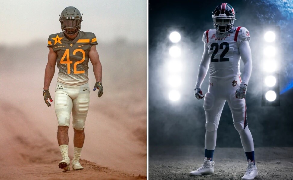
Good Saturday morning, readers, and I hope everyone has had a good week.
Army and Navy first met on the field on November 29, 1890, and have met annually since 1930 — with the game originally scheduled for the first weekend after Thanksgiving, but is now set as the second Saturday in December, which coincides with the end of the “regular” NCAA Football season and the beginning of Bowl season.
Normally (and for the past thirteen years or so) I would have a pretty huge post describing the special uniforms both squads will be wearing today, but since we switched over to the new “multiple posts per day” format on Uni Watch, Paul actually covered the unveilings of both Navy and Army as they were released. He had great coverage of both sets of unis in those, so if you’re into this year’s uni minutiae, those are great places to start. You can also read more about the uniforms for Army here and for Navy here.
As always, it should be a very good looking game. Little did we all know when, with little to no fanfare, way back in 2008, the two teams embarked upon a special “occasion” uniform rivalry that would later undoubtedly influence the proliferation of special uniforms across college football. Both schools were outfitted by Nike then, and their creation of special uniforms just for the game would lead to the uniform rivalry that is just as spirited as the game itself (hey, this is a uniform blog — I’d venture most of us care as much about the unis as the game, but I could see how that might not be the case for the rest of the country).
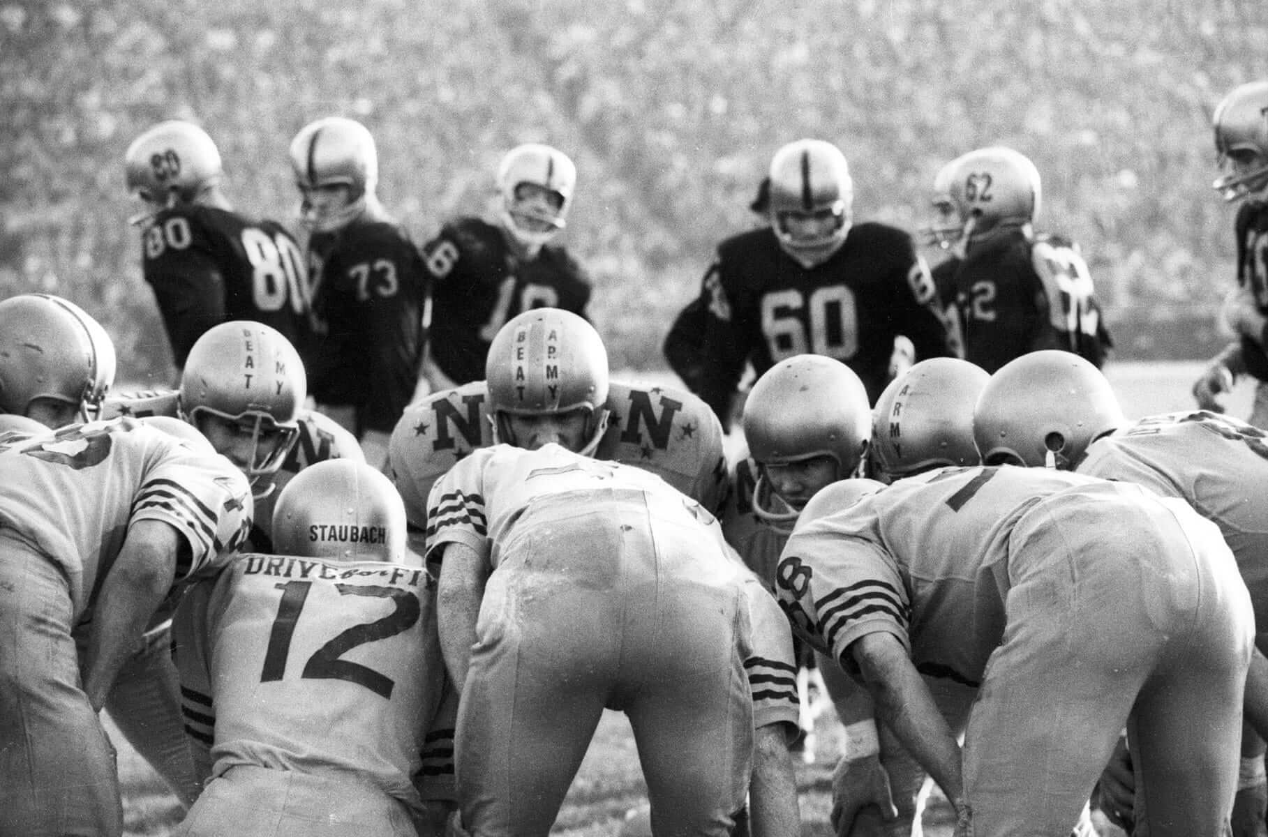
It’s not like 2008 was the first time either academy altered their uniforms for the big game — that had been going on for years (witness Navy’s “BEAT ARMY” helmet stripes and “Drive for Five” NOB from 1963 below):
But 2008 marked the seminal moment when special uniforms were created just for the game. Let’s take a look at how that started and how we got to the uniforms we’ll be seeing on the gridiron (one word) today.
2008
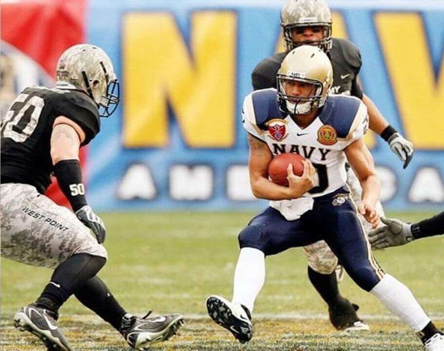
This marked the first game where Nike created special uniforms specifically for this game. Army wore camo helmets and pants (featuring “WEST POINT” down the legs) along with a black jersey featuring camo numbers. Army NOB’s read DUTY. HONOR. COUNTRY. Navy wore their regular gold helmets, but added white jerseys with blue and gold “epaulettes” and navy blue pants featuring the gold/red stripe of the Marines’ Evening Dress trowser.
2009
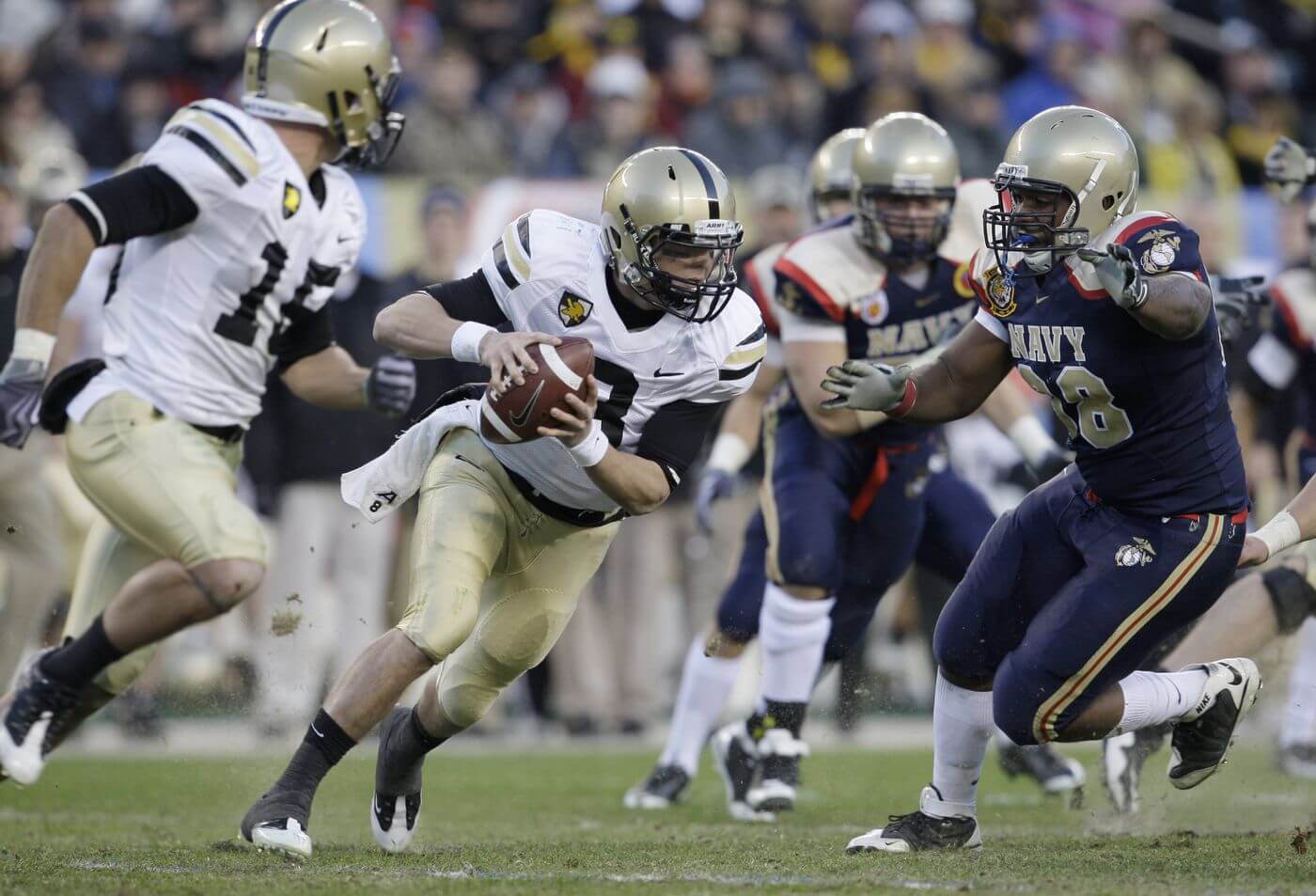
Army would put the special uniform on hiatus for 2009, while Navy riffed on their 2008 unis. Navy kept their 2008 pants and gold helmets, but swapped their white jerseys for navy ones that were basically color swaps of the previous year.
2010
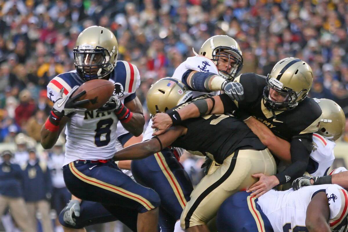
For a second straight year, Army wore its regular uniforms, while Navy slightly changed up their white jerseys from 2008. Whereas in 2008, the team had blue epaulettes bordered with gold, in 2010 they added red stripes and ditched the gold outline. This would be the last game the uniforms would not be a big “part” of the game (and the storytelling would begin).
2011
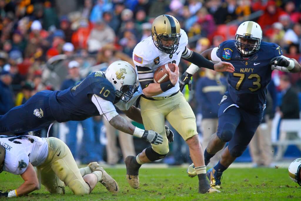
Do you remember the “Nike Combat” uniform? Well, 2011 would feature both teams in specialty uniforms, with Army donning gold helmets with a thick black stripe, basic white jerseys with black undersleeves featuring a modified northwest striping and gold pants. Jerseys would feature special stencil fonts, and shoes were meant to replicate combat boots. Navy got an entire new uniform, with a white helmet featuring an anchor on the side and a gold stripe, with the jersey and pants being mono-navy with gold numbers. While both uniforms would still be relatively staid, compared to what would follow, the uniform “battle” had truly begun.
2012
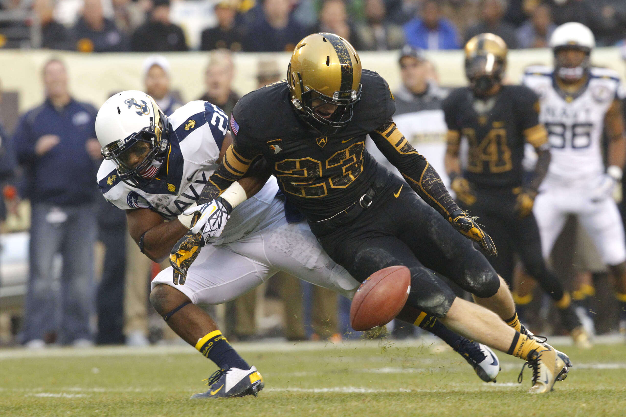
We’d get in 2012 what would unfortunately become the “norm” for many college uni matchups a decade later, when Army wore black jerseys and pants (with stealth stencil numbers with a map gradient) against Navy decked out in mono-white. This may be commonplace now, but back then it was much more of a novelty. The real “star” of the uni show, however, was Navy’s custom helmet, which was pretty revolutionary for the time.
2013
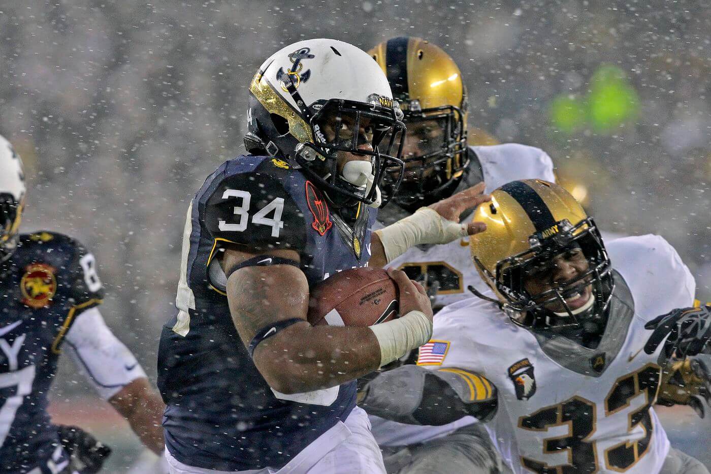
While both teams got special new uniforms in 2013, these would be somewhat mirror images of the prior year’s matchup. Both teams kept their prior year’s helmets, and Army swapped its black jersey and pants for a white jersey, with thick gray collar and gray pants, with a thick black stripe. Navy kept its white pants, but wore a blue jersey this time around. As memorable as the uniforms was the early season snowfall that took place that day.
2014
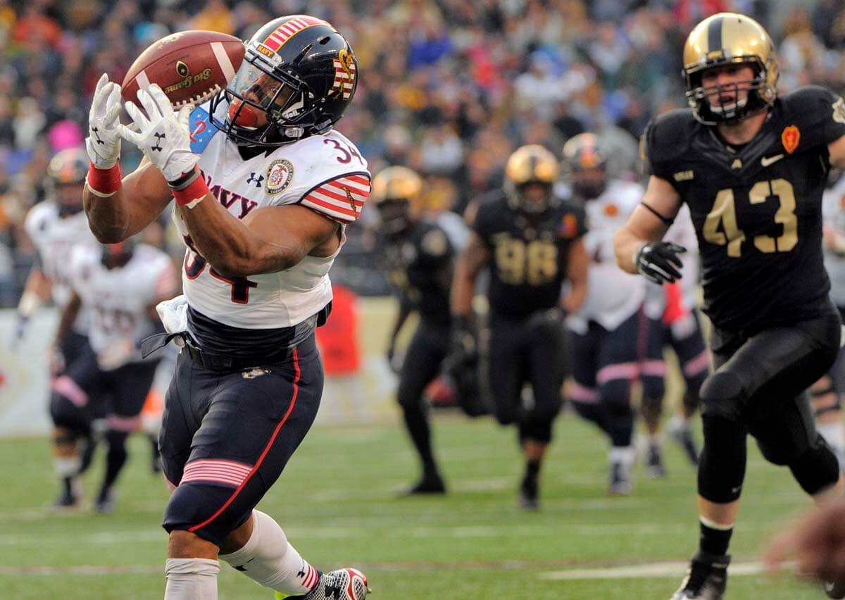
After 2013, Navy dumped Nike and moved to Under Armour for their uniform supplier, and 2014 marked the first time since the “specialty” uniforms for the game (back in 2008) featured different uni makers. And it showed. Nike stuck with a fairly sedate gold/black/black uniform for Army, while Navy’s flag-inspired outfit from UA was quite the spectacle. Nicknamed the “Don’t Tread on Me” uniforms, they even attracted attention from decidedly non-uniform-centered websites.
2015
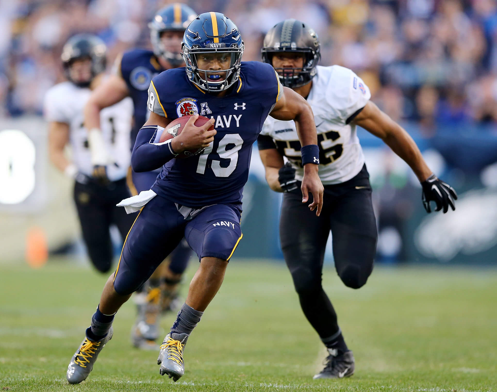
Helmets would be the big story of the 2015 game, with Navy introducing gorgeous custom-painted lids and Army later countering with black helmets featuring different military insignias for each position player. Army’s uniform was pretty basic, with black/white/black, while Navy wore blue helmets, jerseys and pants, with some gray and gold accents.
2016
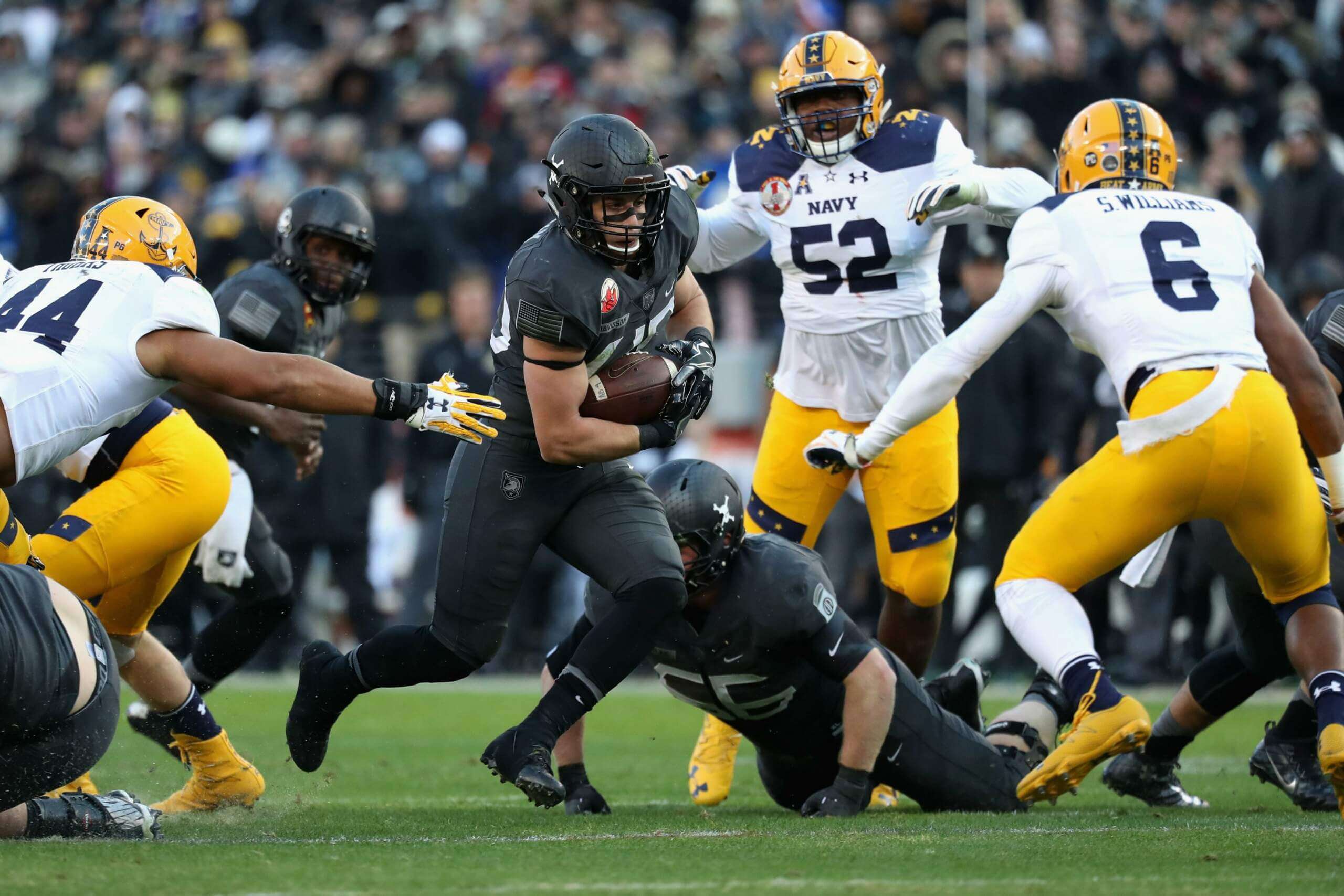
Army would lean into mono-black uniforms very heavily for 2016, inspired by the paratroopers of the 82nd Airborne from World War II. Navy countered with a new uniform which was heavy on athletic gold, which were inspired by the uniforms Navy wore during the 1963 football season. I particularly enjoyed Navy’s gold/white/gold look, even if it wasn’t your classic Navy uniform.
2017
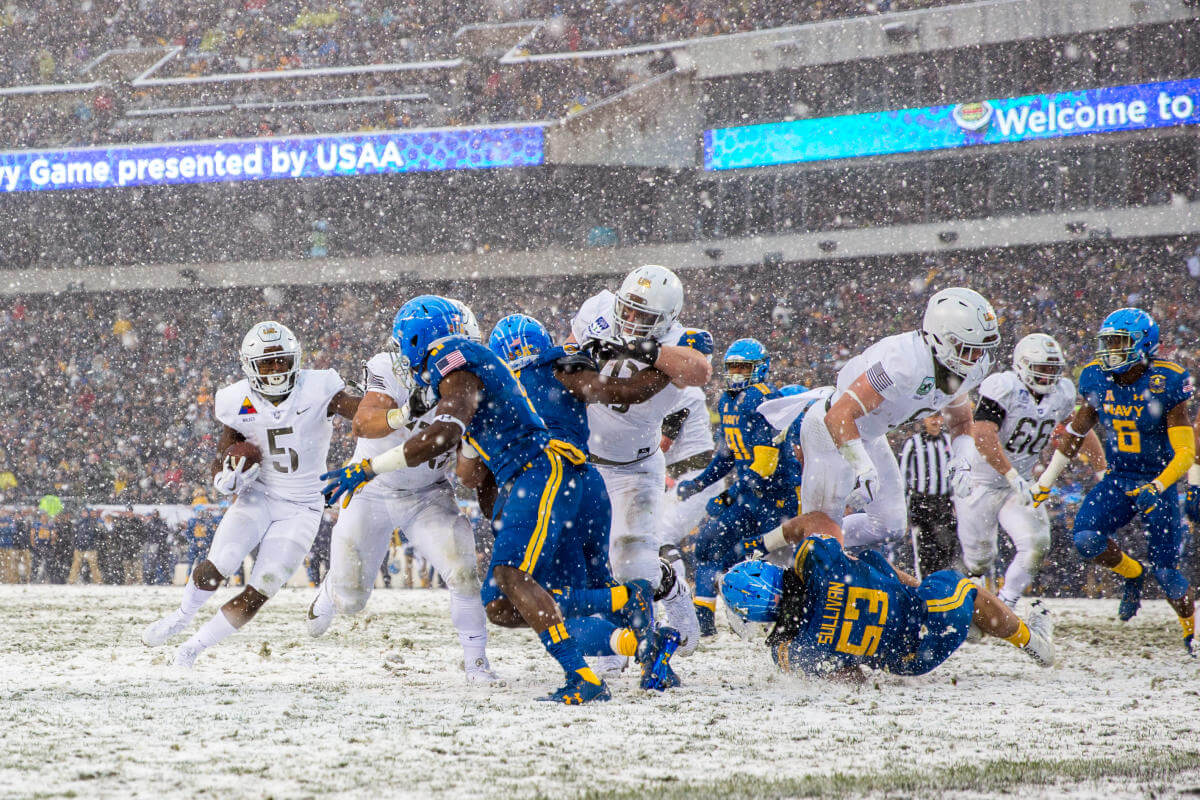
Of course Army didn’t realize it at the time, but their 2017 uniforms — inspired by the Pando Commandos — were the ultimate camouflage uniforms, as another early season snowfall provided perfect cover for the mono-white clad squad. Navy went with a Blue Angels tribute, which were royal with athletic gold trim, with lighter blue custom painted helmets, and were quite striking in their own right.
2018
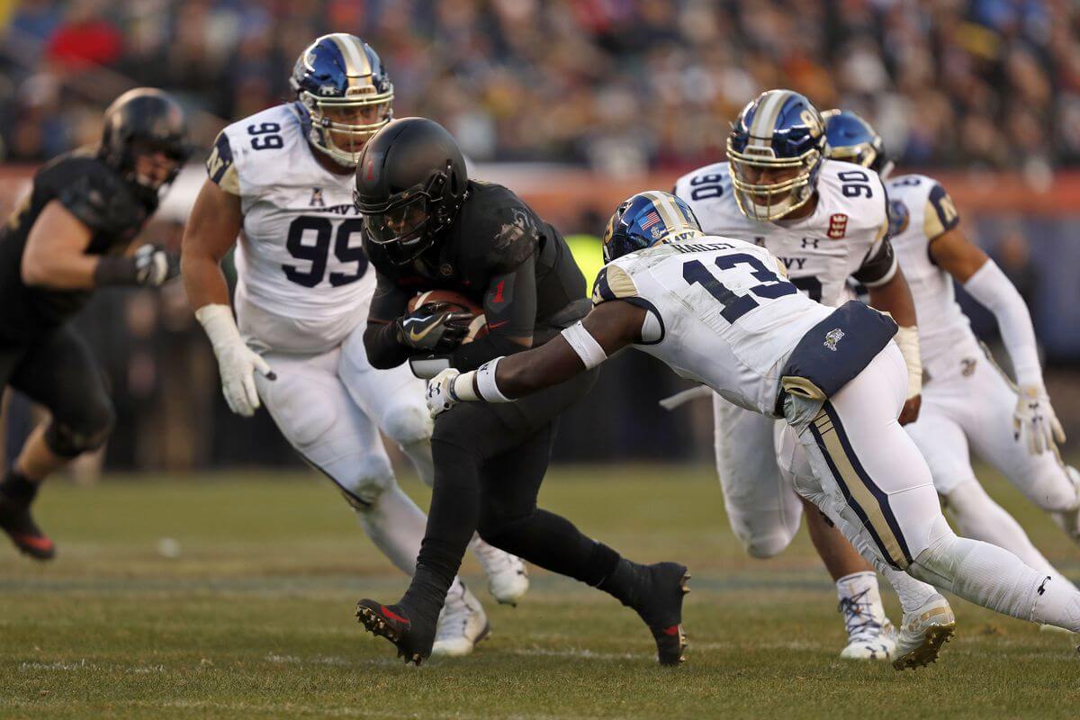
For their 2018 tilt, Army again went mono-black, this time honoring famed World War I unit nicknamed the “Big Red One,” and their uniforms once again were fairly staid. Navy, meanwhile, dedicated their 2018 uniforms to honoring Bill the Goat, the Navy’s animal mascot dating back to 1893! Their rather traditional-looking uniform was navy/white/white, and of course featured a logo of Bill the Goat prominently on the helmet.
2019
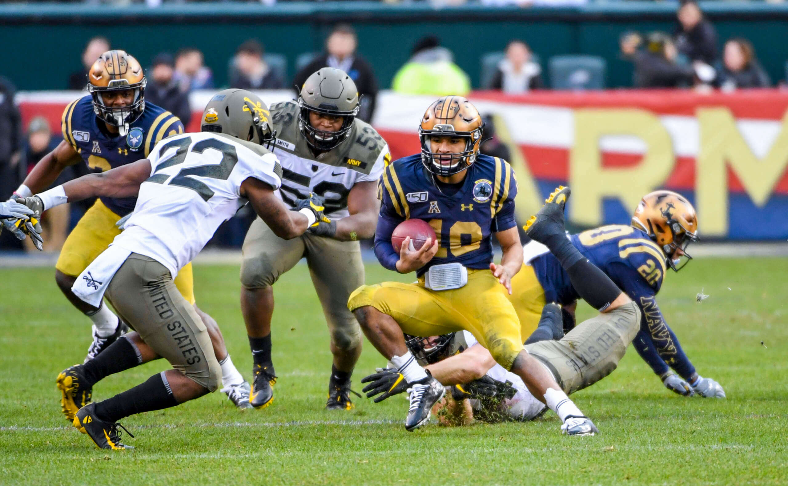
For the 2019 game, Navy broke out 1960s throwbacks which again featured custom painted helmets and navy over gold jerseys and pants. A nice solid look for Navy was countered by Army’s olive green-heavy uniforms, inspired by the 1st Cavalry Division from 1965. While the game didn’t have a throwback feel per se, both schools leaned into the 1960s for their uni-inspiration.
2020
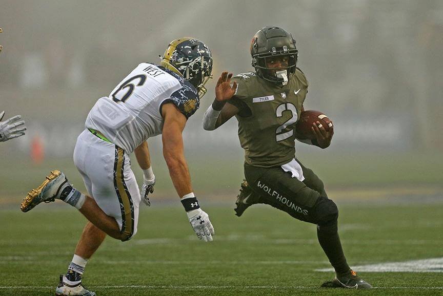
For the first time in forever, Army/Navy wasn’t the “only game in town” in 2020, as the COVID-19 pandemic wreaked havoc on the football season schedule (and pretty much everything else in our lives) — but the game was still played. For this matchup, Army’s uniforms drew inspiration from their 25th Infantry Division, going with a mono-olive uniform, that actually had (purposefully) different shades of olive. Navy countered with a blue/white/white uniform that celebrated 175 years of the Naval Academy. The (relatively) drab uniforms worn on a foggy late afternoon provided a perfect setting for a surreal year in which COVID cast a pall across the world.
2021
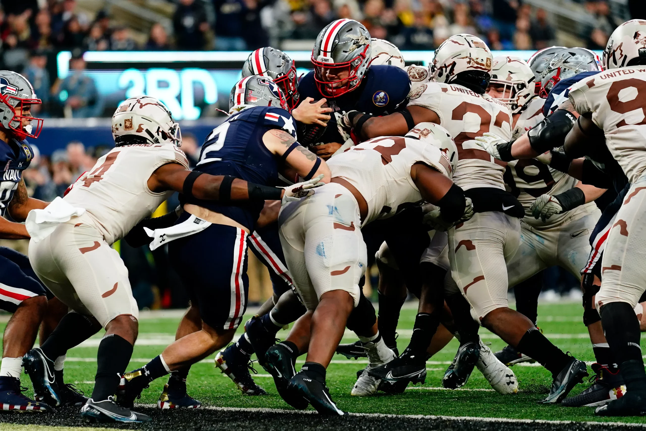
In 2021, Navy again wore custom painted helmets atop a mono-navy uniform, which itself paid tribute to naval aviation and the F/A 18 Super Hornet. Army went with a tan-colored outfit, inspired by that worn by soldiers of the U.S. Army Special Forces Command, and which were specifically designed to honor the US response after 9/11 (2021 marked the 20th anniversary of the terrorist attacks). While the game was certainly easy on the eyes, it was definitely more muted than prior years.
And there you have it. 14 (and counting) years of special Army/Navy uniforms on the day when all college football eyes are on The Game. Which year was your favorite? Do you like the idea of special uniforms (and backstories) every year for the matchup? Should they keep going or should they start to phase back to their regular unis? That horse may have already left the barn though.
And as an added bonus, even though there will be no SMUW tomorrow, Jimmer Vilk will be doing a special “5 & 1 — Army/Navy Edition” where he’ll pick his top five and worst one uni matchups for A/N, all time (and I’m sure some of the 2008-2022 unis will make The List — so stay tuned for that).



“gorgeous custom painted lids”
I can’t stand any of the custom painted helmets. As as Maryland fan/alum, I’m sick of seeing their custom painted flag helmets. IMO their other helmet designs are far superior and wish they’d move away from the airbrushed flags. They remind me of the base of a lamp you’d buy at a flea market. It also seems that only Under Armour schools do this? The individuality of the helmets UA espouses gets lost at a distance when watching the game. I find it to be one of the weakest trends in college football uniform design.
Army Navy is one of those rare games that you just can’t fumble aesthetically. Both teams always understand the gravity of this game and dress accordingly, and I appreciate that.
That said, my favorite has to be 2017. I loved Navy’s Blue Angels tribute, and the Pando Commando theme for Army just looked SO good in the snow.
Oh, there have been some stinkers, but for the most part Army and Navy get it.
Definitely one game from this era is making The List tomorrow, maybe two.
I disagree on the Pando Commandos. That’s great for actual battle but terrible on a snowy football field. I won’t put it in the &1 slot, though.
Always dope, Walter Helfer.
I can never get enough of your presentation skills.
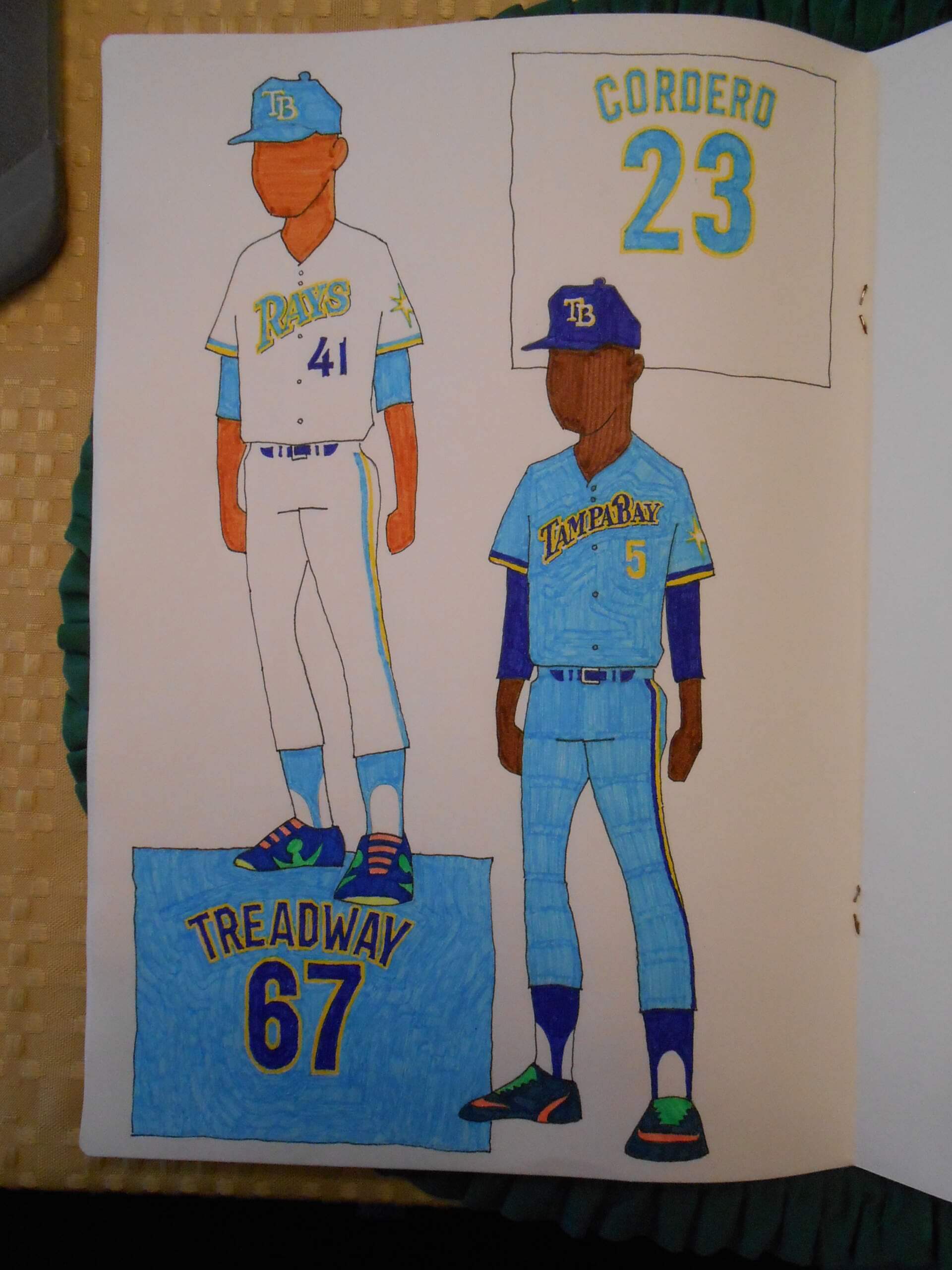
Your home uniform design for the Rays is flawless.
Place your “Tampa Bay” wordmark on it and turn the white grey, and you’ve got a flawless road design. Just one fella’s opine.
And… I’ve always wished that the Rays had an interlocking “TB”. Maybe a tall skinny T overlapping a short squatty B.
Thanks for the kind words, Martin. I like the current iteration of the Rays’ uniforms, but wish they’d lean in on the colors more. The Red Sox’ CC color scheme is the ideal Tampa Bay palette, and I would retire the flat, stodgy chest script from jersey duty. I’m concerned your idea for a cap monogram intrudes on the Twins’ intellectual property, and rather like the functional way the “T” behaves as a hanger for the “B”.
Army is playing the Alouettes? That’s a departure. Contest has an interesting start, if that’s astro turf, that becomes a bit more puzzling.
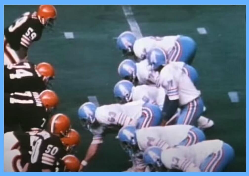
GTGFTU
Browns at Oilers 12/15/74
link
Fair Hooker (best sports name ever) scored a TD for Cleveland
GTGFTU is Cleveland Browns at Houston Oilers, December 15, 1974
Oilers only wore that style of uniform from 1972 to 1974, during which they played the browns 6 times. During those 6 times, The Oilers only ever wore white once, thus eliminating the other 5
Aw rats, I got beat to it!
Give Allan a cigar!
The final game for those glorious blue helmets.
Getting a little verklempt…talk amongst yourselves…
I’m back.
A lot of sunlight shone in the Astrodome that day, making it look like an outdoor game. And the Oilers victory ensured them of a non-losing season after back to back 1-13 seasons. Things were looking up, and two weeks later I unwrapped my Christmas present: a blue Oilers helmet!
Then the following season they came out wearing those white buckets on their heads and I was crushed. Yes, the team got better and I still kind of rooted for them, but it was never the same again. Luv ya, Blue helmets.
The helmet on Vilkmas morning…
link
Ahhh, I thought it had to be an outdoor game, based on the brightness. On television, my memory, the Astrodome looked like all other domes built from the 60’s to 90’s – naturally dreary and dark. But the fence railing in the back of picture 1, is more consistent with it being the Astrodome.
As to what was the dreariest of the dreariest amongst the domes, while New Orleans Superdome is still in the running, I would probably go with the Kingdome. (at least for Football). Tropicana field is in the Hall of Fame for that category. But it’s definitely something they’re starting to get right, the Viking stadium looks great – IMO.
As I may have commented in the past, I was another fan of the Oilers for whom it was never the same after they went to white helmets. I’m old enough that I’d fallen in love with their original blue helmets in the early 1960s and I managed to adjust and kind of like the silver helmets, then was thrilled when they returned to blue in ’72, only to subsequently be disappointed in ’76.
I just wanna put this out there, & maybe I’m misremembering, but I feel like UW’s coverage of Army-Navy game uniforms is far less critical than similar design choices made by other teams
E.g., this year’s Army uniform includes a gradient design on the lower half of the jersey that we all know would absolutely get flamed on any other team (I’m looking at you, Atlanta…)
Also agree with Nathan Stewart about the custom-painted helmets – they look great up-close, but from the stands or on television, they’re just a mushy blob that probably won’t make sense to a viewer tuning in that doesn’t see the part of the broadcast where they talk about the uniform aesthetics (good on CBS to include this in their broadcast, though)
Anyway, IMO, most of these uniforms are pretty bad from a football uniform perspective, IMO
Just noticed I “IMO”ed twice in that last sentence… sorry…
I’m hoping that Navy will get around to a series of uniforms that are tributes to famous individual warships or naval battles. The WW2 Enterprise and the Taffy 3 battle of 1944 are priorities.
Thus combining two of my favorite Internet destinations, Uni Watch and Drachinifel.
Guess the game – Sunday, Dec. 15, 1974, Cleveland Browns losing to the Houston Oilers 28-24 at the Astrodome, Pastorini wearing number 7 behind center.