Tired of seeing annoying ads (like this one!) on Uni Watch? There’s a simple solution: Join Uni Watch Plus. You’ll get an ad-free site experience, plus exclusive access to our UW+ discussion forums, push notifications whenever a new blog post has been published, a special UW+ badge accompanying all your comments on the blog, and a 20% discount on our Teespring merchandise.
I’ve been intrigued by the Pistons’ new City alternate (shown above), which to my eye is very attractive and, unlike so many City designs, has a genuinely interesting story behind it. The down side is that it has zero visual connection to the rest of the Pistons’ visual program.
That combination of factors raises some interesting questions — not just about this uniform, but about the City program as a whole — so I recently convened a panel of Pistons fans to pick their brains about all this. It resulted in a really interesting discussion, the transcript of which I’ve just published over on Substack.
You can read the first portion of the article here. In order to read the entire thing, you’ll need to become a paying subscriber, which I hope you’ll consider doing! Thanks.
Tasty
Speaking of this season’s new City alternates, the Mavs debuted theirs last night, and holy shmoly did it look great. Easily the best uniform that this visually characterless franchise has ever worn. Here are some additional pics:
What Can Brown(ie) Do for You?
Who’s that in the cool St. Louis Browns jacket? None other than longtime Uni Watch reader and D&J Glove Repair honcho Jimmy Lonetti (who I interviewed last month). He says he’s always liked the baseball version of Brownie, so he recently picked up a vintage jacket on eBay and sewed a Brownie patch onto it — nice!
Here’s a better look at the jacket and its cool interior label:
Nicely done, Jimmy!
Holiday Shopping Advisory
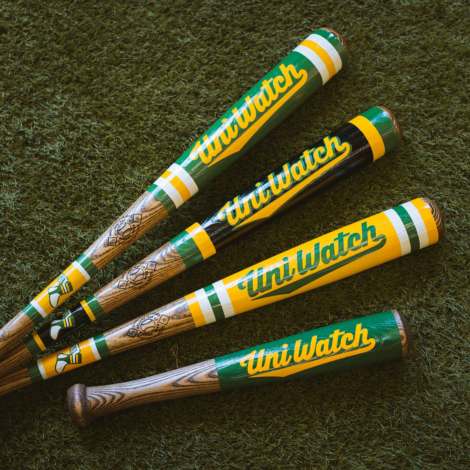
Our friends at the great Pillbox Bat Co. tell me that if you want one of our custom-painted Uni Watch baseball bats in time for Christmas delivery, you must get your order in by next Wednesday, Dec. 7 — that’s one week from today. Full details here.
Broncos, AMA Reminders
In case you missed it last week, here are two reminders for you:
First, I’m now taking entries for our latest design challenge, which is to redesign the Denver Broncos. The deadline is Friday, Dec. 2. Full details here.
Also, my next quarterly installment of “Ask Me Anything” — the bit where you can ask me anything about uniforms, sports, myself, or anything else, and I do my best to answer — will be coming up next month on Substack. If you’d like to submit a question, feel free to email it here. (Please note that this is not the usual Uni Watch email address.) One question per person, please. I look forward to seeing your queries!
Uni Watch Hit Parade
I’m not sure which I like better on this 1960 R&B tune — the song title or the sensational label design. The song itself is pretty good, too. Recommended!
Comments (30)
I cannot wrap my head around why any team is still doing the wishbone collar. The league has moved on from that manufacturer/designer, and it looks awful. Go back to the round or the v. Come on, everybody!
There’s not really a tidy end to the wishbone collar, fair enough. And this page and most of its users are very anti-maker’s mark and advertisements, which also, fair enough. I am also passively anti-maker’s mark and VERY anti-ad.
But the wishbone collar does sort of create a nice little nook for the maker’s mark and ad to reside in on either side of it. Compared to the Pistons uni above it, the ad and maker’s mark are kind of floating without an anchor a little more, to my eyes.
Would we be better off with a rounded collar and no marks on the chest of any kind? Of course. But visually, if the marks REALLY aren’t going anywhere, the wishbone collar doesn’t bug me as much as it normally would.
Fair point, and framing/spacial relation to other elements can make a huge difference in how something is perceived. For me it’s not the makers marks (please don’t burn me at the stake for this but…) the Nike mark doesn’t bother me much. Particularly the retro mark. To me it’s no different than any other jersey (majestic and russel had their marks on baseball jerseys for ages) it’s just in a different spot. At least Nike has the decency to color match with the team. The ads however do bother me, particularly because it just starts to feel like clutter.
It’s really just the way it comes together at the bottom. I think if the curve-back toward the nadir was less severe and there was a material crossover at the point, I’d like it fine. It just feels like a remnant of a template that wasn’t good in the first place and is totally out of it’s time now.
Agreed! It makes me cringe!
I usually hate them as well, but it actually works for some reason. I think it’s because it mirrors the curves of the font and almost looks like two lines coming together, similar to the font itself….or something like that.
No idea why the D is script and the ETROIT is block.
Whammy In The Gizmo just made my day, daddy-o!!
“Whammy In The Gizmo”- one of the greatest song titles ever. When used as a phrase so applicable in so many situations!
The Detroit jersey is yet another example of when storytelling is more important than the team’s identity. It is a great jersey-if the Pistons were an expansion team and this was their “I still call it a road jersey,” the praise would be darn near unanimous. But there is no green anywhere in the palette of Detroit major sports, so it comes off as a money grab cloaked in local history.
Sadly, this is the direction of things in the uni-verse. The Red Sox City Connect was the figurative shot across the bow; if fans would accept (and more importantly, buy) a historical franchise with an iconic look abandoning all of that, then there were no sacred cows immune from slaughter.
I won’t count a *fourth* uniform as sacrilege for stepping outside the team identity in a way that’s genuinely meaningful to their home market. St. Cecilia’s matters to Pistons fans. The colors of the Boston Marathon matter to Red Sox fans. I’d rather save my disdain for “city” kits that are either weird for weird’s sake because the designers couldn’t find that meaningful local hook (Brewers, especially that MKE/414 forced mashup logo) or look like they were designed by and for tourists (SF Giants’ “fog” kits).
(On that note, I’m genuinely dreading the Pirates City Connect uniforms. I worry that the club is too cheap and unsuccessful, and the market too small, for the designers to put a good effort into it. We’ll get something excessively touristy, like bridges, girders, or fries and cole slaw somehow. I’d love to see them do for Andy Warhol what the Brooklyn Nets did for Jean-Michel Basquiat considering the Andy Warhol Museum is one block down General Robinson St. from PNC Park, but I’m not getting my hopes up.)
The green Detroit jersey would make for a decent Dallas Mavericks or a Michigan State Spartans uni, IMO.
Just caught the replay of this game at the gym. They look like… well… they look like a catholic highschool with lots of money and a shitty basketball team.
Here’s the kicker for me: the score bug, the dynamic graphics for the broadcast and the center court all featured the “city” design in the green color scheme. The baseboards, 3 point arc, half court line, and key were all done in royal blue with the standard wordmarks in white and red.
The effect? Looked like I was watching a catholic highschool regional championship that was being played in the piston’s arena.
Sorry. Ok uni (just ok), not a great overall execution. Commit so we have less to gripe about.
The Mavs’ new uniforms are beautiful, and accurately mirror the expansion year, 1980, without looking dated. They really should go all-in with this design. The wishbone collar is not a deal-breaker, if they take care to render it the way it was originally done, on the Pistons’ and Lakers’ jerseys.
I don’t like wishbone collars. However, with this Mavs uniform it seems to fit and work, perhaps something about the wishbone matches up to the font? Not sure, but it definitely seems to work for this uniform. Certainly think this is the best uniform the Mavs have ever worn. Shame it is a one-off design. Sort of crazy to think they can make something new and original that looks so good, and yet most of Nike’s original content is garbage.
When I see those Mavs unis, I see the 1980-81 Denver Nuggets.
visually characterless franchise? No love for the cowboy hat wearing basketball logo? I always liked that one!
Fair point. But they’ve certainly been characterless lately!
I’m always down for the Uni Wstch Hit Parade. Those old 45’s from the 50’s and 60’s have some really cool and unique designs. Perhaps during a slow time in the Uni verse we could further in depth on those magical labels…Thanks Paul
I miss the days when you could turn on a ballgame and know who was playing just by the uniforms.
Yes, we discuss that in the article. Check it out! link
Whammy in the Gizmo made my mojo happy.
It’s faaaascinating to me that everyone who’s mentioned the song in today’s comments has spelled it as “Gizmo,” when the spelling on the record is actually “Gizzmo.” The extra “z” is one of my favorite things about it!
It drives me nuts when teams don’t wear their official colors.
Agree. I think the only exception is if they are wearing a throwback to a period when the team had different colors. The Packers navy/yellow throwbacks being a good example. At least in that case the lack of team colors just reflects a uniform the team once wore.
But the various alternates, city connects, etc. that populate the landscape, the teams are unrecognizable just for the sake of using a color that might have some connection to the city/region but no connection to the team. Imagine the Celtics wearing some Boston Tea Party red/white/blue themed costume one game. That’s not the Celtics.
I couldn’t agree more with your assessment of the Pistons alternate. I love the story, The uniform looks great. Really great actually. I just don’t feel like I’m looking at the Pistons. A lot is asked of teams and designers to reinvent things every year, so I get why they presented this. It’s not a miss by any means. It just doesn’t look like the Pistons. Maybe they need to lean in for a Bad Boys uniform with the skull and crossbones. THAT would be badass.
I know I’m in the minority here, but those Detroit green unis are bad… they fail as a jersey in so many ways. I honestly can’t understand why it would be considered a good jersey
A decent uniform, but absolutely no connection to the Pistons. That’s the problem. Essentially, all NBA uniforms are now “fourth” uniforms. Random colors. Random styles. No tie-in whatsoever to what a team has worn prior. This money grab will continue as long as fans keep buying this stuff. Not sure how many uniform tops a fan needs, but enough fans must be forking over their money, because these versions keep coming and coming
The script D in Detroit at an angle reminded me of the Tigers road uniforms. The design doesn’t work if you look at a basketball top and think baseball team. It just has zero connection to the Pistons brand in any way: no common color, font, or logo. The brand is already confused by having RWB as main colors but the teal era still popular. The green clashes with both and muddies the waters even further. It’s so bad it can’t overcome how good it looks as a generic basketball design.
The Pistons uniform is nice and has a relevant local story to tell. The Mavs one is also very good. Adding the shorts make both uniforms look much better than when we first saw the jerseys only.
Anybody done the edit on that Pistons kit with their regular colors?