Good Sunday Morning Uni Watchers, and welcome to Week 10 of the Sunday Morning Uni Watch. I hope everyone is enjoying their “extra” hour of sleep today.
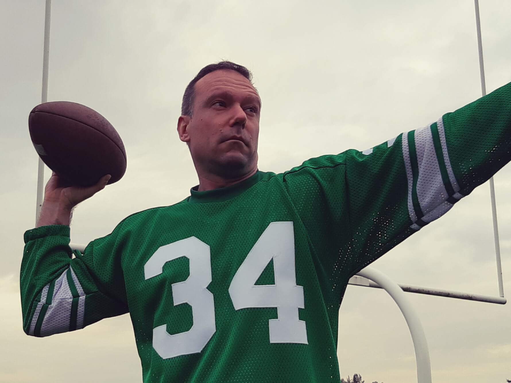
While there was plenty of uni shenanigans yesterday (it’s S&S/GI Jokevember after all), today’s splash photo is of a team that doesn’t get much coverage ’round these parts: the University of North Texas, aka the “Mean Green.” The team looked more like the neon green yesterday, as they wore throwback uniforms and helmets, with the logo lovingly referred to as the “Flying Worm.”
According to Mean Green Sports, the logo
was a quintessential piece of 70s design, a child of 1960s psychedelic design with thick, curvilinear shapes; a long, thick body with equally thick wings coming off its back.
It was a stylized rendition of an eagle. However, to North Texas students of the era, it looked like a flying worm. And the name stuck.
But the 1970s uniforms were much more than the Flying Worm. North Texas has long changed the shade of green worn by its student-athletes, but this was easily the most bold: a bright, eye-catching, practially neon lime green.
Introduced in 1973, the Flying Worm and lime-green uniforms were retired in 1982-83. But more than any uniform or logo before or since, the Flying Worm continues to enjoy popularity.
The great Hayden Fry, who coached at North Texas from 1973-78, and artist Rick Spears designed the Flying Worm logo
The team had worn Flying Worm throwbacks before, but this was the first time they did so with a white jersey. Now, normally I’m not a yuge fan of neon colors on a football uniform, but it was used so sparingly (and the uniform itself was pretty plain), it really looked great.


I wouldn’t quite call the “neon” green chartreuse, but it’s close…and chartreuse is a color that is sorely lacking in sports. When it’s done right, like these are — the simple block numbers outlined in dark green, the green helmet with classic striping — it’s all good. It would have looked even better with pants stripes matching those on the helmet, but other than that, I have no complaints. It didn’t hurt that UNT’s opponents, Florida International, went mono-blue, rendering the matchup both high-contrast and pleasing to the eye. A nice little mid-to-late season break from the usual “icy whites” and “blackout” uniforms so prevalent these days.

And with that, I’ll now turn the rest of this portion of the SMUW to Terry who’ll bring you your…
Sunday Morning Uni Watch
by Terry Duroncelet, Jr.
From Tuesday:
• Kent State/Ball State: Kent State kicked off G.I. Joevember by wearing their GFGS alts against Ball State (closer look at the helmets).
• Ohio/Buffalo: The Bobcats missed the Halloween invitation by a day, so the BFBS is completely out of place here.
From Wednesday:
• Bowling Green/Western Michigan: Contrast Matters: Chocolate Cake and Whipped Cream Edition. Seriously, I’ve never seen so much brown and white concentrated in one football game in my LIFE.
From Thursday:
• Rice/UTEP: Grey alts for Rice.
From Friday:
• UConn/UMass: S&S decals for the Huskies.
From Saturday:
• TCU/Texas Tech: Road throws for the Red Raiders, and would you look at how GOOD this game looks! This matchup was made for the afternoon sun!
• Illinois/Michigan State: Much like SEC matchups kind of have their own aesthetic that FEELS SEC, there are certain B1G matchups that FEEL like a proper Big 10 game.
• Wisconsin/Maryland: Mono-red for the Badgers (featuring a nice hole in the left pant leg of Wisconsin Senior RB Isaac Guerendo).
• Marshall/Old Dominion: Black lids and trou for Marshall.
• LA Tech/MTSU: Not much to talk about apart from the rare red tops for LA Tech, but check out this lad!
• Stanford/Washington State: The Stanford Black wore their BFBS alts to be “intimidating”, I guess. How’s that working for ya?
• UL Monroe/Texas State: G.I. Joevember unis for Louisiana-Monroe.
• Louisville/James Madison: “Steel Wings” G.I. Joevember unis for Louisville.
• Boise State/BYU: Why are SO MANY TEAMS not getting the memo that last Saturday was their LAST CHANCE FOR AN ENTIRE YEAR TO PULL THIS SHIT
• SMU(.)/Houston: …Apparently, a criminal amount, to answer the above question.
• Michigan/Rutgers: Turning to something pleasant for once, Michigan wore mono-white, but the exciting part were the maize sleeves, socks, and leggings that they wore alongside them. Meanwhile, Rutgers wore S&S decals on their white helmets.
• Vanderbilt/South Carolina: Full-black unis for Vandy, with some G.I. Joevember flair thrown in (closer look).
• USC/Cal: Road throws for UC Berkeley.
Thanks, TJ! And now we move onto the coverage from north of the border, as Wade Heidt brings us the CUUW.


Saskatchewan Huskies pulled off a great looking green, black and white combo – those colors can look great when used in the right amounts.
Huskies look good. Like when they pair the green jerseys with dark grey pants too.
I really wish the Huskies would wear a throwback someday. I was a fan of the late 1980s, early 1990s green with silver trim uniforms. Similar double striping to what was seen on old Washington ‘skins or Toronto Argonauts uniforms. As seen here in 1989 Vanier Cup.
link
I know Phil isn’t going to change standard (love that word…welcome back Standard Time!) Uni Watch terminology, so I’m just going to pose this to the readers: In an era of multiple helmets, when you hear “Wisconsin went mono-red” or “Michigan wore mono-white,” do you picture them in red and white helmets respectively as I do? I’m Calling It White/Red/Red and Blue/White/White.
That look should be Wisconsin’s default home uni. I like that as much as I’ve grown to like the Buffalo Bills in white/blue/blue.
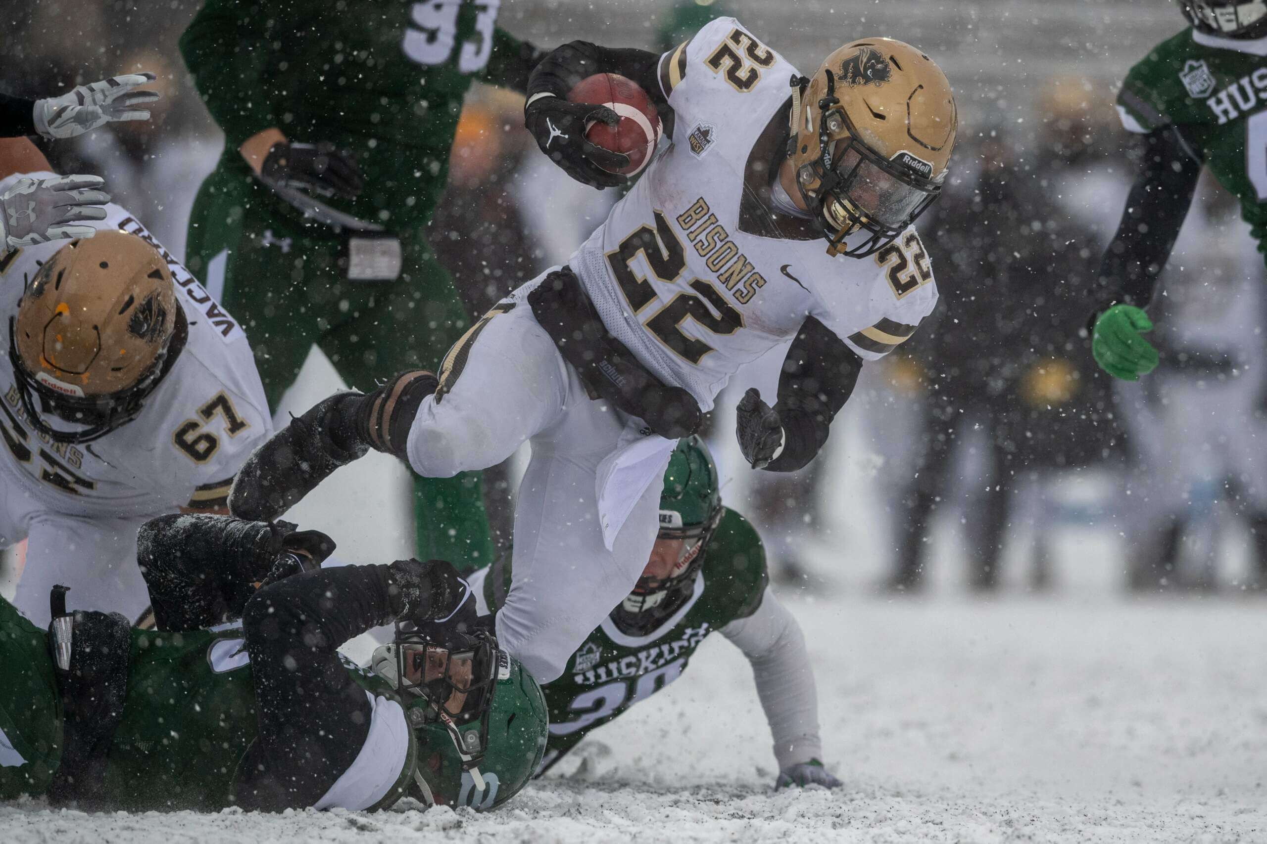
Roll on, Mount Allison! Oh, and for all the teams that wore white jerseys and pants in the snow yesterday: don’t.
Almost forgot…shame on you Laval.
You’re named after two colors, you wear those two colors. Don’t be like the Chicago “White” Sox.
Manitoba Bisons used to wear brown pants on the road sometimes with the previous road unis. Have only ever worn white pants with these newer white jerseys.
link
Terry did a great job highlighting all the new combos, but yesterday I felt that on the whole most power conference games wore their “traditional” uniforms. What a relief!! While it is fun to see all the new combos, it is comforting to see games that reflected my deep memories of the teams.
Wade great work! Now lets go Lions!
Thanks Rick! Good thing the roof will be closed at BC Place today. Rainy weather here. 12-6 Lions vs. 12-6 Stampeders should be epic playoff game.
One correction: North Texas numbers were outlined in dark green, not black. Also, as a Mean Green alum, I approve these uniforms.
You know…I thought that was dark green (to match the helmet stripe) but the rest of the uni was so bright, it looked black to my eyes. Should have gone with my original thought — thanks for the correx!
Yeah, it’s a very dark green, and contrasted with the neon, it looks even darker. And they have unfortunately used black before. But thankfully they went green here.
I am a North Texas alum myself, and am someone who attended when the Flying Worm was used. We/they called the color “Apple Green”. Color-wise what they’re using now isn’t quite accurate (wasn’t quite so “neon”), and I really wish they had worn uniforms from the late-’70s-early-’80s era. White jersey with Apple Green pants; Forest Green and White stripes on the pants. Jersey numerals in Forest Green trimmed in Apple Green, and White facemasks. Sleeve stripes too.
Hey Donovan!
Question — is the “Apple” green Oregon uses anywhere close to the UNT “Apple Green”?
Quote of the day:
“….chartreuse is a color that is sorely lacking in sports.”
Pleasantly surprised to see North Texas in the first entry. 3 of my kids went there.
Good work, Alex!
The Astros won all their WS games in softball tops and lost both games played in traditional uniforms.
That’s ‘winning ugly’.
Phillies fans will probably still gravitate toward/hold fond memories of the powder blues even though Philly’s post-season record wearing those is terrible.
Today may be the ugliest uniform day in NFL history. Almost every early game has a uni-tard going on, and the Jets keep going with those ugly black pants.
One exception: Lions vs. Packers is classic. The rest (at least in the 1:00 hour)? Awful.
In fact, the 4:00 games will be just as bad. And MNF will have the ‘aints in mono-black.
Second best matchup today? SNF, with the Titans going navy/white/powder vs. KC in red/red/(and I’m assuming white). Doubt they’ll go mono-red tonight…
Since the jersey/pants striping matches, I like when the Bengals go (arguably)Best Helmet in the NFL/black/black. And the Panthers look alright in mono-white…yeah, yeah there’s no silver to match up the helmet – but still a nice set.
Bonus points to Cincy for wearing the orange socks…that’s balance enough for me.
One of the Mustangs’ players had the wrong sticker on his helmet. The horse ought to be facing forward.
Boise State needs to burn those black abominations.
I wonder what the record is for most BFBS worn in one week in CFB…?
1st point: can we please stop with using BFBS and GFGS when referring to black and gray? It’s really getting very tired. Black and gray are colors. People wear them. Many people like them. You really need to learn to accept this because it’s not going away.
2nd point: can you guys please stop using curse words in these articles? I shouldn’t have to look at that that while trying to enjoy some interesting uni news. Thank you.