A good Sunday Morning Uni Watchers, and welcome to Week Four of your Sunday Morning Uni Watch. As always, the main rundown is provided by long-time SMUW uniform watcher Terry Duroncelet, who’ll take you through your NCAA Football uni news and notes. This year TJ is joined by UW stalwart Wade Heidt, who brings us a look at the unis of university football up north in Canada.
As I had mentioned yesterday, I spent most of Saturday at a bonspiel (that’s a fancy name for a Curling tournament); regrettably, this was one of the worst (results-wise) bonspiels I’d ever been in, and while none of my three teammates played spectacularly well, my own play was, for the most part, far less than stellar. No excuses: I was bad. I did make several really good shots over the course of three days, but they were far too few and far too in-between to help us much. Ah well. I had fun, and the company was excellent, the food was good, and I’m sore and exhausted. Just the way it should be!
Now then…onto the SMUW.
As expected, Mississippi State broke out throwbacks alternate uniforms yesterday. While they might more appropriately be termed “fauxbacks,” they weren’t really even that. I wrote about the special uniforms back in August, so I won’t go over the details here (you can read that if you’re curious). I thought the uniforms looked as good on the field (no, I didn’t see the game, but I did see highlights and photos) as the early previews. What made the uniforms special wasn’t so much their historical significance, but the University’s honoring its first two Black players, who became stars for the squad.

As you can see, the uniforms weren’t all that different from those the team wears in 2022, but the white helmet with the vertically-stacked “MS” and the radially arched “MISS STATE” on the chest are the biggest differences. Please do refer to the linked article above to see how the designers came up with the game day unis.
As we now enter the heart of the NCAA Football season, big games and inter-conference play yield some more uni variety, which will of course reach a crescendo until rivalry weekends (when hopefully most schools will wear what we’d consider their “Sunday best” outfits), and Terry will take us through the rest of Week Four’s uni hijinx, shenanigans and other notable machinations. Here’s TJ with your…
by Terry Duroncelet, Jr.
It’s time for that nice Autumn chill and vibe, so grab your favorite LoFi radio from your favorite streaming platform and… wait, didn’t we do this last week?
From Thursday:
• Virginia Tech/West Virginia: The Mountaineers’ Country Roads uniforms return for the second time this season. Well, from the waist-up, at least. Doesn’t hit quite the same as with the proper white pants, but still a neat look. On the other hand (or the other side of the ball, in this case), given that we are now officially in the Autumn season, I’m disappointed that Virginia Tech didn’t break out any orange pants. Do they not realize just HOW MUCH POWER THEY HAVE??
From Friday:
• Syracuse/Virginia: As I mentioned with the Backyard Brawl from a few weeks back, if your team goes up against an opponent that has a near-identical color scheme, this is the way you should handle that scenario.
From Saturday:
• Kansas/Duke: I dunno what’s weirder; seeing the Jayhawks in mono-red, or seeing them at 4-0 on the season (2-0 in conference).
• UCF/Georgia Tech: I actually really liked GT’s black and blue uniforms in their game against Central Florida. You can’t see my face right now, but I am trying to hold back the most smug grin on my face right now.
• USA/LA Tech: Can we talk about South Alabama’s helmets for a sec? Out of all of the asymmetrical decal lids that have come out of the woodwork in the last 11 years, this is easily one of my favorites. The Jester Jaguar is a nice nod to Mardi Gras, which –for the uninitiated– traces its roots in Mobile, AL, despite its bond with New Orleans.
• I don’t talk much about FCS, but am I the only one who thinks this promo shot of Albany’s “Hometown Heroes” helmets looks like the decal was Photoshopped?
• Ohio State/Wisconsin: Yes, we all see it. We all can see their sin. Let’s try our best to not seethe (I say, as I seethe at my keyboard), and move on. There is some drip among the Buckeyes that I can respect.
• Rutgers/Iowa: The Scarlet Knights living up to their team name against the Hawkeyes.
• Texas A&M/Arkansas: A rare sight to see a Texan team playing at Jerryworld in colored tops. Funny enough, I actually like Arkansas’s all-whites more. There’s something oddly-satisfying about them.
• Oregon/Washington State: I feel like I’m watching a game between sentient white linen bedsheets and sentient mounds of mud, and it’s giving me anxiety.
• Temple/UMass: …Honestly, I think I prefer THE’s BFBS togs over these. Those player numbers are a concept. That’s a notion that they’re using for jersey numbers.
• North Carolina/Notre Dame: Throwbacks for the Tar Heels, and a good-looking game overall.
• Northwestern/Miami (OH): Full-blacks for Northwestern.
• Florida State/Boston College: Look too fast, and you’ll confuse the Florida State Eagles with the Boston College Seminoles.
• Utah State/UNLV: The Aggies wore green ribbon decals for mental health awareness against the Rebels.
• BYU/Wyoming: BYU wore decals honoring Wyoming’s ‘Black 14’. You can read more about that here.
• Georgia/Kent State: The Golden Flashes wore some new decals against Georgia (better look, with thanks to Blaise D’Sylva).
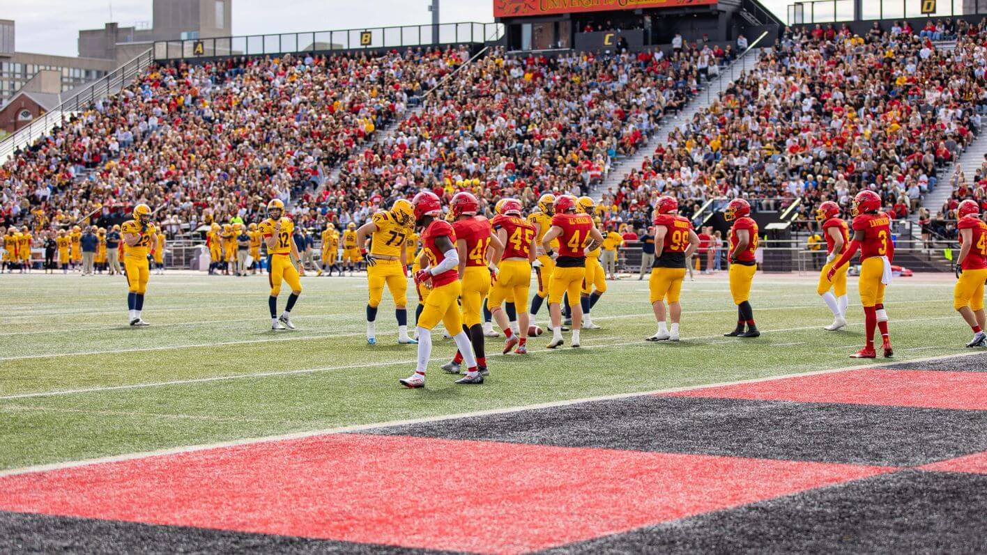
Next up is Wade with your look at University football in the Great White North!


Get ’em next time, Phil.
Rutgers almost made my Five this week. Now those were some scarlet Scarlet Knights!
(Why do I have Don McLean singing in my head now?)
The Oregon/WSU game was a lesson in why white should be used sparingly on a very sunny day. The Ducks seared my eyes more than any neon team ever did, while the white on Wazzu really popped. I actually liked how the Cougars looked.
Usually not a fan of anything 90s but the Tar Heels looked mighty fine. Unfortunately, any game the tiny-numbered Irish are in won’t make the Five.
Alberta Golden Bears for the win! Love that look.
Great stuff, guys!
Exactly how I feel: the Irish numbers should be bigger.
Great stuff from everyone on the SMUW Crew, as usual! And a hearty congratulations to Wade Heidt for the official debut of Canadian University Uni Watch! For the record, I was reading CUUW way back when it was in the comments section. B–)
Maybe it’s just the lighting in the picture, but Alberta looks like they were wearing true yellow, not athletic gold.
Also worth noting Colorado State wore their Orange “Ag Day” uniforms, complete with a white helmet with a retro logo.
link
link
No need to mention the score though…
Indeed! I was at the game. Fun to see so much of the stadium awash in orange! Not so fun to see CSU get flattened by an FCS school (except, I guess, for the roughly 3 or 4 Sacramento State fans I saw there).
I disagree with tj on the temple look, the all black with a white helmet is ridiculously ugly and atleast white black white matches two parts of the uniform. Really wish temple would bring back black helmets like they have done before
Or you could just call it a curling tournament and not have to explain it each time. Just sayin’.
Or you could learn a new word from what Phil is doing to provide a little education to the uninitiated. Just sayin’.
Been following this blog for many years, so I knew what it meant.
Apparently, you’re fond of pretentiousness.
Nope. I’m fond of descriptive and accurate terms. What I’m not fond of is smug contrarians. Let Phil describe it how he wants.
I’m not a hoodie guy, but “I’d Wear That”.
Sad that UMass looked more like Temple should…and the Philadelphia Eagles should look to the Saskatchewan Huskies for design tips once it comes time for them to return to the Kelly and Silver/Gray. Love CUUW!
Terry is the best, the best!
MoVi, such a great job on that oiler.
The Canadian university roundup is a nice touch. Now, let first establish that I am one to throw around “gold”, like some do “yellow”, it’s a generic catch all, and as accurate. But I will also be accurate on shades too when needed, so I love the right proper “athletic gold” to project an image of packer/steeler/wolverine gold/yellow shade; it’s accurate, like “old gold”, or “vegas gold”. but you can’t use “atty-gold”, and then say Alberta isn’t something else, like a really pale-ochre gold? there is no way on the cornmother’s green earth that is athletic gold if you are going to use terms like athletic gold.
-Hugs, kisses, and welcome to the SuMo Uniwatch team with as uniwatch a comment as I can mustard-gold up.
RPM, fair points. The difficult situation about athletic gold/yellow and how we should refer to it. Have to say the lighting in photo does make the Golden Bears look a little bit lighter, but fair to say it may not be athletic gold. If we are using the Steelers as proper athletic gold, here are the colour codes per teamcolorcodes.com:
link.
Now same website does not look at Canadian schools. A 2019 site gives University of Alberta standards if they are still the same:
link
So the Golden Bears a bit more yellow. School claims they are green and gold. Golden Bears and CFL’s Edmonton Elks thought to have similar uniforms. Many feeling the Elks and Green Bays Packers look identical.
Best solution may be to call the Golden Bears’ version yellow.
well that IS pretty athletic gold, it must have been the photo. I’m not trying to split too many hairs on shades of gold, or what we can call whatever, I just meant that photo looked like a new color. I was mostly just having some fun with the new guy on the SuMo block in the most UW way I could. ask mothervilker, that was nuthin:)
Indeed!