[Editor’s Note: Paul is on his annual August break from site (although he’s still writing his weekly Bulletin column and may pop up here on the blog occasionally). Deputy editor Phil Hecken is in charge from now through the end of the month.]
Good Monday morning, everyone, and welcome to August. As you know (and can read above), Paul has begun his annual sabbatical from the blog, and I’ll be handling the weekday content from now until the end of the month. We’re all still getting used to the new format (myself included), and as such there may be a few tweaks going forward, but I plan to adhere to the way Paul has been doing things for the past two weeks. That is: one morning post which may include a few sub-ledes (as today’s will), then the day’s ticker (I’ll usually run that about a half-hour after the original post goes live), and likely at least one (and sometimes more) articles throughout the day.
A bit more than two weeks ago, during my final weekend posting during July, I ran a great piece from reader Walter Helfer (An NFL Beauty Pageant for Numerals, Part I), and to kick off my August run, I’m back with Walter for Part II today. Enjoy, and be sure to keep reading after this article for more news and housekeeping. Here’s Walter…
by Walter Helfer
If there is a common factor among all the team sports, perhaps the most iconic is the basic octagonal numeral. They bond pro baseball, varsity football, ultimate frisbee, volleyball, and more. Designed with a ruler, it offers function and beauty; readable from long distances, it can be rendered plainly or in multi-colors without sacrificing legibility. But I would regard a world decorated only by these no-nonsense numbers in the same way I would consider rock & roll played only on acoustic guitars. Capable, but lacking in imagination. The time has arrived to put the NFL under the discriminating eyes of the judges.
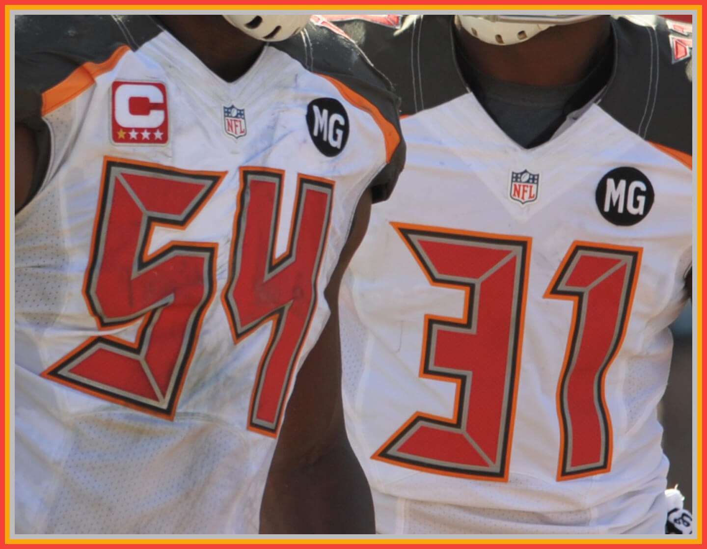
In the NFL, the most commonly used font is Sand-Knit, with a few teams using variations. Tampa Bay, for instance, multiplies the outlines in an unusual way. Indianapolis uses a fancy version once employed by the Cowboys and the New York Titans. Each font will receive a score of 5 through 0: 5 = Excellent; 4 = Good; 3 = Okay; 2 = Poor; 1 = Godawful; 0 = Booby Prize.
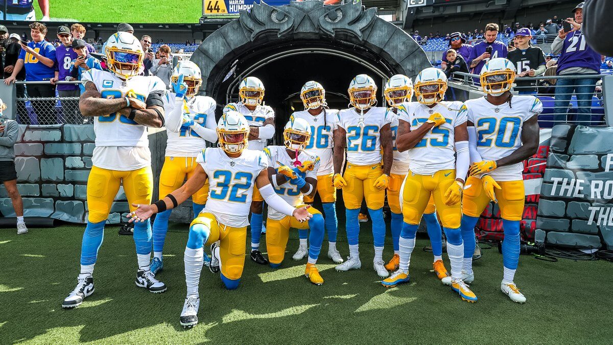
An epic stay in San Diego found the team being the NFL’s sole tenant in Southern California for an extended period. Things were rosy until an ill-advised 2007 tune-up saw mismatched lightning bolts and fussy trim on the new Agency Gothic font. It seemed no designers were involved. The move to Sofi Stadium appeared to right the ship and the Thunderbolts took on a trim new look with italicized numbers and a simplified color scheme. Things are looking up!
My Scores: 2 (2007); 4 (2020)
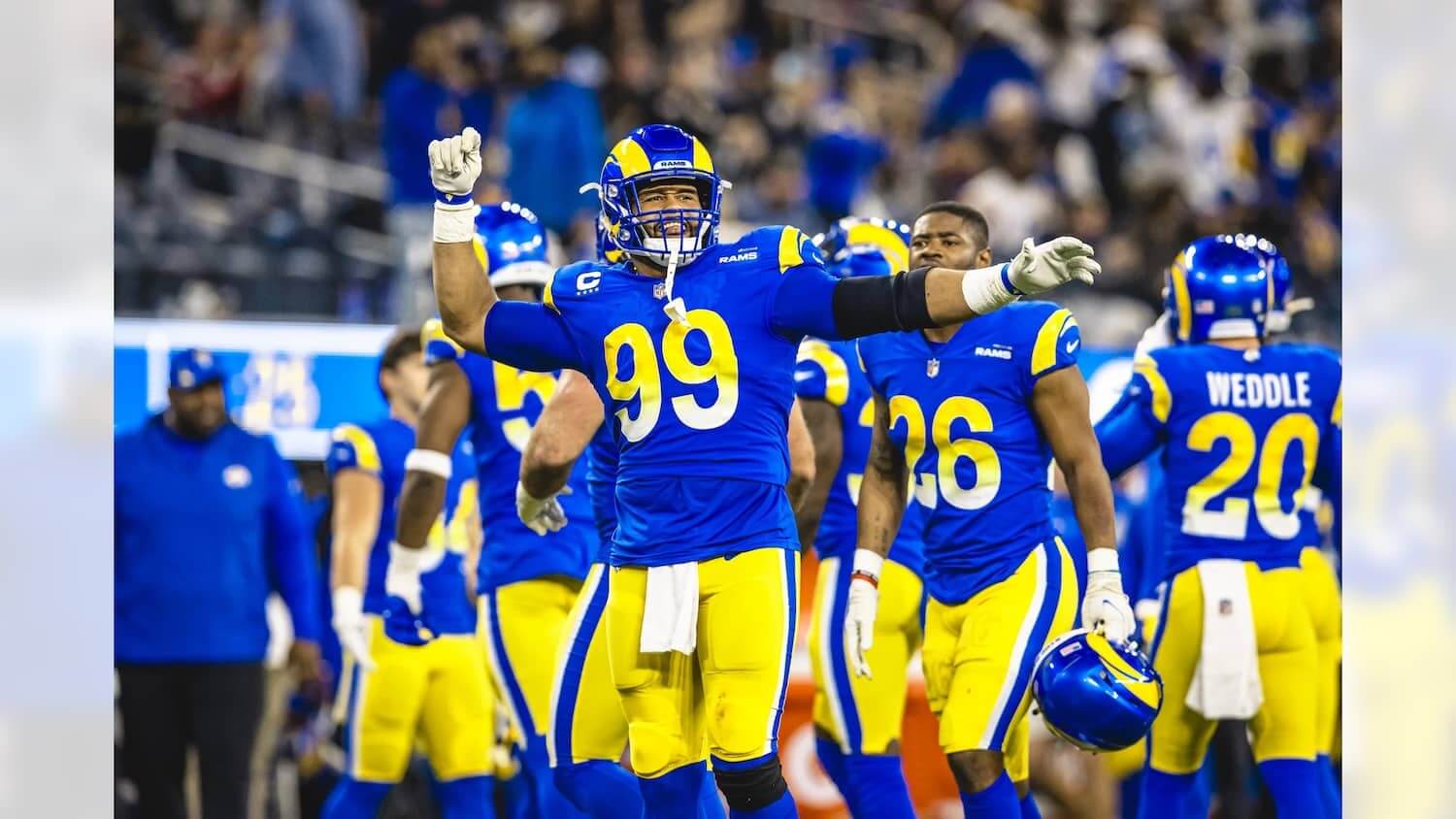
The Rams’ eventful tenure in St. Louis yielded an unsuccessful 2001 tune-up of their colorful Hollywood uniforms. Colors were muted, and then a dated number font with rounded-off corners was added. Ho-hum. The move back to the left coast found the Bighorns in a giddy mood, and the move to Sofi Stadium saw the team brighten the color scheme and adopt a streamlined font with Mobius strip details added to the center. I might get a raspberry for this, but to me the new numerals are nice, and the skinny elongated version used for TV numbers are stylish and easy to read. I wish all the jerseys had them.
My Scores: 2 (2001); 4 (2020)
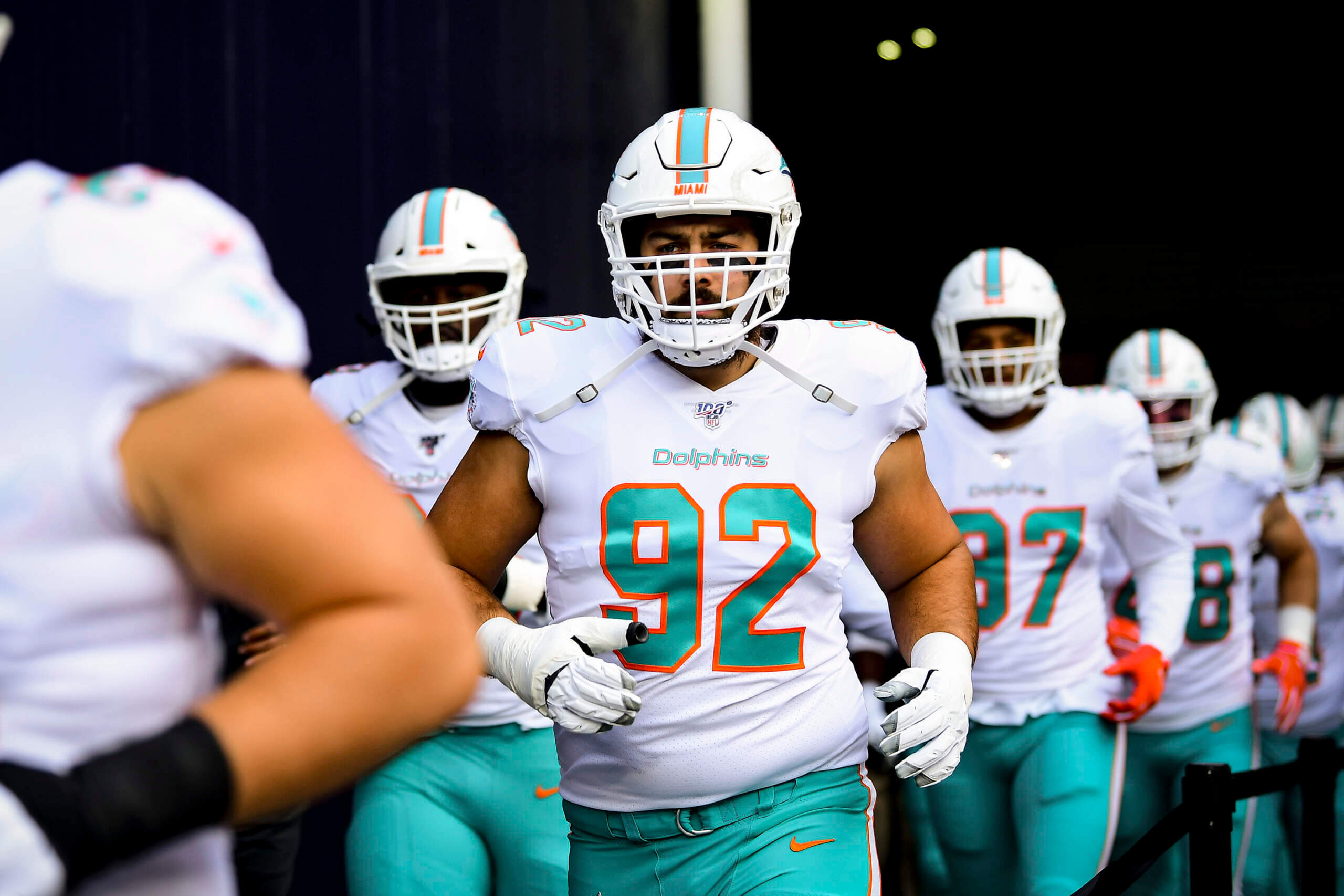
The end of a lengthy Super Bowl run and Dan Marino’s career hit the Dolphins hard. In 2013, Nike took their hacks. Colors weren’t changed so the uninitiated probably didn’t notice. The corners on the left of the digits were rounded off; the ones on the other side were left alone, to the detriment of the “1”, especially. Change for change’s sake. In 2018, the dark blue trim was removed from the numbers, improving them a bit.
My Score: 2
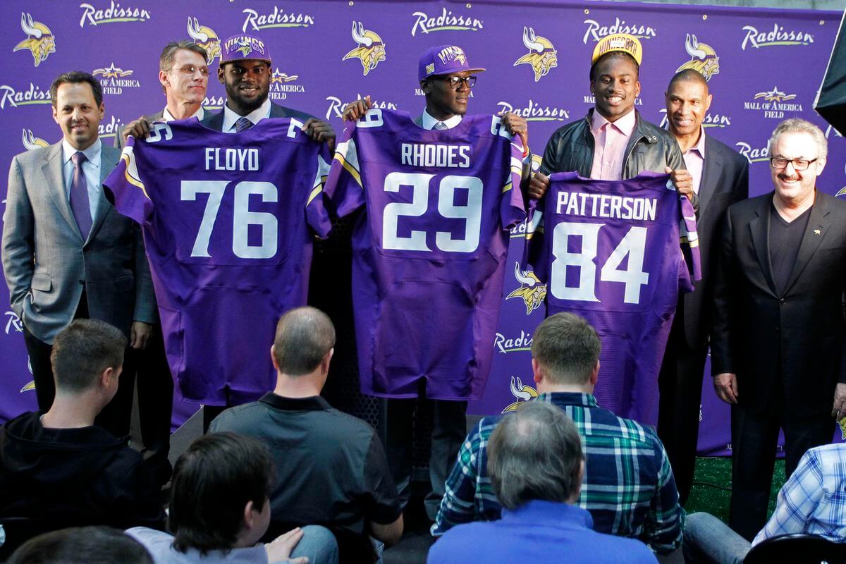
Nobody thought the Vikings needed a makeover until the Super Bowl appearances stopped. Now, despair seems to have crept into the Purple People Eaters. In 2006 the Vikes adopted sleeve horns to match the ones on the helmet and a lot more gold was slapped on the uniforms. The new font was based on Sand-Knit but added superfluous gold outlines which were fatter and curvier than the numbers that went before. The fans howled and the reset button was slapped at the earliest possible season, 2013. This time, the stripes were simplified but a curve was added to mimic the prow of a Viking longship. Not bad, but a Berserker typeface distinguishing between the numbers in the tens column and the ones column came into use. It was attempt to be psychedelic, making two-digit numbers a nested pair, but failing miserably. To do it correctly, it has to be done by hand, complicating the process. Preset ligatures simply do not cut it. The new uniform would be improved 100% if they would simply resort to the Sand-Knit font.
My Scores: 3 (2006); 1 (2013)
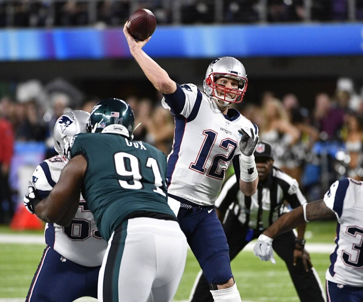
Robert Kraft changed the Pats from a red & white team to a blue & silver one, and put italicized numerals on their jerseys in 1995. Playing with vertically-textured fabric, the drop-shadowed numbers sat at an odd angle. The effect was busy but not all that unpleasant (or it WOULD have been had those massive Elvis heads not been plopped on the shoulders). In 2000, Dark blue replaced the royal, and silver Vikings-inspired horns graced the shoulders. The new font was well-designed, utilizing heavy downstrokes and light horizontal ones. Thousands of Tom Brady jerseys were worn by little kids and a Patriots’ shirt became immediate and easy to identify. But the exposure of multiple Super Bowls couldn’t save what was ultimately a dated design by 2020, so a simplified version was introduced. If the font is custom, you certainly couldn’t prove it by me.
My Score: 3 (1995); 4 (2000)
P.S. New England’s 1995 numerals turned up on the sweaters of the 1997 NHL Carolina Hurricanes. Is it the conservation of resources by a team who also used to go by the name of “New England”?
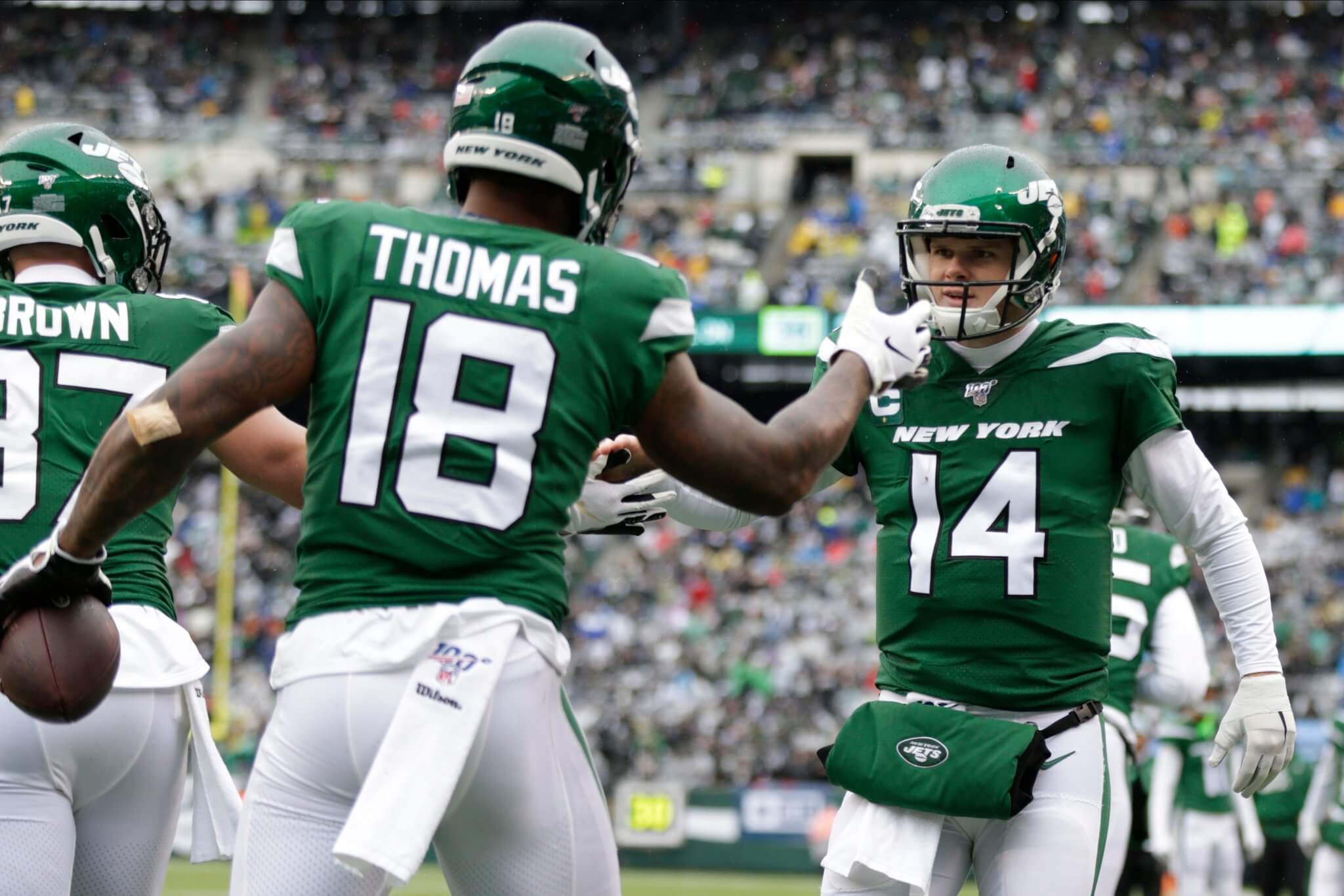
During an extended period of futility, the 2019 Jets hit the reset with a contrail-bedecked uniform employing a huge “NEW YORK” identifier and trimly designed numbers. Simpler than Sand-knit, the corners were rounded off and the “1’s” became plain oblongs, a la the Bears. Nobody seems to think this set of suits will age as well as the Namath-era look, but at least it’s not busy, and would have looked fine on a different team.
My score: 4
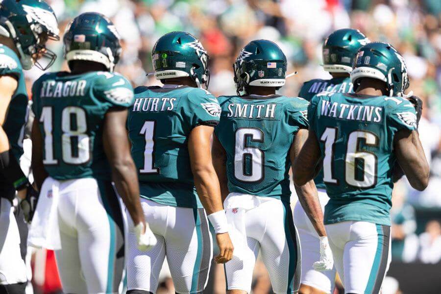
In 1996, the Iggles embarked on a controversial redesign. Colors and iconography were reworked, and a new display font replaced the varsity-style face. In 2003, anthracite was added to the black and Midnight green layers. Silver would have been better; Eagles green and anthracite have the same value, muddying the graphics, somewhat. Oddly, I was sitting in my doctor’s office and my eyes came to rest on the blood pressure gauge (“That’s called a ‘sphygmomanometer’. I’m surprised they didn’t teach you that in medical school”.) Where have I seen that before? The numbers! Those are the Eagles typeface. Well, everything but the “1”, which is unique. If Philadelphia returns to the Kelly Green and Silver, I hope this font is retained. It is readable and a recognizable trademark.
My Score: 5
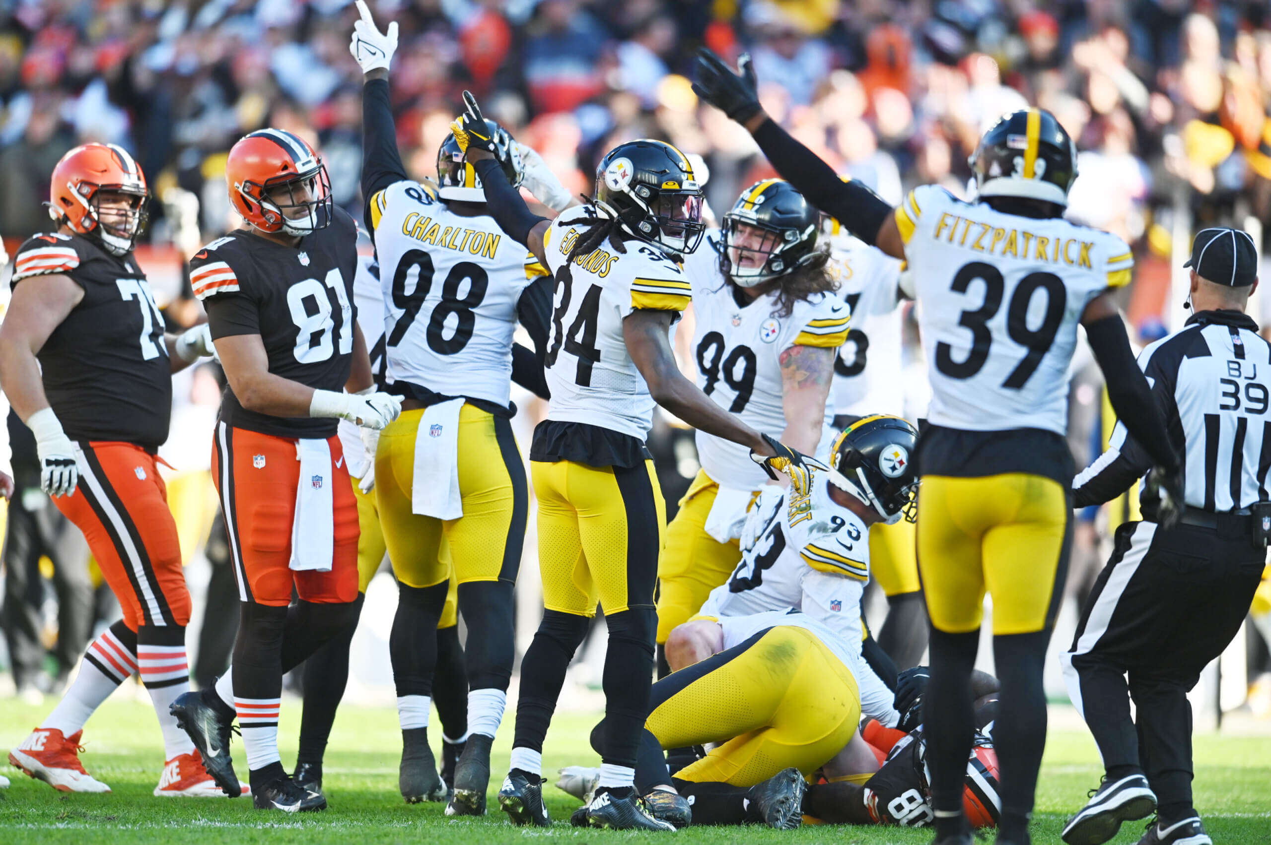
Nike was anxious to put their stamp on this team (Everybody wants that Steeler pixie dust) and the opportunity came in 1997. Futura Condensed, to match the helmet numbers, was decided upon, but Nike used the Italic variant, presumably for emphasis. I can’t make up my mind: it’s readable and distinctive, but italic numerals look as though the garment shrank in the wash. A better choice might have been to go with straight-up helmet-style numerals, and left it at that.
My Score: 4
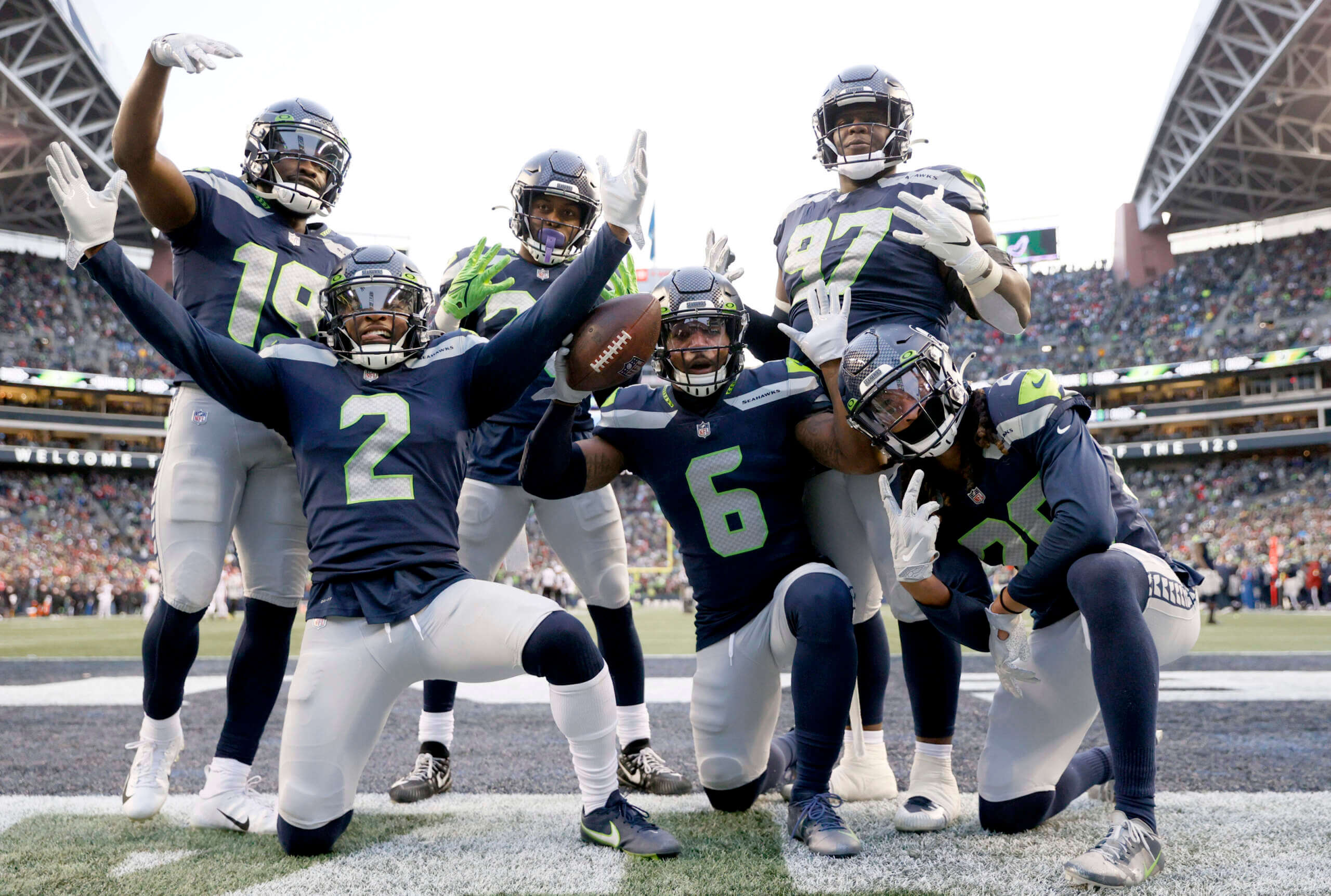
The Dave Krieg/Cortez Kennedy years well behind them, the Hawks changed their colors in 2002, and again in 2012. A bold Nike restyling employing a bird’s beak motif came with a new, blunt font. Not all that attractive, it’s rendered in a dull color and has a pattern of beaks within it. Not the stuff of pageants.
My Score: 2
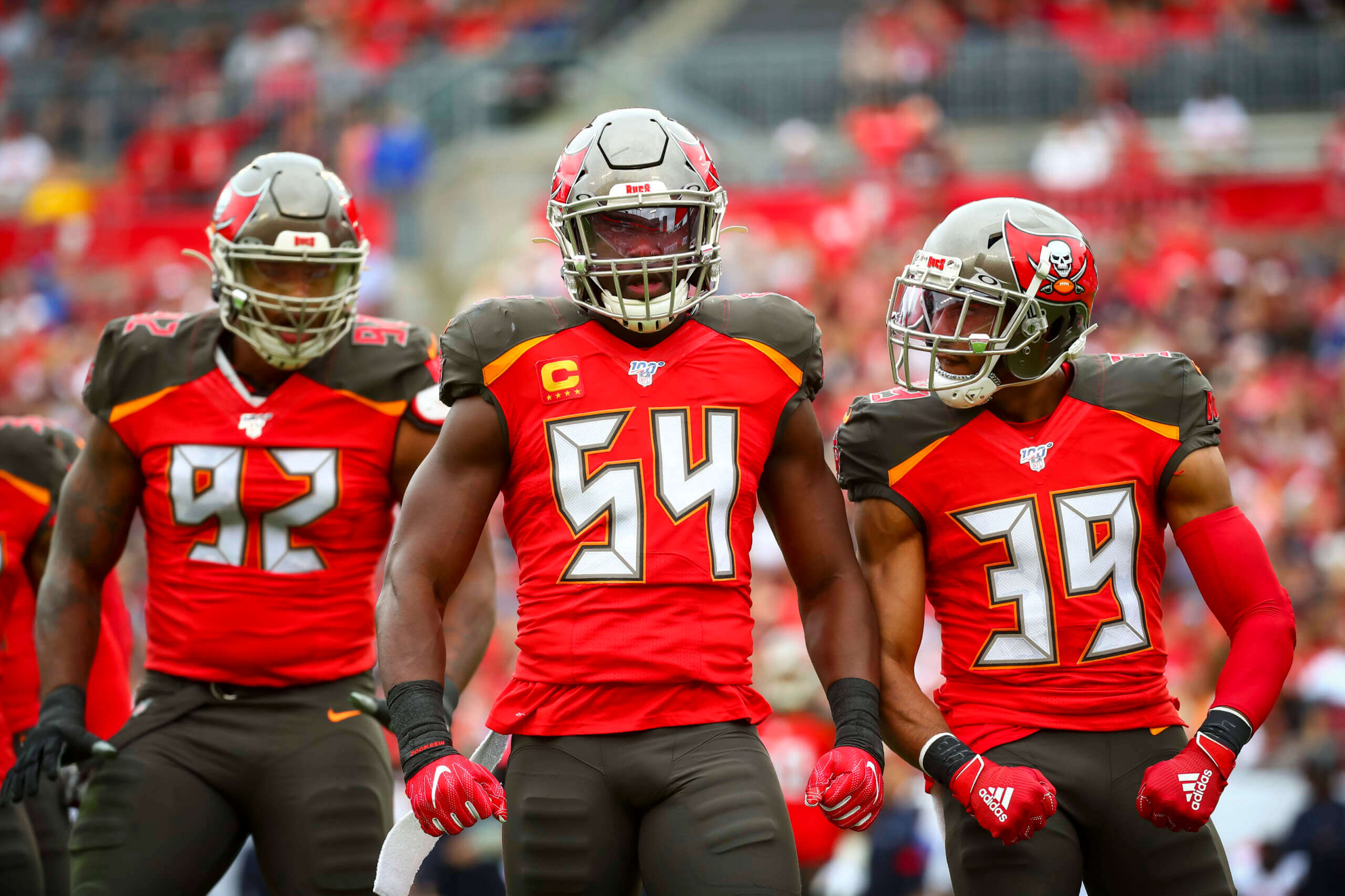
For some reason, a uniform with a Super Bowl win in it was deemed insufficient, and Nike stylists went berserk with a 2014 hot mess, turning the pewter brown, making the skulls evil, and adding blocks of color and an inexplicable “Clock Radio” font bearing reflective tape and digital details. It was flat-out unreadable and possibly the worst NFL uniform in history. The team realized its mistake and made sure Tom Brady took the field in a respectable professional football suit.
My Score: 0
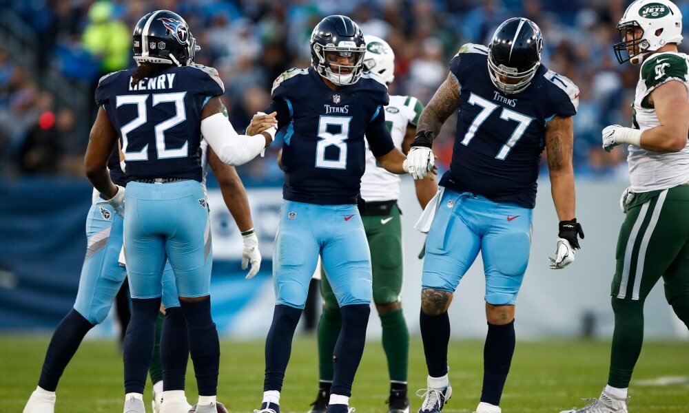
The Artist Formerly Known as The Houston Oilers received a soup-to-nuts rebrand in 1999, reaching back in NFL history for “Titans”. The look was two-tone blue and a formal typeface with rounded corners and slender serifs was used. Readable when big, it suffered on the shoulders from the extra outlining and Columbia Blue backdrop. In 2018, the Titans started over with sword-inspired graphics and a face evocative of the Cleveland Indians “Caveman” font. It was unduly pointy and hard on the eyes. Once, again, the TV numbers were butchered (doesn’t Tennessee know they’re not required any more?) The typeface was fattened up for the pale blue jerseys, slightly improving that jersey at the expense of the others.
My Scores: 3 (1999), 1 (2018)
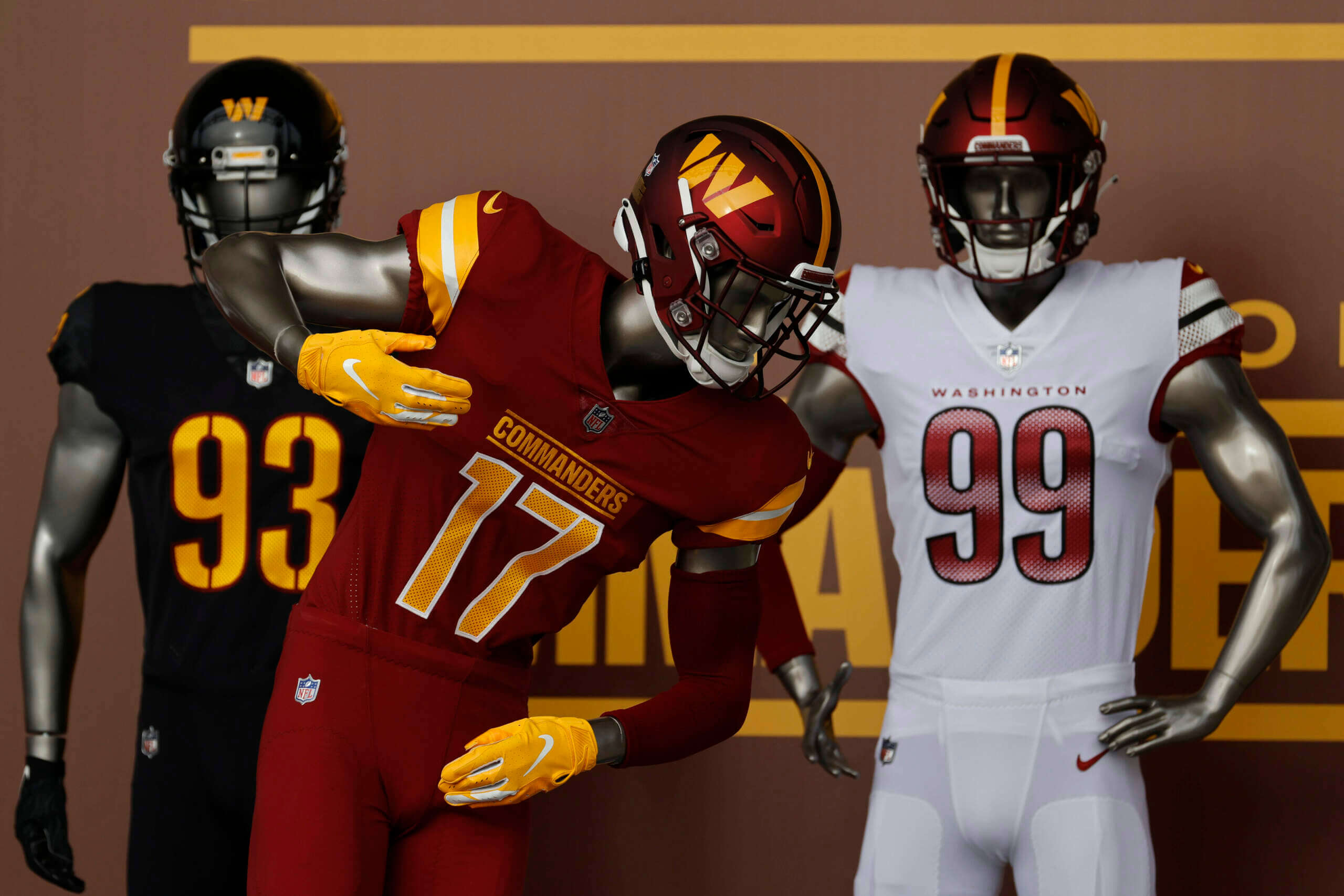
Everyone says, “Be afraid: Be very, very afraid.” This is Washington’s first foray out of Sand-Knit, but until I see the product on the field, I have to assign an incomplete.
My Score: Pending

Robert Kraft did not change the Pats uniforms in ‘93. It was James Orthwein.
Well, butter my biscuits! I suppose, then, Kraft was responsible for the dark blue making his team more closely resemble the Cowboys. Rob, was it Victor Kiam who oversaw the Pats’ change from red to blue?
No, it was James Orthwein…….
As a longtime Eagles season ticket holder, I find it’s really hard to discern the difference between 6, 8 and 9 from my seats in the top deck. It certainly has become a trademark of the team, but I wouldn’t highlight it as legible.
Having never seen a live NFL game, I defer to your experience. Frankly, I wonder how many team presidents overlook the crucial step of putting their players in prototype uniforms, have them run around on the field, and observe them from the highest spot in the stadium (under different lighting conditions)? Like most people (and I guess you would view this as an unfortunate circumstance) I consume my football on television.
The team realized its mistake and made sure Tom Brady took the field in a respectable professional football suit.
So where is the grade for that font? They’ve worn it for two seasons
I don’t want to speak for Walter, but I believe he’s grading only “custom” (bespoke) fonts, not block fonts common to more than one team — which is what the team is now wearing (again).
Thanks for clarifying this–I was also a bit confused reading the entry this morning!
I too was confused. It just seemed like random selection of certain teams numbers.
What the Pats are wearing is a variant of Sand-Knit but it is slightly different and no other teams are wearing exactly that.
That Alabama black uniform is brutal.
…But I would like it if it weren’t Alabama.
Good work again, Walter.
Re: Chargers – I know you’re covering just the jerseys, but I wish they hadn’t put numbers on the helmet…those only look ‘right’ on their throwbacks (though they should go the Air Coryell route sometime soon), in era-appropriate black University Gothic(?).
Re: Jets – Their shirts would have been made better had they opted to go with an italicized, trim-less number font that resembled the style of their wordmark and left the “New York identifier” in the Sears Wish Book.
Re: Titans – Trimming the ‘Tennessee Tip’ would move the needle, but not enough to change the score you assigned them.
Thanks, Chris.
1. Helmet numbers for the Thunderbolts are in a font which inspired University Gothic: Futura Medium, also known as the “VW” typeface from those classic Doyle Dane Bernbach print ads.
2. I’ll do you one better: the Jets ought to put the italicized “NY” on the helmets.
3. When your state is a parallelogram, it tends to dictate an aesthetic that doesn’t work in all mediums. How bad would it suck if Wyoming and Colorado caused all their intellectual property to become rectangles? (Though it would be kind of cool if all Vermont uniforms were New Hampshire uniforms with inverted graphics: Your hot take for the day)
2. I’ll do you one better: the Jets ought to put the italicized “NY” on the helmets.
Well that’s at least two of us who think that now :)
I don’t think the field of play will do anything to enhance the Commies font. The white jersey completely ruins an already bad design. The gradient on the numbers looks like a botched spray paint job. Also, as much as I dislike the vertical spacing on the black and burgundy jerseys numbers, I loathe the fact that the white jersey doesn’t incorporate them. It’s like Chong got his wish when he debated band uniforms with Curtis.
For those who don’t know about cleanin Skeeter’s peter…
link
Yeah I know Curtis man…
No NY Giants?
The Giants do not have a custom font.
I couldn’t disagree more on the Eagles’ font. I think their whole visual program, from the logo to the font to the excessive BFBS, looks dated and cartoonish. They look like a mid-’90s Arena League team, not a(n) historic NFL franchise.
Nobody needs to accept my judgment on Philadelphia NFL Football. My optimal redesign includes the beloved Kelly Green color replacing the Midnight Green, and returning the helmet graphic to the angular wings we know and love. But I’m all in on green numerals with black outlines.
Another great write-up but as an Eagles fan, I must disagree. The font is too cute and delicate for a football team from Philadelphia. Basic Sand-Knit (or what the Colts wear) was fine.
What did the ‘1’ look like on that sphygmomanometer? Better? The ‘1’ the Eagles use is too top heavy.
It was just an oblong, like the Bears’ “1”.