
Greetings and good Saturday morning Uni Watchers. I hope everyone has had a pleasant week, and you’ve been enjoying the new and improved features of the blog. If you read Paul’s introductory post on Monday (and been reading all week), you’ll know that the weekdays will now be broken up into several smaller postings throughout the day, rather than one long standalone post — as has been the custom basically since Paul started UW back in the mid-2000s. He also mentioned that weekends might still consist of one long post, or follow the new style we just adopted.
What I’d like to do this weekend is to employ both — today will follow the previous format with one long(er) post, although the ticker will still be its own standalone article (which will be posted later today). Of course, if there is any breaking uni news today, then I’ll run a shortish post as Paul has been doing throughout the week.
Regardless of whether there is an additional uni-post today, tomorrow I plan to employ the “new” style, with several shorter posts sprinkled throughout the day. What I’m hoping for is feedback from you guys: please let me know whether you prefer one longer posting (like today) with only a ticker as a separate item, or whether you prefer things broken up (as is the new weekday style), and which I’ll employ tomorrow. Depending on your preference(s), I’ll adapt the weekend posts accordingly. The one exception will likely be once SMUW (Sunday Morning Uni Watch) rolls around — that will likely be broken up into several posts throughout the day, even if readers prefer the “old” one-post-per-day (plus separate ticker) style.
Now then…
Today I’m pleased to once again be joined by Walter Helfer, who as you’re all aware has guest authored several different articles over the years, and who most recently brought us “A Beauty Pageant for Numerals” (Part I and Part II) for MLB. When those articles appeared, I mentioned Walter would be back with a look at the NFL in the same style. We have that for you today. I’ll now turn the rest of this lede over to Walter!
by Walter Helfer
If there is a common factor among all the team sports, perhaps the most iconic is the basic octagonal numeral. They bond pro baseball, varsity football, ultimate frisbee, volleyball, and more. Designed with a ruler, it offers function and beauty; readable from long distances, it can be rendered plainly or in multi-colors without sacrificing legibility. But I would regard a world decorated only by these no-nonsense numbers in the same way I would consider rock & roll played only on acoustic guitars. Capable, but lacking in imagination. The time has arrived to put the NFL under the discriminating eyes of the judges.
In the NFL, the most commonly used font is Sand-Knit, with a few teams using variations. Tampa Bay, for instance, multiplies the outlines in an unusual way. Indianapolis uses a fancy version once employed by the Cowboys and the New York Titans. Each font will receive a score of 5 through 0: 5 = Excellent; 4 = Good; 3 = Okay; 2 = Poor; 1 = Godawful; 0 = Booby Prize.
Looked upon as a textbook case of what NOT to do, the NFL’s oldest extant team adopted a garish costume with contrasting panels and shoulders in 2005, and replaced their Sand-Knit numerals with a bland font having rounded corners. It was a bad look 15 years ago and it is execrable now.
My Score: 2
The Falcons’ sartorial history strikes me as periodic spasms of a tormented franchise. Each new design comes off as the worsening of a series of mistakes. In 2003 Atlanta birthed a contrived, fussy uniform with crowded sleeves and rectangular numbers featuring rounded corners and a subtle drop shadow. The jerseys’ only redeeming feature. Hoping to change their luck after a torturous Super Bowl, a new design came in 2020, and it managed to upset even more people. Constructivist square numbers with a “redshift” feature arrived to muddy things further. A cry for help if ever I saw one.
My Scores: 3 (2003); 1 (2020)
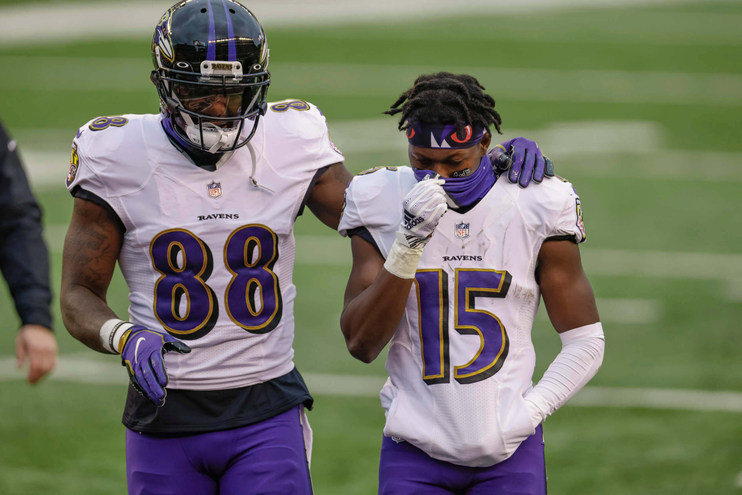
Demonstrating the axiom “When you name your team the Browns it ends up in Baltimore”, Cleveland became the Ravens in 1996. Donning crow-inspired purple and black, the team added an attractive display font. The slim triangular serifs were evocative of a bird’s talons. The following season, drop shadows were added to the numeral outlines, so the face was simplified somewhat. It has aged very well and continues to be a Raven trademark.
My Score: 5
P.S. The first-year numbering matched the font of the Arizona Diamondbacks through their purple tenure.
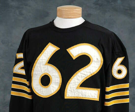
A font which seemed to be older than George Halas, himself, was actually inaugurated in 1950. Was it developed specifically for the team? Maybe, but I admit I haven’t seen it anywhere else. It bears a passing resemblance to the serpentine numbers used by the Cubs decades before. Readability? Not an issue, and it takes outlining beautifully. TV numbers and torso numbers have the most difference of all NFL faces; the little numbers have beautiful circular counters. The gold standard!
My Score: 5
The 2004 Bengals augmented their redone uniforms with a curvy font inspired by the Chicago Bears’. A deep drop shadow was added which lent clutter to a pretty garish costume. In a rare show of good taste, the 2021 team excised all the details which didn’t work, and retained the ones that did. Fonts were tweaked with triangular ends and the shadows were deleted. Happy team, happy fans, success on the field. Win-win-win.
My Scores: 3 (2004); 4 (2021)
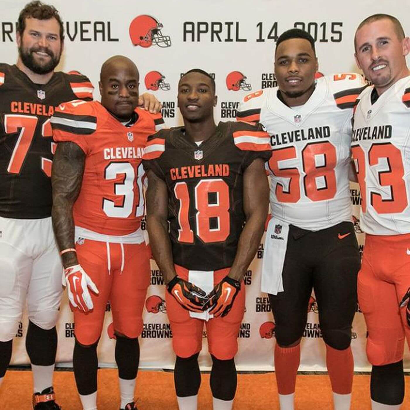
The Mistake By The Lake invoked bad mojo in 2015 by soliciting a Nike makeover. Every crass detail was employed to make an august franchise look like a group of clowns. The ONE THING they got right — the number typeface — was ruined with gaudy colors and incomplete outlining. A bonfire was called for, and in its wake the Browns actually received a tasteful restyle. Most, but not all, of the original trademarks were returned, and number font based on Sand-knit with a few rounded corners graces the 2020 jerseys.
My Scores: 3(2015); 4 (2020)
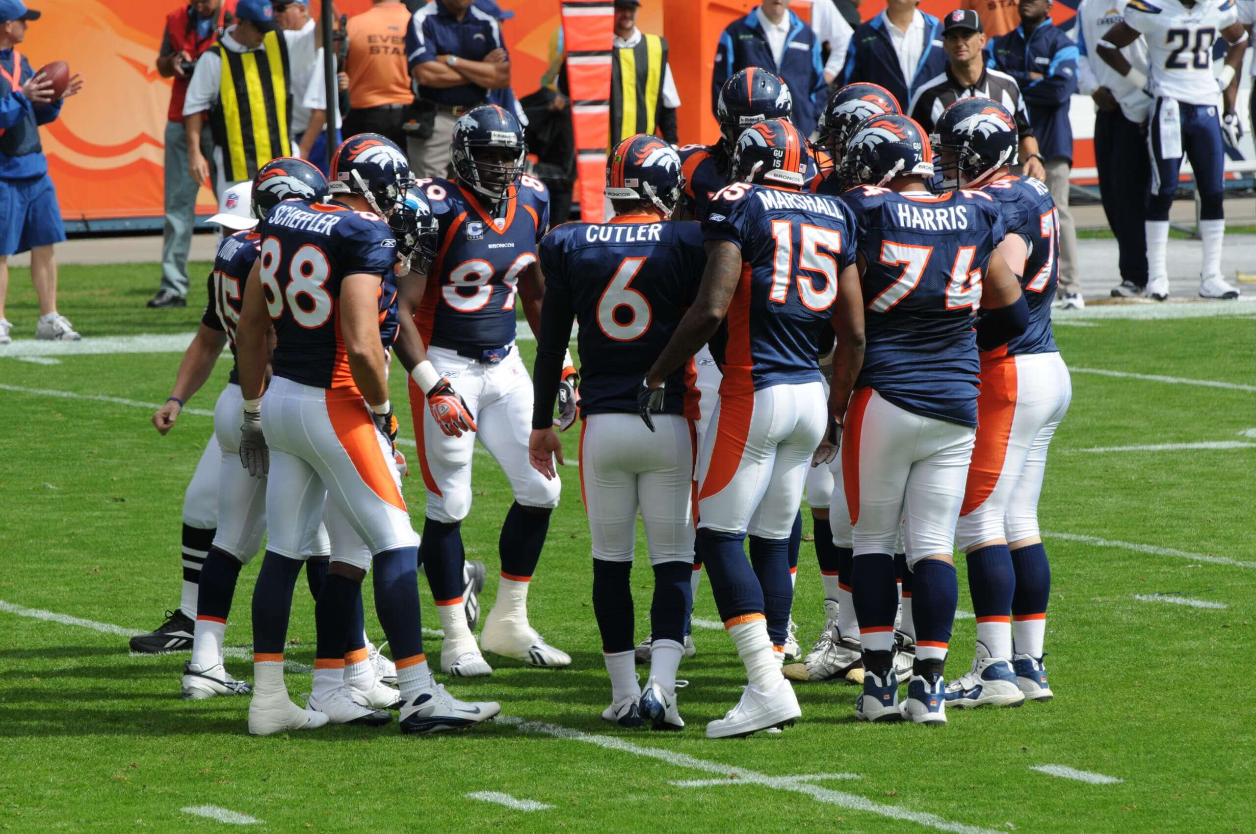
There must have been a sense of desperation in the Mile-High City. The Broncos seemed to be complete, but needed something intangible to reach the top of the NFL mountain. It came in 1997 in the form of a much-discussed redesign which relegated orange to a fat swoosh running down the players’ sides. The popular and trendy Emigre foundry was tapped to render a font for the new look, and the look was geometric with left-pointing rectangular flourishes. Success followed, but hard-core Broncophiles appeared to believe the team had sold its soul. I feel the face has aged poorly, and could do with some freshening.
My score: 3
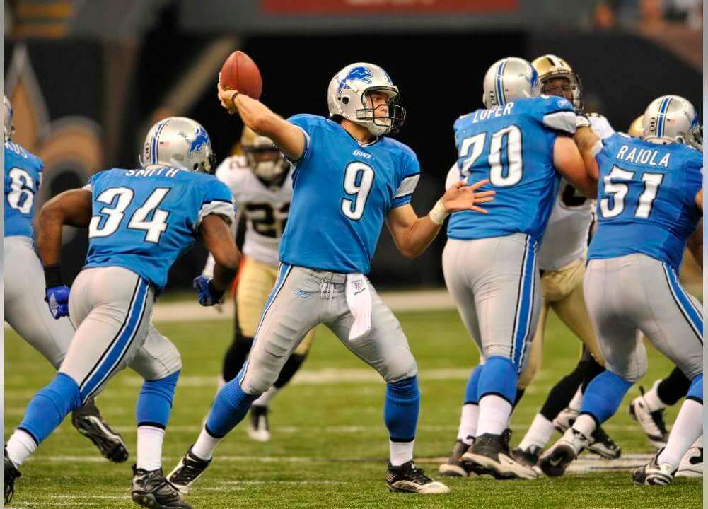
You think following the Jets is tough? Try being a Lions’ fan! After the axe was grabbed from Matt Millen’s hands, and the team had added black to its palette (making them resemble the Carolina Panthers), a 2009 restyle gave them a blue Ohio State vibe. The serpentine font looked rather silly. Nor was it easy to read. Dissatisfaction must have run pretty high, because they were replaced in 2017. Improved? Hardly. Fat, clunky stripes ruled the day, and slender, italicized numbers rendered in shades of grey were hard to read. Expect more changes before long.
My Scores: 2 (2009); 2 (2017)
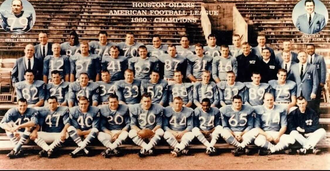
For one year, their first, the Roustabouts wore the then-new University Gothic font.
My Score: 5
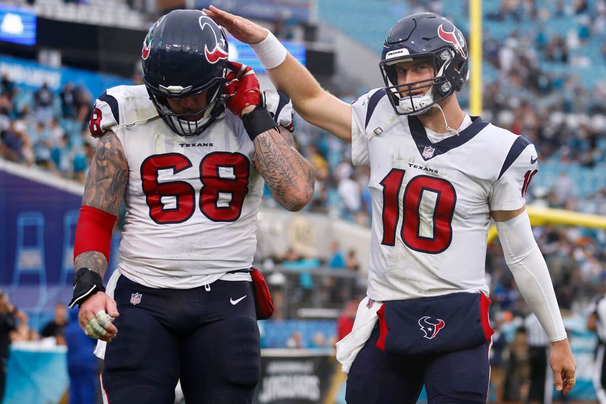
The 2002 expansion Texans appeared with conservative dark blue duds and a straightforward, readable typeface which still managed to look fresh. In a way, it reminds me of the face used by the AL Texas Rangers on their white jerseys throughout the 1970s. They did their homework.
My Score: 5
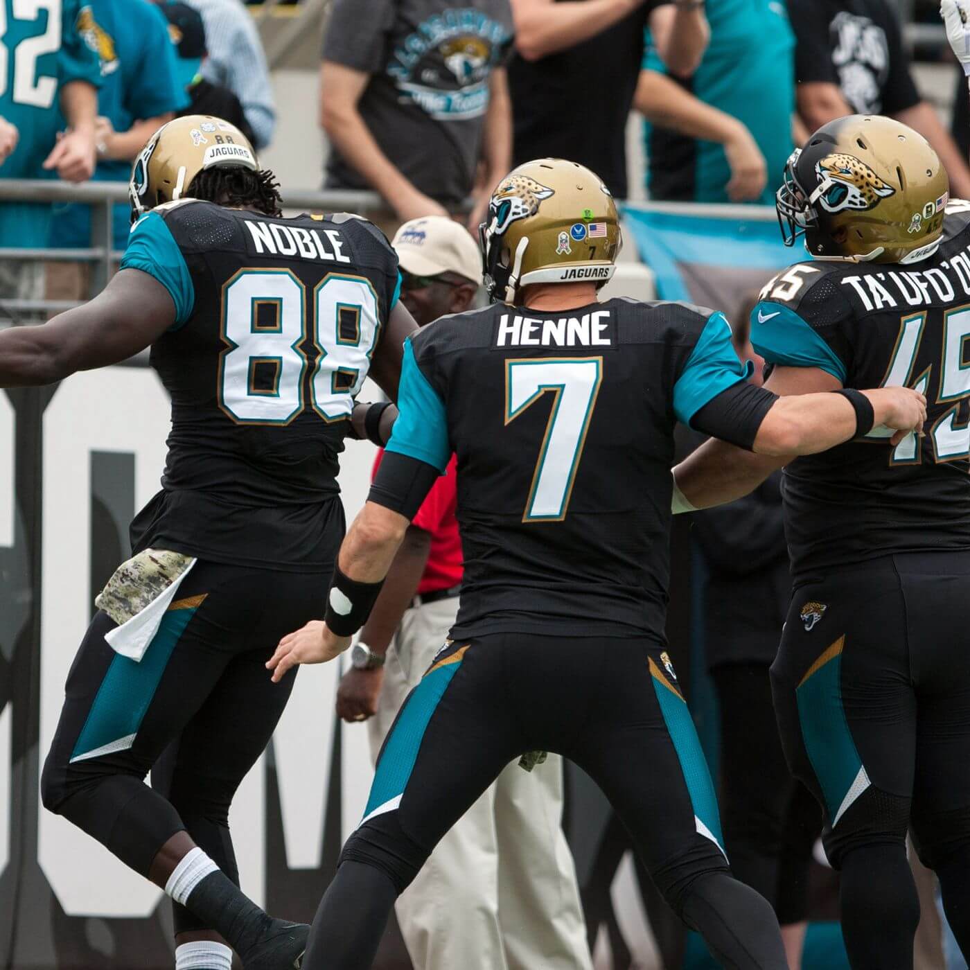
Responsible for a hefty chunk of this list. The 1995 Florida expansion team changed its numeral font in the 1997 preseason. The characters were very oblong and featured a drop-shadow. Legibility issues caused the team to tweak the numbers in time for the regular season. In 2009 the Cats simplified their color scheme, excising the gold, and adopted a fussy, multi-cornered number face. Nobody liked it, evidently, and it was hastily replaced in 2013 with a garish, tacky costume including half-painted helmets, diagonal swatches of color, and a bespoke font with incisor-shaped serifs. Truthfully, the numbers weren’t bad. Readable, and colorful. A beaten-down team said “Let’s try this again” in 2018 and issued a stark uniform with no stripes and very little decoration. The new font is a riff on Varsity Bold and seems only different enough to spite counterfeiters. Readable, but not all that attractive. Two-color treatments (in gold) would do wonders for this team.
My Scores: 3 (PS-1997); 4 (1997); 1 (2009); 3 (2013); 2 (2018)
The earliest iteration of this team (the Oakland Señors) wore uniforms with Steelers’ colors and the recently-minted University Gothic face. In 1962, they went to the Sand-Knit font before adopting their silver-trimmed uniforms.
My Score: 5


Prefer old style all at once. Unless I see a Twitter post, unlikely to revisit later in day. Thanks!
Flag football is very popular! Especially with the focus on doing as much as possible to prevent head injuries now, lots kids start out with flag.
I also prefer the old style, “all-in-one” format.
I also prefer the old style for the weekend.
Context is everything. Take those numbers out of the Cardinals uniforms, plop them into their 70s St. Louis set, and they’d be acceptable, at least. I would submit that this entire exercise is laboring under a misnomer; the author is judging the font in the context of the uniform as a whole.
Context IS everything: I’d be a liar if I contradicted this. And more often then not, a bad font is part and parcel of a bad design. But I DID take care to point out that the 2003 Falcons, 2015 Jags, and 2013 Browns had appealing (or inoffensive?) typefaces in spite of the ugly uniforms.
I don’t know that it matters which format I prefer. I do know that with the new format, I spend a lot less time on the site. I don’t revisit during the day. So each morning, I look at the posted headlines and click into only those that I haven’t seen somewhere else during the previous day and have more to say of interest. Then, if I am not busy, I’ll scroll down to find where the ticker is and skim through that.
I’m not entirely sure what the goal of the format change was, but if it was to get people on and off of the site faster and less time with eyes on ads, that’s been accomplished for me.
Prefer the old style all at once. With typically having more time on weekend mornings, I enjoy sitting down and reading it “longform” style all at once.
I prefer the old format. It felt like opening a new, large coffee table book every morning and slowly going over each dedicated page. It was relaxed and pleasurable.
The new format feels claustrophobic and busy. It feels like work having to navigate the site. Of course, I’ll get used to it and hope it benefits Uni-Watch.
But then again, I wish every team sported the Sand Knit font. To my eyes, most of these custom fonts are excessive and cartoonish. Perhaps I am just old and set in my ways.
I have to admit I like the new format more and more with each passing day.
Something I failed to point out in the Denver Broncos feature is their font is a match with the credits for CBS’ “NCIS” series.
old style format
Hi Phil!
I was just wondering if the comm-Uni-ty would participate in the Grand Rapids Griffins design contest like we have done for a few years in the past?
Also, I prefer long-form, but I’m not as vehemently against short form as some others may be.
Sorry Ian, but we’re not partnering with the Griffins this year.
Prefer the old style format that you can peruse through all at once without thinking about checking other posts to see if you missed something. Great post today!
I prefer the old style all at once unless some major uni news happens later in the day. I get busy after the mornings and am unlikely to remember to check back several times.
Old style. I like to read Uniwatch one a day over breakfast.
I hate this new checking back multiple times a day.
And yes, I get that I can just read the new posts the next day, but there is something about reading one smooth flowing post that I find appealing.
Plus I don’t like the feeling of being behind the news.
The new site look/format I like. The breaking up the posts I do not.
Slowly getting used to the new format during the week but kinda prefer keeping it old school on weekends ! Just my two cents !
I like the all in one form as I like to see it all in one sitting, I get the short pieces but I also don’t like how it comes at wierd times,
I’d love to see the Raiders wear the Senors’ throwbacks.
I as well, but the Raiders never played as the Señors. Some interesting background (and some uni-tidbits) here:
link
I love my Ravens, but I have been a HUGE advocate for them to drop the drop shadow. Interestingly, I have opted not to buy a Ravens jersey until they do. Hoping, of course, that new designs are an improvement, cuz we know how things can go (*cough* Atlanta *cough*, *cough* Jag’s two-tone helmet *cough*).
In the NFL, always be careful what you wish for! What would you like to see? purple numbers trimmed in gold? Purple numbers trimmed in black? or something else?
I’ve long liked University Gothic (the University of Washington wore it until 1975) but have to confess it looks a little dated now.
One question I have long had is this: What is the font the Colts wear? They wore it back in the ’60s, revived it when they tweaked their unis for the 2021 season. The Cowboys used to wear it, too. As did the Packers, briefly, early in Lombardi’s tenure. But I’ve been unsuccessful in finding the name of the font. Thanks.
Nice work on the Las Vegas designs, Victor. I wish you’d taken the opportunity to get rid of the superfluous apostrophe in “A’s” while you had the chance, though.
If the apostrophe goes, so does the little “s”, because “As” is a word.
A huge majority of people in Cleveland were very happy when the Browns ditched those 2015-19 clown costumes and went back to our beloved traditional look. But Nike, being Nike, just had to stick in some ridiculous tweak, I guess as a little F.U. to the legions who loathed their clown design. The serif on the bottom of the number 7 goes only halfway across, and it looks incredibly stupid. Why do they have to be like this?
P.S. I like the new format. For those who don’t, give it some time. You’ll get used to it.
I’m sure Nike and the NFL are in agreement over one thing: Once a team takes on a proprietary font, that ship has sailed and it ain’t coming back. The Great Satan to them is counterfeiting, and this goes a long way toward stopping it. But a few things about the clown costumes were appealing, and one of them was the typeface. I still like it. They probably should still be using it.
I remember playing flag football in gym class as a kid, but do people even play it any more?
Not only do people play it (at my local rec center, for instance), it’s worldwide. Last night I was flipping through Pluto TV and their NFL Channel was showing flag football from the World Games currently being played in Birmingham. The US (in white) was taking on Italy (dressed in blue the same as their futbol team). The Italian QB’s playbook was an actual playbook, which he stuffed into the back of his shorts. Wish I could have taken some screenshots but it was getting late…plus with no kicking it didn’t hold my interest as much as tackle football.
I absolutely love the University Gothic font. It’s almost the same as Highway Gothic font one sees on interstate highway signs. Clear and readable.
Preachin’ to the choir, dude. It still comes up periodically when one of the smaller colleges freshens up its football uniforms. UNH had them a couple years ago. The most recent pro team was the last season of the CFL Ottawa Renegades.
Fellow huge University Gothic fan here. I fondly remember the one year — 1996-97, I think — that link wore it while I was there. (They then switched to a more standard block font that looked almost exactly like the 49ers’ throwbacks.)
The Cubs also used it for their first-ever interleague series with the White Sox, on the backs of their awesome all-dark-blue 1900s-1910s road throwback uniforms, which didn’t have numbers originally. They would have looked just fine with the normal Cubs font, but I like University Gothic on them too.
While I don’t think the Cardinals look *that* bad, I agree they could use a back to basics makeover. What I will disagree about is their number font.
I love it.
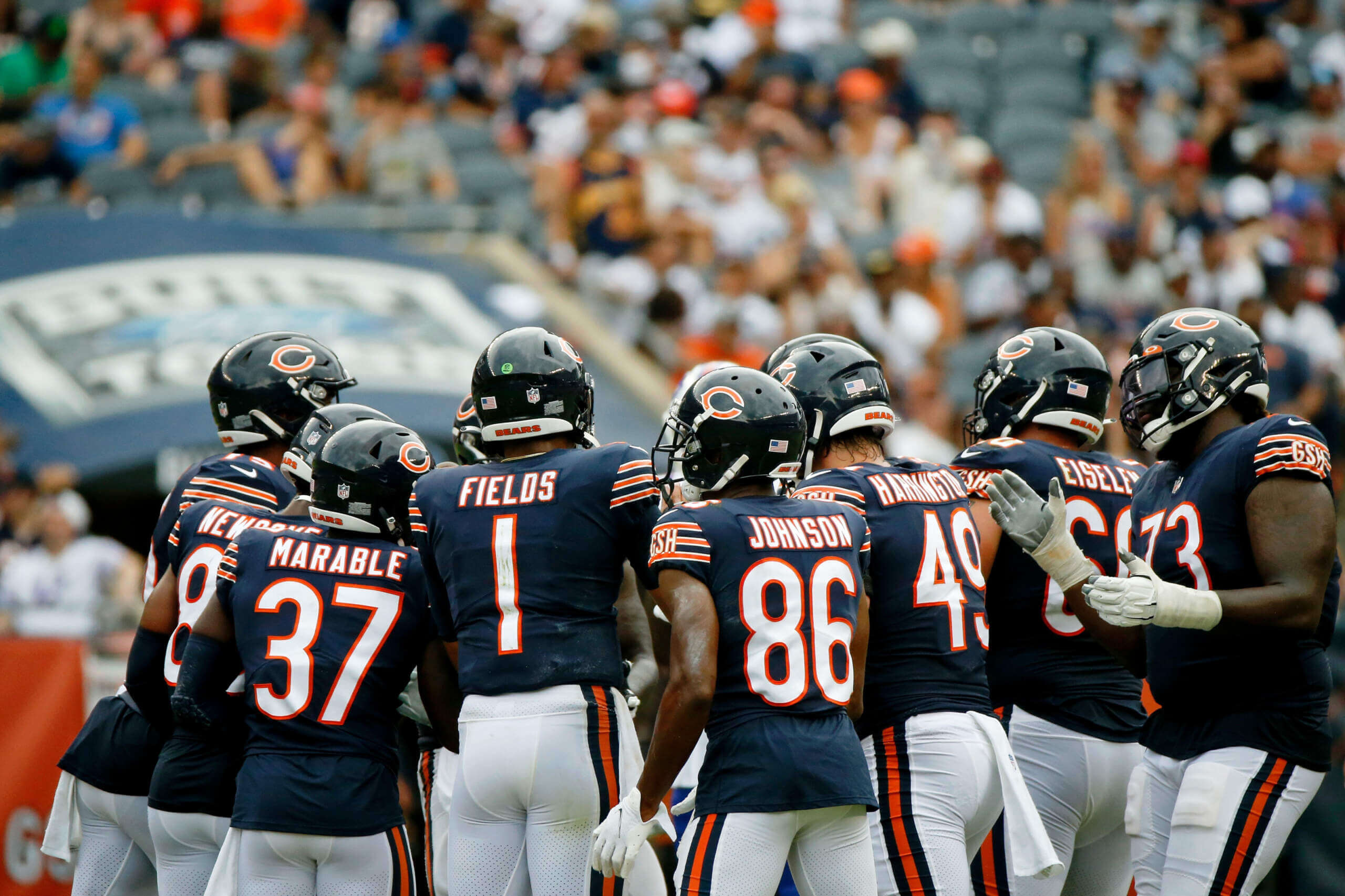
And I’d give the Bears a 4.99 rating. Not a fan of the straight up and down 1. If they used Denver’s 1 with the rest of their fabulous numbers, it’d be completely fabulous.
Bring Back University Gothic Font!
The best argument against the oblong “1” is Klay Thompson. The digits are kerned so close together it looks like a one and not an eleven.
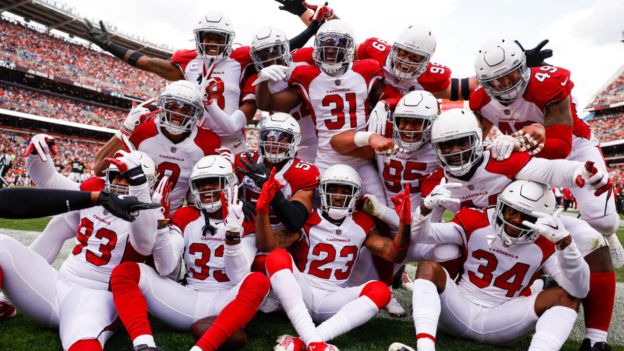
My fondest memories of the Cardinals are of their last couple of seasons in Missouri and the first two in Phoenix. The red digits of the road uniform had a fat black outline with crisp corners. It was formal, colorful, and professional (and I wondered why the home uniforms were so blah).
Perhaps my take on the current font is clouded by the fact that other teams have done it so much better.
Here’s a hot take: The Cards’ numbers should be much bigger- and with fatter outlines. It couldn’t be worse.
The Cards’ numbers should be much bigger- and with fatter outlines.
I don’t think you’ll get any argument from Jimmer on this.
I wonder if the Bears’ no-serif “1” comes from link, which also has that “1” and which looks a lot like the somewhat “squatter” version on the Bears’ sleeves. The resemblance can’t be coincidental; did Shepard work for the Bears at some point? Or did the Bears just borrow from their baseball brothers?
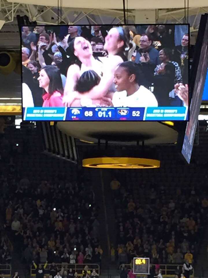
The scoreboard is Iowa v. Missouri in women’s basketball on 3/24/19. I was likely at that game.
I prefer the new format, several smaller postings throughout the day. This way each subject gets its own headline, and its own discussion.
I really like the new site redesign, it’s a little like Chris Creamers Sportslogs.net. I love being able to check the site throughout the day to see if anything has been release or updated.
Terrific work yet again, Walter!
Completely agree with your ranking of the Texans… many think they need to rework their uniforms, but I say they totally work and are a modern classic.
As for the weekend format…out with the old, in with the new.
I think the new site looks way better but i find myself clicking far less because i think what i used to get on one webpage now might be spread across multiple links. Not complaining just giving honest feedback as a longtime consumer of this awesome site and yes i know i consume it for free!
#OneLove!
Another week, another uniform concept with an ad in it. As if the A’s concept wouldn’t look authentic without the Nike swoosh?
I don’t see the excuse for running concepts that contain ads that help to normalize the practice
Coachie. Again…the swoosh is a makers mark, NOT an ad. And yes, while I’d prefer they not be on the concept, it’s not the same thing as including an ad. Think of it as designing a concept car for say, Chevy. You’d design the car with the car maker’s logo. But you wouldn’t put, for example, “Pat’s Taxi Service” on the door, as that would be an ad, even if the car were designed to be a taxi. Perhaps to you it’s a difference without a distinction, but a makers mark is NOT an ad.
Hey you made my Sunday morning Walter – been looking forward to reading part 2! I like the University Gothic and wish it would make a comeback. Both the Oilers and the Raiders in my Alt-History teams have versions of it. But I wonder because it’s not a team bespoke font we are unlikely to see it (apart from throwbacks)?
Like others have mentioned, I read UW in one go with my morning coffee. But because I’m in the UK that means a whole day’s content is posted and waiting for me by the time I read it. The downside is I’m always commenting on yesterday’s posts!
Glad I could brighten your day, Chris. I too am a fan of University Gothic, and am always surprised to see it pop up, usually on a NCAA Division I Football Championship Subdivision team. I don’t believe I’ve ever seen it grace a hockey sweater (just like the McAuliffe font).