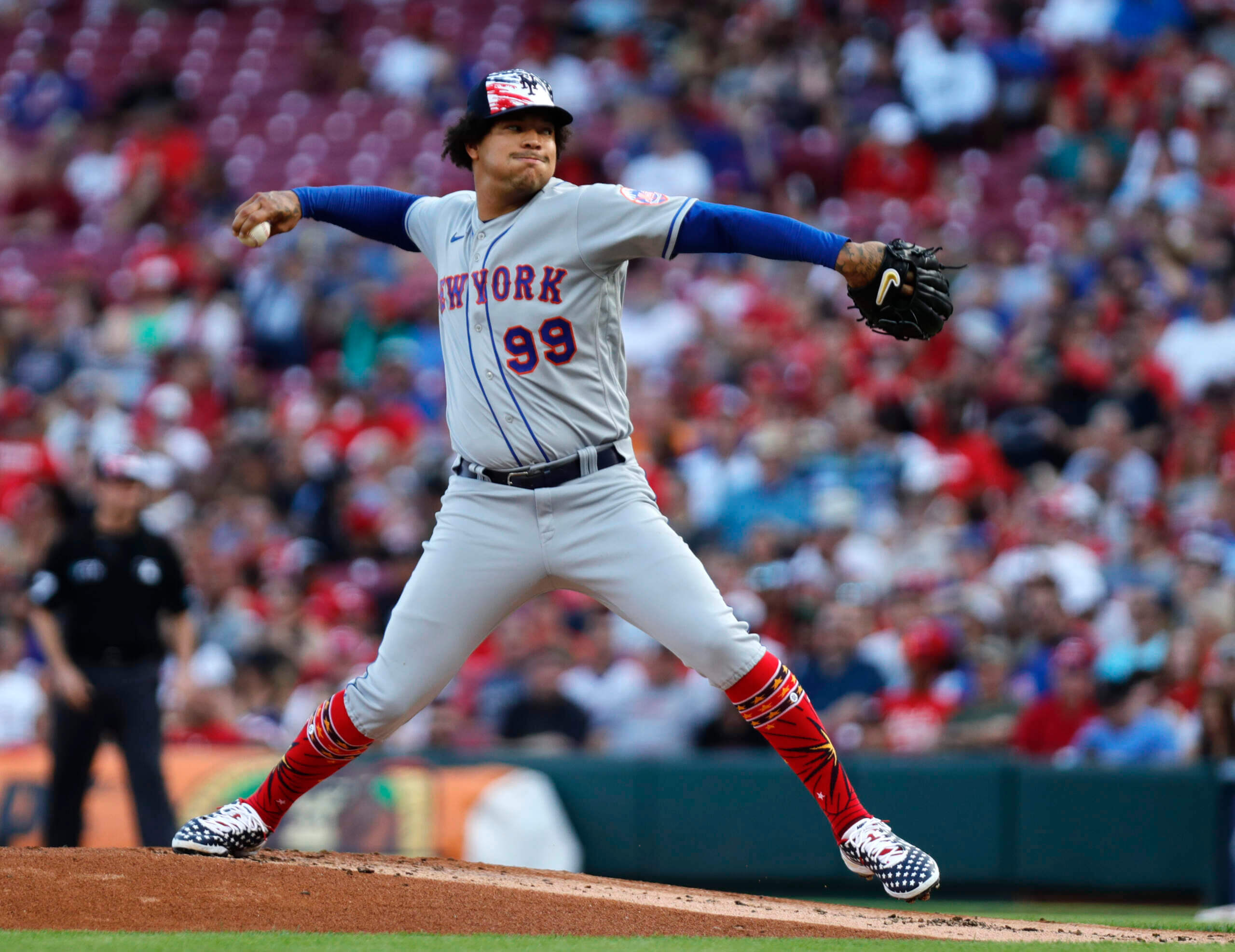
Photo by David Kohl, USA Today Sports; click to enlarge
Good morning! Hope everyone had a good holiday weekend.
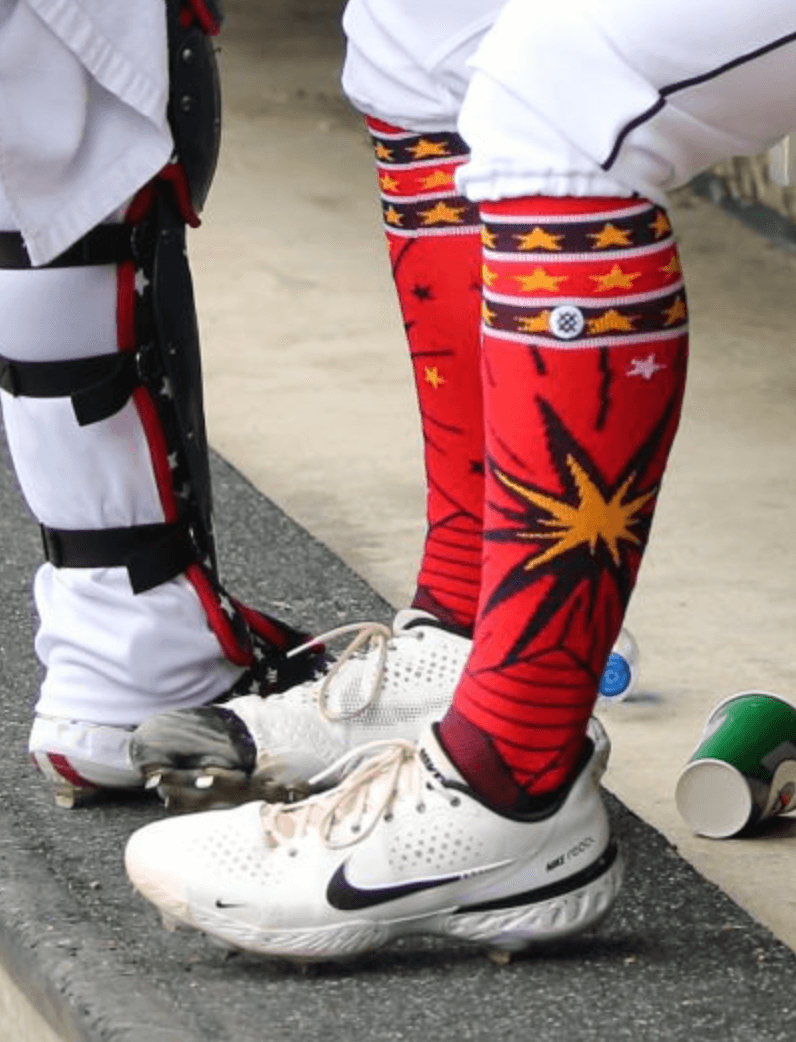
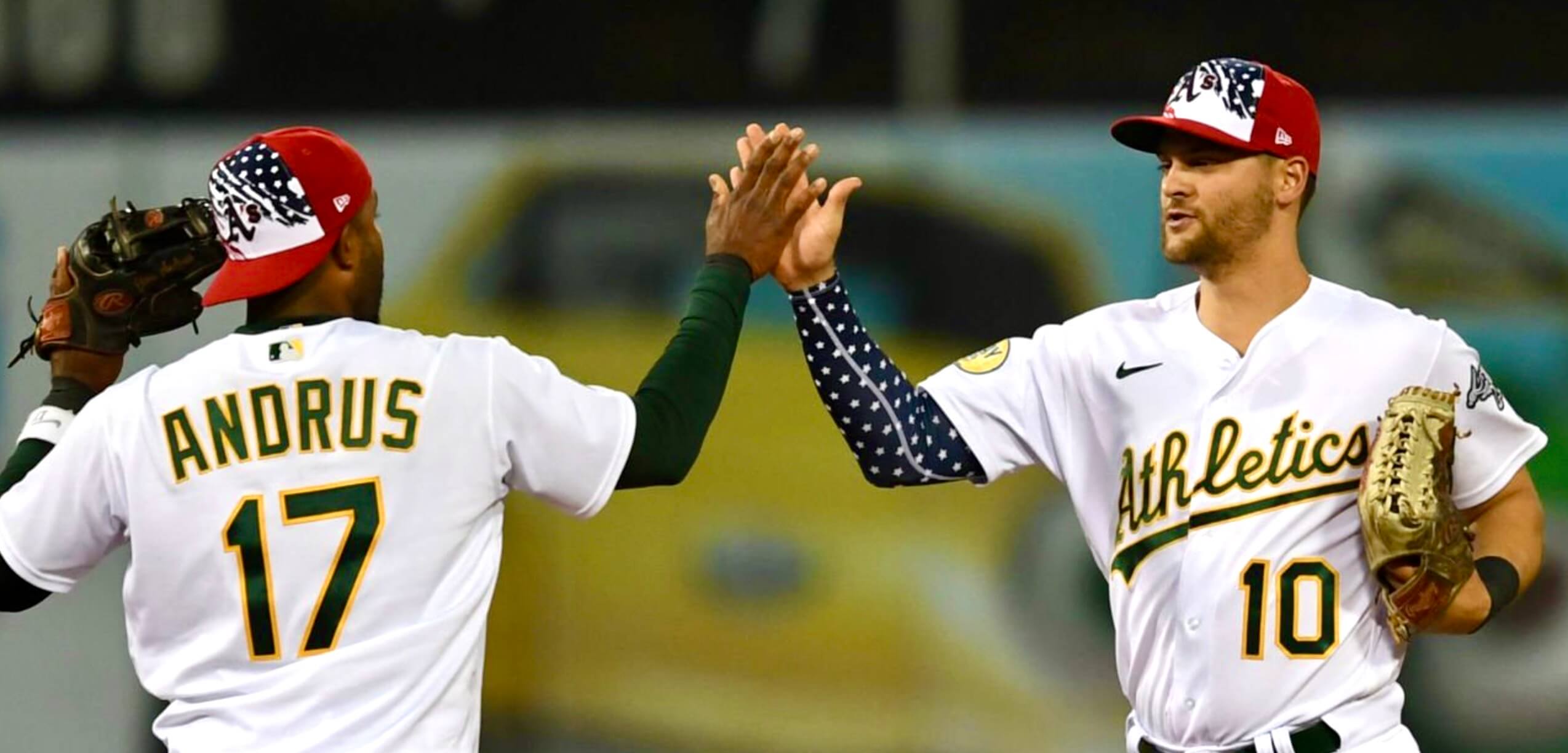
Speaking of the holiday, MLB teams wore lots of Independence Day gear yesterday. As you can see above, the ensemble included red socks, which looked really weird for teams that don’t have red as a team color. Here’s a closer look at the design:
Other MLB notes from yesterday:
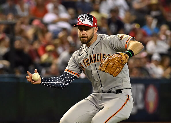
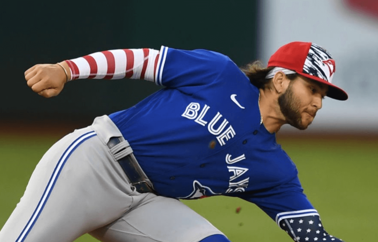
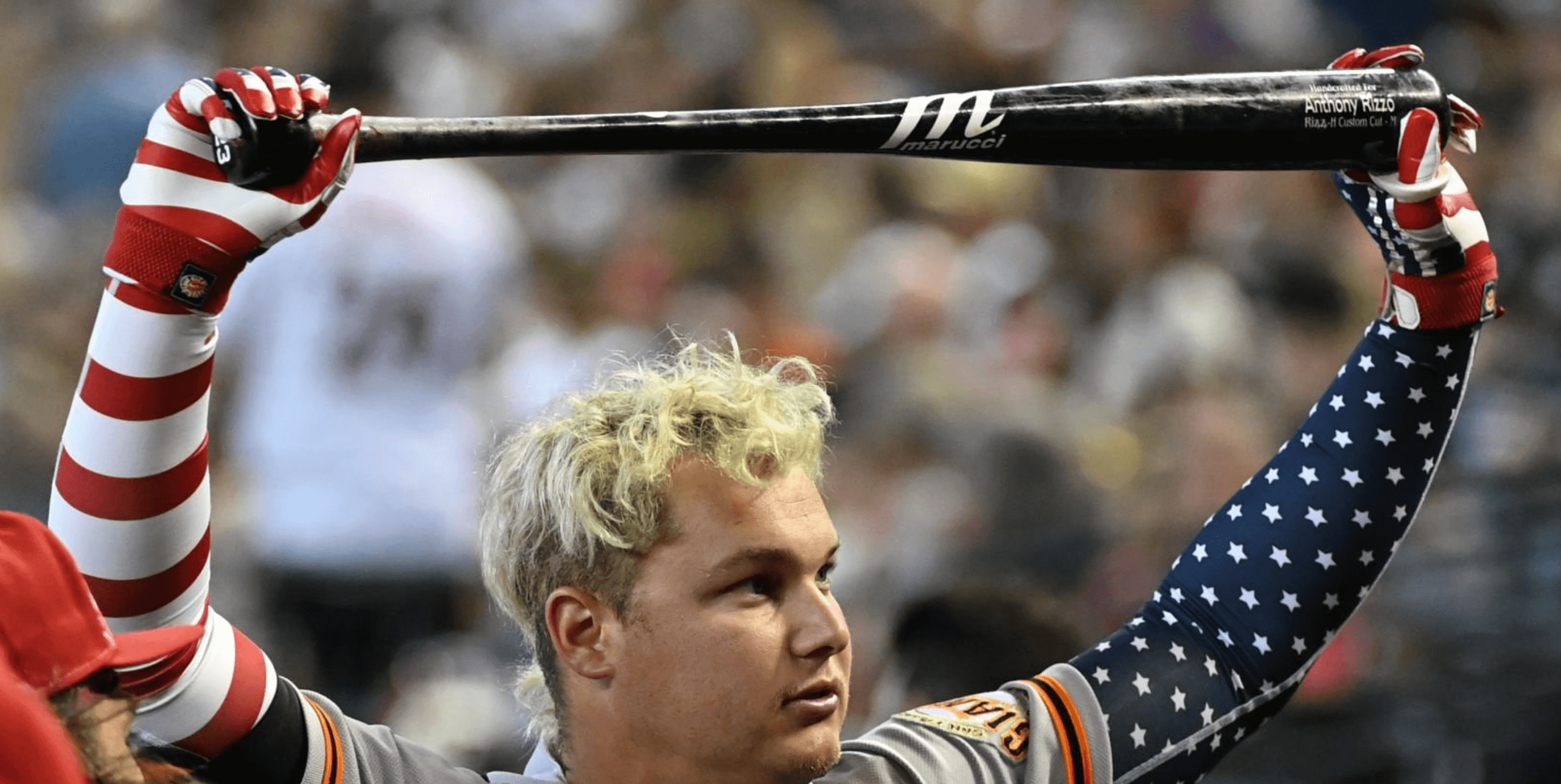
• Many players wore star-spangled and/or striped compression sleeves:
• There were also stars/stripes batting gloves:
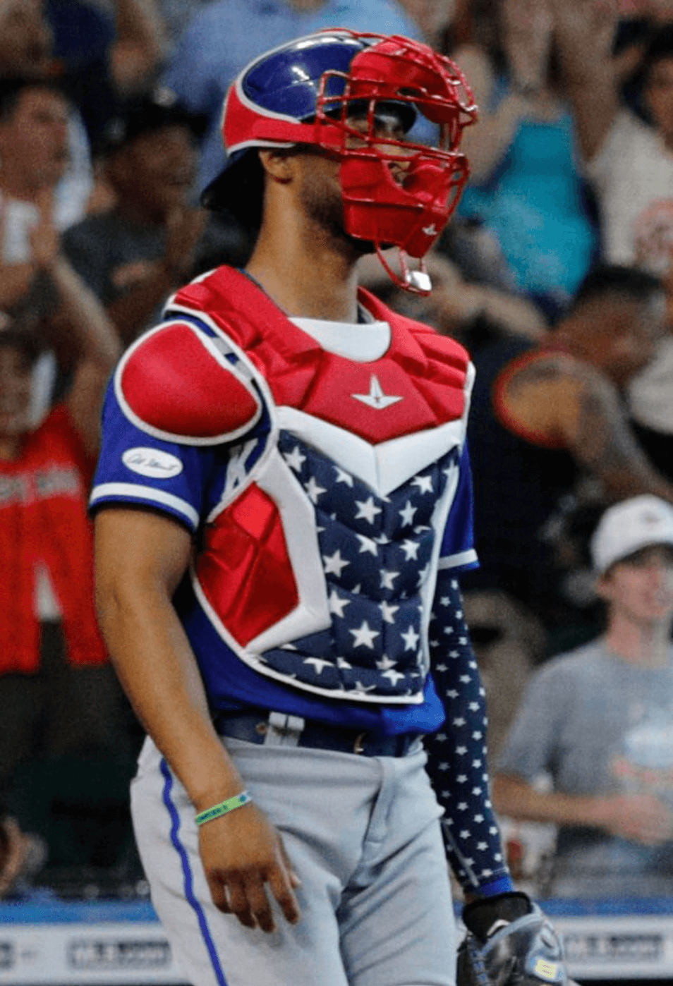
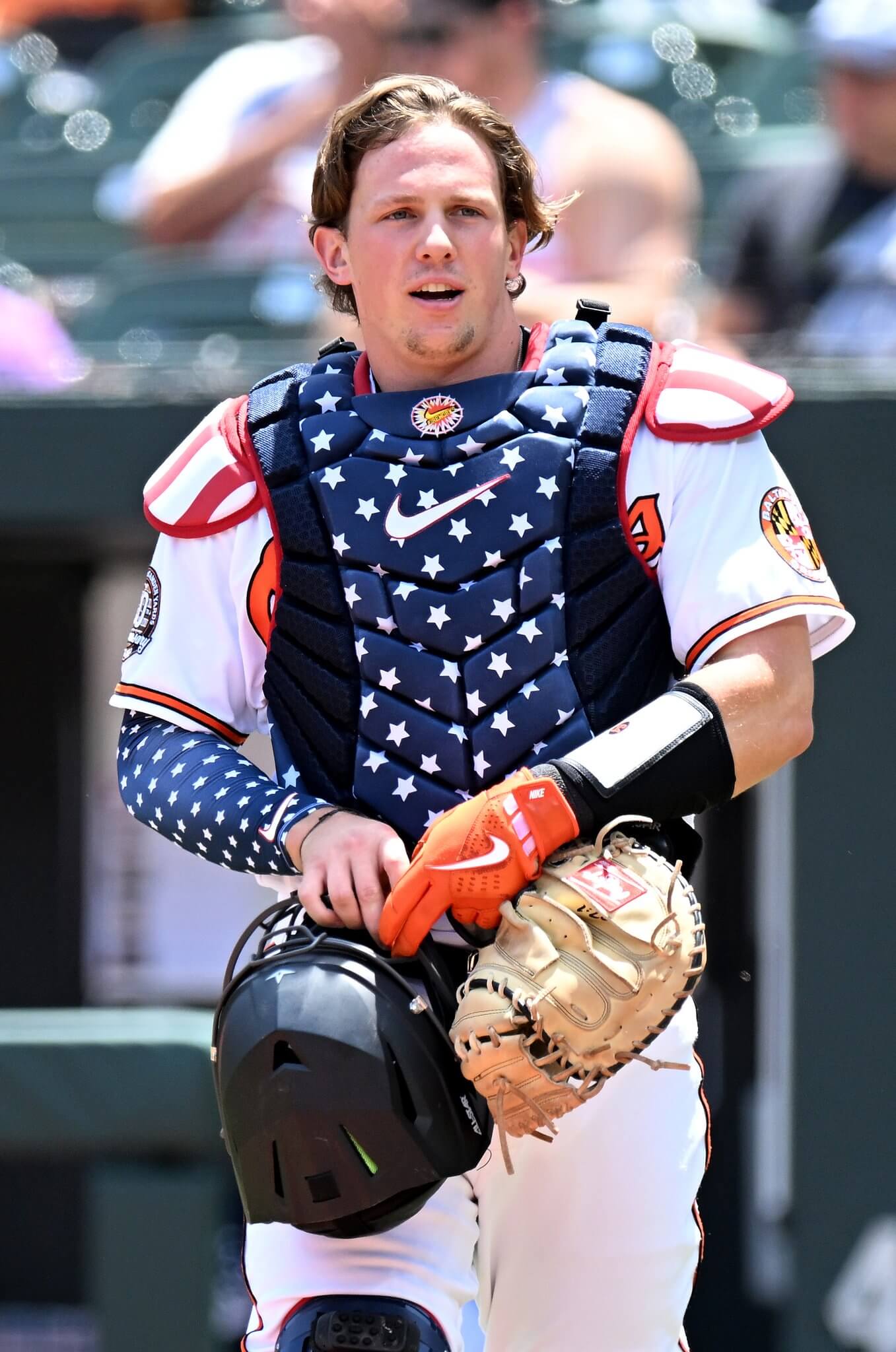
• Lots of catchers wore flag-themed chest protectors:
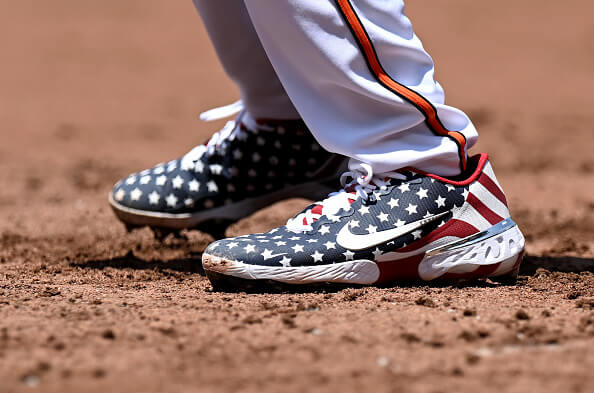
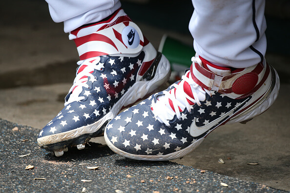
• As you’d expect, lots of players wore flag-themed footwear:
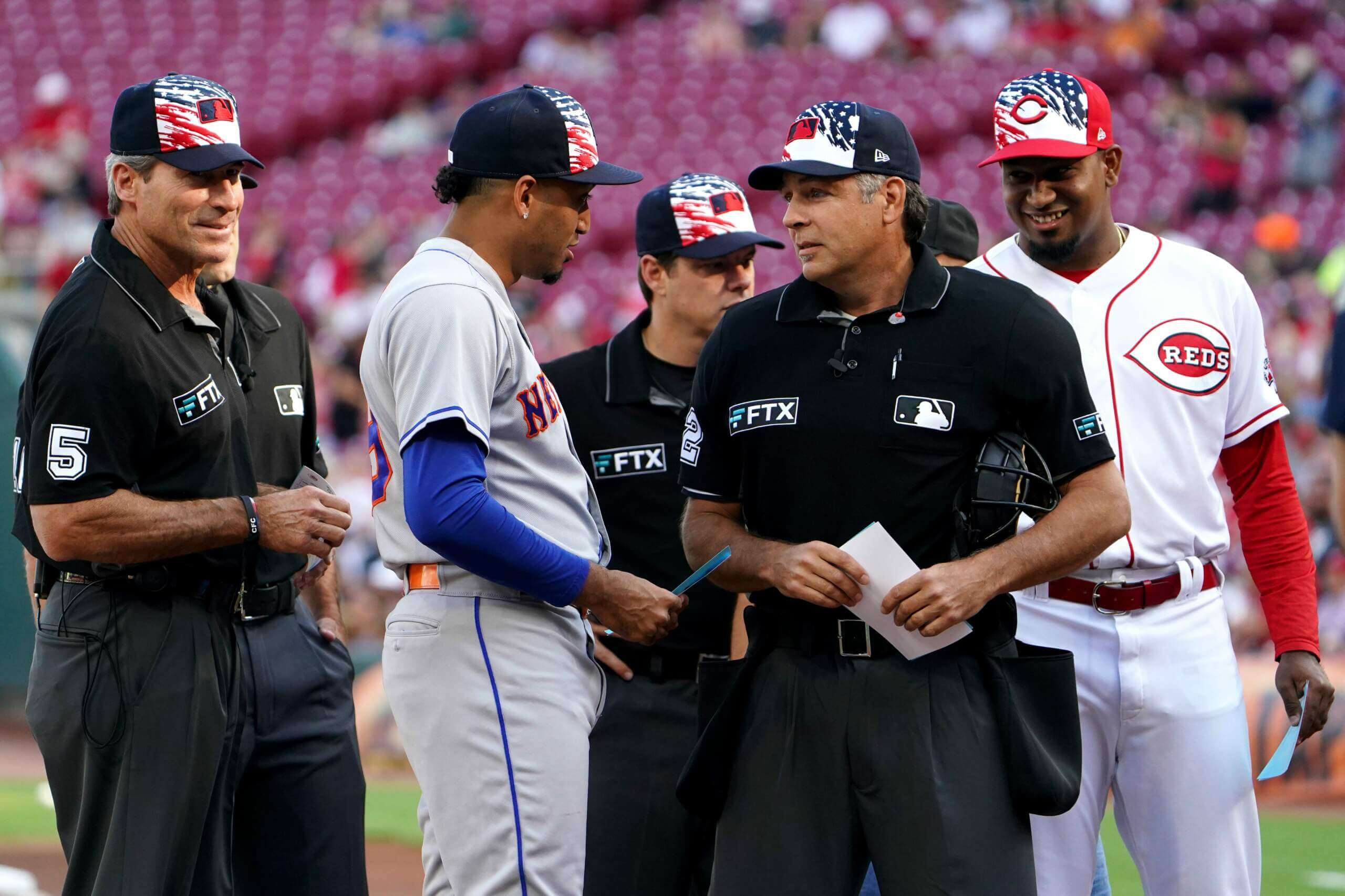
• Even the umpires got into the act:
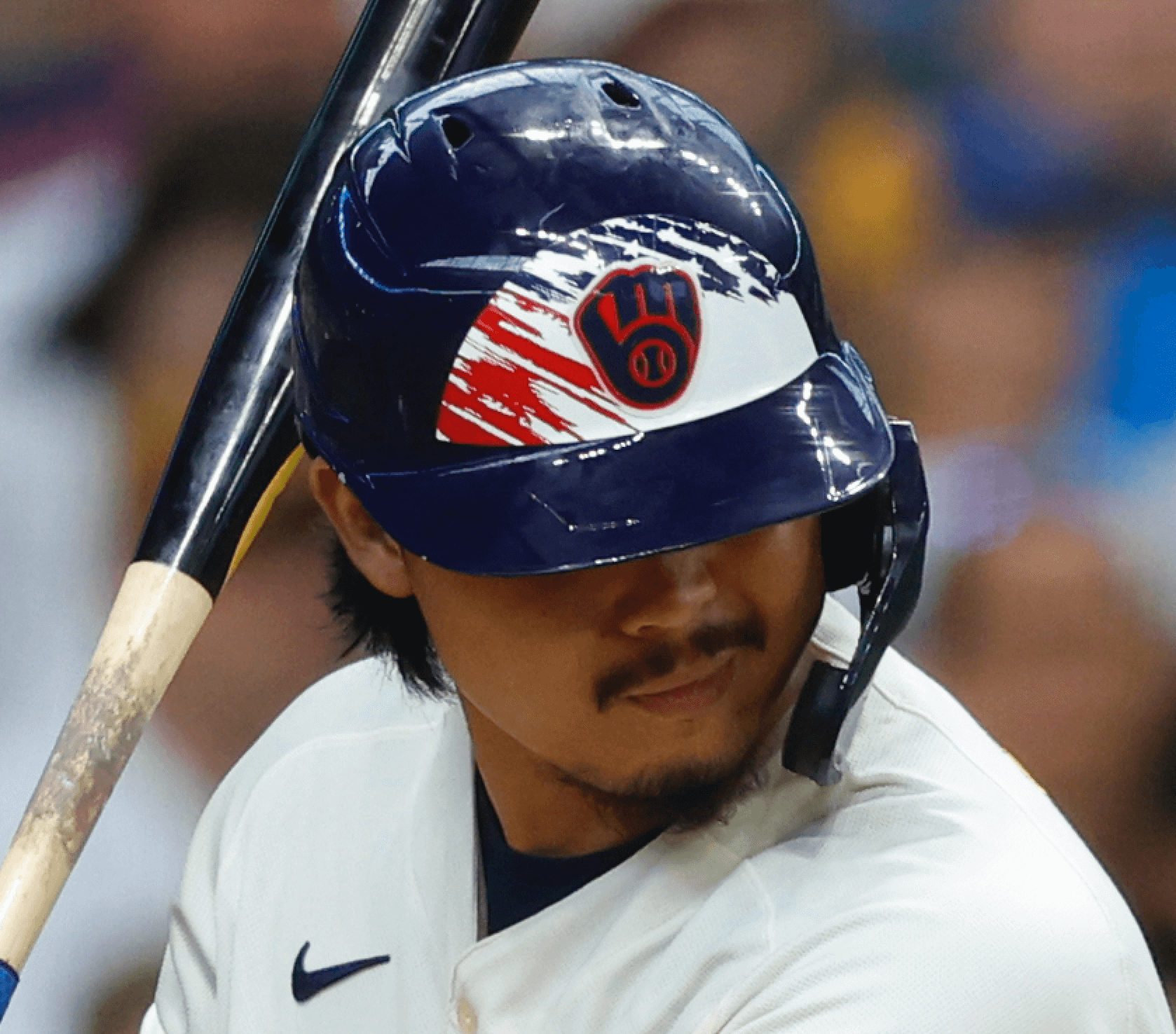
• As usual, the Brewers went the extra mile by wearing holiday-themed batting helmets, although their white-panel decals looked a bit too small:
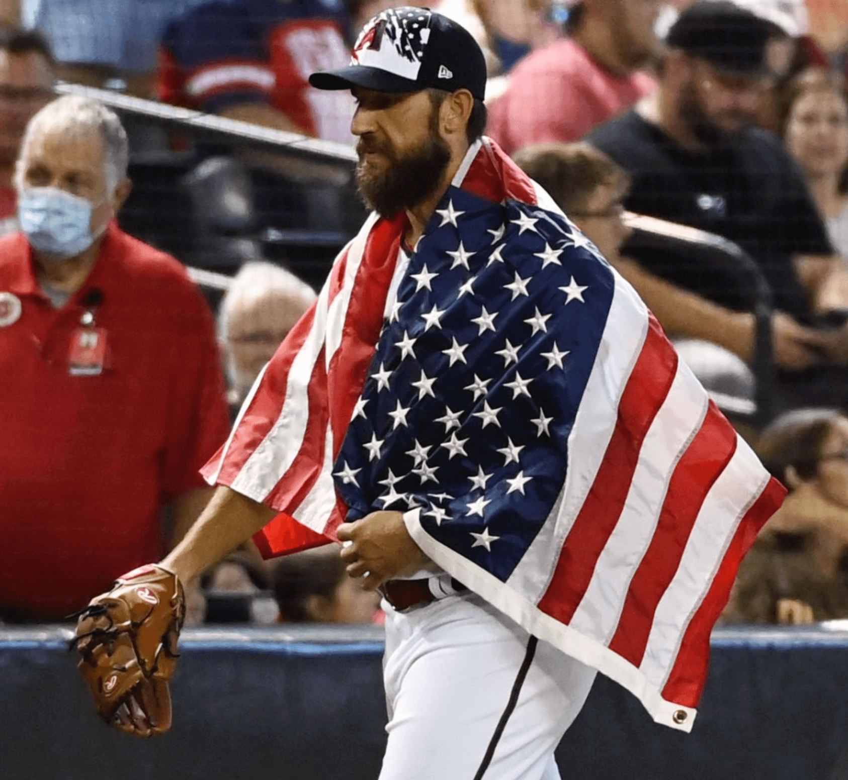
• Speaking of the extra mile, D-backs pitcher Madison Bumgarner literally draped himself with the flag while walking from the bullpen to the dugout prior to his start:
• Also as usual, the A’s looked particularly bad in the holiday attire, because it clashed badly with their color scheme:
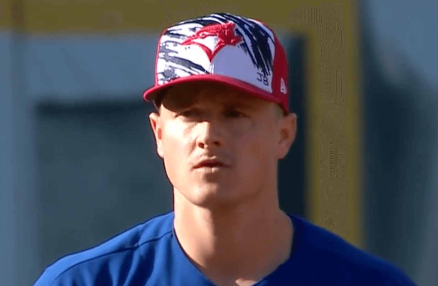
• The Blue Jays wore a modified, less flag-y version of the cap, and Jays players also inscribed their caps with “JB” — a memorial for Julia Budzinski, the recently deceased daughter of coach Bud Budzinski:
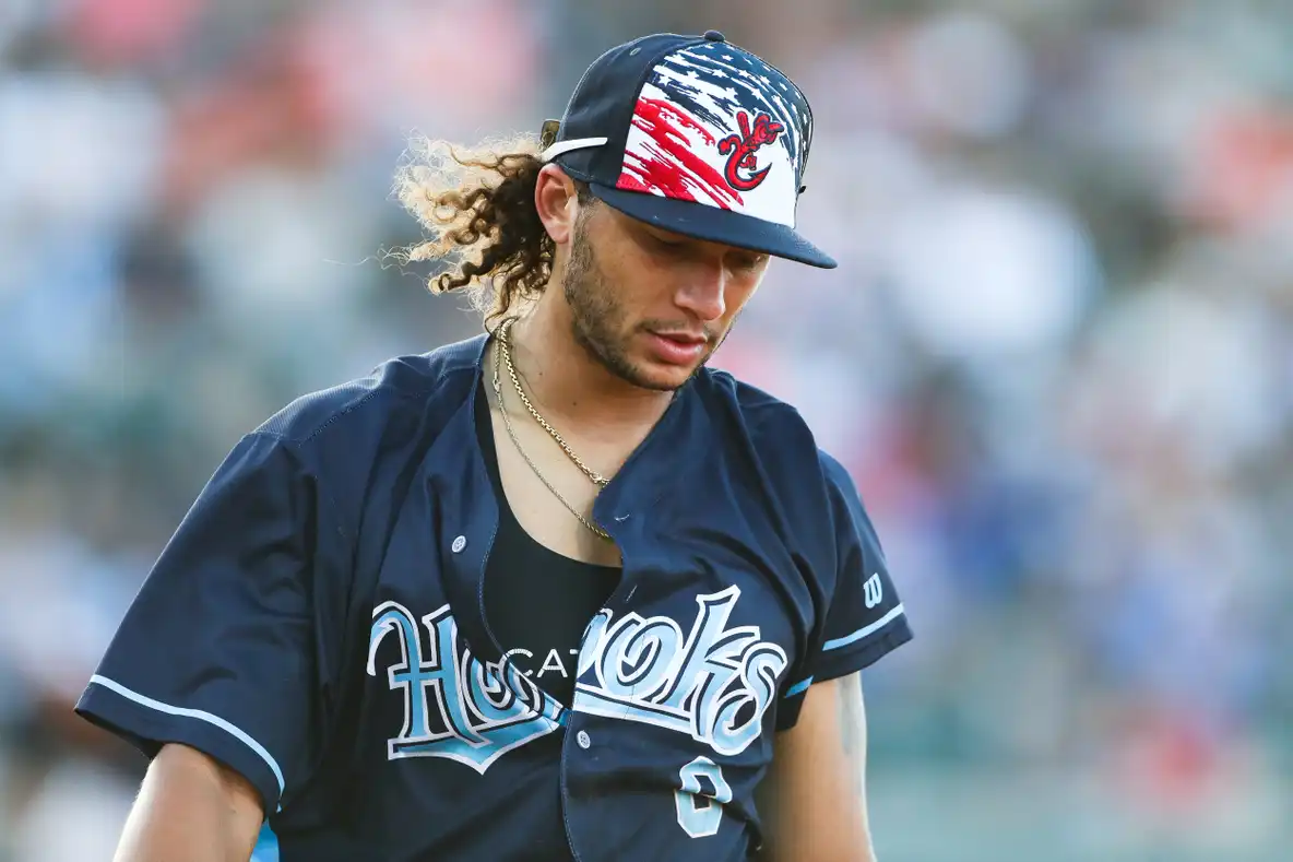
• As an aside, minor league teams wore the same holiday cap template yesterday:
(My thanks to Marcus Hall, Kurt Rozek, and @Spesh98 for their contributions to this section.)
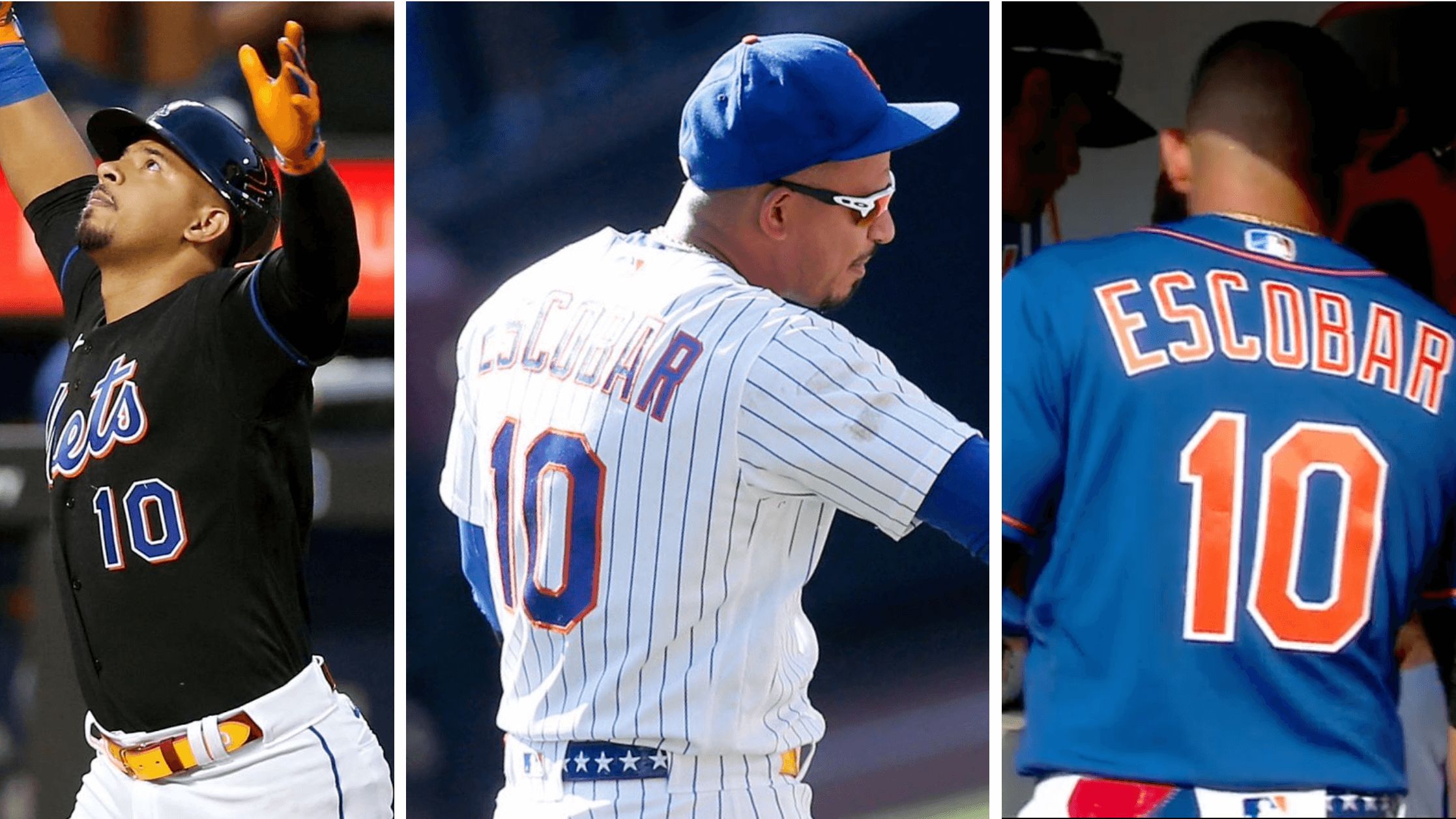
Click to enlarge
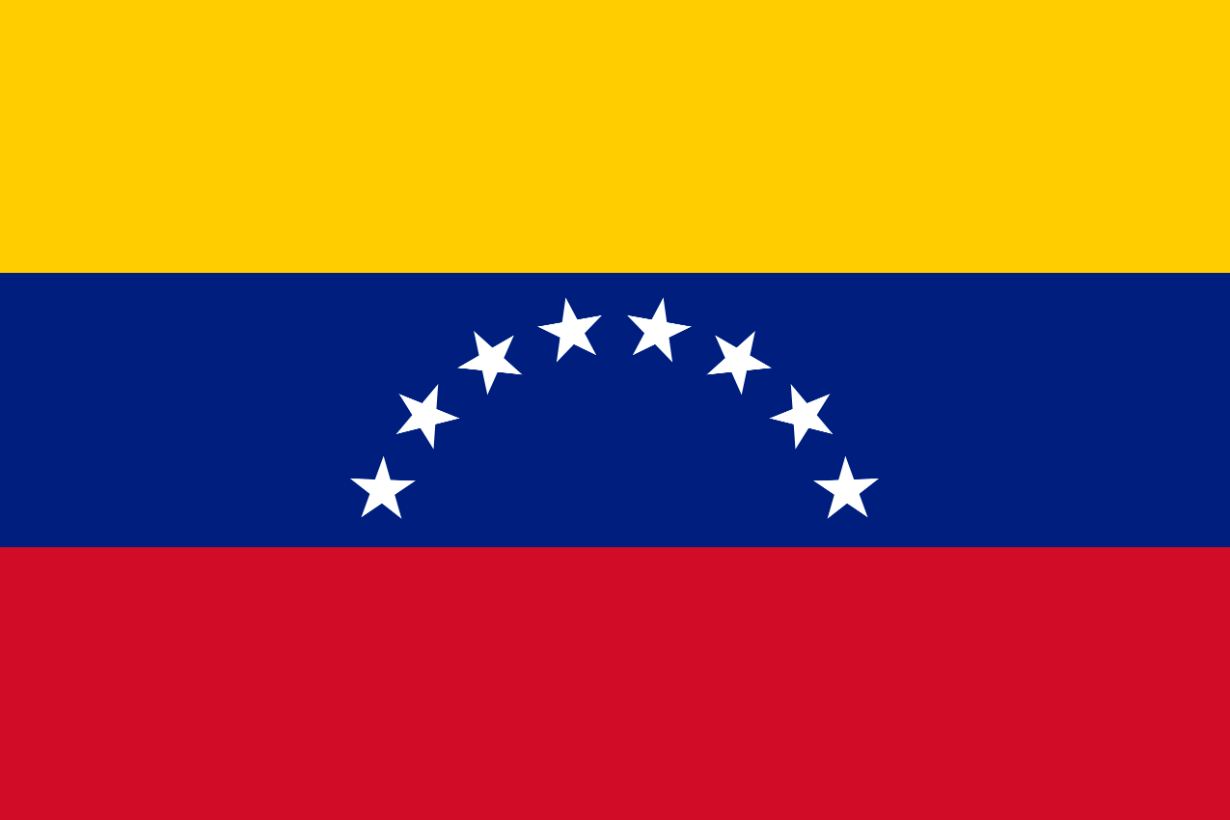
Very superstitious, continued: You may recall that Mets third baseman Eduardo Escobar tried to change his luck by changing his shoes in the middle of a game earlier this year. He tried something similar on Friday when he began wearing a new belt with an unusual design based on the flag of his native Venezuela (shown at right). Additional info here.
MLB belts have been a free-for-all for a couple of years now, but I don’t think I’ve seen one quite as flashy as this one. Once he began wearing it, Escobar promptly homered in three consecutive games, so it seems like a safe bet that he’ll keep wearing it for the foreseeable future.
(My thanks to @FormerDirtDart, Charlie Steele, and Phil for this one.)
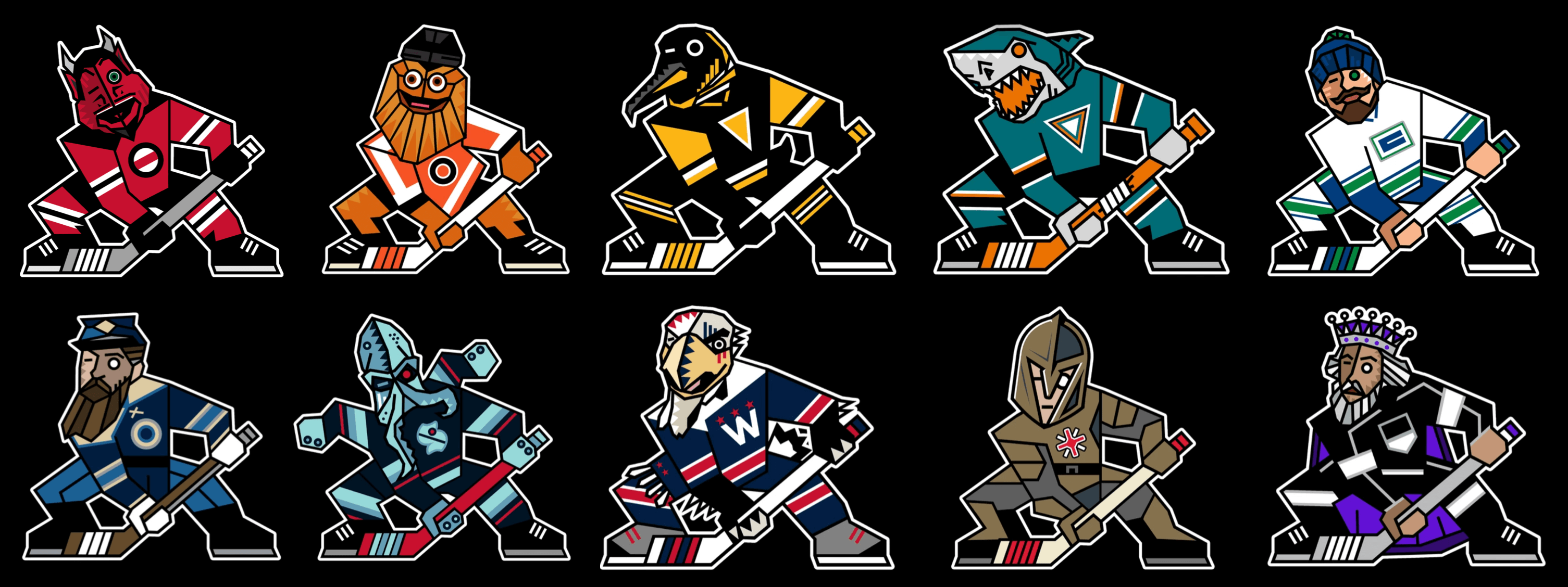
Click to enlarge
Great art project: A guy named Mick Earlson decided to make a Kachina-style logo for every NHL team. The results are really fun. You can see the entire project here.
(Big thanks to Mike Chamernik for this one.)

A few reminders: In case you missed it last week, Uni Watch is once again partnering with Grey Flannel Auctions to offer free, no-obligation appraisals of your sports memorabilia. Have a cool item and want to know what it’s worth, or maybe even want to put it up for auction? Get the full scoop here.
Also: I’m now accepting entries for a new design contest. The challenge is to create a set of MLB All-Star uniforms that don’t suck. Yes, of course it would be better for players to just wear their regular team uniforms, but Nike and MLB have abandoned that approach, so let’s see if we can do better than what they’ve come up with. Full details here.
Click to enlarge

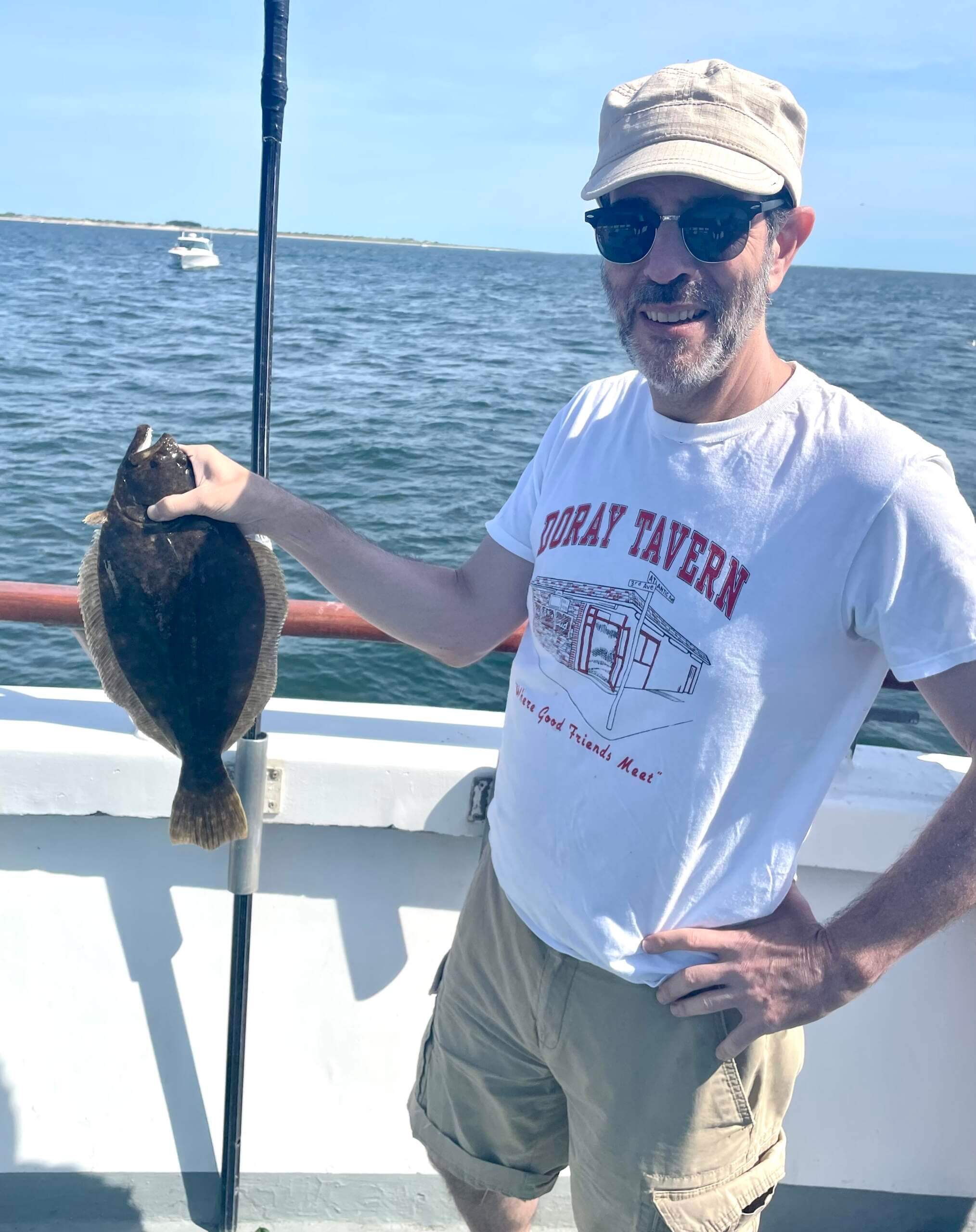
What Paul did last night yesterday: It was a gorgeous, sun-splashed day here in NYC yesterday, so Mary and I decided to spend the afternoon fishing on one of the boats that go out from the south tip of Brooklyn. No keepers, alas, although I came close with this 18″ fluke — half an inch shy of legal size. A very nice way to spend the holiday.
Sorry, no Ticker today, because the entire Uni Watch staff had the day off. The Ticker will return tomorrow. — Paul
This Kachina project is one of the best I’ve seen! The Kings, in particular, have two amazing designs.
I’m especially fond of the minimalist jersey crest interpretations and the subtle additions to the stick.
Great work, Mick!
Now, now about a Pucky the whale?
My only criticism is that the original kachina Coyote is clearly wearing half of an old-style goalie mask, with the black dash representing the eye slot, so seeing the slot-eye on figures that are clearly not wearing masks looks a bit odd… like they’re suffering from Popeye Squint.
Still, quite entertaining.
If only the Athletics had a 1950s Philly/KC throwback in their rotation, that would’ve paired better with the cap. It still wouldn’t be good, but it’d be less bad.
I’m as patriotic as they come, but jeez, give it a rest MLB. A flag patch on hats or jerseys would be plenty.
The Kachina project is amazing. Kudos to Mick.
Lastly, the little recap of the fishing trip was a reminder of when we only knew Mary as the tugboat captain, and didn’t even know the origin of the nickname. I always thought that was a fun quirk for the community here. I enjoyed the brief period when I thought Mary was an actual tugboat captain, before Paul shot down that theory. Glad to see the two of you had an enjoyable holiday.
Given that there are actual tugboats in New York City, and those boats have captains, I regret that Paul didn’t stick with the bit longer! It was fun mystique while it lasted.
The Kachinas are delightful! Most are very good, and the Blue Jackets and Kraken ought to be in each team’s logo set.
The Kachina project is GREAT! It reminds me of the link project!
The Julia Budzinski item looks like it was supposed to have a hyperlink, but it came across in plain text.
Yup, already fixed.
Paul, love the Doray Tavern tee shirt. I knew a bunch of Mohawk iron workers who were regulars there. It’s a shame that the Doray/Hank’s shut down. Thanks for the memories.
Gone but not forgotten. A special place.
5th picture down, the Royals catcher (don’t know his name, sorry) – the chest protector’s giving me serious Confederate flag vibes.
That’s probably not what MLB were aiming for.
Melendez? Sorry, but not getting that vibe (at all) — perhaps if the blue field/white stars were in the shape of an “x”…
But not a particularly good design either, which is probably what MLB was aiming for.
I think I see what Matt is referring to. It’s the red area surrounding a blue area with white stars bordered by white. It isn’t in a cross but it is topologically equivalent to the confederate flag. The pattern of the chest protector is what is causing it so I imagine it’s unintentional. It wouldn’t surprise me if the designer had never seen a Confederate flag as this lack of knowledge of history affects general uniform design as we know *cough*#RespectThePlacket*cough*.
The whole OTT patriotism thing makes me feel slightly uncomfortable anyway. Not that it’s American specifically, just the flag waving in general. Team sport is inherently tribal of course, but including national symbols in that feels like something that probably shouldn’t be a part of sport to me.
The July 4th uniforms were offensive on the eyes in a way I didn’t think possible. What a cravenly chintzy brand of patriotism.
Yesterday’s uniforms and accessories were the dictionary definition of “flag desecration.”
There have been several years of these patriotic themed caps. The first ones were probably the best the designers could come up with, but now we’re getting the umpteenth best version. Each year’s version from here on out will look worse and worse. (And the first ones were bad)
If MLB wants to honor America on the fourth, how about a simple flag on the back of the jersey, displayed correctly (Canadian flag for the Blue Jays)?
With the Yankees off yesterday, I thought I’d be spared seeing these horrible caps this year. No such luck.
LOVE the Kachina project, great stuff
The Kachina project is top notch, so many nice variations!