[Editor’s Note: Back in March, Marc Mayntz designed a “national flag” for each NFL team. Then he did the same thing for the NHL and NBA. Today he’s back with the MLB installment of this ongoing project. Enjoy. — PL]
By Marc Mayntz
These designs took some extra time to create, for a couple reasons. First, baseball logos are, to a large degree, already minimalist and timeless. One advantage that MLB does have, however, is the unique experiences at the ballpark, so there are a lot of nods to certain parks and traditions in this flag set.

Arizona Diamondbacks
The turquoise and sand of the Arizona desert are separated by a Diamondback stripe.
———
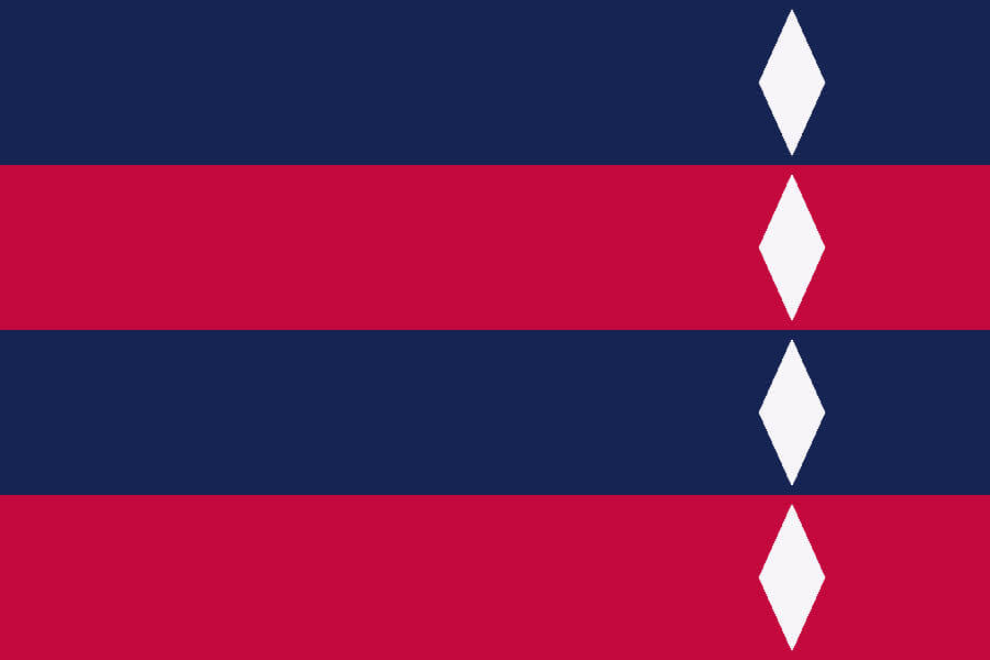
Atlanta
Navy stripes representing Boston and Milwaukee, red stripes for Atlanta’s MLB and Negro League teams. The four diamonds honor Hank Aaron in perpetuity.
———
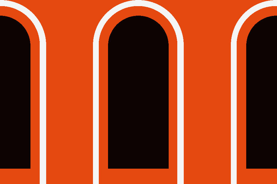
Baltimore Orioles
An orange flag evoking the windows and brickwork on the B&O warehouse beyond right field of Camden Yards.
———
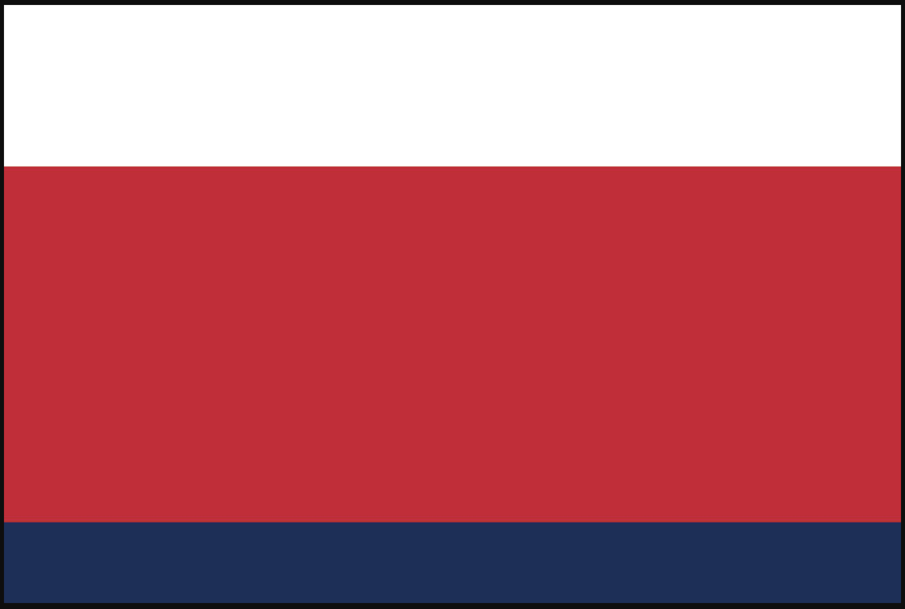
Boston Red Sox
The design shows the relative heights of the Green Monster (white), the Triangle bleachers (red), and the Pesky Pole (navy).
———
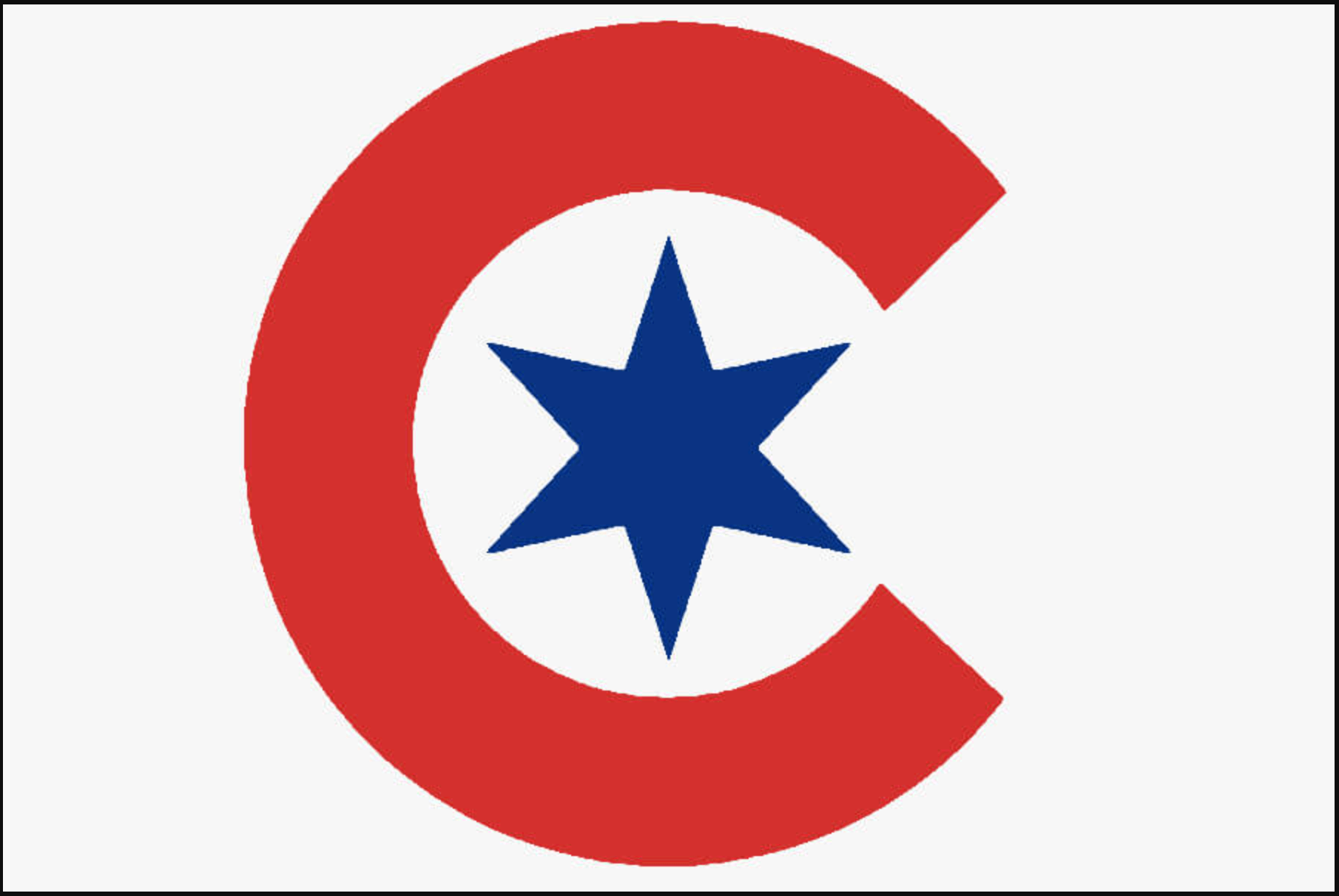
Chicago Cubs
The team’s City Connect cap logo is reproduced on a field of white to match Wrigley Field’s “W” victory flag.
———

Chicago White Sox
An adaptation of the old Beach Blanket uniform.
———
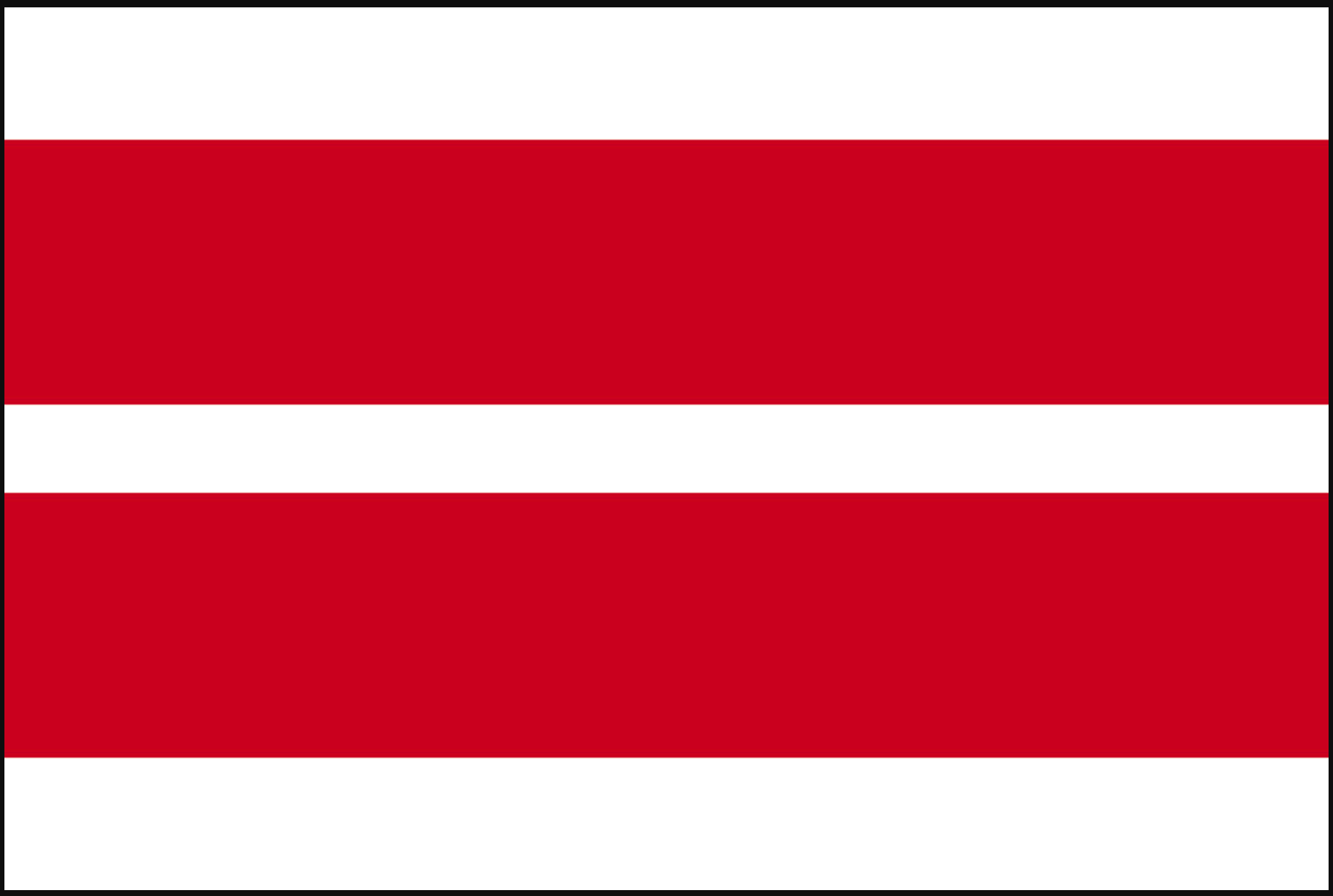
Cincinnati Reds
Mr. Redlegs’s pillbox cap is the model for the alternating red and white stripes.
———
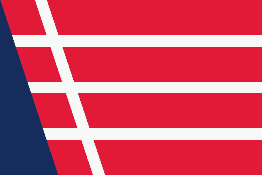
Cleveland Guardians
The stylized “G” wings in the team’s new logo abut a navy blue triangle representing Lake Erie.
———
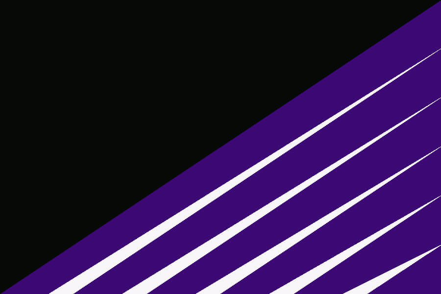
Colorado Rockies
A simplified version of the Rockies’ logo.
———
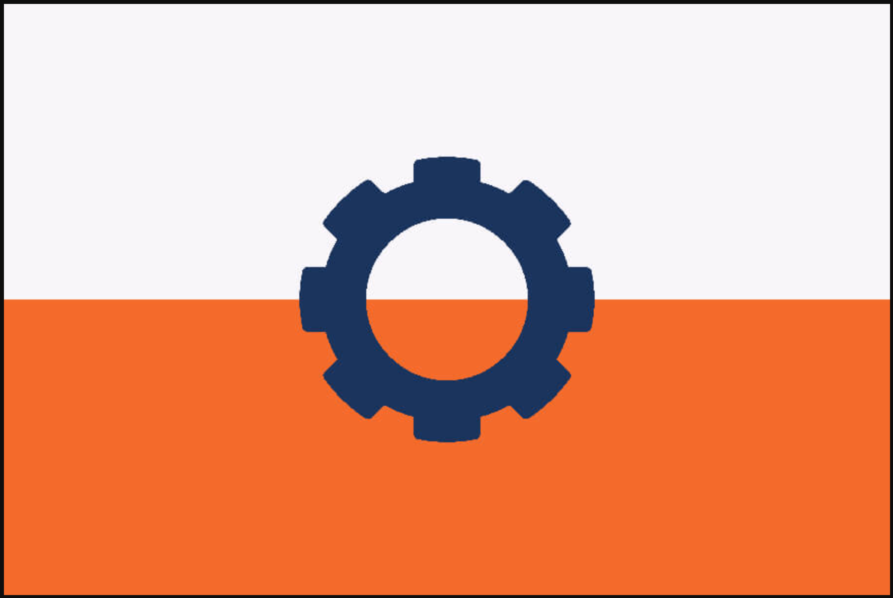
Detroit Tigers
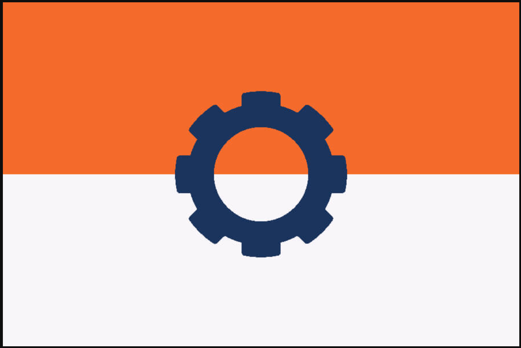
My favorite uni detail of all time is the Tigers’ cap logo changing color between home (white) and away (orange). So the flag can flip depending on whether the game is in Detroit (white on top) or elsewhere (orange on top). A dark navy gear with eight teeth represents Detroit being one of the eight original American League teams.
———

Houston Astros
Just another tequila sunrise.
———

Kansas City Royals
I wanted a “watery” look to the different shades of Royals blue through the team’s history. The edge shade is the navy blue from the Kansas City Monarchs.
———
Los Angeles Angels
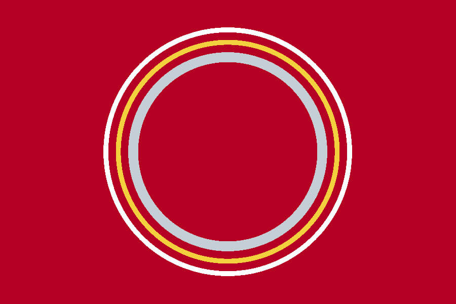
Three concentric halos representing the three versions of the Angels’ cap halo.
———

Los Angeles Dodgers
Dodger Stadium’s hexagonal scoreboard dominates the white field, with the lower-right corner colored red, just like the front numbers on the team’s jerseys.
———
Miami Marlins
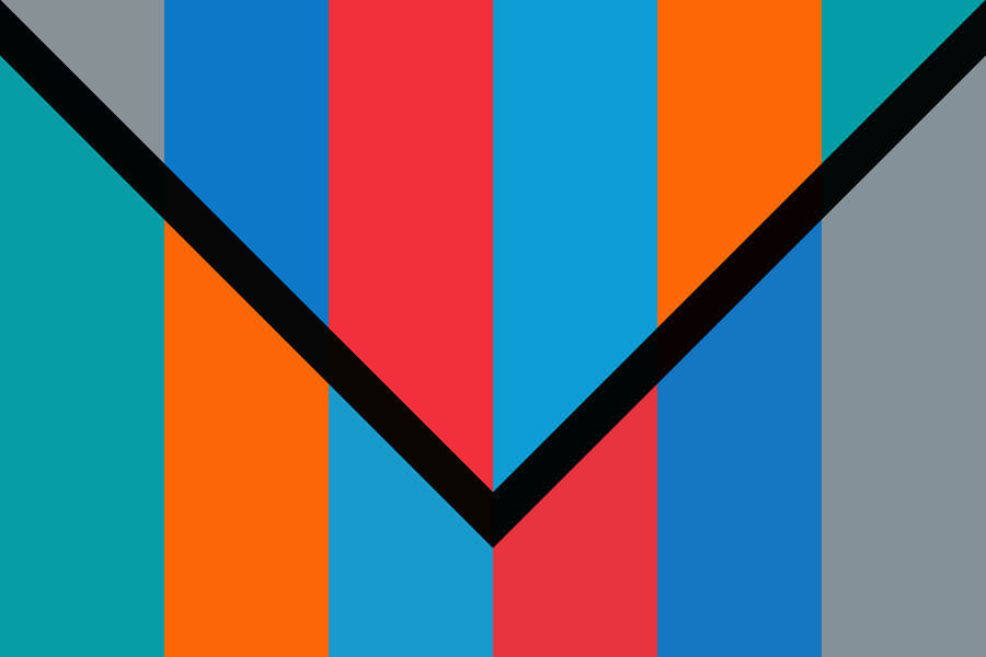
Black is the only color that has been present in every iteration of the Marlins’ color scheme. The “test pattern” symbolizes the vibrant, multicolor look of Little Havana.
———

Milwaukee Brewers
Just like in the ball/glove logo, an “M” is hiding in plain sight in this beer barrel design.
———
Minnesota Twins
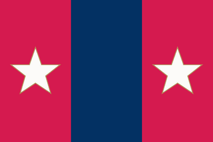
Minneapolis on the left, St. Paul on the right, Mississippi River in the middle.
———
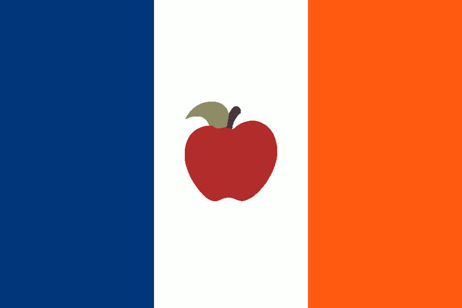
New York Mets
A modification of the NYC flag, with the Home Run Apple in the middle.
———

New York Yankees
27 pinstripes, with room for more.
———
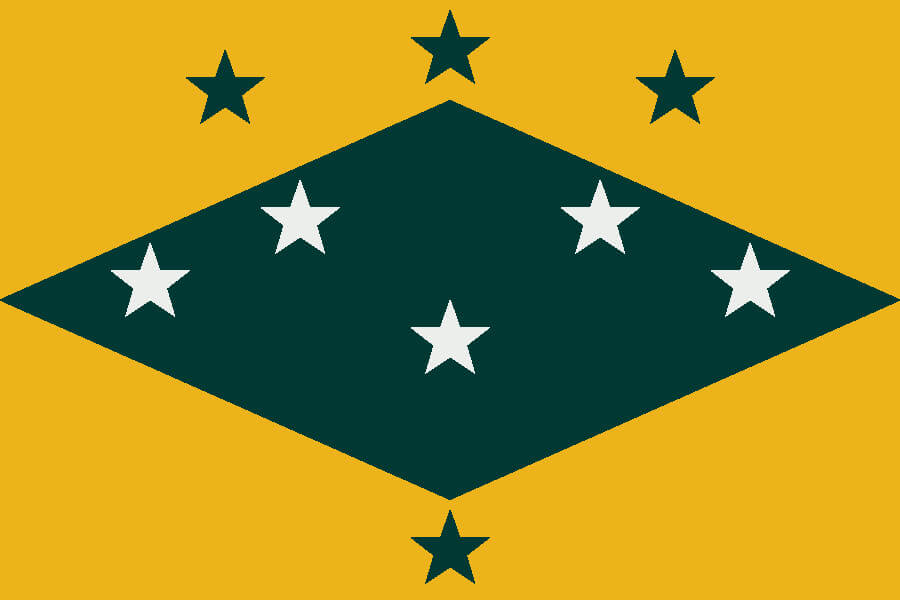
Oakland Athletics
The diamond was used during the Kansas City years. The white stars are the Philadelphia championships (1910-11, 1913, 1929-30). The green stars are the Oakland championships (1972-74 in the outfield, 1989 catching).
———
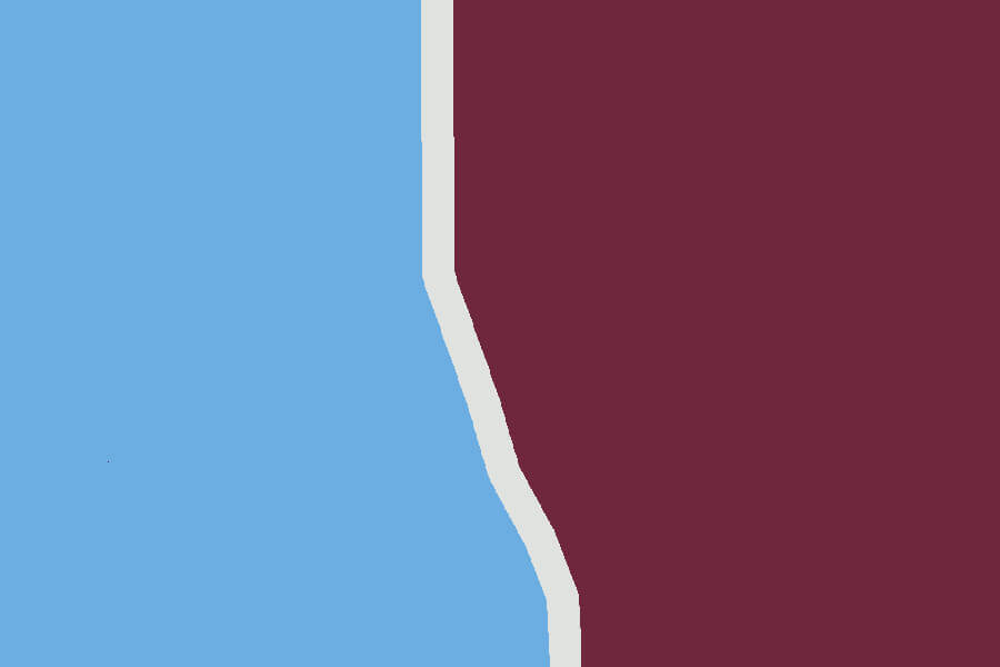
Philadelphia Phillies
The crack in the Liberty Bell separates fields of powder blue and maroon, the colors of the Phillies’ first World Championship team.
———
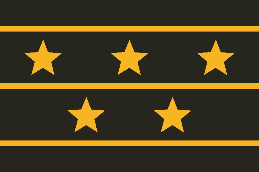
Pittsburgh Pirates
Stargell Stars will never not be cool. Plus, Pittsburgh owns black and gold.
———

San Diego Padres
A simplified San Diego city flag with the Padres’ signature brown as the main color.
———
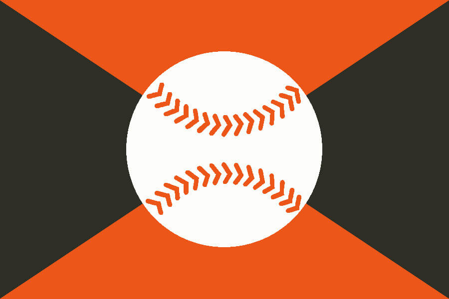
San Francisco Giants
A baseball has been part of every Giants logo since the move from the Polo Grounds.
———

Seattle Mariners
The only square flag in this set. The compass rose is tilted to the northwest, indicating Seattle’s geographic position and relative MLB isolation.
———
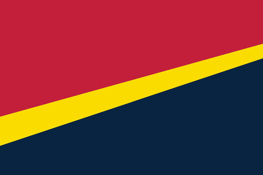
St. Louis Cardinals
The Cardinals bat separates the primary red and navy fields. Since the team long predates the Gateway Arch, I decided not to include it in this classic-style design.
———

Tampa Bay Rays
The old Devil Rays rainbow is capped by a tilted dome roof of Rays navy.
———
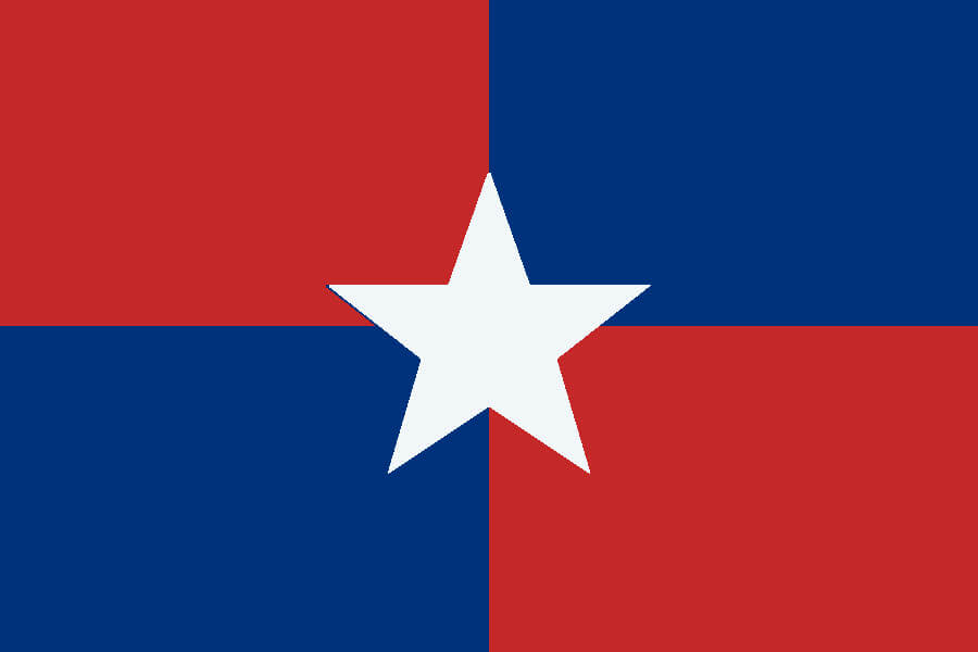
Texas Rangers
This quartered flag reflects the Rangers’ historic straddling of the “red team” vs. “blue team” divide.
———

Toronto Blue Jays
The split letter font mimics the Toronto city flag.
———
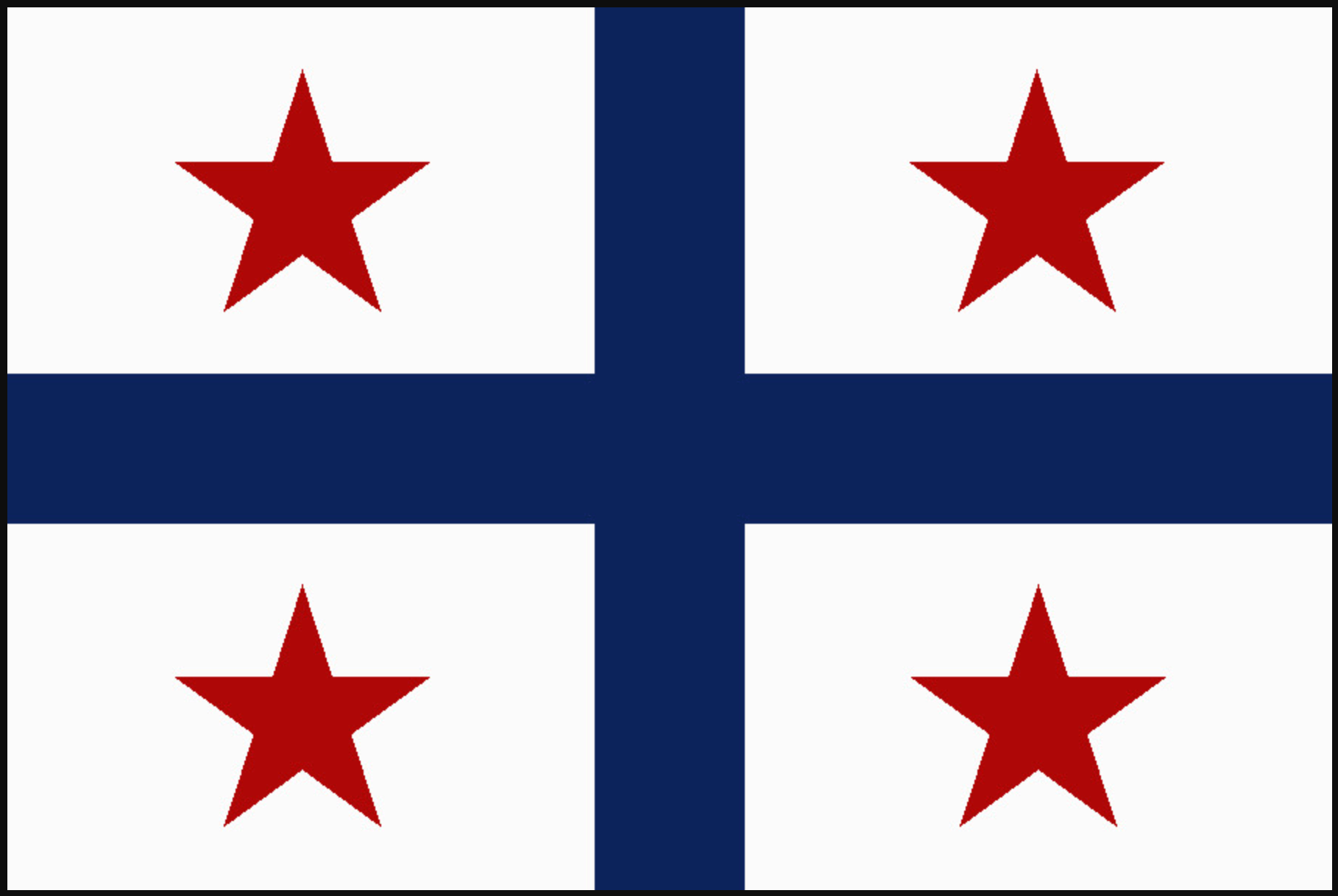
Washington Nationals
Official story: The four quadrants of DC are represented, with the Capitol at the center of the cross. Unofficial story: Take the Quebec provincial flag, switch the blue and white and change the fleurs-de-lis to stars.
———
Paul here. Big thanks to Marc for this great four-part project, which I’ve been proud to share on Uni Watch. Well done!
The return of “What’s It Worth?”: Over the past few years I’ve periodically run promotions in which Uni Watch readers have been invited to submit items of memorabilia for appraisal by Grey Flannel Auctions at no charge and with no obligation, sort of like an online version of Antiques Roadshow. Lots of readers have submitted photos and descriptions of their items, and some have taken the extra step of consigning their items with GFA and selling them for a pretty penny. Items from Uni Watch readers have included this Tom Seaver USC uniform (which sold for over $37,000!), this Aaron Rodgers jersey (over $30,000), this Tom Glavine jersey ($4,468), this Rick Honeycutt jersey ($1,805), and this Jose Cruz jersey ($866).
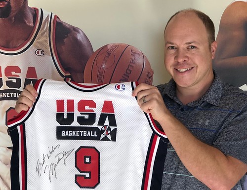
So now we’re going to do it again. Here’s some quick background: Over the years I’ve developed a good relationship with GFA’s director of operations, Michael Russek (that’s him at right), who periodically advertises here on Uni Watch. In an industry that can sometimes be a bit sketchy, Michael has always impressed me as a stand-up guy. Back in 2017, when my friends Sonya and Tony acquired an amazing 1905 Princeton football jersey at a flea market and asked me if I had any suggestions on how they could sell it, I sent them to Michael because I knew he’d treat them right, plus I knew GFA would reach the right audience to bring the best price for the jersey. (It ended up selling for over $50,000.)
Do you have some sports or pop culture memorabilia that you think might be valuable? Have you ever wondered how much it might actually be worth? Now’s your chance to find out. Here are the details:
1. Items that can be reviewed for appraisal include game-used and game-worn jerseys, bats, and equipment; vintage sports and historical autographs; championship jewelry, trophies, and awards; pre-1960 trading cards (for any sports); and entertainment, rock ’n’ roll, political, Americana, and historical memorabilia.
2. For each item, please provide several photos (front, back, tagging, maker’s mark) and a detailed description regarding the item’s condition and provenance.
3. Also include your name, phone number, and email address.
4. GFA only handles items with a perceived value of at least $250. If your item doesn’t meet that threshold, you may get a response indicating that the item doesn’t fit the parameters for a GFA appraisal.
5. Full disclosure: If you end up consigning an item to GFA and the item sells, Uni Watch will get a cut of GFA’s fee. (And in case you’re wondering, I did not receive anything for the 1905 Princeton jersey. That referral was just a favor I did for my friends.)
Okay, ready to see what your treasures are worth? Email your photos and descriptions to GFA. You’ll get a response within a week.
Have fun with it, people. We’re excited to see the treasures you share with us!
Click to enlarge
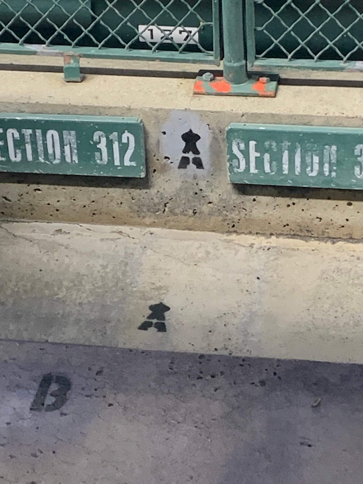
Too good for the Ticker: Here’s yet another interesting detail at Angel(s) Stadium: They use the team’s halo-topped “A” logo to mark rows on the stairs within the ballpark. I love that!
(Big thanks to Ryan Wetstein for this one.)

Uni Watch Screening Room: On Friday night we streamed The Unbearable Weight of Massive Talent, in which Nicolas Cage plays himself in all his absurd Nicolas Cage-itude. The movie is basically an extended hall-of-mirrors wink-wink riff on Cage, his eccentricities, and the movie industry. It’s very self-aware, very meta, and very, very funny.
The last 20 minutes or so crossed the line from clever in-joke to overbearing self-parody, at least for me, but for the most part this is a very successful gimmick movie. If you don’t care about Cage, you can skip it. But if you’re a Cage fan, as I am, you’ll love it. Either way, kudos to Cage for being a good sport who’s able to laugh at himself.
The Ticker
By Jamie Rathjen

Baseball News: The Brewers’ scoreboard mentioned yesterday that LF Christian Yelich is the great-grandson of Rams helmet designer/football helmet logo pioneer Fred Gehrke (from multiple readers). … The Marlins have a team-branded football helmet that C Nick Fortes wore for a TV interview yesterday. It’s also covered in players’ bat knob stickers (thanks, Phil). … Yesterday, White Sox 1B Gavin Sheets homered while his helmet logo was askew. He kept it like that for the second at-bat, but popped out, and it was fixed for the third (from Clint Wrede). … Athletics P Zach Jackson had a No. 78 belt yesterday. That number isn’t currently worn by anyone on the team (from Rich Paloma). … Rays pitching coach Kyle Snyder wasn’t wearing the team’s throwback cap yesterday (from @pointbrett). … The New York Times found a Phillies fan who turned one of his bathrooms into a homage to the team’s relievers called the Relief Room (from Kurt Esposito). … The next two are from Kary Klismet: For the past several years an Omaha teenager has been drawing the Men’s College World Series participants’ logos in chalk outside the stadium. … Marshall moved the location of its planned new baseball stadium. … With Dodgers 1B Freddie Freeman making his return to Atlanta this past weekend, fans wore Atlanta/Dodgers frankenjerseys (from Nicklaus Wallmeyer).

Football News: If you go to this page and search on “Creamsicle,” you’ll find an amusing item about how the Buccaneers’ inaugural-season jerseys ended up on the memorabilia market (from our own Jerry Wolper). … The College Sports Logos Twitter account discovered that the Pitt script logo was apparently influenced by UCLA’s helmet logo (from Kary Klismet). … The University of Tennessee has approved new renovations to Neyland Stadium.

Hockey News: A family member of Avalanche coach Jared Bednar wore an Avs jeans jacket with Bednar’s NOB — but not in the Avs’ vertically arched style — for last night’s Stanley Cup Final(s) game (from L.J. Sparvero).

Basketball News: New Bucks draft pick MarJon Beauchamp is planning to wear No. 0 for motivational reasons (from Maverick Johnson).

Soccer News: The first part of this section is from women’s international friendlies: Match info on England’s shirts against the Netherlands on Friday called their opponents “Holland,” which to state the obvious is wrong. Striker Rachel Daly also wore two commemorations for her 50th England appearance. … Germany played Switzerland and had a punny Euro 2022 hashtag, “#HungriGER,” on one sleeve, and the German Football Federation’s Ukraine peace logo on the other. … Norway held a pride game on Saturday that took on extra meaning after a mass shooting targeting Oslo’s pride events. Striker Ada Hegerberg celebrated a goal by holding up the team’s rainbow captain’s armband. … The US wore rainbow numbers, which we mentioned earlier this month would happen, as did Canada. … France wore new shirts. … At club level, new shirts for Germany’s SV Meppen and 1. FC Nürnberg (first shirt) (both also from Kary Klismet). … More new shirts from Kary for Germany’s Mainz 05 (first), VfL Wolfsburg, 1. FC Heidenheim (third), and SV Elversberg; Mexico’s Atlas and Leones Negroes de la UdeG; Scotland’s Ayr United; and Spain’s CD Mirandés. If it seems like some of these clubs have been in the Ticker already, that’s because they may release two or three shirts at different times. … The next three are also from Kary: The USL Championship/W League’s Indy Eleven have a location for their new stadium. … New ball design for England’s EFL Cup. … Here is a guide to the 2026 men’s World Cup host stadiums. … John Flory sends us a piece from The Athletic on why FC Barcelona’s Camp Nou is called that. … The Scottish club formerly known as Edinburgh City changed its name to FC Edinburgh earlier this month. … The blog Museum of Jerseys has an ongoing series on shirts that look very similar to ones the same club wore in the recent past. … With the Glastonbury music festival returning this weekend for the first time since 2019, it’s a good time to point out that the Glasto Shirts Twitter account is posting many pictures of the soccer shirts worn by attendees.

Grab Bag: The Telegraph, which is the only newspaper I’m aware of that has full-time women’s sports coverage, has a piece on how Wimbledon’s all-white dress code is stressful for women who get their period during the tournament (from Trevor Williams). … Meanwhile, The New York Times has a piece on Wimbledon’s grass. … The two drivers on the W Series Bristol Street Motors team, Jess Hawkins and Alice Powell, are wearing helmet designs that won a contest for next week’s races supporting the Formula One British Grand Prix. … New sports logos for Division III Hilbert College (from Kary Klismet). … The Sam Noble Oklahoma Museum of Natural History has some beaded necklaces based on Heat and Broncos logos (from Chance Plett). … Reader Jared Buccola has this week’s Premier Lacrosse League roundup: “Chaos Lacrosse Club added new matte black helmets, making a first time uniform combo against Waterdogs LC. Great contrast for Redwoods LC vs Whipsnakes LC. Cannons LC went dark against the light gradient for Chrome LC. Battle of the blues between Atlas LC and Archers LC. Redwoods, Cannons and Archers all wore their second jerseys for the first time this season (Week 4).” … The first lady of Illinois, M.K. Pritzker, has a dress covered in husband J.B.’s campaign logos (thanks, Anthony).

Click to enlarge

What Paul did last night on Saturday and Sunday: We had quite the epic weekend. On Saturday alone we attended the opening reception for a very cool Dept. of Sanitation museum exhibit, then went to our neighbor’s kid’s bar mitzvah, and then went to a friend’s backyard party. Spent a good chunk of Sunday recovering from all that and then got dressed up to attend the 50th-anniversary party for our favorite local tavern (hence the photo shown above), which was held at a big banquet hall.
However you spent your weekend, hope it was a good one. Here’s to a restful work week!
The “relief room” bathroom guy might also be “too good for the ticker.” Great story and thanks for sharing it.
Great job on the MLB flags. Easily my favorite set so far.
It’s not “incorrect” to refer to the Dutch national football team as “Holland.” Dutch fans, speaking in either English or Dutch, do it all the time. During big international tournaments like the World Cup or Euro, entire streets in towns across Holland will be festooned in orange banners that read, “Hup Holland!” or “Hup Holland Hup!”. It will always be more correct to refer to a Dutch national team as Netherlands or even KNVB, but “Holland” isn’t wrong in this case. The whole Netherlands/Holland thing is not identical to Britain/England, at least not in the sporting context.
What I find more strange about the England v Netherlands game is that England wore orange kits (monotone) and the Netherlands were in white!
Two words. Both of which happen to be very important in the world of football/soccer: Nike & money.
Nike wants to sell as many of the change shirts as possible, and there’s no guarantee the teams will get a chance to wear either set during the tournament as their primary kits (England: all-white, Holland: all orange) happen to be colors that teams would normally wear if there was a clash of colors.
I always go for three picks in a World Cup: The Netherlands, Holland, and the Dutch. It makes it simple.
Great work again, Marc! Such a cool project.
Came to second this. Such a neat idea and well-done.
Interesting take on the 49’s helmet by Susquehanna Township, Pennsylvania.
link
Looking at that photo I would have sworn it was on some collegiate level. I mean I have been out of high school since 2000, but I didn’t realize that even high schools have that level of practice gear.
Feeling like an old man, but in my day we certainly never practiced in anything close to that, just fairly generic school issued jerseys and pants (when practicing in full pads), everything else was your own stuff. Certainly no school issued branded practice gear.
I love the flag project! Great work, Marc. The Astros, Yankees, and Pirates concepts are particularly strong.
The St Louis flag reminds me more of the Blues road jersey from the mid 90s
Pretty off topic here but something I’ve been thinking about the last few days. How many monochrome full uniform (jersey and pants) have there been in baseball? So there’s the obvious ones in white and grey, and the less common but still popular cream and powder blue. Those 4 at least have been worn by multiple teams even if they aren’t technically their colors. Then there’s the team color ones like the Oakland all yellow, Baltimore all orange, Pittsburgh, Philadelphia, etc. Then there’s the oddballs like the Padres sand (I don’t think repeated?), and the D-Backs charcoal grey (which has been repeated a couple times in college, team USA). Any other ones? I know a bunch of other team color ones I didn’t mention too especially with Nike CC coming but any obvious ones I missed?
What is interesting about the powder blue road sets from back in the 70s/80s is that it was just a replacement for gray.
I had always viewed the Phillies of that era as having the team colors of maroon and powder blue. But the Phillies really weren’t a maroon and powder blue team, they were just a maroon team who swapped out the gray for powder blue. I guess the maroon and powder blue complimented each other so well in my mind (and probably a lot of others) you thought those were the team colors, but really at that time the blue was no more a Phillies color than gray was when they paired that maroon design with road grays.
Yes that was my point! When I said Philadelphia I was referring to their full Maroon set, not the powder blue. I was more just seeing how many full color sets there have been in history. White, grey, cream, and powder blue have been worn by so many teams, and like you said even if powder blue isn’t a color (Phillies, also Cardinals). I was more looking for more oddballs like the San Diego sand or Arizona charcoal.
Cleveland blood cot uniforms for in 1970’s
Ok here’s what I came up, excluding white, grey, cream, and powder blue. Let me know if I missed any:
Red/Maroon – Cleveland, Phillies
Orange – Orioles
Yellow – Athletics, Pirates
Green – Athletics, Rockies (CC)
Blue/Navy – White Sox, Dodgers Cubs and Astros (Last 3 CC)
Black – Pirates, White Sox (CC)
Charcoal – D-Backs (also been repeated by several college teams, team USA)
Sand – Padres, D-backs (newly updated CC)
Don’t forget the solid gold Padres’ uniforms from 1972-73 and 1978.
Ah yes! Padres are interesting with this!
And the Pads’ Sand jerseys from the mid-late 2000s are different than the light brown they wear today on the road. More of a gold tone than the current roadies.
Correct. Still a general “sand” tone like we see with the D-Backs or even some college teams like Florida State does. But definitely different.
The Cubs have worn all dark blue many times; off and on from the 1880s to the 1910s. They also wore all black in the late 1880s and 1890s.
I totally agree with your review of the Nicholas Cage movie. They blew the ending. Still worth seeing, though.
If you read the comments to the Twitter thread on the Pitt/UCLA logo connection, you’ll see that there is some doubt about the veracity of the claim. Both teams started using the script helmet logo in 1973, so obviously Pitt wasn’t influenced by UCLA’s helmet logo.
It does seem possible that UCLA was using the script logo in some capacity prior to 1973, though I haven’t found any evidence of it yet.
Magnificent job (again) by Marc Mayntz!
Freeman’s Franken-Jersey:
It’s as if the Dodgers moved back to Brooklyn, and became the “Bridgers”.
MLB: You didn’t mention that the Rays wore their 1998 Devil Rays throwbacks Saturday.
Count me among those who really enjoyed the MLB Flag project.
I can’t speak for everybody, but I’d love to see more original ideas like this one, it seems as though we’ve seen about as many “if I could tweak a current uniform set” submissions as are humanly possible.
Great collection of flags! I agree the Tigers flag being flipped would be a great nuance about it!
Great job, Marc, on the MLB flag designs! This would have been a home run for the Pittsburgh Pirates/Stargell Stars desing alone, but so many of the others equally oustanding. (I love the simplicity of the Yankees’ design, too.) Thanks for sharing all these designs! It’s beena really fun project to follow so far!
A family member of Avalanche coach Jared Bednar wore an Avs jeans jacket with Bednar’s NOB — but not in the Avs’ vertically arched style — for last night’s Stanley Cup Final(s) game (from L.J. Sparvero)
That is Bednar’s daughter. She’s wearing a jean jacket similar to those made by several other wives, girlfriends, and family members of the Avalanche players and staff. You can see more about them here:
link
And apparenntly, players’ wives and girlfriends wearing playoff jackets is a pretty well-established tradition. Here’s more on that:
link
Marc’s flags have been my favorite Uni Watch project.
So when Pitt went old gold and navy blue years ago, it was actually a return to the original colors?????? Who knew!!!
Thank you to everyone for their kind words and critiques. Of course, a tremendous thank you to Paul for donating his corner of the internet.
Excellent work Marc Mayntz! The Oakland A’s was sublime… it looked great on the 1st pass… and on the my second review, when I realized the stars were all at fielding positions… “chef’s kiss.” Incredible!
Marc’s flags are amazing. As a Cub fan I love that logo with the Chicago star. I’m envisioning a super-plain ice-white alternate home uniform with that logo and the old-style Shepard font numbers on the back and nothing else. Would be great.
I know I’m a little late to it here, but although Zach Jackson is wearing #61 now, he was listed as #78 in Spring Training.
link