
Click to enlarge
Good morning, and happy summer solstice! It’s been a while since we took a look at a vintage sports merch catalog from Kevin “Gashouse” Cearfoss’s collection. We’ve already examined his NFL catalogs from 1970, 1971, and 1973, along with his MLB catalog from 1976. Today we’re shifting back to the NFL, with a catalog from 1978.
Like all of Kevin’s catalogs, this one was intended for retailers looking to stock their stores, not for consumers. The cover is shown above (love all those wordmarks!); here’s the inside front cover and the first few pages, which extoll the virtues of stocking NFL merch:


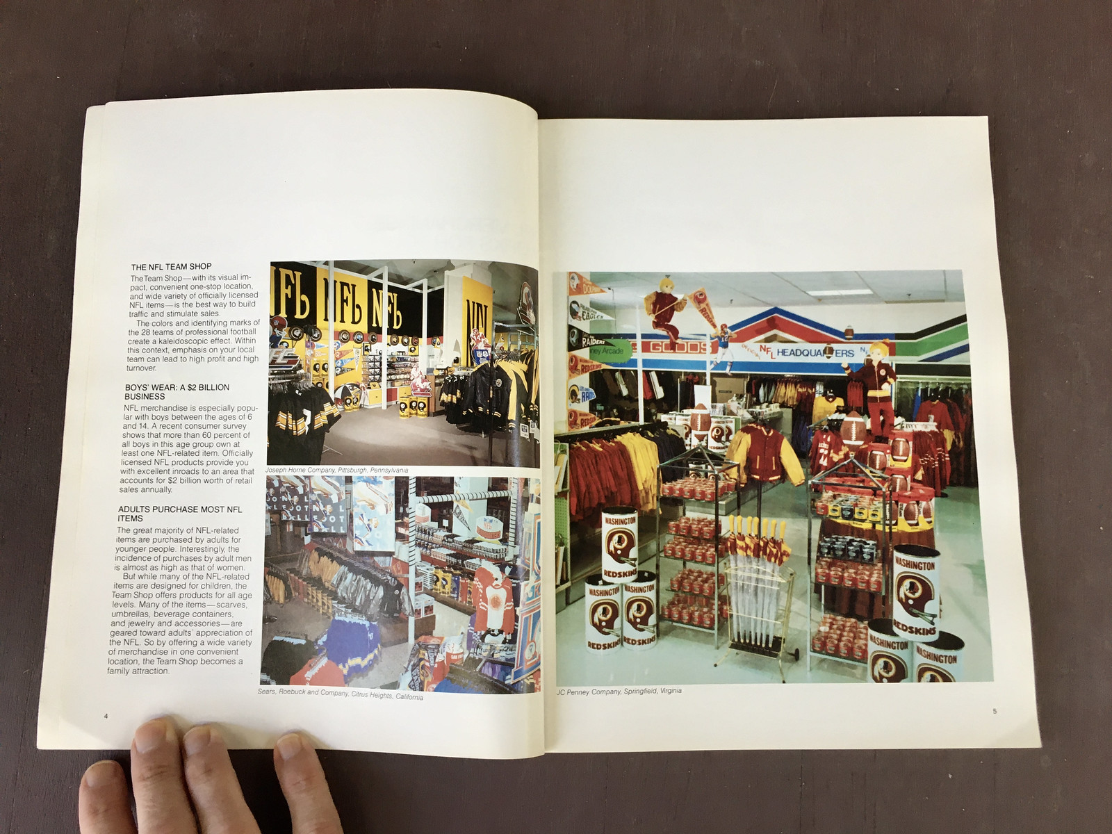
Now let’s start with the merch offerings, beginning with some kids’ apparel:

These mesh-backed hats look better than a lot of what passes for NFL headwear these days:

Love the striped sleeves on the Cardinals shirt at far right on this next spread:

Not fond of the name-tag chest patches, but aside from that I really like the color-blocked shirts on the right-hand page of this spread:

Sometimes I think they had a rule about at least half of the models having to be blonde:

Interesting tube socks on the left-hand page here — not just Northwestern-striped, but also an additional stripe right at the top:

Back in 2007, I met reader (and now-pal) Marty Hick at a Uni Watch party in St. Louis. He was wearing a Cardinals necktie just like the ones shown here:

Not sure which I like better — these kids’ track suits or pajamas:

You want round NFL belt buckles? Check. You say you prefer square belt buckles? Double-check:

It’s hard to think about winterwear in June, but here are some swell-looking gloves and mittens to keep your hands toasty warm:

Okay, now let’s shift to non-apparel items, starting with these excellent gym bags:

Check out the Bengals pennant on this next spread. It shows a helmet with “Bengals” lettering that’s pretty true to life, instead of the more cartoonish, exaggeratedly large lettering more typically used for Cincy graphics during this period:

Seems a little odd to have bobbleheads all wearing No. 0, no? But that’s what they chose to do:

Check out the lunchbox on this next spread. Great stuff, but surprising to see all the team helmets facing to the left! Also, those look like Pro Bowl illustrations along the sides of the box:

Take a look at the Cowboys mug at the bottom of the next spread. Is it just me, or is that an oddly shaped handle? Seems almost Vulcan-eared:

Whoa, check out that Saints wristwatch on this next spread. Definitely a watch style that didn’t catch on:

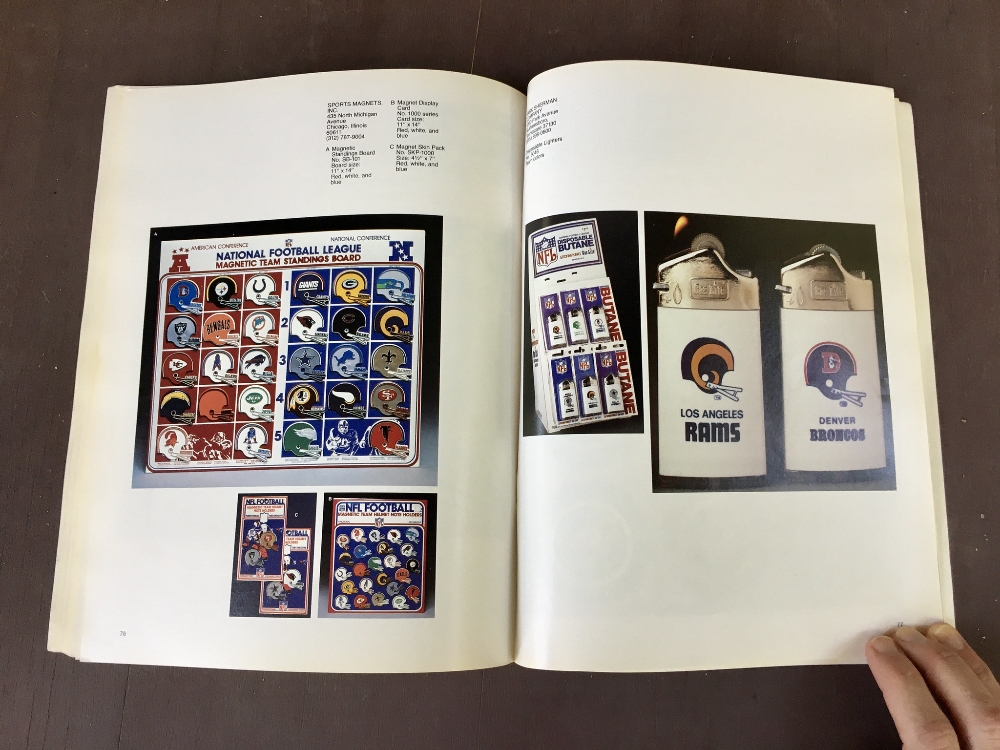
It’s pretty much a Uni Watch rule that if there’s any kind of standings board, we have to show it — or, in this case, show all three of them:


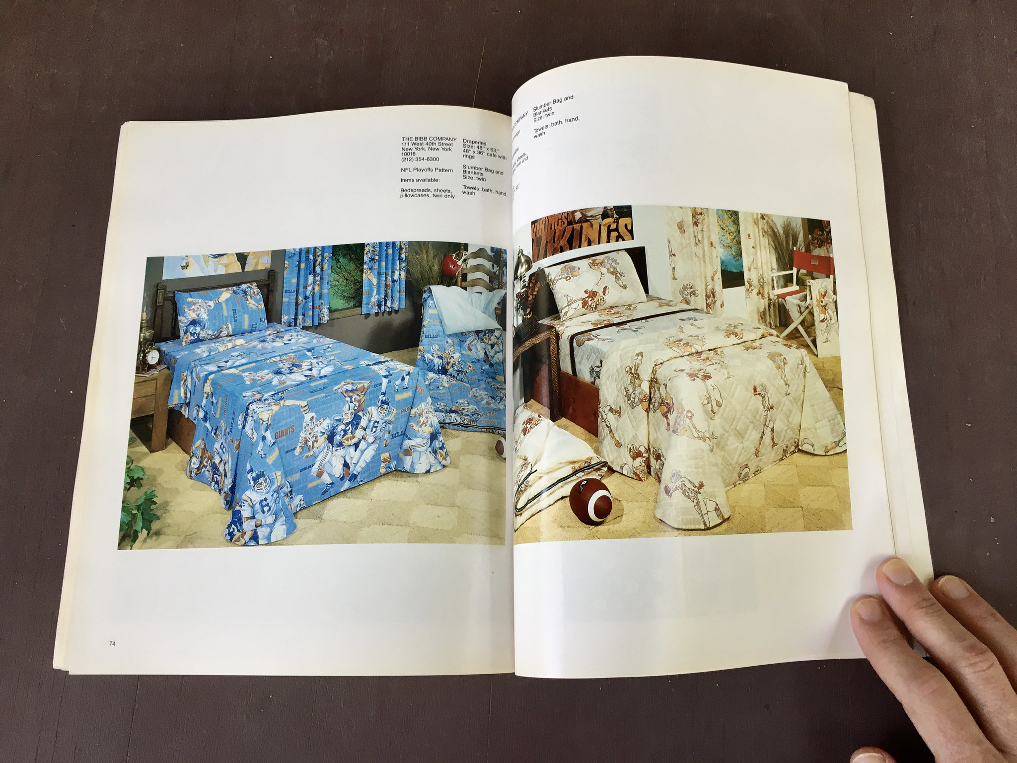
We’ve all seen NFL sheets, pillowcases, and so on. But I’m not sure I’ve ever seen the blue set shown on this next spread:
Also new to me: these NFL hairbrushes! Dig:

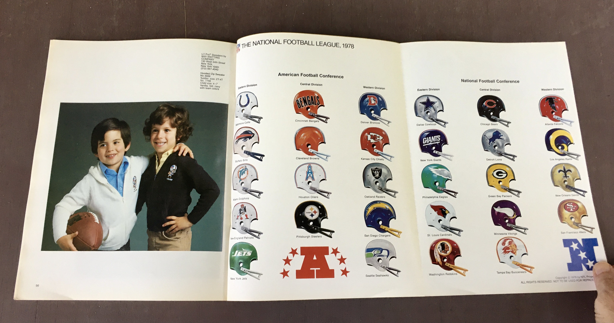
Next up is a section called “Li’l Pro” — a line of apparel and other merch with graphics depicting little kids dressed up as NFL players, sort of like little mascots. I don’t remember seeing these before, so I guess they didn’t catch on:


As usual, the catalog concludes with a fold-out showing all of the league’s then-current team helmets (this time including the Seahawks and Bucs, who didn’t yet exist during the years represented by the earlier catalogs we’ve looked at):
———
Want to see more? There are several pages I left out, but you can see the entire catalog here.
(My continued thanks to Kevin Cearfoss for sharing his catalog collection with me and allowing me to share it with you.)
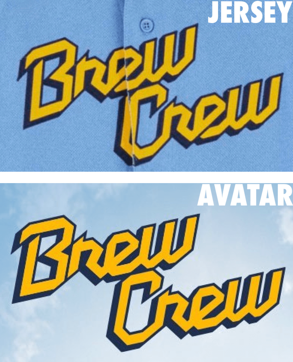
“Brew Crew” times two: Reader and lifelong Brewers fan Scott Ross Steffes has noticed something odd about the City Connect script that the team is currently using as its Twitter avatar. If you look at the diagonal stroke that connects the “r” to the “e,” you can see that the stroke on the jersey has a dark outline, while the one on the Twitter avatar does not.
This inconsistency extends to other realms. The script shown on the official CC T-shirt, for example, includes the outline, while a graphic that appears at the of the official CC unveiling video does not:
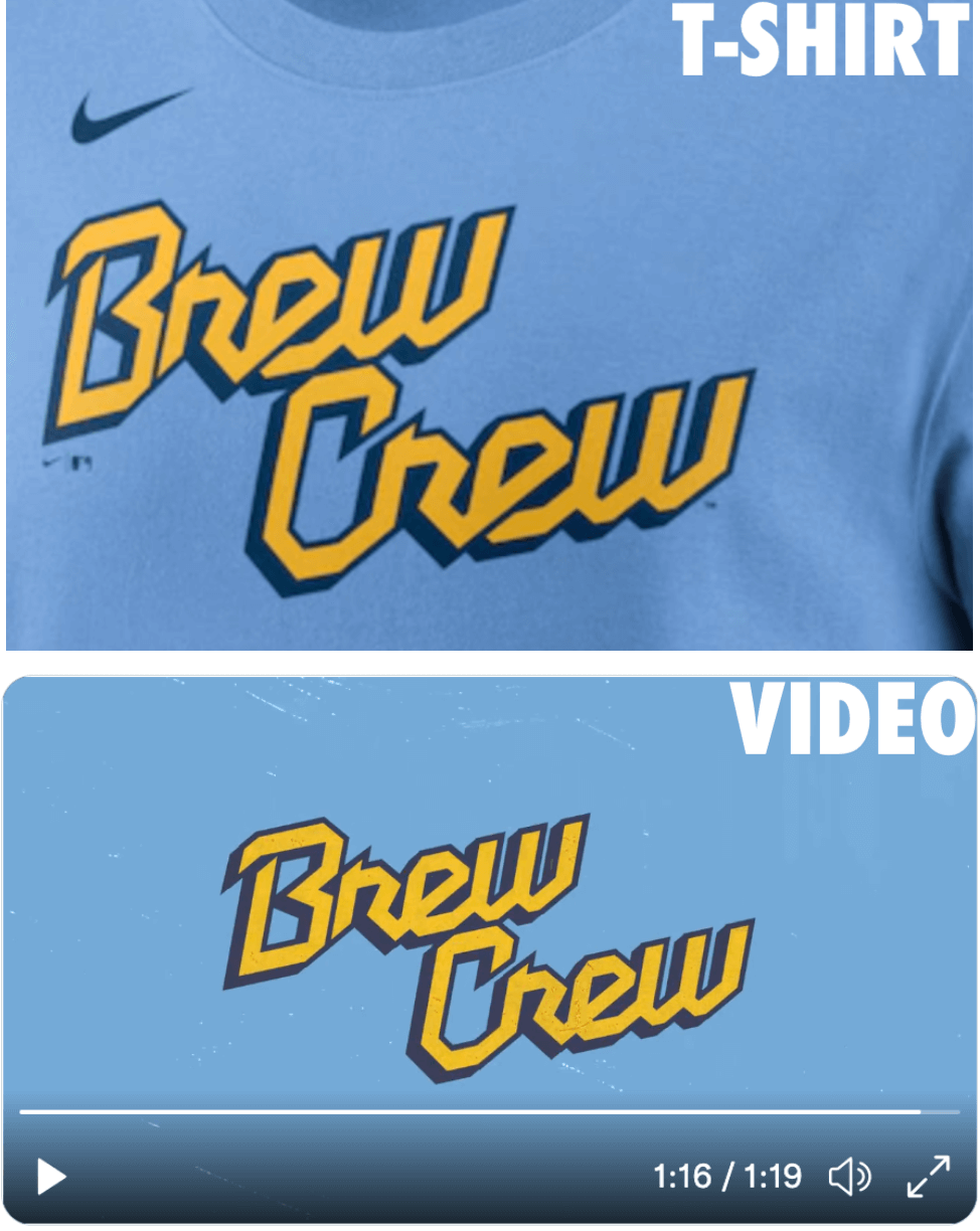
Is it a big deal that a social media avatar or video graphic doesn’t quite match the on-field script? Of course not. But the inconsistency is surprising, and may indicate that this design was a rush job.
If anyone spots any other versions of the script without the outline, feel free to let me know. Thanks.
It’s the little things: What’s going on in this photo? It’s from an Instagram account called MLB.mini, a meme project that shrinks MLB players so they’re only a few inches tall. The project been around for a while — ESPN wrote an article about it nearly a year and a half ago — but I don’t think we’ve ever mentioned it here on Uni Watch (or if we did, I’ve forgotten). It’s extremely entertaining!
Want to know more? The Athletic has a new article about MLB.mini here.
(Thanks to Anthony Nuccio for this one.)
Click to enlarge
Collector’s Corner
By Brinke Guthrie
Follow @brinkeguthrie
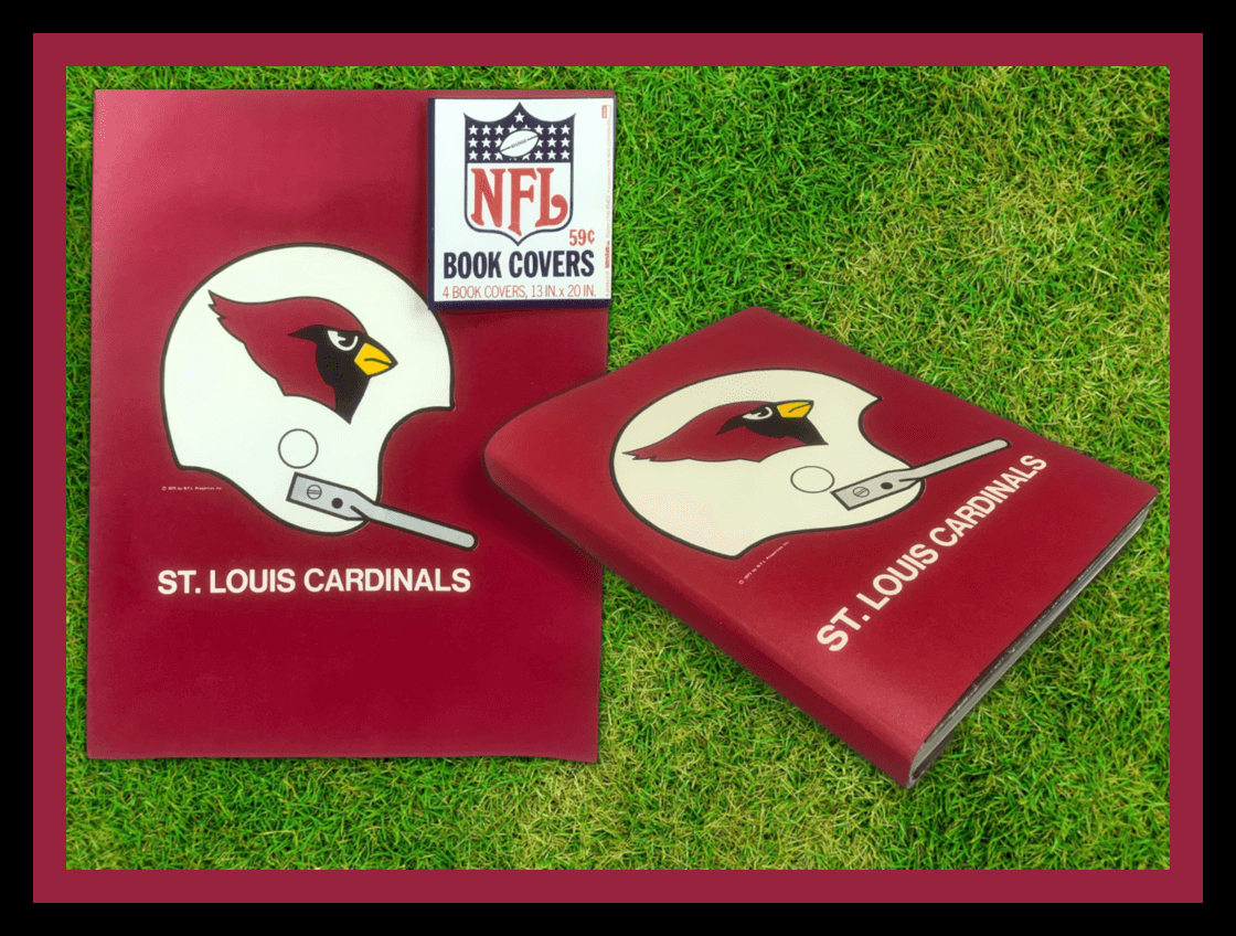
Remember these? There was a period in the early 1970s when NFL Properties cranked out a line of school supplies like notebooks, folders, and binders, all featuring the standard NFL helmet single-bar look, like these these St. Louis Cardinals book covers. You’d think these would be right up my alley, but I never bought them at the time, because I just made covers out of brown paper grocery bags.
Now for the rest of this week’s picks:
• Here’s a 1970s Pro Football Superstars poster book. You get a dozen of these with no team branding, including NFL stars like “Dallas Skipper” Roger Staubach, “Cool N’ Easy” Bob Griese (the artist even got the Cobra brand cleats right), and Earl Campbell (he’s a “Souper Back,” get it?).
• You really couldn’t beat the cover art on the 1970s NFL game programs called PRO! Here’s a set of four issues.
• Are you a Pittsburgh Steelers fan? A real fan? Then check out this 1970s display of 28 Steelers pencil sharpener gumball helmets, ready to go.
• Staying with the Steelers: I remember Legos from way back, but there’s a similar product called BRXLZ, and you can get an NFL stadium made of them. (Mucho assembly required!) Here’s one for Heinz Field. And I’m fairly sure if you step on one of these parts, it will hurt the same as a Lego!
• These Los Angeles Dodgers “highly absorbent wax bottom coasters” are from the late 1950s.
• And what do you use with drink coasters? Drink glasses, of course, like this pair of 1970s glasses commemorating Henry Aaron’s 715th home run.
• Here’s a NY Yankees jacket with a discreet logo on the front, the MLB patch on the sleeve and a large Yankees logo on the back. (Not sure of the era for this one. I pointed out to the seller that it’s not a 1950s item, due to the 1968 Jerry Dior MLB logo.)
• Look at this 1969 print ad for a Chiquita Banana NFL Radio. I have one of these radios sitting right here on my desk! A little static-y when you turn it on, then it still works great. (It sits next to this 1970 Panasonic radio.)
• Here’s a pair of great late-1960s Dave Boss NFL posters, including one called the “Evolution of the Uniform,” which was a General Tire promotion.
• The Golden State Warriors just won their 4th NBA title in the last eight years, so here we have a 1990s Logo Athletic jacket in their sharktooth motif.
The Ticker
By Alex Hider

Baseball News: Paul already showed 10 of the MLB Independence Day caps when they leaked last week. Now the full set has been officially unveiled (thanks to all who shared). … The Red Sox wore their City Connect uniforms last night, and may wear them a few other times this week. Sox manager Alex Cora joked that the team needed to “sell a few of them” (from Phil). … Speaking of, the Bosox changed their Facebook avatar to CC colors, leading lots of fans to mistakenly think the colors indicated a political cause (from our own Anthony Emerson). … Reader Gregg Girard has been tracking the Mets’ record by uniform and has found the team is 10-1 at home when wearing blue, 10-8 in pinstripes and 3-1 in black. He also notes that P Carlos Carassco has worn pinstripes for every start this year besides two Friday night games which are designated for black uniforms. … Staying in Queens, SS Francisco Lindor and 3B Eduardo Escobar have made a habit of messing with manager Buck Showalter’s uniform when he comes to the mound for a pitching change. … Jason Hillyer’s son’s travel baseball team went with the all-red, full bloodclot look on Sunday.

Football News: With the World Cup coming to Kansas City, the Chiefs’ stadium is slated to get $50 million in upgrades (from Brinke). … West Virginia will wear a one-off uniform when they travel to Pitt for the “Backyard Brawl” this year (thanks to all who shared). … Iowa State’s football facility includes a wall that has nearly every helmet design the Cyclones have ever worn (thanks to all who shared). … An Oregon blog had contributors “draft” the helmets the Ducks have worn throughout the years (from Phil). … Troy announced yesterday that they will once again add black helmets to the rotation this upcoming season (from Ben Whitehead and @TrojanWallF5).

Hockey News: As many of you know, the Dallas Stars defeated the Buffalo Sabres in the 1999 Stanley Cup Finals. But Addison Walton spotted this cap for sale on eBay that lists the matchup as between the Flyers and the Stars. Even weirder is that the Flyers didn’t even make it out of the first round of the playoffs that year.

Basketball News: PF Pete Nance is transferring from Northwestern to North Carolina and will wear No. 32 with his new team (from James Gilbert). … The Spurs will reportedly have a new uni advertiser next season, along with a new black alternate uni that will be unveiled soon — possibly today.

Soccer News: Scottish club Dundee United has updated its crest. This PDF goes into details about the changes that were made (from our own Jamie Rathjen). … Yesterday was a big day for club soccer uniform unveilings, and the next seven submissions were sent in by prolific Ticker-er Kary Klismet: New home uniforms for Dutch club Ajax. … Italian clubs Lazio (Serie A) and Ternana (Serie B) have unveiled new kits. … New home uniforms for 2. Bundesliga clubs FC Ingolstadt 04 and FC Heidenheim. … Staying in Germany, 3. Liga club FC Saarbrücken unveiled new home kits. … In Spain’s La Liga 2, C.D. Leganés has unveiled new third kits and S.D. Huesca has unveiled new home kits. … Swiss Super League club Servette FC unveiled new home and away jerseys. … Japanese club Kawasaki Frontale is celebrating the team’s 26th anniversary with their new kit. … New away jerseys for Portuguese club Porto. … Mexican club Necaxa has unveiled new home and away jerseys. … New home uniforms for English League Two club Bradford City. … New shirts for Austrian club SK Rapid (from Ed Żelaski). … More from Liga MX: Cruz Azul has a new crest design (from @metallidicz).

Grab Bag: With the cryptocurrency market in a major recession, reports indicate that crypto firms are backing away from sports uniform advertising. … A new school in North Carolina, Mint Hill Elementary School, has chosen “Manatees” as its team name thanks to an incoming student’s illustration (from Kary Klismet). … U.S. soldiers stationed in Japan can now wear a unique uniform patch combining the Japanese and American flags (from Timmy Donahue).
Click to enlarge

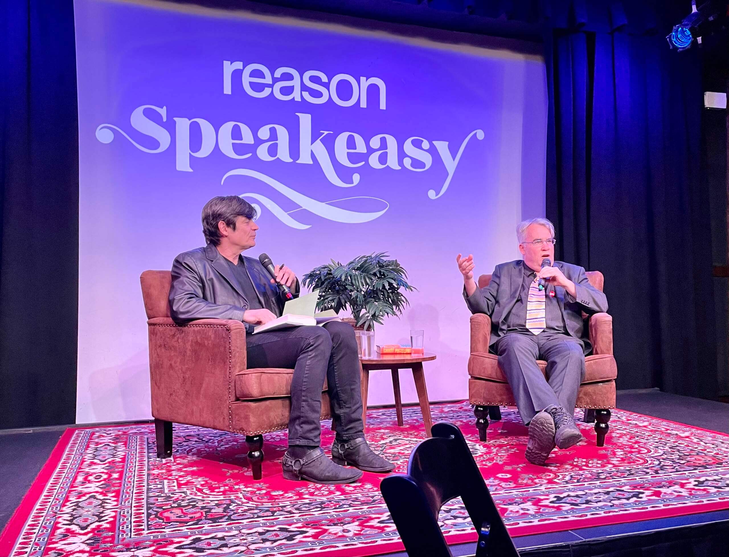
What Paul did last night: An old zine pal of mine, Brian Doherty (on the right in the photo above), has written a new book about the history of underground comics, called Dirty Pictures: How an Underground Network of Nerds, Feminists, Misfits, Geniuses, Bikers, Potheads, Printers, Intellectuals, and Art School Rebels Revolutionized Art and Invented Comix. He was in town last night to promote it and was interviewed for 90 minutes at a Manhattan club by Nick Gillespie, an editor at the libertarian magazine Reason.
I hadn’t seen Brian in many years, so it was a great to see him, and the interview was really interesting. (It will be published later this week as the next episode of this podcast.) Afterward, about a dozen of us went out for eats and drinks. A really good night. Hope your night was good too!
Hilarious that MLB used a fucked “U”p Cubs hat in their promotional pictures.
Honestly,
Between this and the Blue Jays thing. It’s pathetic and lazy. Do it right or don’t do it at all. (I’d prefer the latter option anyways.)
That’s a “U” for “Ursa.”
Comment of the day!
Is there a better example of MLB not getting it than the Toronto Blue Jays Independence Day cap? Wow.
Catching up on yesterday’s post too. Just wanted to say that post is a great example of how well Paul evaluates new uniforms. Not a simple, I like this or a I don’t like this. But rather an explanation of why various uniform elements are good or bad based on an understanding of what uniforms are supposed to be and do.
Thanks, Greg — appreciated.
I feel like you could make this comment every day, but it’s funny you specifically called out yesterday’s entry because I had the same thought while reading it. Example: I couldn’t articulate why “Brew Crew” on a uniform felt wrong. Then I read, “A nickname like Brew Crew loses a lot of its vernacular charm when you institutionalize it on a jersey.” Paul nailed it in a single sentence.
Aw — thanks, guys. Means a lot to hear that!
Thanks for the post and the walk down memory lane. I’m fortunate enough to have a bunch of that 1970’s NFL merchandise. Pre internet those catalogs were the only place to buy that stuff since there were no sports stores near me.
Yeah, it was either the Sears or Penney’s Christmas catalogs that came out around Labor Day, where you got your NFL gear. As a Vikings fan in upstate NY, it was tough to get Minnesota stuff, so we always waited for the Penney’s catalog, which our family preferred because they had a store fairly close by (as I recall, you didn’t pay shipping if it was shipped to the store, and it was always faster). Thanks for the trip down memory lane Paul.
Indeed. The obsession of my youth, those catalogues. And I still have the Bengals helmet, waste basket, belt buckle, stocking cap and bobblehead.
Ok, that manatee drawing for that elementary school is ADORABLE. Thanks for sharing!
Agreed!
So one version says “Bnew Cnew” and the other says “Bnow Cnow.” It looks like a 1980s metal band trying to look EXTREEEEEEEM! Can’t wait for the CC program to end and fade into bad memoryland.
Watching the Brewers game last night, it was staggering how many fans were wearing the new CC jersey. The program is not going anywhere, unfortunately.
The NFL mesh back hats in the merchandise catalog look great, but the Oilers version bothers me. Love ya red? Red was a complementary color for them, wasn’t it? That hat looks 115% better if it’s done in the gorgeous blue. Of course the catalog itself is 250% awesome.
The kerning (keming?) on the Colts logo on the cover image makes the word nearly unreadable.
Proofreading: The sentence before the T-shirt image in the Brewer’s CC section says “…at the of the…”
The Buccaneers helmet in the last picture is on the NFC page, but their helmet is on the AFC lunchbox!
Also, the AFC lunchbox has the helmets facing the typical direction – I assume so they can show the Steelers.
The lunchbox showing the Bucs in the AFC must be from 1976.
That’s the 1976 lunchbox. In 1976 the Buccaneers played in the AFC and the Seahawks played in the NFC; the NFL had those teams play an “expansion schedule” where over the course of 1976-1977 they played all 26 existing teams and played each other twice. So the NFC designated Buccaneers played in the AFC and the AFC designated Seahawks played in the NFC in 1976, then moved to their designated conference for 1977. Also these were the last 2 seasons of the 14-game schedule. Of course the Seahawks switched to the NFC in 2002 with the most recent realignment.
Is it me or do almost none of the NFL team wordmarks on the cover of the catalog not match the actual team wordmarks? Odd.
The mesh caps were branded as Super Stripe and were ubiquitous in the late 70s, early 80s. I believe they existed for multiple sports. Would be interesting to learn more about their history, but they were mainly merch and sideline caps.
link
Sorry for the wording…almost none of the wordmarks match the actual team wordmarks from that era.
None of those wordmarks match; tho the Pats come close.
Having had Sears bedsheets with the original team wordmarks on them, the front cover boggles my mind.
The Dolphins and Oilers are reasonable facsimiles.
Just noticed, the standings board shown with all teams, is the same one as in Collector’s Corner; looks like Cowboys/49ers graphic.
I had the blue NFL bedsheets and curtains and had the “Dallas Skipper” image on a t-shirt. Thanks for posting!
Nothing like waking up and seeing your NFL catalogs featured on UniWatch. A great day it shall be.
Kev
I was so hoping that radio was shaped like a banana.
What does it have to do with bananas?
Chiquita was a big sponsor of the league at the time- those stickers on the bananas, a yellow foam football, I loved those stickers!
For years, the NFL used #0 as a default for mascots, since it could not be worn on the field.
Why were some of the facemasks on the pennants yellow? Maybe it was the lighting in the pictures but the Cowboys looked like there was a yellow facemask.
Gorgeous catalog. Years ago I believe I sent in a ticker item/picture of a very early 90s NFL catalog that I have. The love for the early 90s aesthetic and nostalgia is similar to that for today’s catalog post. I remember combing through and wishing for so many of the items. Rarely, if ever, did I get to buy anything.
For the Flyers vs Stars SCF cap: I wonder if it’s really for the 1999-2000 season. The Flyers had a 3-1 series lead in the conference final but ended up losing to the Devils, who went on to beat the Stars in the Final.
Those 4th of July caps are just brutal.
I just love the NFL catalogs!! Such great memories.
I have always heard the 1976 catalog went to print before the Seahawks decided what to do with their helmet so the catalog shows nothing but plain silver helmets for the Seahawks. That sure would be interesting since I don’t think they ever wore plain silver helmets on the field.
Hopefully a 1976 catalog will turn up sometime!!!
Loving all the 1970s catalog photos. I was hoping to see some pajamas similar to what I wore circa 1979. They were Minnesota Vikings and made of the scratchiest material known to mankind. When I outgrew them I’m sure my dad repurposed them in his wood shop.
My guess is that they made the logo without the line on the E for print materials and approved it, but when put onto a jersey the gap where they button together made it too difficult to read without the extra emphasis on the E and thus they had to fix it after everything else was already in production
Were the wordmarks on the catalog some special Wordmark set used by the NFL? I took a brief look at trying to find that Colts wordmark anywhere, and couldn’t find it.