Click to enlarge
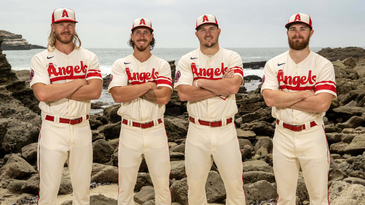
The Angels unveiled their City Connect uniform yesterday. The design had already leaked about 10 days earlier, so yesterday’s reveal didn’t offer much in terms of surprises, but it gave us some closer looks at the design, which is supposed to be based on surf culture, fun in the sun, and so on.
In theory, I like the idea of the Angels (or Dodgers, for that matter) having a casual, beach-inspired alternate uniform. In practice, though, I don’t much care for this one. Here’s why:
1. The chest script is so close to being really good — very Hanna-Barbera, and I mean that as a compliment. But I hate the way the “g” gets subsumed into the underscore:
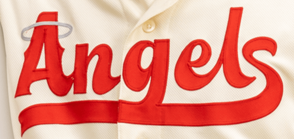
If you didn’t know better, you might think it said, “Anaels.” Why couldn’t they have had the descender of the “g” loop back up, or have it outlined in white? A foolish mistake.
2. The striping on the left sleeve feels more football-y (like Northwestern striping with the bottom line missing) than baseball-y. Yes, there’s a cringe-inducing “storytelling” explanation for it, but whatever — it either works visually or it doesn’t, and it definitely doesn’t work for me.
3. Even worse, the striping appears on only one sleeve, throwing the jersey’s symmetry out of whack. (I realize this is like the old joke where one person says, “The food at this restaurant is lousy” and the next person says, “Yes, and such small portions!” But in this case, even though the striping looks out of place on a baseball uni, I’d still rather see it on both sleeves. Or, better yet, neither sleeve.)
4. The “A” on the cap doesn’t match the goofy playfulness of the “A” on the chest insignia. Here’s a comparison — jersey on the left, cap on the right:
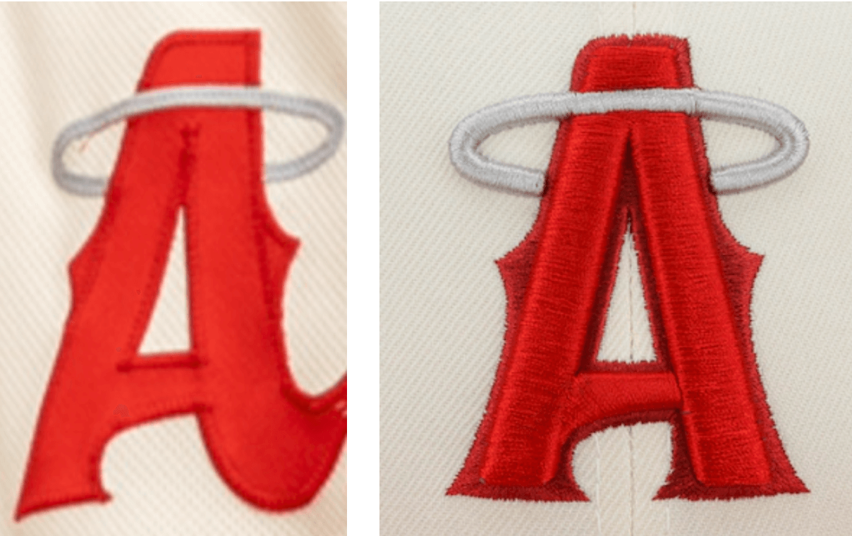
I wish the cap logo looked a bit more like the jersey logo.
As for the other details — the numbers, the sleeve patch, etc. — I can take or leave them.
A few other notes:
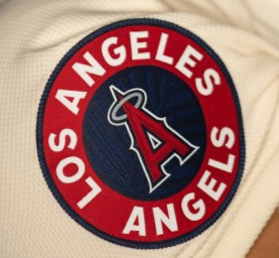
• Speaking of the sleeve patch (shown at right), Twitter-er @SDubs35 says this marks the first time the Angels have used the words “Los Angeles” on their uniforms since reclaiming L.A. as their hometown in 2005.
• Up until now, almost all of the CC uniforms have featured non-white jerseys — often with matching pants, creating a mono-colored look — so the Halos are bucking the trend a bit here by going with a traditional white jersey. (Okay, so it’s actually cream, but you get the idea.)
• I’m mildly surprised that none of the CC uniforms have featured pullover jerseys. I thought MLB and Nike might use the CC program to experiment a bit with that format, but that hasn’t been the case.
• This uniform will make its on-field debut this Saturday, June 11.
• The Brewers are now in the CC on-deck circle. Their design is slated to make its on-field debut on June 24, so the unveiling will presumably be four or five days prior to that. (As you may recall, the cap apparently leaked about a month ago.)
Click to enlarge
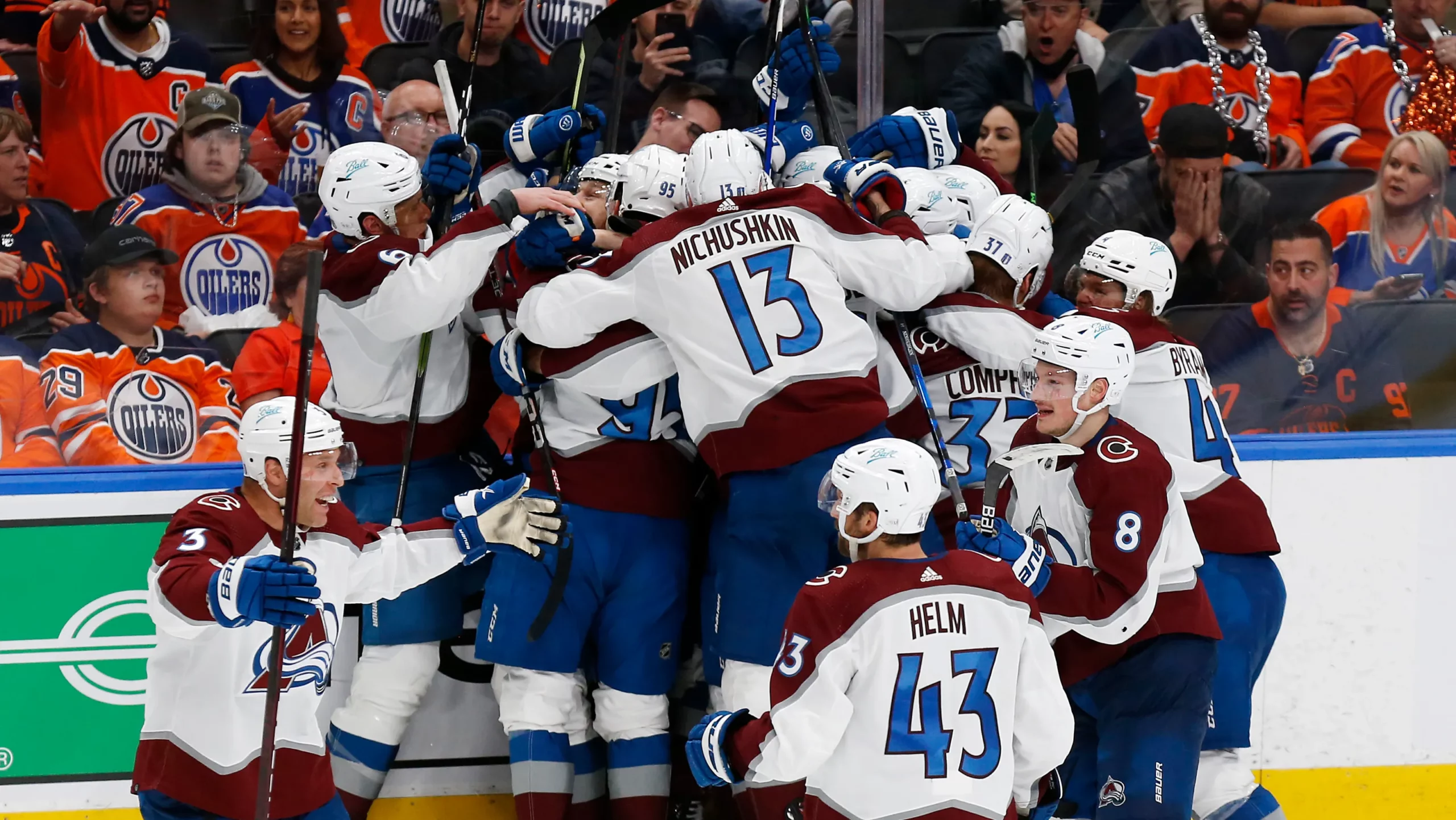
One down, one to go: The Avalanche punched their ticket to the Stanley Cup Final(s) last night. If the Rangers take care of business and also advance, we’d be treated to a major rarity: a championship round featuring two teams with vertically arched NOBs.
The last Cup champion to go vertically arched was Detroit in 2008. And the last time both teams in the final round went that route was — uh, I’m not sure that’s ever happened before! Definitely a good reason to root for the Rangers.
Meanwhile, now that the Avs have advanced, we’ve also gotten our first look at how the new Final(s) logo will look as a jersey patch.
Click to enlarge
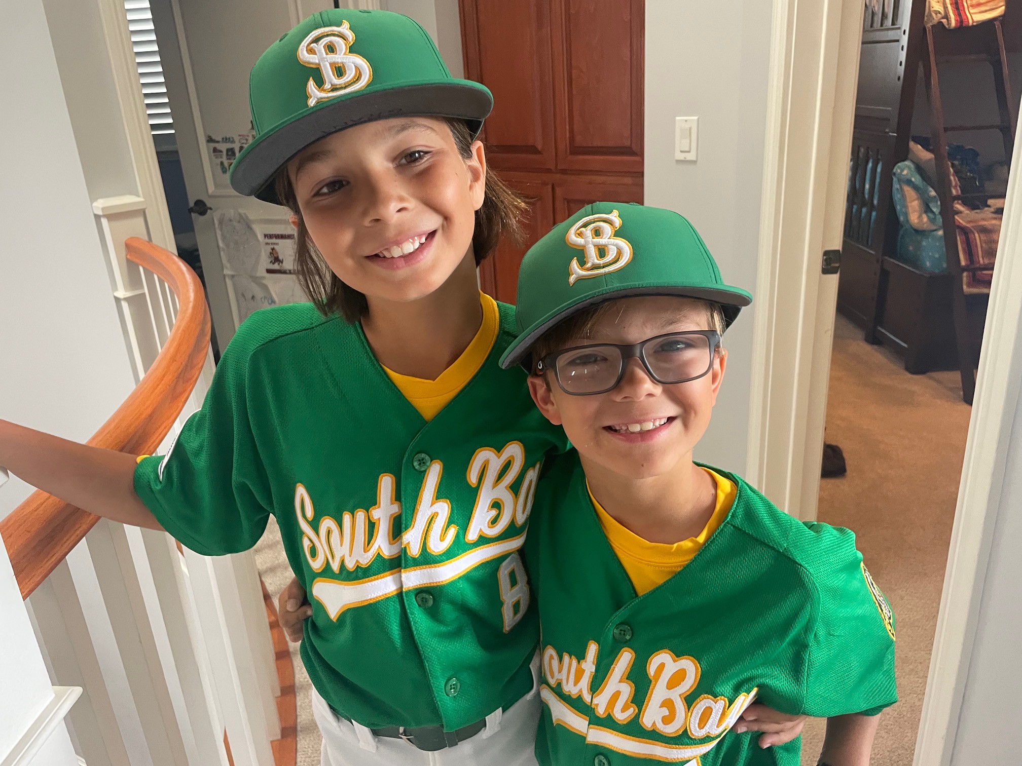
Start ’em young: Got a note the other day from reader Brent Horstman, as follows:
Just wanted to say thank you for all the years of great writing, as well as some of the inspiration for my kids’ South Bay PONY all-star uniforms. Our league’s colors are green and gold (a combo I know you like) to match Mira Costa High School, whose fields we play on.
As our league’s all-star director, I have a hand in designing our uniforms, so I went back and read several old Uni Watch articles on the Oakland A’s for some of the inspiration.
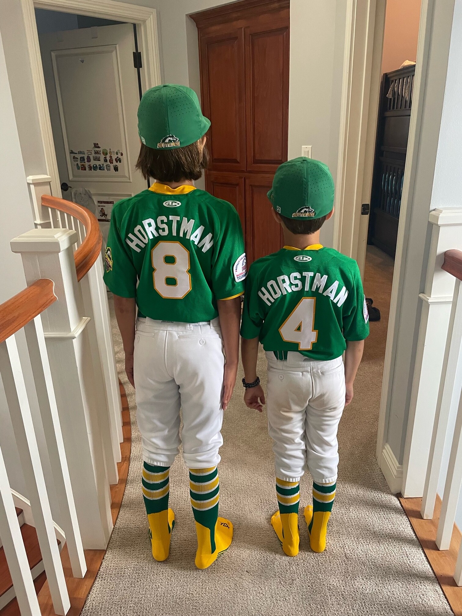
Last year we went with a gold jersey, and this year I pushed the limits with a Kelly green look, complete with tackle twill letters and numbers. (We also produced fan gear, which sold surprisingly well.)
Nice! Here’s how those uniforms look from the back:
Click to enlarge
Collector’s Corner
By Brinke Guthrie
Follow @brinkeguthrie
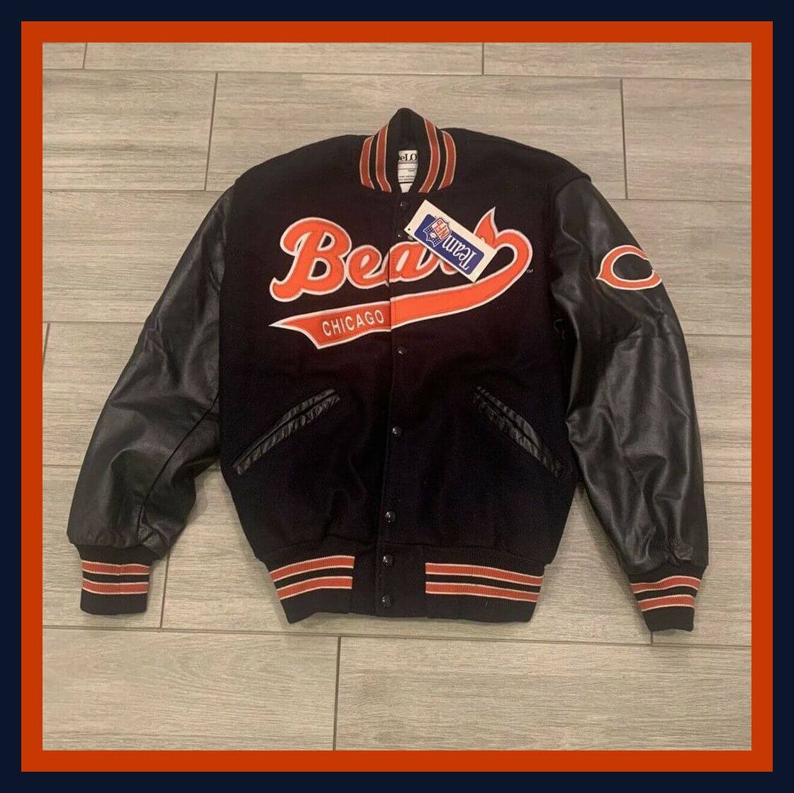
Reader Todd C. submitted this week’s showcase item, noting, “I know how you love DeLong and this one is a beauty.” Well, he’s right about that — this Chicago Bears varsity jacket is indeed a beauty. New with tags!
Now for the rest of this week’s picks:
• This 1935 Big League Baseball Game is played — get this — with tiddlywinks!
• Here’s a pair of World Champions patches for the 1969 Amazin’ Mets. These include the names of Tom Seaver, Tommy Agee, Art Shamsky, and Jerry Koosman.
• You may recall last week we included an eBay listing for a rather deranged-looking 1960s Baltimore Orioles bumper sticker. There’s no quit in that guy — he’s back again, this time on a 1960s shirt.
• This is a really nice-looking CBS Sports Radio/NFL cap. Navy with a red bill, embroidered logos, and adjustable strap.
• This 1971 Keds Allsports Poster Book of Champions includes six full-color posters of stars like Johnny Unitas, Pete Maravich, Tom Seaver, Johnny Bench, Bobby Hull, and Willis Reed.
• Hall of Fame pitcher Rollie Fingers is sporting the Milwaukee Brewers’ powder blues for this 14″ tall hand-knit plush doll.
• Richard (Popcorn) Wylie recorded this 1973 single, titled “Move Over Babe, Here Comes Henry,” in honor of Henry Aaron’s pursuit of the MLB home run record. (If you want to know what it sounds like, you can listen to it here.)
• The Golden State Warriors are in Boston tomorrow night for Game Three of the NBA Finals, so we’ll do one item for each team: Here we have a 1990s Warriors cap in the Logo Athletic “Sharktooth” design, and also a 1960s Bob Cousy Pro 14 basketball shoes plastic bag.
• Rafael Nadal won his 14th French Open title two days ago, an achievement of mind-boggling proportions. Here’s an autographed Nadal cap with his Nike “bull” logo and a letter of authenticity.
The Ticker
By Alex Hider

Baseball News: The Tigers have two pitchers on their roster with the last name Rodriguez: Eduardo and Elvin. Eduardo has been wearing a traditional NOB. Elvin is now wearing El. Rodriguez after starting the season with just FIOB (from Joanna Zwiep). … Paul has written about this before, but on Saturday, Dodgers broadcaster and former P Orel Hershiser spoke at length about MLB’s decision to switch from green to light-grey undervisors in the 1990s. During the game, Hershiser noted that he used to color his undervisor black with a sharpie because he preferred a dark color (from Michael Baker). … Here’s a look you don’t see every day: biker shorts, tights, and stirrups! That’s Columbia SS Andy Blake in a NCAA tournament game from last weekend (from Kevin Kurz). … UCLA has a street map of Los Angeles sublimated into the numbers on both their baseball and softball jerseys (from James Gilbert). … Both Texas and Oklahoma have been inconsistent with their College World Series sleeve patch placement. Some players are wearing the patch on their left sleeve, others are wearing it on their right (from John Muir and Kevin Clark). … Also from John: Hofstra is using inconsistent batting helmet logos. … Southern Mississippi wore white during the NCAA Tournament despite being designated the road team (from Chris Mycoskie). … The Kia Tigers of the Korean KBO League will wear jerseys made out of recycled PET plastic material for an upcoming series (from Jeremy Brahm). … Also from Jeremy: The World Baseball Softball Confederation has unveiled the mascot for the upcoming U12 Baseball World Cup — “Dorky.” … UConn P Justin Willis wore a 2021 cap last night (good spot by Timmy Donahue).

Pro Football News: The Commies will release their revamped team fight song on Aug. 13 (from Tom Turner). … A man was recently interviewed on a local Charlotte TV news segment while wearing an XFL cap (from Lake Koelling). … Cowboys RB Ezekiel Elliott is one of several NFL players wearing Riddell’s new Axiom helmet model during OTAs (from Brinke).
College Football News: Illinois has a new turf design for the upcoming season (from @mrmichael21 and Kary Klismet). … Here’s a look at USC’s helmet history (from Phil and Kary Klismet). … It’s not often you see a football field with yard markers in anything but white. But at Genesee Community College, the school is outfitting its new FieldTurf with black football markings. That’s because the field will primarily be used for soccer/lacrosse, though school officials wanted to leave the option open to host local high school games. The final version of the field will feature the school’s mascot, a cougar, at midfield (from Joseph A. Bailey).

Hockey News: Wayne Gretzky’s sweater from the 1988 Stanley Cup Final — the last sweater he wore as an Oiler — recently sold at auction for $1.452 million, the highest price ever for a hockey jersey (from Andreas Papadopoulos). … New logo for Chicoutimi Sagueneens of the QMJHL (from Rob Altman).

Basketball News: The NBA has sold advertising on tweets showcasing players’ pre- and post-game outfits (from Paul Panganiban). … Rapper J. Cole is giving pro basketball a shot by playing with the minor league Scarborough Shooting Stars of the Canadian Elite Basketball League. The Shooting Stars played their home opener Sunday, and fellow rapper Drake was in attendance, wearing J. Cole’s jersey (from Bob Martin). … New court design for San Jose State (from Ethan Kassel).

Soccer News: The first four items are from our own Jamie Rathjen: Two U.S.-based teams used uniforms to spread awareness about gun violence in America over the past weekend: USMNT players wore orange armbands, and Washington Spirit of NWSL wore warm-up shirts in support of the Brady Center, a gun control advocacy group. … Gotham FC of the NWSL wore rainbow numbers for Pride Month on Saturday. … Tottenham’s women’s team will soon begin playing most of their home games at Leyton Orient’s Brisbane Road Stadium. … Speaking of Tottenham, here’s their new first shirt. … Japanese club Nagoya Grampus has unveiled a fauxback uniform that honors the 1995 team that won the Emperor’s Cup (from Jeremy Brahm). … Bristol City of the English Championship have unveiled new goalkeeper jerseys for the upcoming season (from Kary Klismet). … New away kit for Spanish side Athletic (from Ed Zelaski).

Grab Bag: Uni Watch lacrosse correspondent Jared Buccola notes that Whipsnakes (all green) and Cannons (all white) debuted new uni combos in Week 1 of the Premier Lacrosse League. He also notes that on all uniforms, both the Champion maker’s mark and the PLL logo are plastic patches. … Wolfie Browender sends along a couple of license plate-based submissions: California is testing out vinyl decal license plates as a potential replacement for traditional metal plates. License plate fanatics should also check out this database that has photos of plates from around the world. “A great way to get lost for a few hours,” Wolfie says. … The Big Ten is holding its annual 10K race next month in Chicago. As the conference has done in years past, registered runners receive a T-shirt in the colors of their school of choice (from Kenneth Traisman). … Indian River State College in Florida has a new mascot logo (from Michael Jaworski). … The Space Force has issued clarifications on its lipstick and nail polish regulations (from Timmy Donahue). … The Army has published a press release on its website that recaps all the changes it has made to uniforms in recent years to better accommodate female soldiers (from Kenn Tomasch). … The Mid Mountains Netball Club, a youth program in New South Wales, Australia, has unveiled new uniforms designed to recognize indigenous people (from Kary Klismet). … Also from Kary: New marching band uniforms for Pierce County High School (Georgia).
Our latest raffle winner is Bud Parks, who’s won himself a Uni Watch membership card. Congrats to him, and thanks again to birthday boy Jamie Rathjen for sponsoring this one. — Paul
New away kit for Spanish side Athletic
It should be “Athletic Club” (often referred to as “Athletic Bilbao”.
I grew up surfing in Orange County, and nothing about this Angels uniform reminds me of that. These background stories are stupid.
Just curious, what would remind you of Orange County?
Front of the jersey that says “It took me three hours to drive cross-county.”
Picture of Richard Nixon on the cap?
I love vertical arched NOBs but there’s never a reason to root for the Rangers ;)
+1,000,000
there’s never a reason to root for the Rangers
This ^
Do you consider the Avs’ unis to be a shade of purple?
Hmm. I never really thought about it that way. I know they call that shade “burgundy” (which I don’t consider a shade of purple, though I suppose one could argue it’s in the purple *family*), but it does lean a tad more towards indigo, IMO.
If one’s opinion is that purple does in fact link then I guess the Avs would possibly fall into one of those shades.
So…tl;dr: no, I don’t consider it a shade of purple, but some might
FWIW: We do not consider it purple for membership card purposes.
I know you’re not asking me, but I consider the Avelanches unis to be a shade of red.
Lee
Also not the guy you asked, but the Pantone is 209C and the best description I’ve found is “a medium dark shade of pink”
link
Crayola called it brick red.
Except when you live in St. Louis and they’re playing against a Kroenke team.
Have you ever considered including polls with your posts on uniform unveilings? It might be interesting to gauge readers on whether or not they agree with your takes (not that your uniform opinions are meant to be a democratic vote or anything…just an interesting thought).
Polls suck. No nuance, no thought, no explanation. If people agree or disagree with me, they can post a comment and explain why. Much better.
I’ll be the first to say it: The Angels’ CC uniforms are better than their day-in-day-out uniforms.
The descender of the “g” is defined by the edge of the placket. I didn’t have a problem with it.
Overall, I despise the concept of City Connect, as it forces yet another freaking uniform on us. But I don’t hate the Angels’ unis as much as most as they look kind of plausible. I have a solution for the chest wordmark… let the tail of the S end when it hits the G and let the G fly from there. So much better.
I don’t totally hate the Angels looks, but it’s not great. Really what I don’t understand is the PCL angels had so many weird looks that Nike couldn’t draw from the history,
link
This is just a few and that’s not to mention the Hollywood Stars looks that frankly the Dodgers should draw from.
As a Mets fan I will say this again. I don’t love the Black jersey like most of us here but if they will be our City Connect jersey I will take them without question.
“very Hanna-Barbera” – perfect analogy.
Paul,
It looks as if Chris Heck from the 76ers is resigning. Maybe we’ll get to see this Iverson-era unis after all!
link
The other day we saw “City Connect” for a team with a state name and now “City Connect” for a team that refuses to acknowledge its city at all.
I’ve always wondered what the actual marketing research shows them on the benefits of being called Los Angeles vs Anaheim. I cannot imagine locally people in the region would say “nah I’m going to be a Dodgers fan because they are called Los Angeles.” Nor do I think nationally it would make a difference to a perspective fan whether they were called Anaheim or LA.
It matters in China.
Lee
Perhaps it’s the size of Los Angeles that makes me think it warrants being a two-team city. And the fact the Rams played in their building creates a precedent of LA-branded teams in Anaheim. Forgive me for appearing to slag Anaheim (or Southern California) but branding the Angels as “Los Angeles” not only makes tautological sense, it increases the value of the franchise. My own choice would be “California Angels”, but all solutions are imperfect.
I’ve always thought that given there are a whopping five MLB teams in California, any one of them claiming the state as their location identifier just shouldn’t be done.
Yeah, I fully understand that going by Los Angeles instead of Anaheim ties them more to this big market. I am just curious if that has actual tangible financial gain for them. I guess it must.
I just think locally they aren’t going to get better TV deals by being branded as LA vs Anaheim, are they? The benefit of being in the big market is physically being there and having access to that large market for local ads, etc. So I wonder if being branded LA actually gets them more local revenue.
And nationally, I’d be curious if them being known as LA vs Anaheim garners them more fans? In the NFL for example, you have plenty of smaller market teams that have some of the largest national followings (Green Bay, Pittsburgh). I tend to think developing a non-local following has far more to do with your success, compared to the name of your local market. Did the Rams gain non local fans by moving from St Louis back to LA?
This is probably the best city connect because it actually feels like an MLB uniform. Agree they could have done better on the g in the wordmark, Ron’s solution above makes the most sense.
Aside from the unnecessary roundel logo on the right sleeve I think I like all of it. Even the odd stripes on the left sleeve sort of work for me, which is weird because I usually HATE asymmetrical uni designs. Perhaps because they are so large, they feel less like stripes that should be on both sleeves, and more like a specific stand alone feature.
It definitely gives off the southern California beach vibe of the 50s and 60s (at least as I have seen Hollywood portray it).
For the uniform reveal photo, the Angels had players pose with their arms crossed, obscuring the front of the jersey (including the diamond-shaped number box). Makes no sense.
As an added bonus, now you read Elvin Rodriguez name as El Rodriguez. As in “The” Rodriguez.
Have we seen the Axiom model with any other face mask than the one Zeke is wearing?
It’s going to be so weird seeing players with very little visible mask (ala Axiom) mixed in with today’s standard masks. Teams with masks matching the helmet won’t be jarring, but I think it might be on the others. Those Axioms cut face mask real estate more than half.
As of now, the Axioms look weird to me, but I’m sure that won’t last. I never thought I would have seen the day that I thought Brady looked weird wearing the old Riddell. I even own my own Revo Speed. Thrift store. $2.50.
Paul,
The Army uniforms changes page in the Grab Bag doesn’t seem to open.
Try this:
link
Something you didn’t mention is if the Lighting win, it’d be singular team name vs singular team name. No “S” at the end of either of these names!
“This is probably the best city connect because it actually feels like an MLB uniform.”
I was just about to say the same thing. I’m still trying to decide whether I like the Angels’ City Connect uniforms generally or only in a relative sense as compared to the other CC uniforms. I seem to grade them on a generous curve that’s largely based on the principle of “Well, it could have been worse, and at least it’s not as bad as THAT one.”
Get rid of sleeve line, Halos on the front chest, small a with halo on front of hat, and 0ut the number in a surf board logo on the bottom front
Not saying everyone willl like it but it fixes this jersey
Angels uniform is not bad. Though not a fan of having really thick striping on one sleeve and then no striping on the other sleeve. Off balanced.
“New logo for Chicoutimi Sagueneens of the QMJHL”
Sags logo was in need of a refresh and this will do the job without compromising the integrity of the classic logo and look. Wasn’t expecting a new logo from them but cool.
If any team in the Q needs a new logo for sure it is the Shawinigan Cataractes. Would like to see that team embrace their retro logo and go back to blue and green.
I am of the thought that the City Connect program is for people who don’t actually like baseball uniforms. So how am I to judge?
Take away all the other CC uniforms, and this Angels one would be among the worst MLB uniforms out there.
As with any college uniform, as well as NBA, City Connect is just another program for me to basically ignore. They do not bring me joy.
Lee
I was watching a cubs game on MLBN this past weekend & was shocked at how many fans were wearing wigleyville merch.
I am always shocked at how many people wear jerseys in general. No one likes baseball/sports more than I do, but the notion of spending $200+ on jerseys strikes me weird. I mean maybe one or two ever few years? Some people though buy every new one that comes out!
I know its just personal preferences & priorities, but who has that sort of money for a fancy t-shirt.
Anyways…
Lee
As far as I know, the only teams in the NHL to have had vertically-arched NOBs on their primary uniforms are the Red Wings (since 1982), Rangers (since 1990), Avalanche (since 1995), and Sharks (1998-2007). As a result, there haven’t been many VA vs. VA playoff matchups, and they’ve all been in the Western Conference to date. (The Wings moved to the Eastern Conference in 2013-14, but have not met the Rangers in the Playoffs since the 1950 Finals.)
By my count, there have been 10 VA vs. VA matchups, occurring in 8 playoff years (the Red Wings took on the winner of a Sharks-Avs series twice).
1996 CF – COL 4, DET 2 – Avs go on to win the Cup
1997 CF – DET 4, COL 2 – Wings go on to win the Cup
1999 CQF – COL 4, SJ 2
1999 CSF – COL 4, DET 2 – Avs lose CF to Stars
2000 CSF – COL 4, DET 1 – Avs lose CF to Stars
2002 CSF – COL 4, SJ 3
2002 CF – DET 4, COL 3 – Wings go on to win the Cup
2004 CSF – SJ 4, COL 2 – Sharks lose CF to Flames
2007 CSF – DET 4, SJ 2 – Womgs lose CF to Ducks
2008 CQF – DET 4, COL 2 – Wings go on to win the Cup
*2007 – Wings, not WOMGS! Bad typo…
I still call them Womgs. :P
Well, I managed to forget two teams that had VA NOBs at one time, and both in the Eastern Conference – the Lightning (1995-2001) and the Panthers (1998-2006)!
But, they only qualified for the Playoffs once each during those time frames, going out in the first round, and did not face each other or the Rangers – the Lightning lost to the Flyers in 1996, and the Panthers were swept by the Devils in 2000.
All right, last one for today: After going through the Unofficial NHL Uniform Database, I’m confident I’ve accounted for all of the normal vertically-arched teams. But, after that review, there are three footnotes I think are worth mentioning:
The Capitals’ black alternate uniform from 1997-2000 had bottom arched NOBs with a straight top, creating a “bridge” effect. They only wore them as their road uni (back in the days of white at home) in a playoff series once, in 2000, when they lost to the Penguins in the first round. When they replaced their blue jerseys with the black ones the following season, they used regular straight NOBs.
Then there’s the original Edge unis of the Dallas Stars, which used a vertically-arched DALLAS on the *front* of the jersey. They only qualified for the Playoffs once in this set, in 2008, losing to the Red Wings in the 2008 Conference Finals, marking the only VAPNOB vs. VACNOF matchup in NHL history to date.
Finally, there’s the infamous red Atlanta Thrashers alternate which had “THRASHERS” vertically-arched on the front, but those only lasted from 2008-2011, and their only playoff appearance before their relocation to Winnipeg was against the Rangers in 2007.
Whenever I see a cream uniform (Oklahoma football throwbacks, Angels CC), I think the Cleveland Browns should swap white for cream. Would be so natural (no pun intended) with the brown, in my opinion.
If they had done it from the beginning perhaps… but now – IMO – their all whites are so perfect. Anytime they wear something else, I can help but be a tad disappointed (even though I don’t hate all their other options).
Lee
Agreed.
The hat on these CC uniforms always seems like an after thought.
Which is weird, because they sell plenty of baseball hats too. So with the goal of the program being moving merchandise, you’d think they’d want a good cap to go with it. Personally I’d be more willing to buy a cap than a jersey, and not just because of the price point.
“Uni Watch lacrosse correspondent”- I hope to someday earn a title for myself. My current beat of the Great Lakes shipping industry isn’t very uni-rich.
I don’t mind this Angels CC uni so much. It has a bit of an endearing what-if quality to it, looking like a re-design that the Angels could have come up with at any point. It’s different, but the team is recognizable.
It’s important that it just doesn’t mess either with the color scheme the team actually wears, or with baseball tradition of wearing white(ish) as the home uniform’s background color. I wish more of these
merch money grabsuniforms actually respected these simple things.Why are either of the things you mentioned important?
Alternate jerseys are rarely white and are often worn at home. Are CC jerseys not another form of alternate?
I think having some visual consistency is a desirable quality in team uniforms. A contrast would be the recent example of the Rockies suddenly taking the field all in green.
How do you feel about this? Does visual consistency in a team’s uniform sets matter?
Did anyone else notice that the first listed songwriter for the “Move Over Babe” song was Ernie Harwell?
The other songwwriter, Bill Slayback, was a pitcher for the Tigers at the time the song was written.
Love the Angels CC. Will search out this game on Saturday just to see ’em. Best of the CC bunch so far IMO.
Rollie Fingers! Surprised it was still available…now where to put him…
Well, Joe Maddon doesn’t get to wear his new City Connect Angels Uni…
He would have worn a jacket/warmup over it anyway.
He might have left the jersey visible — he didn’t hide the jersey when the Cubs wore Negro League throwbacks a few years ago.
Regarding the descender on the “g”:
If you didn’t know better, you might think it said, “Anaels.”
“Anael” is an link so it sort of works even if you misread it.
Lukewarm at best with any of the CC unis. But can the Tigers please nod towards Motown instead of the auto industry when their time comes? Hitsville USA would be a no brainer!