For all photos, click to enlarge
Good morning and happy Cinco de Mayo!
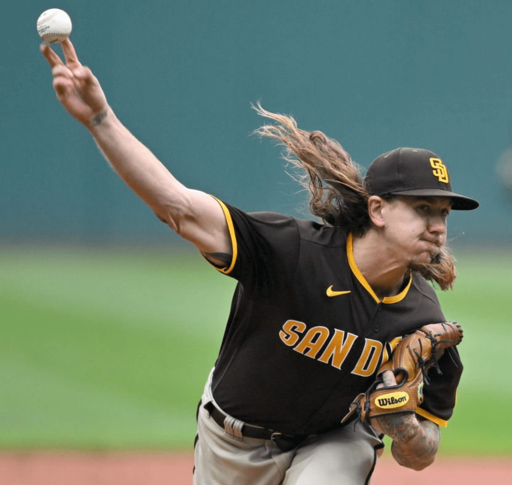
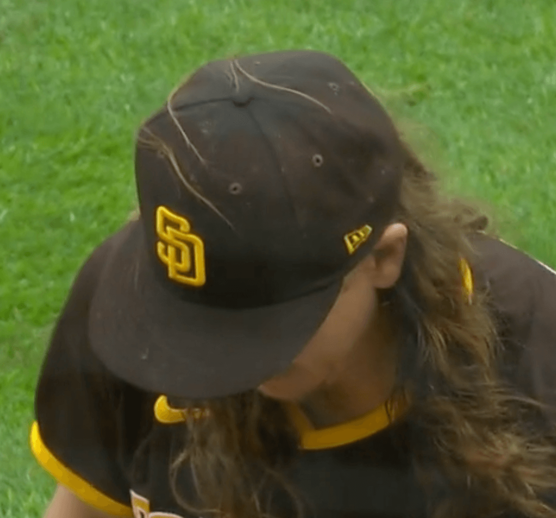
Now then: Padres pitcher Mike Clevinger started yesterday’s game against the Guardians. It was his first MLB appearance since 2020 after spending all of last year and the first month of this season rehabbing from Tommy John surgery, and I think it would be fair to say that he did not spend much of that time at the barber shop.
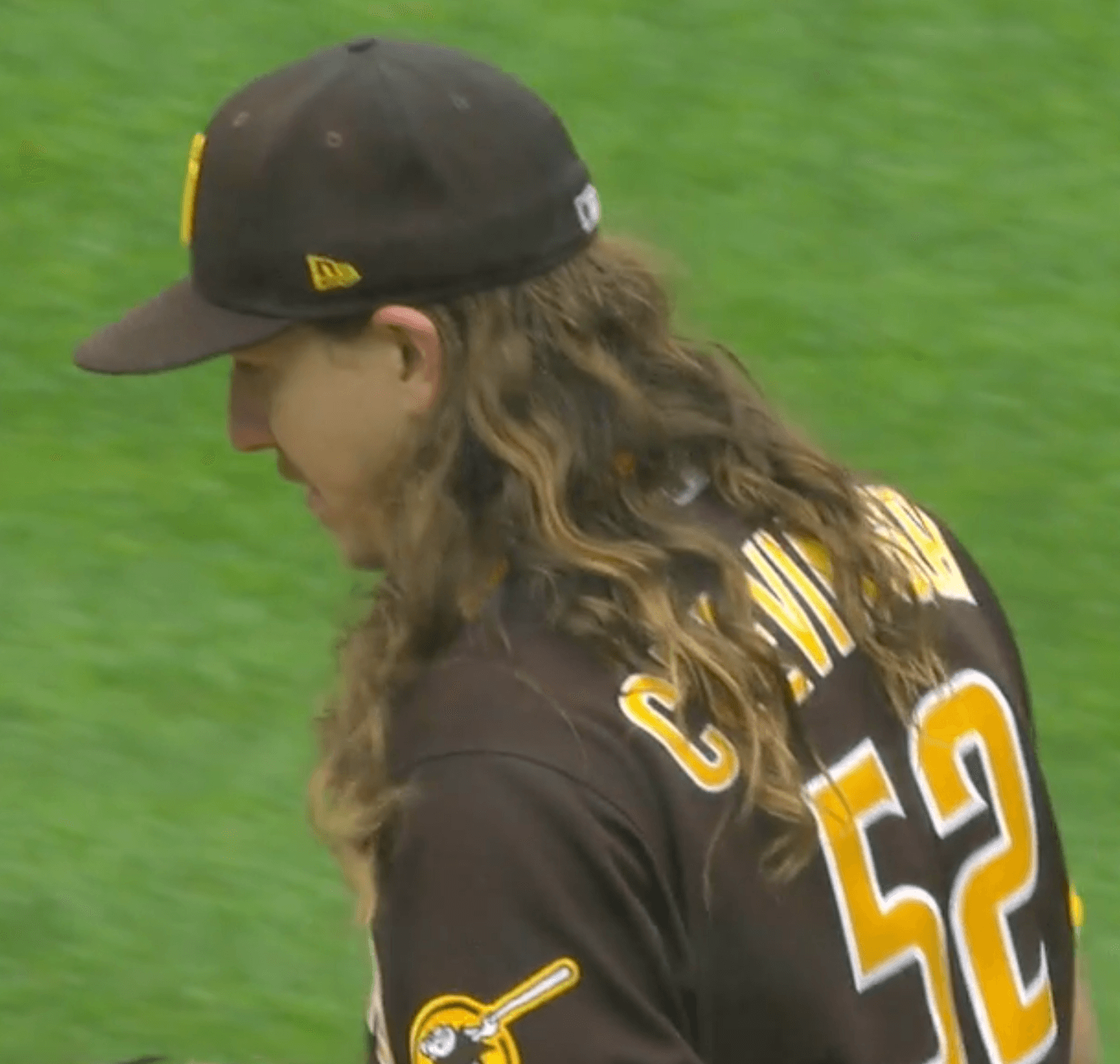
Clevinger has had long hair for years, but his locks have now reached epic proportions, to the point where he might be the longest-haired player in MLB history. Check out some of these shots from yesterday:
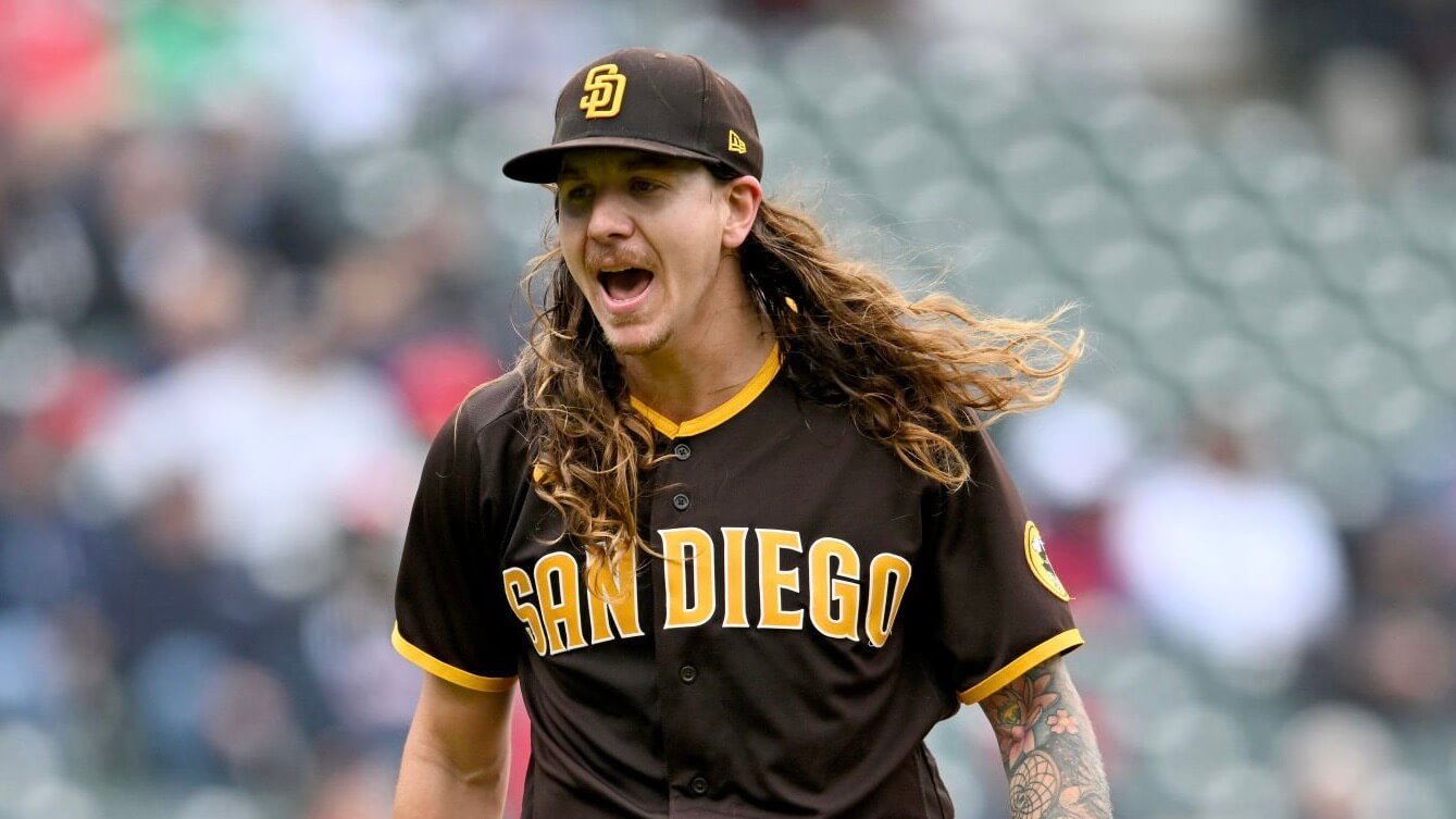
At various points his hair flowed up over his cap:
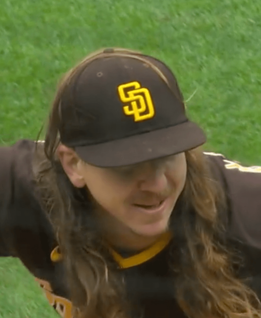
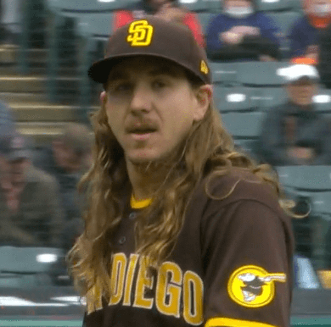
There have been plenty of other long-haired players in recent years, including Noah Syndergaard, Jacob deGrom, Jayson Werth, and others. But I don’t think any of them are in Clevinger’s league. The only serious contender I can think of is Johnny Cueto:
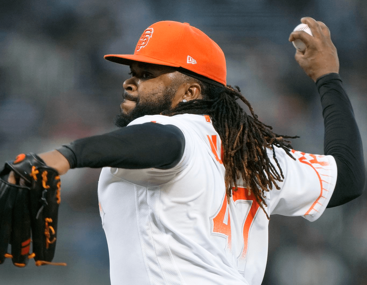
Cueto is currently on a minor league contract with the White Sox but is expected to join the big league club soon. Can you imagine if he and Clevinger started against each other in the same game? They could have a bet — loser has to get a haircut! Unfortunately, the Padres and White Sox aren’t scheduled to face each other until the next-to-last series of this season, so we’ll have to wait nearly five months to see if that hair-raising pitching matchup comes to pass.
Are there any other Clevinger-length MLB hairstyles that I’m overlooking?
(My thanks to Mike Ortman and Colin Wimbles for their contributions to this section.)
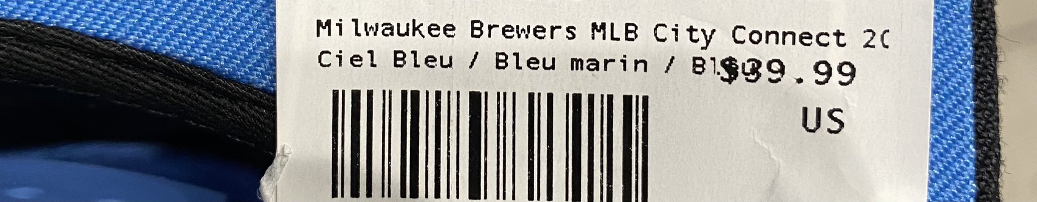
Click to enlarge
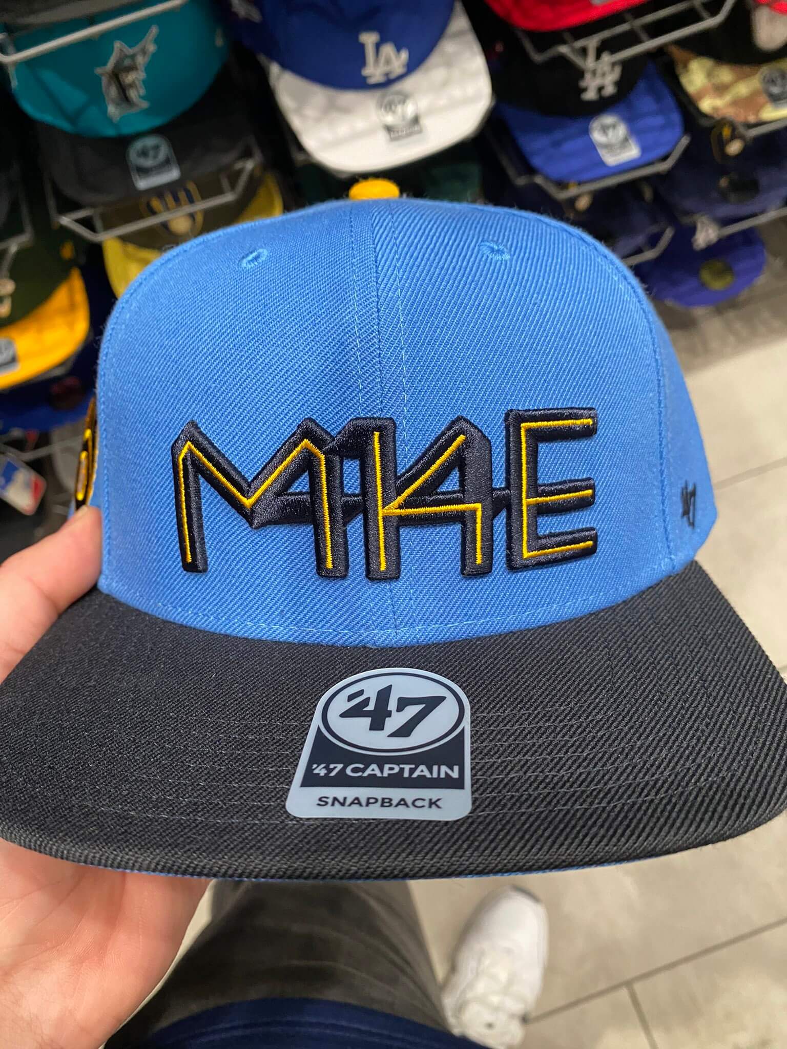
Possible Brewers CC leak: The Brewers’ City Connect uniform isn’t scheduled to make its on-field debut until June 24, which means the official unveiling is probably still more than a month away, but the cap shown above may offer some hints regarding the design. The photo was taken by Ken Bartelt, who works at a sportswear shop in Milwaukee. “I asked my manager if they were supposed to be kept in the back and they said no,” he says.
Although the cap is made by ’47, not New Era, the price tag suggests that it’s part of the CC program:
Note that the cap logo works “414” (Milwaukee’s area code) into the “MKE” lettering. That feels very, very CC.
Also, check out the underbrim:
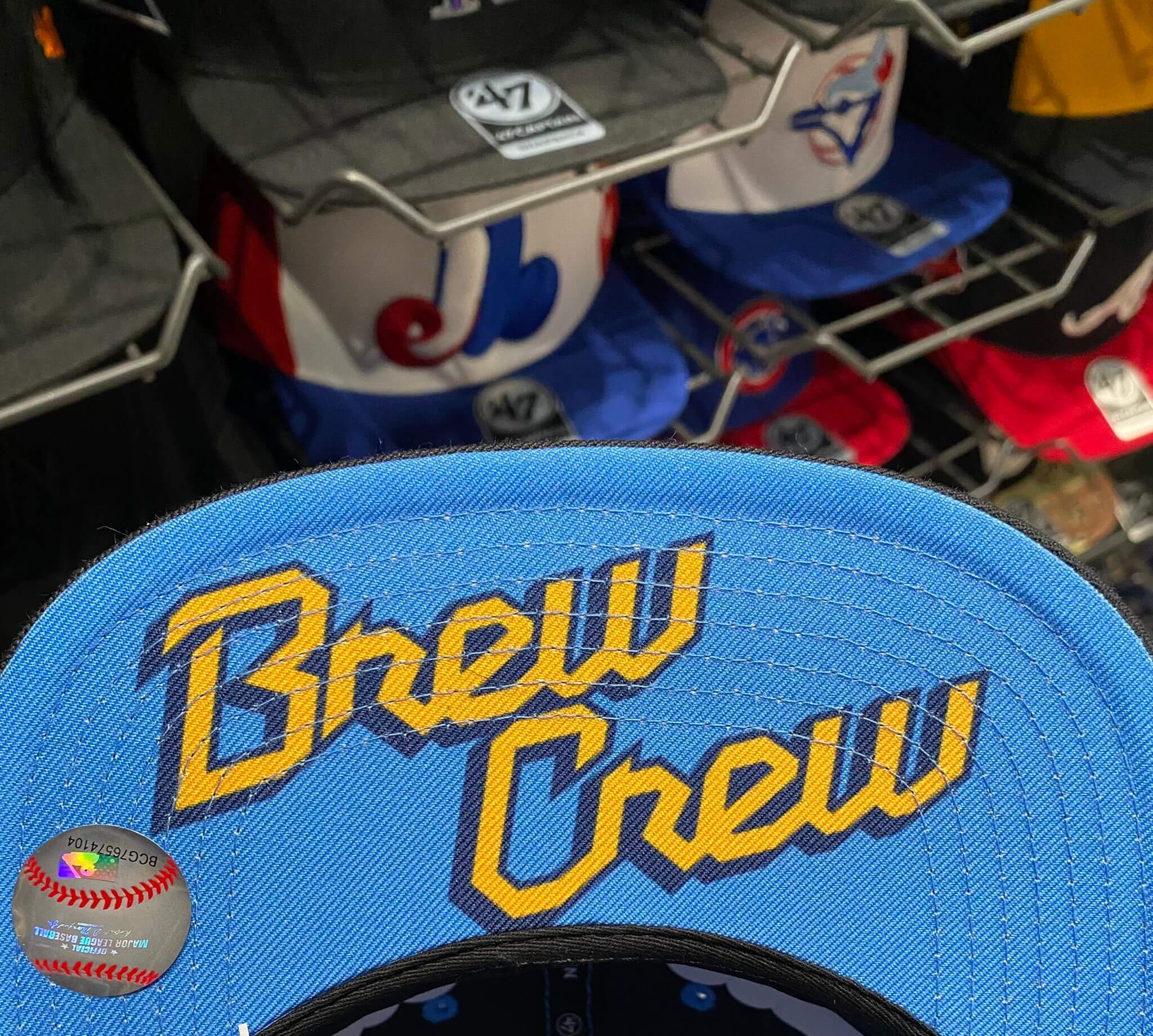
Could that be the jersey insignia? We’ll find out soon enough.
Click to enlarge
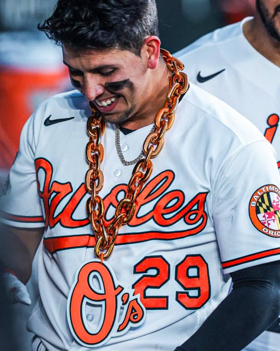
What’s wrong right with this picture?: The Orioles have a home run chain. Kudos to the person who made it, because that person gave it a proper fucking apostrophe, not an upside-down apostrophe like the one that’s inexplicably been part of the team’s official logo (and hat, and mascot hat) since 2005.
Here’s hoping this heralds a change to the official branding. And if anyone knows who created the home run chain, feel free to let me know.
(Thanks to everyone who brought the chain logo to my attention.)
Click to enlarge
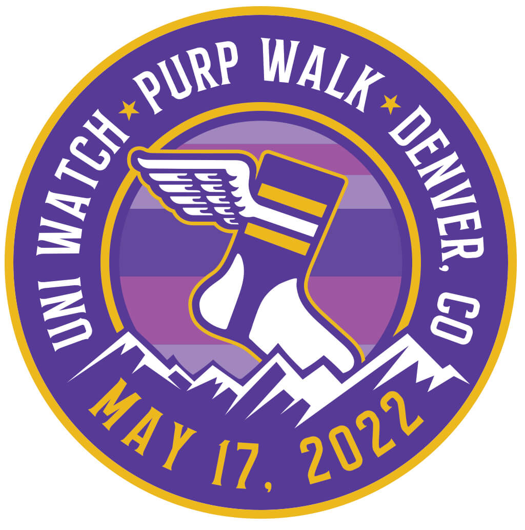
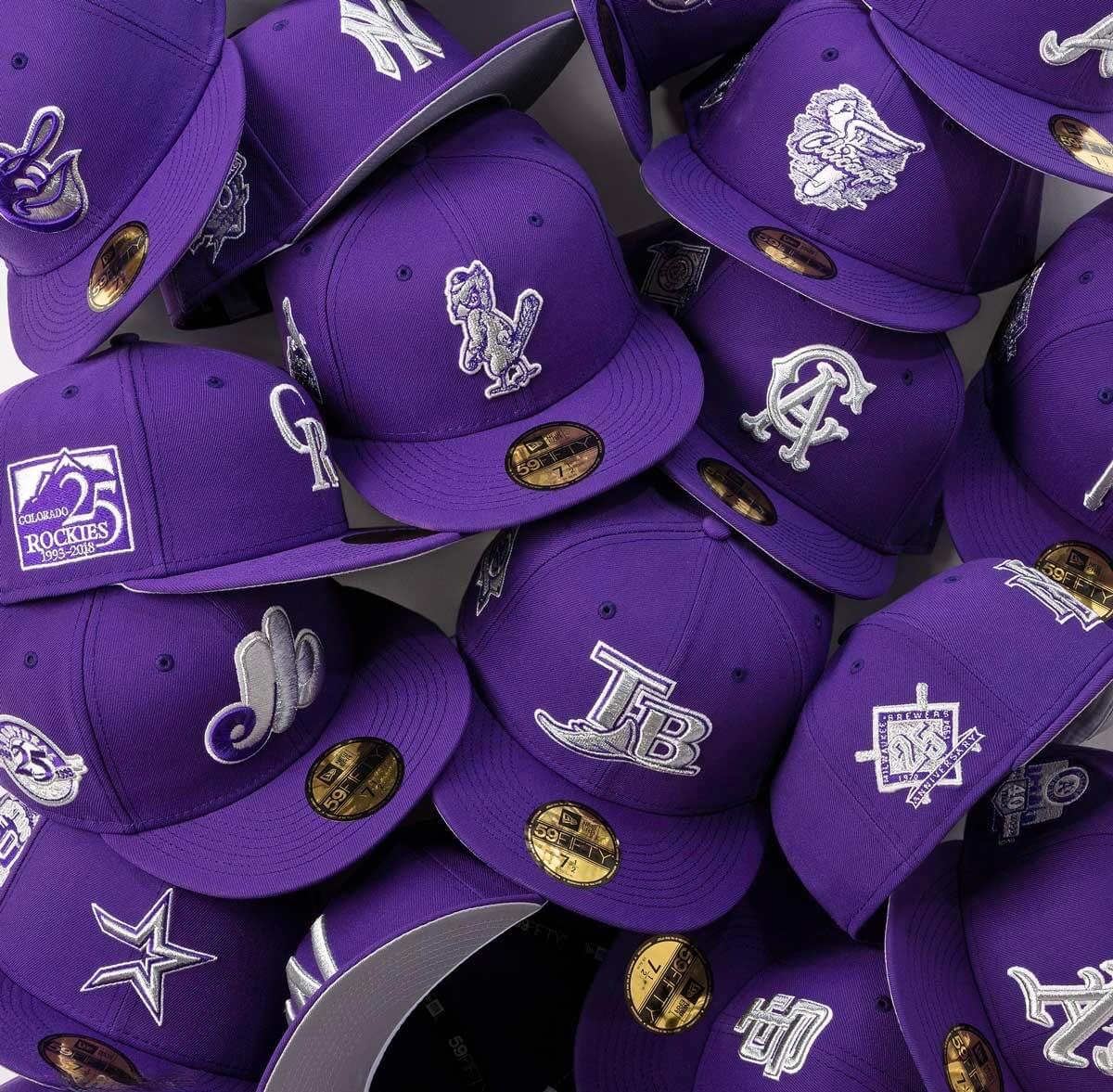
Purp Walk update: We’re now only 12 days away from Purple Amnesty Day. As if on cue, New Era has just released a line of purple MLB caps! How perfect is that?
But I will not be wearing one of these caps for Purp Walk. Is it because of the $44 price tag? Nope (although that would certainly be a good reason). Is it because of the grey underbrim, which shows an insufficient commitment to purple? Nope (ditto). It’s because I’ve already procured myself a cap to wear on May 17:
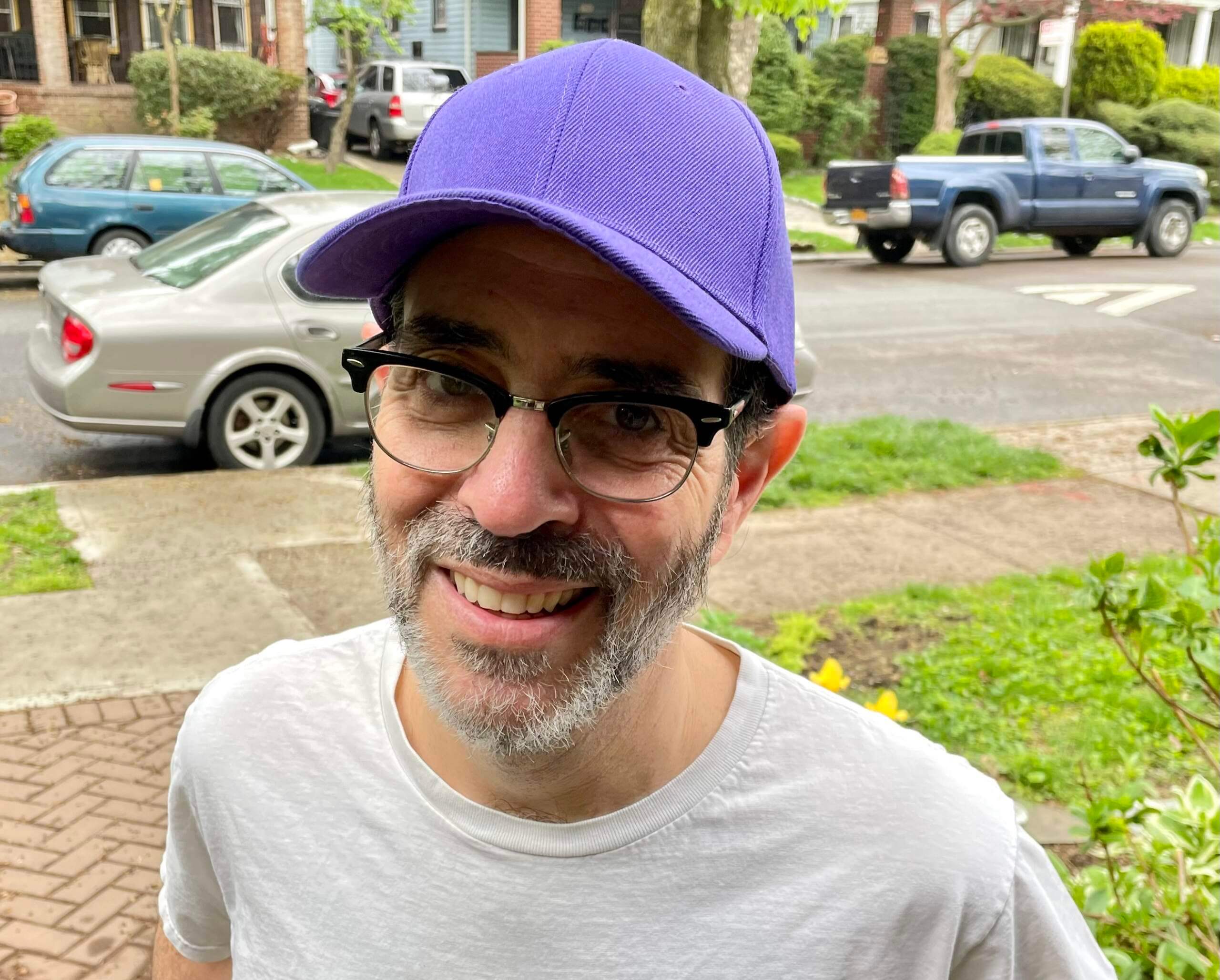
I got that on eBay — six bucks, free shipping, no maker’s mark. What’s not to like? Well, except for, you know.
The Ticker
By Paul
Indigenous Appropriation News: The North Hills School District in Pennsylvania is removing the Indian logo from its marching band uniforms (thanks to all who shared).

Baseball News: The Rays are wearing green jersey ribbons this month for mental health awareness. I’m assuming they’ll pause it for Mother’s Day, since everyone will be wearing pink ribbons that day (from @tsklear). … Great research find by Todd Radom, who turned up a fascinating 1981 newspaper article about how Pirates-style pillbox caps had become a fashion fad among Black youth.

Football News: Here are the uni numbers for the Bears’ rookie class (from Kenneth Traisman). … In a related item, here are some stories about Bears uni numbers through the years. … New helmet, apparently, for the CFL’s Calgary Stampeders. … The rest of these are from Kary Klismet: Texas Wesleyan has broken ground on a new stadium. … New grass surface for Iowa State.

Hockey News: Denver Nuggets star Nikola Jokić wore the jersey of Avs captain Gabriel Landeskog at Tuesday night’s Avs/Preds playoff game (from Kary Klismet).

Soccer News: Here’s Manchester United’s new home kit (thanks to all who shared). … Here are the inaugural shirts for the NPSL’s Akron City FC (from Ed Zelaski). … Also from Ed: This is purportedly a preview of Barca’s third shirt. … The rest of these are from Kary Klismet: One of Qatar’s new stadiums for the 2022 World Cup is made from shipping containers and will be deconstructed and recycled after the tournament. … New 97th-anniversary kit for Ecuadorian club Barcelona SC … New alternate kits for Matsumoto Yamaga FC of Japan’s J3 League. … CF Montreal will respond to fan feedback by changing its logo (from Tim Capper). … New home kit for Liverpool, featuring a new font (from Josh Billman).

Grab Bag: New athletics logos for Crown College in Minnesota (from Paul Allan). … Diego Maradona’s “Hand of God” jersey has sold at auction for a record $9.28 million. … Mozilla has a logo for the 100th version of Firefox (thanks, Brinke). … The great Wafflebored, always on the lookout for cool vintage finds, spotted this gorgeous 1954 varsity-style jacket the other day. In Uni Watch colors, too!
Click to enlarge

What Paul did last night: Went out last night and saw Everything Everywhere All at Once (which in Hong Kong is called Weird Woman Warrior Fucks Around and Saves the Universe, and in Taiwan So Fucking Many Universes), a bizarre and completely charming mix of sci-fi, immigrant striving, family drama, and martial arts. It’s impossible to summarize, so I won’t even try, but I will say that it includes very amusing references to hot dogs, everything bagels, googly eyes, and the movie Ratatouille, and it features an extremely likable performance by Stephanie Hsu (whose character, unfortunately, is barely even shown in the trailer embedded above, but she really steals the film). It’s more than two hours long and worth every minute. Uni Watch’s highest recommendation.
Orioles’ homerun chain: While Paul is celebrating the correct orientation of the apostrophe, I’m still triggered by the fact that an apostrophe is even being used to create a plural in the first place! Oakland does the same thing with their logo. The use of apostrophes to create plural words in a written sentence is a real pet peeve of mine for some reason. I suppose I could grant some artistic/aesthetic license in the realm of a sports logo!
Actually, the apostrophe can be seen as simply standing in for the letters “riole.”
Paul, I don’t know if you are serious or not, but if I play along, and tell myself that the apostrophe is being used to create a contraction, and not a plural, the whole situation becomes more palatable for me!!!
I’m completely serious.
I’m triggered by the fact that my beloved team has a ‘home run chain’ in the first place. (Sorry, I’m still grumpy after my OTHER beloved team’s 3OT loss on Tuesday)
What an odd thing to get triggered about. It’s baseball, supposed to be fun. Love seeing stuff like this! (And I’m in my late 50’s)
This cracks me up. I made the same observation years ago, I think about the A’s logo. As in, “apostrophes are possessive, why the hell is it there?” I was likewise a major annoyance to me. Paul nicely schooled me at that time. I was (unbelievably) in my 40s when I first learned you could use an apostrophe that way. Ah, the things we learn! Yet another perk of being in the Uni-verse.
Using an apostrophe with a single letter is accepted copy style, whether it’s to denote an abbreviation or just for clarity’s sake. Without the apostrophe, those words in question can be misread as “Os” or “As.” Consider the sentence “Paul received three A’s and two B’s on his report card.” Those are not abbreviations but would read strangely without the ’pos.
This makes sense. What is the rule with numbers? I see them all the time with an apostrophe s (crazy 8’s, 1970’s, lucky 7’s, etc), but that situation is neither possessive nor a contraction, so it doesn’t seem correct to me.
‘47 recently started putting out a City Connect line, so that’s probably a legit leak.
link
Also, I’ll second the Everything Everywhere All At Once love. What a great film and one where you want to tell people why you like it and also not give anything away because going in blind is the best way to see it.
Jason DeGrom?
Shame on me. Fixed.
House of David? Old time barnstormers.
Good point!
Ross Grimsley.
Brandon Marsh isn’t quite to Clevinger’s length but could be on a watchlist to see if he lets it get there.
Mike Schmidt(or is it?), 1985:
link
I have noted that the date they gave for the Milwaukee City Connect release corresponds with the start of Milwaukee’s Summerfest, the “world’s largest music festival.” So the somewhat rock T-shirt-like text on the underbrim makes some sense.
The 414 thing is also a big deal here, in part because you see it on a lot of flags and apparel produced by a local company called Too Much Metal. Not that anyone can trademark an area code, but this does give me a mild feeling of this being less than original.
Well shit, Paul. I thought the Brewers could have had one of the better city connect uniforms but not looking super promising. We shall see…
Manny Ramirez by the end of his career would seem to be a serious contender.
link
Ah, yes — of course. Thanks!
The “hat” example of the Orioles’ upside-down apostrophe just shows the words “image coming soon.”
Fixed. Here’s the proper link:
link
I have loved the weirdness of Barcelona SC since I discovered it on a trip to Ecuador years ago – a blatant copying of one of the most recognizable uniforms/logos, but make it uglier and plaster it in ads.
Paul, are you in danger? Your picture appears to be a distress call. The forced smile and the color of the beast above your brow! ;-)
LOL. Someone send Paul a purple Mets hat so he can at least have his team represented. Or, maybe not; he might hurl.
Regarding that pillbox cap story, my family moved to Philly in early 1981 and the Pirates pillbox cap was very popular among white kids in my suburban elementary school. First on-field-style cap I remember seeing off the field. It was a fashion thing, not a Pirates fan thing, as all the boys were huge Phillies fans, except for a couple of Orioles fans I knew. Similar to how, a decade later, the then-new black White Sox cap became briefly fashionable among my mostly Twins-rooting high school peers.
Paul do you put a special salve on before you put the dreaded purple items of clothing on?
CF Montreal is changing its logo? Means I might not be able to continue calling them the Snowflakes?
O’s have had the upside-down apostrophe logo since 2005, not 2009.
Fixed. (I was going by the date listed on SportsLogos.net, but you’re right — it’s 2005.)
Somewhat tangentially, but those Padres uniforms remain fantastic looking–the brown and gold just looks tremendous.
I totally agree. I’ve always thought brown is a strange color for a sports team, but the brown/yellow combo always seems a good fit to me (vs. brown/orange – sorry Browns fans, or brown and anything else). I really like Wyoming’s uniforms, particularly with that font they use for lettering. Sort of cowboy-fitting if you ask me.
Go Pokes!
Randy Johnson sported a pretty long mullet in his Seattle days, but I don’t believe it was quite “Clevenger length”. Josh Hader of the Brewers had some long, long hair early in his career.
In the non-pitcher category, the Reds’ Jonathan India has quite the flow going.
Brandon Marsh is looking fantastically hirsute these days as well:
link
I, sometimes, react with a smirk when I read about baseball caps of specific teams being popular with any demographic. I once worked in a relatively urban high school quite a distance from my home and was very surprised to see so many Reds, Rockies, and Pirates fans in a New Jersey high school. It was the next day when this naive school leader learned they were the colors of gangs in the school. The reds and blues didn’t want to be confused with actual Phillies, Yankees, or Mets fans. The yellows had no such problem. Two colors identified within one specific demographic, the other of another demographic.
At first glance I thought the Brewers cap had “44” embedded in it as a Hank Aaron tribute. The cap is hideous but that detail at least made it palatable. Knowing they missed that opportunity makes a bad cap look even worse.
The Giants seemed to have a couple of long haired contenders in Tim Lincecum and Jeff Samardzija at various times?
For long hair, check out Matt Strahm on the Red Sox. It is close to Clevenger’s length, if not longer.
According to the color guys on NESN, Strahm suffered an injury shortly after his last haircut. Being the superstitious type (he also makes an exaggerated leap over the foul lines when he leaves the field), he hasn’t had a haircut since the injury.
RE: a proper fucking apostrophe
It looks like it was supposed to be upside down on the chain. Look at the white border just to the right of it. It has a hard edge that would be there if it were upside down.
My guess is those pieces were all laser cut separately by color and a person had to assemble them together by hand. While doing that they probably thought, “why would this be upside down?” and just glued it together the proper way.
Sorry, but that Brewers MKE cap (or whatever it’s supposed to stand for) is one of the worst logo designs I’ve ever seen. I had to stare at that for a good ten seconds to figure out the pattern- and that violates every design rule I can think of. If you have to look at it that long to figure out what you’re looking at, that’s a huge design fail.
And the pitcher’s hair looks ridiculous.
Agreed. I was looking at the picture before scrolling down far enough to read the caption. Based on the convoluted mixing of numbers & letters, I thought it was a new player brand logo, like TB12 or CP3 or SC30 (and not a good one at that).
I was racking my brain to try and figure out who Mike 44 or M14E could be on either the Grizzlies or the Chargers?
Probably a bad sign for the Brewers if I thought it was a crappy designed player logo
I agree about the hair. When we played sports back in the 70s and 80s (especially football) the rule if you wanted to play was “Whitewalls and Racing Stripes”…meaning over the ears and above the collar.
Rant over. STAY OFF MY LAWN!
As a native Wisconsinite, I noticed it pretty quick, but it’s tough to look at. MKE is pretty common right now, just like the airport codes in a lot of cities
As a Wisconsinite who is not much of a fan of Milwaukee, the city, I tend to shy away from Brewers stuff that centers the home city. Like, I love their yellow Milwaukee script on navy, but I’d never buy or wear a t-shirt with it, because it says “Milwaukee” more than it says “Brewers.” So the cap is super not for me, but I don’t know whether it has an audience in Milwaukee itself. Maybe it does! Also I’m not thrilled about the implied color scheme of sky blue and black. I’m curious to see how Nike puffs that color scheme up as some historic cultural connection. Whereas when I think of Milwaukee, other than Brewers blue and yellow, the colors I think of are cream, bronze, black & orange, and the blue, yellow & white of the People’s Flag.
I will be pleased if there’s a jersey with Brew Crew on the front in that script though. Not much of a “city connect” kind of idea for jersey lettering, but I dig the team-nickname aspect of it. There’s a Federal Express calling itself FedEx vibe to that sort of thing.
I’ve never understood those who live in outstate Wisconsin who have problems with Milwaukee. It just doesn’t make sense to me. It’s a major economic pull for the entire state. It’s a cosmopolitan city that’s becoming moreso with recent additions. I’m really proud of being a Milwaukeean. I just don’t get why the rest of the state takes issue, unless it’s moreso an issue with just an urban area in general.
Arizona has similar issues with “Phoenix”. It’s why the Cardinals changed their name from “Phoenix” to “Arizona”, and later the Coyotes did the same thing. Other parts of the state aren’t as fond of the city. It has always made sense to me to have the professional team named after the state, or even region, over the city when there’s only one city in the state that has a professional team.
It makes even less sense to me in Arizona, where there seem to be a few towns scattered amongst desert, mountains and native reservations and most of the people in Phoenix or Tucson.
Wisconsin, for better or worse, is kind of a microcosm of America in that it has a few city-type areas surrounded by a lot of rural land. In 2022, the nature of the very different views on the world urban folks and rural folks have is often apparent, as is the case here.
I, for one, would kind of like to see such different ways of thinking smashed. Even as city folk myself, I respect farmers and what they do, even while I believe the family farm is a losing idea in the 21st century and we’d be smart to move rural areas away from an agrarian mindset toward newer uses of such wide swaths of land. I’d like to think, at some point, those areas would also understand the different needs of urban areas and be open to adjusting their ways of life to the new world we live in. But I also know I’m a little pie-in-the-sky in that regard.
Anyhow, I’m about togetherness, not apartness. So I like to challenge those who take issue to think about why they do so, then perhaps challenge them to change their thinking.
I don’t really understand the infatuation with area codes to begin with . . . the telephone numbering plan allows for areas codes to be added and divided and overlaid. Plus, people with cell phones move and have phone numbers that are not in the area codes in which they live.
The weird thing about 414 is it really only represents the city of Milwaukee nowadays. It’s been surrounded by 262 for over 20 years now. There is kind of a running joke about how 414 is for the city folks and 262 is for the suburbanites.
So for a team that sometimes likes to market itself as belonging to the state as much as the city, it feels like a swing and a miss to use the area code as a design element.
Like another poster above, it’s disappointing. I had hope because there’s a lot of unique things about Milwaukee that the people here would like to celebrate. The light blue might have an appeal, I suppose, but I think it’s going to be an attempt to “get” this area that doesn’t really “get this area.
Well, the program is literally called City Connect, so not trying to reach the suburbs.
Well, yeah, but I’ve never felt like the program has specifically been “we are trying to connect only with fans of people within the borders of the municipality the team resides in.”
A lot of the Brewers’ fanbase is suburban; a good chunk of it comes from Waukesha and Ozaukee counties. It’s one of the reasons I’ve always thought a downtown ballpark here would have been a bad idea, and I’m glad the leadership of the area agreed with me. It’s a team with regional pull.
I don’t think any of us are expecting the Braves’ City Connect to specifically extoll the virtues of Cumberland.
I’m with you, Anthony. Area codes are going to be totally meaningless in another 10-15 years as people move more, but keep the same phone numbers on their mobile phones.
Honest question: Can someone clue me in on the impetus for those purple New Era baseball caps? I mean, green ones in March is one thing, and can be explained away. But purple ones – and only for selected teams – in May just escapes me.
I saw “Everything, Everywhere, All at Once” a couple of weekends ago. I am in complete agreement. It was an amazing movie that defies description. In addition to the highlights you mentioned, I loved seeing Ke Huy Quan (Data from “The Goonies”) on the big screen again.
In a related item, here are some stories about Bears uni numbers through the years.
Something to contemplate in a future column: Which teams have the best of the bespoke fonts? I’ll bet the Chicago Bears come out on top of that beauty contest, with some competition from the Cubs.
I’ll add the Toronto Blue Jays to that list
1977 *and* 2012.
cycling tidbits:
team EF education has a new kit for the Giro d’Italia, since they normally wear pink and the Giro leader jersey is pink
link
Alpecin-Fenix also revealed a special kit, the shade of green is not being well received from what I’ve seen
link
Soccer ticker typo: Masumoto should be Matsumoto.
Fixed.
So the Calgary Stampeders helmet in the draft room. The return of stripe is reminiscent of what was on 1989-93 helmet. Some silver accents in the logo. Makes me think the Stamps have changes coming to their uniforms. Maybe a return red over white as home combo instead of red over black? Maybe return of silver as a trim colour again with the black?
4 teams (including Calgary in this though not formal unveiling) have made helmet changes. 3 teams we’ve just seen the helmets without uniforms. Expect in the coming month to see some small uniform tweaks to have the uniforms match with these helmet updates.
Upon further review I don’t think that is an upside down apostrophe in the orioles logo but is in actuality the letter b. The logo is an acronym, O.b.s. Our baseball stinks!
Sorry Baltimore fans.
I have never heard of any marching band having home and away uniforms. Seems like a huge waste of money. As a band teacher I would have much better ways to spend $100,000. Funny thing is that would have been my high school had I not moved to Illinois when I was 3.