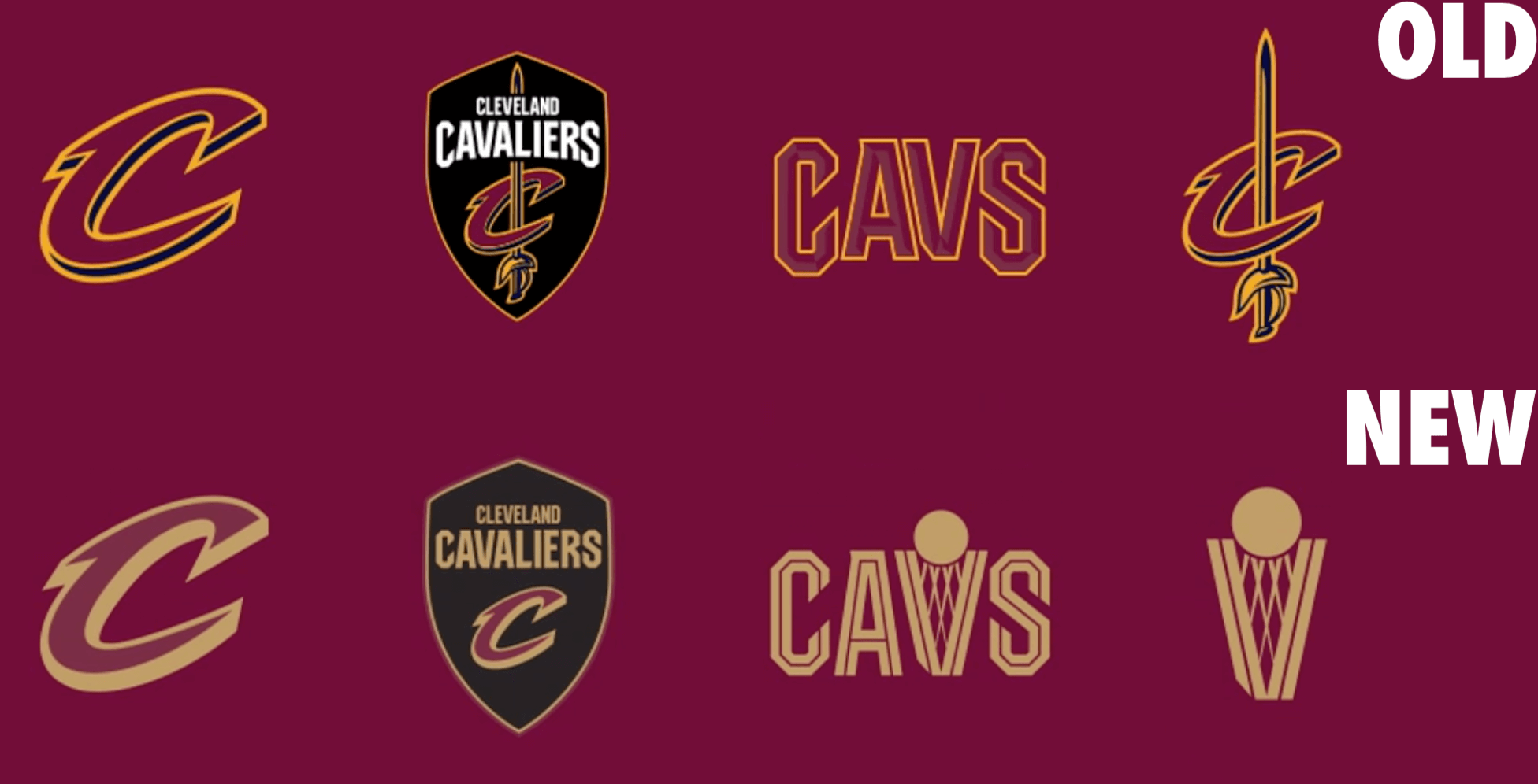
Click to enlarge
The Cavs yesterday released a new set of logos for next season. As you can see above, the biggest change is that they’ve moved away from yellow and back to gold, plus they’ve also dropped the sword imagery and introduced a new “ball going into the basket-V” graphic (something they first did back in the early 1980s).
The new logos will eventually be joined by a new uniform set for the 2022-23 season, although it’s not yet clear when that will be unveiled.
Some quick notes and thoughts:
• The new logos and uniforms are being overseen by artist/designer Daniel Arsham, who became the Cavs’ creative director in 2020. I wrote an InsideHook piece about his role with the team a little over a year ago. At the time, he told me he’s mostly into classic looks, so I’d expect the new uniforms to reflect that sensibility.
• I don’t love the new logos, mainly because the yellow popped against the wine more than the gold does. However, the gold on the uniforms will reportedly “have silicone over it, making it pop even more,” so maybe that will help. (Interestingly, that bit of info was in that Cleveland.com article I just linked to but was not in the team’s own press release.)
• The ball/basket/V graphic is supposedly meant to evoke the O’Brien Trophy. Let’s take a closer look at that:
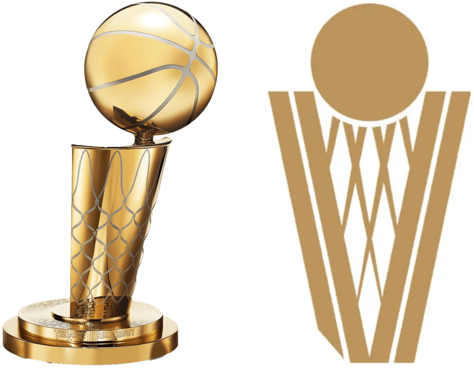
Seems like a reach, but whatever — chalk it up to “storytelling.”
As usual, it’s hard to assess a logo set without seeing the uniforms, so let’s not get too worked up either way about these. We’ll know more when we see the full visual identity.
What is wrong with the kerning on Zamora’s jersey? #mariners pic.twitter.com/lGUQIUJOUf
— Richard Brodie 🤫🦁 (@QuietLion) June 5, 2021
Bulletin reminder: In case you missed it on Thursday, my Bulletin article for this week is a deep dive on the NOB font used on the Mariners’ navy alternate jerseys, which over the past 20 years has provided a steady stream of kerning issues and other typographic glitches. In an effort to get at the root of the problem, I interviewed the team’s equipment staff, the guy who created the NOB font, a team exec, and more. Proofreader Jerry Wolper, who usually maintains a very even keel while performing his duties, calls this “peak Uni Watch,” and I don’t mind saying I’m pretty pleased with the article myself.
I should add here that a lot of teams would not have been willing to talk to a reporter about something like this, but everyone with the Mariners was extremely open and candid with me. This says a lot about the organizational culture there — kudos to them.
My premium subscribers can read the article here. If you haven’t yet subscribed, you can do that here (you’ll need a Facebook account in order to pay). Don’t have or want a Facebook account? Email me for workaround info. Thanks!
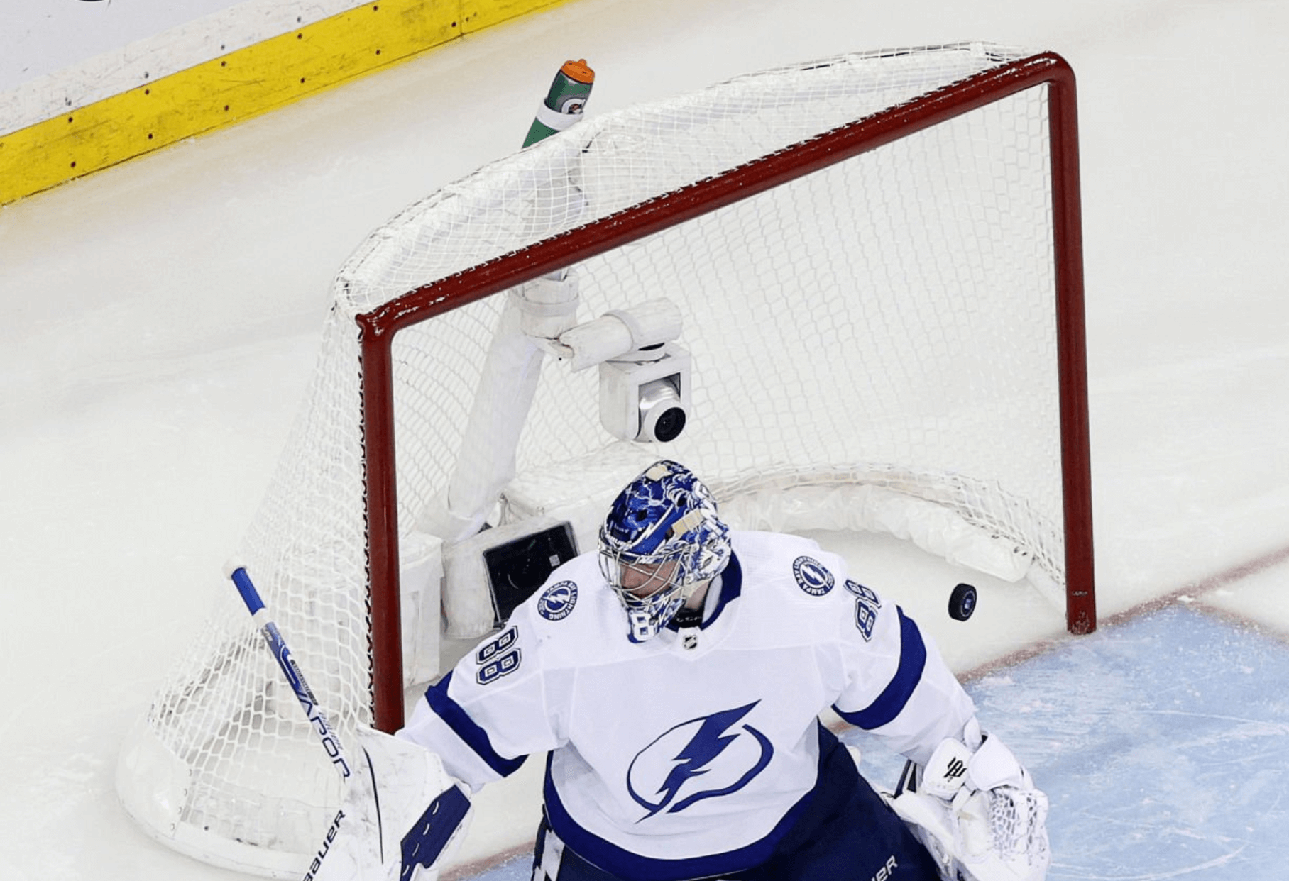
Click to enlarge
End of an (advertised) era: Everyone knows about the encroachment of advertising on NHL boards and also on the ice itself. But one of the more insidious NHL ad-creep developments over the past generation is the ubiquitous Gatorade bottle mounted on each goal. The bottles, which began appearing in 2006, used to be mounted on top of the net and then more recently moved to the back. Goalies can routinely be seen drinking from them.
But all that is coming to a close, as Gatorade has decided not to renew its contract with the NHL, a move that will also have visual implications for NHL team benches and the annual skills competition.
I’m assuming a substitute advertiser will be found soon enough.
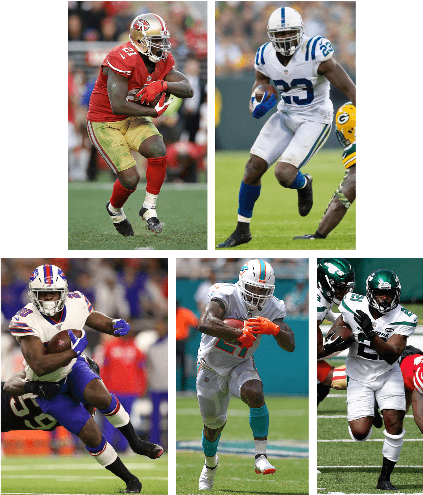
Click to enlarge
One of a kind: Frank Gore retired yesterday. It seems safe to say that no running back in NFL history wore shorter pants or showed more skin than he did over his 16 pro seasons. Not my favorite look, but certainly a distinctive signature style to go along with what will probably end up as a Hall of Fame résumé.
Click to enlarge
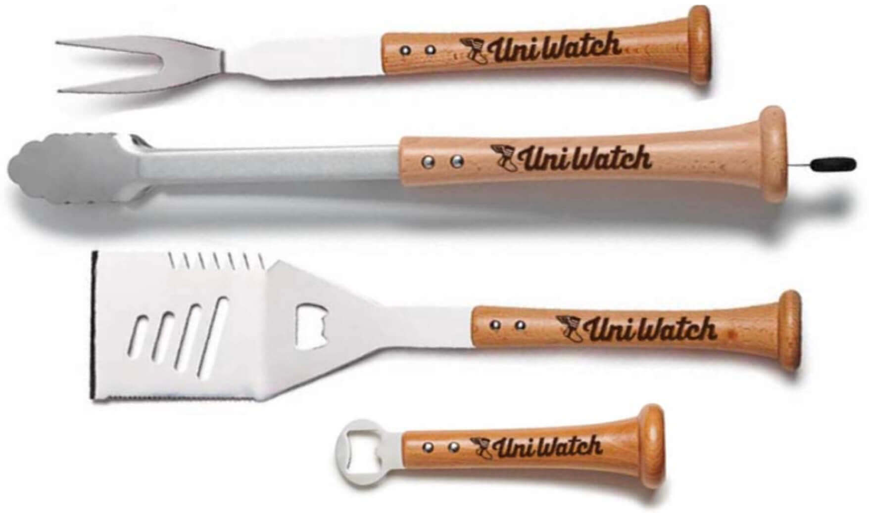
Father’s Day deadline reminder: The folks at Baseball BBQ tell me that if you want any of our cool Uni Watch grilling tools in time for Father’s Day delivery, you must get your order in by next Monday, June 6. The products, with handles made from real baseball bats, are available here.
The Ticker
By Anthony Emerson

Baseball News: Yesterday was Lou Gehrig Day, so all players wore a commemorative chest patch. … New logos for the Billings Mustangs of the independent Pioneer League (from Kary Klismet). … Pro golfer Nelly Korda’s caddie, Jason McDede, uses a Braves cover on his yardage book (great spot by James Moeller). … In a rare move, the Orioles wore their primary home cap with their black alternate jerseys yesterday (from Andrew Cosentino). … Sticking in Baltimore, rumor has it the Baltimore Sun sign above the Oriole Park scoreboard is not long for this world (from multiple readers).

Football News: CBS Sports has ranked NFL teams’ current alternate uniforms (from Kary Klismet). … Also from Kary, the Winnipeg Blue Bombers have unveiled their 2021 Grey Cup championship rings. … Sue Bird’s company has followed through on its threat to sue the XFL over its logo.

NBA News: There’s a new official trunk for the Larry O’Brien Trophy. … YouTube TV is using a little O’Brien Trophy icon as its cursor for NBA Finals games (from @Coach_KT). … The Celtics have their ad patch on their NBA Finals shooting shirts, but the Warriors do not (from @fdm3mnl).

College Hoops News: Alabama G Dominick Welch will wear No. 10 this season to honor the 10 victims of the recent Buffalo supermarket shooting. Welch is a Buffalo native (from @mrmichael21).

Soccer News: New shirts, and a 120th-anniversary logo, for German third-tier side MSV Duisburg (thanks, Jamie). … ESPN has reviewed all of the kits for Women’s Euro 2022 (thanks, Phil). … The rest of these are all from Kary Klismet: The ball for the 2022-23 UEFA Nations League has been unveiled. … Italy’s men’s team debuted new home kits in Wednesday’s Finalissima against Argentina. … New away kits for English side Stoke City. … New uniforms for Nicaragua’s men’s national team. … New kits for Dutch side F.C. Twente. … New home uniforms for Mexican club Chivas.

Grab Bag: Organizers of the 2023 Pacific Games are asking schoolchildren in the host country, the Solomon Islands, to help name the event’s mascot (from Kary Klismet). … Ever wonder why all cryptocurrency logos look similar? Fast Company has an article about it.
Happy early birthday to our own Jamie Rathjen, who’ll be celebrating another trip around the sun this Sunday. Enjoy your special day, Jamie!
And that’ll do it for this week. Stay well, enjoy Phil’s weekend content, get outside and take advantage of that June sunshine, and I’ll see you back here on Monday. Peace. — Paul
Take it for what it’s worth, but I’m not a basketball fan at all and when I saw the Cavs’ “V” logo the first thing I thought of was the championship trophy.
What’s up with the bottom of the V on the Cavs logo? Looks like someone took a bite out of it.
I was wondering the same thing when I saw it yesterday. Paul, any insight into that missing notch on the bottom left?
Nope. Looks weird, I agree.
My guess is it’s to represent “the cutting edge of a sword, which is what we aspire to be on the court” or some other Nike storytelling crap.
It’s worth noting that the previous wordmark (2017-22) had that piece missing too.
Official trunk for NBA trophy link leads to 403 forbidden page.
When the moon hits your eye
Like a big pizza pie, that’s Za-mor-A.
You win the internets today. Also, I need pizza for lunch now.
Trunk link:
link
I agree with Paul on the color contrast in the Cavs logos, but otherwise I think they’re all improvements. A good combination of elements of their various looks going back to the 80s.
Blue Jays wore their white panel caps yesterday for the first time since Sept 11 2020
Is the V significantly wider than the other letters? Looks that way to me, though I haven’t taken the time to count pixels or anything.
It clearly is. The vertical strokes on the V are set at a wider angle than on the A. Compare to the previous wordmark, where the right stroke on the A and the left stroke on the V were parallel.
Cavs logos are very underwhelming. Trading the yellow and blue for the old gold and black to go with the burgundy is a bad swap. It all turns into a dark swamp right now. Getting rid of the sword is even more yawninducing. The new uniforms will be very bland as well, I expect. Pity, as both the burgundy,yellow and blue colors and the sword were part of an original team identity.
I just realized the Gatorade Bottle was strapped to the goal now. I remember when goalies just flipped them on top.
Even though it doesn’t show up on Gridiron Database, I could have sworn the Bucs had a pewter jersey back in the first go-around the the current uniforms. The reason I say this, is it was back in the “shiny jersey era” and the pewter jersey shimmered. I may be wrong. Can anyone else back me up on this?
I think you maybe wrong. Possibly something like that existed in the retail world though.
The Cavs update is very underwhelming. They need to get rid of the black. It has no business being in their color palate. I don’t know why they didn’t keep the sword.
The Cavs keep changing their uniforms and logos, resulting in no consistency. I wish they kept their 2003 uniforms as those were really nice. Even the uniforms they wore in the second Lebron go around (2014-2017) were nice before the current iteration. Now it’s just garbage.
I feel safe saying no NBA team has had more uniforms than the Cavaliers. Even the Nuggets and Jazz must bend the knee to Cleveland. That’s bad juju when trying to build a core of success. Can we just admit the Stepien-era suits were objectively better than anything else this team has trotted out and go back to them?
The O’s wearing black jerseys with their regular home caps isn’t just rare, it was the first time they’ve EVER done it. Like, ever ever (helmet notwithstanding).
And they looked great.
I knew black was here to stay for the Cavs when they won the title wearing the black uniform. I always liked the navy blue and maroon together. It’s not a common pairing, and seemed unique to them. Black is so overused now. I understand getting rid of either, since together made no sense, I’m just sorry it was the navy they got rid of.
“These uniforms looked hideous when the Falcons debuted them back in 2020, but the Falcons’ alternate uniforms actually look decent on the field.”
Not possible.
KFC missed their big chance in the 80’s when water bottles first starting appearing on the back of goalies’ nets in the NHL. Glen Sather commented then about the Flyers’ goalie doing that “What are they going to want up there next, a bucket of chicken?”
link
“The Cavs keep changing their uniforms and logos, resulting in no consistency. I wish they kept their 2003 uniforms as those were really nice. Even the uniforms they wore in the second Lebron go around (2014-2017) were nice before the current iteration. Now it’s just garbage”. Agree with all of this. Then we have teams like the Clippers that seldom make uniform/logo changes and when they do, it still looks bad. *sigh*
That Nicaragua crest is, uh, interesting.
If the chunk out of the Cavs V logo stands for “the chip on the shoulder of hardworking Clevelanders” I’m going to jump headfirst into a bird bath
Watching the Cubs Cards game today. Cards pitcher Zach Thompson is wearing #57, per the Cubs announcers, is the first player to wear that since Darryl Kile, who died in 2002, ironically in Chicago.
The CBS sports alternate uniform ranking is so terrible I felt compelled to leave my first comment after reading uni watch for 10 years