By Phil Hecken
Follow @PhilHecken
Good Sunday morning folks. Hope everyone had a good Saturday and you’re enjoying — at least if you live in the States — a long weekend. Tomorrow is Memorial Day, which was originally known as “Decoration Day.” While several locations have claimed origins, nationally the day became a day for decorating the graves of Civil War soldiers. Following the World Wars, the day of remembrance has morphed into Memorial Day, as a way of honoring all fallen soldiers. If any of you have loved ones who made the ultimate sacrifice (and who we honor tomorrow), my condolences, and you have my deepest respect. Please keep that spirit in mind on Monday.
Anyhoo.
Yesterday afternoon the New York Yankees played the Tampa Bay Devil Rays in a game in which Tampa wore their throwback uniforms.
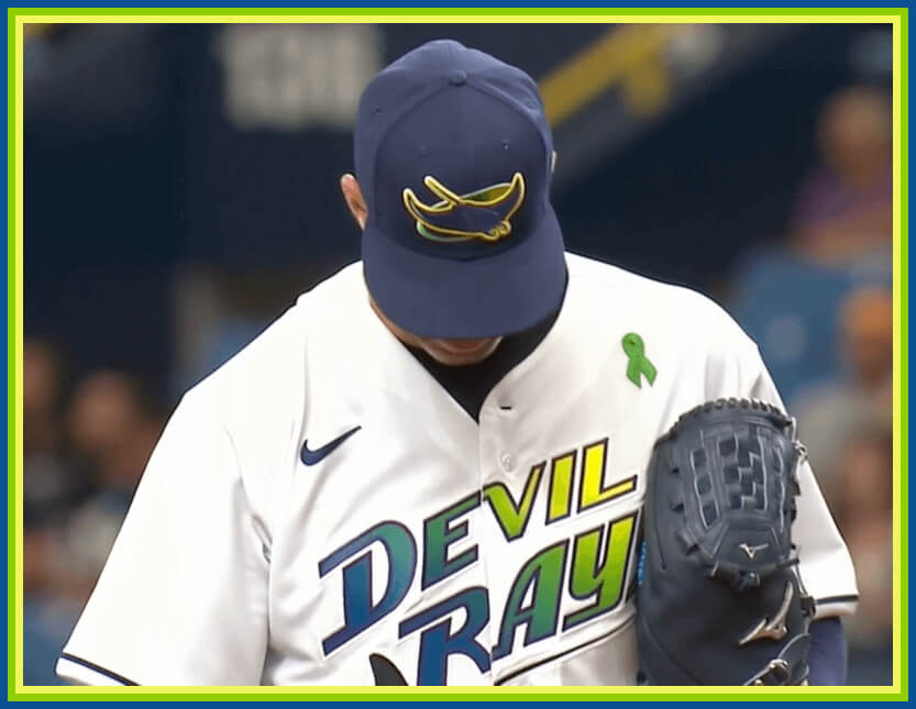
Unfortunately, the weather was spotty, so I found myself inside during the afternoon when the game between New York and Tampa was on. I hadn’t realized beforehand the Rays would be throwing back, but I heard it on the radio in my car just as the game was about to start and I was headed home. At first, I thought to myself, “oh great, those awful unis against the mono gray Yanks inside the gloomiest ballpark in America. Think I’ll pass.” I hated them when they debuted in 1998; and even though they’ve been throwing back to these uniforms since 2018 (and they also wore them in 2009), I never really warmed to them.
But once I got home, I turned on the game and thought…maybe I’ll give the unis one more chance to impress me. Believe it or not — they did!
I don’t watch much AL baseball until the playoffs, and I rarely, if ever, watch the Yankees (it was only because I knew Tampa was wearing throwbacks that I put yesterday’s game on at all).
I’m not going to tell you I love the throwbacks, but they’ve really grown on me after seeing them in action for almost the full game, a snoozefest great pitcher’s duel with some terrible umpiring.
I think part of my dislike for the original uniforms was due to the terrible lighting and fake grass at the Trop, which often made the atmosphere dreary — so I transposed that dislike onto the uniforms. But the turf (still fake, but it looks like actual grass) is much more realistic and the lighting is much better now, and I have to say, it seems like a nice enough place to watch a game. Certainly on TV the game looks fine.
I was pleasantly surprised at how much the colors popped off the jersey…where I once hated the blue/green/yellow gradient, I found the blast of color refreshing.
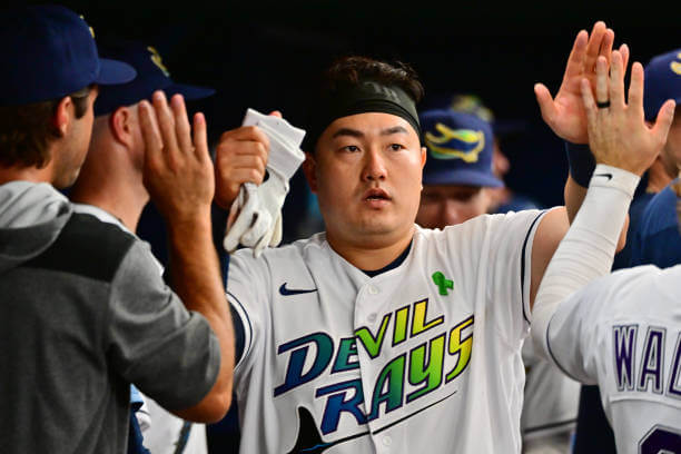
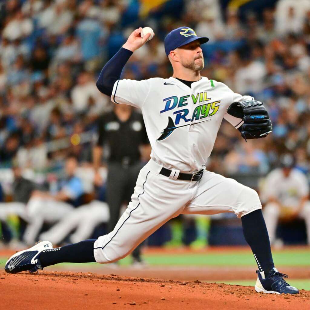
Somewhere in the depths of my brain, I must have pictured the original jersey as this garish multicolor color splotch, when in reality the rainbow effect is solely concentrated in the wordmark. They didn’t overdo it with rainbow soutache or piping (when they probably easily could have), and the solid color cap nicely mutes the gradient, stacked “DEVIL RAYS” on the jersey. With the exception of that, the entire uni — with solid blue sleeve piping and the same piping down the pants legs — looks like a major league uniform.
Low cut pants were de rigueur back when these unis debuted, and remained so for the three seasons the team wore them. And while guys today still wear them pajama style…
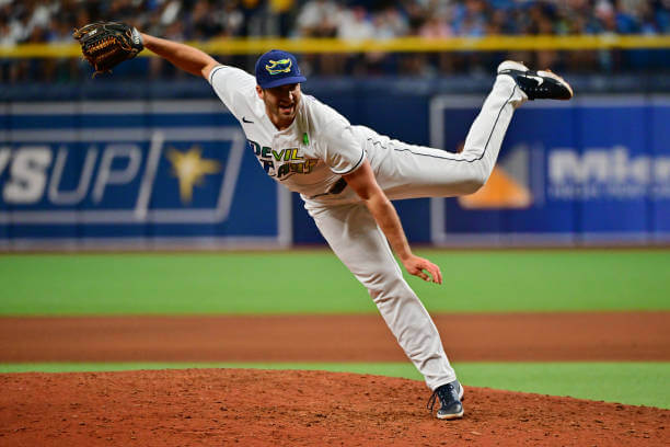
…the unis actually look pretty good when worn with solid blue socks…
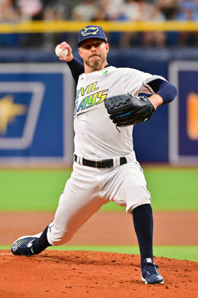
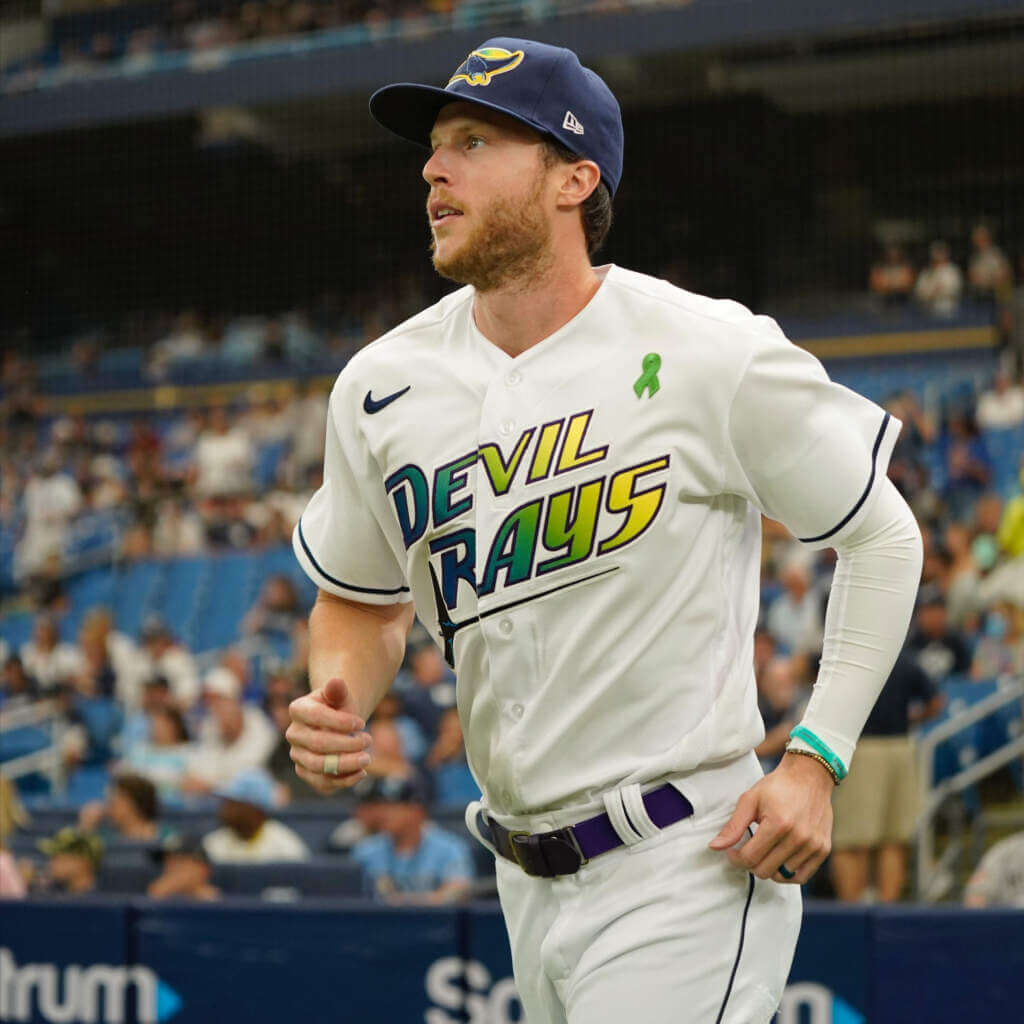
… and not awful with rainbow hose (though those pants need to be properly cuffed and higher up on the calf):
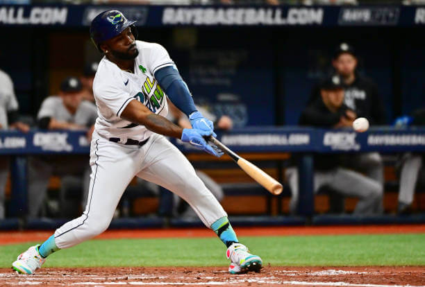
For a jersey that was admittedly as bold and daring as the Houston Astros’ tequila sunrise jersey or the Chicago White Sox winning ugly uniforms, the Rays gradients seem to meet with much more derision and much less approbation than either the ‘stros or Sox. Perhaps in a few years these will become as beloved among die hard fans as Houston’s and Chicago’s seem to be today. The look is certainly a LOT better than some of the City Connect uniforms.
In researching a bit for this, I came across this really good article which provides a bit of a backstory on how the team originally came to wear these uniforms — while the author thinks they’re the “greatest uniform in sports history,” the uniform origins do shed some light on their unique look.
I’m not advocating the team return to this look, but I will now enjoy it in small doses. It was certainly a uniform “of its time,” but now the years seem much kinder to it than they once did. Or maybe I’m just getting softer in my advanced age. Either way, this is one more uniform I can slide over from the “stupid” column to the “good” one.


And now for something Across the Pond
A couple days ago, I got an e-mail from Chris Diamond, who you may remember for his tremendous work last summer on helmet maps, and more recently, for his four-part think piece series on what might have happened if the NFL and USFL had merged in 1987 (all four parts are linked there).
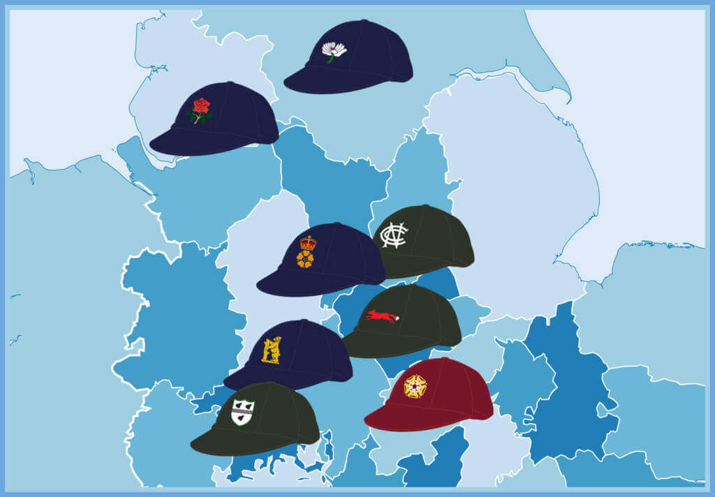
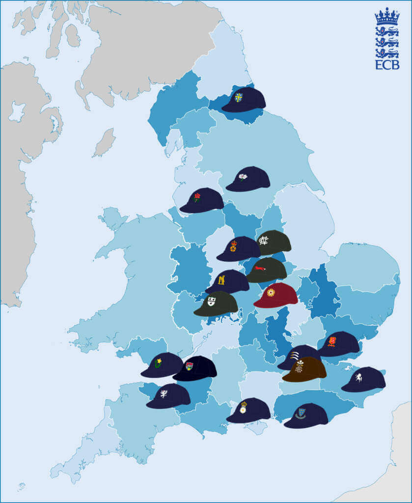
In his latest e-mail, Chris wrote, “I do a lot of graphics work on Wikipedia — mostly maps, but also some Uni-related stuff, in this case Cricket! So I’ve put some of those together to create three graphics for the First Class Cricket Counties. First is the caps, second is the caps with jumpers and finally is a cap map (like my other helmet maps).”
We obviously don’t cover a lot of non-North American sports on Uni Watch, and I realize Cricket is probably “foreign” to most UW readers. Chris even admits as much: “Now I know anything that isn’t about one of the ‘Big Four’ North American sports tends to not get the love it deserves, but I know Jimmer Vilk at least likes cricket and it is kind of similar to baseball in the conservative style and long history so maybe others may take to it?”
I told Chris I’d be thrilled to include his graphics and writeup, so I’ll now turn the rest of this portion over to him.
First Class Cricket Counties
by Chris Diamond
Cricket isn’t covered a whole lot on Uni Watch and when it is, it tends to be one of different World Cups. I felt the First Class British domestic game could do with some love and of course that means cricket whites! Note, all the images below come from the work I do on Wikipedia. Like Baseball, Cricket Unis are primarily white (or cream in fact). But unlike Baseball, the shirt (jersey) and trousers (pants) are normally plain with only a tiny amount of trim, if any. The main source of colour is the cap and jumper. Yes people do still play in jumpers (although some teams have stopped making these out of wool). Each team has a jumper design that rarely changes, although minor tweaks to colour and stripe width do occur. The last was Gloucestershire who this year changed from their slightly quirky design (which was itself an update of an older design) to the one below.
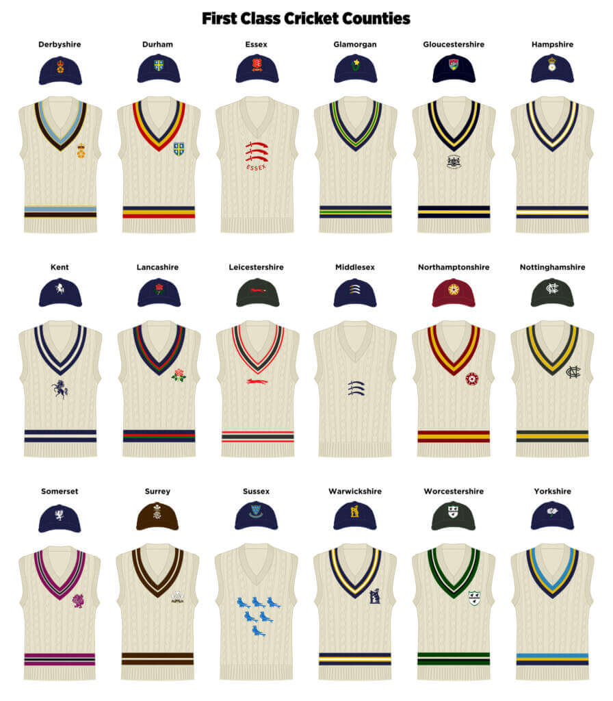
As well as jumpers, each team has a traditional (baggy) wool cap. Unlike Baseball though, wearing them in the field isn’t compulsory and some teams also have baseball style models too. There is no league-wide merchandising deal and each team sells their own replicas. Most don’t sell the wool caps or jumpers though, so quite often the only way to get one is if one goes to auction.
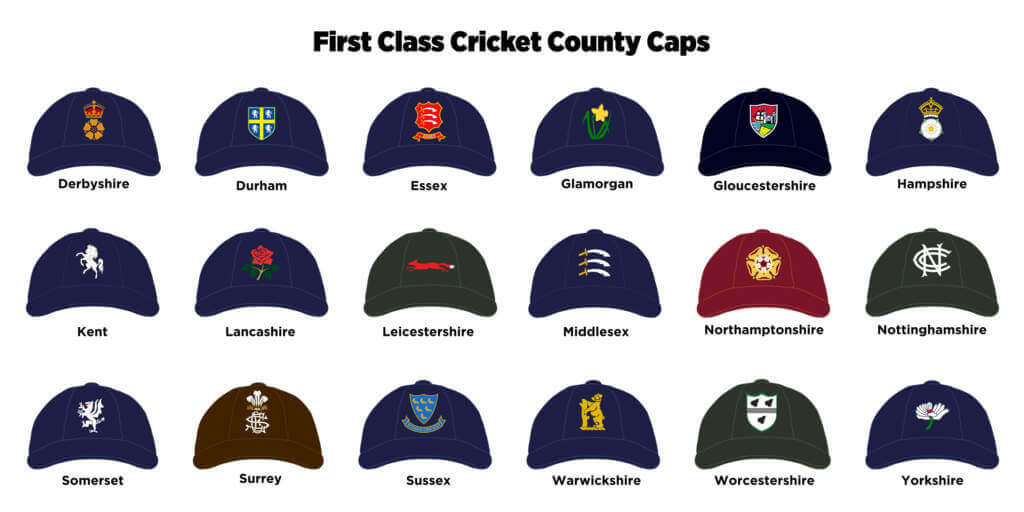
The British domestic league is based on Counties rather than cities, but the counties as they were in the mid 19C. So you get oddities like Gloucestershire actually playing in Bristol, because in the intervening years Bristol grew to encompass their Cricket Ground! Anyway, geographic oddities aside, each of the 18 teams has a primary base within the county where they play most games. But they also play the odd one or two at other towns within the county. And what about the other counties you ask? Well they form a sort of Minor League, but not in the baseball sense — none are affiliated with the First Class Teams or used to farm players. Minor Counties very rarely get First Class Status — the last was Durham in 1992. They do all have their own jumpers and caps too of course!
Thanks, Chris! Great graphics and another wonderful map. Appreciate your sharing!


Still More Caps of the Friendly Skies…
A couple weeks ago, reader Samuel Barrett shared with us a 1969 ad for United Airlines, showing 20 of 24 MLB teams’ ball caps. That was followed up in short order by a similar ad featuring football helmets.
Samuel followed up with two additional ads he found.
I just found another United Airlines poster with MLB caps on it, this one being from 1970, as evident from the Indians cap being navy, Phillies cap having a different P on it, and what I can only assume is a Brewers cap from when that was a minor league team. Perhaps they weren’t able to get an actual MLB Brewers cap for this advertisement. I also noticed the red button on the United Airlines cap, which I don’t believe the cap in the 1969 ad had.
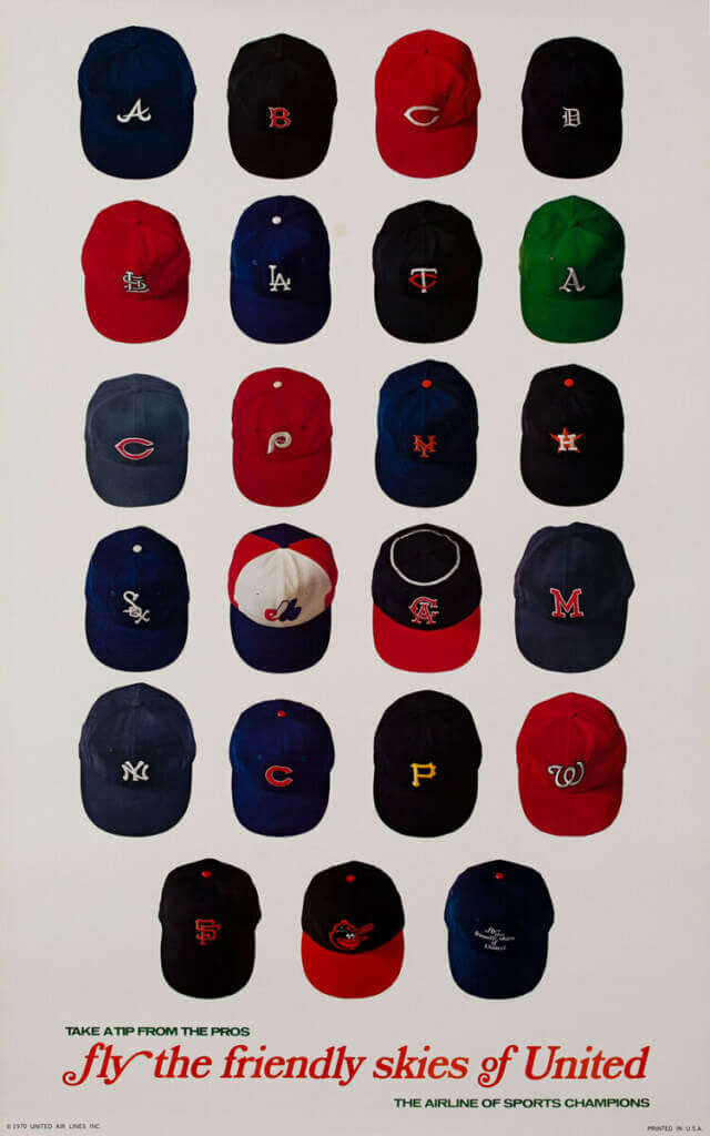
I should’ve waited a minute before I sent the last one, because I found yet another one! This one I’m not sure about the year, but I think mid-late 60s is probably the range that this advertisement appeared in, judging by the caps.
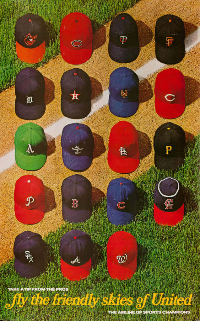
Pretty cool. I vaguely remember these advertisements from when I was a kid (I think they may have continued the campaign into the early 1970s). If anyone can find any other baseball (or football) ads, send them my way!


Guess The Game…
from the scoreboard
Today’s scoreboard comes from Alfred Nugent.
The premise of the game (GTGFTS) is simple: I’ll post a scoreboard and you guys simply identify the game depicted. In the past, I don’t know if I’ve ever completely stumped you (some are easier than others).
Here’s the Scoreboard. In the comments below, try to identify the game (date & location, as well as final score). If anything noteworthy occurred during the game, please add that in (and if you were AT the game, well bonus points for you!):
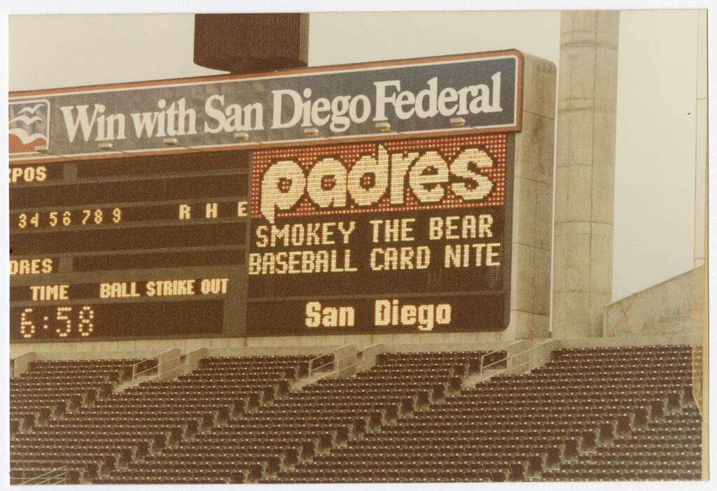
Please continue sending these in! You’re welcome to send me any scoreboard photos (with answers please), and I’ll keep running them.


Uni Watch News Ticker
By Phil

Baseball News: On this Memorial Day weekend, the Lexington County Blowfish honored the memory of those lost in the August, 2021 terrorist attack in Kabul, by wearing special jerseys. … I still haven’t seen any confirmation of the reported LA Angels City Connect uniform leak other than this tweet I posted yesterday, but that hasn’t stopped fans (and non-fans alike) from ripping on the unis. … The Corpus Christi Hooks took batting practice yesterday on the flight deck of the USS Lexington Museum on the Bay as part of Blue Ghosts Weekend. Here are a bunch of photos from the event (from Michael Coffin). … Reader Max Weintraub asks, “Did a bat design cause a strike three call?” He continues, “In the bottom of the first inning of the Nationals game against the Rockies tonight, Juan Soto thought he checked his swing on a two-strike slider, but the third base coach said he went around. Nats TV color commentator Kevin Frandsen suggested the third base ump may have made the call because he could see the cup of Soto’s bat, which is a different color than the barrel.” … If you’re curious, here’s the uniform breakdown for the Red Sox this year (from Freedman). … The NC Dinos are a South Korean professional baseball team based in Changwon. Yesterday, they wore special ‘Doguri’ character uniforms for their game (from Dan Kurtz). … Gotta love college baseball: Kennesaw State in white as the designated visitor in yesterday’s ASUN championship final (from Chris Mycoskie).

Football News: I’m pretty sure we had this before in the ticker, but just in case: Illinois football will be getting new uniforms for the 2023 season. … Reader Andrew J. visited Fleet Week exhibitions on the west side of New York on Friday, and noticed that some sailors and Marines making their way on shore were wearing New York Jets replica jerseys. “I could only get photos of the sailors, but the Marines wore the home green jerseys and the sailors wore the black alternate jerseys.” … Brooks County High School in Georgia has received their rings for winning the state championship in December (from Kary Klismet). … The University of Colorado is conducting an online poll to choose a new personal nickname for Ralphie IV, their latest live buffalo mascot (also from Kary Klismet). … In the CFL, the Calgary Stampeders were wearing a new uni combo in yesterday’s preseason game (red pants with regular helmet). Submitter Wade Heidt also includes additional photos here.

Hoops News: Here’s a look at the CEBL (Canadian Elite Basketball League) championship rings presented to the Edmonton Stingers the other night (from Wade Heidt).

Soccer News: FC Isloch Minsk Raion is a Belarusian football club based in Minsk, although it officially represents Minsk Raion and is named after the Islach River. Yesterday, they debuted new shirts (from Ed Żelaski). … Real Salt Lake wore a remembrance patch on their jerseys last night to honor the 21 victims in the Robb Elementary School shooting earlier this week. … Yesterday, Real Madrid’s Vinicius Jr. was wearing NEXT seasons jersey with this seasons “FINAL PARIS 2022” embroidery (from Johnny Jatt. … Check out the 2022 Women’s European Federation kits (thanks, Brinke).

Grab Bag: Reader Michael Barrett writes, “I know you have had a lot of content this week about multiple Australian efforts to recognize aboriginal origins, but I haven’t seen anything about the AFL Melbourne Demons changing their names for this week to Narrm. (This would be roughly equivalent to the Boston Bruins becoming the Shawmut Bruins for a week.)” … The Indianapolis 500 is today, and a lot of the drivers are going all out on the helmet art. … Calaveras High School in California has unveiled a new costumed mascot after recently changing their team name to the Red Hawks (from Kary Klismet). … Moses Lake High School in Washington has chosen Mavericks as a new team name (Kary Klismet again). … Also from Kary: Pentucket Regional School District in Massachusetts has announced its middle and high school sports teams will now be called “Panthers.” … One more from Kary: New helmet for Mercedes driver Lewis Hamilton ahead of Formula One’s Monaco Grand Prix. … Brinke says “Check this article from 2015; I –loved — these Nike Air Trainer 1s. (The gray McEnroe one.)


Uni Tweet of the Day
Please let these be the throwbacks for the Falcons alternate helmet…
Not a baseball tweet, but man those early 1980s @AtlantaFalcons uniforms were awesome! pic.twitter.com/pEp0BaJPYc
— Vintage Jerseys & Hats (@PolyesterUnis) May 27, 2022


Space Force Updates Uni Guidelines
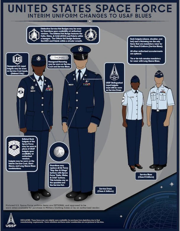
In non-sports uni news, the United States Space Force, now the sixth branch of the military, announced updates to grooming and uniform policy.


And finally… that’s all for today. Everyone have a good Sunday, a safe Memorial Day tomorrow, and a great week. See you next Saturday.
Peace,
PH
Because this page is about detail….
The named community the Rays represent is Tampa Bay, not Tampa. Tampa is a city and not (currently) the one they play in. Tampa Bay is a body of water, but the name is also applied to the multi-city, multi-county metropolitan area. The city where the team plays is St. Petersburg.
The NFL and NHL franchises also represent the water body/metropolitan area, but do actually play in the City of Tampa.
I recall one time when the Bucs were playing in Green Bay and the scoreboard identified them as “Tampa”. When the Packers made a return visit to the Sombrero, they were referred to as “Green” on the scoreboard.
Which begs the question… Do the three franchises (Rays, Bucs, and Lightnings) fall into the same category as the Golden State Warriors and the New England Patriots?
It’s not as obvious as a hotdog being a sandwich.
I know this one! Pick me! Pick Me!
Only a small grouping of major league teams are named for something other than cities and states: NFL- Patriots, Buccaneers, Panthers; NHL- Hurricanes; NBA- Warriors, Nets; MLB- Rays. Did I miss any? The Vegas Golden Knights took some liberties.
Oh, and the Lightning.
Yeah, but… One could argue that Tampa Bay includes Tampa, Carolina includes part of a state name, etc. I think the Patriots and the Warriors (come out and ply-e-ay – Ol’ Dirty) stand alone.
I’ll be contrarian here.
I love the Angels’ City Connect uniforms!!! They remind me of what someone may have come up with in the late 1930s with the number on a diamond on the front.
I hope this becomes the new normal for The Team Formerly Known As The California Angels.
I have to agree I think they really just scream baseball. Reminds me of a lot of those old topps designs. Any city storytelling would be weak considering how much they flip flop with where the team is from so why not just make the unis look good
I like the number in the diamond. It reminds me of how the Stars in the old Pacific Coast League used to put a number inside a star. The font looks really nice too; almost like the one Otis Shepard made for the Cubs years ago. The Cubs had a presence in California back in the day; they trained there in the spring (and there was a second Wrigley Field there, which the Angels played in). Is there a connection here with the number font or is it a coincidence?
I just drove myself crazy trying to figure out what the cap with the script writing was in the United Airlines posters, before I realized it was for United Airlines itself.
Those are really cool, though. And the one from the other day with the Seattle Pilots hat was really cool!
Wouldn’t these be considered faux-backs?
I think the original caps were black.
True. Black instead of navy blue. Hats were different.
link
The team considers them throwbacks — and yes, the link was both a different shade and had the “TB” in link along with the ray. For the purpose of the article, though, I was concentrating on the jersey/pants moreso than the cap (which is NOT a throwback to the original).
Probably not a hot take, but I think the switch to navy and the updated cap logo both makes this uniform much, much better.
I’d agree. That’s probably why, after seeing them yesterday, I re-evaluated my own position. I probably should have mentioned that in the lede (along with my original objections). When worn with the lighter, updated cap and blue socks (as seen on Corey Kluber above) and in the improved lighting, with more realistic fake grass, it’s much more palatable than the original in 1998-2000. Even though the jersey and pants never changed, those *other* tweaks greatly improve the uni.
Further to the post about the Calgary Stampeders. It is an interest situation with their uniforms. The CFL regular season will start in 2 weeks and we really have no idea what the they will be wearing. They also seem intent on not telling us ahead of time.
For their 75th season last year, they wore a special helmet both at home and on road. A one-season thing with their logo on one side, the 75th season logo on the other side, and centre striping they normally don’t have. The longtime regular helmet featuring no striping not in rotation.
Their home uniform last year was the red and white throwback-inspired 75th season uniform. Thought might be only a one season thing. The helmet had black trim though and they wore their regular road uniforms.
The 75th season uniform appears to be staying around. They have taken promos for broadcaster TSN wearing these jerseys and the accompanying white pants. Would signify it would be a primary uniform if they are doing this.
One would think the team would transition back to just red and white with an new road uniform to match. Logically including no black in the helmet. However, the regular helmet with the black trim has been worn in camp and in preseason. In addition, there was a mystery helmet in their draft room featuring black, different helmet striping and silver in the logo. We know nothing about this helmet as the team is tight-lipped about it.
link
Also, CFL teams usually wear one jersey in preseason. It is turning into an annual event of orange vs. red game when the Stampeders and BC Lions play in preseason.
Re: The United ads, if the top one is from 1970 (which it has to be; in ’71 the Pirates wore yellow caps, the White Sox wore red caps, and the A’s had yellow bills) it’s missing the Royals and Padres even though it has the other two 1969 expansion teams (Expos and Pilots/Brewers), and has to have been done after the 1969 season since it’s already replaced the Pilots cap with an ersatz Brewers cap.
The bottom one has to be ’68; the A’s had “KC” on their caps through ’67. The Dodgers and Yankees are missing.
Perhaps KC and San Diego are missing from 1970 United Airlines advertisement is that they both had other “official” airlines. TWA was headquartered in Kansas City and San Diego had PSA (which morphed into US Airways)
All of these United ads (MLB/NFL) are missing at least one for that reason.
The scoreboard is from May 14, 1984. Expos 7, Padres 6 in ten innings.
Found this webpage where they have a picture of Smokey Bear throwing out the first pitch.
link
And here is the card set that was the giveaway that night.
link
There was a great article in the Wall Street Journal on November 2, 1995 on how the Devil Rays and Diamondbacks uniforms came to be. For the longest time I saved a printed copy, but I no longer have it. I found a link to the beginning part of the article, but most of the content is not available. If you can find the full article it is fascinating to read.
link
Come on, Padres! It’s Smokey Bear, not Smokey the Bear. Nitpicking…rant off.
It’s an easy mistake link.
“In 1952, Steve Nelson and Jack Rollins wrote the popular anthem that would launch a continuous debate about Smokey’s name. To maintain the rhythm of the song, they added “the” between “Smokey” and “Bear.” Due to the song’s popularity, Smokey Bear has been called “Smokey the Bear” by many adoring fans, but, in actuality, his name never changed. He’s still Smokey Bear.”
Never really understood why Tampa Bay dropped the unique “Devil Rays” nickname and cool devil ray cap logo in favor of the much more bland and boring “Rays”.
As the song says…
I don’t like cricket.
I love it!
Glad to see County Cricket getting some love (again…can’t believe it’s been five years since I reviewed the T20 unis: link ) on Uni Watch!
As Chris knows, the cricket whites are taking a break now since it’s currently T20 season. I haven’t seen some of the teams’ whites up close, because I mostly listen on the BBC app. You can see games stramed live, but I usually listen while I do other stuff.
Surrey are my favorites. Love me some brown! After them, my favorite whites are Durham, Derbyshire and Somerset (please win a County Championship already, Somerset!).
Great work again, Chris. Thanks!
As for that other bat & ball sport…it’s Tampa Bay. Not Tampa.
*streamed
Not stramed…
Thanks Jim, I had a feeling you would appreciate it :) I’m a Nottinghamshire fan myself, having spent my childhood in the city. They are green and gold so I’m sure Paul would approve!
How did you get into Cricket Jim? Do you play? I used to, but had to retire after my knees went and I couldn’t keep wicket any longer!
My first exposure to cricket was from watching 80s British sitcoms. The next time was when fellow reader Doug Keklak used to tweet about the IPL games he saw on TV during his Caribbean vacation. From there I started watching IPL highlights on YouTube. In the suggested videos was a Surrey T20 highlight. Once I saw the brown helmets and duck egg blue shirts, that was my favorite team. When I found out I could listen to entire matches (For free! No commercials!) on the BBC website, I was hooked. I listened to all three forms of cricket and slowly but surely learned the game. I still need to refer to my trusty printout of all the fielding positions, though…
Haven’t gotten into following The Hundred. I don’t see the need for it.
I bought a plastic cricket bat about five years ago, and used it a grand total of two times. I thought about playing garden cricket like Surrey’s commentator Mark Church, but we have a large number of Nepalese immigrants in my daughter’s school so I may offer it the gym teacher instead.
I like Notts as well. Nice uniforms and nice stadium.
For a while I was obsessed with making a DIY Subbuteo cricket set using electric football players with bottlecap bases, but I couldn’t figure out how to play solo so I abandoned the project.
I think you can watch some First Class County Championship games on YT. It’s only 2 camera stuff filmed by the team but not bad. I was sceptical about The Hundred but it’s quite exciting to watch. Plus it’s the only live Cricket available on Free-To-Air TV here.
You should definitely try getting some sort of cricket going at your daughter’s school. There are special forms of the game designed to be accessible for children – have a look at this:
link
Thanks for the link!
It’s weird…you get The Hundred free on TV but it’s the only thing I don’t get free on audio!
I used to be able to see entire CPL rebroadcasts on YouTube, but that site was removed. I can still see some 2016 Blast matches there. Doesn’t have to be new…if I don’t know the result, I’ll watch it!
The cricket thing was kind of interesting.
But, it’s not British cricket – it’s English (and one team from Wales).
Scotland and Northern Ireland don’t really do cricket. It’s played, it’s just not that popular. Although a few years ago Scotland did manage to beat England which is a bit like your local amateur league team beating the Yankees.
Much prefer the ‘05-‘07 vested green Rays to the uniforms they were born in.
“…but man those early 1980s @AtlantaFalcons uniforms were awesome!”
The pic is of their ‘76-‘77 set; the Falcons wore silver pants throughout the ‘80s.
Although those Falcons’ uniforms were produced by compromise, they were one of the best in NFL history.
Re the United Airlines ads, how could the Angels NOT bring back caps with a halo on top?? And I mean permanently, not just for some throwback/fauxback promotion . . .
I believe this was addressed the last time the ads were shown on here (by Walter Helfer?). Apparently the halo on the cap interfered with the batter’s eye or some such. Probably “banned” for the same reason pitchers can’t wear a white glove or white sleeves.
Chris diamond, really enjoyed the photos. Thanks buddy
These wool county cricket hats are the coolest. Also the international versions of Australia, New Zealand and most of all the West Indies in burgundy. Very hard to get. The baseball style versions are not nearly as nice. My favorite ones are Surrey (MCC), Middlesex (the 3 scabbards), Glamorgan (the daffodil) and Nottinghamshire (huge UNC monogram vibes). But they are all nice because of the structure (short bill), the material (wool) and the overall 19th century vibes.
IIRC, the club got a lot of complaints from people claiming to be devout Christians and saying they couldn’t support a team with “Devil” in their name.
*Replying to Jasper’s post above about the Devil Rays