[Editor’s Note: Paul is on his annual August break from the site. Deputy editor Phil Hecken is in charge from now through the end of the month, although Paul may be popping up here occasionally.]
By Phil Hecken
Follow @PhilHecken
Good morning Uni Watchers, and a good Wednesday to you all!
I have a very special post for you today, and it’s really a story of uni watching, childhood “artwork,” DIY projects and more — all rolled into one! Longtime reader Chris Diamond contacted me and wrote, “I’ve been fascinated by uniforms and helmets in particular since I was a child. I am also fascinated by maps so I decided to combine the two! I did my first NFL helmet map in 1985. This was all hand drawn using Rotring pens, pencil crayons and felt tips on cartridge paper – size is about A2. I also did ones for the USFL and MLB and NHL. This was tricky for me at the time as being in the UK, before the internet access to pictures or graphics to work from was hard work.” There was more to it than that, and Chris also sent me a few examples of his work. I was immediately smitten and asked if he could create an article to share with the readership. It’s somewhat long (but thorough!) so I’ll stop right here and let Chris take it away. Enjoy!
Helmet Maps
by Chris Diamond
Monday September 3rd 1984, not a day most remember. Except for us it was the day that our family was finally able to receive Channel 4 TV. Most of the rest of the UK got it in 1982, but living in a remote coastal town surrounded by hills, it took another two years for us to get it. What has this got to do with unis you wonder? Well, Channel 4 showed (American) Football every Sunday at 6pm — the first regular coverage on British free-to-air TV. I had heard about it at school from those kids who lived the other side of the hills and was dying to see it. But not for the reasons they watched — the hard hitting, the razmatazz. No, I wanted to watch to check out the uniforms! I’d always been interested in sports kits (British for uniforms) because of my love of colour and graphics (and sets of things). So the football uniforms held promise of a potential new set I’d not seen before!
So the following Sunday night I tuned in to watch. The show was an hour long (and was a week behind – like the old NFL Game of the Week + highlights from the 60s you can see on YT). I *think* it was the Patriots and the Dolphins – I remember being confused by the logo guy on the Patriots helmet wearing blue but the team wearing red! I loved the uniforms – the simplicity of the designs and fact that most teams used the same block style of numbers. But what caught my eye the most were the helmets!
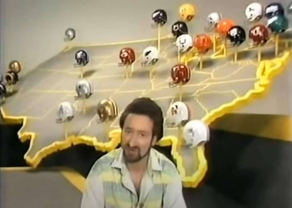
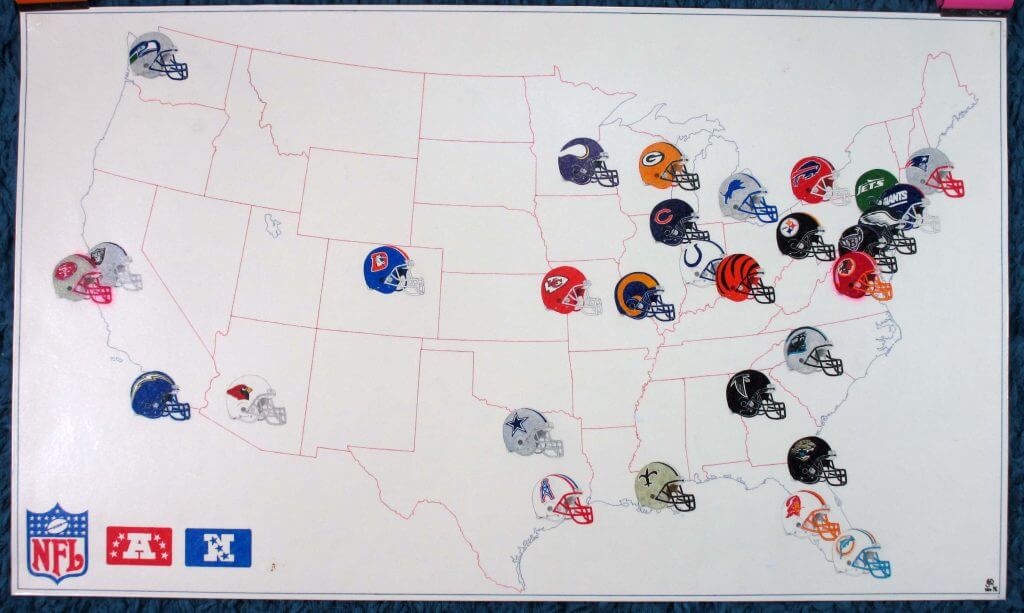
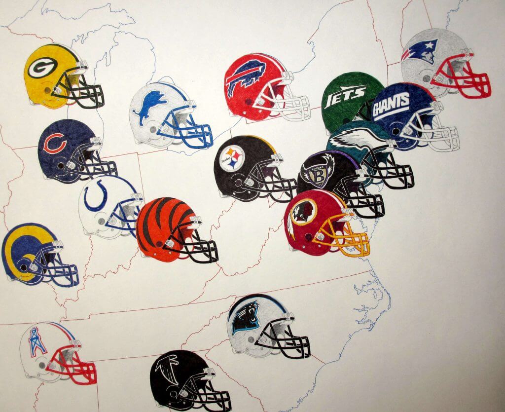
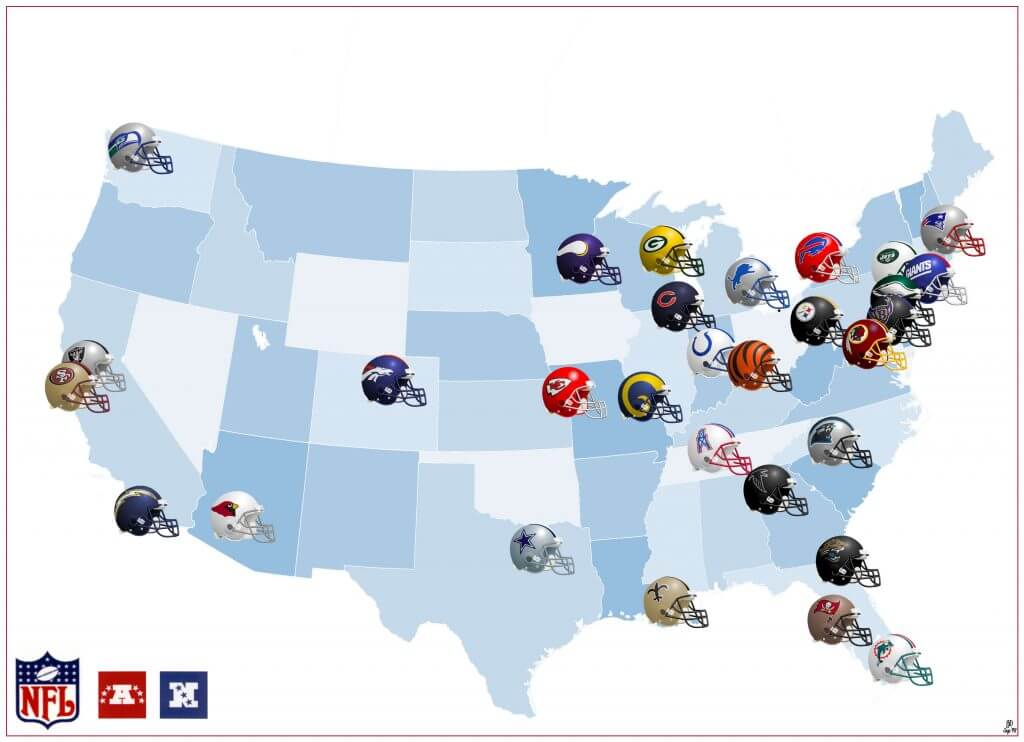
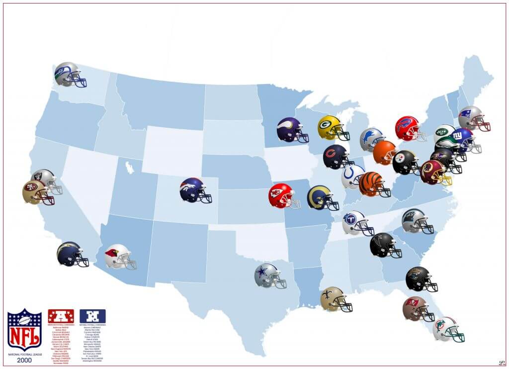
Apart from the helmets themselves, the thing from the show that jumped out was a part of the studio set. Behind the presenters was a HUGE map display of the USA, with a full-size helmet of each team on a pole above each city. I guess the idea was to give us Brits an idea of where each team was because (apart from me) most Brits couldn’t then (and still can’t) tell you even where New York is!
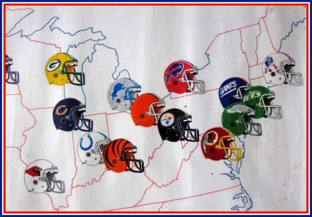
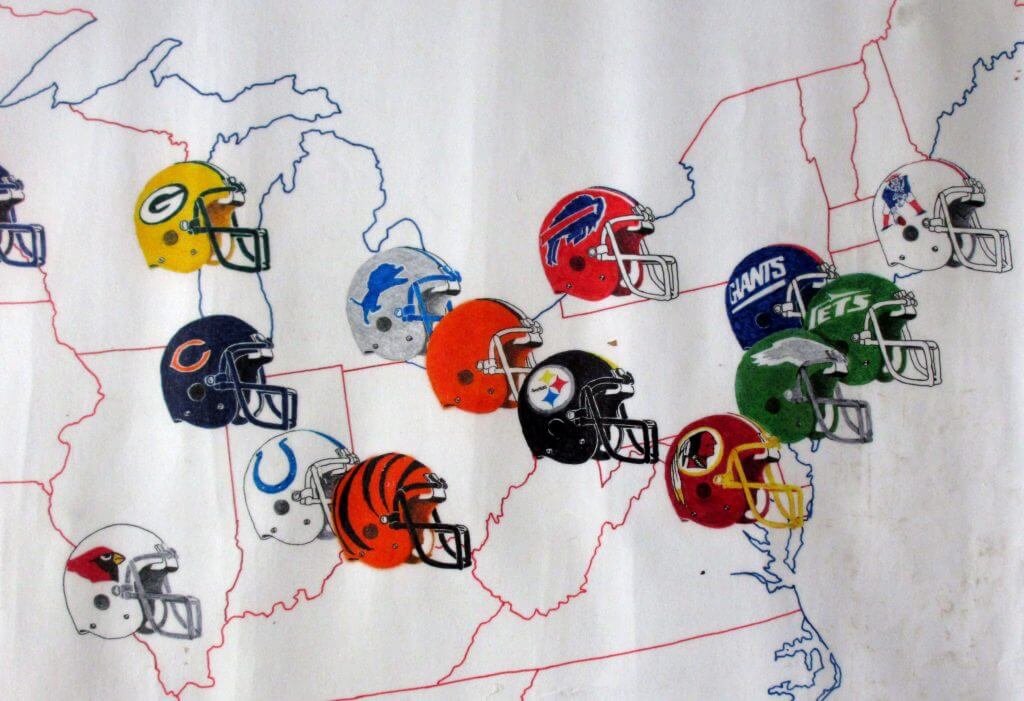
I knew where New York was because as well as graphics, I’d been fascinated by maps ever since I got a Philips Atlas as a birthday present. So here were two cool graphical things combined in one! I just had to have my own version somehow. Obviously what was in the show was impossible — even if we’d been rich enough to buy and get all those helmets shipped to the UK, where would it go? So I would have to use my own artistic skills to draw something instead. My first effort sadly hasn’t survived. But fast forward to 1985, now armed with the Official NFL Record and Fact Book 1985 (amazingly found in the local WHSmiths) plus two A1 sheets of cartridge paper, a pad of tracing paper, my Rotring pens, felt tips and pencil crayons and my atlas I made my first proper 3D helmet map. I even covered it in clear Fablon to protect it! To give a sense of scale, each helmet is about 2″ wide and whole map is 33″x20″.
Then in Summer 85 I happened to see a copy of Gridiron UK Magazine in WHSmiths. On the cover was a player called Doug Flutie, wearing a uniform I had never seen. “What the heck is this?”, I thought. “Who are the New Jersey Generals and what is the USFL?” Well following a bit of research including sending off for USFL Championship Game Programmes from the publisher in the US, I eventually managed to make a USFL 85 helmet map. Unlike the NFL though I didn’t have the 3D helmet graphics so had to improvise the best I could.
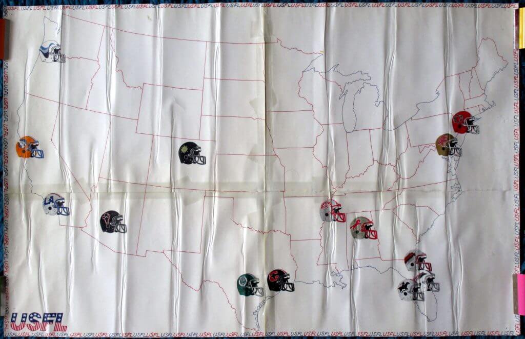
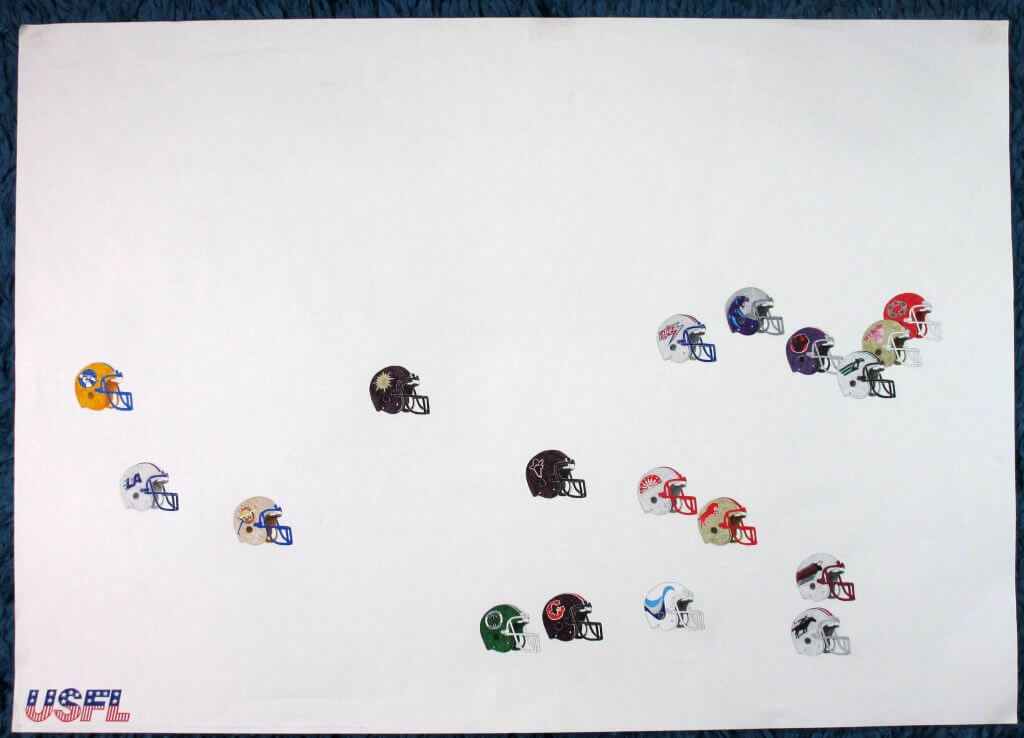
As can be seen by the unfinished USFL 84 map, by this time I had started to drift away from sports and the next year I went off to University. I then entered a ten year uni-free void…
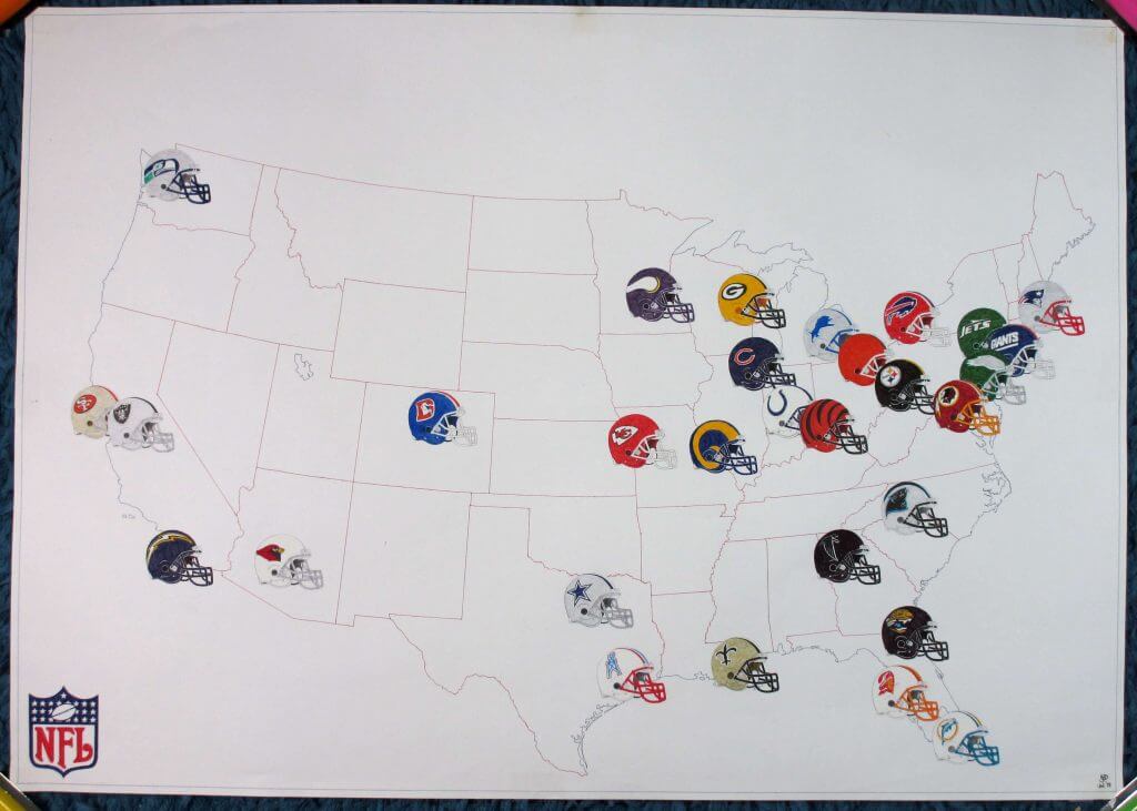
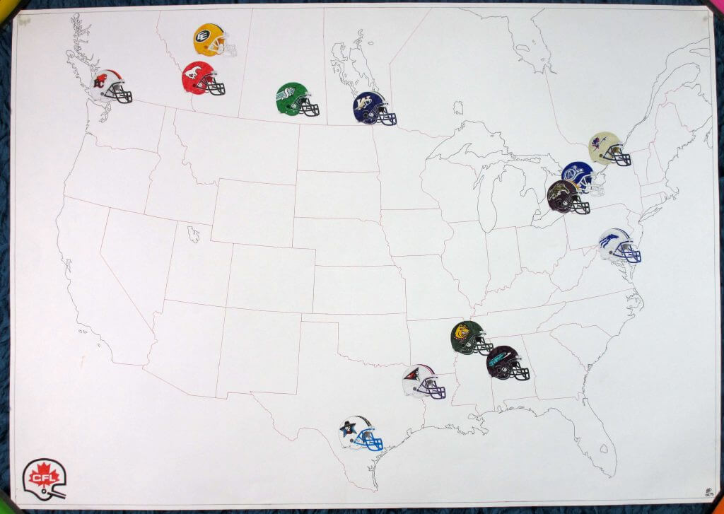
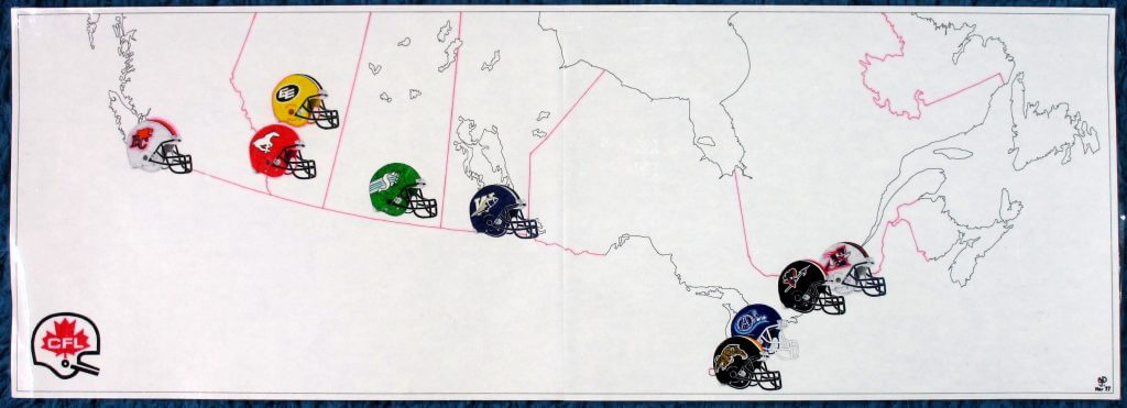
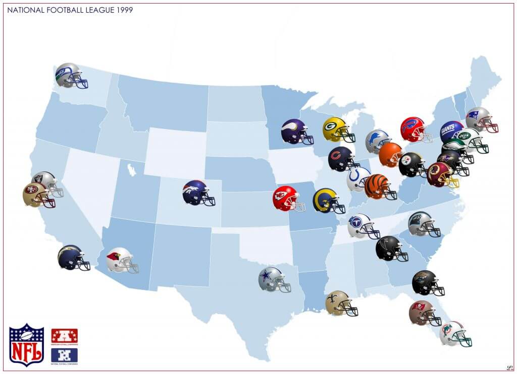
Then in the mid-90s after I had finally left uni with my PhD (not in uniformology sadly), when I moved into my first apartment I was going through some boxes my parents had sent me and found my old maps! By now the world wide web was a thing and so it wasn’t quite so impossible to get information about US Sports here in the UK. It got me interested again and so I decided to do a new map. Perplexingly to me, some teams seemed to have moved and there were two new ones! This sort of thing is almost unheard of in soccer here – wherever a team would move to, there is already a team with fans there! It made the new map more interesting though. I also discovered there was a CFL and they had just expanded to the US.
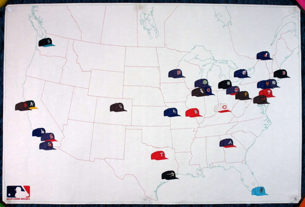
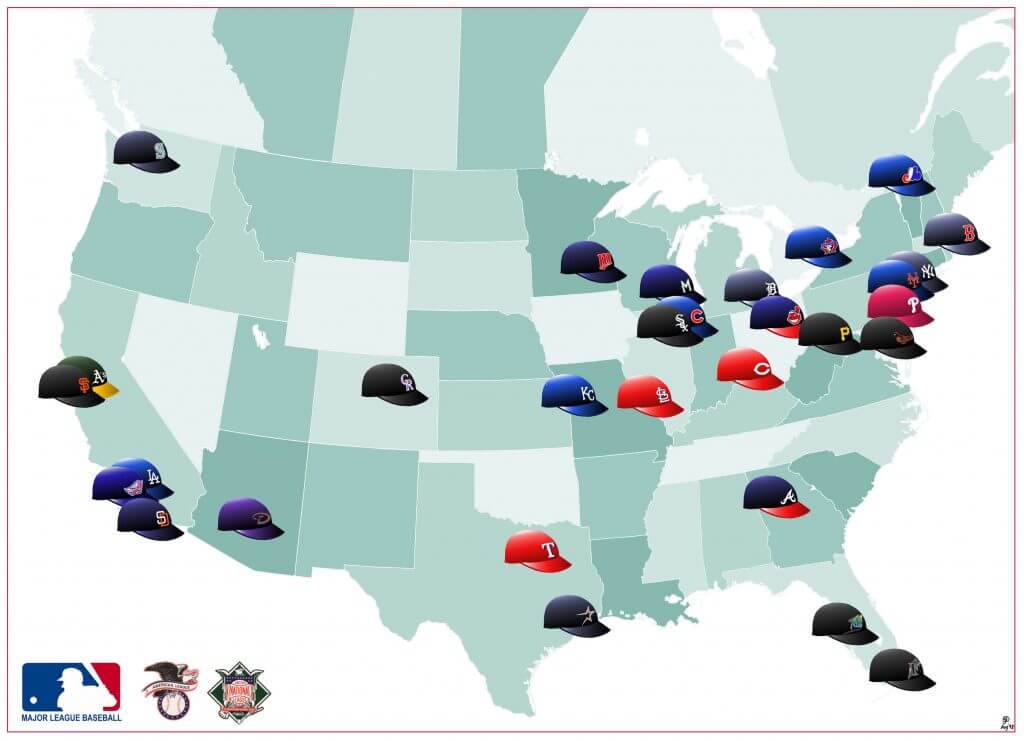
As well as football, on the web I discovered baseball, although at first I showed caps rather than helmets.
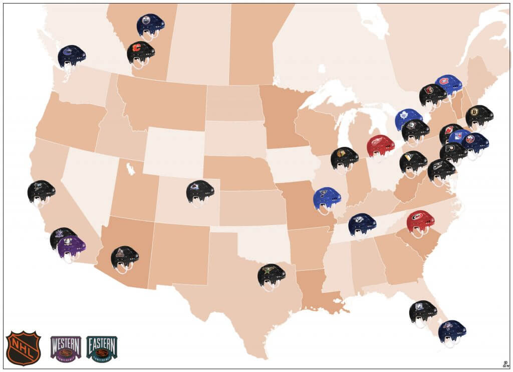
Finally I got on to the NHL as well, but by this time affordable computer graphics software had got to the point where it was possible for me to actually create decent digital versions of my maps, so I never finished the paper NHL one.
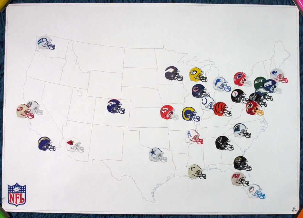
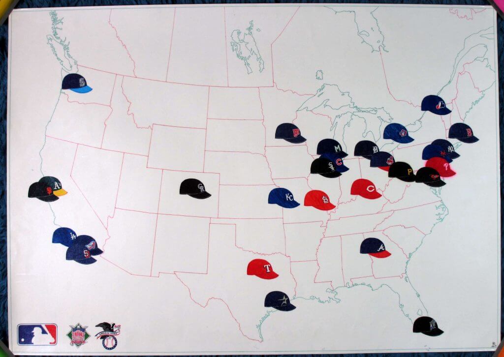
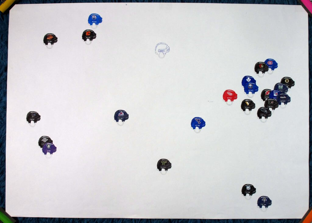
For 1998, I took the different line drawing helmet graphics, scanned them into Photoshop and then created smooth shaded versions. For the NHL one, I experimented with using a helmet photo as a base graphic, then putting the logos on top. These I would then print out to make the full size paper maps.
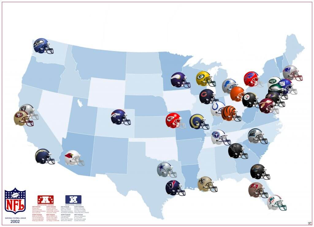
For the next four years I carried on with ad-hoc digital versions, but my fickleness with sports was kicking in again and 2002 was the last I did before disappearing into another ten year uni-free void…
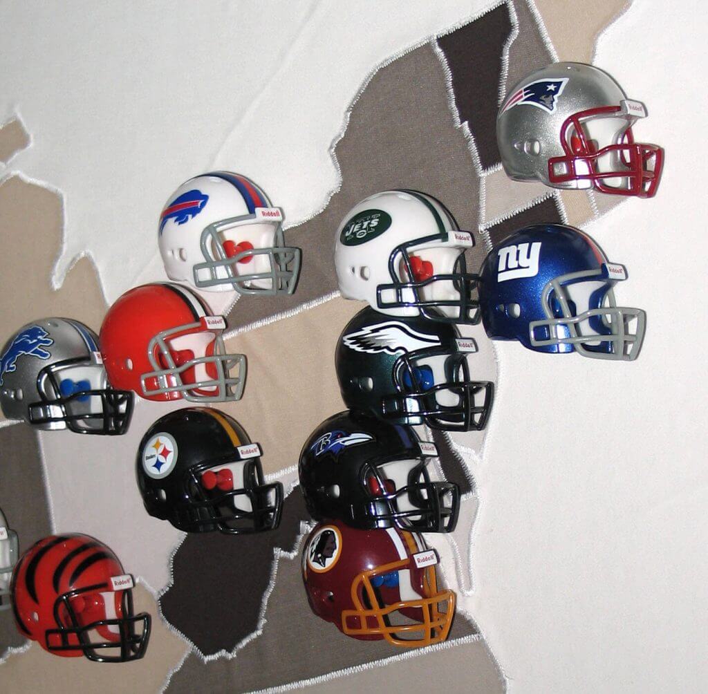
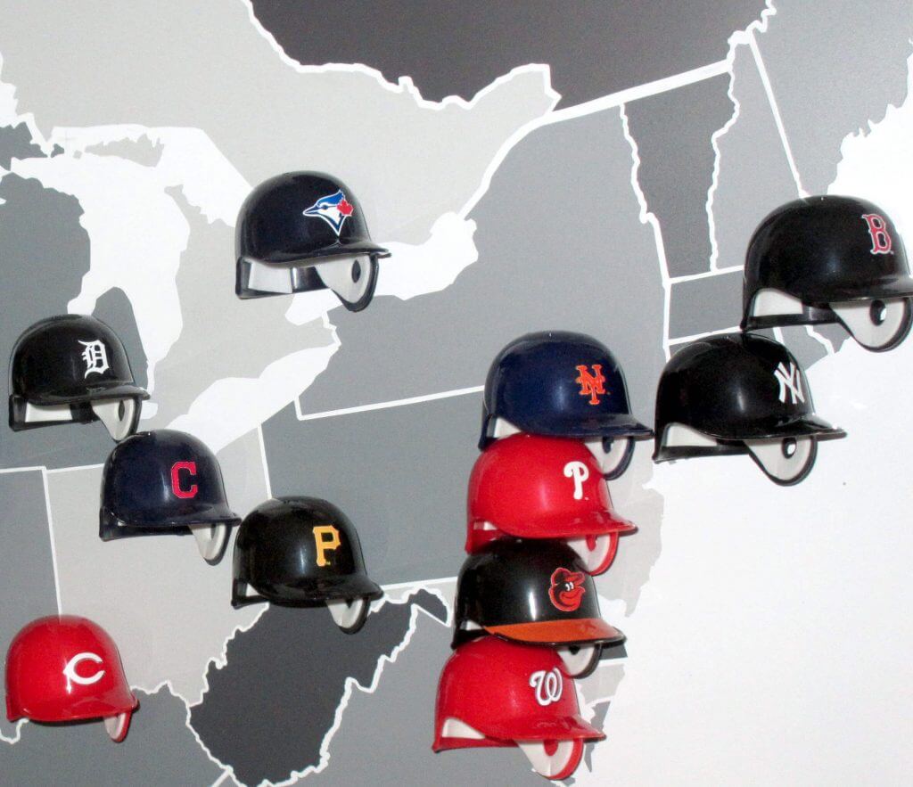
Eventually in late 2011 I returned from my sojourn and rejoined the unisphere. Despite loving my 2D helmet maps, underneath I still wished I had something more tangible, something truly three dimensional. By now the world of US Sports collectibles was available to me, including helmet replicas. But these were still out of my league for the same reasons as before. I kept looking and then one day I came across the Riddell Pocket Pros. Finally, here were helmets small enough and within my finances. And in fact they were almost exactly the same size as I had drawn them on my maps!
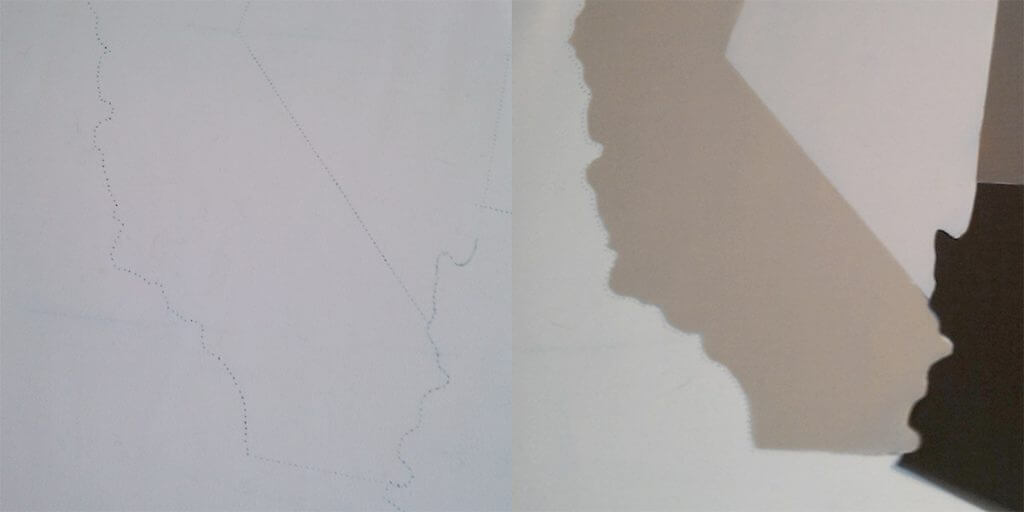
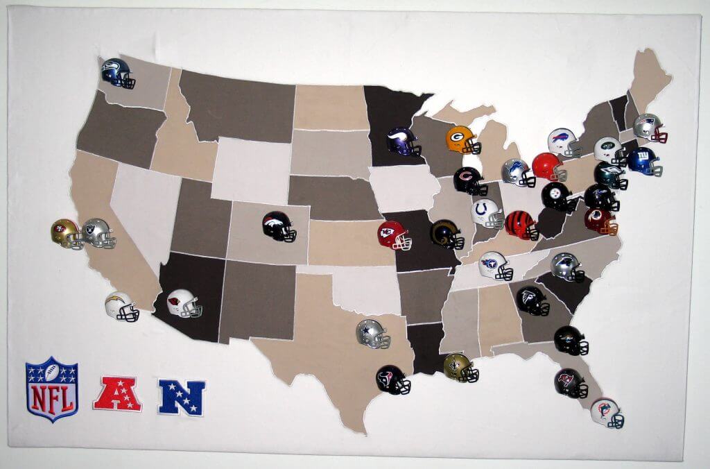
After a lot of eBaying to find a US seller prepared to ship them over here (this was 2011) I got the NFC and AFC conference sets. So that solved the helmets part, but what would I display them on? The paper maps would be too thin and how would I attach the helmets? I initially thought about using different wood-effect Fablons for each state, stuck on a piece of hardboard. But experiments hand cutting the states from vinyl with an X-Acto weren’t accurate enough. What could I do? Well I could sew! So I made a trip down to the local department store and returned with a large cream linen tablecloth and a selection of cotton pillowcases in various shades. Using tracing paper and prick-and-pounce, I transferred the map design to the tablecloth. Then I cut out individual states/provinces from the pillowcases and stuck them to the tablecloth.
Finally using my sewing machine, I ran satin stich down all the borders to cover the seams. All I needed then was to attach the helmets and came up with the idea of using drawing pins stuck through the earholes. Sticking the cloth map to a large piece of corrugated cardboard, finally after 27 years I had my 3D map. As a final touch I added NFL, NFC and AFC patches.
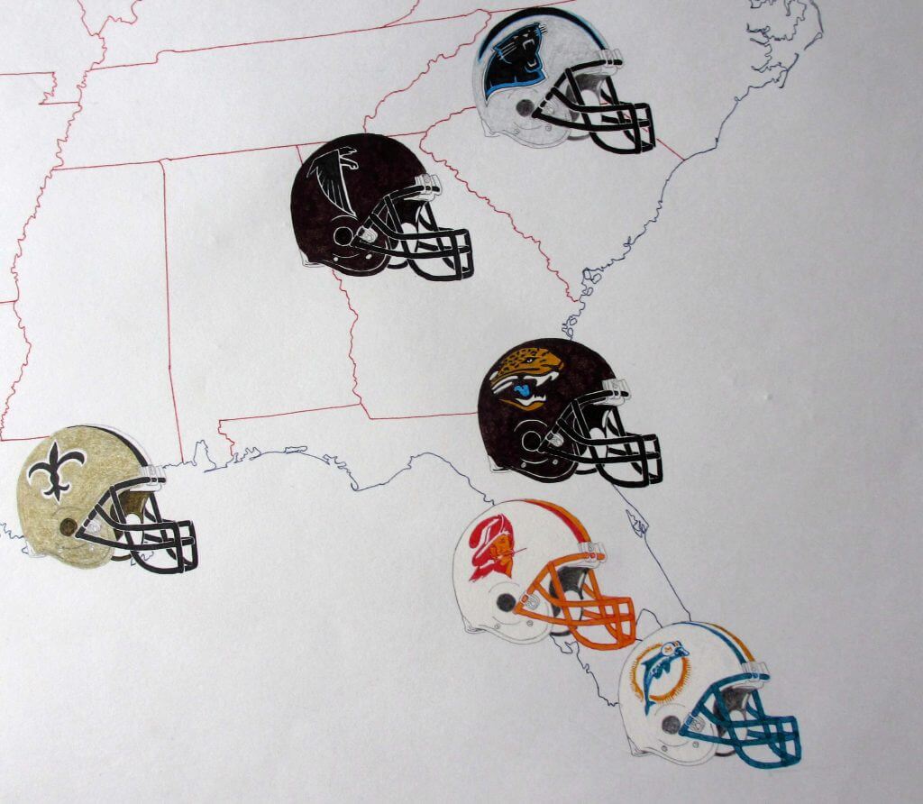
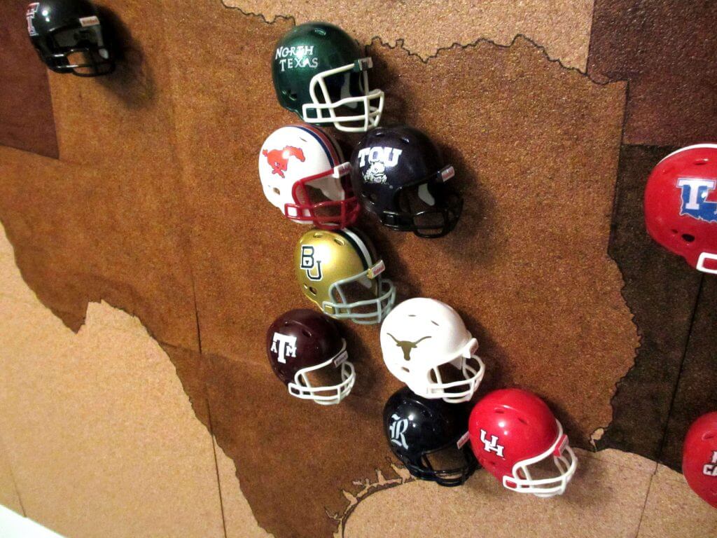
Emboldened by my success I thought can I go bigger? I knew now that Riddell also made NCAA Pocket Pros and I longed for a display of those too. But the NCAA had more than 100 teams even at the top level so the cloth method wouldn’t work as easily for the size of map that would be needed. After a bit of trial and error, I landed on using cork floor tiles. Not as pretty, but you could pin directly to them. So a bit of time on the PC scaling up the map and a few pots of varnish later I had my NCAA sized map. Although Riddell made NCAA Pocket Pros, they didn’t do *all* the teams. So I grabbed a load of spares off eBay and proceeded to make my own customs using inkjet decal paper. Finally I had my NCAA map. For a size comparison it filled a whole wall in my flat!
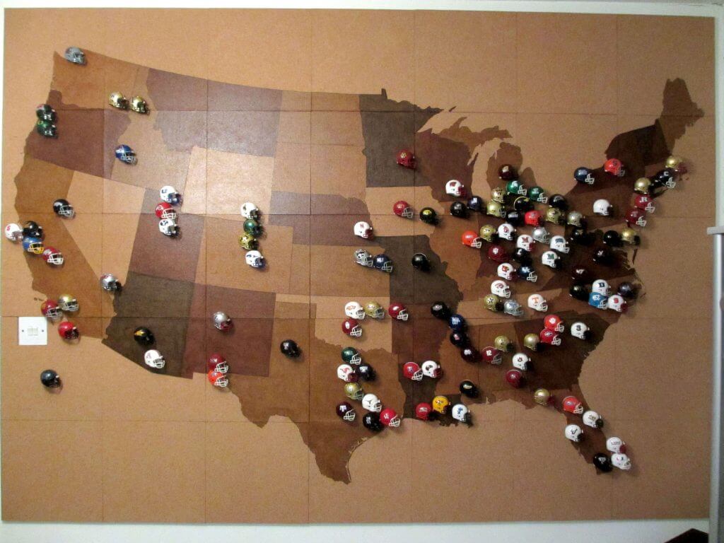
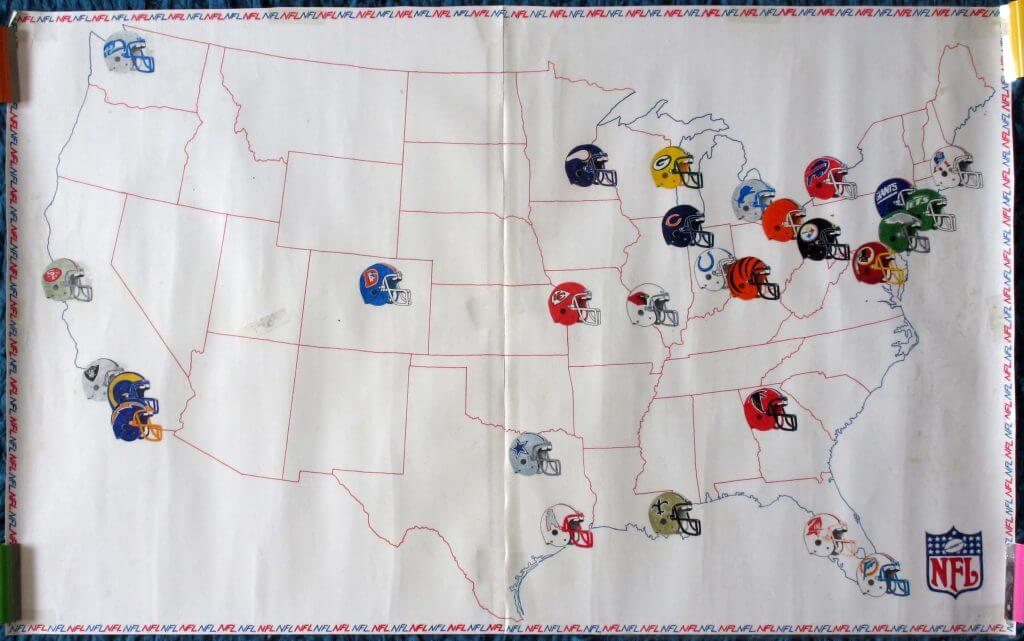
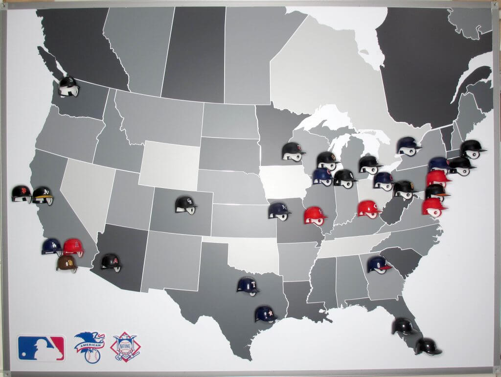
Over the following years I found the Riddell MLB pocket pros which meant I could do a baseball one too. And every year I would update the helmets as teams changed them. But then in 2021 after ten years of doing this, the map was the worse for wear from all the re-pinning. So I needed to make a new one. In the ten years since the first map, technology and computers had moved on so could I now try another way? Earlier this year I had bought a Cricut Maker. This is a computer controlled cutting machine and I got it to make my own T-Shirt and jersey designs using heat transfer vinyl (but that is another story!) As it cuts vinyl with ease I thought maybe I can revisit the Fablon idea? A quick test run showed it could cut accurately enough and so I got it to cut out the states and provinces in shades of grey Fablon. Rather than stick it to carboard again though, I got a flash of inspiration and bought an A2 magnetic white board to which I carefully stuck the Fablon pieces. To stick the MLB pocket pros to it I glued small neodymium magnets to them. As the MLB pocket pros are no longer made, many of these are custom – here I used the Cricut to cut new logos for these (rather than decals). I also made magnetic MLB, NL and AL logos to stick to the board.
Going forward this will hopefully keep me in business for the NFL and MLB for years to come. I am still working on the NHL :)
Wow! Chris, thank you so much for sharing! Over the years Paul (and I) have had the pleasure of showing off many readers’ childhood artwork, DIY Project and other projects, and this one really combines many of those passions we had as kids. Great stuff!
Readers, what do you say?
Utah Utes Unveil Special “USS Salt Lake City” Unis
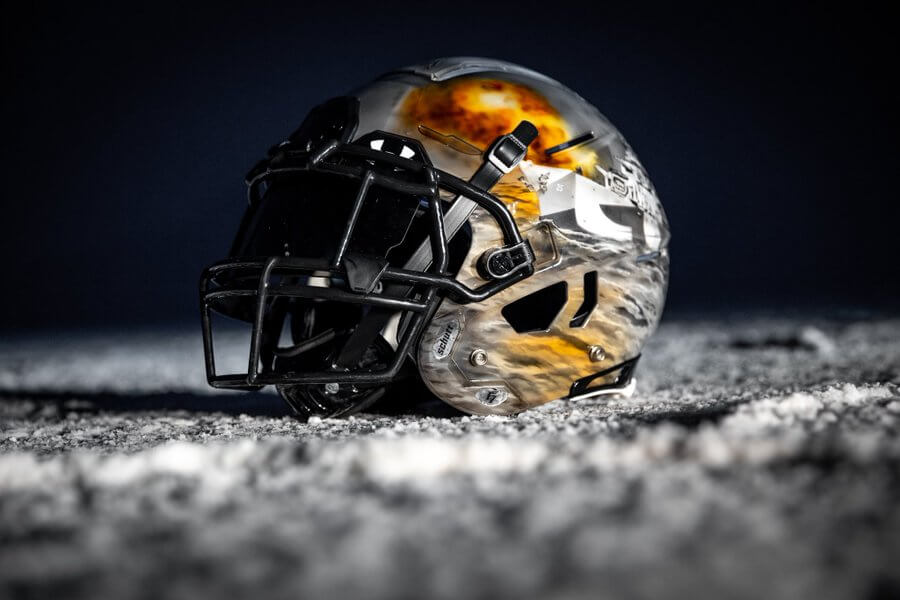
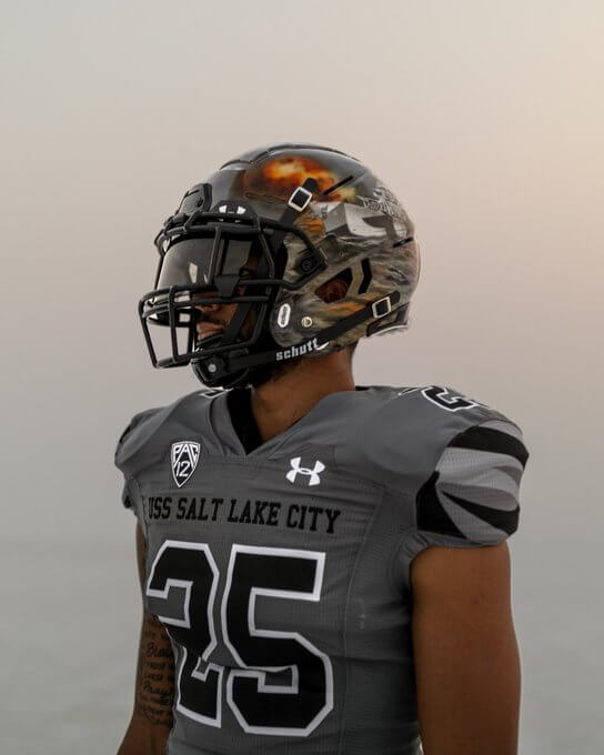
Yesterday, the Utah Utes football team unveiled special uniforms they will wear later this season (November 20) at home against the Oregon Ducks, inspired by the naval ship USS Salt Lake City, which saw extensive action during World War II. That date was chosen because it will be the school’s military appreciation day. As you can see above, the unis will feature a pretty amazing hand-painted helmet.
Of course, the uniforms were accompanied by a hype video, but unlike most, this one was long on facts and low on hyperbole, and narrated by U.S. Navy veteran YN2(AW) Ryan (@RynBrkr), who is also on the Utes Equipment staff. In fact, I’ll actually use the hype video text to describe the uniforms and their rationale):
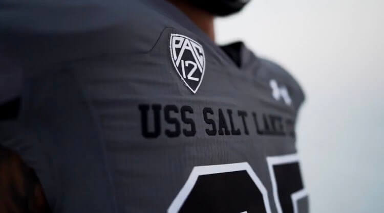
The USS Salt Lake City was a heavy cruiser during World War II. The ship can be identified for having three, eight inch guns on the bow. We chose to feature number 25 as it is the hull number of the ship. She fought in more combat engagements than any other ship in the WWII Pacific Fleet, earning the nickname ‘One Ship Fleet,’ which is featured on the back neckline.
The base color of this uniform is dark grey and features dazzle-camo accents on the shoulders and sides of the pants. The patterns on the left and right sides are in accordance with the patterns on the port and starboard side of the original vessel. This is also featured on the gloves. Each uniform features a single battle star on the right shoulder. When the ball is in play, there will be 11 stars on the field, signifying the 11 battle stars earned by the USS Salt Lake City. One of those battles is depicted on the helmets, each of which was hand painted by a single artist. Finally, the interlocking ‘U’ is on the pant leg tying the University and our team with the ship. We are proud to represent the USS Salt Lake City, her crew and their accomplishments. Go Utes.
Here’s the video:
Details on the USS Salt Lake City uniforms.
Narrated by YN2(AW) @RynBrkr @SolomonEnis @Utah_Football | #USSSLC pic.twitter.com/uV6t7sDtVx
— UtesEquipment (@UtesEquipment) August 24, 2021
“
And here are a few additional looks at the uniforms:
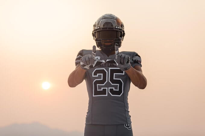
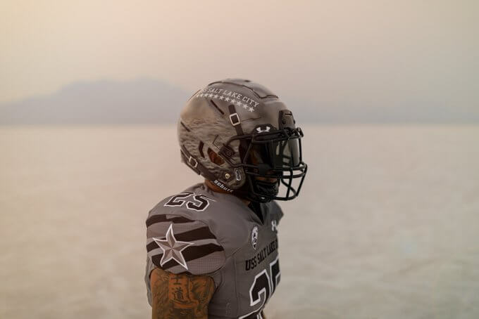
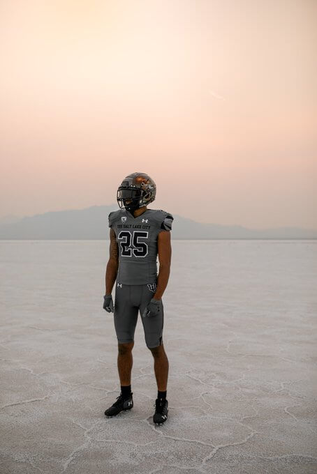
I’m generally not a fan of special occasion uniforms, or gray unis in general, but I think this one is pretty solid — the team could have gone quite crazy with their use of the ship’s dazzle camo graphics, but this is pretty restrained. Yeah, there’s that new “slogan on the neck” thing (which looks like it’s becoming a thing now), but all in all, a nice job. And those handpainted helmets look pretty sweet. I’m definitely looking forward to seeing this one on the field.

Uni Concepts & Tweaks
Time for more Uni Tweaks from the UW readership.
I hope you guys like this feature and will want to continue to submit your concepts and tweaks to me. If you do, Shoot me an E-mail (Phil (dot) Hecken (at) gmail (dot) com).
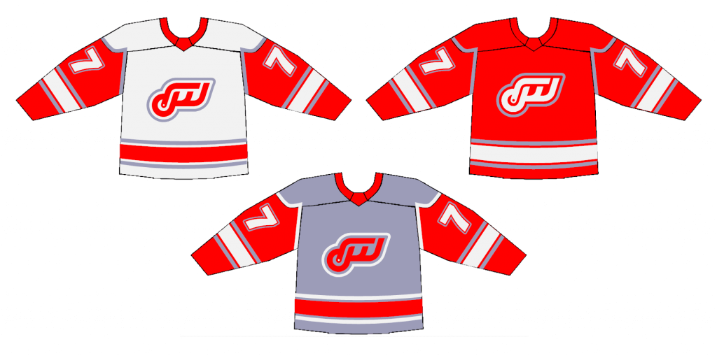
Today’s concepts come from John Woods:
Hey Phil,
Back in 1975, the New York Giants came out with their “Disco Giants” logo that lasted one season.
Soon after, the New York Rangers came out with a modern jersey with their shield logo and vertical sleeve stripe that lasted two seasons.
Here is a concept the Red Wings would’ve tried in the same era.
Minimalist logo features a D, R and W in lower case outlined in chrome (silver).
To emphasize the jersey having red wings (sleeves), a chrome version is created.
And, just like the Giants and Rangers, the Red Wings would drop these in a few years for a more traditional version.
Also attached: a mono red logo without the chrome outline.
John J. Woods
And here are his concepts:
OK readers (and concepters). If you have some tweaks or concepts, shoot ’em my way with a brief description of your creation and I’ll run ’em here.

Guess The Game…
from the scoreboard
Today’s scoreboard comes from Gary Chanko.
The premise of the game (GTGFTS) is simple: I’ll post a scoreboard and you guys simply identify the game depicted. In the past, I don’t know if I’ve ever completely stumped you (some are easier than others).
Here’s the Scoreboard. In the comments below, try to identify the game (date & location, as well as final score). If anything noteworthy occurred during the game, please add that in (and if you were AT the game, well bonus points for you!):
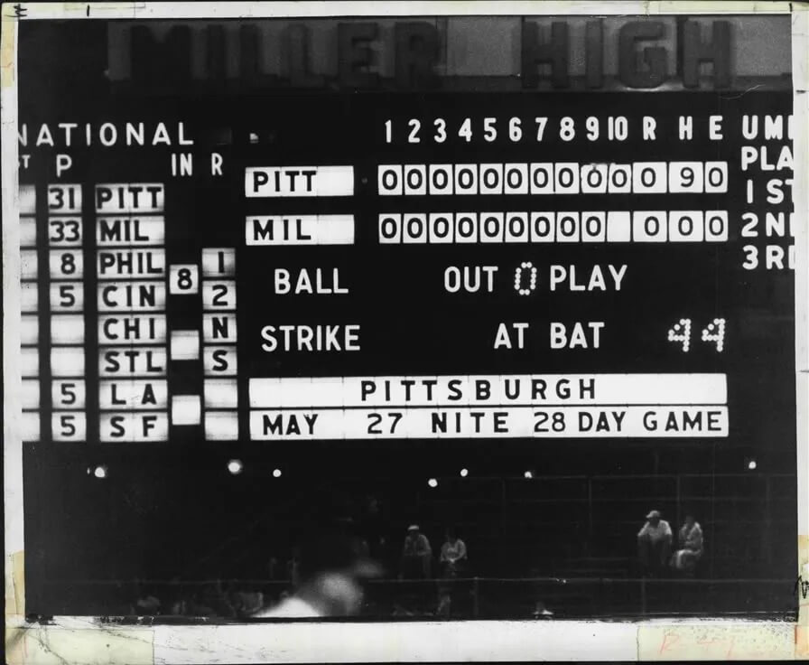
Please continue sending these in! You’re welcome to send me any scoreboard photos (with answers please), and I’ll keep running them.
The Ticker
By Lloyd Alaban

Baseball News: The Braves held Phil Niekro Night at Truist Park last night, celebrating the life and legacy of the Hall of Fame knuckleballer. He wore lots of uni combinations (from our own Phil Hecken). … New Pirates IF Michael Chavis is still using a Red Sox duffel bag, but he taped over it with “Pirates Arrgh” to fit his new team (from Charles Sherrange).

![]()
NFL & NCAA Football News: New rear bumpers for the Saints. Previously, they went with blank rear bumpers (from Patrick Wieboldt). … At least one sportswriter believes that ads on Florida uniforms are coming (from our own Phil Hecken). … Reader Nate Mueller 3D printed a 15.5” resin BIG10 trophy.

Hockey News: New mask for Sharks G Adin Hill (from Wade Heidt). … Also from Wade: New center ice logo for the Golden Knights.

Basketball News: Reader Etienne Catalan has the latest NBA uni assignments. … New court for Valparaiso (from Scott Held).

Soccer News: New kits for the University of Winnipeg with 1970s logo on away shirts (from David Larkins).

Grab Bag: Afghanistan’s flag made it into the Paralympics opening ceremony even though their two athletes had to withdraw (from our own Jamie Rathjen). … American University field hockey has new white shirts. The text is blue instead of red (from our own Jamie Rathjen). … Apparently half of all Delta flight attendants are wearing their own clothes to work (from Mario M. Carr).
Uni Tweet of the Day
Almost worthy of a GTGFTS…
Polo Grounds, New York, 1963. That's Duke Snider (in a Mets uniform) at the plate. pic.twitter.com/2hXNrXQ0vx
— Lost Ballparks (@lost_ballparks) August 24, 2021
And finally… that’ll do it for today. Big thanks to Chris for sharing (and saving all these years!) those helmet maps. Just wonderful stuff there.
Everyone have a good Wednesday, and I’ll catch ya tomorrow.
Peace,
PH
Harvey Haddix’s near perfecto where the Battlins lost in the 13th to the Milwaukee Braves. 1-0 MWK on 5/26/1959
GTGFTS is 5/26/59: Harvey Haddix’s 12-inning perfect game against Milwaukee, which he lost in the 13th on a throwing error by Don Hoak, followed by Joe Adcock’s walk-off home run.
GTGFTS: May 27, 1959 at County Stadium. When MLB came up with an official definition of no-hitters that no longer included this game, Harvey Haddix told his wife, “I know what I did.”
Wow, incredible stuff Chris!
Thanks JohnMark!
Harvey Haddix’s 9 innning perfect game!
Artistically and from a craftsman’s perspective those helmet maps are incredible. But there is a geographic mistake on the Texas college one (that appears to be an easy fix). TCU is in Ft Worth and SMU is in Dallas so TCU should be on the west side. Flip flopping those would fix it. The same is true of UT and A&M. Austin is west of College Station so switching those helmets would solve those.
I like maps too. There are helmets out of place on the NCAA map. Switch TCU & SMU,UT & A&M, and Washington and Washington State.
Great stuff on the helmet/cap maps.
Phil, would have liked to have seen a phot of Phil Niekro in the 70’s red pinstripes like the photo at the top of this. I always liked that uni.
link
Terrific stuff with the helmet maps! I can’t believe I just now realized we had two NFL teams in Missouri for all those years. I just never think of Missouri and pro football. I am a doofus.
It takes some balls to rebrand an Original Six team, especially to a 70s theme. But this one works. I don’t hate it. It’s the kind of thing that, had that hypothetical timeline actually happened, people would be clamoring for a throwback for.
I don’t like the chrome, but the logo is really nice….reminds me of one used by the WHA Michigan Stags during that same timeframe.
Years ago I did something of the same thing, only on paper. Didn’t incorporate the DRW letters like that, which is pretty interesting. I had more of a minimalist look, where a heavy line represented the tire, and became the top and bottom of the wing. Then two somewhat thinner lines repeated the pattern, concentric to the outer line, and finally a red dot at the hub of the wheel. Thinking back now, it would have been almost Flyers-esque, if you know what I mean.
Same thing with the Leafs; the 11-point star from 1967 through 2016 became (on my sheet, anyway) just a series of five acute angles that mimicked the basic pattern of the maple leaf without the stem.
Anybody else catch that the British TV set has the Steelers helmet reversed?
I think it’s because they drive on the wrong side of the road there, so to them it looks right.
Well played
Hard to tell with the angle but it looks like it might be the plain silver Seahawks helmet too.
Yes it is reversed so incorrectly shows a left side logo. For some reason they had the helmets facing left not right which is odd for both that reason and for the fact that they face away from the viewer. And as Paul wrote in a piece recently, the convention is right facing.
Great stuff Chris. And yes, I saw the geographical mistakes on the college board also. Also, it struck me how difficult this college one is with teams having many different helmets. For instance you used a black helmet with ASU, Arizona State University, whereas their most recognizable helmet is yellow.
Thanks to those of you who spotted the mistake – I hadn’t noticed it. When I submitted this I figured you guys would find any mistakes straight away! If that is the only one I will be relieved :)
GTGFTS… The Baseball Project recorded a great history lesson of Harvey Haddix’s “not-so-perfect” game, listing all 17 pitchers who had thrown a perfect game. There have been several since the original song was recorded, and they update it for live performances. link
Something about that Polo Grounds photo really struck me. Wow. I think I haven’t seen many color photos of the park.
Thanks for sharing.
Chris, those maps are fantastic! Well done, especially for someone who lives overseas! I’ll be thinking about those maps all day.
I’m surprised you didn’t do one for Premiere League teams. I suppose the kits change too often to do it justice…and the crests are all different shapes. Having the logos on a helmet add a certain uniformity to it all.
And John, that logo for the Red Wings looks exactly like something that would have been created at that time. Great job mixing the words into the shape of the original logo!
As often as I (deservedly) bash GFGS unis, but I’ll give credit where credit is due and say those ones for Utah are pretty good. I bet it’ll be hard to read the numbers on television though. I also think it works that they didn’t try to include any of their primary red color into the design and made it a busy looking uniform.
Thanks Memal! I have done maps for non North American Leagues – but never for soccer (for example I did British First Class Cricket Counties). I also did an NBA one, but the problem with non headwear based one is because logos are different shapes you don’t get the same overall design feel you get with helmets or caps.
You ever think of doing a Rugby map of the various club teams/leagues?
Those helmet maps by Chris are insanely awesome!
As for the Red Wings concept, it’s an interesting idea, to be sure. From a historical perspective, though, Bruce Norris (owner of the Red Wings at the time) comes off as a traditionalist, as aside from the switch to red sleeves on the white sweater in 1956 and the league-mandated NOBs as of 1977, the uniform really did not change much at all until Mike Ilitch bought the team in 1982 and modernized them. Still, if Norris had been in a more experimental mood, I could see this having happened… though not with that piping around the sleeve seams.
And I realized moments after my comment that the Red Wings concept really needs a matching “detroit red wings” wordmark (all lower-case to match the logo’s design) to go with it. The traditional flourish-y wordmark definitely wouldn’t fit with it.
Say goodbye to the Fighting Irish:
link
I’m not about to rehash all the Uni Watch talking points regarding the legitimacy of the Fighting Irish iconography.
Instead, it seems the lifespans of team names/mascots are more and more determined by the shifting priorities of public opinion. Sure, Notre Dame has had fun with their mascot for generations, but it will only last until a groundswell of protest (inside a crucible, like the Black Lives Matter movement) makes it obsolete.
I’m all for rebel pride, and satisfaction results from saying, “Oh yeah? Well, I don’t like YOUR mascot, either.” But I know a trend when I see one. Sooner or later, ethnicity-based names will succumb to a spirit of well-meaning inclusiveness. The tea leaves tell me so.
Hats (and helmets) off to Chris! Well done, sir.
Love those maps!
Great stuff Chris! Thanks for sharing ! I also have a love for helmets and maps so I greatly appreciated the post today! Great stuff !
I would just like to point out that that fake Red Wings logo from the fake 1970s is brilliant and genius and I love it.
Wow, Chris! Your 3D projects reflect a lot of sweat and toil, not to mention the glorious anal-retentive traits that are the mark of all serious uni-watchers. I would only have gotten as far as the maps done in marker pens, but I’m in awe of your draftsman’s skills. Did it create storage issues that all your projects were so big?
Thanks Walter! The paper maps are mostly around A2 size and I store them all in my artist’s zip case that I got at school. Of the rest, the NCAA cork tile map and all the helmets is in a large box in my attic. I won’t have enough wall space to display it again unless I move!
I found this web site several months ago, enjoy!
link
Those maps are brilliant!
I also have a love for both maps & uniforms. I spent many hours drawing uniforms and reading/viewing my giant world atlas as a kid (glad to hear I was not the only strange kid that had these unusual interests).
By any chance have you considered creating & selling some versions of these? Based on the response today you may have a market.
Thanks Mic. I’ve not considered selling either the maps or the display boards. Part of the problem is re-use of the team logos, which I’m sure the league lawyers would view in a dim light!
Fantastic maps. The NFL on Channel 4 was required viewing in the 1980s and went a long way into making me a fan of American sports and uniforms in general.
I have a pretty good knowledge of US geography which I have to credit to my intrest in sports. I’d hear all these exotic names like Minnesota, Kansas City and Cleveland and rush to my dad’s atlas to pore over the huge map of the USA and figure out where each team was.
The ruling re. no hitters needs to be changed. Haddix pitched a perfect game for 12 innings! It’s not his fault the Pirates didn’t score. That may never happen again…
As a cartographer, I really enjoyed todays post.
As an Oregon Duck fan, I really enjoyed that the UW Fuskies and WSU Cougars helmets are reversed on the cork board map.
:)
For those who didn’t click on the link regarding Florida teams possibly adding advertisements, here is the key line:
“The NHL announced last week it will allow teams to sell advertising on jerseys beginning in 2022. The NBA has allowed it since 2017. The NFL and MLB are making similar advertising plans.”
This is the first I’ve heard that the NFL was considering advertisements on uniforms, and it’s unclear what the source is for this. But I’ve been thinking for a while that it is just a matter of time. I mean, there is really no reason not to (from the owners’ POV), and I suspect the NFL might simply be waiting for the other leagues to go first so it won’t seem so unusual when football does it.
For GTGFTS, May 26, 1959. Harvey Haddix’s 12-inning perfect game that he lost in the 13th when the Milwaukee Braves ended up beating Haddix’s Pirates 1-0. It should still be counted as a perfect game, IMHO.
This is awesome, Chris! My favorite part of your maps is seeing the helmets and caps move around and morph over the years as teams are relocated or rebrand. I grew up thinking of the Rams as a St. Louis team – very funny seeing them boomerang to LA!
Thanks Matt! As a Brit the whole idea of teams moving was a new one on me so to find the Rams had moved to St. Louis during my absence was shocking. So it’s funny that you are sort of looking at the St. Louis to LA move the same way!
The maps are a fun trip thru both sports team’s movements and home technology advancements. However, since I lived in Texas for twenty years one problem on the NCAA map jumped out at me: the Longhorns and the Aggies are in each other’s locations!
I find it more than fitting that Phil Niekro pitched in the Show long enough to come full circle – from the classic uniforms in the Milwaukee years, to the simple pinstripes and navy-and-white in Atlanta, to the feather pullovers, the garish and ugly (yes, I said it) red pinstripes and powder blues of the Turner years, and finally back to the classic tomahawk unis. I know they’re not politically correct, but man they look nice.
My father served on the USS Salt Lake City in WWII. Its great to see someone somewhere is remembering its long and distinguished service.
Great work, Chris-thanks for sharing those maps!
I really enjoyed seeing a couple of my favorites – the teal Marlins hat and the ‘97-‘99 Brewers helmet- as well as the USFL helmets (minor quibble-I think the ‘84 Michigan Panthers had royal plum face masks).
I like that Red Wings concept more than I thought I would. That totally would have worked in the 1970s for the Wings. Even if they went back to the traditional Winged Wheel by now, that would have fit in perfectly.
Just a heads up it appears the Washington and Washington State helmets need flipped.