By Phil Hecken
Follow @PhilHecken
Good Sunday Morning, Uni Watch nation. Hope everyone had a good Saturday. It’s a new month today — we May-de it. Happy May Day to anyone celebrating.
Last evening, the Kansas City Royals became the third team this season to debut their “City Connect” uniforms (the Washington Nationals and Houston Astros were the first two, with the Colorado Rockies up next, on June 9th). Paul had a preview of the KC unis here, and a write up on the team’s City Connect cap here. Both of those provided the “backstory” for the unis the team wore last evening.
Usually, one takes a “I need to see it on the field, in action” type of attitude towards these things, since unveilings don’t always show the full uniform, or it may look slightly different. Such was not the case with the Royals’ CC duds. They are what we thought they were.
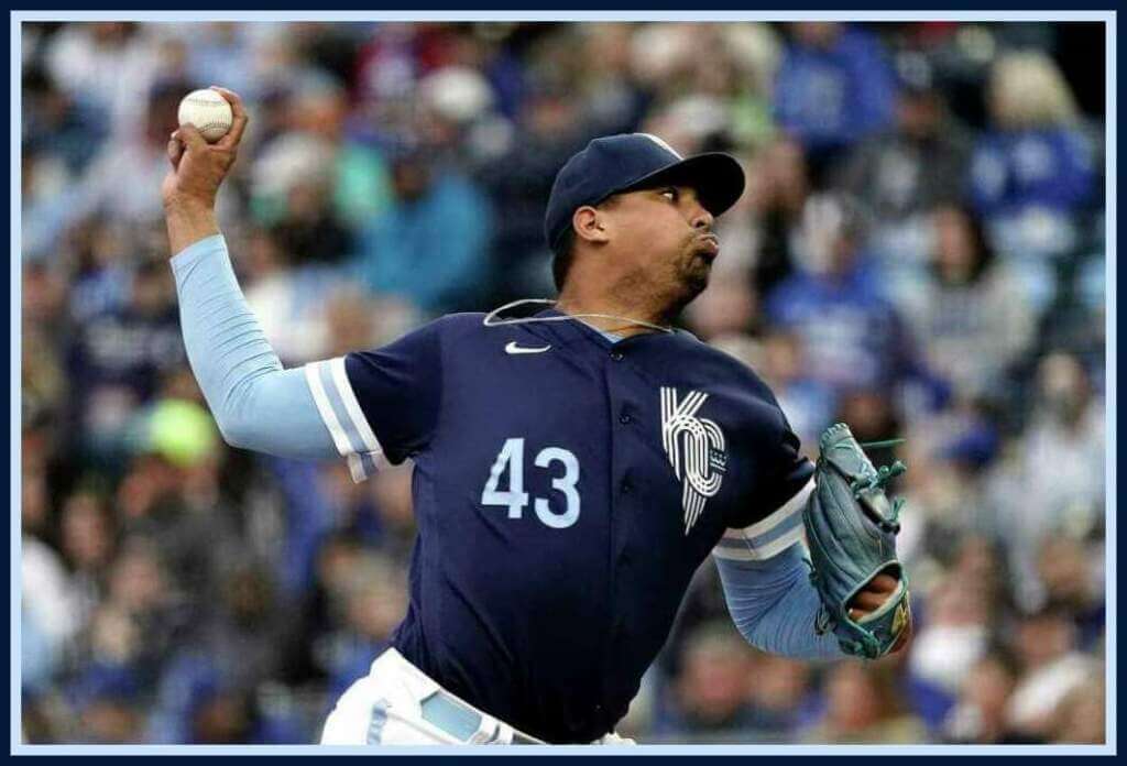
For a team whose main color, which is in its name (Royal), these unis contained none of that shade of blue. Instead, caps and jerseys were navy — jerseys were accented with a wide white/powder/white sleeve hem, with a stylized “KC” (based on the municipal flag) logo on the caps and jersey front, with a stylized “R” on the right sleeve. Most players who wore sleeves wore a contrasting powder blue (which was nice).
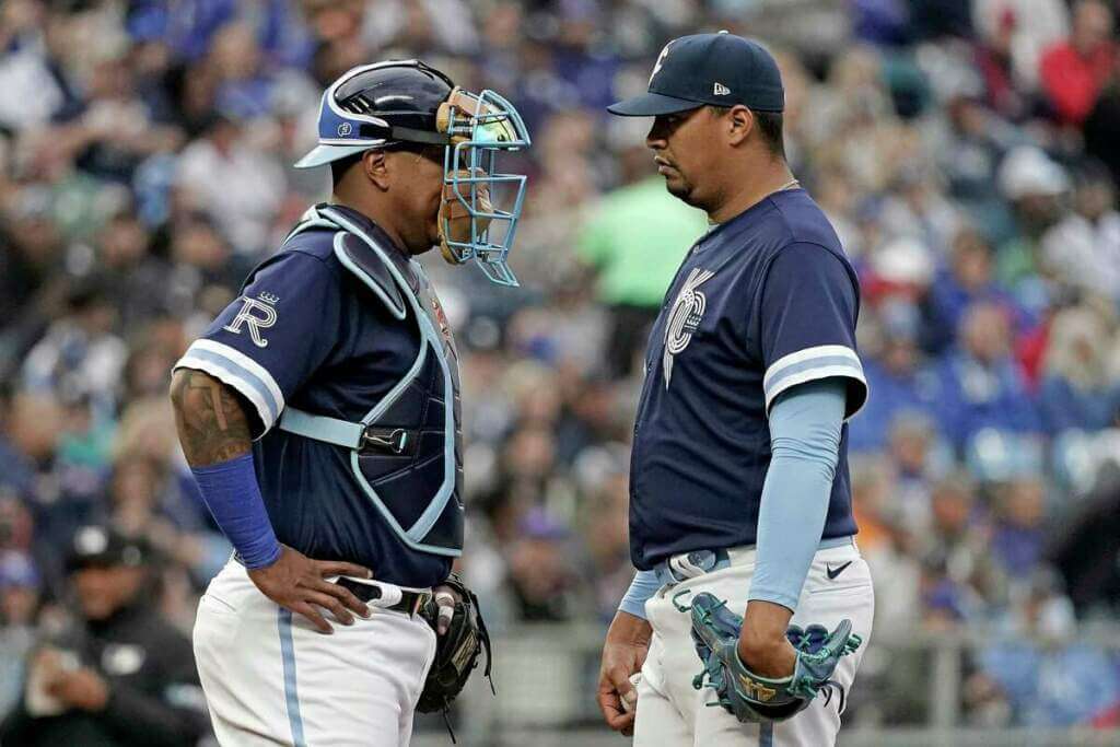
Pants were white, with a thin powder/white/powder stripe. Most players who wore belts wore powder blue ones.
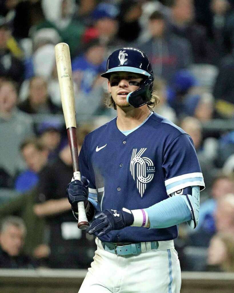
In a bit of a twist, as you can see above, while the caps the team wore had a blue crown AND brim, helmets had a powder blue brim — an odd choice of helmet and cap not matching. I think the caps might have looked better with the powder blue brim.
The uniforms had front numbers, also rendered in powder blue.
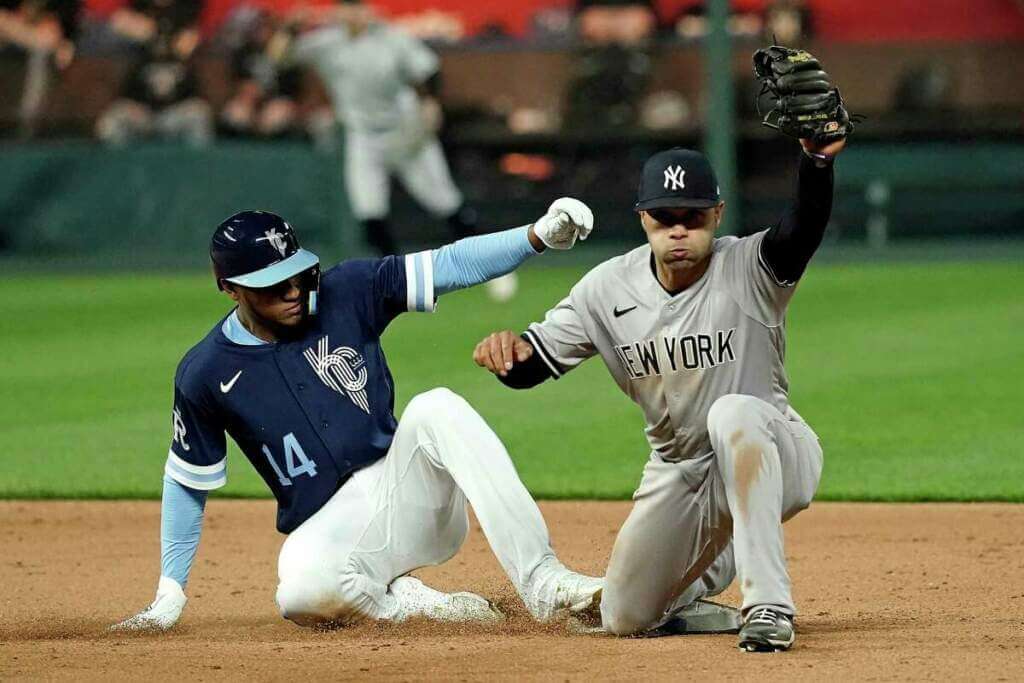
Most players wore their pants at full length — something I normally frown upon…
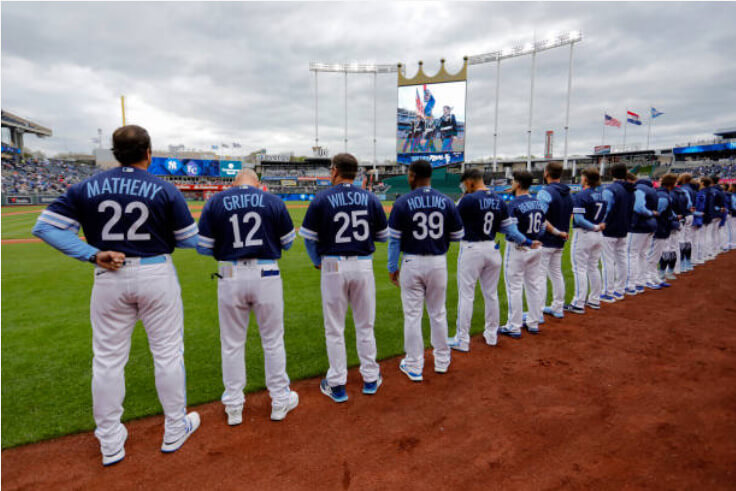
…but not so much this time, as the CC socks were um… well
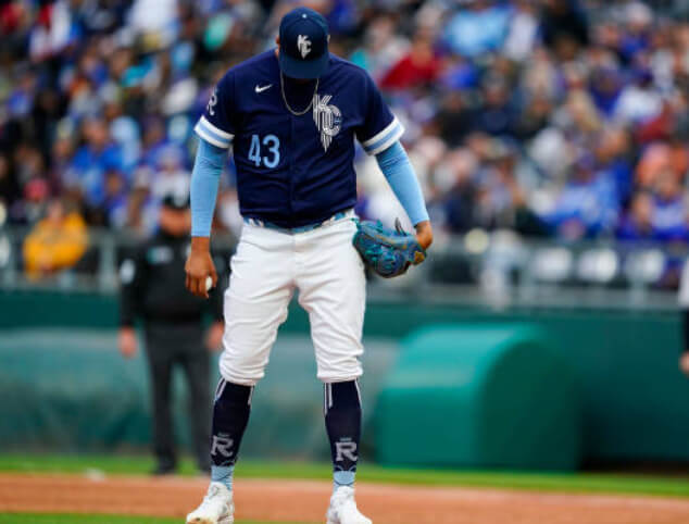
I think the team would have looked much better with a solid powder blue sock. Those stylized CC socks certainly didn’t help this uniform in the looks department. (Here’s a closeup.)
NOB was rendered in a radially arched powder blue custom font, with back numbers in white.
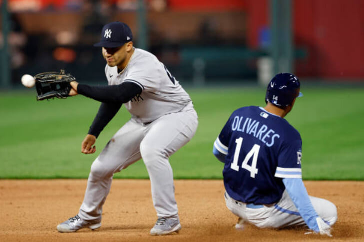
This is of course, opposite from the front, where the number was rendered in powder. While usually not both visible in the same shot, this inconsistency bothered me a bit.
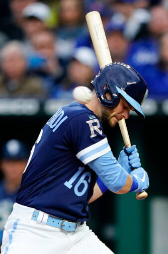
While not the worst CC uni by any means, I was disappointed the team didn’t opt for a full powder blue uniform (especially since they didn’t add a full powder uniform when they updated their unis this past fall). Storytelling aside, it seems like Nike is quickly running out of ideas for the CC unis (sort of similar to when concepters try to redesign every uniform in a league — you just can’t avoid repeating certain types of looks).
You can see more photos here
Rangers Throw It Back 50 Years

Over in Arlington yesterday, the Texas Rangers (who moved to Texas in 1972, following their original incarnation as the expansion Washington Senators) celebrated 50 years by wearing 1972 throwbacks.
Those original Rangers uniforms had the distinction of having a button front jersey paired with sansabelt pants. The collar of those 1972 unis had an odd design — a red/white/blue striping pattern that didn’t quite wrap around. This detail was actually pretty well replicated (though with a thicker striping pattern) on the throwbacks.
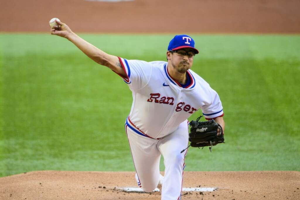
The custom “RangerS” font was also nicely replicated, as were the striping patterns on the sleeve (blue/white/red) and sansabelt (red/white/blue).
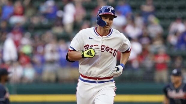
Both helmets and caps had royal crowns and red brims.
NOB was rendered in red, and rear uniform numbers were red with a thin blue outline. Pants had a thin red/white/blue stripe.
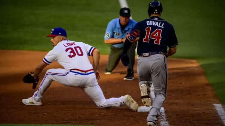
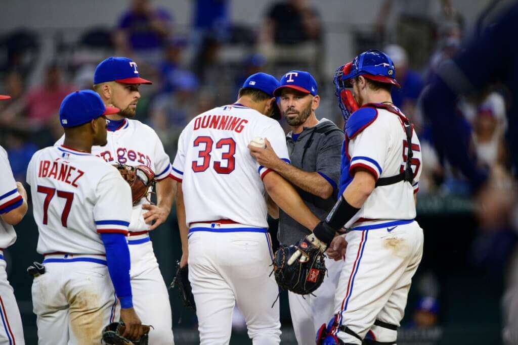
Of course, back then, players wore blue stirrups with white sanis, but I didn’t see (in photos) a single player going high cuffed.
The Rangers have thrown back to their original duds before, so the basic template was probably still available. It looked great in 1972 (when polyester unis were just taking off, and players still wore stirrups), but the look seems a bit quaint and dated now. I’ve always loved that original wordmark (and the capital “R” and “S” subliminally standing for Robert Short, the team’s owner), and it’s nice to see it brought back on occasion.
You can see more photos here.
Your thoughts on these unis?


Uni Concepts & Tweaks
Time for more Uni Tweaks from the UW readership.
I hope you guys like this feature and will want to continue to submit your concepts and tweaks to me. If you do, Shoot me an E-mail (Phil (dot) Hecken (at) gmail (dot) com).
Today’s concepts come from Ron Barron:
Hi Phil,
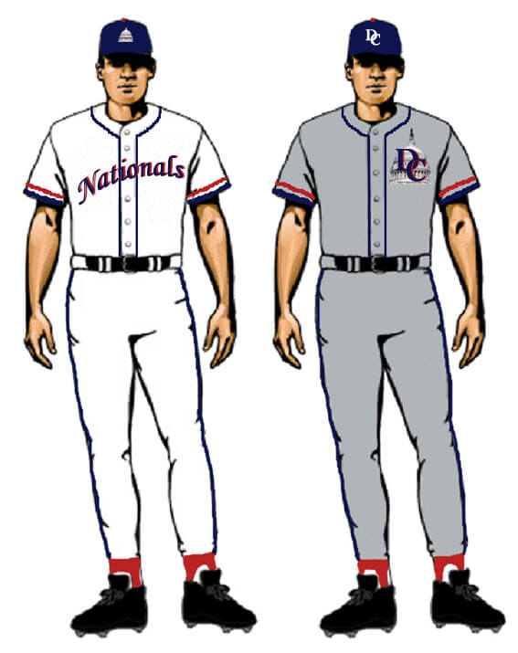
My name is Ron Barron (in Boston) and I have been a longtime reader/occasional email sender and as I was going through some old files on my computer, I came across the attached concepts I did in Photoshop before the Nationals first season in DC.
As you can see, I did two different home uniforms but just one road uniform (because I liked that one much better!).
Let me know what you think and if it is post-worthy for the ticker.
Thanks!
Ron

OK readers (and concepters). If you have some tweaks or concepts, shoot ’em my way with a brief description of your creation and I’ll run ’em here.


Guess The Game…
from the scoreboard
Today’s scoreboard comes from Vikram Chowdhry.
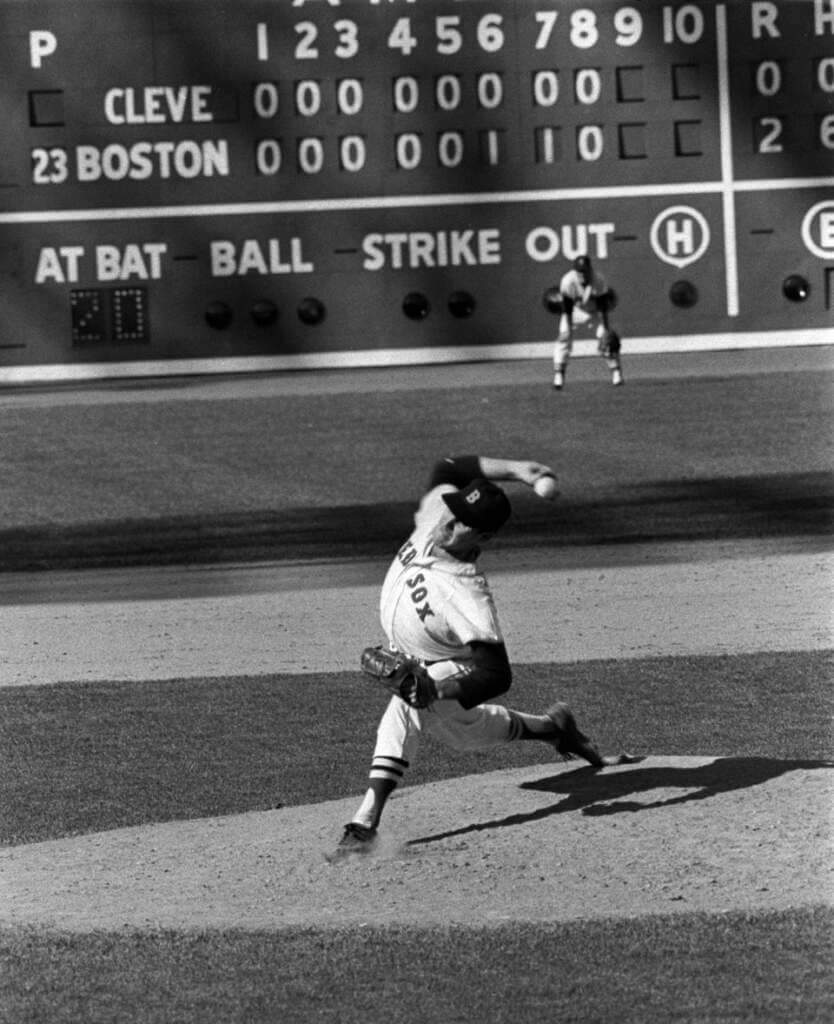
The premise of the game (GTGFTS) is simple: I’ll post a scoreboard and you guys simply identify the game depicted. In the past, I don’t know if I’ve ever completely stumped you (some are easier than others).
Here’s the Scoreboard. In the comments below, try to identify the game (date & location, as well as final score). If anything noteworthy occurred during the game, please add that in (and if you were AT the game, well bonus points for you!):
Please continue sending these in! You’re welcome to send me any scoreboard photos (with answers please), and I’ll keep running them.


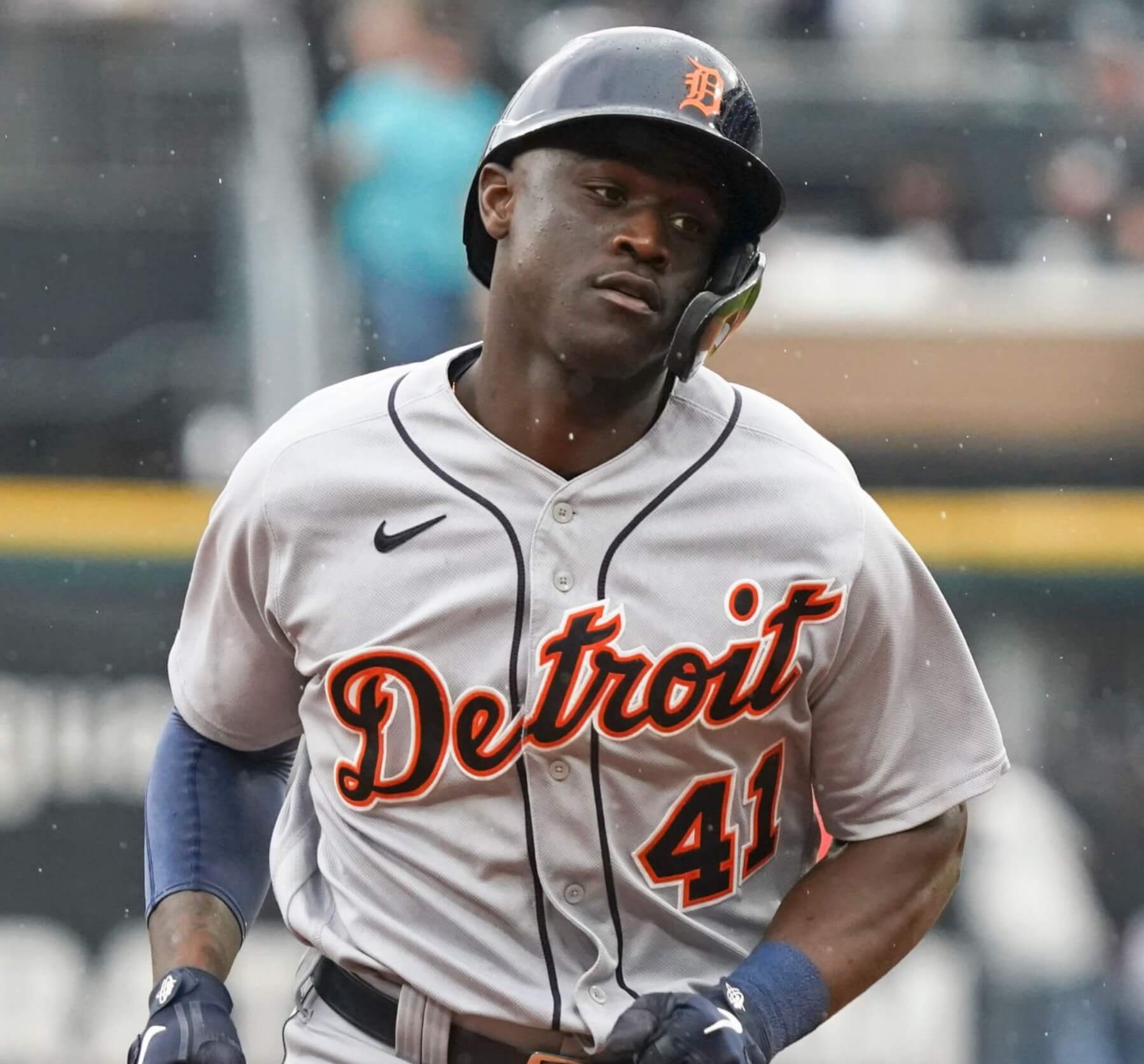
And now a few words from Paul: Hi there. In case you missed it, my Bulletin article this week is a worst-to-first Uni Watch Power Rankings assessment of MLB road uniforms. My premium subscribers can check it out here. If you haven’t yet subscribed, you can do that here (you’ll need a Facebook account in order to pay). Don’t have or want a Facebook account? Email me for workaround info.
Also: I’ve been running a sale on Uni Watch pins this week. Here are the discounted prices:
- • One pin
• Any two
• Any three
• Any five
• Any 10 for $30
A few designs have sold out this week, and a few more are running low. Full details here.
That’s it from me. Now back to Phil!


Uni Watch News Ticker
By Phil

Baseball News: Normally, the SF Giants have been wearing their orange alternate jerseys Friday evenings (“Orange Fridays”), but due to supply chain issues, they’ve been forced to wear their City Connect uniforms instead. … Following Friday night’s no hitter, the Mets displayed a post-game graphic on the Citi Field scoreboard and SNY which showed Edwin Diaz in his 2021 black jersey (with blue headspoon on the front). Good catch by Teddy Ballpark. … The Lehigh Valley Iron Pigs have started a “No Pork Left Behind” campaign and are offering an official Lehigh Valley Scrapple jersey for presale (from Lehigh Valley Iron Pigs). … This is video from August 2019 Nippon TV, where they followed the people who clean uniforms after games in Japan. 133 players/staff gear done by 11 people in 5 hours. Even ironed hats, batting gloves (from Jeremy Brahm). … Speaking of Asian Baseball: Here are some KBO Aesthetics: Doosan released their Seoul jersey for this season. They will wear these as their away jerseys when they face LG or Kiwoom (from Dan Kurtz). … Vanderbilt seems to have taken camopandering to the next level. … Hawai’i baseball wore retro white uniforms last evening. … Remember back in 1997 when the Twins wore red softball jerseys? It was only worn twice (April 6 & 27) and then retired. … LSU Softball has a tradition where the Seniors pick the unis, so yesterday they wore teal over purple (via M. Quinlan Duhon). Yes, it looked as bad as it sounds. … This excellent story about defunct baseball parks in Bellingham, Wash., has lots of great old photos, including this beauty showing the uniforms worn by the Elks, the city’s official team in the 1910s and ’20s (from Kary Klismet). … New costumed mascot for the independent Atlantic League’s Staten Island FerryHawks (also from Kary). … Members of the 1971 and ’72 Meridien (Miss.) High School baseball teams finally received rings for winning the state championship (Kary again). … Robinson Chirinos is definitely sporting a different batting helmet than anyone else on the O’s (from Dillon Atkinson). … There’s high cuffs…and then there’s this (from Stephen Schoch).

Football News: Pretty much no new uni news in the pro and college ranks (other than uni number announcements) due to the 2022 draft, but up in Canada, the Montreal Allouettes have released a new helmet. … If you scroll down a bit in this article, it takes a stab at the best uniform in each NFL team’s history. It surprisingly gets a few correct. … New Kansas City WR Skyy Moore is sticking with his college jersey number, which is 24. … Cam Akers will wear #3 for the Rams. Odell Beckham is not pleased. … Looks like several New York Jets are going to fight over who gets to wear #1. … And it may cost new New York Giants DL Kayvon Thibodeaux a LOT of money if he wants to wear #5.

Hockey News: “I’m watching the Islanders-Lightning game [Friday night] and noticed something surprising and unusual,” observes Larry Schmitt. “After Mike Bossy’s passing two weeks ago, they added his #22 on a memorial patch to the front of the jersey between the crest and right shoulder. Bossy’s was just below and diagonal to the right of the #9 already there for Clark Gillies in January. But [Friday] night both patches were moved. Bossy’s in the position Gillies had been, with Gillies directly to the right of Bossy’s in a straight line. I can not ever recall an in-season reconfiguration memorial patches in this manner. Even more surprising the Islanders just played Washington last night, so the move was made knowing this was the last game of the season (the Isles won’t make the post season this year).” … Wade Heidt noticed Canucks G Spencer Martin wearing his AHL Abbotsford Canucks pants in Edmonton Friday night. The tipoff? No stripes down the sides of the pants. … Anaheim Ducks in an emergency backup goalie situation of Friday night. Goalie Tom Hodges went NNOB! (from Nas). … After 51 years behind the mic, John Richard “Rick” Jeanneret is retiring, and he received a bit of an on-ice tribute (via Paul). … Here’s an interesting piece on the history of Stanley Cup championship rings (from Kary Klismet). … Pretty cool-looking colo(u)r vs. colo(u)r game yesterday in the AHL (from Josh Dudych).

Soccer News: Here are the latest renderings of what Inter Miami’s new stadium will look like (from Kary Klismet). … Barcelona’s reserve team wore half-red, half-blue shorts on Friday in a match in Spain’s third-tier pro league, the Primera División RFEF (also from Kary). … One more from Kary: New home kits for Croatian side Hajduk Split. … Here’s one of those cool progressive timelines of LaLiga winners since 1929 (from Greg Harvey). … German Bundesliga Team Arminia had a special jersey yesterday as a sign of awareness to protect the Teutoburger Wald,a Mountain range near Bielefeld (from конец войне).

Grab Bag: I’ve never been to San Francisco, but I can’t tell you how much I love these circa-1970 BART uniforms! … Check out these Curling stone-shaped award trophies and a box of curling stone chocolates on display at the gold Medal match in the World mixed doubles curling championships (from L.J. Sparvero).


Uni Tweet of the Day
Here’s one where I disagree with Paul. I do NOT like white outlining on gray roadies…
The Dodgers lettering should still have the white outline on their road uniforms. pic.twitter.com/hVHYu6doFi
— Stirrups Now! (@uniformcritic) April 30, 2022


And finally… that’ll do it for me for today and this weekend. Everyone have a great Sunday and a better week, and I’ll catch you back here next Saturday.
Peace,
PH
GTGFTS: September 16, 1965. Dave Morehead of the Red Sox no-hits Cleveland.
It would be the last Red Sox no-hitter until 2001 when Hideo Nomo no-hit the Orioles.
And the last no hitter at Fenway until Derek Lowe in 2002 (I was there!)
Cleveland’s starting pitcher was future Red Sox legend Luis Tiant. Attendance was about 2,000.
It was the fourth no-hitter by a Red Sox pitcher in a ten-year period, with Mel Parnell pitching one in 1956 and Earl Wilson and Bill Monbouquette both pitching one in 1962.
ROYALS CC: Meh.
RANGERS THROWBACKS: Yes! Right down to the giant helmet logo.
NATS CONCEPT: very Clip Art, a lot of disjointed elements thrown on top of each other and a lot of detail that would be hard to replicate on jerseys.
SHORT BASEBALL PANTS: c’mon, man. Stop.
So if the different color of numbers on the front and back is an “inconsistency” to be avoided, then the Dodgers home uniform is a deeply flawed design that needs to be fixed with same-color numbers front and back, yes? For the Royals, I really like the number treatment because front and back the more important element is treated with higher-contrast white. If there’s gonna be a number on front, this is the way to do it. The way to improve it is to eliminate the number on front entirely.
That Rangers throwback is A) A pretty terrible, outdated uniform; and B) Much better than anything the team wears today. Make the switch, Rangers!
The Cubs do it well.
Re: Giants Friday unis and supply chain issues – as someone who’s not a fan of any of the City Connect cash grabs, I wish they were the ones delayed by issues.
Atlanta really dropped the ball yesterday by not wearing their 1972 uniforms. Even if they had attempted, it would have just been the ‘74 Hank Aaron models which would have been significantly incorrect. One of these days, the SandKnit circus font will return! A guy can dream, right?
I believe the home team provides the road unis in a throwback game. Rangers didn’t want to share the spotlight in their initial 50th celebration. Lets hope we see some visitors wearing era appropriate unis this summer.
But [Friday] night both patches were moved. Bossy’s in the position Gillies had been, with Gillies directly to the right of Bossy’s in a straight line. I can not ever recall an in-season reconfiguration memorial patches in this manner. Even more surprising the Islanders just played Washington last night, so the move was made knowing this was the last game of the season (the Isles won’t make the post season this year)
—Many teams wear “off our back” sets for the last game of the season that they auction off or give away to fans. That is likely the case here and whoever applied the patches probably either didn’t check or decided to do it different. It is puzzling that it is different, but not that they had different jerseys for the last game.
The LSU teal and purple unis RULE.
Question for the group. Do the colors of the Royals city connect uniforms have any relation to Kansas City itself? I can understand the colors if they relate to something Kansas City (like Boston’s CC unis ). However, if they’re just like the Cubs CC uniforms where the colors have no relationship to Chicago or the team, then I agree with Phil that the whole concept doesn’t work.
But the Royals in KC’s name isn’t even about the colour, so what is the big problem with the shades of blue they used?
As much as I dislike the notion, this is true.
Same goes for the Cleveland Browns and the St. Louis Blues.
For uniforms called, “City Connect,” I would expect the colors to be connected to something related to the team or the city. If they are not connected, the colors should be judged on their own. Using that standard, the colors seem lazy and uninspired.
Nothing, except that the uniform is uninspired and the colors are pedestrian.
The City Connect uniforms of the Dodgers, Giants, Cubs, White Sox, and Astros all lack colors that correspond to their city. It’s not a requirement and so far, teams that do change their colors to something related to the city itself are in the minority.
True, but in the case of the Sox, Dodgers and Astros, the colors can be connected to the history of the team. The Giants uniforms are connected to the SF fog. It’s not a great connection or uniform, but its there.
One “L” in Alouettes. #copyediting #ocd
Like Phil, I dislike when grey uniforms use a white outline to set off their graphics. The reason being the road jerseys become fancier than home jerseys, and that alters the importance of one set of uniforms over the other. Home uniforms should be primary; road uniforms should be secondary.
Teams with two or more official colors don’t have this issue. Exhibit A: The Mets.
The Ticker link to the Japanese video about the uniform cleaning crew was… interesting. Ironing the caps was a bit OCD – are there any players allowed to do the “never wash my cap!” for luck – thing? At 1:38 in the video, someone holds up a pair of pants with elastic stirrups sown in the bottom. And speaking of Japan (and uniform dirt), The Bellingham baseball article links to a photo of a Japanese-American team showing the catcher wearing dark colored pants. link After all, the catcher spends much of the game practically on his knees.
Scrolling thru thru Rangers pics, I noticed Ronald Acuna Jr. wearing the link on his socks – not stirrups, but still great.
Does anyone know what font that is on the Royals’ City Connect jersey numbers? It looks (with the exception of the “1”) a lot like the font that link.
I really like and wish the Cubs had used it for their City Connect jerseys. They used a link when they wore dark blue throwbacks in 1997 and it looks really good, just like the Royals do now.
I could do without the NOBs, though, particularly how big they are.
The Texas Rangers didn’t wear throwbacks, as the new ones have the Nike ad patch on the jerseys and the New Era ad patch on the caps.
Not only that, but the fabric and tailoring were different, they didn’t wear proper stirrups, etc., etc.
Yes, we all know that throwbacks are not exact matches for the originals. But they’re still throwbacks.