Click to enlarge
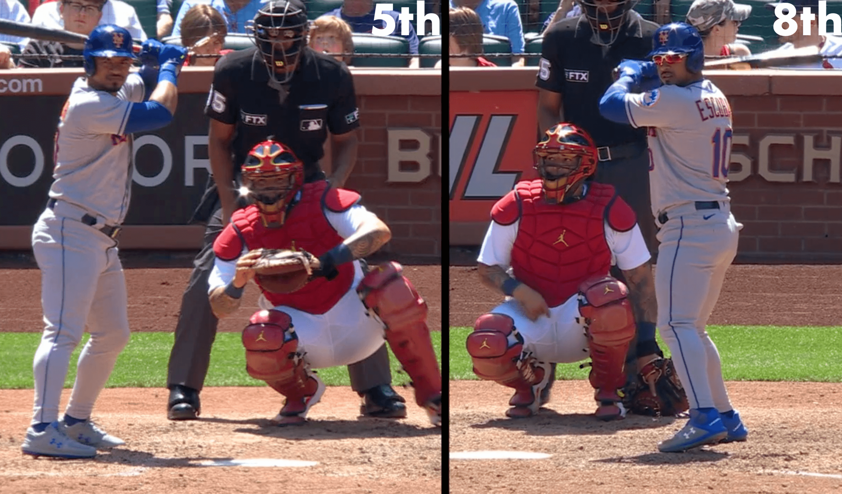
Mets DH Eduardo Escobar changed his shoes in the middle of yesterday’s game against the Cardinals. What was that about? SNY broadcaster Steve Gelbs was all over it:
We talk about superstition all the time amongst baseball players. Well, when Eduardo Escobar doesn’t like an at-bat, he goes and changes his cleats. In his last at-bat, he struck out [he also struck out in the at-bat before that — Paul], he was wearing pretty much all-grey. This at-bat, half-grey, half-blue. He keeps a lot of different cleats in his locker just in case he doesn’t like his AB.
That’s some excellent uni-watching by Gelbs, who clearly Gets It™. Escobar promptly doubled, so his slump-buster move worked!
As an aside, I’ve noticed that Escobar has a very snug fit on his pants, especially over his calves. It’s like he’s wearing skinny-cut stretch jeans!
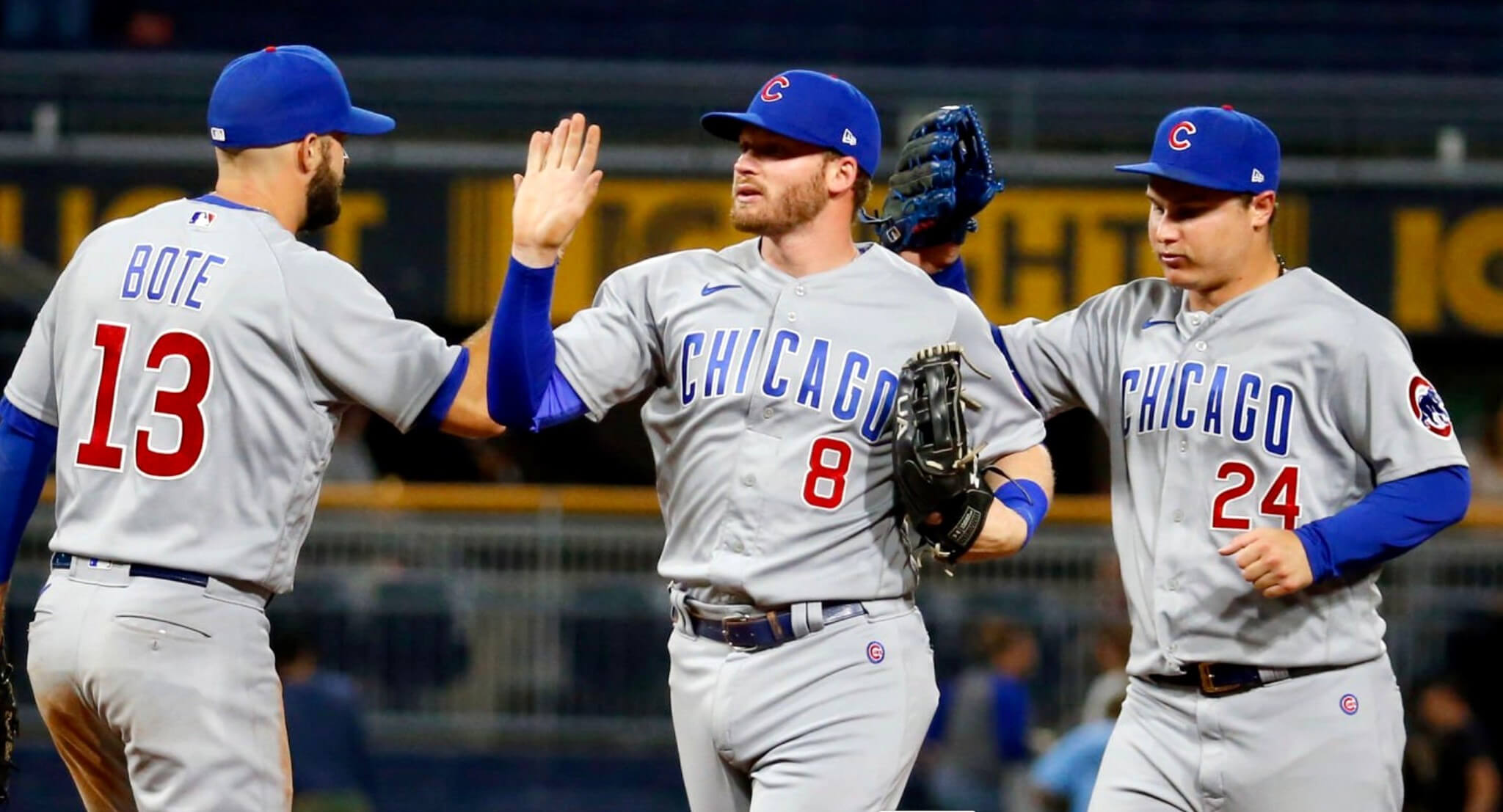
ITEM! New Bulletin article: Due to the delayed delivery of MLB alternate uniforms, we’re seeing a lot more home whites and road greys so far this season. Road uniforms usually don’t get a lot of attention, so I’ve decided to give them the Uni Watch Power Rankings treatment for this week’s Bulletin article — a worst-to-first assessment of MLB greys (or, in San Diego’s case, tans).
My premium subscribers can read the article here. If you haven’t yet subscribed, you can do that here (you’ll need a Facebook account in order to pay). Don’t have or want a Facebook account? Email me for workaround info. Thanks!
Click to enlarge
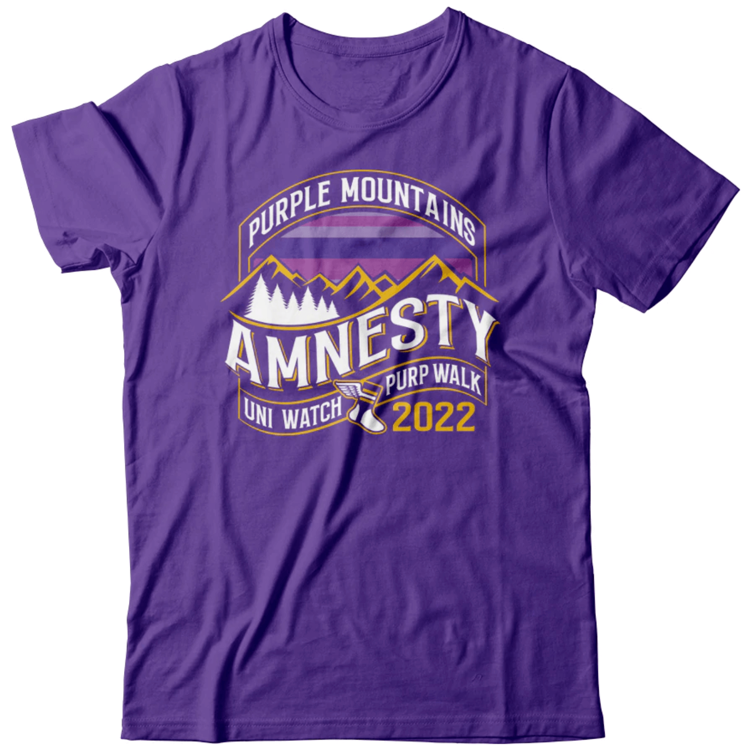
IMPORTANT Purp Walk reminder: If you plan to attend the Purp Walk party in Denver on May 17, today is the last day to pre-order the shirt with the bonus logo on the back. So if you want in on that, order your shirt now.
We’ll be giving out these shirts at the party, so don’t pre-order unless you’re going to be there. If you’re not going to be there, don’t worry — you can still order the shirt on Purple Amnesty Day, but it won’t have the bonus logo on the back.
Click to enlarge
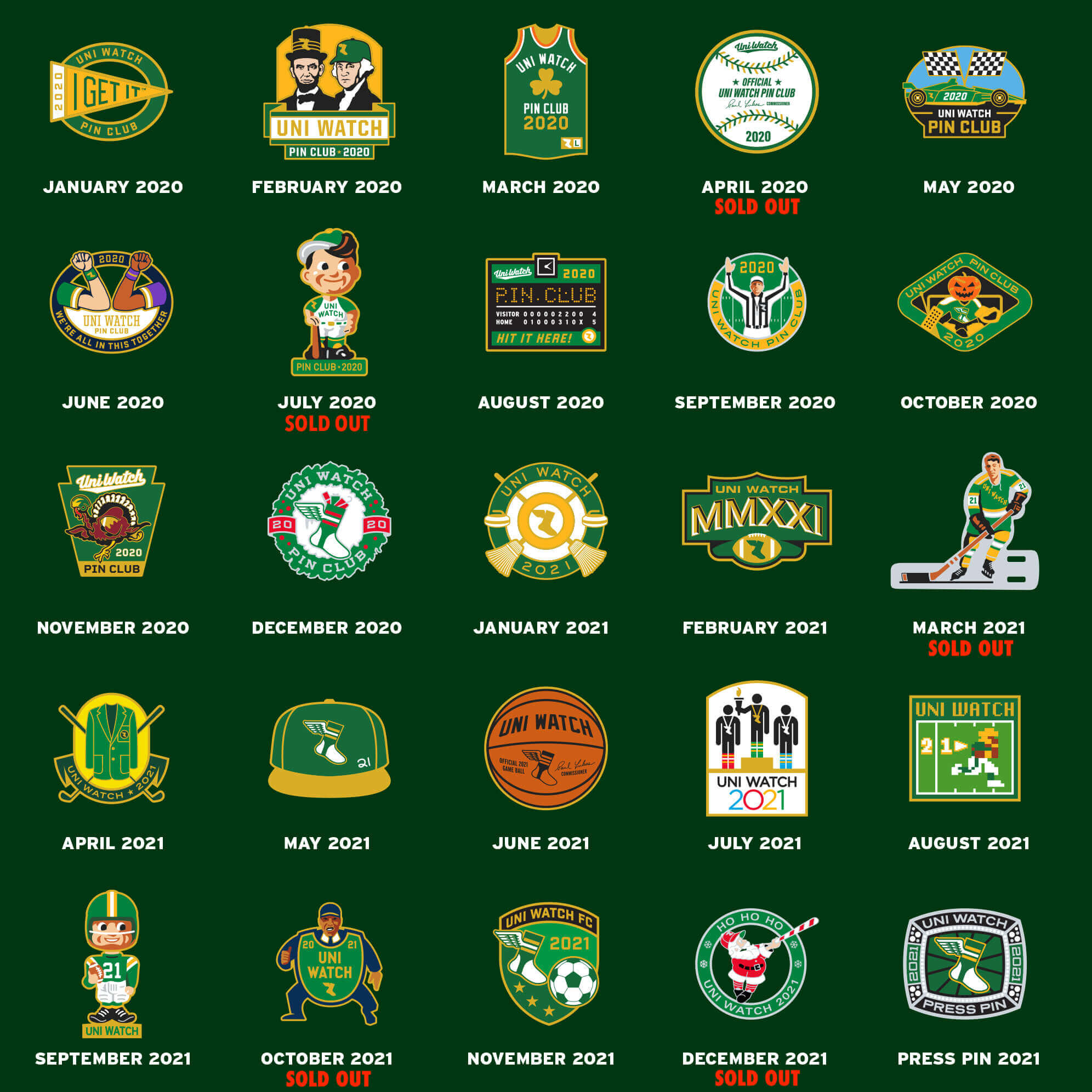
Pin sale reminder: In case you missed it, I’m running a sale on Uni Watch pins for the rest of this week, as follows:
- • One pin
• Any two
• Any three
• Any five
• Any 10 for $30
If you want more than 10, email me and I’ll give you a price.
Full ordering details here. My thanks, as always, for your consideration of our products.
The Ticker
By Paul
Indigenous Appropriation News: Anderson (Ind.) High School has suspended the use of its “Indians” team name. The move comes after the spread of a viral TikTok video that showed students performing in Native garb prior to a basketball game (from Kary Klismet). … Also from Kary: Waterloo (N.Y.) High School will no longer call its teams the Indians and is asking for community input on a new name. … Catawba College in North Carolina, whose teams are called the Indians, has changed its logo to eliminate a pair of feathers but is keeping the team name.

Baseball News: New “Rodeo Weekend” uniforms for the Double-A Corpus Christi Hooks (from Ignacio Salazar). … Main & Mill Brewing Co. in suburban St. Louis is collaborating with Uni Watch pal Graig Kreindler to showcase his portraits of Negro League players on a series of beer cans (from Kary Klismet). … New York Post columnist Jon Heyman says that some new lines could be drawn on MLB fields next season. Key passage: “One exec estimates 80 percent of baseball folks are anxious to see [the shift] outlawed, with the plan for two infielders on either side of second (though drawing lines to keep fielders farther away from second is being discussed).” This reminds me of the chalk “balk lines” that were added to the mound for spring training games in 1974 (photos from Trevor Williams). … The Worcester Bravehearts, a summer collegiate team, will wear in-game rally jerseys this season, changing into a new jersey design if they’re losing after seven innings (thanks, Phil). … Twins SS Carlos Correa wore the wrong cap last night. … I’ve seen women’s stirrup pants before, but never high-cuts like this. Very much like baseball stirrups! (From Harry Kent.)

Football News: Following up on a teaser item from yesterday’s Ticker, here’s the new helmet for the CFL’s Montreal Alouettes. … Rams RB Cam Akers is changing his uni number for 23 to 3.

Hockey News: NSFW: Here’s a story about RISD’s costumed mascot, Scrotie, who’s as risqué as his name implies (from Kary Klismet).

Basketball News: A huge mural of Bucks C Giannis Antetokounmpo, with the back of his jersey facing outward, is being painted in downtown Milwaukee (from Jeff Ash). … Georgia Southern has unveiled renderings of its planned new basketball arena (from Kary Klismet). … Here’s a gallery of Pacers jerseys uniforms through the years (thanks, Phil). … Kareem is wearing an awkwardly lettered “Kareem” jacket in this 1981 fast food commercial (from Willard Kovacs).

Soccer News: New shirt advertiser for the NWSL’s Washington Spirit (thanks, Jamie).

Ukraine News: Portland Timbers and Portland Thorns players played a coed charity match yesterday to raise funds for Ukrainians affected by the war. One side wore yellow with blue trim, the other side wore blue with yellow trim, corner flags were Ukrainian flags, and the center logo was a peace sign (thanks, Jamie).

Grab Bag: Here’s a nice interview with me by fellow Bulletin writer Stefano Fusaro. … New athletics logo for Allan Hancock College (from proud alum Mike Chaldu). … Fun story about a collector who specializes in memorabilia from defunct companies (from Jon Vieira). … New logo for CNET (thanks, Brinke).
Our latest raffle winner is Nick Ruggeri, who’s won himself a vintage Mets glove. Congrats to him, and my repeated thanks to the awesome Jimmy Lonetti for making this one possible. — Paul
Proofreading on the Graig Kreindler item in The Ticker: looks like there’s a missing word in between “cans” and “several.” “Commemorating” or “celebrating,” maybe?
Fixed.
I think the “skinny fit” is a trend gaining a bit of traction in MLB over the last few seasons. While it doesn’t look as good as high socks, it’s at least better aesthetically than the boot cut look.
For the 2 CFL teams that have significantly changed their helmets this year (Alouettes and Elks), I would bet we will see small changes to their uniforms too. The pant stripes no longer match the helmet centre stripe for the Elks. With the new Alouettes helmet having white on the logo and in the centre striping, possible they may add a bit of white trim to their navy uniforms. The only white in the navy uniforms now can be found in the numbers.
Both helmets are fine. Both teams have switched to the conventional style of logo on the side and stripes down the centre. I really enjoyed seeing the Elks play the Alouettes last year when neither team went this conventional route. Elks had the antlers and not their logo. Alouettes with the logo on the top. Somewhat disappointed that is gone.
link
The brilliance of placing the Alouette on top of the helmet is how it centers a letter “M” over the players’ face. Something is lost when teams change to the more ordinary.
When I cue up my laptop in the morning and the first words I see are “very superstitious,” and then a certain Stevie Wonder song gets stuck in my head, I know it’s gonna be a great day!!!
Sir Duke? Signed Sealed Delivered? My Cherie Amour? Don’t leave us in suspense. ;)
Take a look at the Pacers slide show. Look carefully at the Game vs the Knicks, couple of things to highlight, First those ugly Knicks Uniforms which they wore the white. I looked closely and the Arena was not MSG. The second picture with the Knicks player wearing 40, you can see the Ad for Indianapolis power and light. So the Pacers wore color at home during that game.
Cam Akers plays RB not CB.
Right-o. Fixed.
On your Bulletin article on MLB road uniforms, the Angels put themselves at a disadvantage since they don’t want “Los Angeles” on their uniform. Their Orange County fans don’t like the team being called Los Angeles, and the owner wants to benefit media and advertising wise by being in the greater Los Angeles market. That’s why they should call the team “Southern California”. I grew up in Long Beach, and I always tell people I grew up in Southern California, and not Los Angeles. There are a number of professional teams named after a region and not a city or state, like New England, Carolina, Tampa Bay, and Golden State.
Or do what Chuck does … “That Team From Southern California.
But they don’t need to have *any* wordmark. They could just put a logo on the upper-left chest! Copy/pasting from the home jersey is always lame-o.
^^^
This is my preference. Gray (or pink!) version of the home uniform, but with the red halo-A on the chest instead of the Angels wordmark. Throw in a red alt jersey with the halo-A in white and the Angels would almost be in the same class as the Dodgers, uniform-wise. The red-on-red cap would still be a problem; ghosted cap logos rarely work, and while the Angels version almost does, it doesn’t quite. About the same as the Brewers home caps, where the blue-on-blue almost but doesn’t quite cut it.
Agree. Maybe an interlocking SC on their left chest, “Southern California would be very long, so maybe a “Southern Cal”. It was good enough for Keith Jackson when calling USC games. But the Angels definitely have an identity problem with all their names over the years. Los Angeles, California, Anaheim, Los Angeles Angels of Anaheim, and now back to Los Angeles.
I agree, put the “A” on the road jersey fronts, remove it off the sleeves and put a “Trohtani” patch on the sleeve. Holy Guacamole, that just might work!
As an Angels fan, I think that would be a great idea, as long as they took the extra “A” off the sleeve.
I Still Call Them The California Angels.
I love engaging this discussion; it’s so multi-faceted! The professional leagues and their owners are looking to maximize the equity of their franchise. Part of that process is identifying each team with its metropolitan area; the larger, the better.
A league lacking teams in key metropolitan areas is behind the 8-ball. Every time an alternate football league took the locator “New Jersey” for its Big Apple franchise, I pegged that league as doomed.
San Francisco has vexed franchises wanting their pixie dust for decades: the Warriors, Sharks and 49ers have wrestled with this problem using different solutions. In the Sharks’ case, they took the name of one of SF’s bedroom communities, which had grown quickly and become California’s third largest city. That’s as maybe: some still think of San Jose as a glorified bus stop. You just know they always wanted to be known as the San Francisco Sharks, but real-world issues (beginning with expensive real estate) got in the way.
The Morenos are faced with a dilemma; meaning any solution comes with a problem. To maximize the teams’ equity (or pizzazz, take your pick), he wants to associate his team with Los Angeles, the nearest, largest metropolitan area; but as Rick pointed out, local fans of the team don’t associate with LA. In Moreno’s defense, the teams tautological name reminds everone of this bond.
For a few seasons, the team was known as the Anaheim Angels, and worse, the Los Angeles Angels of Anaheim. Anaheimers were pleased, but MLB bit its lip, having one of its franchises associated with a faceless burg, best known as the town Disneyland outgrew.
The “Southern California Angels” has the unenviable task of reminding everyone of the franchises’ best name (California Angels). The “Southern” modifier makes it wishy-washy, the same way the NFL has a problem when it places the Super Bowl in “South Florida” when everyone knows it’s Miami.
Only a few teams benefit from regional locators: The New England Patriots take advantage of the region with the strongest identity (can you imagine the Southwestern Cowboys?) “Tampa Bay” takes advantage of the symbiotic Tampa-St. Pete relationship, and neither city can host a big-league team on its own.
NSFW: Here’s a story about RISD’s costumed mascot, Scrotie, who’s as risqué as his name implies (from Kary Klismet).
A valuable opportunity to tie in with South Park was crucially overlooked.
What is RISD, anyway? (Not gonna click on the link right now.)
Rhode Island School of Design.
Rhode Island School of Design
Rhode Island School of Design
Rhode Island School of Design
Rhode Island School of Design
I was wondering this too. Rhode Island School of Design.
That is the Rhode Island School of Design. Each of their mascots has a similar, um, theme.
Or just stick with Anaheim Angels. If the team is successful they won’t “need” to be known as LA to have a popular brand.
The Rhode Island School of Design.
Rhode Island School of Design
I believe it’s the Rhode Island School of Design.
Not the place I would expect to find a link to Aubrey Plaza but I am here for it!
Just ordered my Purp Walk Denver t-shirt. I’m really looking forward for the meet up next month at Blake St Tavern!
A’s and Braves would get higher marks for road uniforms if they wore their home hats with their road greys. Marlins just need to go back to as close as their original uniforms as possible.
With all the great powder blue alternates that have arrived recently, now is the time for a team to say forget the road greys and going powder blue with the road unis. Fits perfectly and a nod to history for a team like the Blue Jays, Royals, or Twins to make this plunge.
Rhode Island School of Design. It’s where the B-52s got their start I believe.
I never thought I’d read the words “Mets DH” but here we are.
Thin entry today, after a couple small paragraphs of content – mostly selling stuff. I still do appreciate the ticker. I wish Paul would partner with a more ethical platform, and I wonder sometimes how he can be so anti-appropriation yet put his amazing work on a platform that has/can cause much more damage. Hopefully there will be another option in the future! Maybe even his own platform with like minded collaborators.
You’re raising two different issues here, Steven:
1) Short lede: That’s not new. For many, many years now, the lede has almost always been short whenever I have a feature-length piece appearing on ESPN, SI, or Bulletin. I’m pretty sure you already know this and are just using this issue as a straw man for your real point, which is…
2) You don’t like Facebook: Fair enough. We can agree to disagree on that point. But it would be nice if you could just say that instead of using the short lede as a straw man for your real point.
(Side note: It’s fine for you to say I’m “selling” my Bulletin content, but the flip side of that, which you conveniently ignore, is that today’s “thin entry,” as you put it, is available for free. I mean, do you want a refund or what? It’s an unsustainable model — that’s why I sell stuff.)
Looks like “balk lines” carried over to 1975 spring training- that’s when Catfish Hunter (pictured) joined NYY
Would I be the only one who thinks the new CNET logo is horrible?
Anyone else think the CNET Wordmark/Logo is awful?