By Phil Hecken
Follow @PhilHecken
Greetings and salutations, Uni Watchers, I hope everyone had a good Saturday. BTW, my team is still on pace to win 162 games this season…so that’s good.
Back in May of 2021, I ran a set of MLB concepts from Gregory Kohn which he had created during quarantine. Those were well received, and just before the holidays at the end of last year, Gregory sent me another set of “bizarro” uniforms — this time for teams in different sports who share the same team names. I had promised I’d get to these after the holidays…and, well, it’s plenty after the holidays now. Some of these are actually quite clever! I’ve always thought certain teams’ unis might better translate to a different uniform template (and sport), but I never imagined translating that into “same name” teams. But Gregory has.
Here we go:
Shared Nickname Uni Swaps
by Gregory Kohn
It’s another bizarro world… this one switches the look of teams that share a nickname across any of the 4 major sports. So, imagine if the New York Jets were a hockey team while the Winnipeg Jets were the NFL team etc. I was surprised that there were only 6 active nickname combos like this. I thought there’d be more. I did cheat a little and added back the Houston Oilers just cause their look was too good.
CARDINALS
Arizona Cardinals:
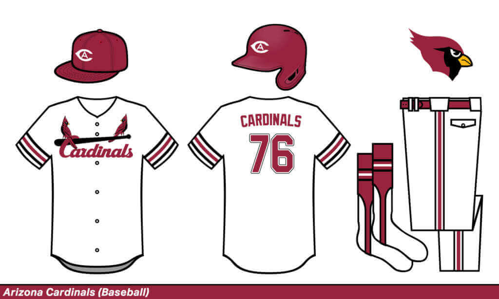
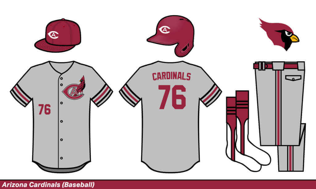
In this bizarro world, the Arizona Cardinals are the baseball team, but I went all the way back to football’s Chicago Cardinals for the logo inspirations. The bird and bat logo on the jersey was pretty fun to reimagine.
St. Louis Cardinals:
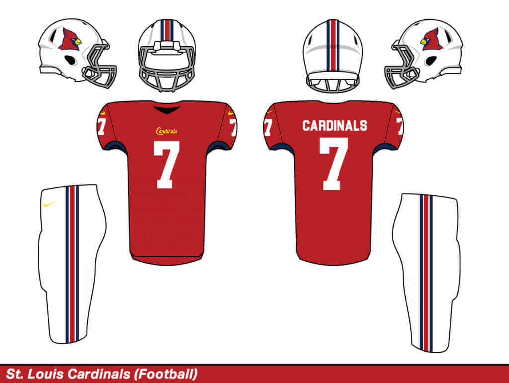
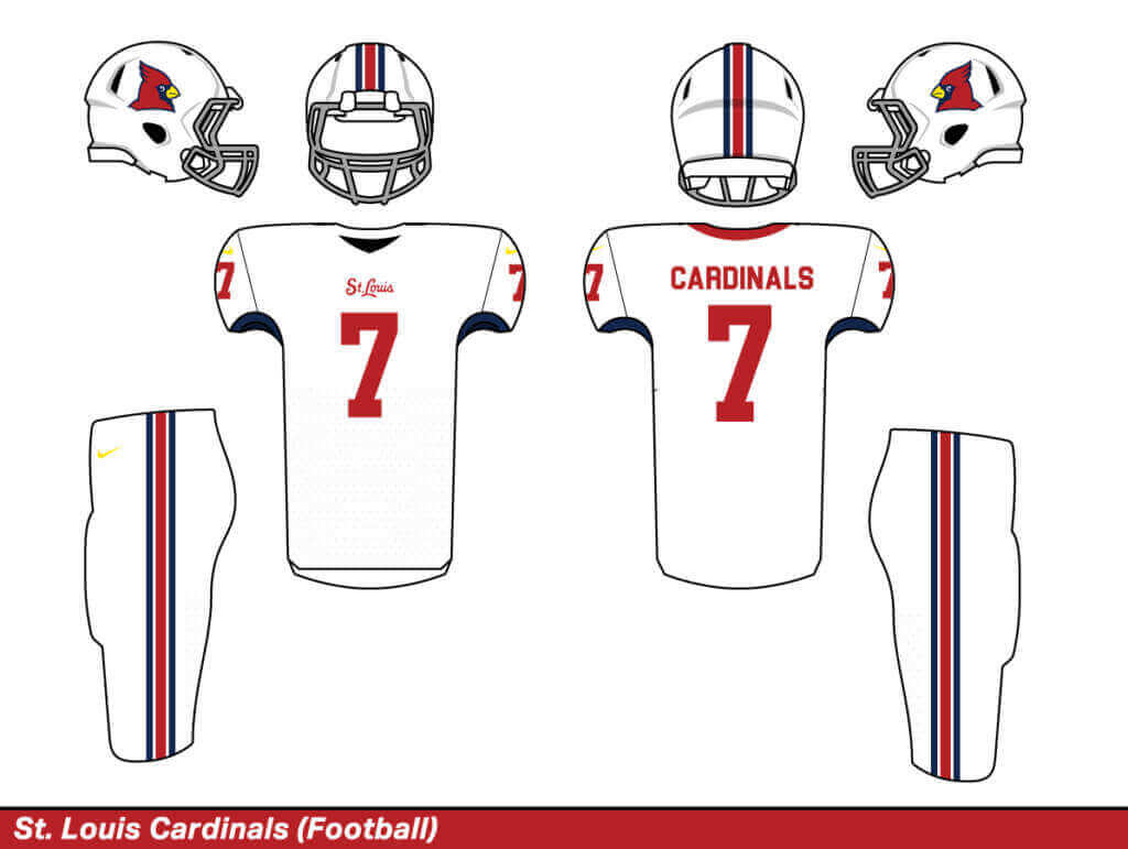
I feel like these turned out looking classy, which is a good representation of how the real-life baseball team looks. Plus, this is a clear upgrade over the current NFL team’s set, which I know is not saying much.
GIANTS
New York Giants:
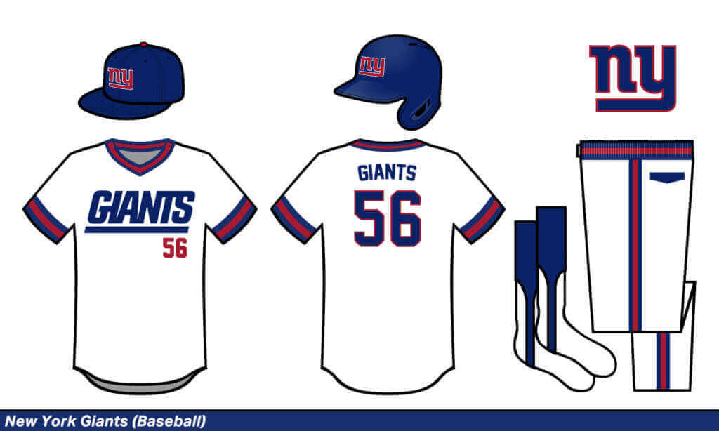
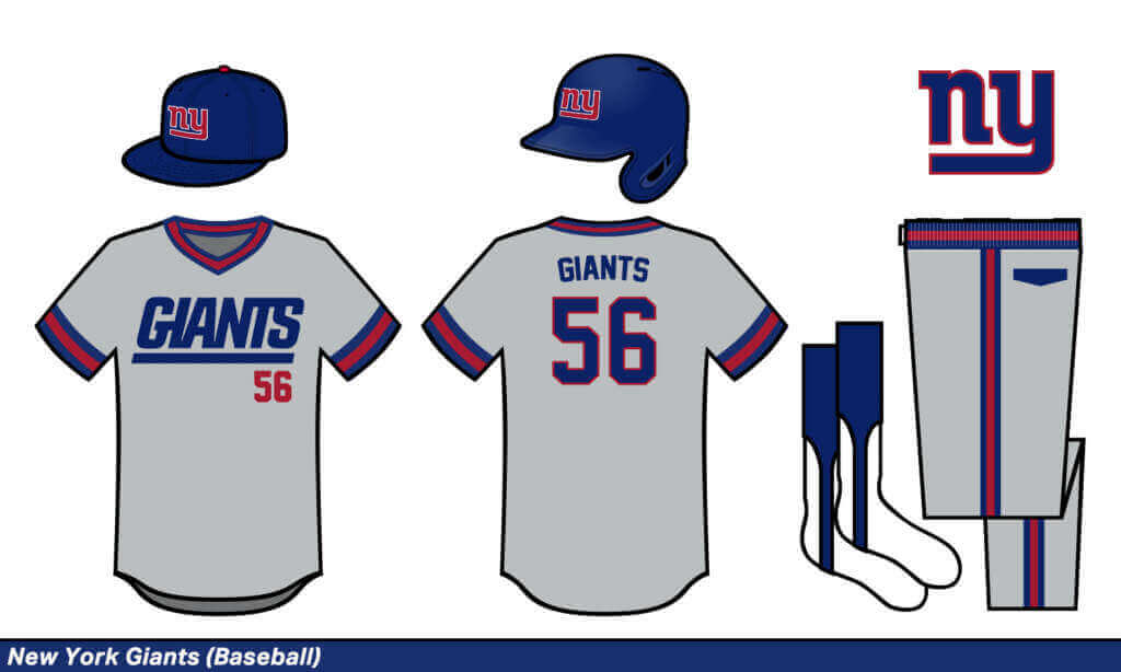
I mixed the LT-era Giants with the 70s-era MLB style. I love that big GIANTS font.
San Francisco Giants:
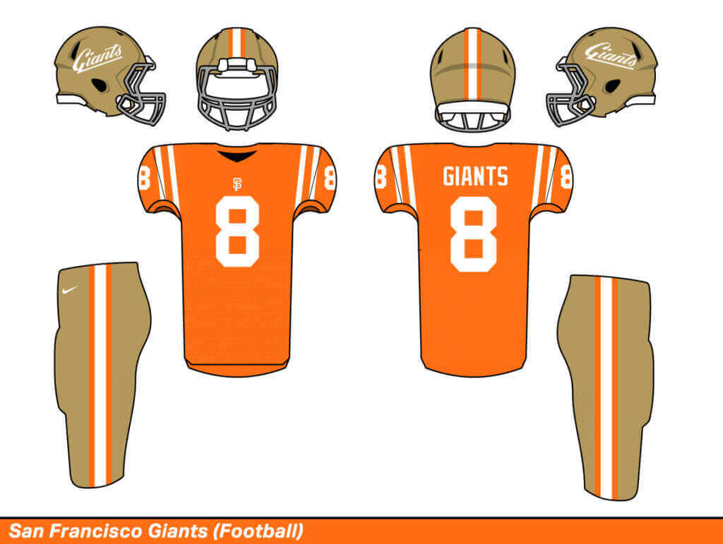
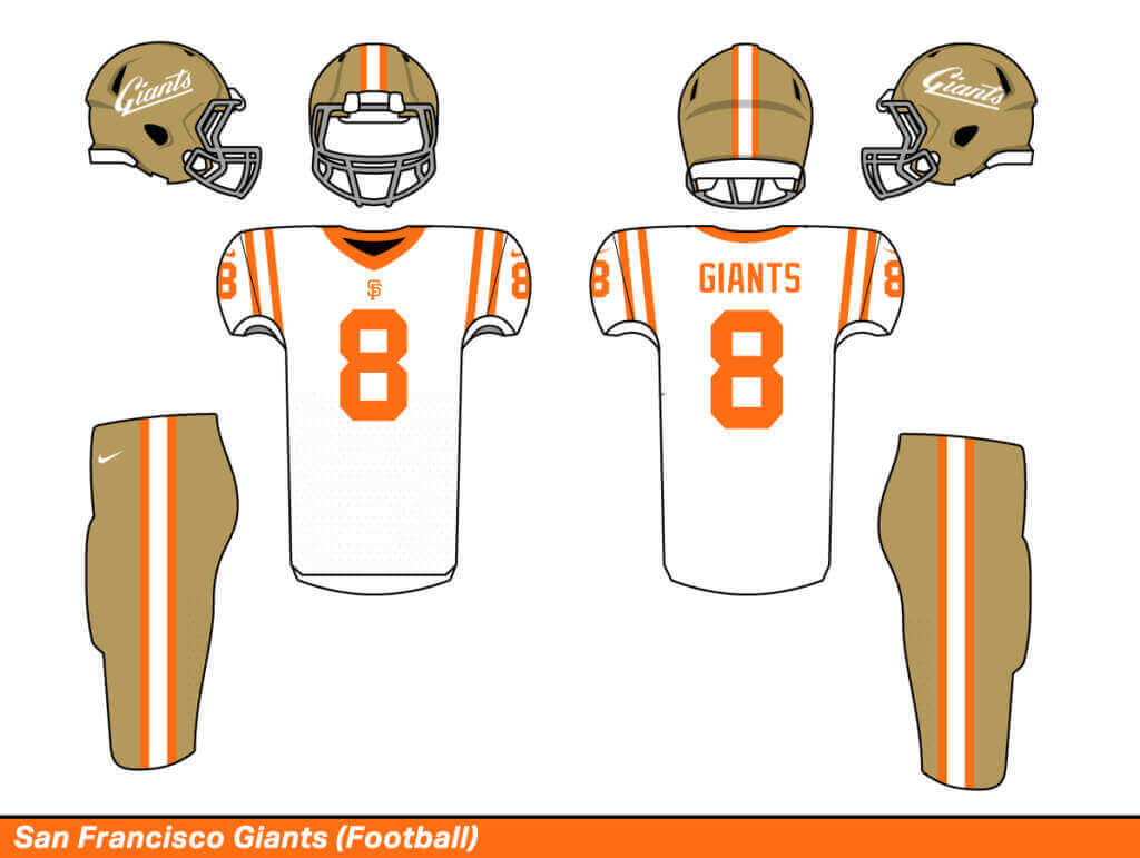
Black and orange is too Halloween-y on a football uniform, so I kept the 49ers gold. Is that cheating? Probably, but this is my fake uniform universe so I did it. I think it looks good with the orange too.
JETS
New York Jets:
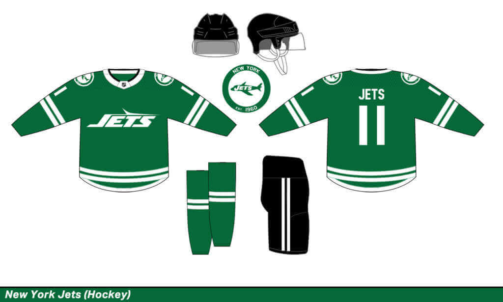
I know hockey shouldn’t be text-based, but I just love this 90s-era Jets logo too much. I also kept the current modern number font which works well on a hockey jersey.
Winnipeg Jets:
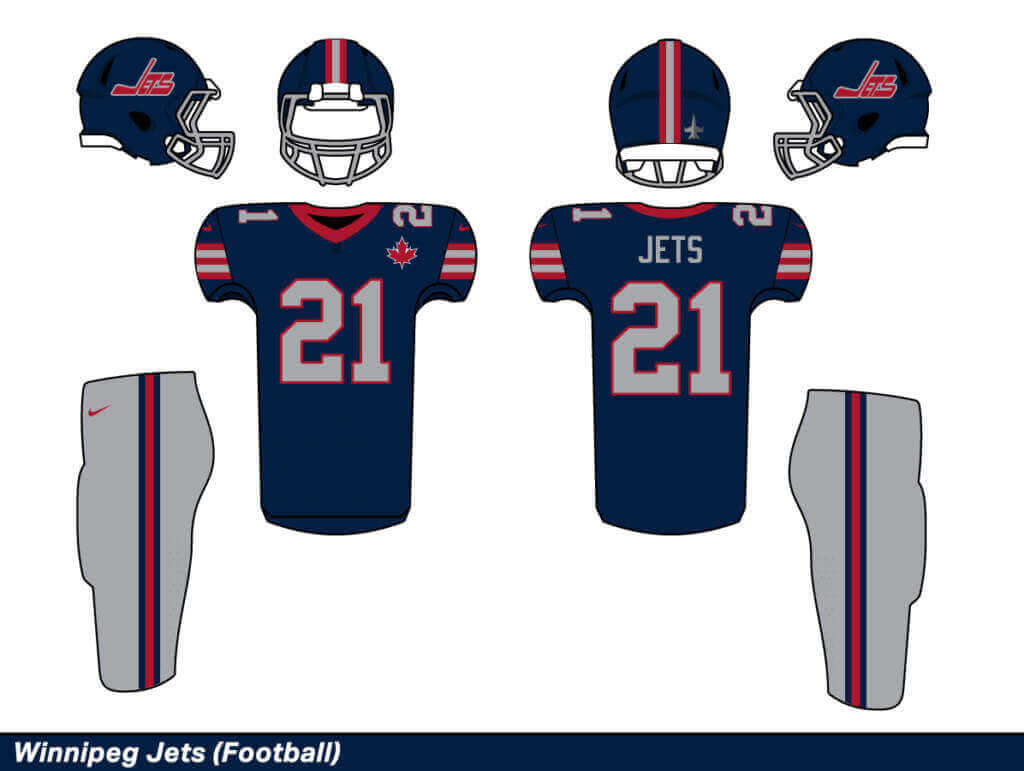
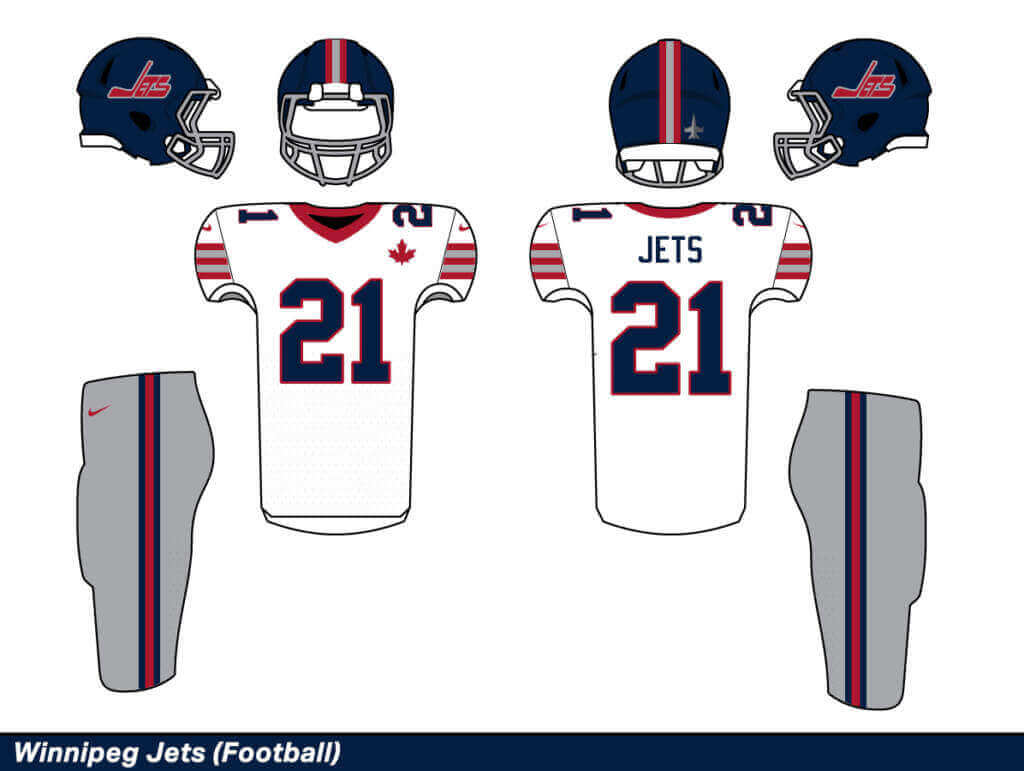
Can we actually switch these teams in real-life? The current NHL Jets look awful with that weird light blue arm striping. They’re much improved as an NFL team.
KINGS
Los Angeles Kings:
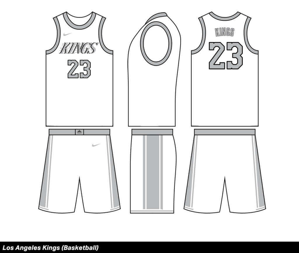
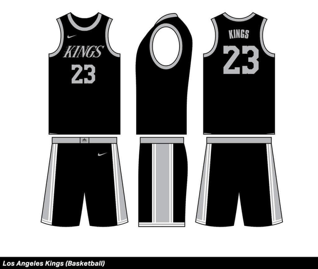
Would these be better or worse than the Spurs? I can’t tell. But I do think it’s a better look than the current NBA Kings.
Sacramento Kings:
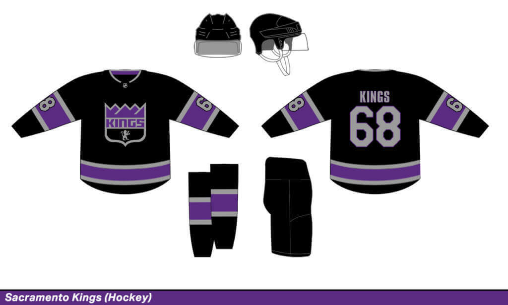
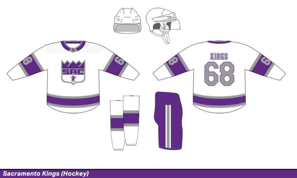
The many different logos of the Sacramento Kings actually worked really nicely as an NHL crest.
OILERS
Edmonton Oilers:
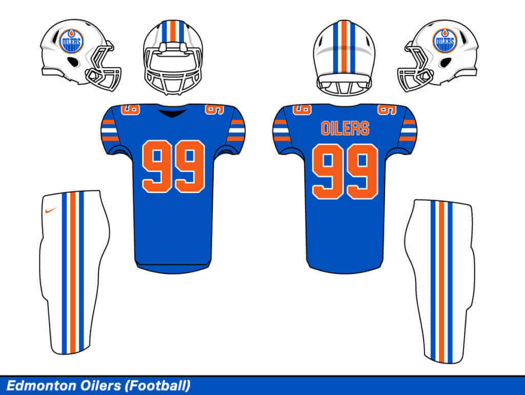
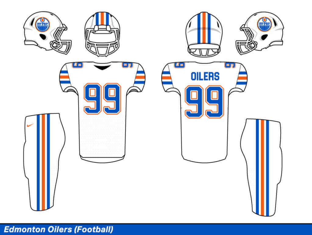
My least favorite uniform of the bunch. I couldn’t escape the Florida Gators look. But it was better than using an orange or a navy jersey. Regardless, I had no chance of beating the Houston Oilers football look.
Houston Oilers:
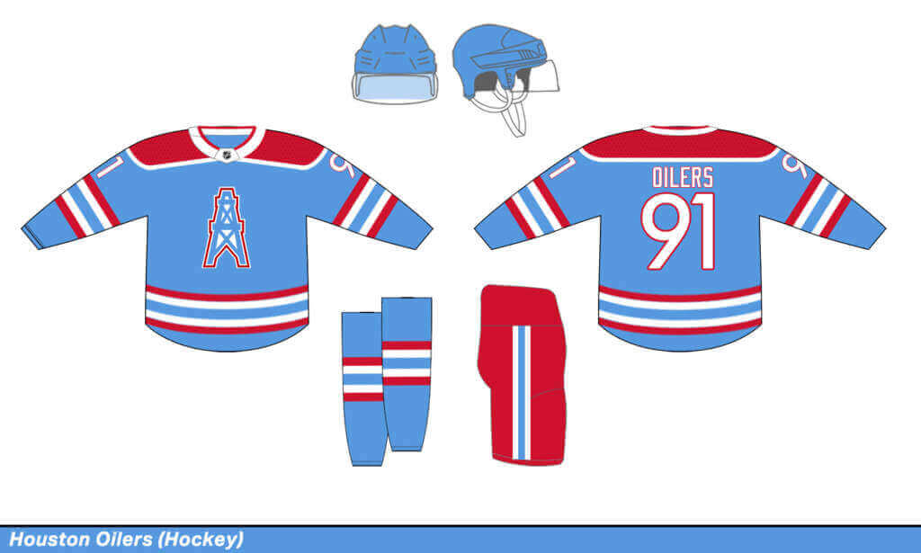
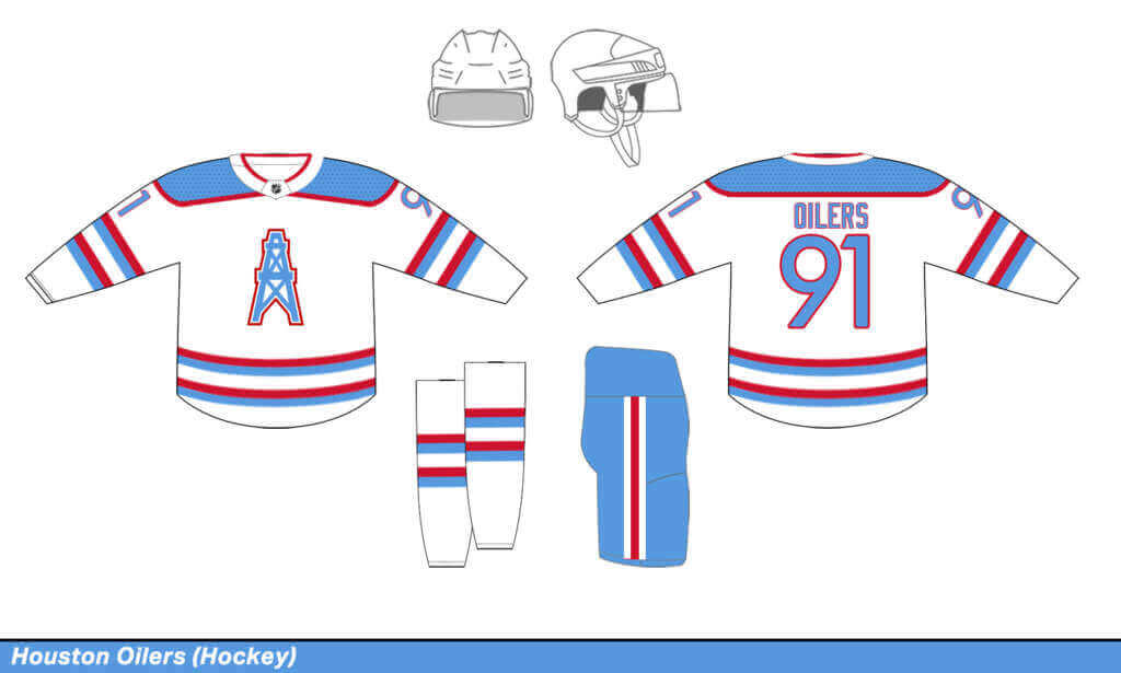
Okay, I cheated big time. This team name hasn’t existed for almost 25 years. But I mean, come on… that logo as a crest and the striping with those incredible colors. Probably my favorite design of them all.
PANTHERS
Carolina Panthers:
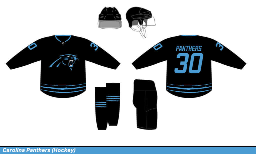
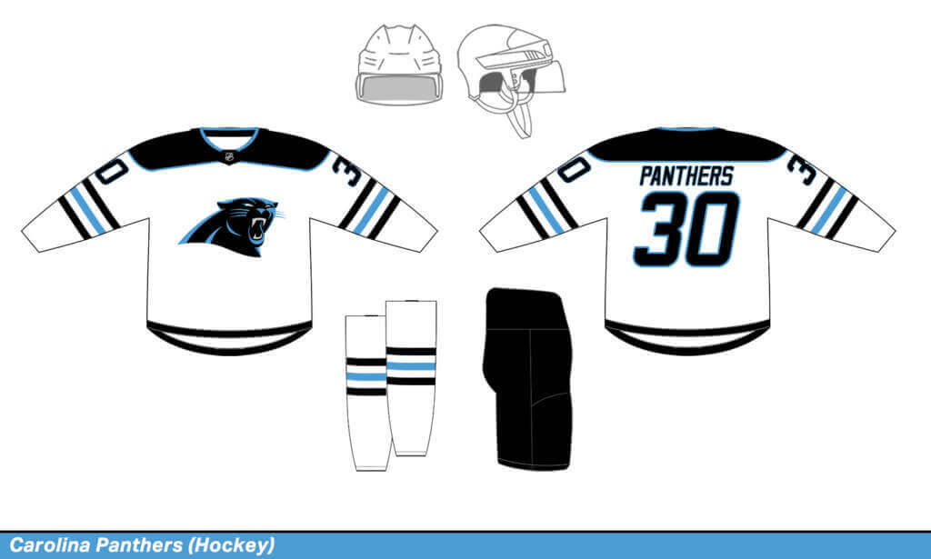
I’ll be honest, I think the NFL Panthers are one of the worst looks in sports. Can we please stop pairing baby blue with black? I did the best I could turning them into a hockey team, but that mad cat logo isn’t a proper hockey crest.
Florida Panthers:
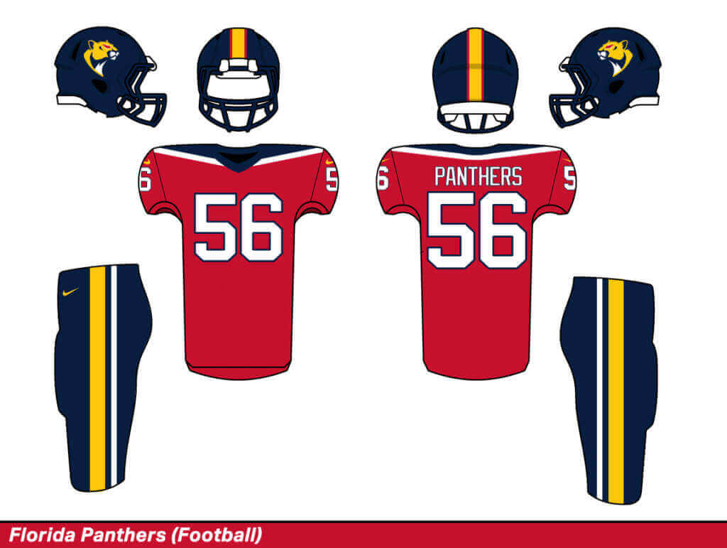
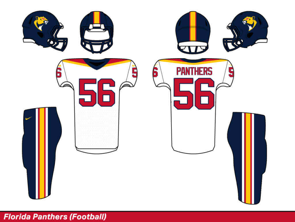
For the helmet logo, I colored the panther’s eyes red, cause, ya know, it’s football where apparently every mascot needs to look mad. I’d still take this look any day over the real Carolina set.
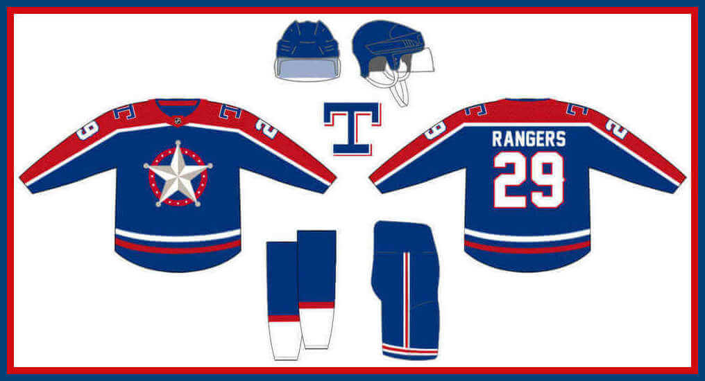
RANGERS
New York Rangers:
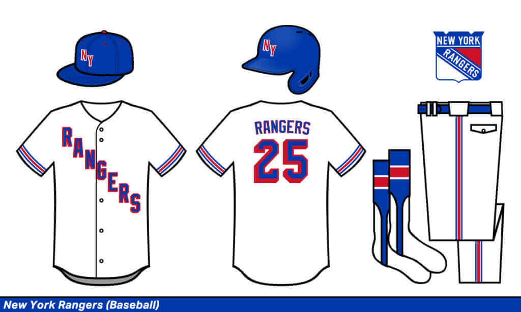
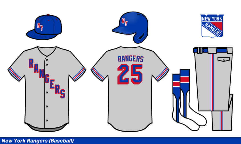
I’m all for diagonal lettering on a baseball jersey!
Texas Rangers:
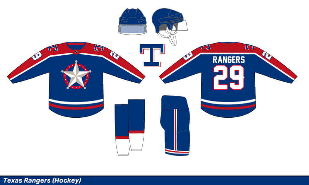
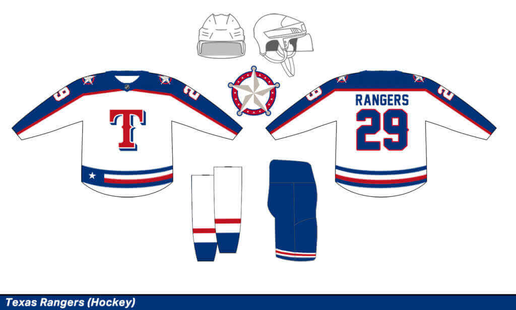
I went big, bold, and tacky for this Texas team. I think it works pretty well, but definitely not better than the classic NHL Rangers set.
Thanks Gregory! Very fun concepts in your bizarro world. Thanks for sharing!


Guess The Game…
from the scoreboard
Today’s scoreboard comes from Chad Handler.
The premise of the game (GTGFTS) is simple: I’ll post a scoreboard and you guys simply identify the game depicted. In the past, I don’t know if I’ve ever completely stumped you (some are easier than others).
Here’s the Scoreboard. In the comments below, try to identify the game (date & location, as well as final score). If anything noteworthy occurred during the game, please add that in (and if you were AT the game, well bonus points for you!):
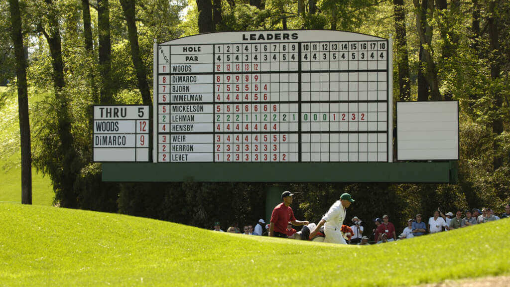
Please continue sending these in! You’re welcome to send me any scoreboard photos (with answers please), and I’ll keep running them.
The “BEST OF” Kreindler’s Korner
Hey guys & gals. You’ve enjoyed Kreindler’s Korner for several years now, mostly on the weekends, on Uni Watch, and we’re still doing the “Best of” until Graig can re-devote his efforts to new writeups for paintings you haven’t seen. Hopefully that will be soon!
Here’s today’s offering:
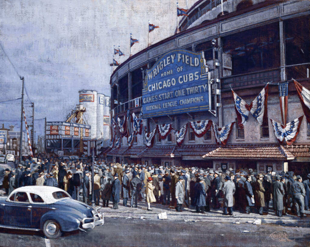
Title: “Wax and Wane at Wrigley”
Subject: Wrigley Field, 1945
Medium: Oil on linen
Size: 24″ x 30″Pictured is the scene outside of Wrigley Field early in the morning on October 10th – the seventh game of the 1945 World Series. Tickets for the 1:30 game had gone on sale at 8:30 AM, long after the crowd had gathered with the hopes of scoring tickets to the last game. With temperatures in the upper 40s, the Cubs took the field for the final contest of the series, hoping that the momentum from their dramatic win the previous Monday would carry them to their first title in almost 40 years. Returning from his 4-inning relief performance during Game 6, Hank Borowy was slated to start with less than 48 hours rest. After giving up three straight singles in the opening frame before recording an out however, manager Charlie Grimm pulled Hank, conceding that he had done all that he could for the Cubs that season. In replacing Borowy, Paul Derringer fared little better, giving up a bases-clearing double to catcher Paul Richards, bringing the Tiger run total to five in that first inning alone.
The Cubs would never catch up. Though Detroit’s Newhouser allowed ten hits and three runs, he would also strike out ten Chicago batters. Additionally, the Tigers would all but shut the door in the 7th and 8th innings, with a series of doubles and sacrifice flies, opening the last frame with a 9-3 lead. With two outs and one man on, Cubs second baseman Don Johnson would ground-out to the shortstop, forcing Roy Hughes at second, and ending the game, the 1945 blue ribbon classic, and the Cubs dynasty of that era.
Thanks, Graig! You can (and should!) follow Graig on Twitter.
Uni Watch News Ticker
By Phil

Baseball News: The Pittsburgh Pirates ordered five life-sized bobbleheads to be displayed outside of their ballpark, but unfortunately, two of them did not rise to their high expectations (from Jon Vieira). … The Milwaukee Brewers paired their alternate blue/gold cap with their road grays for what is believed to be the first time ever (from multiple sources). Here’s another view. … In yesterday’s Blue Jays/Rangers match-up Teddy Lauchlan noticed Texas’ catcher Jonah Hiem using a more modern looking, All-star hockey style catcher’s helmet, which has a much more geometric look. He adds, “this style, or a new redesign of their catching equipment, as far as I know hasn’t been announced by All-star, or available to the public either.” … A couple readers noticed a very wrinkled jersey for the Padres Taylor Rogers on Friday evening. … Looks like the Houston Astros City Connect cap has leaked (from Ignacio Salazar). … I absolutely love this blazer (from Stephen Nesbitt). … Tweeter Teddy noticed Adam Wainwright wore a Majestic pullover before Opening Day. He asks, “Was it a tribute/throwback to 2011? I think that particular style is at least that old!” … Interesting helmet number numeral font for the 1967 Cardinals (from Vogt). … OMG! Check out this amazing Banner Day photo at Shea Stadium in 1964 (from Allie Allie Oxenfree). … Awesome: one of Paul’s tweets was featured during MLBNetwork’s regional coverage of the White Sox and Tigers (good spot by Richard Grossman). … The Florida Semimoles…er Seminoles … played softball and an unfortunate placket overlap led to the “new” name (from Chad Kollas). … One of the more awesome fan givaways at the Friendly Confines yesterday: a beer holder mitten (from Jff Dmrly). … Due to “supply chain issues,” the Cardinals wore their regular home whites yesterday (from Jeff Jones). Possibly related: the Phils did not wear their normal afternoon cream uniforms yesterday either. … A’s starting pitcher Cole Irvin was sporting a yellow belt yesterday (from Dan Mallon). … There were bound to be problems with Pitch-Com, the new signal calling device (from Dan Eisterhold). … The Durham Bulls are the only Triple-A affiliate the Tampa Bay Rays have ever known, and the team will celebrate a quarter century of that partnership with commemorative uniforms this year. … Check out Larry Doby Jr. in his Duke baseball uniform (from James Gilbert). … Yesterday, InGuardians skip Tito Francona wore a Guardians hat and Indians tee in postgame presser (from The Grump co-starring Taco and Bridget!). … Juan Soto has his own UA-branded batting gloves (from Col Scofield).

Football News: As is tradition, Clemson’s QBs wore purple jerseys with white pants in yesterday’s spring game, a combo that has not seen regular season play since 2008 (from Clemson Uni Tracker).

Hockey News: The Vancouver Canucks have unveiled a special jersey celebrating British Columbia’s community heroes. … Check out the sweaters at the annual U.S. Congressional hockey game vs. lobbyists (from Woody).

Basketball News: Nikola Jokic donned a red headband for part of his most recent game to cover a gash in his forehead. It does not appear to be a long-term wardrobe thing (from Ron Ruelle). Rayjon Tucker will wear No. 59 for the Milwaukee Bucks. He is the first NBA player to ever wear No. 59 (from Etienne Catalan).

Soccer News: Sheffield Wednesday, a soccer club that competes in League One, the third tier of the English football league system, has a new uni advertiser (via Paul). … Brighton & Hove Albion are honoring injured teammate Jakub Moder, by wearing his name on their warmup shirts. Moder ruptured his ACL last week (from Ed Żelaski). … The Minnesota Aurora, , have unveiled several new kits (via Paul). The team begins play in the USL Women’s League in May 2022. The team is women-led and community-owned. Here’s a bit more on that. … Following up on yesterday’s lede, Forward Madison raised $20 thousand for Ukraine relief. … Polish football fans made their feelings towards Vladimir Putin clear at yesterday’s Lech Poznań vs Legia Warsaw match (via Paul).

Grab Bag: Here’s a Wall Street Journal (mostly paywalled, unfortunately) on how sneaker restoration is now a thriving business (from Tom Turner). … Scottish curler Kyle Waddell wore a cap with patches covering either makers marks or ads at the World Curling Championships yesterday (from L.J. Sparvero). … Of this Dartmouth logo, Tris Wykes writes, “Having the inside of the 0 be a D bothers me for some reason. Not sure why.”
Uni Tweet of the Day
How many things “wrong” with this jersey can you spot?
This right here ain’t it pic.twitter.com/EoeEYpPsRn
— Steve Perrault (@Steve_Perrault) April 8, 2022
And finally… that’s it for today. Big thanks to Gregory for his “Bizarro” same name uni concepts.
Everyone have a great week, and for those who are observing, a blessed Palm Sunday. I’ll catch you fine folks back here next weekend. Until then…
Peace,
PH
You could have done the Washington Nationals and Syracuse Nationals as well.
Speaking of Nationals, I believe some time back they acquired the Senators name/branding, etc. from the Texas Rangers. I think I read that here at some point.
I dig the Jets hockey and the Rangers baseall swap the most. Diagonal letters would be interesting to see in person on the field.
Nice job Gregory. However you missed a great opportunity to do the SF Giants in their colors. I don’t think of Halloween when I see Oklahoma State or Oregon State playing football, or the SF Giants playing baseball. In fact SF has one of the best uniforms in MLB. A black helmet with the classic interlocking SF logo would look awesome. And with the one shell rule now gone, an orange alternate would also be great.
2005 Masters, final round, won by Tiger Woods in a playoff. Tiger chipped in from an impossible spot long and left of the 16th green in what is considered one of the best shots in Masters history, if not one of the most replayed!
Bizzaro alright. Yeesh.
Hopefully there was some good checking (no, not the kind where lobbyists give lawmakers a check) during the lawmakers vs. lobbyists hockey game.
The Phillies are wearing their normal pinstripes this weekend as the two alternate unis have not arrived from the factory yet, and no ETA on when they will come in.
Ruth: red and NOB
Supply chain issues = better looking baseball games. Too bad the city disconnect Nationals jerseys didn’t also get delayed.
Gregory, the baseball Rangers, hockey Oilers, basketball Kings, and football Panthers knocked it out of the park! I have often wondered why baseball teams eschew lettering that slants down from right to left. Maybe they don’t want their fans to say their team is going downhill.
I know it’s basically the same sport but how about the BC Lions and Detroit Lions swapping colors? Would love to see Detroit in black & orange! Also, that Oilers hockey sweater needs to be made yesterday!
A uni note for today:Pistons (red) and Sixers (blue) going color on color tonight in Philly.
CFL prior to 1997. Same sport, same league, kind of same name. Saskatchewan Roughriders and Ottawa Rough Riders colour swap would be fun. Though it is true the Saskatchewan Roughriders actually did it in 2010. They were black and red in the days they were known as the Regina Roughriders and wore some old-time throwback in 2010.
link
Terrific Job !